
 100% Security Verified | No Subscription Required | No Malware

Gray white color palettes sit in the sweet spot between pure minimalism and expressive storytelling. They feel calm, modern, and reliable, which makes them perfect for creators who want their content to look clean without feeling cold. Soft whites paired with layers of gray can suggest clarity, professionalism, or emotional depth depending on how much contrast you use.
For video creators and designers, gray white is a versatile base for thumbnails, titles, intros, channel branding, and even full cinematic grades. The palettes below give you ready-made gray white color combinations with HEX codes, so you can drop them straight into your designs or recreate them in Filmora when you color grade your clips, add text overlays, or design YouTube intros.
In this article
Minimalist Gray White Color Palettes
Soft Studio Hush
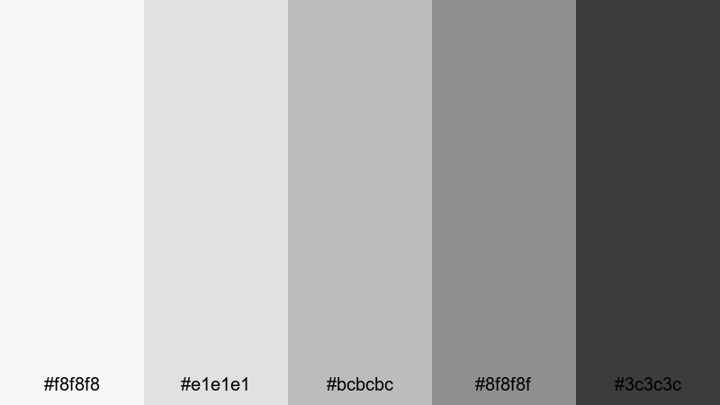
- HEX Codes: #f8f8f8, #e1e1e1, #bcbcbc, #8f8f8f, #3c3c3c
- Mood: Calm, understated, and professional.
- Use for: Perfect for clean tutorial intros, tech explainers, and minimalist channel branding.
Soft Studio Hush moves gently from near white to deep charcoal, creating a smooth gradient that feels like a quiet photo studio. It keeps the frame neutral and polished, so your subject, icons, and typography stand out without visual noise. The darker charcoal tone is ideal for legible text and UI-style shapes, while the lighter grays serve as subtle background plates.
Use this palette for tutorial lower thirds, product callouts, or intro screens where you want maximum clarity but zero distraction. In thumbnails, you can place your face or product against the pale gray whites and frame key text in the deeper gray for a premium, minimalist gray white look that is easy to keep consistent across your entire Filmora project.
Pro Tip: Build A Minimalist Gray White Look In Filmora
To keep a Soft Studio Hush feeling across an entire edit, start by choosing one of the mid grays (#bcbcbc or #8f8f8f) as your base color for titles, shapes, and transitions. In Filmora, set that as your default text and border color, then use the lighter tones for backgrounds in split screens, callouts, or end cards. This locks in a cohesive gray white identity from intro to outro.
You can also lean into the studio vibe by slightly desaturating your footage and lifting the shadows so they approach the darker gray of the palette. This creates a calm, controlled atmosphere that suits tech explainers, productivity content, and desk setups while still looking sharp on mobile and desktop feeds.
AI Color Palette
If you already have a reference image that nails this Soft Studio Hush mood, you can turn it into a look for your entire video. Filmora's AI Color Palette feature analyzes a reference frame or color card and automatically transfers that style to the rest of your clips. That means your A-roll, B-roll, and cutaway shots can all share the same polished gray white atmosphere.
Simply choose a shot with the tones you like, open AI Color Palette, and apply it to other clips in the timeline. The AI will harmonize exposure and color balance so your whites, mid grays, and charcoals stay consistent, saving you from manually matching every clip by hand.
 secure download

HSL, Color Wheels & Curves
Once your main colors are in place, you can fine-tune the gray white tones using Filmora's HSL, Color Wheels, and Curves controls. Slightly cooling the midtones or warming the highlights can push the palette toward sleek tech or soft lifestyle, all while staying within the same neutral gray white family. Adjusting the curves lets you deepen charcoals without crushing detail, which is perfect for text legibility and contrasty thumbnails.
If you want more control over how your grays roll off into shadows and highlights, use the color wheels to lift the highlight whites closer to #f8f8f8 and anchor the shadows around #3c3c3c. Combined with the guidance from Filmora's color tools and tutorials, this gives you a flexible yet consistent minimalist look.
secure download1000+ Video Filters & 3D LUTs
If you prefer working fast, you can start from Filmora presets and then nudge them toward this Soft Studio Hush palette. Filmora's video filters and 3D LUTs make it easy to get a modern, low-saturation base, then you can adjust brightness and contrast so your whites and grays match the HEX codes in this set.
Apply a neutral or cinematic LUT to flatten strong colors, then layer a soft filter to keep edges clean and highlights smooth. From there, tweak exposure and contrast so your footage feels like it is living inside your chosen gray white gradient, which helps your thumbnails, intro cards, and social cuts look unified at a glance.
secure downloadMorning Fog Edit
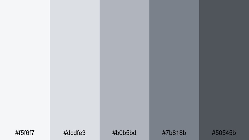
- HEX Codes: #f5f6f7, #dcdfe3, #b0b5bd, #7b818b, #50545b
- Mood: Airy, reflective, and slightly cinematic.
- Use for: Works well for day-in-the-life vlogs, lifestyle lookbooks, and subtle lower-third graphics.
Morning Fog Edit layers soft whites and cool grays that feel like early daylight filtering through a cloudy sky. The palette is gentle but not flat, with enough depth in the darker grays to keep your text and icons crisp. It brings a reflective, almost journal-like feel to your visuals, perfect for calm storytelling and aesthetic B-roll.
Use the lightest tones as backgrounds for chapter titles or timestamps, and reserve the deeper grays for subtle borders and captions. In Filmora, you can pair this palette with slow pans, soft zooms, and light background music to create peaceful vlog intros, Pinterest-style thumbnails, and lookbook sequences that feel cohesive and cinematic.
Paper And Pixel
- HEX Codes: #ffffff, #f2f2f2, #d3d3d3, #a0a0a0, #666666
- Mood: Clean, editorial, and design-forward.
- Use for: Great for typography-focused thumbnails, motion graphics, and UI-style overlays in productivity or design videos.
Paper And Pixel combines bright whites with controlled mid grays, echoing stylish magazine layouts and digital wireframes. It feels organized and intentional, which is ideal when your content is heavy on text, numbers, or UI elements. The contrast is strong enough for readability while staying soft on the eyes.
This palette works especially well for title screens, list-style thumbnails, and overlay graphics that explain steps or features. In your Filmora projects, you can build card-based layouts, captions, and animated infographics in these shades to reinforce a thoughtful, design-savvy brand identity.
Nordic Workspace Glow
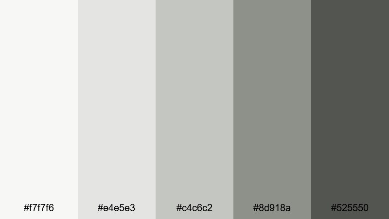
- HEX Codes: #f7f7f6, #e4e5e3, #c4c6c2, #8d918a, #525550
- Mood: Minimal, cozy, and quietly confident.
- Use for: Ideal for desk setup tours, productivity channels, and calm office B-roll sequences.
Nordic Workspace Glow mixes gentle whites and muted gray greens to imitate soft daylight in a Scandinavian studio. It feels organized yet cozy, like a carefully curated desk with plants, notebooks, and clean tech. The palette keeps everything neutral, which helps gear colors and skin tones look balanced on screen.
Use the lighter tones for background panels, lower thirds, and titles, and rely on the deeper gray for contrast when you need strong text or buttons. In thumbnails and intros, this gray white scheme is perfect for creators who want their workspace to look high-end but warm and approachable.
Cozy Neutral Gray White Color Palettes
Hearthside Clouds
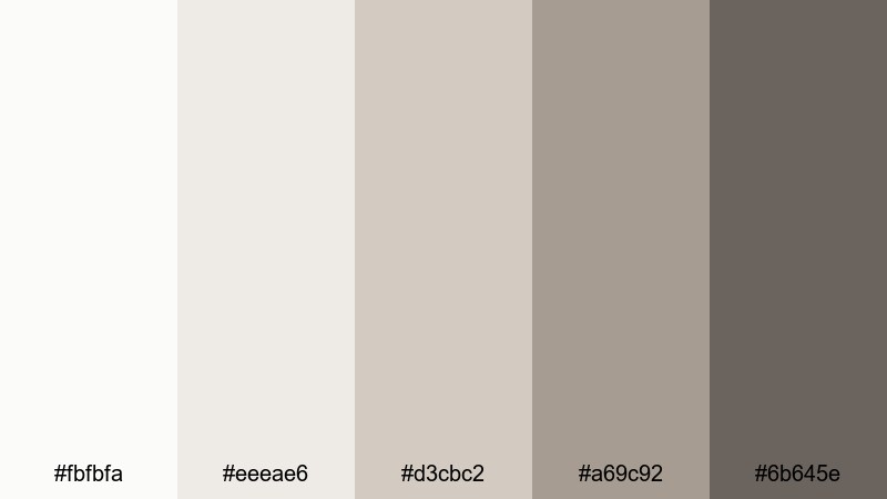
- HEX Codes: #fbfbfa, #eeeae6, #d3cbc2, #a69c92, #6b645e
- Mood: Warm, homey, and inviting.
- Use for: Perfect for cooking videos, family vlogs, and cozy storytelling intros.
Hearthside Clouds leans into warm whites and taupe grays that feel like soft blankets and slow weekends. There is a gentle creaminess in the lighter tones, while the deeper taupes add just enough weight to frame titles or important details. The overall effect is comforting and lived-in without feeling messy.
Apply this palette to kitchen overhead shots, family moments, or narrative intros where you want viewers to feel welcome. In your thumbnails, pair a bright smile or steaming mug with the creamy whites and use the darker gray for text so your video stands out while still conveying warmth and familiarity.
Latte Foam Grain
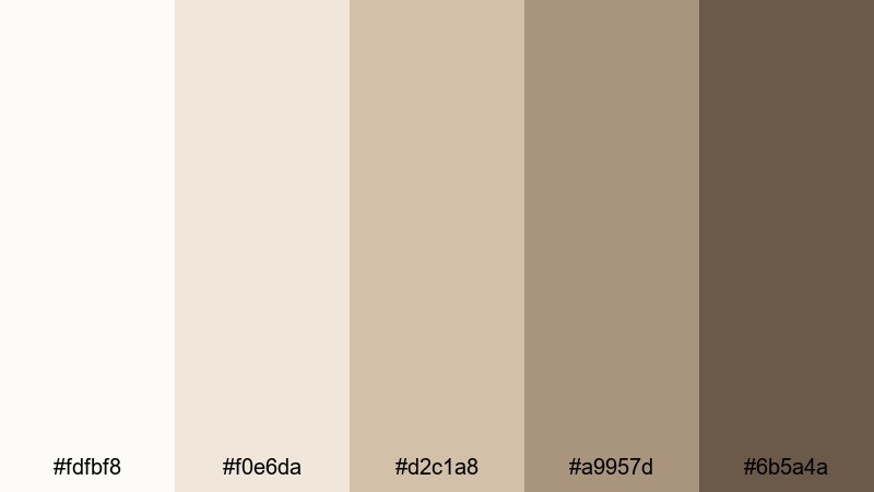
- HEX Codes: #fdfbf8, #f0e6da, #d2c1a8, #a9957d, #6b5a4a
- Mood: Comforting, earthy, and relaxed.
- Use for: Great for coffee shop b-roll, journaling reels, and soft-spoken ASMR channels.
Latte Foam Grain blends milky whites with latte-tinted grays and browns, immediately calling to mind coffee foam, wooden tables, and worn paper. It carries a tactile, analog feel that works beautifully for slow content and intimate storytelling. The warmer tones naturally flatter skin and wooden textures.
Use the lightest shades for backgrounds on title cards or subtitles, and keep the deepest brown gray reserved for text and accent lines. In Filmora, combining this palette with soft fade transitions, light film grain, and gentle music will give your videos a cozy, cafe-like atmosphere that translates perfectly to thumbnails and shorts.
Rainy Window Light
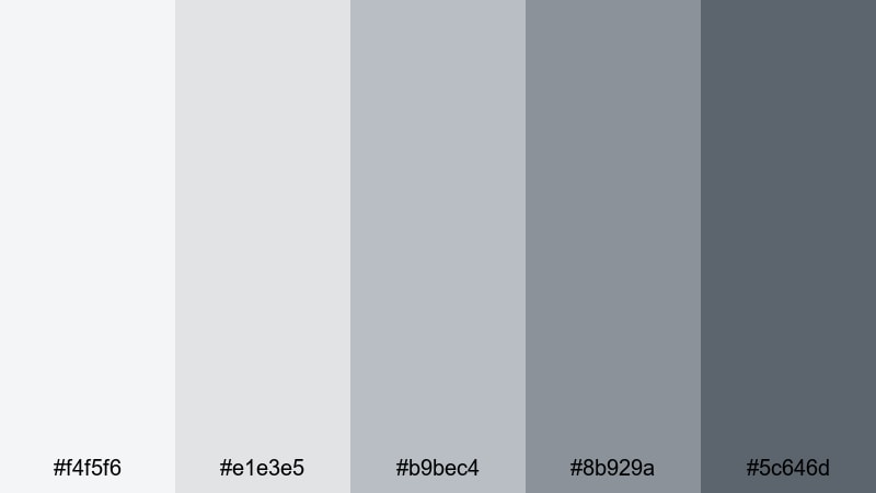
- HEX Codes: #f4f5f6, #e1e3e5, #b9bec4, #8b929a, #5c646d
- Mood: Melancholic, soft, and introspective.
- Use for: Works well for reflective vlogs, poetry visuals, and ambient lo-fi music videos.
Rainy Window Light uses cool whites and stormy grays to evoke overcast afternoons and quiet rooms. It adds a gentle melancholy to your visuals, ideal for reflective monologues, journaling clips, or moody B-roll. The mid grays feel like soft shadows, while the darkest shade gives you enough depth for titles and subtitles.
In your projects, let these colors dominate backgrounds, frames, and overlays, then add subtle color accents like muted blues or desaturated greens in your footage. This gray white base helps your content feel cinematic and emotional while staying clean enough for crisp text in thumbnails and intro cards.
Cashmere Blanket Fade
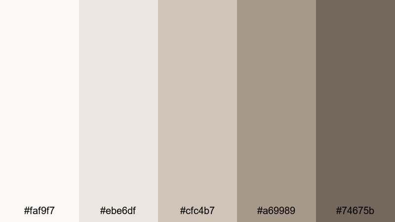
- HEX Codes: #faf9f7, #ebe6df, #cfc4b7, #a69989, #74675b
- Mood: Soft, nostalgic, and soothing.
- Use for: Ideal for slow-living content, reading nooks, and aesthetic b-roll transitions.
Cashmere Blanket Fade combines creamy whites with muted, slightly dusty grays and browns that feel like an old favorite sweater. The palette has a nostalgic softness perfect for slow living content, bookshelf tours, or relaxing routines. It gently mutes strong colors, letting your footage feel timeless and calm.
Use the lighter tones as full-screen backgrounds for quotes or chapter titles, and the mid browns for line elements and accents. When grading your video, pushing your highlights and mids toward these warm neutrals can make every scene feel like part of a cozy, curated story.
High-Contrast Gray White Color Palettes
Monochrome Spotlight
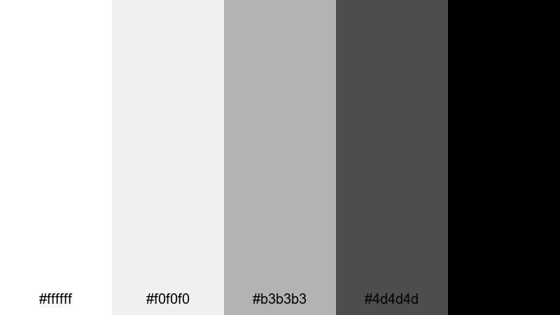
- HEX Codes: #ffffff, #f0f0f0, #b3b3b3, #4d4d4d, #000000
- Mood: Bold, graphic, and attention-grabbing.
- Use for: Perfect for high-impact thumbnails, title cards, and logo stings that must pop in feeds.
Monochrome Spotlight is a classic high-contrast grayscale, from pure white to deep black. It is bold, graphic, and instantly readable, which makes it ideal for channels that rely on strong typography and simple shapes. The palette feels decisive and confident, much like a poster or logo lockup.
Use the pure black and white pairing for your most important elements like main titles, CTA buttons, and logo reveals, and rely on the mid grays for backgrounds or secondary text. In thumbnails and YouTube intros, this look cuts through busy feeds with sharp contrast that still fits a minimalist gray white identity.
Neon Frame Mist
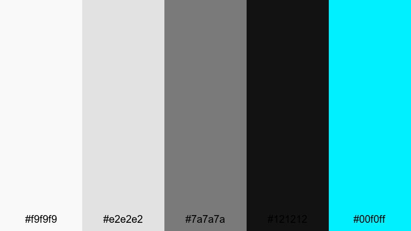
- HEX Codes: #f9f9f9, #e2e2e2, #7a7a7a, #121212, #00f0ff
- Mood: Edgy, digital, and futuristic.
- Use for: Great for gaming intros, tech reviews, and glitch-style transitions where highlights need to stand out.
Neon Frame Mist builds a moody grayscale base and slices a bright electric cyan through it for impact. The soft whites and mid grays give you a neutral canvas, while the near-black anchors everything and makes the neon accent explode with energy. It feels digital and cyber-inspired without overwhelming the viewer.
Use the cyan sparingly for lines, stroke effects, HUD elements, and key text like scores or specs, and keep the rest of your UI in gray white. In Filmora, you can animate these neon accents around your subject or logo for intros and transitions that feel sharp and futuristic in both long-form and short-form content.
Noir Title Card
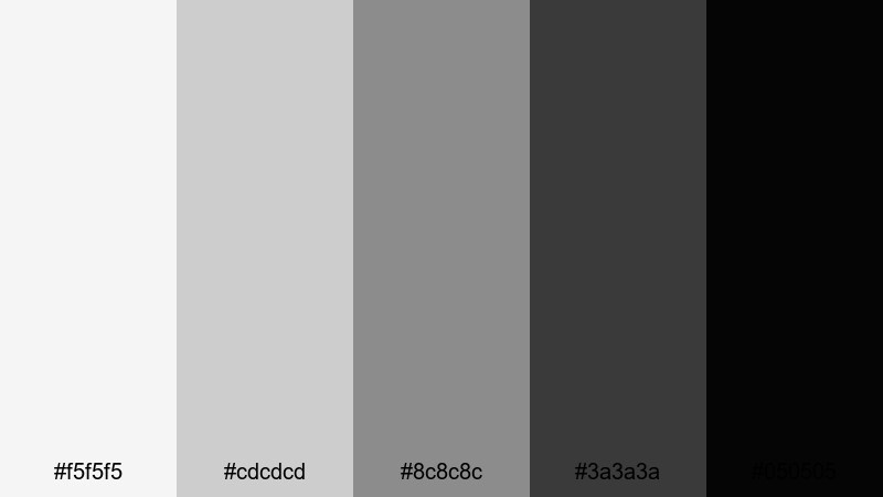
- HEX Codes: #f5f5f5, #cdcdcd, #8c8c8c, #3a3a3a, #050505
- Mood: Cinematic, dramatic, and moody.
- Use for: Ideal for film-style opening credits, documentary titles, and dramatic chapter breaks.
Noir Title Card shifts from muted whites to almost-black grays, echoing classic film noir imagery. It feels weighty and cinematic, with smooth gradations that look great behind text and overlays. The darker end of the palette is perfect for title cards that need to feel serious, suspenseful, or elegant.
Build chapter intertitles, cold open titles, and credit sequences with this gray white set, keeping motion slow and considered. In thumbnails, pair a still frame from your video with a strong title in light gray on deep charcoal to instantly signal drama and story-driven content.
Glitch Overlay Frost
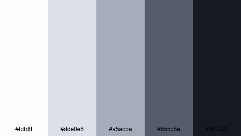
- HEX Codes: #fdfdff, #dde0e8, #a5acba, #555c6a, #161922
- Mood: Cool, digital, and slightly chaotic.
- Use for: Works well for motion graphics packs, distortion effects, and transitions between high-energy scenes.
Glitch Overlay Frost brings icy whites and steel grays together with deep navy-black, perfect for glitch effects, HUD overlays, and high-energy transitions. The palette feels digital and technical but remains controlled, avoiding the clutter that often comes with glitch visuals.
Use the lighter tones to mimic screen glare and scan lines, while the darker colors serve as backgrounds or shadowed frames. In Filmora, combine this palette with distort, shake, and RGB split effects to build cohesive glitch sequences that still maintain clear readability for text and logos.
Modern Cinematic Gray White Color Palettes
Silver Screen Drift
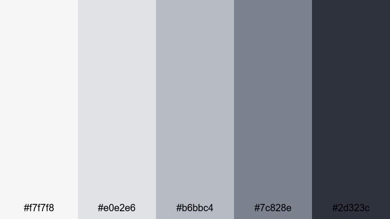
- HEX Codes: #f7f7f8, #e0e2e6, #b6bbc4, #7c828e, #2d323c
- Mood: Polished, cinematic, and sophisticated.
- Use for: Perfect for trailers, short films, and branded cinematic intros.
Silver Screen Drift uses silvered whites and bluish grays to echo classic film reels and modern streaming aesthetics. It feels refined and cinematic, with enough contrast to frame titles and enough softness to flatter most footage. The palette is a great choice when you want your content to feel like a polished trailer or branded opener.
Grade your footage slightly cooler and reduce saturation, then lean on these HEX tones for your titles, lower thirds, and end screens. In thumbnails, pairing a dramatic still shot with title text set in the darker gray on a pale silver background makes your project look like a professional film poster.
Urban Skyline Haze
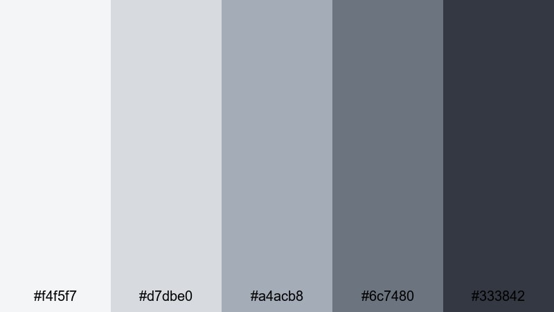
- HEX Codes: #f4f5f7, #d7dbe0, #a4acb8, #6c7480, #333842
- Mood: Urban, modern, and slightly gritty.
- Use for: Great for city b-roll, travel edits, and dynamic montage sequences.
Urban Skyline Haze captures the look of distant high-rises under a cloudy sky. The palette is cool and modern, with hazy whites and mid grays that feel like concrete and glass. It brings a subtle grit to your visuals without leaning into heavy contrast or harsh colors.
Use this scheme for travel edits, street photography reels, and energetic montages of city life. In Filmora, you can pair this gray white base with quick cuts, speed ramps, and subtle overlays like light leaks or faint grain to create a stylish, metropolitan mood that looks great in both widescreen videos and vertical shorts.
Trailer Teaser Static
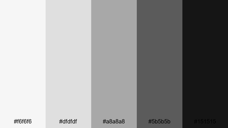
- HEX Codes: #f6f6f6, #dfdfdf, #a8a8a8, #5b5b5b, #151515
- Mood: Tense, dramatic, and high-energy.
- Use for: Ideal for teaser trailers, countdowns, and glitchy text slams between scenes.
Trailer Teaser Static ranges from bright white to near-black, with mid grays that resemble film grain and static noise. The palette is intense and energetic, great for dramatic teasers, countdowns, and scene transitions that build tension. It makes motion and typography feel punchy and urgent.
Use the lighter tones as flash frames or backgrounds for big title hits, and the darkest gray for shadowy overlays and silhouettes. Paired with glitch effects, stutter cuts, and sound design in Filmora, this gray white set turns even simple footage into something that feels like a cinematic trailer.
Tips for Creating Gray White Color Palettes
Gray white palettes are flexible, but a few practical guidelines will help you combine them with other tones, maintain readability, and keep your branding consistent across every edit.
- Always define a clear darkest and lightest tone so you have reliable contrast for readable titles, captions, and UI elements.
- Limit strong accent colors to one or two hues (like cyan or warm beige) and keep the rest of your design in gray white to avoid visual clutter.
- Test your palette on both light and dark backgrounds, especially for thumbnails, to ensure text remains clear at small sizes.
- Match your footage to your palette by slightly desaturating strong colors and nudging temperature and tint toward your chosen grays.
- Use warmer gray whites for lifestyle, family, and cozy content, and cooler gray whites for tech, gaming, and cinematic edits.
- Keep channel branding consistent by reusing the same HEX codes for titles, lower thirds, and end cards across all videos.
- Check your designs in grayscale or on a phone screen to see if the hierarchy still reads clearly without relying on subtle color differences.
- Create preset color styles in Filmora for text and shapes so you can apply your gray white scheme with one click in future projects.
Gray white color palettes might look simple, but they are powerful tools for shaping mood, clarity, and brand identity. From calm studio aesthetics and cozy home scenes to bold monochrome thumbnails and cinematic trailers, the right combination of whites and grays can make your videos feel instantly more intentional.
Use these 15 palettes as ready-made starting points: grab the HEX codes for your titles and graphics, then adjust your footage in Filmora so everything sits inside the same visual world. Whether you are designing thumbnails, building intros, or grading a full short film, a consistent gray white scheme will help your channel or brand feel more polished and memorable.
Experiment with different levels of warmth, contrast, and texture in Filmora until you land on a signature gray white look that feels like you, then save it as your go-to style for future edits.
secure downloadNext: Black Color Palette
