
 100% Security Verified | No Subscription Required | No Malware


 ChatGPT
 Perplexity
 Gemini
 Claude
 Grok
Grok
Green, blue, and purple sit next to each other on the color wheel, which is why they blend into such smooth, cinematic gradients. Green brings freshness and life, blue feels calm and trustworthy, and purple adds a creative, slightly mysterious edge. Together, a Green Blue Purple color palette can feel like ocean mist, neon nightlife, or a clean tech interface depending on the exact tones you choose.
For creators and Filmora users, these hues work beautifully in YouTube thumbnails, title cards, intros, channel branding, and color grading. Below are 15 hand-picked Green Blue Purple color palettes with HEX codes so you can match your thumbnails to your video grade, keep your Instagram and TikTok posts consistent, and build a recognizable style across all your edits.
In this article
Soft & Dreamy Green Blue Purple Palettes
Aurora Coast Fade
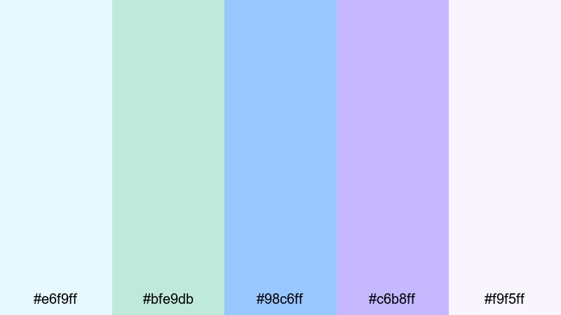
- HEX Codes: #e6f9ff, #bfe9db, #98c6ff, #c6b8ff, #f9f5ff
- Mood: Gentle, airy, and hopeful like first light over calm water.
- Use for: Perfect for soft vlog intros, lifestyle b-roll, wedding highlight reels, and dreamy channel banners.
Aurora Coast Fade mixes pale mint, sky blue, and lilac into a soft gradient that feels like sunrise over a quiet ocean. The light tones make your footage feel clean and uplifting while the purple hint keeps it a little magical and cinematic.
Use this Green Blue Purple color palette for romantic edits, morning routine vlogs, and thumbnails where you want viewers to feel calm and inspired. In Filmora, it works especially well for lower-thirds, animated titles, and subtle overlays on wedding or engagement videos where harsh colors would distract from the story.
Pro Tip: Enhance Your Green Blue Purple Visuals With Filmora
Once you choose a palette like Aurora Coast Fade, the real power comes from applying it consistently across your whole edit. In Filmora, you can reuse the same Green Blue Purple tones on your intro, transitions, b-roll, and end screen cards, so every scene feels like part of one cohesive story.
Save your favorite gradients and text styles, then copy them across sequences for YouTube, TikTok, and Instagram Reels. With a soft, airy palette like this, gentle glows, smooth transitions, and minimal overlays in Filmora help keep the visuals light while still feeling branded.
AI Color Palette
If you have a reference image that perfectly captures your dream Green Blue Purple aesthetic, you can turn it into a full video look in just a few clicks. Filmora's AI Color Palette feature analyzes the colors in your reference frame and applies that style to other clips in your timeline.
Drop a still of your thumbnail, a mood board, or a graded hero shot into Filmora, then let AI Color Palette match the tones across your entire edit. It is an easy way to keep aurora-style pastels running from your intro to your outro without manual keyframe work.
 secure download

HSL, Color Wheels & Curves
To polish a soft Green Blue Purple look, fine-tune your footage using HSL, color wheels, and curves inside Filmora. Slightly lowering saturation in the greens while lifting the blues in the midtones can make ocean scenes feel cleaner and more cinematic, while a gentle S-curve adds contrast without crushing pastel highlights.
If you want a deeper walkthrough, Filmora's color correction guide explains how to balance shadows, midtones, and highlights so your mint, blue, and lavender tones stay flattering on skin and do not shift into muddy grays.
secure download1000+ Video Filters & 3D LUTs
If you want to stylize your Green Blue Purple palette even faster, Filmora offers a large library of filters and LUTs that can push your footage toward pastel, cinematic teal, or dreamy fantasy vibes. Start with Aurora Coast Fade as your base colors, then layer a filter to add film grain, glow, or subtle haze.
Filmora's video filters and 3D LUTs make it easy to test different looks on a single clip and then apply your favorite to the entire project. This keeps your thumbnails, intros, and main footage aligned visually without spending hours on manual grading.
secure downloadCloud Garden Pastels
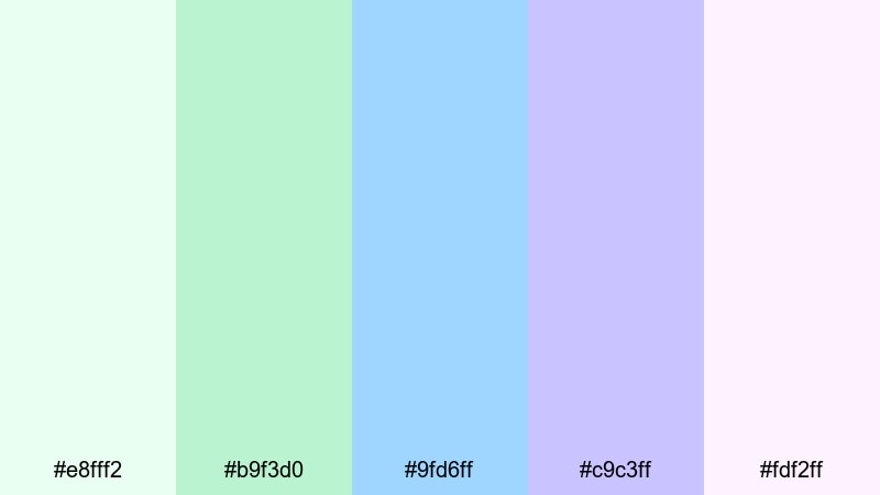
- HEX Codes: #e8fff2, #b9f3d0, #9fd6ff, #c9c3ff, #fdf2ff
- Mood: Soft, playful, and comforting with a pastel glow.
- Use for: Use this palette for cozy daily vlogs, kids content, channel art, and friendly tutorial thumbnails.
Cloud Garden Pastels feels like a soft toy shelf in color form: mint greens, powdery blues, and gentle purples that feel safe and approachable. It is ideal when you want your channel to look friendly, family-oriented, or welcoming to beginners.
Apply this green blue purple color palette to your YouTube banners, playlists covers, and tutorial lower-thirds so viewers immediately recognize your style. In thumbnails, pair the brighter mint (#b9f3d0) or blue (#9fd6ff) behind bold white or dark text for clear, high-contrast titles.
Lavender Lagoon Mist
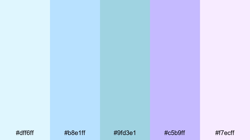
- HEX Codes: #dff6ff, #b8e1ff, #9fd3e1, #c5b9ff, #f7ecff
- Mood: Calm, reflective, and lightly magical.
- Use for: Ideal for relaxing travel montages, spa or wellness videos, and chill music visualizers.
Lavender Lagoon Mist blends cool lagoon blues with hazy lavender, creating a calm, dreamy atmosphere. It works well for beach travel vlogs, ASMR channels, and spa or meditation content where you want viewers to slow down and breathe.
Use the deeper blue (#9fd3e1) for titles and overlays, while the pale lavender (#f7ecff) becomes a perfect background for end screens and quote cards. In Filmora, this palette pairs nicely with slow crossfades, lens blur, and gentle zooms for a soothing watch experience.
Spring Rain Whispers

- HEX Codes: #e3fff7, #b6f2e1, #8fd0ff, #b7c5ff, #f3f0ff
- Mood: Fresh, optimistic, and lightly nostalgic.
- Use for: Great for aesthetic morning routines, nature vlogs, journaling reels, and gentle overlay graphics.
Spring Rain Whispers has that just-after-the-rain feeling: dewy greens, soft blues, and a muted purple that adds a nostalgic twist. It feels both clean and emotional, making it a strong fit for personal storytelling and reflective content.
Bring this palette into your morning routine edits, desk setup tours, and journaling reels. Use the fresh greens (#e3fff7 and #b6f2e1) for backgrounds or panels and the cooler blues for text or icons. In Filmora, subtle film grain and vignette effects can add warmth without losing the fresh, minimal mood.
Bold & Vivid Green Blue Purple Palettes
Neon Harbor Waves

- HEX Codes: #00f5a0, #00c2ff, #0066ff, #7b2cff, #120033
- Mood: High-energy, futuristic, and punchy.
- Use for: Use for gaming intros, EDM edits, tech promos, and click-worthy YouTube thumbnails.
Neon Harbor Waves is loud in the best way: vibrant aqua, electric blue, and deep violet against an inky base. It feels like neon reflections on dark water, perfect when you want your content to stand out in a crowded feed.
Use the darkest shade (#120033) as a background and layer aqua (#00f5a0) or cyan (#00c2ff) for glow effects around titles and UI elements. In Filmora, combine this palette with glitch transitions, light streak overlays, and beat-synced cuts for gaming and EDM content that pops.
Tropical Arcade Glow
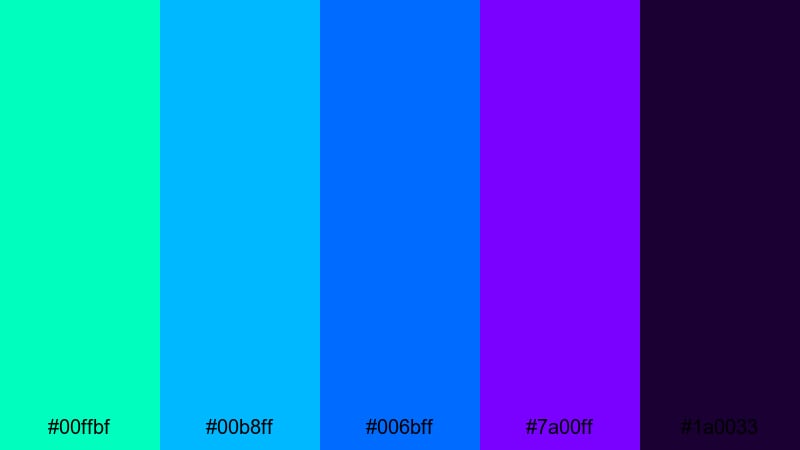
- HEX Codes: #00ffbf, #00b8ff, #006bff, #7a00ff, #1a0033
- Mood: Playful, neon, and retro-futuristic.
- Use for: Perfect for shorts, gaming highlights, creator logos, and bold title cards that need to pop on mobile.
Tropical Arcade Glow mixes tropical greens and blues with intense purple, throwing you straight into an 80s arcade mood. It is bright enough to grab attention, especially on small screens where subtle colors can easily get lost.
Use the bright teal (#00ffbf) for call-to-action buttons and subscribe badges, while the darker purple and navy form your background. In Filmora, pair this palette with fast zoom transitions, bold text animations, and speed ramps for kinetic gaming highlights or upbeat shorts.
Electric Skyline Pop
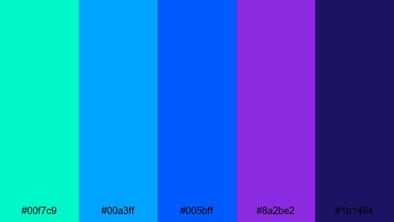
- HEX Codes: #00f7c9, #00a3ff, #005bff, #8a2be2, #1b1464
- Mood: Urban, confident, and super bright.
- Use for: Great for city vlogs, fashion edits, event recaps, and bold lower-third graphics.
Electric Skyline Pop captures the feeling of neon city lights against a deep night sky. The bright teal and saturated blues scream modern and bold, while the rich purple adds a slightly luxurious, fashion-forward touch.
Use the vivid cyan (#00a3ff) and electric blue (#005bff) for titles and accent lines and let the purple (#8a2be2) carry your key brand elements like logos and icons. This green blue purple color combination works nicely in time-lapses, fashion lookbooks, and event recaps edited in Filmora with whip pan or flash transitions.
Cyber Reef Energy
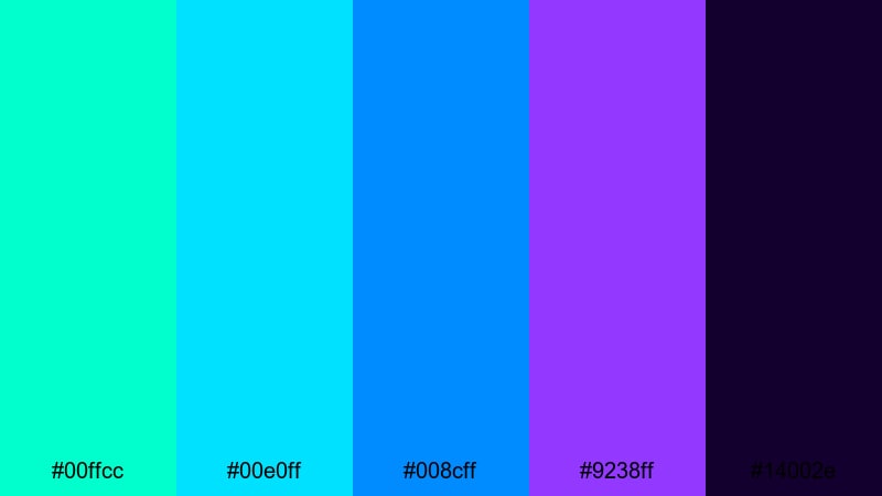
- HEX Codes: #00ffcc, #00e0ff, #008cff, #9238ff, #14002e
- Mood: Techy, immersive, and intensely luminous.
- Use for: Ideal for app promos, motion graphics, product teases, and futuristic UI overlays in edits.
Cyber Reef Energy feels like a glowing user interface underwater: bright aqua and cyan flowing into neon purple on a deep, almost black background. It is perfect for tech content and futuristic motion graphics where you want a strong digital identity.
Use the darkest shade (#14002e) as a base, then build UI panels, HUD elements, and animated lines using the brighter cyans and purple. In Filmora, this palette shines with graphic overlays, masked shapes, and split-screen layouts for app demos and product teases.
Modern & Minimal Green Blue Purple Palettes
Minimal Mint Horizon
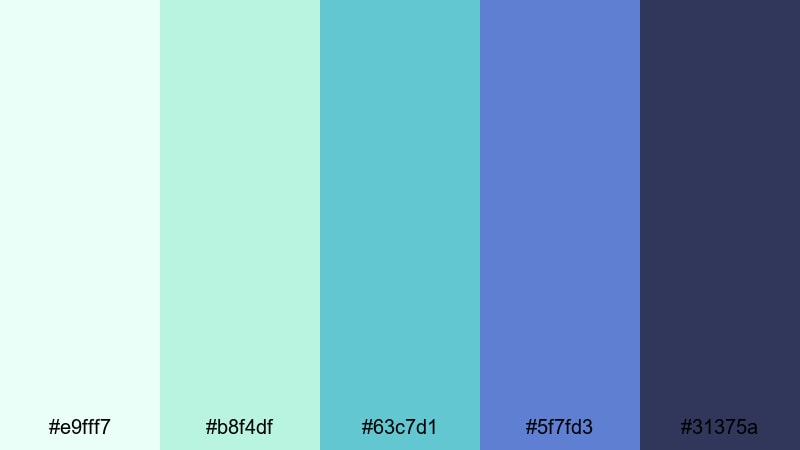
- HEX Codes: #e9fff7, #b8f4df, #63c7d1, #5f7fd3, #31375a
- Mood: Clean, balanced, and quietly optimistic.
- Use for: Perfect for startup explainers, productivity channels, and minimal title screens or infographics.
Minimal Mint Horizon moves from fresh mint into cool blue and a grounded slate, creating a modern, uncluttered look. It feels professional but not stiff, and works especially well for tech and productivity creators.
Use the lighter mints (#e9fff7, #b8f4df) for clean backgrounds and the deeper blue (#5f7fd3) or slate (#31375a) for titles and iconography. In Filmora, combine this palette with simple line icons, flat lower-thirds, and smooth fade transitions for explainers and dashboard demos.
Urban Teal Balance

- HEX Codes: #e7f5ff, #9ed2d4, #4ba6b5, #5864b8, #272a3f
- Mood: Professional, trustworthy, and calm.
- Use for: Use for channel branding, tech reviews, UI mockups, and clean lower-thirds that feel reliable and modern.
Urban Teal Balance is a desaturated, grown-up take on green blue purple. The understated teals and cool blues give a serious, trustworthy feel that works well for reviews, tutorials, and business-oriented channels.
Use the darker navy (#272a3f) under white text for crisp readability and employ the teal accents (#4ba6b5) for buttons, chapter markers, and icons. This palette is ideal in Filmora templates for channel intros, sponsor segments, and product comparison layouts.
Cool Studio Gradient
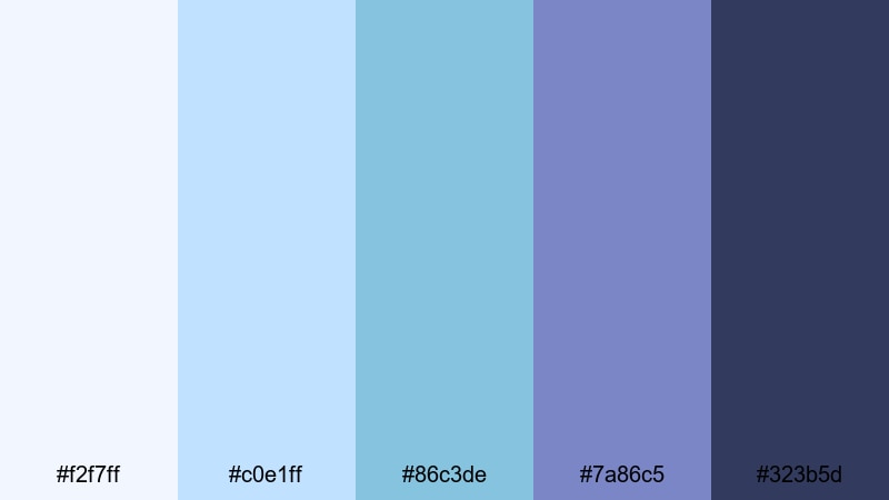
- HEX Codes: #f2f7ff, #c0e1ff, #86c3de, #7a86c5, #323b5d
- Mood: Chic, polished, and studio-ready.
- Use for: Ideal for tutorials, software walkthroughs, portfolio reels, and subtle animated backgrounds.
Cool Studio Gradient blends soft studio blues into subdued purple with a deep navy base, creating a sleek, polished impression. It looks like a modern set design, which is great for educational and portfolio content.
Use the lighter tones (#f2f7ff, #c0e1ff) in background gradients and keep your text on the navy (#323b5d) for clarity. In Filmora, you can animate this gradient slowly behind your screen recordings or talking-head shots to make them feel more premium without distracting from the content.
Glass UI Aurora
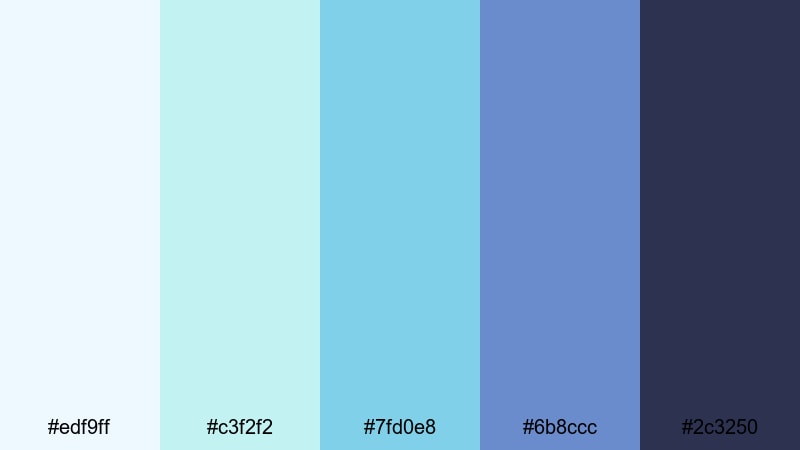
- HEX Codes: #edf9ff, #c3f2f2, #7fd0e8, #6b8ccc, #2c3250
- Mood: Tech-savvy, airy, and futuristic but friendly.
- Use for: Great for app showcases, SaaS promos, dashboard animations, and L-cut text overlays.
Glass UI Aurora captures the frosted, glassy interface trend using cyan, teal, and soft indigo. It feels tech-forward but not aggressive, making it perfect for startups and SaaS brands that want to look modern and approachable.
Use the pale blues (#edf9ff, #c3f2f2) as translucent cards or panels, with the darker indigo (#2c3250) anchoring your titles and logo. In Filmora, this palette is ideal for split-screen demos, kinetic typography, and animated overlay panels explaining product features.
Cinematic & Moody Green Blue Purple Palettes
Midnight Neon Tides
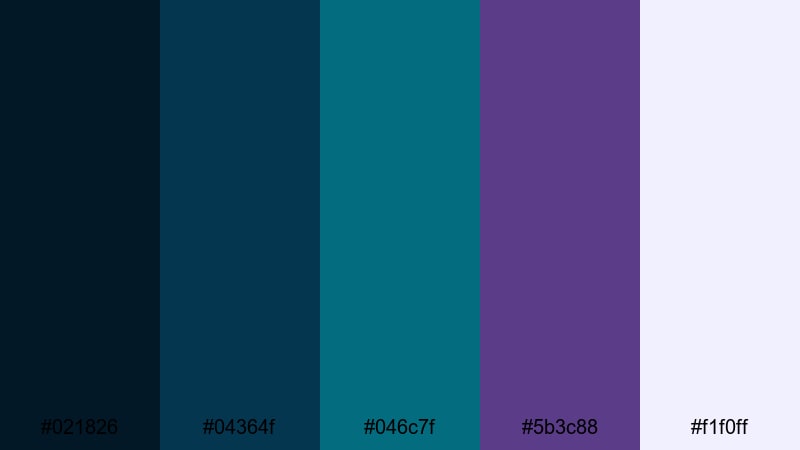
- HEX Codes: #021826, #04364f, #046c7f, #5b3c88, #f1f0ff
- Mood: Cinematic, mysterious, and slightly surreal.
- Use for: Use for night city b-roll, music videos, travel films, and dramatic title sequences.
Midnight Neon Tides combines deep teal shadows with ocean blues and muted violet, plus a pale highlight to catch the eye. It feels like a night drive through a coastal city, atmospheric and slightly surreal.
Use the darkest teal (#021826) and navy (#04364f) for backgrounds, reserving the pale highlight (#f1f0ff) for key text and logo reveals. In Filmora, this palette shines in slow-motion b-roll, music videos, and travel films using overlays like light leaks, bokeh, and smooth camera moves.
Stormy Orchard Lights
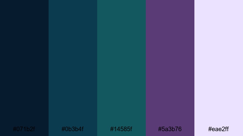
- HEX Codes: #071b2f, #0b3b4f, #14585f, #5a3b76, #eae2ff
- Mood: Brooding, artistic, and quietly intense.
- Use for: Ideal for short films, poetic reels, narrative edits, and dramatic grading on dialogue scenes.
Stormy Orchard Lights uses stormy teal shadows and plum highlights to create an art-house mood. It is emotional and introspective, making it a strong choice for narrative work and poetic visual essays.
Use the rich purple (#5a3b76) for accent lights or color splashes in your scenes, with the soft highlight (#eae2ff) on text and key graphic elements. In Filmora, you can lean into this palette with slower cuts, letterboxing, and more restrained transitions for a filmic, festival-ready feel.
Twilight City Pulse
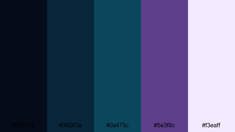
- HEX Codes: #050b18, #08263a, #0a475c, #5e3f8c, #f3eaff
- Mood: Noir-inspired, urban, and rhythmic.
- Use for: Perfect for street photography edits, lo-fi beats videos, documentary intros, and moody channel branding.
Twilight City Pulse blends inky navy and teal with deep purple and a pale twilight accent, creating a noir-inspired city vibe. It works beautifully for street edits, lo-fi visuals, and documentary-style intros that rely on atmosphere and rhythm.
Use the darker tones (#050b18, #08263a) as your main backdrop, with the purple (#5e3f8c) and soft highlight (#f3eaff) to emphasize titles, quotes, or key frames. In Filmora, combine this palette with gentle camera shake, film grain, and music-synced cuts to immerse viewers in your urban stories.
Tips for Creating Green Blue Purple Color Palettes
Green Blue Purple color combinations can shift from soft and dreamy to bold and cyberpunk, depending on brightness, contrast, and saturation. Use these tips to design palettes that look great in both your video edits and overall brand design.
- Choose a hero color: Decide whether green, blue, or purple will lead your palette, then use the others as supporting accents rather than giving all three equal weight.
- Control contrast for readability: Pair darker blues and purples with white or very light text; use deeper shades for text when placing it over pastel mints and sky blues.
- Limit the number of active colors: In any single frame or thumbnail, stick to 2 to 3 of your palette colors as main elements to avoid a cluttered, unprofessional look.
- Match your footage: If your raw clips lean warm (sunset, indoor lighting), shift your greens and blues slightly toward teal; for cooler footage, keep purples softer to avoid oversaturation.
- Use neutrals to balance: Add dark navy, charcoal, or off-white into your Green Blue Purple color palette to give the eye places to rest and make accents stand out.
- Stay consistent across assets: Reuse the same HEX codes in your thumbnails, lower-thirds, channel art, and end screens so viewers instantly recognize your brand.
- Test on mobile: Always check how your palette looks on a phone screen; adjust brightness and contrast if text or icons become hard to read in smaller sizes.
- Build presets in Filmora: Once you find a look you like, save titles, color grading, and overlays as presets so you can apply your Green Blue Purple theme in seconds on future projects.
Green Blue Purple palettes are incredibly flexible, from soft pastels for lifestyle vlogs to neon gradients for gaming, and moody tones for cinematic storytelling. By choosing the right mix of greens, blues, and purples, you can set the emotional tone of each edit and make your channel feel intentional and cohesive.
Use these 15 palettes and HEX codes as a starting point, then refine them inside Filmora with color grading, overlays, and motion graphics. The more consistently you apply your chosen colors in thumbnails, intros, and titles, the stronger your visual identity becomes.
Open Filmora, drop in a few test clips, and start experimenting with your favorite Green Blue Purple color combination. You will quickly see how the right palette can make your footage feel more cinematic, professional, and uniquely yours.
secure download