
 100% Security Verified | No Subscription Required | No Malware

Lake-inspired blues sit between sky blue and deep navy, carrying the calm of still water and the depth of distant horizons. In color psychology, these tones suggest balance, trust, and quiet confidence, which is why they appear so often in wellness brands, tech interfaces, and cinematic landscapes. They feel natural and timeless, yet modern enough for digital content.
For video creators, lake color palettes are a powerful way to keep your intros, thumbnails, lower thirds, and color grading consistent across an entire channel. The right mix of soft shoreline neutrals, deep water blues, and warm dock accents can instantly set a mood for vlogs, documentaries, and reels. Below are 15 curated Lake color palettes with HEX codes designed for creators and Filmora users who want cohesive visuals in every frame.
In this article
Serene Lake Color Palettes
Morning Mist Over Water
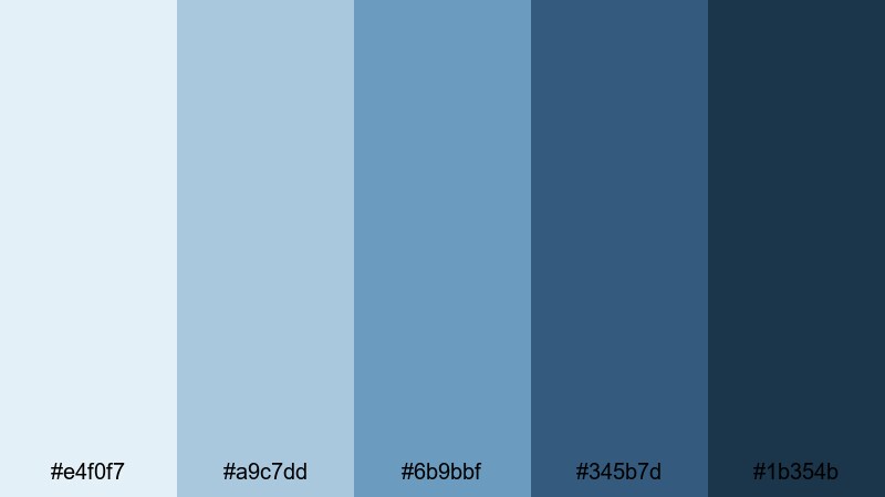
- HEX Codes: #e4f0f7, #a9c7dd, #6b9bbf, #345b7d, #1b354b
- Mood: Soft, peaceful, and reflective like a quiet lake at dawn.
- Use for: Ideal for cinematic travel vlogs, reflective documentaries, and calming channel intros.
This palette fades from pale misty blue into deeper shoreline tones, just like a lake slowly waking up under a cool morning sky. It feels gentle and unhurried, perfect when you want your viewer to slow down, breathe, and focus on your story.
Use the lighter HEX codes for backgrounds, titles, or thumbnail frames, and reserve the darkest blue for text, outlines, and logo accents. In Filmora, this palette works beautifully for soft gradients in intros, subtle overlays on B-roll, and cohesive color grading for reflective voiceovers or meditation content.
Pro Tip: Build a Cinematic Lake Look in Filmora
To keep this misty Lake palette consistent, start by choosing two or three key HEX colors for your titles, lower thirds, and overlays in Filmora. Apply the palest tone to backgrounds and panels, then use the mid blues for buttons, shapes, and callouts so nothing feels too harsh against the footage.
Once your graphics are set, copy those colors to other assets like end screens, subscribe bars, and social cutdowns. This way, your viewers always connect the quiet, misty vibe with your channel, whether they see a full YouTube video, a short, or a teaser on social media.
AI Color Palette
You can turn a single still frame of your favorite lakeside shot into a color reference using Filmora. Filmora's AI Color Palette feature lets you sample the soft blues and deeper tones from that image and map them across an entire video or multiple clips.
Import your reference image, pick it as the source, and then match other clips so skies, water, and midtones all share the same gentle Morning Mist Over Water feel. This is especially useful if you filmed on different days or cameras and want every scene to look like it belongs in the same calm morning sequence.
 secure download

HSL, Color Wheels & Curves
After you match the overall tones, use HSL, color wheels, and curves in Filmora to fine-tune your lake blues. Slightly desaturate the blues in the shadows while lifting the midtones to keep faces natural and the water soft. The color wheels let you cool down highlights for a misty feel without making skin tones look gray.
For a deeper dive into grading water and skies, you can follow Filmora's color correction guide and mirror the steps using your own lake footage. A gentle S-curve on the RGB curves panel will add cinematic contrast while preserving the delicate, airy quality of this palette.
secure download1000+ Video Filters & 3D LUTs
If you want a faster route to a stylized lake look, Filmora’s video filters and 3D LUTs make it easy to build on this palette. Start with a clean look, then add a subtle teal-and-orange LUT or a soft filmic filter, adjusting intensity so your Morning Mist Over Water hues stay in control.
Combine filters with your chosen HEX colors for graphics, so your intros, titles, and thumbnails all share the same misty atmosphere. This is a simple way to create a recognizable lake-inspired identity without spending hours on manual grading for every project.
secure downloadGlassy Blue Reflection
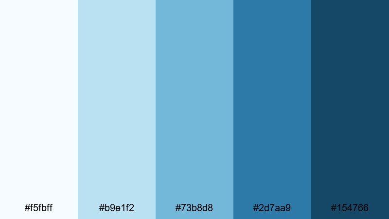
- HEX Codes: #f5fbff, #b9e1f2, #73b8d8, #2d7aa9, #154766
- Mood: Clean, airy, and refreshing with a crisp lake surface feel.
- Use for: Works well for lifestyle channels, product explainers, and tutorial lower thirds.
Glassy Blue Reflection layers bright sky tones over deeper water blues for a crystal-clear, modern look. It feels fresh and energizing without being overwhelming, like sunlight bouncing gently off smooth water.
Use the lightest hues for clean backgrounds in explainer videos or software demos, then reserve the richer blues for headlines, buttons, and icons. This palette is ideal for YouTube thumbnails that need to look trustworthy and polished, or for branding lifestyle vlogs with a cool, airy identity.
Pine Shore Quiet
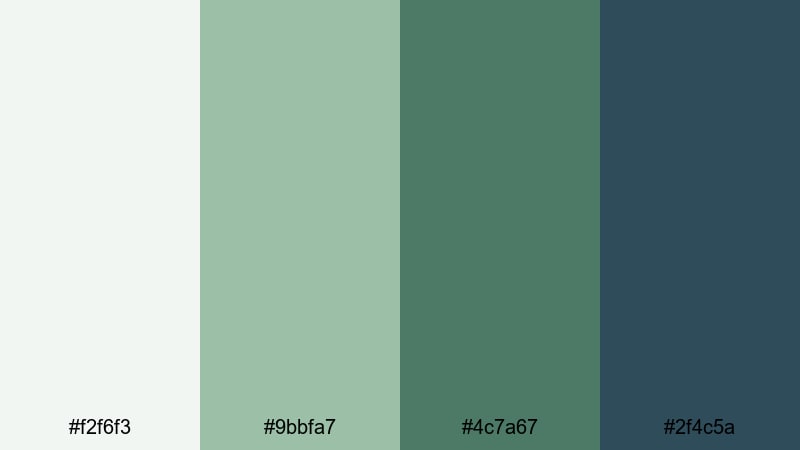
- HEX Codes: #f2f6f3, #9bbfa7, #4c7a67, #2f4c5a
- Mood: Grounded, natural, and restorative like a forested lakeside trail.
- Use for: Great for nature vlogs, eco brands, and outdoor gear promos.
Pine Shore Quiet blends cool greens with muted blues, echoing pine trees leaning over still water. The palette feels rooted and restorative, perfect for content that highlights sustainability, hiking, or slow travel.
Bring the soft green into your lower thirds and chapter titles, while using the darker blue-green for logo marks and important calls to action. In thumbnails and channel art, this mix signals nature-focused storytelling and eco-friendly values without needing heavy text.
Foggy Dock Sunrise
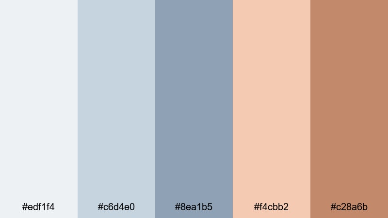
- HEX Codes: #edf1f4, #c6d4e0, #8ea1b5, #f4cbb2, #c28a6b
- Mood: Dreamy, nostalgic, and softly romantic.
- Use for: Ideal for morning routine videos, soft brand intros, and memory-style montages.
Foggy Dock Sunrise mixes hazy lakeside blues with warm peach and tan, like sunlight slowly cutting through morning mist. It feels nostalgic and cinematic, giving your footage a gentle, storybook quality.
Use the cooler tones for backgrounds and overlays, then bring in the warm peach for accents on text, icons, and end-screen elements. This palette is especially strong in reels and short films about routines, cozy cabins, or relationship stories filmed near water.
Moody Lake Color Palettes
Storm Over Deepwater
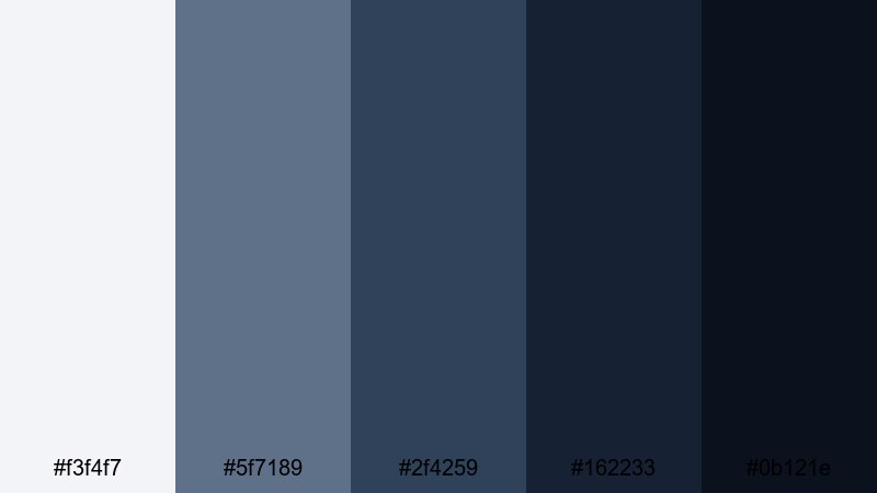
- HEX Codes: #f3f4f7, #5f7189, #2f4259, #162233, #0b121e
- Mood: Dramatic, intense, and mysterious like an incoming storm.
- Use for: Best for trailer-style intros, suspenseful travel stories, and moody B-roll overlays.
Storm Over Deepwater moves from soft overcast gray into near-black navy, capturing the tension of a storm rolling over a dark lake. It feels cinematic and powerful, ideal for intros where you want to build anticipation before the story begins.
Use the darkest hues as backgrounds for titles, then let the lighter steel blues highlight text, progress bars, or chapter markers. In Filmora, pair this palette with subtle film grain or vignette effects to deepen the mood of travel documentaries, mystery edits, or night-time B-roll.
Twilight Boat Lights
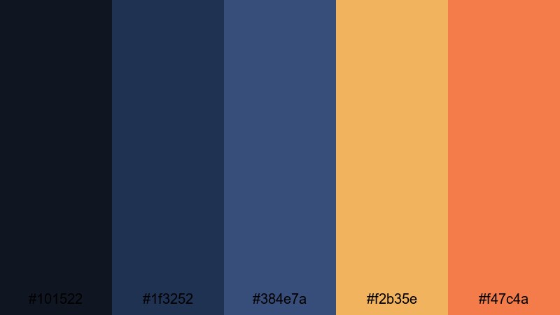
- HEX Codes: #101522, #1f3252, #384e7a, #f2b35e, #f47c4a
- Mood: Cinematic and atmospheric with sparks of warm light in the dark.
- Use for: Great for night scenes, city-by-the-lake vlogs, and stylized title cards.
Twilight Boat Lights contrasts deep twilight blues with bright amber and orange pops, like cabin windows glowing across dark water. It keeps the frame moody but adds just enough warmth to stay lively and engaging.
Use the blues for full-screen backgrounds and overlay shapes, then spotlight key text, buttons, or icons in the warm accent colors. This palette is perfect for neon-inspired title cards, evening city vlogs, or events filmed around illuminated lakesides.
Raincloud Horizon
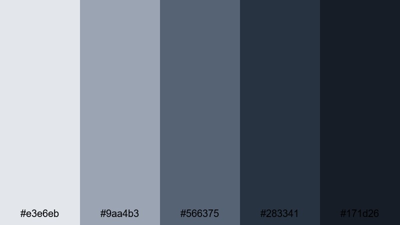
- HEX Codes: #e3e6eb, #9aa4b3, #566375, #283341, #171d26
- Mood: Overcast, introspective, and cinematic.
- Use for: Perfect for reflective voiceovers, study-with-me videos, and understated brand aesthetics.
Raincloud Horizon uses a range of cool grays and muted blues that resemble low clouds drifting over distant water. The result is calm but slightly somber, a great base for thoughtful or academic content.
Use the lighter grays for backgrounds, note cards, and chapter labels, while the darker tones frame your footage or highlight important text. This palette keeps thumbnails and intros clean and minimal so the focus stays on your message and storytelling.
Midnight Fishing Pier
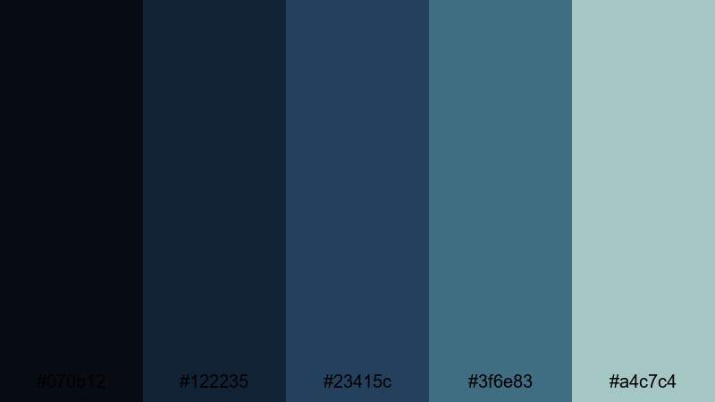
- HEX Codes: #070b12, #122235, #23415c, #3f6e83, #a4c7c4
- Mood: Quiet, contemplative, and slightly nostalgic.
- Use for: Use for late-night streams, lo-fi music visuals, and calm gaming overlays.
Midnight Fishing Pier stacks inky blues with weathered teal, creating a hushed, late-night atmosphere. It feels like sitting at the end of a dock with only a few distant lights breaking the darkness.
Use the deeper shades as overlay tints on your footage and stream layouts, then bring in the lighter teal for readable text and subtle icons. For lo-fi music videos, study sessions, or relaxed gaming overlays, this palette keeps the screen dark yet readable for long viewing sessions.
Vibrant Lake Color Palettes
Canoe Rental Brights
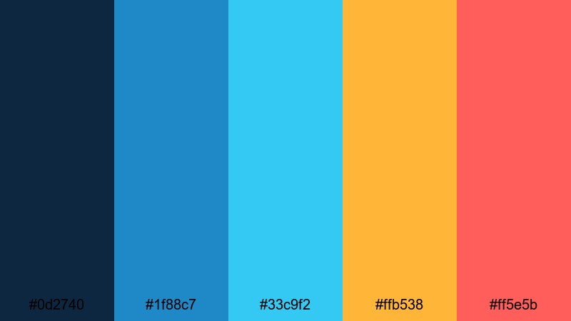
- HEX Codes: #0d2740, #1f88c7, #33c9f2, #ffb538, #ff5e5b
- Mood: Playful, energetic, and adventurous.
- Use for: Ideal for travel vlogs, outdoor sports intros, and bold YouTube thumbnails.
Canoe Rental Brights combines punchy lake blues with vivid orange and coral, just like a row of colorful canoes lined along a dock. It is loud in a good way, perfect when you want your content to jump out from crowded feeds.
Use the saturated blues as main backgrounds or accent shapes, then deploy the warm oranges and reds for calls to action, arrows, and title keywords. This contrast is highly clickable in thumbnails, especially for adventure, kayaking, or travel challenge videos.
Summer Lake Festival
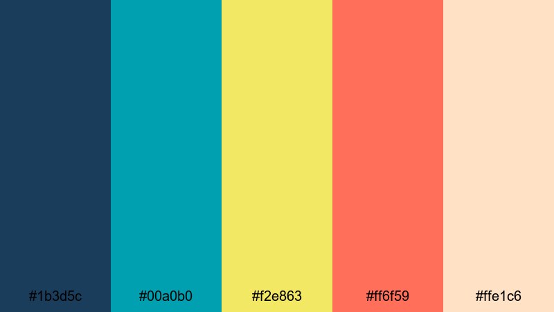
- HEX Codes: #1b3d5c, #00a0b0, #f2e863, #ff6f59, #ffe1c6
- Mood: Festive, sunny, and social.
- Use for: Great for event promos, summer highlight reels, and upbeat channel branding.
Summer Lake Festival pairs bold aqua and coral with a sunny yellow and soft neutral, capturing the feeling of a buzzing dock full of music, food, and friends. It feels social and extroverted, ideal for events or community-driven content.
Use the darker blue for text and outlines, then let the yellow and coral drive focus to titles, stickers, and countdowns. In Filmora, this palette works nicely with kinetic text animations and quick cuts in highlight reels or festival recaps.
Paddleboard Sunset Splash
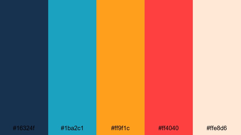
- HEX Codes: #16324f, #1ba2c1, #ff9f1c, #ff4040, #ffe8d6
- Mood: Dynamic, youthful, and bold with a golden-hour twist.
- Use for: Use for action shots, adventure vlogs, and dynamic intro animations.
Paddleboard Sunset Splash links rich lake blues with hot sunset oranges and reds, plus a soft cream highlight. It feels fast, energetic, and perfect for motion-heavy footage like water sports or travel montages.
Use the deep blue as your base and splash in the warm accents on animated titles, transitions, and callouts. This combination creates strong contrast in thumbnails and short-form content, making your lake adventures look as exciting as they felt in real life.
Turquoise Picnic Cove
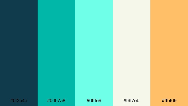
- HEX Codes: #0f3b4c, #00b7a8, #6fffe9, #f6f7eb, #ffbf69
- Mood: Fresh, playful, and inviting.
- Use for: Perfect for picnic reels, family travel content, and friendly brand intros.
Turquoise Picnic Cove mixes juicy turquoise and seafoam with a soft off-white and warm accent, like picnic blankets scattered on bright grass beside clear water. It feels approachable and family-friendly, great for welcoming visuals.
Use the light neutral for clean backgrounds on titles and YouTube cards, let the turquoise define your brand color, and reserve the warm accent for subscribe buttons or key thumbnail words. This palette suits family vlogs, lifestyle channels, and any content that leans friendly and fun.
Minimalist Lake Color Palettes
Blue Slate Jetty
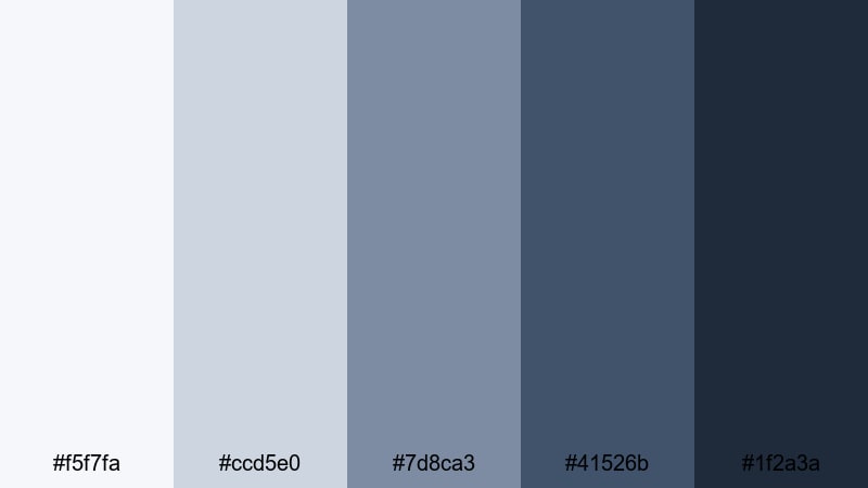
- HEX Codes: #f5f7fa, #ccd5e0, #7d8ca3, #41526b, #1f2a3a
- Mood: Modern, balanced, and professional.
- Use for: Great for tech explainers, UI overlays, and clean lower-thirds in tutorials.
Blue Slate Jetty brings together cool grays and slate blues for a clean, structured lakeside mood. It looks professional and restrained, ideal when you want the focus on information rather than decoration.
Use the lightest shades as panels behind your talking head, screen recordings, or tutorial steps, and lean on the darkest blue for crisp, readable text. This palette works especially well for software walkthroughs, productivity content, and tech reviews that still want a subtle lake-inspired twist.
Soft Teal Interface
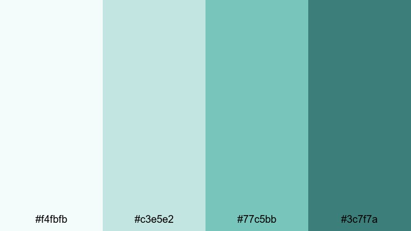
- HEX Codes: #f4fbfb, #c3e5e2, #77c5bb, #3c7f7a
- Mood: Light, friendly, and easy on the eyes.
- Use for: Ideal for app-style overlays, subtitles, and clean vlog graphics.
Soft Teal Interface uses pale aqua and gentle teal, reminiscent of shallow lake water over smooth stones. It is soothing yet fresh, great for interfaces that viewers will be reading for more than a few seconds.
Apply the lightest tones under subtitles and captions to improve legibility without heavy bars, and use the richer teals sparingly for icons and UI elements. This palette supports calm productivity or educational channels where clarity and comfort matter.
Nordic Cabin Lakeview
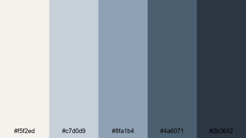
- HEX Codes: #f5f2ed, #c7d0d9, #8fa1b4, #4a6071, #2b3642
- Mood: Cozy, understated, and design-forward.
- Use for: Use for aesthetic vlogs, interior design content, and calm brand identities.
Nordic Cabin Lakeview balances warm off-white with cool lake blues, creating a minimal, Nordic-inspired look. It feels cozy yet highly curated, ideal for aesthetic lifestyle content and design-led channels.
Use the off-white and light gray-blue as your base for backgrounds and frames, then let the deeper blues shape logos, titles, and accent lines. This palette shines in room tours, cabin makeovers, and slow living vlogs where you want a soft, editorial style.
Tips for Creating Lake Color Palettes
When you build your own lake color palettes for video and design, it helps to think like a color grader and a brand designer at the same time. Combine calming blues with supporting neutrals and strategic warm accents so your visuals feel cohesive, readable, and on-brand across intros, overlays, and thumbnails.
- Pick one or two core lake blues as your brand anchors, then add a light neutral and a darker accent for text and contrast.
- Use warm colors like peach, coral, or golden dock tones sparingly so they highlight calls to action without overpowering the calm lake mood.
- Always check text readability by testing your lightest background color with both dark and white text in your editing preview.
- Match your palette to your footage: cooler, misty blues for overcast or morning shots; deeper navy and teal for night scenes and moody edits.
- Keep your thumbnail palette simple: limit yourself to 3 main colors so small screens do not look cluttered or confusing.
- Reuse the same HEX codes for titles, lower thirds, and end screens to create a recognizable channel identity over time.
- When grading in Filmora, use subtle tints that nudge your footage toward your chosen lake palette instead of heavy filters that shift colors too far.
- Export a reference frame from each project and save its palette so you can quickly recreate the same lake aesthetic in future videos.
Lake color palettes are a versatile way to shape mood, from peaceful mornings and minimalist interfaces to stormy trailers and festival highlights. A consistent set of lake-inspired blues and supporting tones makes your videos feel more cinematic and your branding more intentional.
Experiment with these 15 palettes as starting points, then adjust saturation, warmth, and contrast to match your own footage and story. In Filmora, you can quickly apply these colors to titles, overlays, and grading so every upload feels like part of the same lake-inspired world.
Whether you are designing thumbnails, building a channel intro, or grading a full travel series, let these Lake palettes guide your color choices and keep your visuals calm, cohesive, and memorable.
secure download