Library-inspired colors sit in a cozy space between warm neutrals, deep woods, and soft, muted accents. They feel like book pages, polished shelves, and afternoon light on a study desk. In video, thumbnails, and branding, these Library tones instantly suggest calm focus, knowledge, and a touch of nostalgia, making them ideal for study-with-me content, bookish vlogs, or thoughtful storytelling edits.
This guide rounds up handpicked Library color palettes with ready-to-use HEX codes so you can drop them straight into your graphics, intros, lower thirds, and color grading. If you edit in Filmora, these palettes are also perfect references for matching your footage, building cohesive aesthetics, and keeping your channel visuals consistent across every upload.
In this article
Cozy & Classic Library Color Palettes
Fireside Reading Nook
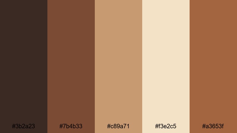
- HEX Codes: #3b2a23, #7b4b33, #c89a71, #f3e2c5, #a3653f
- Mood: Warm, intimate, and comforting like reading by a crackling fireplace.
- Use for: Ideal for vlog intros, cozy reading corners, and lifestyle thumbnails that need a soft, welcoming warmth.
This palette mixes deep wood browns with toasted caramel and creamy light, instantly evoking a favorite chair pulled close to the fire. The darker tones (#3b2a23, #7b4b33) ground your frame, while the lighter HEX codes (#c89a71, #f3e2c5) add a gentle glow that feels like lamplight bouncing off old pages.
Use this for bookish vlog intros, reading journal videos, or any thumbnail that needs to feel like a quiet escape from a busy day. In branding, these Library hues work beautifully for logos, channel banners, and end screens where you want viewers to associate your content with warmth, storytelling, and comfort.
Pro Tip: Build A Cinematic Library Glow In Filmora
To keep this Fireside Reading Nook palette consistent, start by choosing one of the mid-tones (like #c89a71) as your main accent across your edit. In Filmora, you can use this color for text, shapes, and overlays on intros, lower thirds, and end cards, then let the deeper browns fill your backgrounds and frames.
When you color grade, slightly warm up your footage and gently lower contrast so the highlights feel like soft lamp light instead of harsh white. Apply the same adjustments to A-roll, B-roll, and Shorts edits so your whole channel shares the same cozy Library identity.
AI Color Palette
If you have a photo of a real reading corner or a mood board using these HEX codes, you can turn it into a full video look with one step. Filmora's AI Color Palette feature lets you grab the tones from a reference image and apply them across your entire timeline.
Import your reference image with these Library colors, select a clip that matches your ideal mood, then let AI transfer that warmth to everything else. It is an easy way to make your intros, B-roll, and thumbnails all share the same fireside vibe without manually adjusting each shot.
HSL, Color Wheels & Curves
Once your base palette is in place, fine-tune the Library tones using Filmora's HSL sliders, color wheels, and curves. Slightly increasing saturation in the oranges and reds makes the firelight feel richer, while pushing shadows toward a deep chocolate brown keeps the image grounded and cinematic.
With the color wheels and curves, you can follow the steps from Filmora's color grading tutorial to gently warm mid-tones and soften highlights. This avoids harsh contrast and preserves that soft, candlelit Library look even on brighter footage.
1000+ Video Filters & 3D LUTs
To move even faster, you can stack this Library palette on top of Filmora's built-in effects. Warm cinematic filters or vintage-inspired 3D LUTs instantly push your browns, creams, and ambers toward a specific style, from soft romantic StudyTube vibes to darker academic storytelling.
Filmora's video filters and 3D LUTs make it easy to test different moods without losing your base palette. Apply a LUT, tweak its intensity, then adjust HSL if you want your wood tones deeper or your highlights closer to a candlelit cream.
Polished Mahogany Shelves
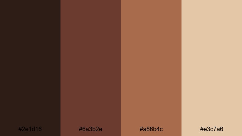
- HEX Codes: #2e1d16, #6a3b2e, #a86b4c, #e3c7a6
- Mood: Refined, traditional, and grounded with rich wood accents.
- Use for: Perfect for branding book review channels, documentary lower thirds, and elegant title cards.
These deep mahogany browns combined with parchment cream feel like walking past perfectly organized, polished shelves. The darker shades provide a serious, academic weight, while #e3c7a6 lightens the mood just enough to keep your visuals readable and approachable.
Use the lightest tone for titles, subtitles, and channel nameplates, while keeping your backgrounds and frames in the richer browns. This palette suits classic literature content, documentary-style intros, and any Library-themed channel that wants to look established and timeless without feeling old-fashioned.
Golden Desk Lamp Glow
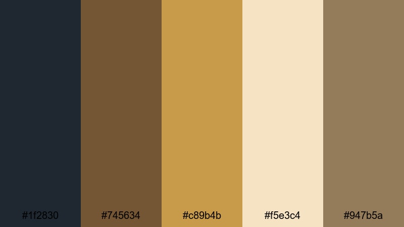
- HEX Codes: #1f2830, #745634, #c89b4b, #f5e3c4, #947b5a
- Mood: Calm, focused, and warmly illuminated like a desk under a vintage lamp.
- Use for: Great for study-with-me videos, productivity reels, and subtle overlays on tutorial content.
This palette contrasts cool slate (#1f2830) with bronze and buttery gold (#c89b4b, #f5e3c4), creating the feeling of a focused pool of light on a dark desk. The subtle browns in between tie it together into a balanced Library look that feels calm and intentional.
Use the golden tones for call-to-action buttons, chapter markers, and timer overlays in study videos, while keeping your backgrounds in the cooler blue-gray. It works especially well for thumbnails where you want a hero subject illuminated against a darker, distraction-free study environment.
Quiet Afternoon Stacks
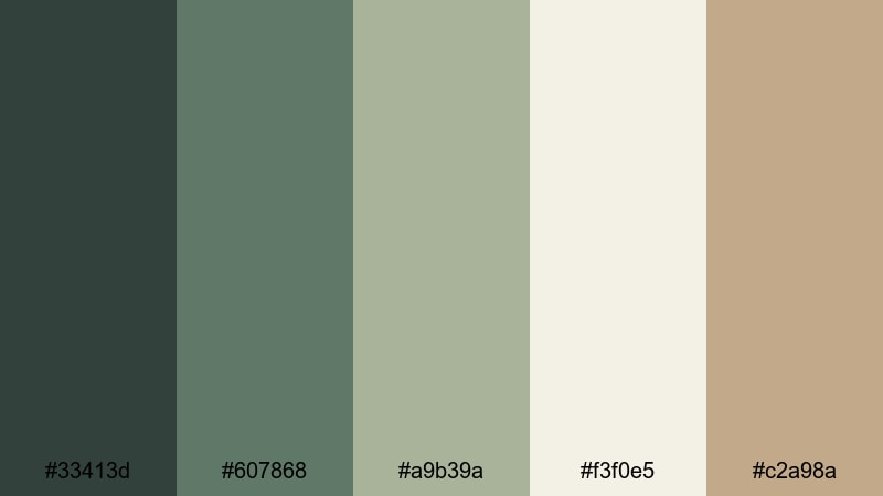
- HEX Codes: #33413d, #607868, #a9b39a, #f3f0e5, #c2a98a
- Mood: Peaceful, airy, and reflective, like wandering silent aisles of books.
- Use for: Use in B-roll transitions, montage sequences, or channel banners that need a serene, bookish feel.
Muted greens and soft creams create the feeling of filtered daylight passing through high windows onto rows of books. The palette sits in a calm, neutral zone, which makes it adaptable for both bright and slightly moody footage.
Use the cooler greens for background shapes, panels, and navigation areas on your channel art, while the warm beige (#c2a98a) adds a subtle human touch. This is a great choice for calm study playlists, journaling content, and softly paced vlogs that lean into reflection rather than hype.
Autumn Syllabus Season
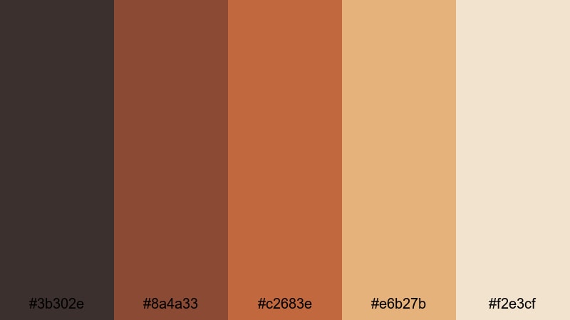
- HEX Codes: #3b302e, #8a4a33, #c2683e, #e6b27b, #f2e3cf
- Mood: Nostalgic, seasonal, and warm like the first week back on campus in fall.
- Use for: Ideal for back-to-school promos, semester reset videos, and educational channel graphics.
Burnt oranges and warm neutrals instantly say back-to-school and new notebooks. The deeper brown (#3b302e) grounds the palette, while #e6b27b and #f2e3cf feel like afternoon sun on a stack of syllabi.
Use this palette across seasonal thumbnails, countdown timers, and lower thirds for new semester series. It is especially effective if you want your Library visuals to feel energetic and inviting without losing that grounded, academic atmosphere.
Modern Study Library Color Palettes
Minimalist Study Session
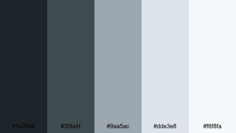
- HEX Codes: #1e2528, #3f4a4f, #9aa5ac, #dde3e8, #f6f8fa
- Mood: Clean, focused, and modern with a soft tech-driven edge.
- Use for: Best for productivity channels, minimalist vlog aesthetics, and UI overlays on educational videos.
This cool grayscale palette keeps your visuals tidy and distraction-free. The darker charcoals frame your subject, while the near-whites (#dde3e8, #f6f8fa) keep everything bright enough for on-screen text and widgets.
Use it when your content mixes analog studying with digital tools like tablets and laptops. It looks sharp on thumbnails, timers, and screen recordings, giving your Library vibe a subtle, modern upgrade that still feels calm and focused.
Soft Sunlit Workspace
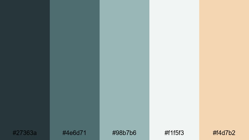
- HEX Codes: #27363a, #4e6d71, #98b7b6, #f1f5f3, #f4d7b2
- Mood: Bright, optimistic, and airy like a sunlit desk near a window.
- Use for: Great for aesthetic bullet journal videos, remote work vlogs, and thumbnail backgrounds that need gentle brightness.
Muted teals and soft creams suggest fresh air, plants, and a tidy workspace. The cooler shades keep things professional, while the soft peachy beige (#f4d7b2) adds a human warmth that feels like sunlight on your desk.
Use the lightest colors as your canvas for titles and callouts, and reserve the deeper teal for accents like progress bars or playlist labels. This palette is ideal for creators who want the structure of a Library aesthetic but with a lighter, more uplifting tone.
Glass Walls And Books
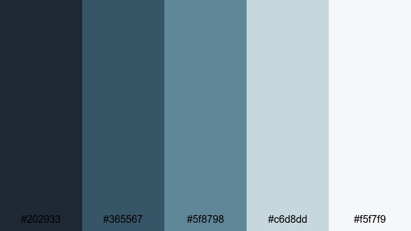
- HEX Codes: #202933, #365567, #5f8798, #c6d8dd, #f5f7f9
- Mood: Sleek, professional, and contemporary like a city library with glass walls.
- Use for: Use for techy explainer videos, academic presentations, and channel rebrands aiming for a polished look.
Cool blues and steel tones give this palette a corporate-meets-campus feel. It is still bookish, but the energy leans toward presentations, data, and research rather than cozy novels.
Use the darker shades as background blocks behind text and infographics, with the lighter tones carrying your charts, text overlays, and icons. This is a strong choice if your Library channel focuses on STEM, study strategies, or academic productivity.
Tech Meets Literature
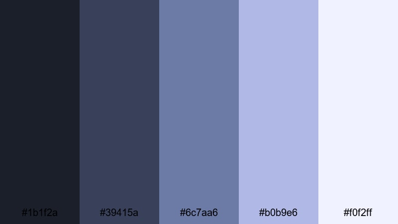
- HEX Codes: #1b1f2a, #39415a, #6c7aa6, #b0b9e6, #f0f2ff
- Mood: Smart, slightly futuristic, and studious with a digital twist.
- Use for: Ideal for channels that blend coding, research, and book content, as well as motion graphics overlays.
This palette balances midnight navy with soft periwinkle, capturing the overlap between glowing screens and shelves of books. It feels intellectual but also a bit futuristic, perfect for content that lives at the intersection of tech and literature.
Use the brighter blues (#b0b9e6, #f0f2ff) for subtitles, annotations, and keyboard overlays, while the darker tones become your backgrounds and borders. This is a great Library color scheme for coding tutorials, digital humanities content, or study setups that feature both laptops and notebooks.
Vintage Bookshop Library Color Palettes
Antique Dust Jacket
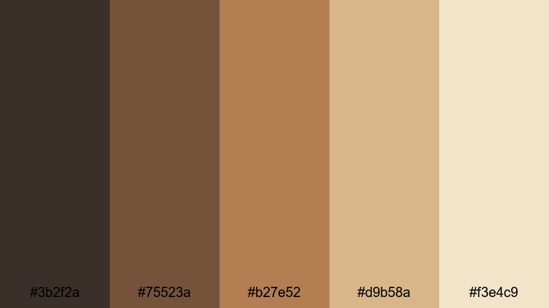
- HEX Codes: #3b2f2a, #75523a, #b27e52, #d9b58a, #f3e4c9
- Mood: Nostalgic, worn-in, and story-rich like a shelf of first editions.
- Use for: Great for history documentaries, classic literature channels, and cinematic title sequences.
Toffee browns and aged creams mimic the look of old paper, faded covers, and slightly yellowed pages. The palette feels soft and timeworn, making every frame look like it already has a story behind it.
Use it across intros, lower thirds, and overlays in videos about history, classics, or long-form essays. The lighter tones are perfect for legible chapter titles, while the deeper browns work beautifully in textured backgrounds, vignette overlays, or animated transitions between sections.
Sepia Margins And Ink

- HEX Codes: #2b2521, #594337, #8a6b57, #c9a98a, #f5e8d6
- Mood: Soft, poetic, and slightly melancholic like handwritten notes in the margins.
- Use for: Use in poetry visuals, essay films, and montage edits that lean into nostalgia and memory.
Smoky browns and sepia tones in this palette recall ink-stained pages and delicate handwriting. Everything feels a little bit dreamlike, perfect for videos that explore memory, emotion, or literature.
Use the mid-tones (#8a6b57, #c9a98a) as your main design colors for subtitles, quote overlays, and poetic captions. The darkest shade makes a great frame or letterbox bar for a more cinematic Library look, especially in slow montages and reflective voiceovers.
Weathered Leather Spines
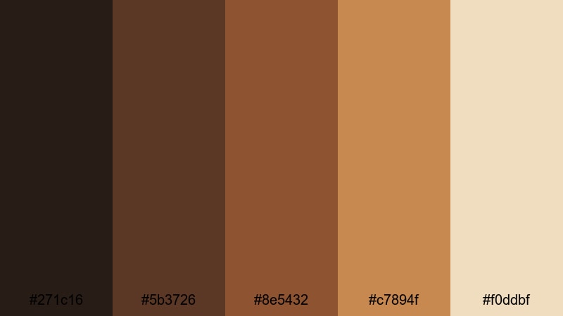
- HEX Codes: #271c16, #5b3726, #8e5432, #c7894f, #f0ddbf
- Mood: Rugged, scholarly, and tactile like a wall of leather-bound volumes.
- Use for: Perfect for channel branding, lower thirds, and thumbnail accents for academic or book review content.
From deep espresso to saddle tan, this palette feels like running your fingers along cracked leather spines. It gives your content a tactile, physical Library presence, even when viewers are watching on a small screen.
Use the darkest tones for backgrounds, frames, and header bars, then bring in the lighter leather hues for text containers, badges, and icons. It is an excellent palette for channels that focus on book reviews, philosophy, or long-form academic commentary.
Dark Academia Library Color Palettes
Midnight Study Hall
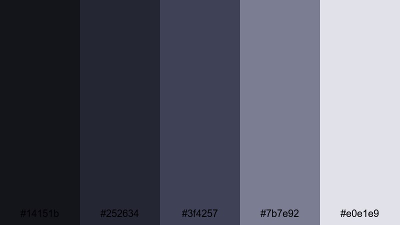
- HEX Codes: #14151b, #252634, #3f4257, #7b7e92, #e0e1e9
- Mood: Moody, intellectual, and cinematic like late-night study sessions.
- Use for: Great for dark academia edits, cinematic vlogs, and title cards with a brooding edge.
Inky blues and steel grays create the hush of a nearly empty Library long after sunset. There is enough contrast between the darkest shade and the pale gray (#e0e1e9) to keep text legible, while the mid-tones add depth and atmosphere.
Use this palette for night study vlogs, essay films, or dark academia mood edits. It looks particularly strong with soft vignettes, slow zooms, and letterboxing that push the cinematic Library feeling even further.
Candlelit Manuscripts
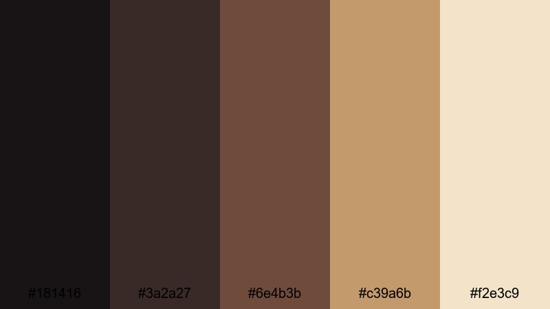
- HEX Codes: #181416, #3a2a27, #6e4b3b, #c39a6b, #f2e3c9
- Mood: Mysterious, scholarly, and warm with flickers of candle glow.
- Use for: Use for lore videos, history explainers, or any narrative that leans into mystery and ancient texts.
Shadowy browns and golden parchment tones make this palette feel like studying old manuscripts by candlelight. The deep shadows keep things mysterious, while the lighter creams (#f2e3c9) suggest fragile, ancient pages.
Use this scheme in lore breakdowns, mythology explainers, and storytime videos where you want a sense of age and secrecy. Let the darker colors dominate your backgrounds, bringing in the warm golds for titles, illuminated letters, and chapter cards.
Stormy Campus Library
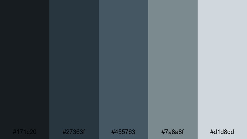
- HEX Codes: #171c20, #27363f, #455763, #7a8a8f, #d1d8dd
- Mood: Brooding, rainy-day reflective with a hint of academic tension.
- Use for: Ideal for moody campus vlogs, rainy study playlists, and cinematic color grading.
Slate blues and cool grays echo storm clouds outside tall Library windows. This palette is perfect for capturing the feeling of deadlines, quiet tension, and rain tapping at the glass while you work.
Use the light gray (#d1d8dd) for text and accent lines so everything stays readable against the darker blues. It works especially well for cinematic B-roll of campuses, umbrella shots, and time-lapses of rain or clouds in between your talking segments.
Secret Archive Door
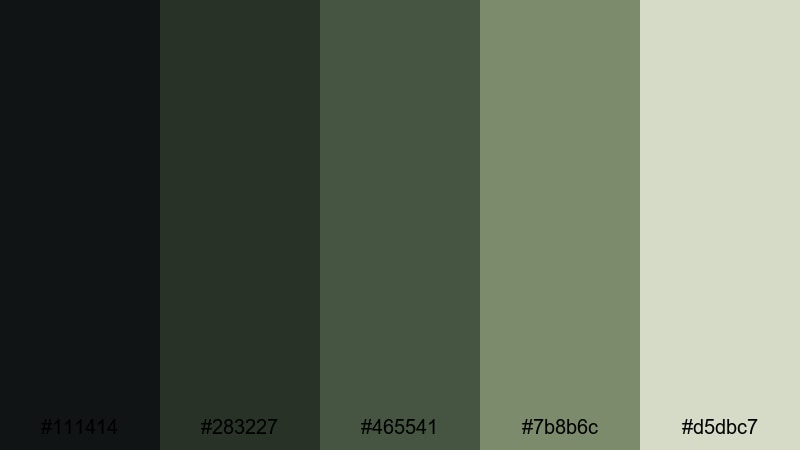
- HEX Codes: #111414, #283227, #465541, #7b8b6c, #d5dbc7
- Mood: Enigmatic, hidden, and adventurous like discovering a locked archive room.
- Use for: Great for mystery series intros, storytime animations, and narrative thumbnails with intrigue.
Deep greens and mossy tones suggest hidden rooms, locked filing cabinets, and secret stacks of documents. The palette has a quiet suspense to it, somewhere between natural and institutional.
Use the darker greens for backgrounds and framing devices, and reserve the soft, pale green (#d5dbc7) for titles and key labels. It is a powerful Library palette for mystery series, investigative storytelling, and narrative thumbnails that hint at secrets and discoveries.
Tips for Creating Library Color Palettes
When you build your own Library color palette for video and design, focus on balancing warm wood tones, soft neutrals, and a few accent colors that fit your channel mood. The right mix keeps your visuals readable, atmospheric, and consistent from thumbnail to timeline.
- Start with one main wood or paper tone (brown, beige, or cream) as your base, then add 2 to 3 supporting shades for depth and highlights.
- Check contrast for readability: always test white or light text over your darkest color, and dark text over your lightest color, especially for mobile thumbnails.
- Pick a single highlight accent (gold, teal, or deep green) to use for buttons, timestamps, and important text so viewers instantly know where to look.
- Match your palette to your content type: warmer browns and golds for cozy vlogs, cooler blues and grays for tech or academic explainers, and sepia for vintage or narrative videos.
- Use gradients or overlays based on your palette to tie mixed footage together, especially if you film in different locations or lighting conditions.
- Keep branding consistent by reusing the same HEX codes across intros, lower thirds, end screens, channel banners, and social media posts.
- When color grading footage, subtly nudge highlights toward your chosen paper tone and shadows toward your chosen wood or shelf color for a unified Library atmosphere.
- Regularly export a frame from your timeline and compare it with your palette cards to make sure your look does not drift over longer projects.
Conclusion
Library color palettes are a powerful way to give your videos and designs a recognizable identity. Whether you lean into cozy reading corners, modern glass-walled spaces, vintage bookshops, or dark academia vibes, the right mix of browns, creams, greens, and blues can instantly set the mood for your audience.
With the HEX codes above and Filmora's color tools, you can turn that atmosphere into a consistent visual brand across intros, B-roll, shorts, and thumbnails. Experiment with a few palettes, save the ones that fit your channel best, and keep refining them until your viewers can recognize your Library aesthetic at a glance.
Open Filmora, drop in one of these palettes as your reference, and start grading, styling, and designing around it. A cohesive Library color scheme can turn ordinary footage into a cinematic, bookish experience viewers want to return to.


 100% Security Verified | No Subscription Required | No Malware
