
 100% Security Verified | No Subscription Required | No Malware


 ChatGPT
 Perplexity
 Gemini
 Claude
 Grok
Grok
Light Apricot sits between peach and cream, bringing a soft glow that feels warm without being overwhelming. It is often linked with comfort, optimism, and gentle romance, which makes it perfect for videos and designs that should feel welcoming, personal, and easy on the eyes. In thumbnails and intros, Light Apricot can instantly soften your look, while still catching attention in crowded feeds.
For creators and Filmora users, Light Apricot is a versatile base for vlogs, lifestyle content, wedding highlights, branding packages, and social covers. Below you will find ready-made Light Apricot color palettes with HEX codes, so you can match your color grading, titles, overlays, and channel visuals across every project.
In this article
Soft & Romantic Light Apricot Palettes
Morning Peach Haze
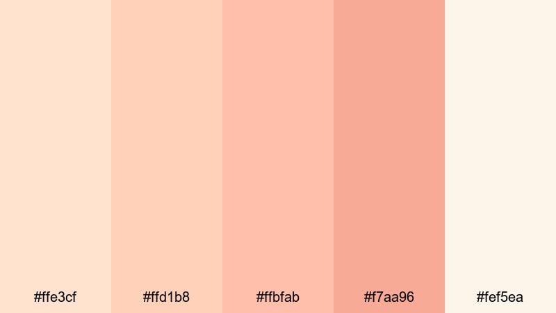
- HEX Codes: #ffe3cf, #ffd1b8, #ffbfab, #f7aa96, #fef5ea
- Mood: Tender, dreamy, and slightly nostalgic.
- Use for: Lovely for wedding highlight videos, romantic vlog episodes, and soft lifestyle thumbnails.
Morning Peach Haze feels like sunlight diffused through sheer curtains: soft apricot, creamy whites, and a hint of warm blush. It creates a misty glow that flatters skin tones and makes everything look delicately filtered without harsh contrast.
Use this palette for wedding highlight reels, couple stories, slow morning routines, and cinematic B-roll. In Filmora, you can bring these HEX codes into your titles, subtitles, lower thirds, and thumbnail layouts so your color grading and graphics share the same romantic Light Apricot language.
Pro Tip: Build Dreamy Light Apricot Stories in Filmora
To keep this hazy Light Apricot mood across an entire edit, build a simple style system in Filmora. Choose one of the soft apricot HEX codes for your main titles, a slightly deeper tone for subtitles, and the lightest cream as your background or frame color. Save these as custom presets so every sequence, from intro to outro, feels like part of the same morning glow.
Layer subtle fade transitions and gentle film grain over your clips, then use adjustment layers to apply the same warm, peach-tinted grade to all shots. This keeps your vlogs, reels, and wedding films consistent, even if they were recorded in different lighting conditions.
AI Color Palette
If you have a still frame or mood board that perfectly captures your ideal Light Apricot vibe, you can use Filmora's AI Color Palette feature to transfer those tones to your entire video. Just pick a reference image with soft apricot highlights and creamy neutrals, and let AI match your clips to that look.
This is especially useful for wedding and lifestyle projects where you want all scenes, from preparation to reception, to share the same peachy, romantic atmosphere. Instead of grading every clip by hand, you can get a cohesive Light Apricot look in a few clicks and spend more time refining the story.
 secure download

HSL, Color Wheels & Curves
Once your base Light Apricot grade is in place, use HSL, color wheels, and curves in Filmora to fine-tune the mood. Gently push oranges and reds toward softer peach for skin, lift the shadows a touch to avoid heavy contrast, and add a slight S-curve for a cinematic finish. Tools explained in Filmora's color correction guide help you keep the apricot tones polished without losing detail.
You can cool down the shadows with a hint of teal while keeping highlights warm, which creates a modern, cinematic contrast that still feels romantic. For dreamy flashback scenes, softly raise the blacks and reduce saturation in non-apricot hues so the Light Apricot notes become the emotional focus.
secure download1000+ Video Filters & 3D LUTs
Filmora's video filters and 3D LUTs make it easy to push your Light Apricot palette toward vintage romance, dreamy pastel, or modern editorial in seconds. Start with a LUT that warms mids and highlights, then reduce intensity so your apricot and cream tones stay soft and believable.
Stack subtle glow or vignette filters to pull attention toward faces and text elements that use your chosen apricot HEX codes. This gives your thumbnails, intros, and montage sequences a professional finish without complex manual grading.
secure downloadBlush Keepsake Letters
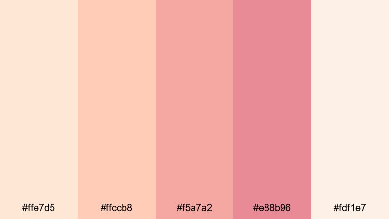
- HEX Codes: #ffe7d5, #ffccb8, #f5a7a2, #e88b96, #fdf1e7
- Mood: Sentimental, handwritten, and heartfelt.
- Use for: Ideal for journaling reels, love story montages, and stationery-inspired title cards.
Blush Keepsake Letters leans further into romantic nostalgia, with more rose and blush mixed into the apricot base. It feels like delicate stationery, faded envelopes, and ink pressed into paper over time.
Use these tones for hand-drawn lower thirds, animated bullet journal pages, and storytime vlogs. In your thumbnails and title cards, apply the deeper pink (#e88b96) to accents or icons, while using the light apricot and cream as backgrounds so text stays readable but still soft.
Apricot Veil Ceremony
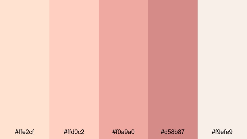
- HEX Codes: #ffe2cf, #ffd0c2, #f0a9a0, #d58b87, #f9efe9
- Mood: Elegant, ceremonial, and hopeful.
- Use for: Beautiful for wedding trailers, save-the-date clips, and formal event intros.
Apricot Veil Ceremony blends gentle apricot with muted rose and warm neutrals, creating a high-end yet emotional atmosphere. It feels like the quiet before walking down the aisle, full of expectation and soft light.
Bring this palette into wedding trailers, engagement announcements, and event highlight reels. Use the lightest shades as lower-third bars, the mid apricot for title text, and the deeper rose for subtle outlines or dividers. Together they give your videos a refined, ceremonial polish that still feels intimate.
Sunlit Balcony Sigh
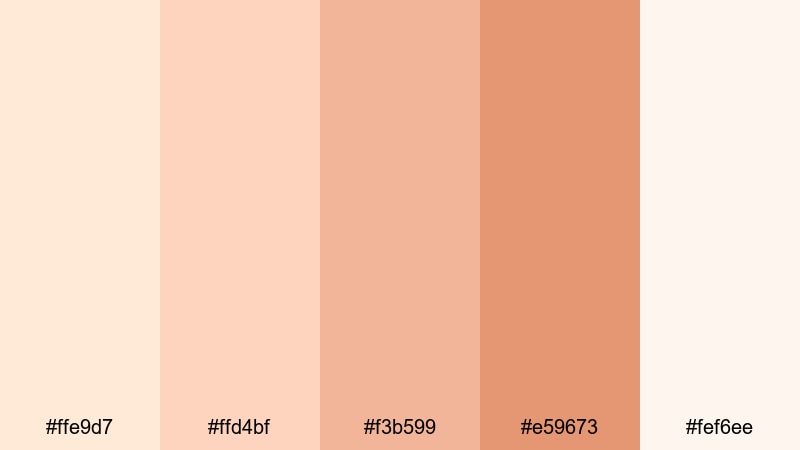
- HEX Codes: #ffe9d7, #ffd4bf, #f3b599, #e59673, #fef6ee
- Mood: Softly cinematic, wistful, and airy.
- Use for: Great for slice-of-life vlogs, travel diaries at golden hour, and cinematic b-roll sequences.
Sunlit Balcony Sigh feels like a late-afternoon pause, with warm apricot, soft terracotta, and creamy highlights. It has more depth than a pure pastel palette, but still keeps everything light and breathable.
Use it for travel vlogs, city balcony shots, and slow, cinematic B-roll. Make your text and icons sit on the light cream (#fef6ee) while accents and callouts use the deeper terracotta (#e59673). This contrast lets your thumbnails and end screens feel cinematic without losing the quietly wistful mood.
Cozy & Warm Light Apricot Palettes
Candlelit Cafe Corner
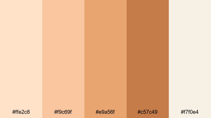
- HEX Codes: #ffe2c8, #f9c69f, #e9a56f, #c57c49, #f7f0e4
- Mood: Cozy, inviting, and latte-warm.
- Use for: Perfect for coffee shop vlogs, cozy study-with-me videos, and podcast cover art.
Candlelit Cafe Corner mixes milky apricot with deeper caramel browns, giving you the warmth of a small cafe lit by candles and tungsten bulbs. It feels intimate and grounded, ideal when you want your content to feel like a safe little corner of the internet.
Use the lighter tones for backgrounds and overlays in study-with-me videos, then reserve the deeper browns for text, icons, and waveform visualizers in your podcast art. Your thumbnails will immediately suggest warmth, conversation, and slow, thoughtful time.
Baked Apricot Crumble
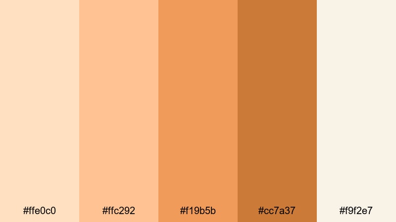
- HEX Codes: #ffe0c0, #ffc292, #f19b5b, #cc7a37, #f9f2e7
- Mood: Homey, tasty, and warm-hearted.
- Use for: Great for recipe videos, fall vlogs, and rustic product packaging or lower thirds.
Baked Apricot Crumble brings in toasty oranges and crusty browns, like a dessert fresh from the oven. It instantly suggests comfort food, family gatherings, and homemade treats.
Apply this palette to cooking channels, autumn vlogs, and rustic product shots. Use the lighter apricot as a plate or card background graphic and the darker caramel (#cc7a37) for titles and timers. On thumbnails, a cream backdrop with accents of deep orange makes food look richer and more inviting.
Fireside Peach Knit
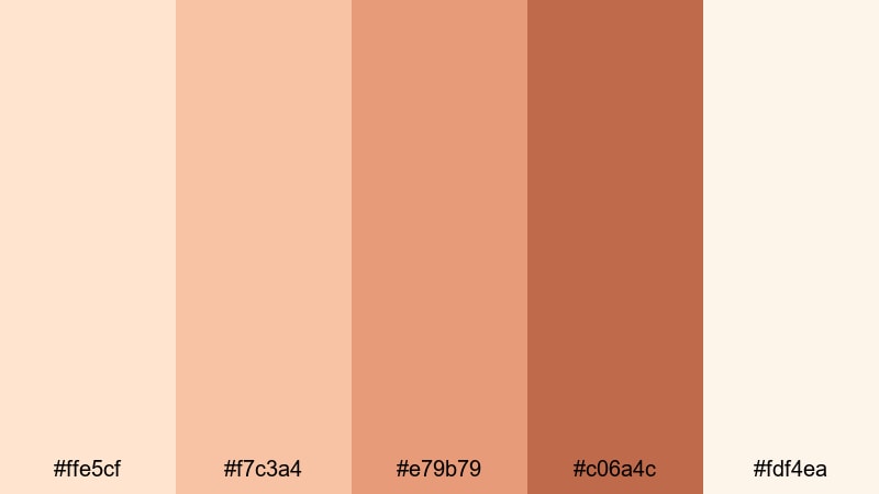
- HEX Codes: #ffe5cf, #f7c3a4, #e79b79, #c06a4c, #fdf4ea
- Mood: Snug, nostalgic, and softly rustic.
- Use for: Ideal for winter vlogs, knitting or craft channels, and warm lifestyle thumbnails.
Fireside Peach Knit layers soft peach and russet tones with creamy highlights, capturing the feeling of wrapping yourself in a knitted blanket next to a fireplace. It is nostalgic without feeling old-fashioned.
Use it for craft tutorials, winter morning routines, or cozy reading vlogs. Choose the darkest shade (#c06a4c) for text or icons, and keep footage slightly desaturated except for warm areas, so the Light Apricot and peach accents stand out as the emotional center.
Harvest Porch Glow
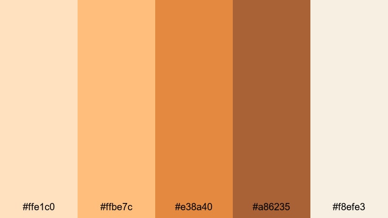
- HEX Codes: #ffe1c0, #ffbe7c, #e38a40, #a86235, #f8efe3
- Mood: Golden, seasonal, and welcoming.
- Use for: Works well for autumn decor tours, holiday intros, and warm brand reels.
Harvest Porch Glow leans into pumpkin spice territory, mixing golden apricot with rich wood tones. It instantly signals fall, holidays, and gatherings on a lantern-lit porch.
Bring these hues into seasonal intro animations, countdown screens, and festive lower thirds. Set your main backgrounds in the light cream (#f8efe3) and let buttons, CTAs, and badges pop in the brighter apricot and pumpkin shades. This makes your seasonal brand assets feel warm but still clean and easy to read.
Playful Pastel Light Apricot Palettes
Peach Fizz Pop
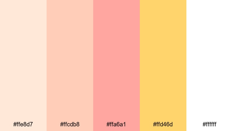
- HEX Codes: #ffe8d7, #ffcdb8, #ffa6a1, #ffd46d, #ffffff
- Mood: Playful, bubbly, and upbeat.
- Use for: Great for upbeat vlogs, fun shorts content, and eye-catching YouTube or TikTok thumbnails.
Peach Fizz Pop adds a bright, citrusy yellow accent to juicy apricot and coral shades, like a sparkling fruit soda. It feels energetic and fun, perfect when you want your visuals to bounce off the screen.
Use the yellow (#ffd46d) sparingly for badges, arrows, and key words on thumbnails, while the apricot and coral tones carry backgrounds and shapes. This palette pairs well with quick cuts, motion graphics, and bold typography in Filmora for high-energy shorts and Reels.
Candy Cloud Carousel
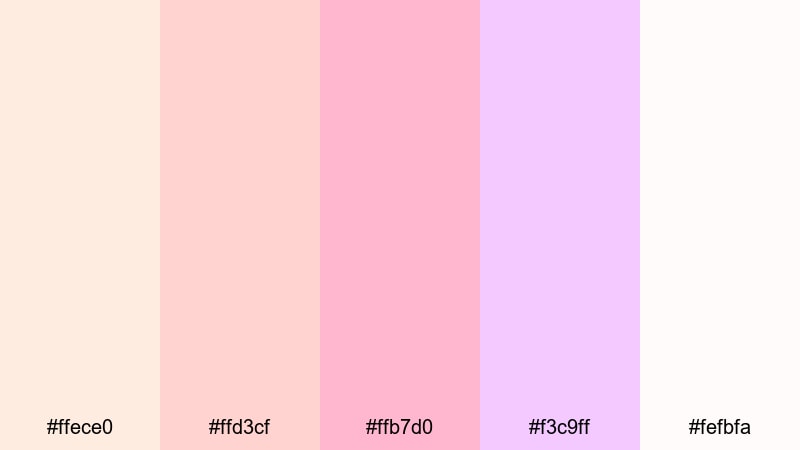
- HEX Codes: #ffece0, #ffd3cf, #ffb7d0, #f3c9ff, #fefbfa
- Mood: Whimsical, cotton-candy soft, and dreamy.
- Use for: Ideal for kids content, kawaii aesthetics, and playful channel branding.
Candy Cloud Carousel blends Light Apricot with cotton candy pinks and a touch of lavender, evoking fairgrounds, pastel toys, and dreamy sweets. It is soft enough for kid-friendly content, but still vibrant enough to attract attention.
Use the lavender and pinks for character outlines, stickers, or animated doodles, while the apricot and cream sit in the background. This works beautifully for gaming overlays, kids educational content, or kawaii branding on your channel banner and end cards.
Apricot Soda Sketchbook
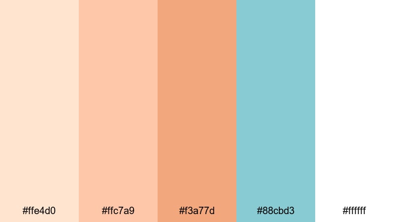
- HEX Codes: #ffe4d0, #ffc7a9, #f3a77d, #88cbd3, #ffffff
- Mood: Creative, lighthearted, and artsy.
- Use for: Great for art timelapses, bullet journal videos, and casual educational content.
Apricot Soda Sketchbook pairs mellow apricot and peach tones with a refreshing pop of aqua (#88cbd3). It feels like notes scribbled in a sketchbook while sipping a fizzy drink.
Use apricot and white for the base of your layouts, then let the aqua highlight key information, progress bars, or step numbers in tutorials. In Filmora, simple shape layers and animated arrows in this aqua accent color can guide viewers through your timelapses or study tips while keeping the overall mood playful and light.
Petal Confetti Stream
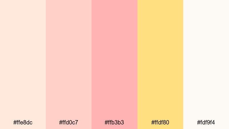
- HEX Codes: #ffe8dc, #ffd0c7, #ffb3b3, #ffdf80, #fdf9f4
- Mood: Celebratory, light, and festive.
- Use for: Perfect for birthday edits, party highlight reels, and cheerful social graphics.
Petal Confetti Stream sprinkles soft apricot and pastel pink with a sunny confetti yellow. It is light and cheerful, like petals and glitter falling in slow motion.
Use the yellow as a bright accent for age numbers, dates, and headlines, while apricot and pink form the background gradients and shapes. This palette is ideal for birthday montages, graduation recaps, or any celebration where you want visuals to feel happy but still gentle on the eyes.
Modern & Minimal Light Apricot Palettes
Studio Apricot Neutrals
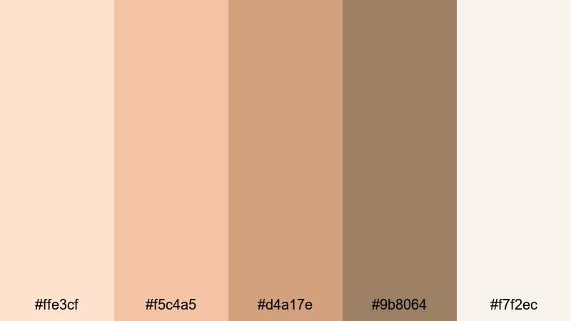
- HEX Codes: #ffe3cf, #f5c4a5, #d4a17e, #9b8064, #f7f2ec
- Mood: Calm, polished, and editorial.
- Use for: Great for minimalist brand intros, portfolio reels, and Instagram grids.
Studio Apricot Neutrals balances Light Apricot with grounded taupes and browns, creating a clean, studio-lit aesthetic. It feels modern and professional, with just enough warmth to avoid looking cold or corporate.
Use the deepest neutral (#9b8064) for text, logos, and UI mockups, and reserve the soft apricot and cream for section backgrounds, split screens, and lower thirds. This is an excellent palette if you are building a personal brand, portfolio reel, or minimal Instagram grid that needs warmth and polish at the same time.
Muted Clay Grid
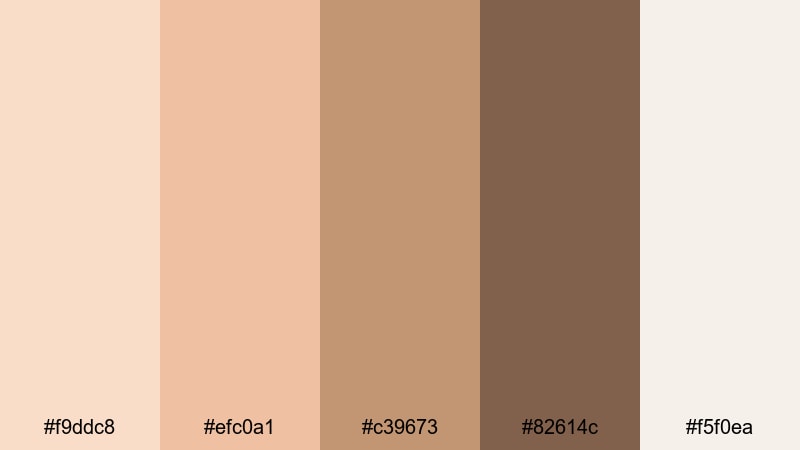
- HEX Codes: #f9ddc8, #efc0a1, #c39673, #82614c, #f5f0ea
- Mood: Earthy, grounded, and design-forward.
- Use for: Perfect for UI mockups, minimalist titles, and calm productivity vlogs.
Muted Clay Grid combines Light Apricot with clay and cocoa tones, giving your designs an earthy, architectural feel. It is perfect for layouts that use clean lines, grids, and simple typography.
Use the lighter colors (#f9ddc8 and #f5f0ea) as your panel and card backgrounds, and let the mid and dark clays define section dividers, icons, and text. This palette works beautifully in productivity vlogs, app demos, and minimalist explainer videos where you want to feel grounded and organized.
Apricot Glass Workspace
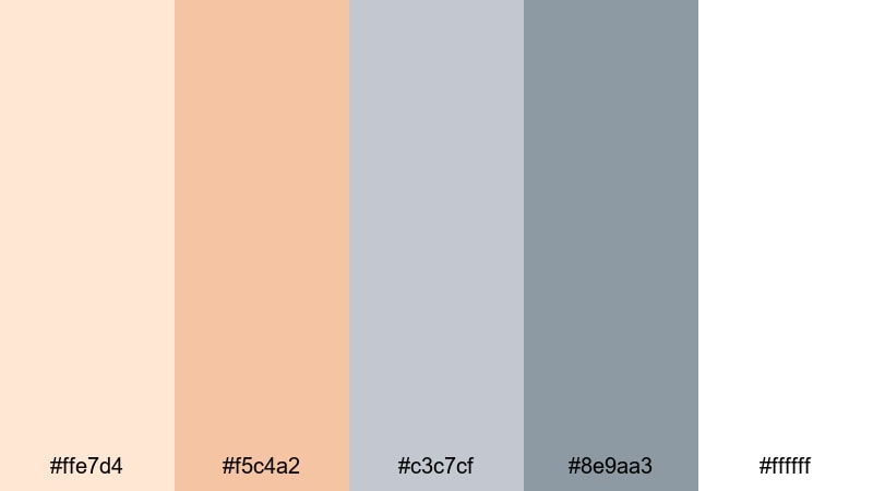
- HEX Codes: #ffe7d4, #f5c4a2, #c3c7cf, #8e9aa3, #ffffff
- Mood: Clean, fresh, and tech-friendly.
- Use for: Ideal for SaaS explainers, productivity apps, and channel rebrands with a soft tech edge.
Apricot Glass Workspace pairs warm Light Apricot with frosted blue-grays, echoing glass surfaces, modern devices, and clean interfaces. It strikes a balance between friendly and professional.
Use the apricot hues for accent blocks, highlight bars, and friendly callouts, while blue-grays handle UI elements, timelines, and diagrams. For tech explainers and SaaS promos, this combination helps your videos feel approachable but still trustworthy and polished.
Gallery Wall Dawn
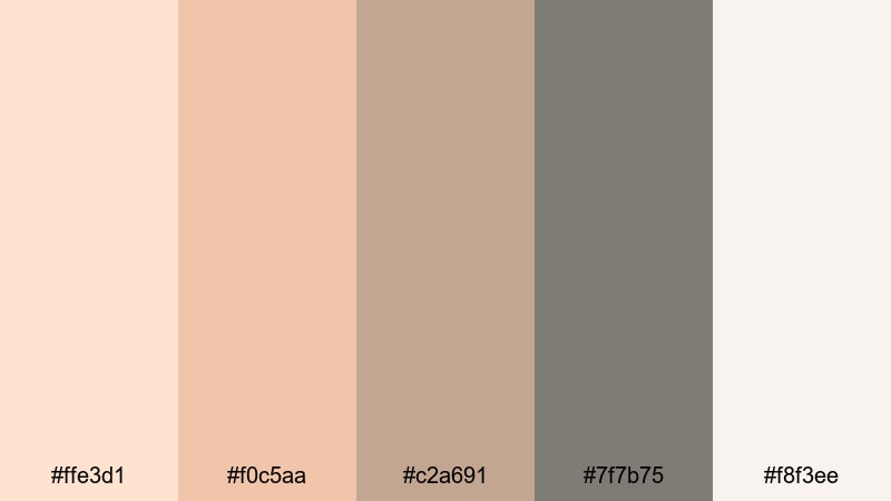
- HEX Codes: #ffe3d1, #f0c5aa, #c2a691, #7f7b75, #f8f3ee
- Mood: Curated, artistic, and softly sophisticated.
- Use for: Great for interior design tours, portfolio showcases, and slow-living lookbooks.
Gallery Wall Dawn feels like early light slipping across framed artwork: soft apricot, muted neutrals, and a calm gray accent. It is elegant and understated, with just enough warmth to feel human and lived-in.
Use this palette to present photography portfolios, interior design tours, or slow-living montages. Keep text in the gray or deeper neutral while backgrounds stay pale apricot and cream. This subtle contrast keeps focus on your visuals and footage, giving everything a gallery-like, curated presentation.
Tips for Creating Light Apricot Color Palettes
Light Apricot works best when it has room to breathe and a few supporting tones to create contrast. When designing for video, branding, or social graphics, think about how apricot relates to neutrals, accents, and real-world footage.
- Pair Light Apricot with soft neutrals (off-white, warm gray, taupe) as your base so the palette feels calm and easy on the eyes.
- Add one deeper shade (terracotta, caramel, or cocoa) for text and icons to maintain readability in thumbnails and on mobile screens.
- Use a single bright accent color (yellow, aqua, or lavender) for CTAs, badges, and key numbers so your design stays focused, not busy.
- Check how your Light Apricot tones look against real footage. If your scene is already warm, reduce saturation slightly so the overlays do not overpower skin tones.
- Keep HEX codes consistent across titles, lower thirds, and end screens. Reusing the same core colors helps build a recognizable brand identity.
- For cinematic looks, warm your highlights slightly and cool your shadows a bit in Filmora, so Light Apricot stands out as the emotional, glowing midtone.
- Always test your palette in both light and dark modes (for overlays or subtitles). You may need a darker apricot or neutral for text on bright footage.
- Save your favorite color combinations as presets or templates in Filmora so you can apply your Light Apricot branding in seconds on future projects.
Light Apricot palettes can make your videos feel softer, kinder, and more welcoming, whether you are telling love stories, sharing cozy routines, or building a modern brand. By pairing gentle apricot tones with thoughtful neutrals and accents, you shape the emotional tone of your thumbnails, intros, and full edits before viewers even hit play.
Try a few of these palettes inside Filmora and see which one fits your style best. Once you lock in your favorite Light Apricot combination, use Filmora's color tools, titles, and templates to apply it across intros, B-roll sequences, outros, and social cutdowns for a unified look.
Over time, this consistent, Light Apricot aesthetic becomes part of your visual signature, helping viewers recognize your content instantly in any feed.
secure download