
 100% Security Verified | No Subscription Required | No Malware


 ChatGPT
 Perplexity
 Gemini
 Claude
 Grok
Grok
Moss green sits between fresh plant life and deep forest shade, which is why it instantly feels natural, grounded, and trustworthy. It suggests balance, renewal, and a slower pace, making it a favorite for calm vlogs, wellness brands, eco friendly products, and storytelling that leans into nature or nostalgia.
Used in video, moss green works beautifully in thumbnails, title cards, lower thirds, and color grading to tie footage together. Below you will find 15 moss green color palettes with ready to use HEX codes, created for creators and Filmora users who want cohesive looks for vlogs, intros, cinematic edits, and social content.
In this article
Soft & Organic Moss Green Palettes
Morning Forest Dew
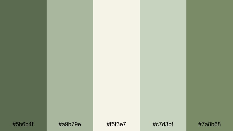
- HEX Codes: #5b6b4f, #a9b79e, #f5f3e7, #c7d3bf, #7a8b68
- Mood: calm, dewy, and refreshing
- Use for: Ideal for slow morning routines, nature vlogs, and relaxing B-roll sequences that need a soft organic feel.
Morning Forest Dew mixes gentle moss, sage, and warm cream, so everything feels like the first light hitting leaves after rain. The muted greens keep the frame soothing, while the off white and pale neutrals stop the image from becoming too heavy or dark.
This palette is perfect for slow morning routines, journaling shots, coffee pours, or soft ASMR scenes. Use the deeper moss for text or logo marks, the lighter greens for lower thirds, and the warm cream for backgrounds in thumbnails, intro slates, and end screens to keep your whole video series visually consistent.
Pro Tip: Build a Soft Moss Green Aesthetic in Filmora
In Filmora, you can turn Morning Forest Dew into a recognizable channel look by reusing the same moss green and cream tones across your intro, transitions, and B roll overlays. Drop color blocks behind text, use shape elements with moss borders, and keep subtitles in the lighter sage so everything feels calm but easy to read.
Save your favorite title designs and color graded clips as custom presets. That way, each new vlog or reel can reuse the same moss green mood without rebuilding the look from scratch, keeping your brand style gentle, organic, and familiar.
AI Color Palette
If you already have a reference image using this palette, you can let Filmora match it automatically. Filmora's AI Color Palette feature analyzes your reference frame and applies similar tones to the rest of your clips, so greens, creams, and neutrals stay unified.
Import a still frame that represents your ideal moss green look, run AI Color Palette on your timeline, and refine the result with a couple of manual adjustments. This is an easy way to give an entire vlog or montage the same misty morning vibe without grading every shot one by one.
 secure download

HSL, Color Wheels & Curves
To perfect your moss green tones, use Filmora's HSL controls to shift greens slightly warmer or cooler depending on your footage. The color wheels help you keep shadows deep and neutral while pushing a subtle warm tint into midtones and highlights, ideal for sunrise scenes. Curves let you add gentle contrast so the greens do not look flat, while preserving soft roll off in the brightest areas.
If you want a deeper dive into balancing color and contrast, check out Filmora's advanced color correction guide and combine those principles with this palette. A few small HSL tweaks are often enough to bring your moss greens closer to the reference HEX values you are aiming for.
secure download1000+ Video Filters & 3D LUTs
Once your base colors are in place, Filmora's filter library can push the look toward dreamy, vintage, or ultra clean. Many presets subtly lift greens, soften highlights, or add a film like wash that pairs perfectly with moss tones.
If you want fast, repeatable results, Filmora’s video filters and 3D LUTs make it easy to apply one click moss friendly looks across entire sequences. Apply a LUT that enhances greens, lower the intensity slider until it feels natural, and you will have a polished aesthetic that works across vlogs, shorts, and thumbnails.
secure downloadHerbal Tea Serenity

- HEX Codes: #6e7c5f, #c2d1b2, #fdf8ec, #b09f82, #87755b
- Mood: soothing, cozy, and restorative
- Use for: Works well for wellness channels, tea or coffee aesthetics, and product close ups with a natural lifestyle vibe.
Herbal Tea Serenity blends earthy moss with oat milk and caramel tones, creating the feeling of a quiet tea break. The soft greens keep everything grounded in nature, while the beige and brown shades add warmth and a touch of comfort.
Use these HEX codes to design thumbnails with moss backgrounds, oat colored titles, and caramel accents around product shots. This palette suits wellness videos, self care routines, skincare flatlays, and any intro sequence where you want viewers to instantly relax.
Mossy Riverbank Calm
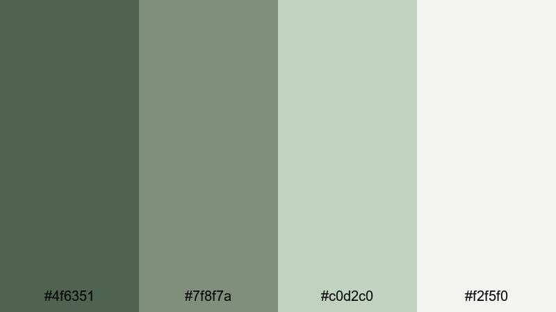
- HEX Codes: #4f6351, #7f8f7a, #c0d2c0, #f2f5f0
- Mood: quiet, reflective, and natural
- Use for: Great for travel montages, mindful shorts, and timelapse shots where you want a peaceful outdoor tone.
Mossy Riverbank Calm layers muted moss and stone greens with pale misty neutrals, echoing a foggy riverbank. There is a soft contrast between the darker foliage tone and the airy background shades, which keeps the image peaceful but not flat.
Apply this palette when color grading outdoor B roll, especially water, rocks, and trees. Use the deeper green for typography, the mid greens for overlays and frames, and the light neutrals for clean backgrounds in maps, travel titles, and reflective storytelling pieces.
Glasshouse Light

- HEX Codes: #7a8f6a, #d9e4c5, #f7faf2, #b0c3a1
- Mood: airy, botanical, and optimistic
- Use for: Use in aesthetic reels, plant care videos, and bright lifestyle edits that need a light filled greenhouse mood.
Glasshouse Light uses soft botanical greens and milky whites to mimic sun streaming through glass onto leaves. The palette feels clean and bright, without the harshness of pure white or neon greens.
This works especially well for plant care content, bright desk setups, and product highlights shot near windows. Choose the medium moss as your primary accent color in titles and icons, while the near white shades become backgrounds for text, chapter markers, and UI styled overlays inside your videos.
Bold & Cinematic Moss Green Palettes
Emerald Canopy Drama
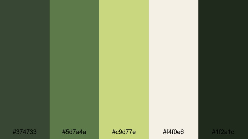
- HEX Codes: #374733, #5d7a4a, #c9d77e, #f4f0e6, #1f2a1c
- Mood: dramatic, adventurous, and cinematic
- Use for: Perfect for cinematic travel films, title cards, and posters that need a rich adventure tone.
Emerald Canopy Drama contrasts deep forest greens with a bright canopy yellow green and a soft parchment neutral. The darkest shade anchors your frame, while the highlight color draws attention to key subjects or text.
Use this palette when designing cinematic title cards, lower thirds for travel documentaries, and hero thumbnails for adventure playlists. The near black green works beautifully as a letterbox bar or background, while the lighter greens and parchment tone keep your typography sharp and readable.
Urban Jungle Title Card
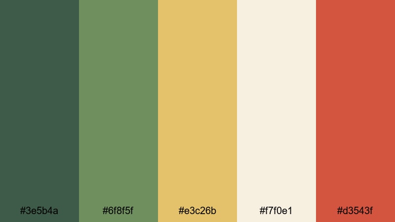
- HEX Codes: #3e5b4a, #6f8f5f, #e3c26b, #f7f0e1, #d3543f
- Mood: energetic, stylish, and urban
- Use for: Strong choice for YouTube thumbnails, bold intro slates, and lifestyle or fashion content set in the city.
Urban Jungle Title Card mixes moss greens with warm gold and a punch of brick red. The result feels like plants pushing through concrete, balancing natural tones with city energy.
Use the rich green as your base, the gold for accents and badges, and the brick red to highlight CTAs or key words in titles. This palette suits city vlog intros, streetwear lookbooks, and lifestyle thumbnails that need to stand out in a crowded search page.
Noir Forest Contrast
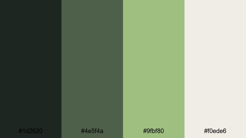
- HEX Codes: #1d2620, #4e5f4a, #9fbf80, #f0ede6
- Mood: moody, mysterious, and refined
- Use for: Great for cinematic short films, mystery intros, and dramatic B-roll with high contrast color grading.
Noir Forest Contrast leans into inky greens and pale highlights, creating strong separation between light and dark without losing color. It feels mysterious and elegant, ideal for narratives with tension or intrigue.
Use the darkest green for letterbox bars, shadows, and backgrounds; the mid moss for subtle details; and the pale neutral for titles and chapter names. This palette is excellent for short films, mystery themed trailers, and moody cinematic B roll sequences.
Cinematic Expedition
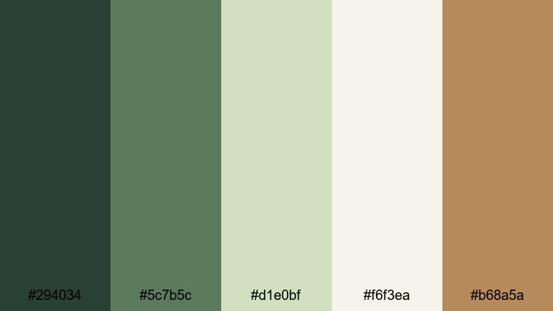
- HEX Codes: #294034, #5c7b5c, #d1e0bf, #f6f3ea, #b68a5a
- Mood: adventurous, warm, and cinematic
- Use for: Ideal for travel vlogs, hiking documentaries, and branded adventure edits with vintage flair.
Cinematic Expedition balances rich moss and trail brown with soft sky tints and warm highlights. It feels like a classic travel postcard brought into a modern color grade.
Use this palette for hiking vlogs, road trip stories, and branded outdoor edits. The moss tones suit landscapes and maps, the warm brown works for badges and logos, and the off whites keep your titles clean and readable against textured footage.
Modern & Minimal Moss Green Palettes
Scandinavian Sprout

- HEX Codes: #6f7d5f, #dde4d0, #f8f8f4, #b7c3a5, #4f5643
- Mood: minimal, fresh, and stylish
- Use for: Use in modern UI overlays, clean tech explainer videos, and branding for eco friendly startups.
Scandinavian Sprout pairs soft moss with off whites and muted charcoal, creating a very clean, design driven look. It feels modern and slightly understated, perfect for content that wants to feel both eco conscious and tech savvy.
Apply these colors in UI overlays, icon sets, and infographic sections of your videos. Use the lighter neutrals as backgrounds, the mid moss for primary buttons or lower thirds, and the darker green gray for body text or outlines in thumbnails and channel art.
Clean UI Moss
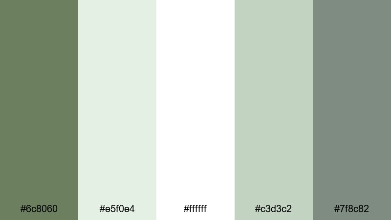
- HEX Codes: #6c8060, #e5f0e4, #ffffff, #c3d3c2, #7f8c82
- Mood: crisp, clear, and professional
- Use for: Perfect for on screen graphics, lower thirds, and app demos that require legible, modern color blocking.
Clean UI Moss combines balanced moss greens with bright whites and soft grays, giving your layouts a polished interface feel. It is professional without feeling cold, thanks to the subtle green tint.
Use this palette for tutorials, SaaS demos, and productivity content. The pure white and pale green make excellent backgrounds for text and screenshots; the mid moss is ideal for key buttons, progress bars, and highlight boxes in both video overlays and thumbnail designs.
Zen Workspace

- HEX Codes: #536554, #bcccb8, #f7f5ef, #e0ded5
- Mood: focused, tranquil, and modern
- Use for: Great for desk setups, study with me edits, and productivity channels that want a calm but contemporary look.
Zen Workspace brings together muted moss, soft stone, and warm paper tones to create a low distraction environment. Nothing is overly saturated, so viewers can focus on your voice or tasks on screen.
Use the darker moss as a subtle accent in borders, timers, and icons, while the softer neutrals fill backgrounds behind text and widgets. This palette is ideal for long form study sessions, co working streams, and productivity montages where you want gentle color that never feels noisy.
Muted Gridlines

- HEX Codes: #5b6f5a, #d2ddcf, #f5f7f3, #a7b39f, #7f8a76
- Mood: structured, gentle, and balanced
- Use for: Useful for infographic videos, planning content, and motion graphics with a subtle, data friendly aesthetic.
Muted Gridlines combines soft moss with cool grays to create a structured but gentle palette. It feels organized and data friendly without using harsh blacks or neon colors.
Use these HEX codes for charts, calendars, checklist overlays, and planning boards in your videos. The mid moss is great for key lines and labels, while the light neutrals keep backgrounds breathable for text heavy frames like roadmaps or analytics explainers.
Vintage & Earthy Moss Green Palettes
Old Botanical Print
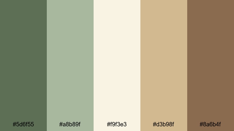
- HEX Codes: #5d6f55, #a8b89f, #f9f3e3, #d3b98f, #8a6b4f
- Mood: nostalgic, warm, and organic
- Use for: Ideal for history inspired edits, cottagecore aesthetics, and brand stories rooted in heritage or craft.
Old Botanical Print echoes weathered moss, faded sage, and tea stained paper, just like vintage plant illustrations. It feels nostalgic and handcrafted, with a warmth that suits storytelling and memory driven content.
Use the moss and sage tones as your primary brand greens, the tea colored neutral as a background, and the warm browns for frames or headline text. This palette works beautifully for cottagecore edits, maker stories, journaling videos, and any brand that leans into heritage or slow craftsmanship.
Cabin Retreat
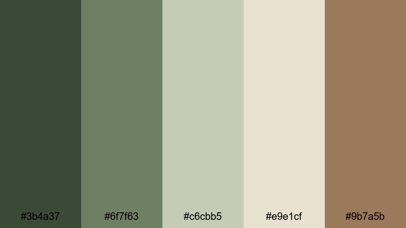
- HEX Codes: #3b4a37, #6f7f63, #c6cbb5, #e9e1cf, #9b7a5b
- Mood: cozy, grounded, and rustic
- Use for: Great for cabin vlogs, outdoor cooking videos, and lifestyle content centered around slow living and nature.
Cabin Retreat mixes deep evergreen with soft moss and worn wood browns to create a fireside mood. It feels grounded and homely, like stepping into a warm cabin after a day in the forest.
Apply this palette in cabin vlogs, outdoor cooking content, and autumn or winter specials. Use the darkest green and brown tones for frames, title bars, and textured backgrounds, while the lighter neutrals are ideal for legible text and simple logo animations with a rustic edge.
Weathered Garden Gate
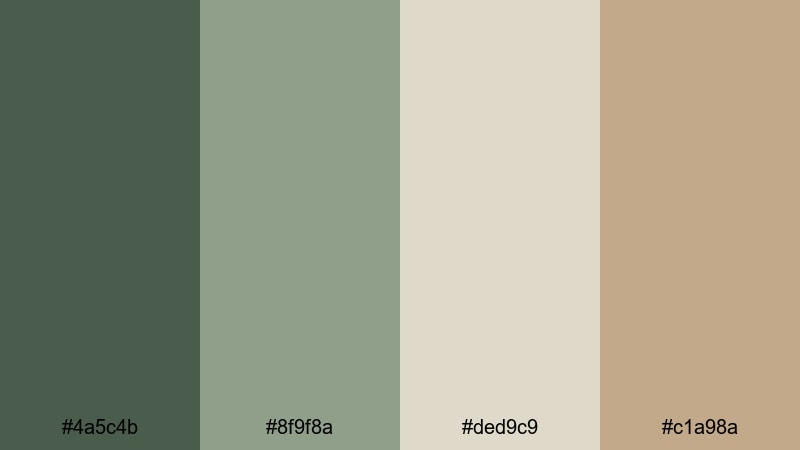
- HEX Codes: #4a5c4b, #8f9f8a, #ded9c9, #c1a98a
- Mood: romantic, aged, and earthy
- Use for: Use in garden tours, slow cinematic b-roll, and nostalgic montages with a touch of romance.
Weathered Garden Gate combines worn moss, aged metal, and sun faded stone tones. It feels romantic and slightly aged, hinting at overgrown gardens, old walls, and quiet paths.
Use this palette for garden tours, floral closeups, and slow motion B roll with a dreamy, almost film like mood. The mid moss and gray greens work for text and overlays, while the warm stone colors are perfect for frames, borders, and subtle vignettes in intros and end cards.
Tips for Creating Moss Green Color Palettes
Moss green is versatile, but it looks best when paired thoughtfully with neutrals, warm accents, and clear typography. Use these tips to build or adapt moss green palettes that stay readable and on brand in both video and design.
- Pair moss green with warm neutrals (cream, oat, soft beige) when you want a cozy, lifestyle feeling; use cooler grays for tech and minimal aesthetics.
- For thumbnails and titles, keep important text on the lightest shade in your palette and reserve the darkest moss or brown as a background or border for contrast.
- Limit yourself to 2 main greens plus 2 to 3 neutrals; too many similar greens can make footage look muddy or unfocused.
- Use a high contrast accent color sparingly (gold, brick red, or warm yellow) to highlight calls to action, buttons, and key stats in your layouts.
- Match your color grade to your palette by gently shifting foliage, clothing, and props toward your chosen moss HEX values using HSL tools in Filmora.
- Check your palette on mobile by zooming out: if your title is not readable at a small size, either darken the text, lighten the background, or add a subtle drop shadow.
- Create a reusable brand kit: store your moss HEX codes for titles, subtitles, and accents, and apply them consistently to intros, lower thirds, and end screens.
- When mixing real world footage with graphic overlays, sample colors directly from your scene (plants, wood, stone) and nudge them toward your moss palette to keep everything cohesive.
Moss green color palettes can make your videos feel calm, cinematic, rustic, or modern depending on how you combine them with neutrals and accents. Whether you are building a cozy vlog brand, an eco conscious startup look, or a dramatic travel series, these 15 palettes give you ready made HEX codes to start from.
Test these moss green combinations in Filmora by applying them to titles, overlays, and color grading across your projects. Once you find a palette that fits your style, save it as part of your editing workflow so every new upload feels unmistakably yours.
With a consistent moss green aesthetic, your thumbnails stand out, your intros feel intentional, and your whole channel gains a recognizable visual identity that viewers remember.
secure download