
 100% Security Verified | No Subscription Required | No Malware


 ChatGPT
 Perplexity
 Gemini
 Claude
 Grok
Grok
Neutral colors are the quiet heroes of visual storytelling. Beiges, creams, soft grays, and charcoals let your footage breathe, making skin tones look flattering and text easy to read. In color psychology, neutrals feel calm, balanced, and trustworthy, which is why you see them everywhere in modern branding, lifestyle vlogs, UI design, and cinematic intros.
Whether you are building YouTube thumbnails, short-form intros, brand kits, or full video edits in Filmora, choosing the right neutral color palette keeps everything looking cohesive. Below are 15 ready-made neutral color palettes with HEX codes so you can quickly match overlays, titles, backgrounds, and color grading to a clear aesthetic.
In this article
Soft Minimalist Neutral Color Palettes
Morning Oat Latte
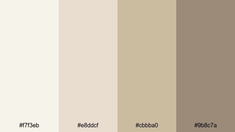
- HEX Codes: #f7f3eb, #e8ddcf, #cbbba0, #9b8c7a
- Mood: Calm, airy, and welcoming with a soft lifestyle aesthetic.
- Use for: Perfect for wellness vlogs, morning routines, and gentle product tutorials where you want a cozy yet clean look.
Morning Oat Latte feels like slow sunlight through a kitchen window. The creamy oat and beige tones (#f7f3eb, #e8ddcf) give your backgrounds a soft glow, while the subtle browns (#cbbba0, #9b8c7a) add just enough depth for text, icons, or simple line illustrations.
Use this palette for calming YouTube intros, day-in-the-life thumbnails, wellness or skincare branding, and lower-thirds that never feel harsh on the eyes. In Filmora, you can match your titles, overlays, and background cards to these HEX codes so your entire edit looks like one cohesive, gentle morning scene.
Pro Tip: Build a Soft Neutral Aesthetic Across Your Edit in Filmora
To keep this warm, creamy neutral look consistent from intro to end screen, save your key colors in Filmora and reuse them for titles, shapes, and background blocks. Apply the lightest shade as your canvas, then use the deeper browns for key text and icons so everything stays readable while still feeling soft.
When you color grade your footage, push highlights slightly toward the warmer beige tones in this palette. This makes skin tones look smooth and natural, and your b-roll, bokeh shots, and product close-ups will feel like they belong in the same calm morning world.
AI Color Palette
You can build this palette from a real-life reference like an oat latte photo or a cozy bedroom still and let Filmora match it across your edit. Filmora's AI Color Palette feature analyzes your reference image and applies a similar neutral tone to all selected clips, so your A-roll, B-roll, and cutaways feel unified.
Just choose your best frame as the reference, then let AI push the other shots toward those same creamy whites and soft browns. This saves time and keeps your neutral aesthetic consistent across YouTube videos, Instagram Reels, and TikTok edits.
 secure download

HSL, Color Wheels & Curves
To fine-tune a neutral palette like Morning Oat Latte, use Filmora's HSL and color wheels to control warmth and contrast. Slightly lower saturation in the yellows and oranges to avoid an overly yellow cast, then nudge midtones and highlights toward a soft warm tint. For more guidance, check out Filmora's color correction tips and apply them to your neutral footage.
With curves, you can add a gentle S-curve for subtle contrast while keeping shadows lifted so the image does not become too dramatic. This keeps your neutral visuals airy and clean, which works beautifully for lifestyle, productivity, and wellness content.
secure download1000+ Video Filters & 3D LUTs
Once your basic neutral balance is set, you can quickly add character with Filmora's filters and LUTs. Filmora's video filters and 3D LUTs make it easy to test soft film looks, matte tones, or subtle vintage styles without breaking your neutral base.
Apply a gentle LUT over this palette to create a signature channel look, then save it as a preset for all future videos. This gives your thumbnails, intros, and B-roll a recognizable style that still feels minimal and easy on the eyes.
secure downloadBare Canvas Glow
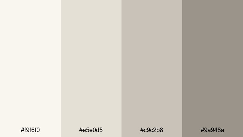
- HEX Codes: #f9f6f0, #e5e0d5, #c9c2b8, #9a948a
- Mood: Clean, understated, and editorial.
- Use for: Use in minimalist title cards, portfolio reels, and UI overlays that need a refined blank-canvas feel.
Bare Canvas Glow feels like a gallery wall washed in soft light. The off-whites and greiges give you a neutral backdrop that flatters any footage without competing for attention.
This palette is ideal for text-heavy layouts, like portfolio reels, UX case studies, or tutorial slides made inside Filmora. Use the lightest shade as the base for full-screen backgrounds and the deeper gray-beige for headlines, graphic frames, and clean dividers in your thumbnails.
Featherlight Linen
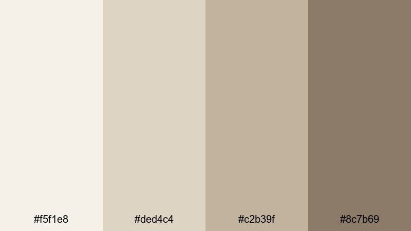
- HEX Codes: #f5f1e8, #ded4c4, #c2b39f, #8c7b69
- Mood: Relaxed, organic, and tactile like natural fabrics.
- Use for: Ideal for home decor videos, DIY tutorials, and eco-friendly brand intros with a soft tactile feel.
Featherlight Linen channels the feeling of soft textiles and natural fibers. The warm beiges and muted browns make your visuals feel grounded and handmade, perfect for decor, crafts, and slow living content.
Use the lighter tones for backgrounds in mood boards, step-by-step overlays, or Pinterest-style thumbnails. The deeper brown takes care of call-to-action buttons, logo marks, and accent lines so everything still reads clearly, even on mobile.
Muted Studio Light
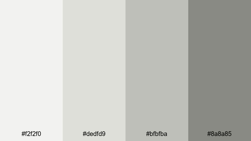
- HEX Codes: #f2f2f0, #dedfd9, #bfbfba, #8a8a85
- Mood: Balanced, quiet, and professional.
- Use for: Great for tutorial screens, explainer videos, and subtle lower-thirds where content needs to stay center stage.
Muted Studio Light feels like working in a well-lit creative studio. The soft grays and off-whites keep the frame bright and neutral, helping your footage and on-screen text stand out without harsh contrast.
This palette works especially well for software tutorials, productivity explainers, and corporate updates. Use the darker gray for main headings and UI callouts, and keep backgrounds in the lighter tones so screenshots and screen recordings stay clear and uncluttered.
Warm Cozy Neutral Color Palettes
Fireside Cocoa Cream
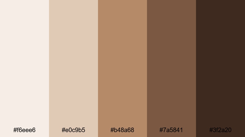
- HEX Codes: #f6eee6, #e0c9b5, #b48a68, #7a5841, #3f2a20
- Mood: Warm, intimate, and nostalgic like evenings by the fireplace.
- Use for: Use for storytelling vlogs, cozy book or cafe content, and cinematic title cards with a warm emotional pull.
Fireside Cocoa Cream combines cream, caramel, and cocoa tones to create an instantly cozy vibe. The lighter shades feel like candlelit walls, while the deeper browns mimic wood, leather, and dark roast coffee.
Use this palette for storytelling vlogs, booktube channels, or cafe aesthetics. In Filmora, apply the rich browns to title text, borders, and chapter markers, while using the creamy tones as soft gradients behind your footage or as overlays on thumbnails.
Autumn Apartment
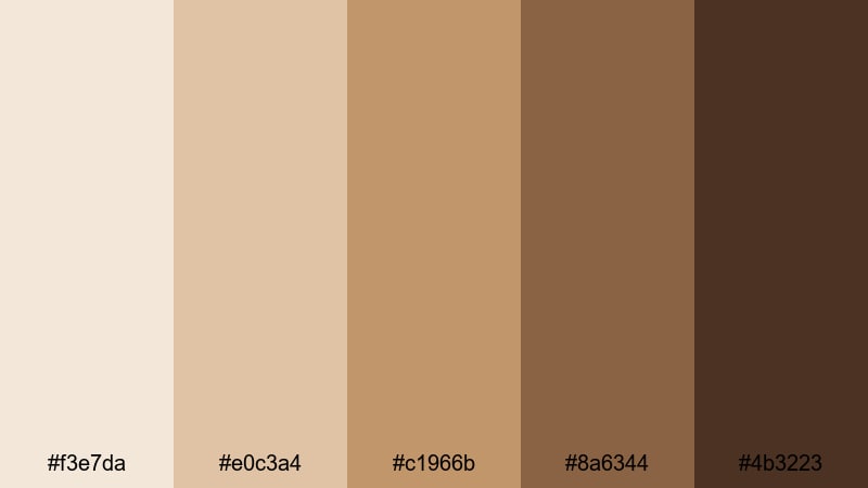
- HEX Codes: #f3e7da, #e0c3a4, #c1966b, #8a6344, #4b3223
- Mood: Earthy, snug, and lived-in with an urban fall vibe.
- Use for: Best for seasonal vlogs, room makeover videos, and lifestyle thumbnails with a warm editorial edge.
Autumn Apartment feels like soft blankets, wooden floors, and golden evening light. Toasted beiges flow into deeper browns, giving your visuals that editorial fall aesthetic seen in magazines and Instagram feeds.
Use lighter tones for room tour overlays, before-and-after text, and cozy thumbnail backgrounds. The darker browns are perfect for bold titles, subtle drop shadows, and accent frames that make your subject pop in lifestyle and interior design content.
Candlelit Stories
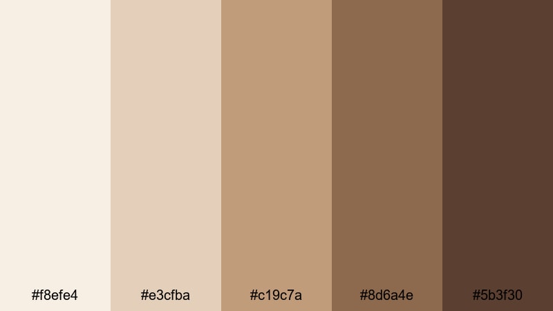
- HEX Codes: #f8efe4, #e3cfba, #c19c7a, #8d6a4e, #5b3f30
- Mood: Romantic, storytelling focused, and gently cinematic.
- Use for: Perfect for narrative shorts, travel diaries, and wedding highlight videos needing a soft glow.
Candlelit Stories brings a romantic, cinematic warmth to your visuals. The cream and caramel shades echo candlelight on skin and wood, while the richer tans and browns add drama and depth.
Use this palette for wedding highlight reels, travel diaries, or narrative shorts with emotional storytelling. In Filmora, combine these HEX codes with subtle vignette effects and gentle fades to create opening titles and lower-thirds that feel intimate and timeless.
Desert Clay Loft
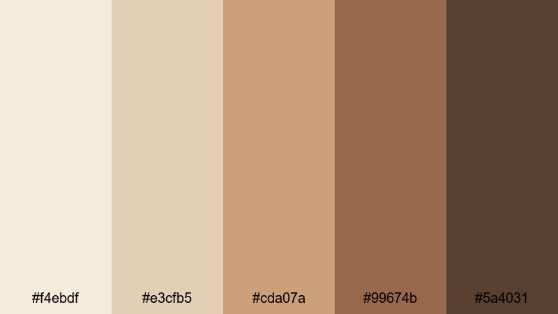
- HEX Codes: #f4ebdf, #e3cfb5, #cda07a, #99674b, #5a4031
- Mood: Sun-warmed, grounded, and stylishly rustic.
- Use for: Use for travel reels, lifestyle brand intros, and aesthetic reels with a desert-modern look.
Desert Clay Loft blends soft sand tones with clay and umber, creating a warm but stylishly modern look. It feels sun-baked yet refined, perfect for brands that want a rustic edge without looking messy.
Apply this palette to travel reels, brand mood films, and aesthetic shorts. Lighter hues work as backgrounds for captions and quotes, while deeper clay tones highlight key text, logo reveals, and end cards inside Filmora.
Cool Modern Neutral Color Palettes
Concrete Loft Mist
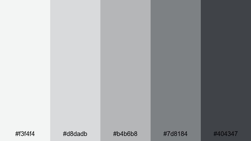
- HEX Codes: #f3f4f4, #d8dadb, #b4b6b8, #7d8184, #404347
- Mood: Urban, sleek, and subtly industrial.
- Use for: Ideal for tech explainers, productivity channels, and design portfolio reels that need a modern edge.
Concrete Loft Mist captures the look of polished concrete and steel. The range of light to deep grays gives your designs a clean, urban feel that suits tech, productivity, and design content.
Use the lighter grays as neutral backgrounds for UI mockups and software demos, and the darker graphite tones for strong headings, iconography, and progress bars. This palette helps your content feel premium and professional without distracting from the information.
Foggy City Morning
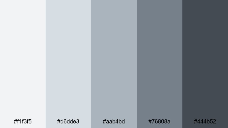
- HEX Codes: #f1f3f5, #d6dde3, #aab4bd, #76808a, #444b52
- Mood: Moody, cinematic, and quietly sophisticated.
- Use for: Use in cinematic b-roll, travel montages, and title cards where you want subtle drama without harsh contrast.
Foggy City Morning uses blue-grays and slate tones to mimic a misty skyline. It is cinematic but understated, giving your edits a calm, reflective mood.
This palette is great for city travel films, time-lapses, and reflective vlogs. In Filmora, match your lower-thirds and opening titles to the mid and dark slate colors, and keep backgrounds in the softer blue-grays for a cohesive, moody feel.
Steel & Cloud
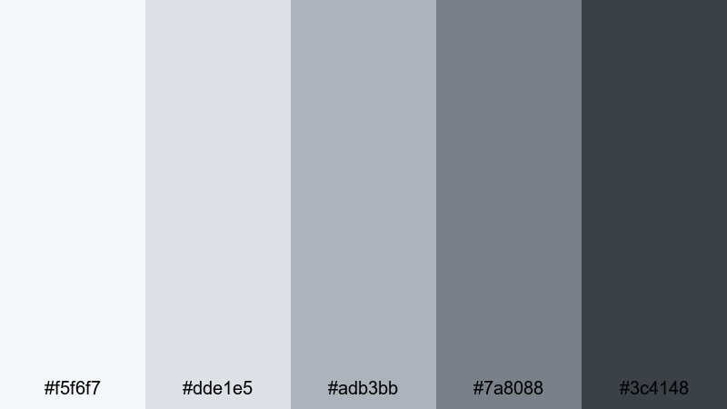
- HEX Codes: #f5f6f7, #dde1e5, #adb3bb, #7a8088, #3c4148
- Mood: Professional, reliable, and clean with a tech-forward feel.
- Use for: Great for software demos, app promos, and corporate openers that need a crisp, trustworthy tone.
Steel & Cloud combines cloudy whites with steel blues, creating a cool neutral palette that feels solid and trustworthy. It works especially well when you want clarity and legibility on all devices.
Use the lighter shades for clean dashboards, infographics, and presentation-style frames, and reserve the darkest tones for logos, calls to action, and navigation labels. This palette keeps your app promos, SaaS explainers, and corporate intros looking sharp and modern in Filmora.
Graphite Workspace
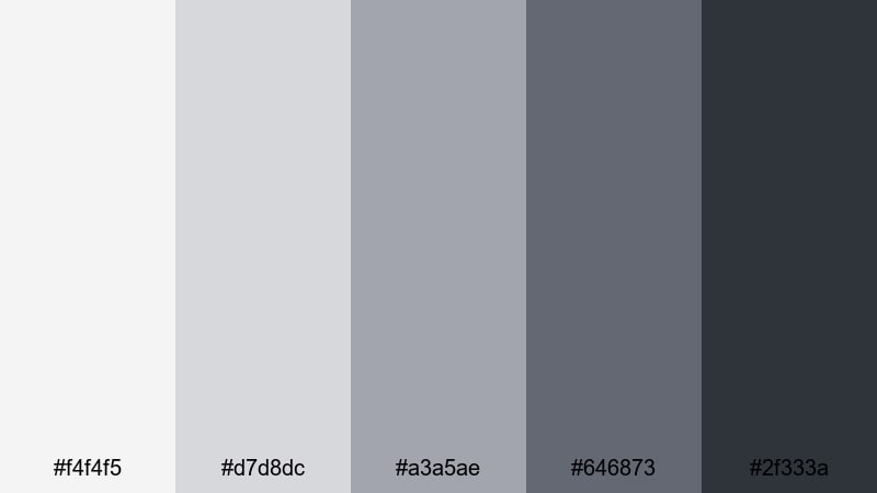
- HEX Codes: #f4f4f5, #d7d8dc, #a3a5ae, #646873, #2f333a
- Mood: Focused, minimal, and productivity driven.
- Use for: Ideal for desk setups, workflow tutorials, and productivity channels emphasizing clarity and structure.
Graphite Workspace echoes modern desk setups, with soft light grays and deep graphite tones. It gives your content a structured, minimal feel that suits productivity and workflow videos.
Use this palette for desk tour titles, task breakdown overlays, and clean chapter markers in your tutorials. The darkest shade works well for time stamps and labels, while the lighter tones keep your frames clutter-free and easy to scan.
High-Contrast Neutral Color Palettes
Ink on Ivory
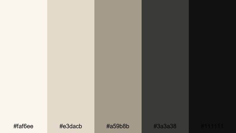
- HEX Codes: #faf6ee, #e3dacb, #a59b8b, #3a3a38, #111111
- Mood: Classic, elegant, and editorial with strong legibility.
- Use for: Use for bold titles, logo reveals, and cinematic credits where contrast and readability are crucial.
Ink on Ivory pairs soft ivory tones with deep ink blacks for a timeless, print-inspired look. It feels like luxury packaging or high-end magazine layouts.
Use the very dark tones for titles, logos, and subtitles, and the ivory shades for full-screen backgrounds, credits, and chapter cards. This palette is perfect when you want your text to be instantly readable on thumbnails, intros, and end screens.
Charcoal Gallery
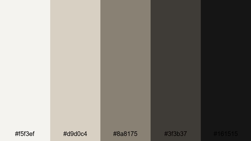
- HEX Codes: #f5f3ef, #d9d0c4, #8a8175, #3f3b37, #161515
- Mood: Artful, moody, and gallery-like.
- Use for: Perfect for art reels, photography showcases, and dramatic trailers that spotlight imagery.
Charcoal Gallery feels like walking through a curated art space. Soft gallery-wall neutrals contrast with rich charcoals, drawing attention to the visuals framed inside.
Use this palette when you want your photos, artwork, or cinematic shots to be the hero. Keep backgrounds and title cards in the lighter tones, and use the deep charcoals for frame borders, captions, and subtle overlays that center your imagery.
Monochrome Edge
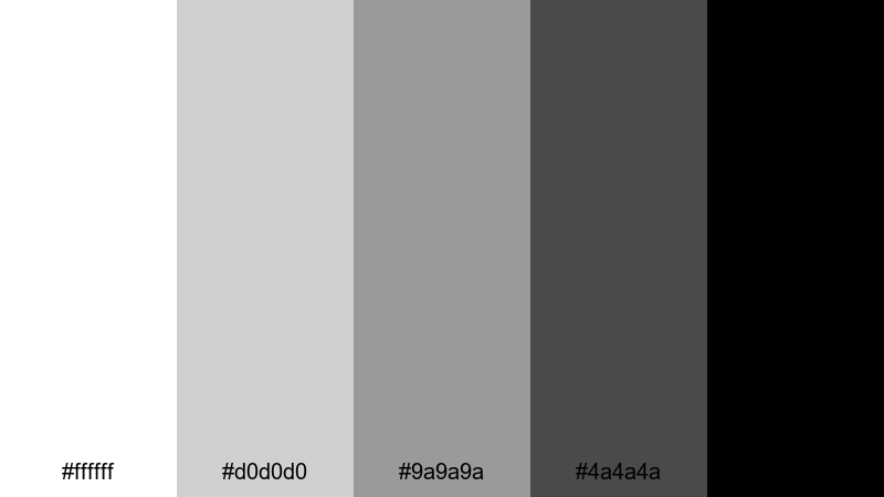
- HEX Codes: #ffffff, #d0d0d0, #9a9a9a, #4a4a4a, #000000
- Mood: Bold, minimal, and highly graphic.
- Use for: Best for high-impact thumbnails, kinetic typography, and motion graphics needing strong visual punch.
Monochrome Edge is a pure black-and-white palette with strong mid grays, perfect for graphic, design-driven visuals. It is simple but powerful, giving your content a sharp and edgy feel.
Use it for kinetic typography sequences, bold channel branding, or high-contrast thumbnails. In Filmora, combine this palette with strong shapes, masks, and motion graphics to create attention-grabbing intros and transitions that stand out in any feed.
Tips for Creating Neutral Color Palettes
Neutral palettes may look simple, but small choices in warmth, contrast, and saturation can completely change how your footage feels. Here are practical ways to build and use neutral colors effectively in video and design.
- Start with purpose: decide if you want your neutral palette to feel warm and cozy, cool and modern, or bold and graphic before picking HEX codes.
- Control contrast for readability: use the lightest neutrals for backgrounds and the darkest shades for text and icons, especially on small mobile screens.
- Pick one accent depth: choose one mid or dark neutral as your main accent color for headlines, buttons, and key graphics to keep branding consistent.
- Match to your footage: sample colors from your environment (walls, furniture, sky, clothing) and build neutrals that support, not fight, those tones.
- Balance warm and cool: warm neutrals flatter skin and lifestyle content, while cooler neutrals work better for tech, productivity, and professional branding.
- Use saturation sparingly: keep neutrals low-saturation so they do not overpower skin tones or colored props in your shots.
- Test on thumbnails: export a frame with your palette applied and check how it reads at small sizes in YouTube or TikTok grids.
- Save presets in Filmora: once you find a neutral grade and text style you like, save them as presets so every new video matches your brand look.
Neutral color palettes are one of the easiest ways to give your channel or brand a clear identity without locking yourself into loud colors. From soft minimalist beiges to high-contrast monochrome, the right neutral mix can make your intros, thumbnails, overlays, and footage feel intentional and professional.
Use the HEX codes in this guide as starting points, then refine them inside Filmora with AI Color Palette, HSL, color wheels, and LUTs. Test different palettes on your existing footage, see which mood fits your voice, and then stick with it to build a recognizable visual style.
As you experiment, think about how each neutral palette supports your story: cozy for lifestyle, cool for tech, bold for cinematic edits. With a few saved presets and consistent choices, your videos will feel polished from the first frame to the end screen.
secure downloadNext: Coastal Color Palette
