
 100% Security Verified | No Subscription Required | No Malware


 ChatGPT
 Perplexity
 Gemini
 Claude
 Grok
Grok
Ocean Wave is that perfect blue-green sweet spot between teal and seafoam. It feels fresh, clean, and calming, like standing at the edge of quiet surf. In video and design, this color family signals trust, creativity, and a modern, coastal lifestyle. It works beautifully for wellness content, travel edits, cinematic grading, and brands that want to feel relaxed but still sharp and professional.
Below you will find 15 carefully built Ocean Wave color palettes with HEX codes you can plug straight into thumbnails, intros, lower thirds, end screens, and branding kits. Whether you color grade in Filmora or just match your text and graphics to your footage, these Ocean Wave color combinations give you ready-made, on-trend schemes for your next edit.
In this article
Calm Ocean Wave Color Palettes
Morning Tide Glow
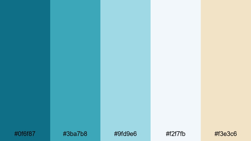
- HEX Codes: #0f6f87, #3ba7b8, #9fd9e6, #f2f7fb, #f3e3c6
- Mood: Peaceful, refreshing, and optimistic like a quiet beach at sunrise.
- Use for: Perfect for wellness vlogs, morning routines, and light, uplifting channel branding.
Morning Tide Glow wraps your visuals in soft teal water, pale foam, and a hint of sunlit sand. The deeper Ocean Wave tones (#0f6f87, #3ba7b8) keep everything fresh and modern, while the airy whites and creams (#f2f7fb, #f3e3c6) add space and light. It feels like opening your window to a calm sea first thing in the morning.
Use this palette to color grade gentle morning routines, healthy lifestyle videos, or aesthetic study sessions. Pair the darker teals with clean white text for thumbnails, and use the warmer beige for buttons, subscribe badges, and subtle intro backgrounds. It is a great Ocean Wave hex palette when you want your brand to feel calm but still bright and clickable.
Pro Tip: Keep Your Calm Ocean Wave Look Consistent in Filmora
Once you fall in love with Morning Tide Glow, keep it consistent across your whole edit in Filmora. Use the deeper teal for your logo reveal, match lower third bars to the mid-tone aqua, and keep backgrounds close to the soft white and sand hues so nothing feels out of place between scenes.
Save your title styles and color settings as presets in Filmora so your intros, B-roll captions, and end screens always share the same Ocean Wave color story. This way, viewers will instantly recognize your channel style, even when you experiment with new content formats.
AI Color Palette
If you have a reference image of a calm seaside morning or a color card using this palette, you can use Filmora's AI Color Palette feature to push that exact Ocean Wave feeling across every clip. Filmora will analyze the colors in your reference and automatically match your footage, saving you from manual tweaking on each shot.
This is especially helpful for vloggers and brands that shoot on multiple cameras or in changing light. Import your reference frame, apply the AI Color Palette to the rest of your footage, and your teal-blues, whites, and sandy highlights will stay cohesive from opening shot to final outro.
 secure download

HSL, Color Wheels & Curves
Even within a calm Ocean Wave color scheme, tiny shifts in hue and brightness can change the mood. Use Filmora's HSL sliders to nudge your teals slightly greener or bluer, and use color wheels to cool down shadows while keeping skin tones warm. Curves let you add soft contrast so your footage stays gentle but not flat.
For a deeper dive, you can follow Filmora's color correction tips in Filmora while you experiment with these palettes. Combine subtle HSL tweaks with curves to get that polished, cinematic Ocean Wave finish that still feels natural to your original footage.
secure download1000+ Video Filters & 3D LUTs
When you want to stylize an Ocean Wave palette fast, Filmora's video filters and 3D LUTs make it easy to push your look toward dreamy pastels, glossy lifestyle ads, or rich cinematic teal-and-orange. Start with a filter that enhances blues and greens, then dial back intensity so your whites and beiges stay soft.
You can also stack subtle filters on top of your base grade to add grain, glow, or vignette without losing the clarity of Morning Tide Glow. Save these combinations as custom presets so future vlogs and reels instantly match your established Ocean Wave brand identity.
secure downloadSeagrass Sanctuary
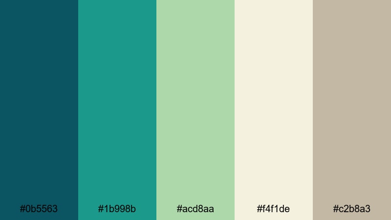
- HEX Codes: #0b5563, #1b998b, #acd8aa, #f4f1de, #c2b8a3
- Mood: Grounded, restorative, and close to nature.
- Use for: Use this palette for slow-living vlogs, eco brands, and minimal product shots that need a natural Ocean Wave touch.
Seagrass Sanctuary blends deep teal and natural greens with soft off-whites and sandy neutrals. It feels like walking through dune grass after the tide has gone out, calm and slightly earthy. The Ocean Wave blues lean more organic here, giving your visuals a grounded, sustainable vibe.
This palette works beautifully for eco-friendly brands, plant-filled interiors, and slow-living content. Use the darker teal for text on thumbnails, the pale green and cream for backgrounds, and the warm beige for product frames or lower thirds. In Filmora, you can grade your footage slightly toward green to match the seagrass feel while keeping skin tones natural.
Harbor Mist Drift
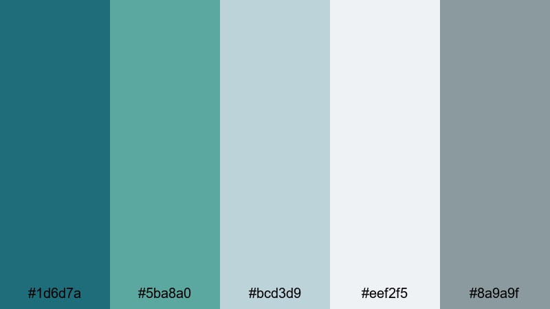
- HEX Codes: #1d6d7a, #5ba8a0, #bcd3d9, #eef2f5, #8a9a9f
- Mood: Softly nostalgic, misty, and contemplative.
- Use for: Great for cinematic travel recaps, voiceover essays, and moody channel art where you want an Ocean Wave look without harsh contrast.
Harbor Mist Drift mixes muted teal water with harbor grays and foggy whites. It has a gentle, overcast quality that suits reflective storytelling and soft cinematic B-roll. The Ocean Wave color is present but quieter, wrapped in cool, misty neutrals.
Use this palette when you want your thumbnails and titles to feel cinematic but not flashy. Teal accents on gray backgrounds work well for essay videos, travel reflections, and calm city-by-the-sea scenes. A light vignette and reduced saturation in Filmora will help match your footage to this misty shoreline mood.
Coastal Reading Nook
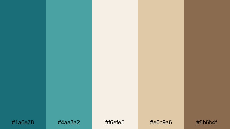
- HEX Codes: #1a6e78, #4aa3a2, #f6efe5, #e0c9a6, #8b6b4f
- Mood: Cozy, thoughtful, and slightly nostalgic with a seaside twist.
- Use for: Ideal for study-with-me videos, podcasts, and branding where you mix Ocean Wave accents with warm, homey neutrals.
Coastal Reading Nook takes Ocean Wave teals and pairs them with warm beige and wood-brown accents. It feels like a sunlit corner with a view of the sea and a stack of books. The teal provides clarity and focus, while the browns keep everything cozy and approachable.
In thumbnails, use teal for titles and warm beige as a background to make your text pop without feeling harsh. The brown shade is perfect for podcast cover art, chapter markers, and subtle icons. This is a strong palette for creators who want an aesthetic color palette for vlogs that balances productivity with comfort.
Vibrant Ocean Wave Color Palettes
Tropical Breaker Burst
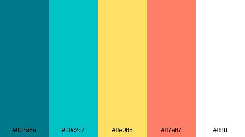
- HEX Codes: #007a8a, #00c2c7, #ffe066, #ff7e67, #ffffff
- Mood: Energetic, playful, and sunny like a tropical surf day.
- Use for: Best for eye-catching thumbnails, travel vlogs, and upbeat brand intros that need Ocean Wave energy to pop in feeds.
Tropical Breaker Burst slams bright teal and aqua into citrus yellow and coral, with crisp white to keep everything clean. It is pure beach holiday energy, perfect when you want your video to stand out in a crowded recommendations feed.
Use the intense aqua for borders or outlines, the yellow for badges and arrows, and the coral for subscribe buttons or key callouts. In Filmora, you can increase saturation slightly and use this palette for graphic overlays, kinetic text, and animated transitions to create a fun, clickable Ocean Wave thumbnail style.
Festival Surf Lights
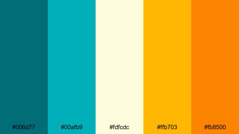
- HEX Codes: #006d77, #00afb9, #fdfcdc, #ffb703, #fb8500
- Mood: Festive, bright, and dynamic with a warm sunset edge.
- Use for: Great for music festival edits, travel montages, and brand content that needs a lively Ocean Wave backdrop with warm highlights.
Festival Surf Lights combines deep teal with bright aqua and glowing yellows and oranges. Imagine beach concerts at golden hour, where the sea is still vivid but the sky burns warm. The Ocean Wave blues anchor the palette while the warm colors inject excitement.
Use the teal for main backgrounds, then layer in warm yellows and oranges for animated accents, titles, and lower thirds. This is a strong choice for music-related content, high-energy travel edits, or lifestyle brands that want both coastal cool and festival warmth in one aesthetic color palette.
Neon Reef Energy
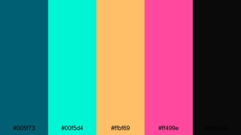
- HEX Codes: #005f73, #00f5d4, #ffbf69, #ff499e, #0a0a0a
- Mood: Bold, futuristic, and nightlife-inspired like neon over deep water.
- Use for: Use this for gaming overlays, techno edits, and motion graphics where you want Ocean Wave depth with neon accents.
Neon Reef Energy sets deep teal against neon aqua, hot coral, and magenta, all grounded by near-black. It feels like a nightclub built over a glowing coral reef. The contrast is intense, but the Ocean Wave base keeps it coherent.
Apply this palette to gaming overlays, beat-synced motion graphics, or futuristic channel branding. Make the dark teal or black your base, then use the neon aqua and magenta sparingly for HUD elements, progress bars, or animated titles. In Filmora, add glow or light-leak effects to push the neon feeling even further.
Sunlit Pier Carnival
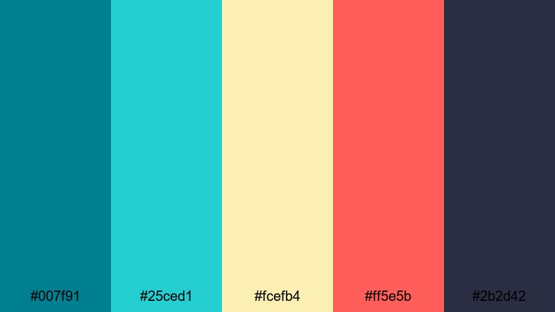
- HEX Codes: #007f91, #25ced1, #fcefb4, #ff5e5b, #2b2d42
- Mood: Cheerful, adventurous, and slightly retro like a boardwalk fair.
- Use for: Perfect for family travel vlogs, lifestyle channels, and summery brand campaigns needing a joyful Ocean Wave look.
Sunlit Pier Carnival leans into bright teal and turquoise alongside soft cream, coral red, and a grounding navy. It feels like cotton candy, rides, and ocean breeze all in one frame. The palette is vibrant but still cohesive enough for long-term branding.
Use the lighter teal for thumbnail backgrounds, cream for text boxes, and coral for calls to action. The dark navy is ideal for smaller text, icons, or outlines that need to stay readable. This is a great Ocean Wave-themed video palette for families, daily vlogs, and retro-summer edits.
Muted Ocean Wave Color Palettes
Weathered Dockwood

- HEX Codes: #215866, #50808e, #b2c9c7, #e0d2c3, #8b6a5d
- Mood: Subtle, mature, and weathered like an old seaside town.
- Use for: Ideal for documentaries, brand stories, and product films that need an understated Ocean Wave tone with a vintage edge.
Weathered Dockwood tones down teal into desaturated, slightly grayish blues and pairs them with faded neutrals and worn wood browns. It recalls old harbors, wooden piers, and soft sea spray. The overall effect is calm, cinematic, and a little nostalgic.
Use this Ocean Wave color scheme when your story is serious, historical, or artisanal. In thumbnails and titles, keep the saturation low and rely on contrast between teal and beige rather than bright color. For product films or brand stories, grade your footage toward these hues for a timeless, handcrafted feel.
Foggy Dune Horizon
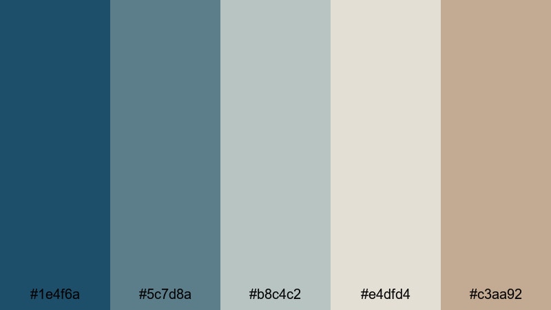
- HEX Codes: #1e4f6a, #5c7d8a, #b8c4c2, #e4dfd4, #c3aa92
- Mood: Quiet, introspective, and misty with a hint of warmth.
- Use for: Use this palette for B-roll montages, essay films, and ambient study streams that need a soft Ocean Wave mood without strong saturation.
Foggy Dune Horizon is built on cool teals that fade gently into gray-blues and warm dune beiges. It feels like an early morning walk along a fogbound shore, with just a touch of sunlight starting to show. Nothing here is too saturated, which keeps attention on your story or narration.
For video use, this palette suits essay-style content, meditative B-roll, and ambient streams. Use the deeper teal for subtle accents and rely on the gray and beige tones for backgrounds, overlays, and titles. In Filmora, lower saturation slightly and lift the blacks to reproduce this soft, hazy Ocean Wave atmosphere.
Pebbled Shoreline
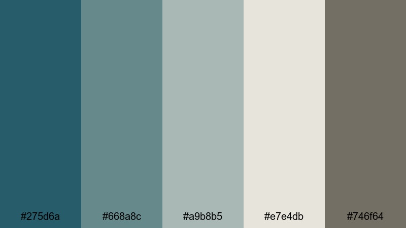
- HEX Codes: #275d6a, #668a8c, #a9b8b5, #e7e4db, #746f64
- Mood: Subdued, steady, and minimal like small waves over stones.
- Use for: Great for minimalist channels, UI overlays, and brand kits that want a quiet Ocean Wave presence without loud color blocks.
Pebbled Shoreline centers on muted teal and stone grays, with an off-white and a soft, pebble-like brown. It is very restrained, ideal for minimal design and content where you want a coastal influence without obvious beach imagery.
Use this palette for clean UI overlays, channel branding, and creator websites. The teal can highlight important elements like buttons or links, while the grays and off-white keep backgrounds simple and professional. It is an excellent ocean-inspired base for tech, productivity, or design-focused channels that favor subtlety.
Cinematic Ocean Wave Color Palettes
Midnight Riptide Cinema
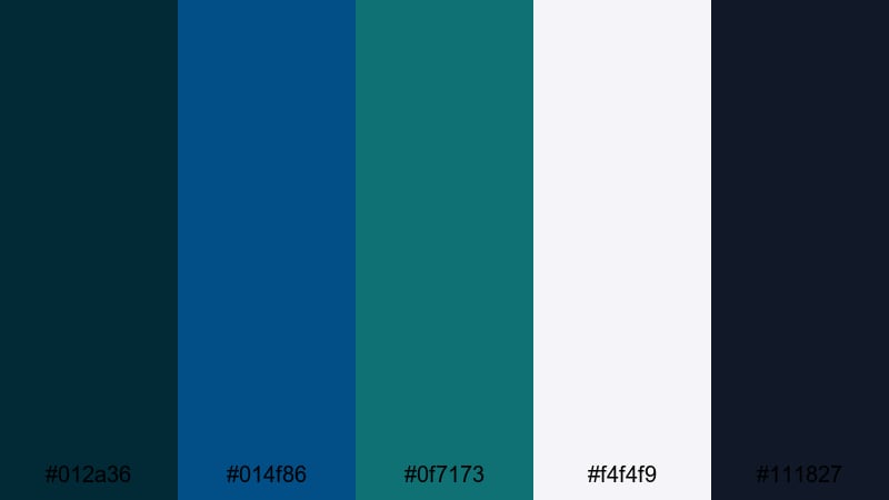
- HEX Codes: #012a36, #014f86, #0f7173, #f4f4f9, #111827
- Mood: Dramatic, moody, and suspenseful like waves under moonlight.
- Use for: Perfect for trailers, short films, and narrative edits that rely on deep Ocean Wave tones with strong contrast.
Midnight Riptide Cinema dives into inky blues and teals, balanced by crisp off-white highlights and charcoal shadows. It captures the feeling of standing by a stormy sea at night, watching waves catch tiny bits of light. The contrast is strong, which makes it ideal for cinematic and thriller-style projects.
Use the darkest tones as your base grade and keep bright elements limited to titles, lens flares, or key props. For trailers and intros, large blocks of deep blue-green with sharp white typography can deliver a polished, cinematic Ocean Wave grading palette that feels premium and dramatic.
Documentary Deep Current
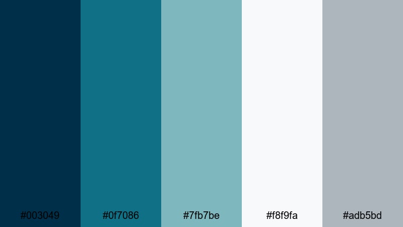
- HEX Codes: #003049, #0f7086, #7fb7be, #f8f9fa, #adb5bd
- Mood: Serious, thoughtful, and documentary-ready.
- Use for: Use this palette in educational content, interviews, and brand documentaries that need polished Ocean Wave professionalism.
Documentary Deep Current pairs rich navy and teal with soft blue-grays and clean off-white. It feels trustworthy and professional, like an educational series or a well-produced brand documentary. The Ocean Wave influence is clear but controlled.
For interviews and explainers, use the navy for backgrounds or title cards and the lighter blues for lower thirds and infographics. The off-white keeps text highly legible. This palette is perfect when you want your content to look authoritative but still fresh and contemporary.
Drone Over Coral Keys
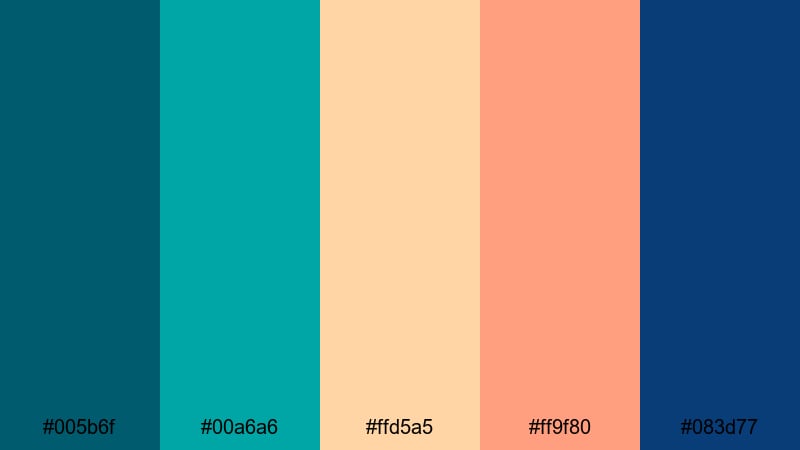
- HEX Codes: #005b6f, #00a6a6, #ffd5a5, #ff9f80, #083d77
- Mood: Adventurous, cinematic, and sun-drenched from an aerial view.
- Use for: Ideal for drone footage, travel reels, and cinematic B-roll where Ocean Wave blues meet warm tropical highlights.
Drone Over Coral Keys combines aqua and teal water tones with peach and coral sand, anchored by a deep, cinematic blue. It looks like golden hour drone shots over clear tropical reefs. The mix of cool Ocean Wave blues and warm highlights gives your footage a vivid, travel-cinematic style.
Use the aqua and teal for grading your water shots, and match your titles and overlay graphics to the warm peach and coral for contrast. In Filmora, a gentle S-curve and slight boost to saturation will make this palette sing, especially for reels and shorts that highlight beaches, islands, or coastal cities.
Moody Storm Swell
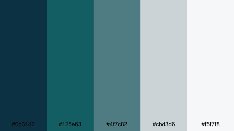
- HEX Codes: #0b3142, #125e63, #4f7c82, #cbd3d6, #f5f7f8
- Mood: Tense, atmospheric, and cinematic like a storm building offshore.
- Use for: Great for dramatic story arcs, cinematic timelapses, and thriller-style edits that need a darker Ocean Wave grade.
Moody Storm Swell focuses on deep teal-blues and muted foam grays, moving into very soft whites. It feels like a storm rolling in over the ocean, full of tension but still visually clean. The palette is cinematic without being chaotic.
Apply this to time-lapse skies, dramatic B-roll, and narrative sequences where you want the environment to reflect rising stakes. Use the lightest tones to highlight key text or important parts of the frame, and keep the overall exposure slightly low. This creates a suspenseful Ocean Wave aesthetic that still looks polished and watchable.
Tips for Creating Ocean Wave Color Palettes
Ocean Wave color palettes are powerful tools for shaping mood, storytelling, and brand identity. A few practical guidelines will help you combine teal-blues, neutrals, and accents so your video and design work stay readable, consistent, and on-brand.
- Start with one main Ocean Wave shade as your hero color, then build supporting tones (lighter and darker variations, plus neutrals) around it.
- Keep strong contrast between text and background; if you use dark teal backgrounds, choose white or pale sand for titles to maintain readability on small screens.
- Limit yourself to one or two bright accent colors (such as coral or yellow) so your Ocean Wave base remains the star of the palette.
- Match your grade to your graphics; if you cool your footage toward teal in Filmora, adjust your overlays and text to the same blue-green family for a unified look.
- Use warm neutrals (beige, sand, soft brown) to balance the coolness of Ocean Wave, especially for lifestyle, beauty, or food content.
- For cinematic edits, darken shadows into deep blue-green and keep highlights slightly desaturated to avoid a cartoony feel.
- Test your palette in both light and dark modes; thumbnails, intros, and end cards should stay clear whether YouTube or apps use light or dark interfaces.
- Create and save color presets in Filmora for titles, lower thirds, and overlays so every new video automatically matches your chosen Ocean Wave palette.
Ocean Wave palettes can make your channel feel calm, adventurous, or cinematic, depending on how you combine teal-blues with neutrals and accents. Whether you go for soft Morning Tide vibes or dramatic Midnight Riptide contrasts, a consistent palette helps viewers immediately recognize your style.
Try dropping these HEX codes straight into Filmora for text, shapes, and overlays, then push your footage toward the same Ocean Wave range with AI Color Palette, HSL, and LUTs. A few saved presets are often all you need to turn a nice color combo into a real visual identity.
As you experiment, pay attention to how different palettes change the feeling of the same clip. The more you test these Ocean Wave color combinations in Filmora, the faster you will find the look that truly fits your channel, brand, or next big project.
secure downloadNext: Picnic Color Palette
