
 100% Security Verified | No Subscription Required | No Malware

Ochre sits between yellow, brown, and gold on the spectrum, which makes it feel grounded, sunlit, and timeless at the same time. It carries the psychology of warmth, comfort, and reliability, so it is often used to suggest authenticity, nostalgia, and earthy luxury in visual storytelling.
For video creators, designers, and YouTubers, ochre is a powerful accent for thumbnails, channel intros, lower thirds, and branding systems. Below are 15 ready-to-use ochre color palettes with HEX codes, tailored for Filmora users and other creators who want cinematic, consistent color across thumbnails, titles, overlays, and full edits.
In this article
Warm Rustic Ochre Color Palettes
Sunlit Clay Courtyard
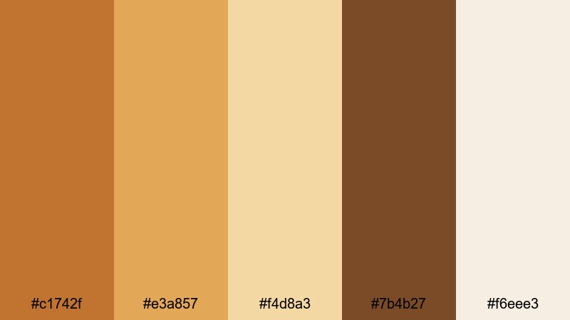
- HEX Codes: #c1742f, #e3a857, #f4d8a3, #7b4b27, #f6eee3
- Mood: Warm, grounded, and nostalgic, like late-afternoon sun on old brick walls.
- Use for: Use this palette for lifestyle vlogs, travel intros, and nostalgic story edits that need a cozy, sun-kissed feel.
Sunlit Clay Courtyard feels like walking through old stone streets at golden hour. The mix of earthy ochre, clay browns, and soft cream gives your visuals a sun-washed, approachable character that works beautifully for personal brands and relaxed storytelling.
Apply this palette to your YouTube thumbnails, intro titles, and lower thirds to create a consistent warm look from the first frame. The deeper clay (#7b4b27) is ideal for text or icons, while the pale cream (#f6eee3) becomes a gentle background for overlays, chapter markers, and channel branding elements.
Pro Tip: Build a Warm Ochre Aesthetic in Filmora
To keep this sunlit ochre aesthetic consistent, pick one of the lighter tones as your default background for titles and one of the mid-tones (#c1742f or #e3a857) as your accent for icons, shapes, and callouts. In Filmora, you can save these colors inside the color picker so every intro, B-roll card, and end screen feels like it belongs to the same courtyard-inspired world.
Use the same accent ochre for your subscribe buttons, chapter labels, and transitions. This repetition makes your channel feel cohesive without overwhelming your footage with heavy color grading.
AI Color Palette
If you have a reference still of a warm courtyard, a vintage photo, or a graphic using this palette, you can turn it into a unified video look using Filmora's AI tools. Filmora's AI Color Palette feature analyzes the reference colors and applies a similar palette across your entire edit.
Import your clip, choose the reference image that matches the Sunlit Clay Courtyard tones, and let AI rebuild that glow over all your scenes. It is a fast way to match A-roll and B-roll, keep thumbnails in sync with the video grade, and ensure your overall channel aesthetic stays consistently ochre and cozy.
 secure download

HSL, Color Wheels & Curves
To refine your ochre tones, head to Filmora's color correction controls. With HSL, you can target yellows and oranges, nudging the hue slightly toward brown for a rustic feel or toward golden yellow for a brighter, lifestyle vlog look. Color wheels then help you balance warm midtones with cooler shadows, so skin tones stay flattering while backgrounds feel cinematic.
If the highlights look too harsh, gently pull down the curve on the brightest area and lift the shadows for a softer, film-like roll-off. For more structured guidance on grading, you can follow dedicated color correction tips in Filmora and then adapt the settings to match your favorite ochre palette.
secure download1000+ Video Filters & 3D LUTs
If you want to stylize your ochre look even faster, explore Filmora's filter and LUT library. Many presets are built around warm, cinematic tones that complement ochre perfectly, adding bloom, subtle grain, or faded vintage contrast on top of your chosen palette.
Filmora's video filters and 3D LUTs make it easy to jump from a flat image to a guided color style in a single click. Start with a LUT that fits your story mood, then fine-tune specific ochre hues to match the exact HEX codes from the Sunlit Clay Courtyard palette.
secure downloadHarvest Fields at Dusk
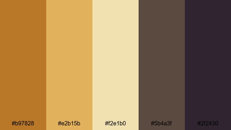
- HEX Codes: #b97828, #e2b15b, #f2e1b0, #5b4a3f, #2f2430
- Mood: Peaceful and cinematic, evoking golden fields under a darkening sky.
- Use for: Perfect for documentary titles, nature B-roll overlays, and reflective montage edits.
Harvest Fields at Dusk combines sunlit ochre and wheat tones with deep dusk shadows. It feels calm and cinematic, ideal for reflective travel stories, countryside documentaries, or slow narrative montages.
Use the lighter tones (#e2b15b and #f2e1b0) for text boxes and lower thirds, while the deeper browns and plum-black (#2f2430) frame logos, end screens, and title cards. This contrast reads clearly on mobile thumbnails and gives your channel a story-driven, documentary feel.
Terracotta Market Glow
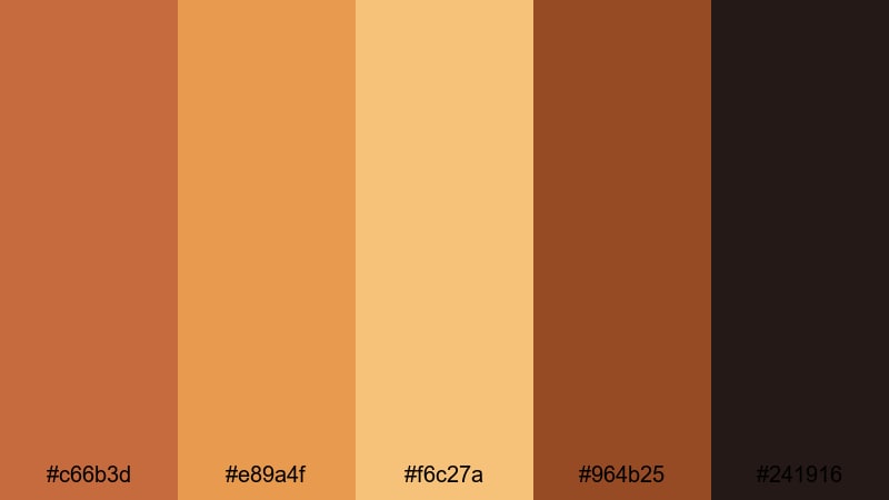
- HEX Codes: #c66b3d, #e89a4f, #f6c27a, #964b25, #241916
- Mood: Lively, artisanal, and sensory, like a bustling open-air market at sunset.
- Use for: Use this palette for food videos, travel reels, and handcrafted brand intros that need rich, appetizing warmth.
Terracotta Market Glow is rich with spice, clay, and roasted tones, perfect for food channels and maker brands. The glowing oranges and ochres feel appetizing, while the deep espresso shade (#241916) helps your titles and graphic elements stand out.
Apply the brighter color (#f6c27a) to callout graphics over close-ups of dishes or products, and use the darker tones in frames, borders, and logo lockups. This palette makes thumbnails for recipes, coffee reviews, and craft markets feel warm, textured, and inviting.
Amber Hearth Stories
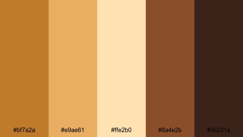
- HEX Codes: #bf7a2a, #e9ae61, #ffe2b0, #8a4e2b, #3c231a
- Mood: Intimate and comforting, like stories shared around a warm fireplace.
- Use for: Great for podcast cover art, storytelling intros, and cozy home or family content.
Amber Hearth Stories wraps your visuals in candlelight warmth. The caramel ochres and soft creams echo firelight on wood, ideal for podcasts, family vlogs, advice channels, or any content centered on connection and conversation.
Use the rich amber (#bf7a2a) for headline text on thumbnails and intro cards, while the dark wood tone (#3c231a) can frame profile photos, channel names, and timestamps. This palette works especially well when paired with gentle motion graphics in Filmora, such as slow zooms and soft wipes.
Modern Minimal Ochre Color Palettes
Urban Ochre Lines
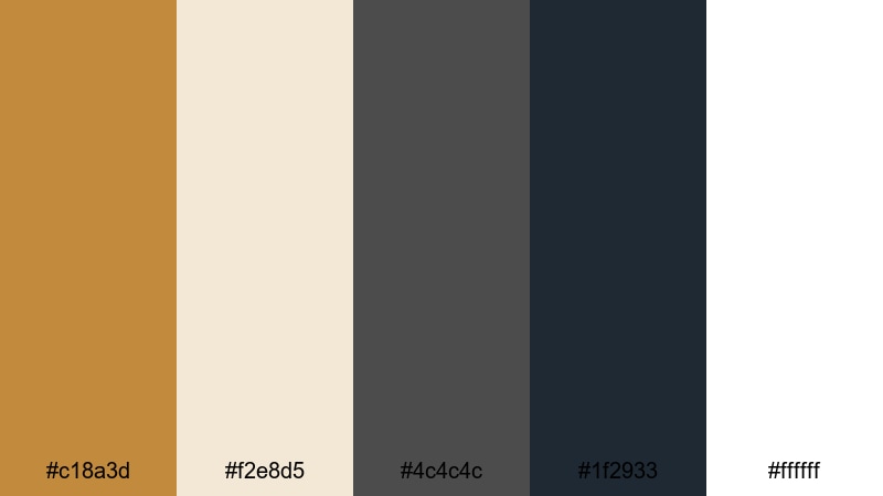
- HEX Codes: #c18a3d, #f2e8d5, #4c4c4c, #1f2933, #ffffff
- Mood: Clean, confident, and urban, balancing warm accent tones with sharp neutrals.
- Use for: Ideal for tech explainers, channel branding, and minimalist title cards with a warm highlight color.
Urban Ochre Lines blends a single warm accent with urban neutrals for a sleek, minimal look. The ochre (#c18a3d) pops against crisp white and charcoal, making it great for tech, productivity, and design-focused channels that want personality without clutter.
Use the ochre as a highlight for icons, bullet markers, and progress bars, while keeping backgrounds mostly white or soft beige (#f2e8d5). This ensures legible titles, clean overlays, and professional-looking UI-style graphics in Filmora.
Muted Studio Grid
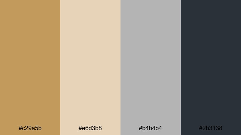
- HEX Codes: #c29a5b, #e6d3b8, #b4b4b4, #2b3138
- Mood: Subtle and thoughtful, like a quiet design studio filled with soft daylight.
- Use for: Use this palette for educational videos, productivity channels, and understated logo animations.
Muted Studio Grid softens ochre into a dusty, intellectual tone. Paired with beige, misty gray, and blue-gray, it creates visuals that feel calm, reflective, and easy on the eyes, which is ideal for tutorials, online courses, and long-form explainers.
Keep your backgrounds in the lighter tones (#e6d3b8 and #b4b4b4) and let the deep blue-gray (#2b3138) carry most of your text. Use the muted ochre (#c29a5b) for subtle accents on diagrams, timelines, and section headers to guide attention without visual fatigue.
Concrete and Saffron
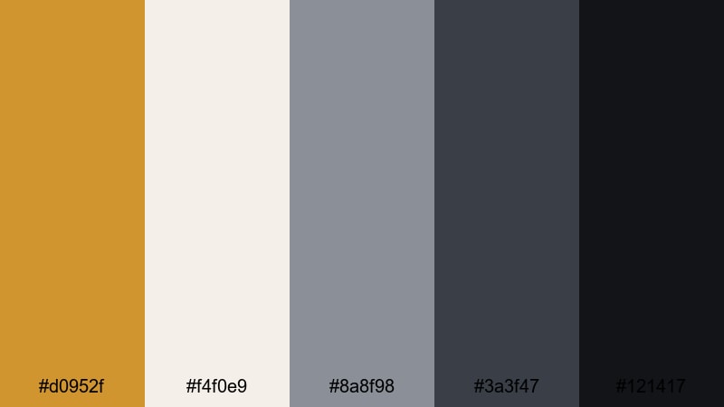
- HEX Codes: #d0952f, #f4f0e9, #8a8f98, #3a3f47, #121417
- Mood: Edgy yet polished, contrasting industrial cool with a single vivid ochre accent.
- Use for: Best for product promos, app previews, and motion graphics that need a sharp, modern pop of color.
Concrete and Saffron sets a vivid saffron accent against layered grays and off-white, like street posters on a city wall. The combination feels modern, confident, and slightly edgy, perfect for software launches, app walkthroughs, and portfolio reels.
Use the saffron (#d0952f) sparingly for CTA buttons, swipe arrows, and accent typography. The darkest gray (#121417) is ideal for cinematic backgrounds in title cards, while the light neutral (#f4f0e9) keeps overlays and info panels clear on smaller screens.
Clean Interface Amber
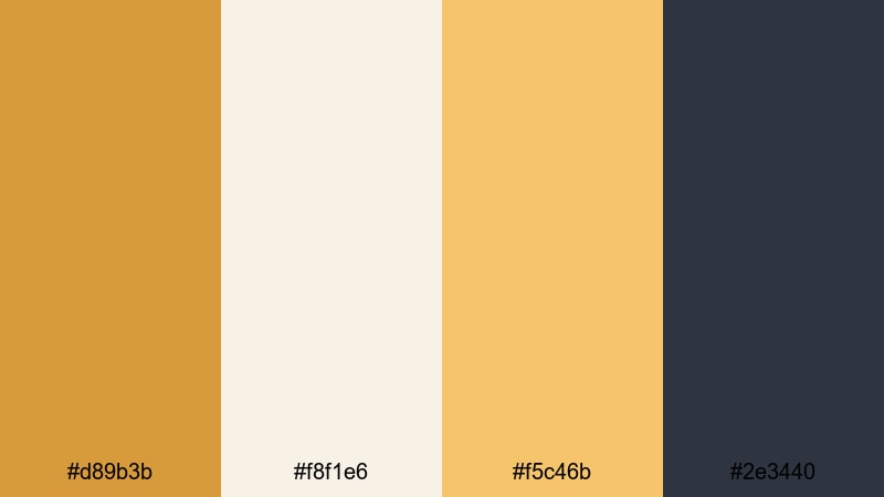
- HEX Codes: #d89b3b, #f8f1e6, #f5c46b, #2e3440
- Mood: Fresh and optimistic with a product-design edge.
- Use for: Great for UI mockups, SaaS explainer videos, and polished lower thirds or callout graphics.
Clean Interface Amber offers friendly amber highlights on creamy backgrounds anchored by a deep slate. It feels like a well-designed app interface, translating nicely to explainer videos, onboarding flows, and feature highlight reels.
Use the lighter amber (#f5c46b) for icons and data points, and let the slate (#2e3440) handle essential text and outlines. This palette keeps your motion graphics in Filmora bright and welcoming while still looking highly professional.
Soft Natural Ochre Color Palettes
Desert Wheat Breeze
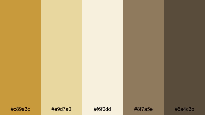
- HEX Codes: #c89a3c, #e9d7a0, #f6f0dd, #8f7a5e, #5a4c3b
- Mood: Airy and contemplative, like standing in a quiet wheat field under a pale sky.
- Use for: Use this palette for wellness content, slow-travel vlogs, and calming title sequences.
Desert Wheat Breeze is soft, pale, and spacious. Gentle ochre and sandy creams dominate, with taupe shadows grounding your visuals. It is a natural fit for mindfulness content, journaling vlogs, and gentle day-in-the-life videos.
Keep on-screen text mostly in the darker taupes (#8f7a5e and #5a4c3b) over the light creams for readability. The main ochre (#c89a3c) can highlight key phrases in your titles, mute transitions, and subtle icons like playheads or checkmarks.
Coastal Sand Path
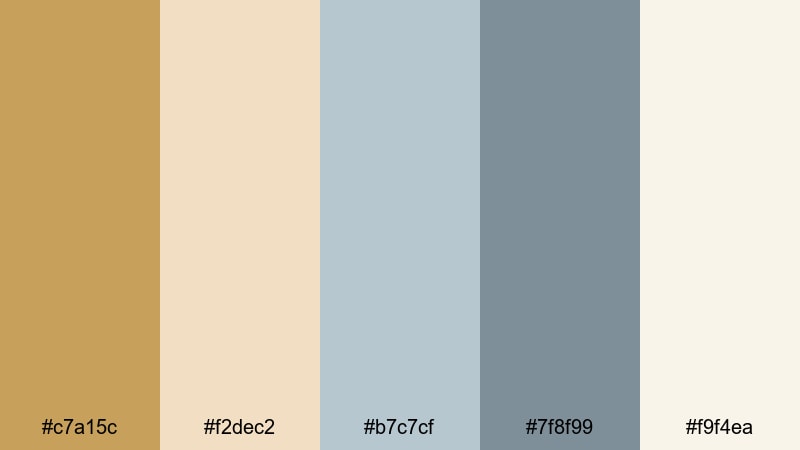
- HEX Codes: #c7a15c, #f2dec2, #b7c7cf, #7f8f99, #f9f4ea
- Mood: Relaxed and breezy, mixing sandy warmth with muted coastal blues.
- Use for: Ideal for travel channels, beach vlogs, and lifestyle reels with a relaxed, airy mood.
Coastal Sand Path balances sandy ochre with sea-glass blues for a laid-back coastal vibe. It works brilliantly for beach trips, van-life diaries, and any lifestyle content that leans on soft daylight and fresh air.
Use the warm tones for text backgrounds and frames, and let the muted blues (#b7c7cf and #7f8f99) color your titles, icons, or divider lines. Thumbnails using this palette will look calm yet distinct in a busy YouTube feed.
Wildflower Honey Mist
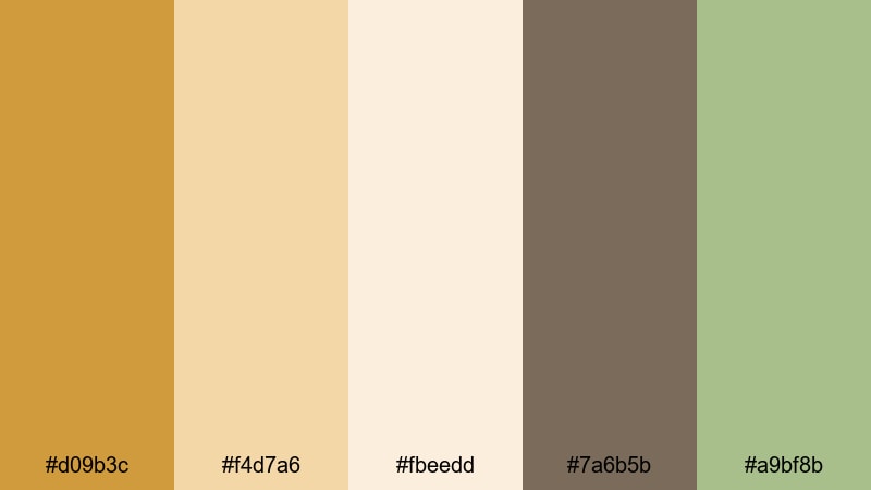
- HEX Codes: #d09b3c, #f4d7a6, #fbeedd, #7a6b5b, #a9bf8b
- Mood: Tender and organic, with hints of meadow greens and honeyed light.
- Use for: Great for nature B-roll, gardening channels, and brand stories focused on sustainability or craft.
Wildflower Honey Mist feels botanical and handcrafted. Honeyed ochre is softened by cream and lifted by muted meadow greens (#a9bf8b), which makes it perfect for eco brands, gardening videos, and artisan product stories.
Use the green as a secondary accent for badges, buttons, or bullet points, while the warm ochres support logos and key phrases. Applying this palette to your overlays and end screens reinforces an organic, eco-conscious brand identity.
Morning Linen Light
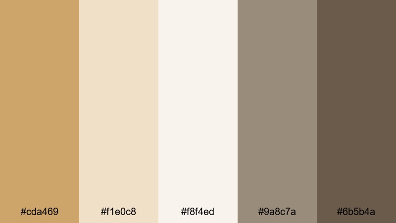
- HEX Codes: #cda469, #f1e0c8, #f8f4ed, #9a8c7a, #6b5b4a
- Mood: Calm and intimate, like soft light filtering through linen curtains.
- Use for: Use this palette for morning routines, studio diaries, and any soft aesthetic vlog content.
Morning Linen Light is all about softness and intimacy. Linen beige, pale cream, and gentle ochre create an airy, clean backdrop for everyday routines, home studio tours, and soft aesthetic vlogs.
Use the darkest shade (#6b5b4a) for text and icons to maintain clarity, and allow the lighter colors to carry backgrounds, frames, and subtle shapes. This palette keeps your visuals light and personal, especially when combined with simple text animations in Filmora.
Bold Cinematic Ochre Color Palettes
Noir Ember Title Card
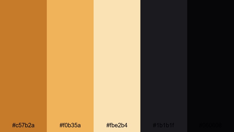
- HEX Codes: #c57b2a, #f0b35a, #fbe2b4, #1b1b1f, #060608
- Mood: Dramatic and cinematic, with glowing embers against deep noir shadows.
- Use for: Perfect for title cards, trailers, and dramatic intros where you want impact and contrast.
Noir Ember Title Card pushes ochre into a fiery spotlight against near-black shadows. It is bold and high-contrast, ideal for trailers, suspenseful intros, and dramatic storytelling where you want the title to feel like it is burning onto the screen.
Use the darkest tones (#1b1b1f and #060608) as full backgrounds, then layer in glowing text and graphic accents in #f0b35a. This palette also works well for end screens with strong CTAs and animated type in Filmora.
Epic Dust Storm
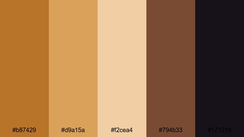
- HEX Codes: #b87429, #d9a15a, #f2cea4, #794b33, #171219
- Mood: Gritty, expansive, and adventurous, like a storm sweeping across a desert plain.
- Use for: Use this palette for action sequences, travel documentaries, and dramatic landscape edits.
Epic Dust Storm mixes gritty ochres, sand, and copper-brown with deep shadows for a sweeping, adventurous atmosphere. It suits action travel, off-road adventures, and epic landscape edits where you want footage to feel raw but cinematic.
Use the mid-tones (#b87429 and #d9a15a) to tint overlays or title backgrounds, and reserve the darkest shade (#171219) for framing and logo reveals. This palette helps thumbnails and titles stand out with a rugged, dust-streaked cinematic character.
Golden Arena Spotlight
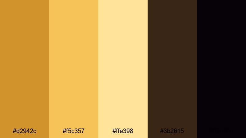
- HEX Codes: #d2942c, #f5c357, #ffe398, #3b2615, #050308
- Mood: Heroic and high-energy, like a spotlight hitting the main stage.
- Use for: Great for sports edits, highlight reels, and bold YouTube intros with dynamic typography.
Golden Arena Spotlight brings stadium energy to your visuals. Vivid golden ochre and stage-light yellows blaze against deep chocolate and near-black, perfect for sports edits, esports intros, award-style highlight reels, and any content that celebrates big wins.
Use the bright tones (#d2942c and #f5c357) for strokes around players, kinetic text, and scoreboards, while the darkest colors anchor backgrounds. On thumbnails, a dark base with gold text and outlines creates instant high-impact contrast, especially when paired with bold fonts in Filmora.
Tips for Creating Ochre Color Palettes
Ochre is flexible enough to pair with neutrals, blues, greens, and deep blacks, but it still needs structure to stay readable and on-brand. These tips will help you use ochre color palettes effectively in your videos and designs.
- Pick one primary ochre and one secondary accent, then keep everything else neutral (cream, gray, dark brown, or black) so your layouts do not feel muddy.
- Use the darkest color in the palette for main text and key icons to guarantee readability on phones and small thumbnails.
- Reserve the brightest ochre or gold tone for CTAs, key numbers, and short phrases you want viewers to notice instantly.
- For cinematic looks, combine warm ochre highlights with cooler, slightly blue or green shadows to create depth and contrast in Filmora.
- Match your palette to your footage: if your scenes are already warm, lean on the lighter neutrals from the palette so skin tones do not become too orange.
- Keep branding consistent by reusing the same HEX codes across your logo, thumbnail frames, lower thirds, and end screen layouts.
- Test light and dark versions of your titles over real footage inside Filmora to make sure text remains readable across bright skies and dark interiors.
- When in doubt, simplify: use fewer colors per frame and rely on typography, spacing, and motion to add interest instead of stacking too many similar ochre shades.
Used thoughtfully, ochre palettes can make your channel feel warm, cinematic, and memorable. From rustic travel diaries to modern tech explainers, these 15 color combinations give you ready-made options with HEX codes that are easy to plug into your thumbnails, overlays, and title designs.
Load a palette into Filmora, match it with your footage, and experiment with subtle tweaks using AI Color Palette, HSL, and filters until it feels like your own signature style. Over time, viewers will begin to recognize your videos at a glance just from your consistent use of ochre tones.
Whether you choose a soft natural scheme or a bold spotlight look, the key is consistency. Keep coming back to the same few ochre colors in Filmora and let them anchor your storytelling, branding, and visual identity.
secure downloadNext: Black Rose Color Palette
