
 100% Security Verified | No Subscription Required | No Malware


 ChatGPT
 Perplexity
 Gemini
 Claude
 Grok
Grok
Orange and blue are one of the strongest complementary color pairings in design. Orange feels energetic, optimistic, and bold, while blue communicates trust, calm, and clarity. Put together, an Orange Blue color palette delivers powerful contrast that instantly attracts the eye without feeling chaotic. That is why this duo shows up everywhere from movie posters and game covers to brand identity systems and social media feeds.
For video creators, this combination is especially useful. Orange Blue color combinations work beautifully in YouTube thumbnails, cinematic intros, lower thirds, and end screens, as well as in full-on color grading for vlogs and short films. Below you will find 15 curated Orange Blue color palettes with HEX codes that you can plug directly into your designs or use as references in Filmora to color match your entire edit.
In this article
Bold And Cinematic Orange Blue Color Palettes
Sunset Cinema Contrast
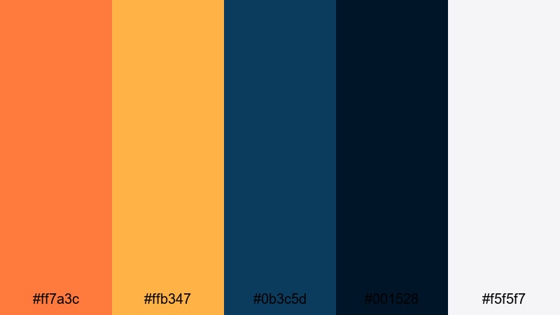
- HEX Codes: #ff7a3c, #ffb347, #0b3c5d, #001528, #f5f5f7
- Mood: Dramatic and high energy, like a sun setting over a deep ocean skyline.
- Use for: Great for cinematic video intros, movie-style trailers, and bold YouTube thumbnails.
This Orange Blue color palette feels like a blockbuster poster: blazing sunset oranges against deep navy blues with a soft off-white for text and UI. The contrast is intense but controlled, giving your visuals a strong focal point and a clear sense of drama.
Use it for movie-style channel intros, trailer-style edits, and thumbnails where you want faces, titles, or key objects to jump off the screen. The lighter orange sits perfectly on dark blue backgrounds for titles, while the pale neutral shade keeps lower thirds, icons, and subtitles clean and readable in Filmora.
Pro Tip: Build a Cinematic Orange Blue Look in Filmora
To keep a bold Orange Blue style consistent across an entire edit, start by designing one hero frame: your intro scene, a title card, or a thumbnail base. Use the HEX codes from Sunset Cinema Contrast for your text, background blocks, and graphic elements. Then, in Filmora, match the rest of your footage to this look by nudging blues cooler and oranges warmer so everything feels like part of the same world.
You can duplicate this palette across intros, b-roll sequences, and end screens by saving presets and reusing them in your project. This way, every social clip, short, and long-form video shares the same cinematic Orange Blue identity without having to rebuild the style from scratch.
AI Color Palette
If you already have a frame or thumbnail design that nails this Orange Blue aesthetic, you can use it as a reference for the rest of your timeline. Filmora's AI Color Palette feature analyzes the colors in a reference clip or image and automatically applies a matching palette to other shots.
Simply pick your best-looking Orange Blue scene, select a batch of clips that need to match, and let AI handle the heavy lifting. This is an easy way to unify your vlog, trailer, or montage so every scene carries the same warm highlights and deep blue shadows you see in the Sunset Cinema Contrast palette.
 secure download

HSL, Color Wheels & Curves
Once your base Orange Blue color combination is in place, you can push it further using HSL, color wheels, and curves inside Filmora. Shift the hue and saturation of oranges slightly toward amber for skin tones and titles, while deepening blues in the midtones and shadows for that cinematic teal-and-orange grade. Filmora's color correction tools give you precise control so your aesthetic color palette for vlogs stays stylish instead of oversaturated.
Use curves to add contrast in the shadows without crushing detail, and gently lift highlights to make light sources and reflections glow. The color wheels let you cool down shadows toward navy and warm up highlights toward soft orange, which perfectly matches palettes like Sunset Cinema Contrast and keeps your footage looking modern and polished.
secure download1000+ Video Filters & 3D LUTs
If you want a fast way to stylize your Orange Blue themed video, Filmora's video filters and 3D LUTs make it easy to lock in a professional look. Start from a LUT that already leans into teal shadows and warm highlights, then tweak saturation and contrast so it lines up with the HEX codes in your chosen palette.
You can combine filters with overlays like light leaks, vignettes, and film grain to give your Orange Blue branding palette even more character. Save your favorite combinations as custom presets so every future project, from trailers to vlogs, can reuse the same cinematic identity in just a few clicks.
secure downloadNeon Harbor Lights
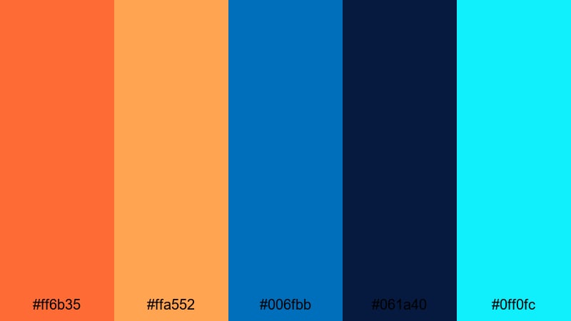
- HEX Codes: #ff6b35, #ffa552, #006fbb, #061a40, #0ff0fc
- Mood: Electric and urban, inspired by neon reflections on dark harbor water.
- Use for: Perfect for gaming intros, cyberpunk edits, and nightlife vlogs that need a modern edge.
Neon Harbor Lights combines glowing oranges with vivid blues and a pop of cyan neon for a high-voltage city-night feel. The very dark navy gives you a strong backdrop, while the bright cyan accent is perfect for techy HUD elements, glitch titles, and futuristic icons.
Use this palette in gaming thumbnails, cyberpunk title cards, or nightlife B-roll where you want screens, signs, and UI details to look like they are lit from within. It works especially well for creators who want modern, edgy Orange Blue color combinations that still read clearly on mobile.
Tropical Surf Energy
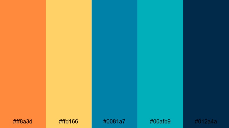
- HEX Codes: #ff8a3d, #ffd166, #0081a7, #00afb9, #012a4a
- Mood: Energetic and adventurous, like a bright day of surfing and beach sunsets.
- Use for: Great for travel vlogs, summer promos, and energetic social ads.
Tropical Surf Energy blends juicy orange and yellow with turquoise and deep sea blues, creating a sunny, adventurous Orange Blue aesthetic. It feels like golden hour at the beach, with sea foam highlights and rich ocean shadows.
Try this palette in travel vlog intros, summer sale promos, or reels that feature water, beaches, and outdoor action. Use the bright aqua for call-to-action buttons or subscribe animations, while the deep navy anchors your text and logos in thumbnails.
Stadium Spotlight Fever
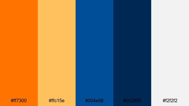
- HEX Codes: #ff7300, #ffc15e, #004e98, #002855, #f2f2f2
- Mood: Heroic and energetic, echoing stadium lights and game day hype.
- Use for: Perfect for sports highlights, esports content, and high-intensity channel branding.
Stadium Spotlight Fever mixes blazing orange with strong royal and navy blues, plus a bright neutral white that recalls stadium floodlights. The palette feels competitive and focused, ideal for content that builds tension and hype.
Use the saturated orange as an accent for scores, timers, and key moments in your edits, while the darker blues frame gameplay or sports footage. The clean white is great for overlays, stats, and bold titles that stand out against fast-moving clips in Filmora.
Soft And Dreamy Orange Blue Color Palettes
Peach Mist Horizon
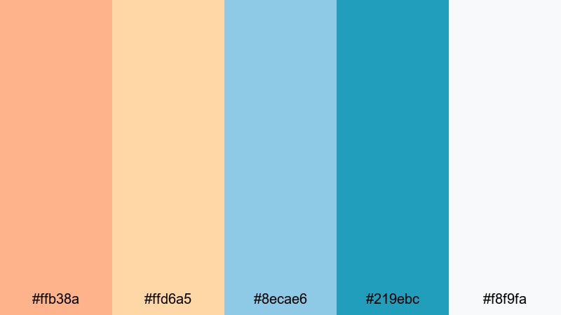
- HEX Codes: #ffb38a, #ffd6a5, #8ecae6, #219ebc, #f8f9fa
- Mood: Gentle and hopeful, like a hazy peach sunrise over calm water.
- Use for: Ideal for lifestyle vlogs, morning routines, and gentle brand intros.
Peach Mist Horizon softens the traditional Orange Blue pairing into peach, cream, and airy sky blue. It feels bright and optimistic without harsh contrast, making it ideal for creators who want a calm, friendly look.
Use this aesthetic color palette for vlogs about daily routines, productivity, wellness, and gentle storytelling. The light peach works beautifully as a background for lower thirds, while the deeper blue anchors logos and key text in intros and outros.
Coral Skies Serene
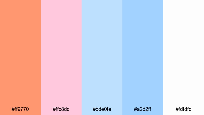
- HEX Codes: #ff9770, #ffc8dd, #bde0fe, #a2d2ff, #fdfdfd
- Mood: Romantic and floaty, like coral clouds drifting through a pastel sky.
- Use for: Great for romantic edits, dreamy reels, and soft branding for creators.
Coral Skies Serene pairs powdery blues with gentle coral and pinkish notes for a very soft Orange Blue aesthetic. It feels romantic, whimsical, and a little nostalgic, perfect for emotional storytelling.
Use this palette in wedding highlights, couples reels, or dreamy montage sequences. The soft white and pale blue shades are ideal for text overlays, while coral accents highlight important words or chapter titles without overpowering your footage.
Morning Tide Pastel
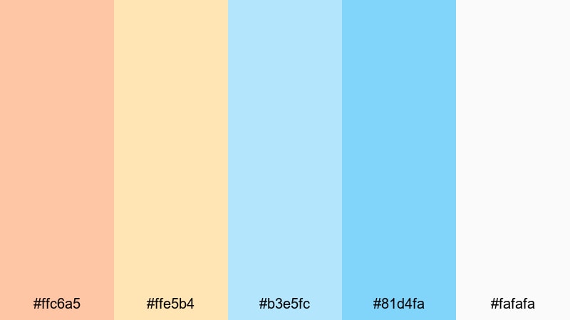
- HEX Codes: #ffc6a5, #ffe5b4, #b3e5fc, #81d4fa, #fafafa
- Mood: Fresh and peaceful, like early light over a calm shoreline.
- Use for: Use for wellness content, tutorials, and channels focused on minimal, calming visuals.
Morning Tide Pastel is a light, breezy Orange Blue color palette built around warm creams and pale blues. It stays bright and approachable, making it great for channels that want a clean, non-intimidating look.
Use it for tutorial title cards, step-by-step graphics, and background frames around talking-head videos. The pastels keep your content visually cohesive without distracting from text, screen recordings, or explanations.
Cloud Drift Glow
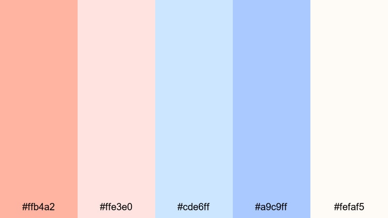
- HEX Codes: #ffb4a2, #ffe3e0, #cde6ff, #a9c9ff, #fefaf5
- Mood: Airy and nostalgic, like warm light glowing through thin clouds.
- Use for: Perfect for slow montages, memory videos, and gentle social media storytelling.
Cloud Drift Glow uses muted coral oranges and milk-glass blues to create a hazy, nostalgic softness. It is ideal for reflective content where you want viewers to slow down and feel the emotion behind each scene.
Use the soft oranges for highlight moments or subtitles over B-roll, and let the washed-out blues sit in backgrounds, frames, or overlay shapes. This palette works beautifully in Filmora when paired with slow transitions and subtle film grain.
Retro And Vintage Orange Blue Color Palettes
70s Travel Poster
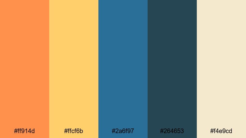
- HEX Codes: #ff914d, #ffcf6b, #2a6f97, #264653, #f4e9cd
- Mood: Warm and nostalgic, reminiscent of retro travel ads and faded postcards.
- Use for: Great for travel diaries, retro title cards, and nostalgic branding.
70s Travel Poster blends muted oranges and golden yellows with inky, slightly desaturated blues and a vintage cream. It instantly feels like an old tourism poster or postcard from a classic beach town.
Use this Orange Blue color palette in travel diaries, story-driven vlogs, or retro-themed brand intros. The cream tone is perfect for backgrounds behind maps, timestamps, or captions, while the darker blue supports logos and bold, serif titles.
Retro Arcade Glow
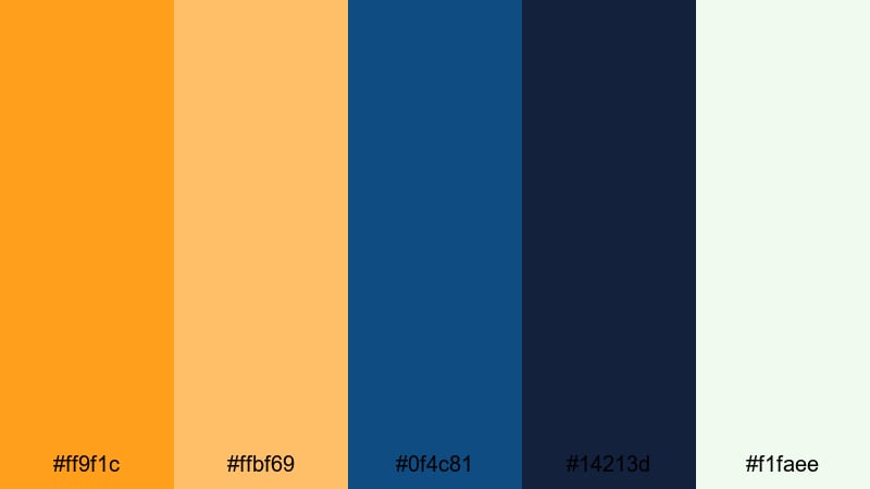
- HEX Codes: #ff9f1c, #ffbf69, #0f4c81, #14213d, #f1faee
- Mood: Playful and nostalgic, like glowing buttons and old arcade screens.
- Use for: Perfect for gaming retrospectives, tech nostalgia reels, and fun overlays.
Retro Arcade Glow mixes punchy oranges with deep, dusty blues and a pale off-white, echoing the colors of arcade cabinets and CRT screens. It feels playful and nostalgic without looking outdated.
Use the bright orange for score counters, glitchy text, or subscribe buttons in gaming intros, and let the dark blue serve as a consistent background tone. The light neutral is ideal for UI panels, caption boxes, and retro grid overlays in Filmora.
Vintage Surf Motel
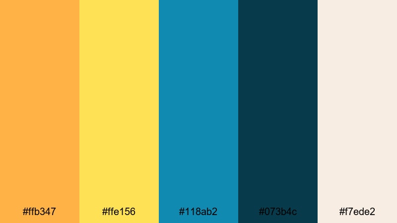
- HEX Codes: #ffb347, #ffe156, #118ab2, #073b4c, #f7ede2
- Mood: Sunny and nostalgic, like a roadside motel sign by the beach.
- Use for: Great for road trip edits, vintage travel branding, and lifestyle lookbooks.
Vintage Surf Motel combines sun-bleached oranges and yellows with teal blues and a sandy neutral. It captures that laid-back, slightly faded summer vibe, perfect for relaxed storytelling.
Use this Orange Blue branding palette for road trip compilations, lifestyle lookbooks, or channel trailers that lean into retro travel aesthetics. The sandy neutral can sit behind text or polaroid-style frames, while teal and orange highlight important elements like dates, locations, and chapter breaks.
Old Film Marina
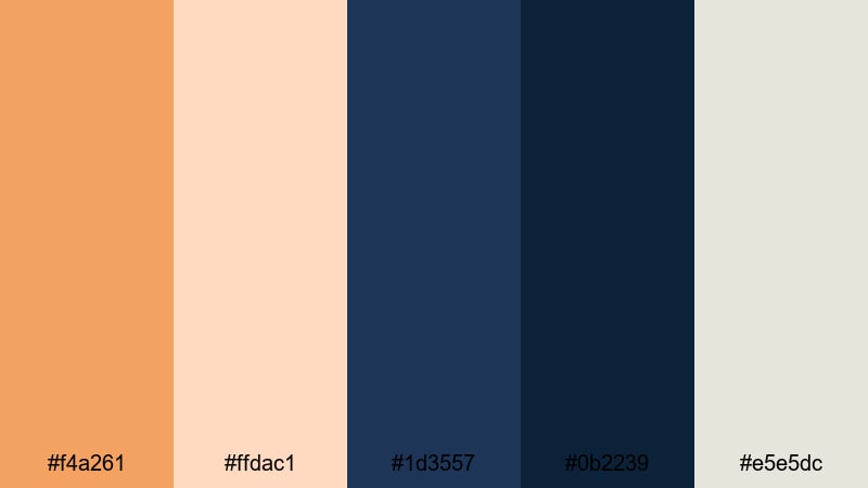
- HEX Codes: #f4a261, #ffdac1, #1d3557, #0b2239, #e5e5dc
- Mood: Moody and cinematic, like grainy film of boats at dusk.
- Use for: Use for documentary intros, moody travel edits, and story-driven content.
Old Film Marina uses dusty oranges and inky blues with a faded neutral that feels like aged film stock. It is moody and cinematic, ideal for slower, more thoughtful edits.
Apply this palette in documentary-style openers, harbor or cityscape B-roll, and stories that unfold at dusk or night. Pair it with film grain, slow zooms, and gentle transitions in Filmora to emphasize the vintage character of your footage.
Minimal And Modern Orange Blue Color Palettes
Tech Startup Breeze
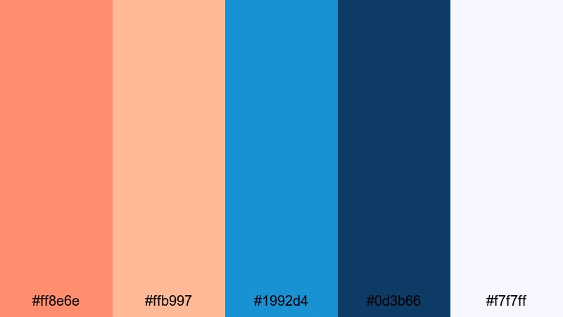
- HEX Codes: #ff8e6e, #ffb997, #1992d4, #0d3b66, #f7f7ff
- Mood: Fresh and ambitious, mixing friendly warmth with confident tech blues.
- Use for: Perfect for app promos, SaaS explainers, and modern logo animations.
Tech Startup Breeze brings together soft, friendly oranges with clean digital blues and a near-white background. It feels modern and optimistic, ideal for tech brands and creators who want to look innovative but approachable.
Use it for app demo videos, UI mockups, and company introductions. The light background is excellent for screen recordings and product shots, while the oranges highlight CTAs, buttons, and key data in your Filmora motion graphics.
Clean Dashboard Focus
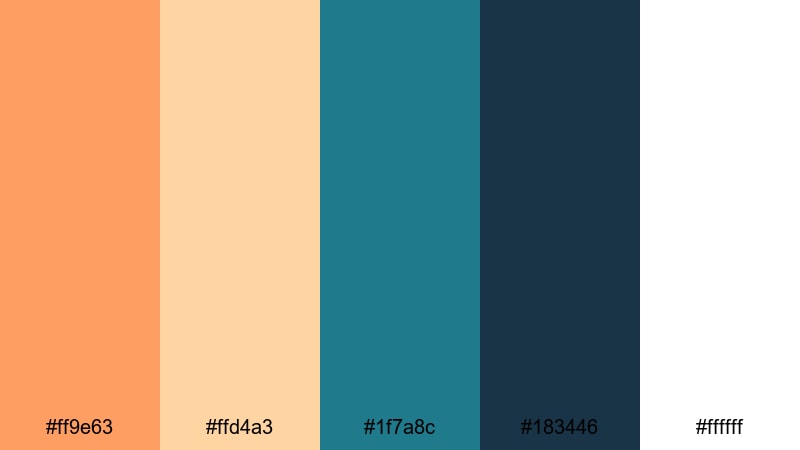
- HEX Codes: #ff9e63, #ffd4a3, #1f7a8c, #183446, #ffffff
- Mood: Clear and focused, designed for sharp interfaces and clean layouts.
- Use for: Great for UI mockups, data dashboards, and product demo videos.
Clean Dashboard Focus balances warm accent oranges against functional, deep blues and crisp white. It is tailored for clarity and readability, making it ideal for data-heavy or educational content.
Use the deeper blues for backgrounds and chart axes, and reserve the orange tones for key metrics and callouts. In Filmora, this palette works well for explainer animations, KPI recap slides, and screen-record walkthroughs where you want the information to remain easy to follow.
Urban Loft Accent
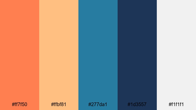
- HEX Codes: #ff7f50, #ffbf81, #277da1, #1d3557, #f1f1f1
- Mood: Contemporary and stylish, like an industrial loft with warm accents.
- Use for: Use for brand idents, lifestyle channels, and minimalist promos.
Urban Loft Accent combines warm, muted oranges with cool modern blues and soft gray-white. It feels sleek and contemporary, like a well-designed studio or co-working space.
This Orange Blue color palette is perfect for stylish lifestyle channels, interior design content, and minimalist brand idents. Use the muted orange on key icons and logo elements, while the blues frame your footage in overlays, line accents, and title bars in Filmora.
Tips for Creating Orange Blue Color Palettes
When you build your own Orange Blue color palette for video and design, a few practical guidelines will help you stay on-brand, keep things readable, and make your edits look professionally color graded in Filmora.
- Decide which color leads: Use orange as the accent and blue as the base (or vice versa) instead of giving them equal weight on every frame.
- Control contrast for text: Place light text on dark blue areas or dark text on pale orange or neutral backgrounds to keep subtitles and titles legible.
- Add a neutral: Include white, off-white, or a soft gray-beige in your palette so not every element has to be orange or blue.
- Match footage and graphics: When color grading in Filmora, nudge your shadows toward your chosen blue and highlights toward your orange so overlays and footage feel unified.
- Test on mobile: Check your thumbnails and lower thirds on a phone to ensure your Orange Blue color combinations stay readable at small sizes.
- Protect skin tones: If you use strong teal blues, avoid pushing skin too far into orange; use HSL tools to keep people looking natural.
- Limit accent colors: One extra accent (like cyan or cream) is fine, but too many hues can weaken your Orange Blue branding palette.
- Save presets: In Filmora, save your favorite LUTs, color settings, and title templates so future projects automatically use the same palette.
Orange Blue palettes are powerful tools for shaping mood, readability, and brand identity, from bold gaming thumbnails to soft lifestyle intros. With the right balance of warm and cool, you can guide your audience toward excitement, calm, nostalgia, or focus in just a few frames.
Use the HEX codes in these 15 palettes as starting points, then refine them in Filmora using AI Color Palette, HSL controls, and filters until they match your channel or brand. The more consistently you apply your Orange Blue theme across thumbnails, intros, lower thirds, and color grading, the more recognizable your content will become.
Open your next project, pick one of these Orange Blue color combinations, and try building an entire edit around it. With Filmora, it only takes a few tweaks to turn a simple palette into a signature cinematic look.
secure downloadNext: Burgundy Color Palette
