
 100% Security Verified | No Subscription Required | No Malware


 ChatGPT
 Perplexity
 Gemini
 Claude
 Grok
Grok
Pastel blue is one of the calmest colors you can use on screen. It suggests trust, clarity, and softness while still feeling modern and fresh. In video, it is often used to create airy skies, clean interfaces, and gentle backdrops that do not distract from the subject. In branding and channel design, pastel blue helps your content feel more approachable, organized, and relaxing at a glance.
If you are building thumbnails, intros, lower thirds, or overlays, the right pastel blue color palette will keep everything consistent from clip to clip. Below are 15 carefully curated pastel blue color combinations with HEX codes, so creators and Filmora users can match their footage, graphics, and text styles quickly and confidently.
In this article
Soft And Airy Pastel Blue Color Palettes
Morning Sky Story
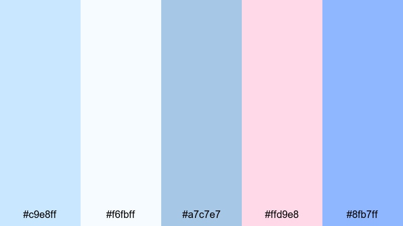
- HEX Codes: #c9e8ff, #f6fbff, #a7c7e7, #ffd9e8, #8fb7ff
- Mood: calm, uplifting, and hopeful like a quiet sunrise
- Use for: Great for cinematic vlog intros, morning routine videos, and gentle storytelling thumbnails.
Morning Sky Story feels like the first light coming through white curtains. The mix of soft blues, off-white, and blush pink creates a weightless, optimistic atmosphere that is perfect for peaceful starts and reflective scenes. Nothing is too saturated, so it keeps your visuals clean and easy on the eyes.
Use this palette for daybreak b-roll, morning coffee shots, wellness routines, or any intro where you want to suggest a fresh start. In thumbnails and titles, pair the lightest blue or white as the background, use the mid blues for frames or shapes, and reserve the blush accent for key text or icons so your visuals stay subtle but clickable.
Pro Tip: Build a Cinematic Pastel Blue Morning Look in Filmora
To keep this sunrise-inspired pastel blue look consistent across an entire edit, set up a simple visual style inside Filmora. Choose one of the lighter blues as your background or overlay color for intros and end screens, then repeat the same hue in lower thirds, subscribe buttons, and titles.
You can also add a soft pastel blue tint using Filmora color tools on your b-roll clips, so your sky, bedsheets, notebooks, and wall colors all lean toward the same gentle mood. This makes your vlog feel curated and cinematic, even if the original footage came from different days or cameras.
AI Color Palette
If you have a still frame or mood board that nails your Morning Sky Story aesthetic, you can use Filmora's AI Color Palette feature to translate that look to the rest of your footage. Just pick your reference image, let Filmora analyze the colors, and apply the palette to the clips you want to match.
This is especially useful when your lighting changes between scenes. The AI Color Palette helps unify pastel blues, whites, and blush accents across intros, talking-head segments, and b-roll so your entire video feels like one continuous, calm morning.
 secure download

HSL, Color Wheels & Curves
Once you have a base pastel blue aesthetic, you can fine-tune it with HSL, color wheels, and curves in Filmora. Nudge the blues in HSL slightly toward teal for a fresher morning feel, or toward purple for a more dreamy, nostalgic mood. Use color wheels to keep highlights soft and cool while allowing skin tones to stay warm and natural.
Curves are great for making your pastel blue look more cinematic: lift the shadows a little to avoid harsh blacks, gently lower the highlights to stop bright skies from clipping, and add a slight S-curve to bring contrast back without losing the soft vibe. If you want more guidance, you can look into Filmora's advanced color correction tools to understand how each control affects your tones.
secure download1000+ Video Filters & 3D LUTs
To speed up your workflow, you can stack pastel-friendly filters and LUTs on top of this palette. Filmora offers gentle film looks, dreamy glows, and soft daylight presets that instantly push your blues into a cohesive style without heavy manual grading.
Filmora's video filters and 3D LUTs make it easy to test different moods: from slightly hazy and nostalgic to clean and minimal. Apply them to adjustment layers so every clip in your vlog intro, main story, and outro sits inside the same pastel blue universe.
secure downloadPowder Blue Daydream
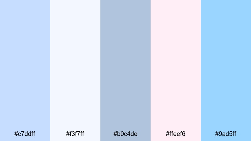
- HEX Codes: #c7ddff, #f3f7ff, #b0c4de, #ffeef6, #9ad5ff
- Mood: dreamy, nostalgic, and softly romantic
- Use for: Ideal for lifestyle vlogs, aesthetic lookbooks, and dreamy short films.
Powder Blue Daydream wraps your visuals in hazy light, like looking through a sheer curtain. The soft blues and subtle pinks make faces look gentle and flattering, ideal for aesthetic room tours, outfit videos, and memory-style edits.
Use the palest blue or white for title backgrounds, then layer mid-tone blues for borders and UI-style frames. The delicate pink is perfect as an accent in thumbnails, subscribe buttons, or chapter cards when you want a romantic twist without going full neon.
Cloud Drift Serenity
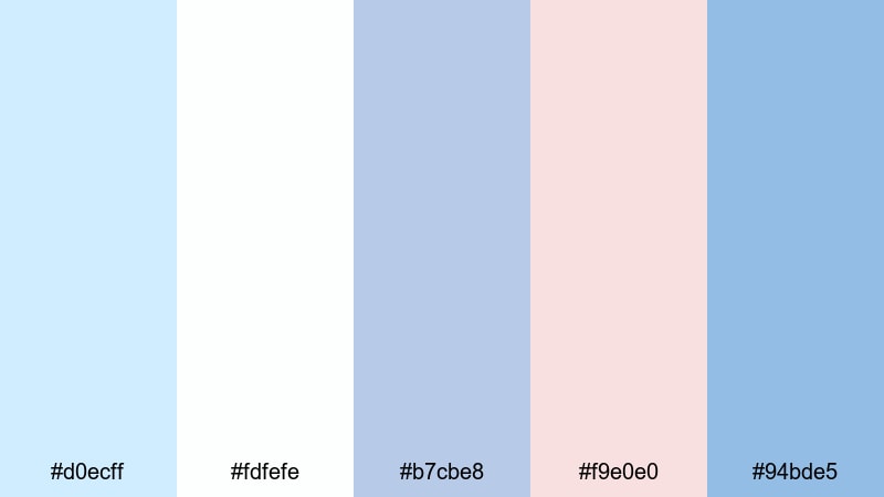
- HEX Codes: #d0ecff, #fdfefe, #b7cbe8, #f9e0e0, #94bde5
- Mood: serene, weightless, and reflective
- Use for: Use for meditation content, calm study playlists, and cinematic b-roll overlays.
Cloud Drift Serenity looks like slow-moving clouds across a pale sky. The blend of airy blues, off-white, and muted coral accents gives your edits a meditative, almost weightless feeling, ideal for focus, sleep, or journal-style content.
For YouTube covers or Spotify-style playlist art, use the whitest tone as the main background and alternate between the darker blues for typography and icons. The soft coral is great for tiny highlights, like timestamps or playlist tags, giving subtle contrast without breaking the calm mood.
Seaside Mist Calm
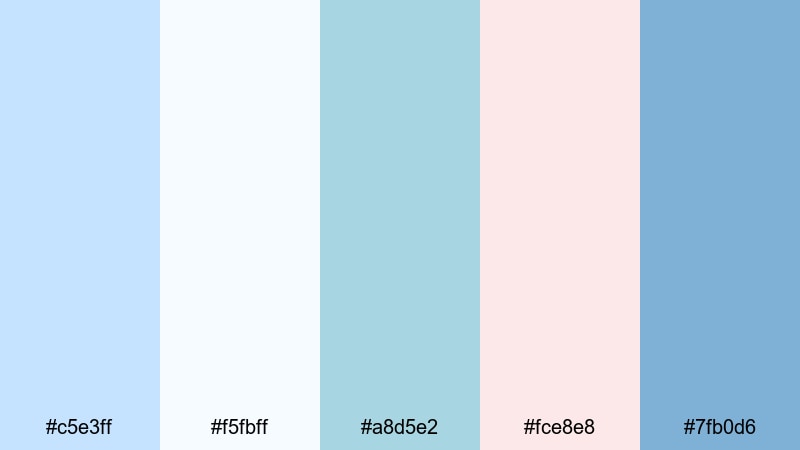
- HEX Codes: #c5e3ff, #f5fbff, #a8d5e2, #fce8e8, #7fb0d6
- Mood: refreshing, coastal, and gently optimistic
- Use for: Perfect for travel vlogs, ocean-themed edits, and relaxing channel banners.
Seaside Mist Calm captures the look of a quiet beach morning, with misty blues and soft shell pinks. It feels cool and refreshing without being sharp, so it works well for long-form viewing such as travel diaries or ambient ocean loops.
In Filmora, pair this palette with gentle motion graphics: pastel blue wave shapes as transitions, soft gradients for title cards, and pink accents for location pins or map callouts. For channel banners and profile headers, this combination tells viewers they can expect soothing, uplifting content.
Blush And Breeze Harmony
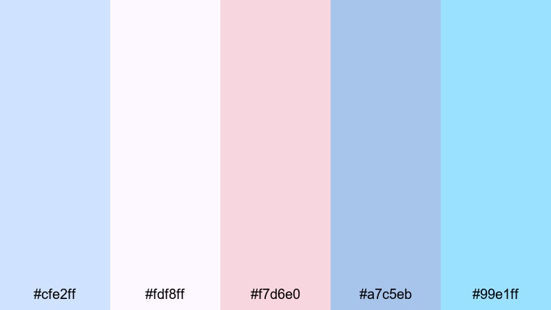
- HEX Codes: #cfe2ff, #fdf8ff, #f7d6e0, #a7c5eb, #99e1ff
- Mood: gentle, romantic, and harmonious
- Use for: Great for wedding highlights, couple vlogs, and branded mood boards with a tender tone.
Blush And Breeze Harmony combines powder blues, creamy white, and rosy blush in a way that instantly feels romantic. It is gentle enough for emotional storytelling but still clean and modern, so your visuals do not slip into overly vintage territory.
Use the lighter blues as main backgrounds for wedding highlight titles, then highlight names, dates, or quotes in blush. This palette also works beautifully for brand style boards: apply it to your logo variations, YouTube channel art, and Instagram story covers to keep a soft, love-inspired identity across all platforms.
Modern And Minimal Pastel Blue Color Palettes
Nordic Frost Glow
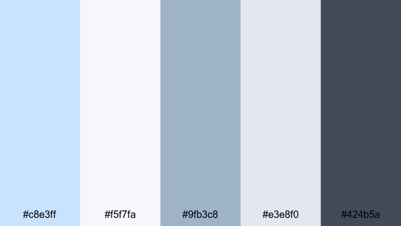
- HEX Codes: #c8e3ff, #f5f7fa, #9fb3c8, #e3e8f0, #424b5a
- Mood: clean, modern, and slightly cool
- Use for: Best for tech reviews, productivity dashboards, and sleek brand intros.
Nordic Frost Glow is inspired by Scandinavian interiors: lots of light, cool blues, and a grounded slate accent. It looks professional without feeling stiff, which is ideal for tech or productivity creators who still want an approachable vibe.
Use the dark slate (#424b5a) for primary text and icons, the light blues for card backgrounds, and the neutral off-white for full-screen slides or interface mockups. In thumbnails, a slate frame around pastel blue panels helps your titles stay readable even at small sizes.
Silicon Screen Haze
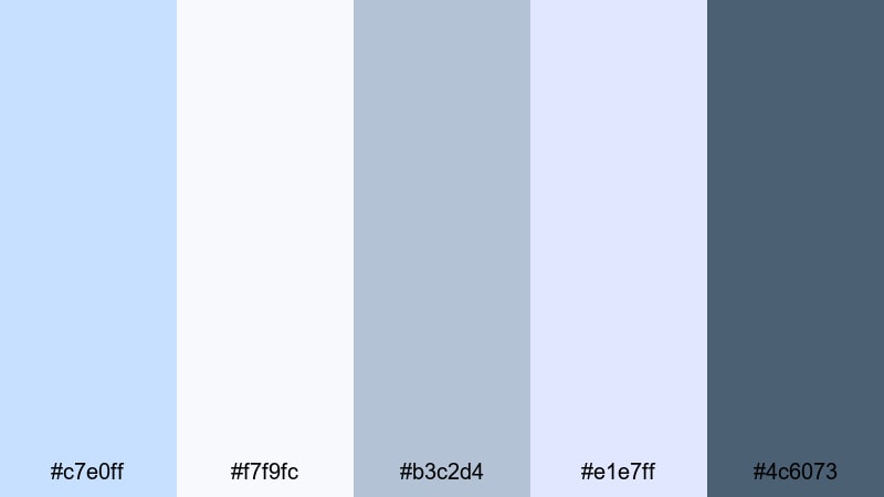
- HEX Codes: #c7e0ff, #f7f9fc, #b3c2d4, #e1e7ff, #4c6073
- Mood: techy, polished, and slightly futuristic
- Use for: Ideal for app promos, UI explainers, and channel branding focused on digital tools.
Silicon Screen Haze looks like a screenshot from a clean, modern app interface. The soft blues and grays are extremely screen-friendly, avoiding harsh contrast while still giving clear visual hierarchy.
Apply this palette to your explainer graphics: use the darkest shade for text and key UI outlines, the mid grays for panels or sidebars, and the lightest blue as a gentle background for overlays and callouts. For thumbnails, layer screenshots inside pastel blue frames with dark-blue captions to instantly communicate a tech focus.
Minimal Loft Air
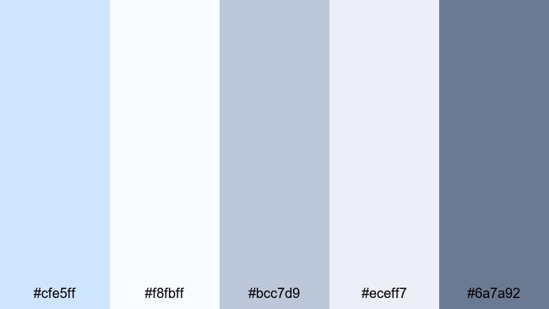
- HEX Codes: #cfe5ff, #f8fbff, #bcc7d9, #eceff7, #6a7a92
- Mood: minimal, airy, and sophisticated
- Use for: Use for studio tours, design portfolios, and clean tutorial layouts.
Minimal Loft Air feels like a bright design studio with tall windows and white walls. The range of off-whites, soft blues, and muted gray-blue accents gives your videos a refined, editorial feel.
This palette works well in Filmora for text-heavy layouts, like step-by-step tutorials or portfolio showcases. Use the darker gray-blue (#6a7a92) for headings, lighter blues for section dividers and buttons, and almost-white tones for backgrounds to keep everything looking intentional and spacious.
Slate And Powder Balance

- HEX Codes: #c0dcff, #f4f7fb, #b0b9c9, #dde4f5, #3f4a60
- Mood: balanced, thoughtful, and dependable
- Use for: Great for educational videos, brand explainers, and professional channel art.
Slate And Powder Balance mixes dependable slate tones with gentle powder blues for a trustworthy look. It is a smart choice if you cover topics like finance, study tips, or in-depth tutorials where clarity matters.
Set your main background to the lightest blue or white, then use the dark slate (#3f4a60) for headings and key numbers so they stand out clearly. Use mid-tone blues for sidebars, progress bars, and infographics in your Filmora overlays to keep information dense but visually calm.
Glass Panel Chill
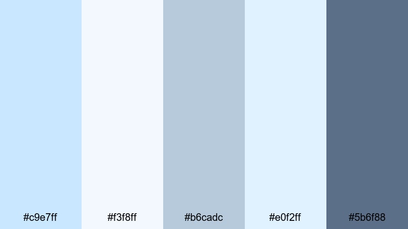
- HEX Codes: #c9e7ff, #f3f8ff, #b6cadc, #e0f2ff, #5b6f88
- Mood: cool, sleek, and understated
- Use for: Perfect for product showcases, software demos, and overlays that need subtle depth.
Glass Panel Chill looks like frosted glass UI elements floating above a cool background. The semi-muted blues and gray-blue accent create a subtle depth that suits modern brands and product-focused videos.
In Filmora, use layered rectangles and rounded panels in these colors to mimic glass cards for titles and feature lists. Keep text in the darkest shade and backgrounds in the palest blue or white so everything remains legible while still feeling high-end and minimal.
Playful And Vibrant Pastel Blue Color Palettes
Cotton Candy Skies
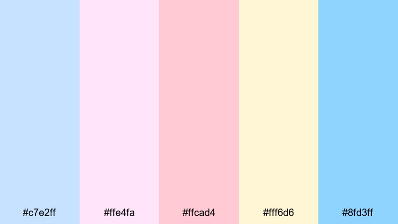
- HEX Codes: #c7e2ff, #ffe4fa, #ffcad4, #fff6d6, #8fd3ff
- Mood: whimsical, sweet, and nostalgic
- Use for: Great for travel reels, kawaii edits, and playful vlog thumbnails.
Cotton Candy Skies is bubbly and nostalgic, like sunset views at a funfair. The mix of pastel blue, pink, and soft yellow adds instant sweetness to any frame without burning the viewer's eyes.
Use the light yellow and pink as background gradients in your openings, then drop bold, dark-blue or white text over the top. For YouTube thumbnails, combine blue sky cutouts with candy-colored shapes around your subject to make the video feel playful and clickable.
Bubblegum Boardwalk
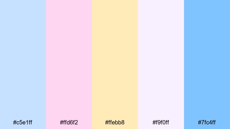
- HEX Codes: #c5e1ff, #ffd6f2, #ffebb8, #f9f0ff, #7fc4ff
- Mood: energetic, youthful, and candy-bright
- Use for: Ideal for summer vlogs, lifestyle content, and bright, clickable thumbnails.
Bubblegum Boardwalk channels the energy of arcades, ice cream stands, and long summer evenings. It stays in the pastel range but still feels bright and energetic thanks to the warm yellows and pinks.
Use this palette when you want your lifestyle or travel content to look fun and full of movement. In Filmora, apply these colors to animated shapes, stickers, and pop-up titles around your footage. Keep the blues as your main base and let pink and yellow accents highlight key words like "NEW", "VLOG", or "DAY 1".
Ice Pop Carnival
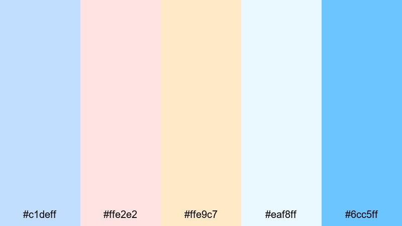
- HEX Codes: #c1deff, #ffe2e2, #ffe9c7, #eaf8ff, #6cc5ff
- Mood: refreshing, playful, and festive
- Use for: Use for party recaps, event promos, and upbeat montage edits.
Ice Pop Carnival feels like a box of colorful frozen treats. The cool blues stay dominant, while peach and cherry notes add a sense of celebration that fits birthdays, events, or festival recaps.
Make your intros pop by using the brightest blue (#6cc5ff) for bold titles and the warm tones for confetti-like shapes and transitions. This palette is also ideal for Instagram Reels or Shorts: quick, punchy edits with pastel gradients and animated text overlays.
Pastel Arcade Neon
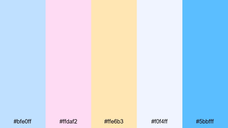
- HEX Codes: #bfe0ff, #ffdaf2, #ffe6b3, #f0f4ff, #5bbfff
- Mood: retro, playful, and lightly neon
- Use for: Great for gaming intros, retro edits, and playful channel branding.
Pastel Arcade Neon gives off a retro arcade glow without going into harsh neon territory. The blues are punchy but not overpowering, while pink and yellow accents nod to 80s signs and game UI.
Use the stronger blue (#5bbfff) to outline titles, buttons, and lower thirds, and let the pastel pink and yellow fill in background panels or scoreboards. For gaming intros, combine this palette with glitch transitions or pixel fonts in Filmora to lean fully into the playful retro vibe.
Candy Wave Motion
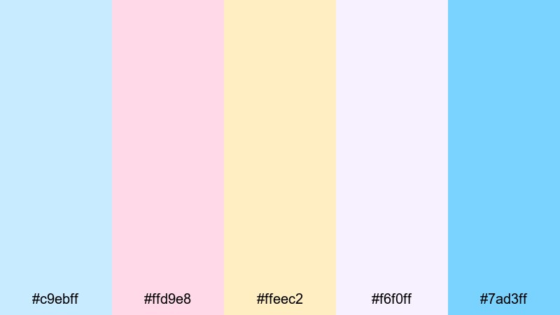
- HEX Codes: #c9ebff, #ffd9e8, #ffeec2, #f6f0ff, #7ad3ff
- Mood: bouncy, friendly, and optimistic
- Use for: Perfect for intros, animated lower thirds, and energetic social clips.
Candy Wave Motion is made for movement. The cheerful blues, cotton-candy pink, and creamy yellow work especially well with animated shapes and flowing transitions, giving your edits a light, bouncy character.
In Filmora, combine this palette with wave-like shape masks, curved lower thirds, and kinetic text. Use the deeper blue (#7ad3ff) for important captions and keep the lighter tones for backgrounds and motion graphics so the final look is fun yet still readable on mobile screens.
Tips for Creating Pastel Blue Color Palettes
When you build your own pastel blue palettes for video or design, balance softness with clarity. The goal is to keep the calm, airy feeling while making sure text, icons, and subjects stand out on every device.
- Pick one primary pastel blue and repeat it across thumbnails, titles, and overlays so your channel feels consistent.
- Add one darker neutral (navy, slate, or charcoal) for body text and small UI elements to maintain readability.
- Use warm accents like blush pink or soft yellow to keep pastel blue from feeling too cold, especially in lifestyle or vlog content.
- Check contrast on mobile by zooming out on your thumbnails; if you cannot read the text at a tiny size, darken the text color or lighten the background.
- Keep your color count tight: 3 to 5 main colors are usually enough for titles, lower thirds, and simple graphics.
- Match your palette to your footage: if your scenes lean warm (golden hour, tungsten lights), nudge your pastel blues slightly toward teal; if they are cool (cloudy, LED lights), keep blues neutral or slightly purple.
- Use gradients sparingly: soft vertical or radial gradients in pastel blue can add depth, but avoid busy multicolor backgrounds behind detailed text.
- Save presets inside Filmora for titles, lower thirds, and overlays using the same colors, so you do not have to re-enter HEX codes for every project.
Pastel blue color palettes are powerful mood-setters. They can make your brand feel calm and trustworthy, or playful and nostalgic, depending on the accents you pair with them. With the 15 palettes above, you can quickly match colors for thumbnails, intros, b-roll, and overlays without guessing.
Test a few of these combinations inside Filmora, then adjust the hues, saturation, and contrast to fit your footage. Once you save a look you love as presets or custom templates, you can apply the same pastel blue style across entire series, so viewers instantly recognize your videos in their feed.
Whether you are designing a minimal tech channel or a soft dreamy vlog, consistent pastel blue color choices will tie your visuals together and support the story you are telling.
secure downloadNext: Black Red Color Palette
