
 100% Security Verified | No Subscription Required | No Malware

Purple mauve sits between soft lavender and muted rose, blending the calm of blue with the warmth of red. It is often associated with romance, nostalgia, and quiet confidence, which makes it a powerful choice for branding, YouTube thumbnails, intro screens, and subtle color grading. Used well, it can make your videos feel polished and intentional without shouting for attention.
For creators and Filmora users, a good purple mauve color palette does more than look pretty; it ties your channel art, lower thirds, titles, and social posts into one consistent visual identity. Below are 15 ready-to-use purple mauve color palettes with HEX codes you can drop straight into your thumbnails, overlays, and LUT-style color looks.
In this article
Soft & Romantic Purple Mauve Palettes
Dusky Rose Evening
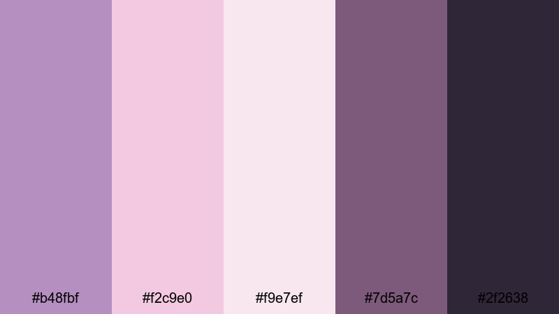
- HEX Codes: #b48fbf, #f2c9e0, #f9e7ef, #7d5a7c, #2f2638
- Mood: Romantic, intimate, and gently nostalgic.
- Use for: Perfect for wedding highlight reels, engagement story videos, and soft lifestyle vlogs that need a warm romantic glow.
Dusky Rose Evening is a tender blend of mauve, blush, and deep plum that feels like golden hour at a garden party. The lighter tones keep your frames airy and flattering, while the darker hues (#7d5a7c and #2f2638) add depth for text, shadows, or logo accents.
Use this palette to design cohesive wedding or couple-themed content: lower thirds, title cards, and YouTube thumbnails that feel romantic without being overly sweet. In Filmora, you can echo these HEX codes in your text styles, overlays, and color grading so your intros, transitions, and end screens all share the same soft purple mauve signature.
Pro Tip: Build a Cinematic Purple Mauve Look in Filmora
To keep a palette like Dusky Rose Evening consistent across your whole edit, start by picking one or two key HEX tones for your text and graphic elements, then echo them subtly in your color grading. In Filmora, you can create preset title styles using your mauve and blush colors, then reuse them in intros, talking-head shots, and end screens so everything feels like part of the same visual story.
Balance the lighter pink-mauve tones in your overlays or background shapes with the deeper plum shade for buttons, outlines, and drop shadows. This contrast keeps your thumbnails clickable and your captions readable, especially on mobile feeds where subtle colors can easily wash out.
AI Color Palette
If you have a reference still frame or mood board using Dusky Rose Evening, you can turn it into a full video look with Filmora's AI tools. Filmora's AI Color Palette feature lets you sample the purple mauve tones from one clip and apply that mood to the rest of your timeline in just a few clicks.
Import your reference image with the mauve and blush tones you love, then use AI Color Palette to match your A-roll, B-roll, and cutaway shots. This keeps your wedding highlights, Instagram reels, and teaser trailers visually cohesive, even if they were shot in different lighting or on different cameras.
 secure download

HSL, Color Wheels & Curves
Once you have a base mauve look, Filmora's HSL, color wheels, and curves tools help you fine-tune it. Use HSL to gently shift purples and pinks toward your chosen HEX values, then use color wheels to warm up skin tones while keeping shadows in that deep plum range. Curves let you add a slight fade to blacks or a soft lift to highlights for a filmic, dreamy finish.
If you want a step-by-step walkthrough of shaping your tones, this color grading tutorial shows how to combine these tools for a cohesive style. Once you dial in a purple mauve look you love, save it as a preset in Filmora and reuse it across episodes to keep your brand consistent.
secure download1000+ Video Filters & 3D LUTs
If you do not want to build a mauve look from scratch, Filmora's library of filters and LUTs can get you close in seconds. Stack soft cinematic filters with pastel or vintage styles to echo the blush and plum tones of Dusky Rose Evening, then tweak opacity until your footage feels dreamy but still natural.
Filmora's video filters and 3D LUTs make it easy to experiment: save one version that leans more romantic for wedding highlights and another that is slightly cooler for engagement interviews or behind-the-scenes reels.
secure downloadLavender Blush Whispers
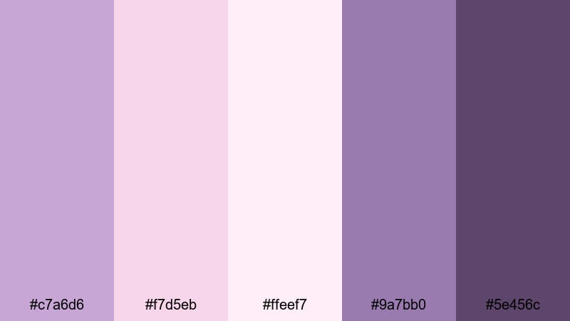
- HEX Codes: #c7a6d6, #f7d5eb, #ffeef7, #9a7bb0, #5e456c
- Mood: Airy, sentimental, and whisper-soft.
- Use for: Great for aesthetic reels, soft-spoken voiceover videos, journaling content, and dreamy travel edits.
Lavender Blush Whispers is all about feather-light mauves and blush tones wrapped in a soft haze. The pastel hex values (#f7d5eb and #ffeef7) bring a delicate glow to backgrounds, while the deeper mauves (#9a7bb0 and #5e456c) help your typography stay readable.
Use this palette for journaling vlogs, ASMR content, or aesthetic reels where you want viewers to feel calm and cozy. In thumbnails and intro cards, pair the lightest shade as a base with darker accents for borders, icons, and timestamps so your gentle color scheme still performs well in crowded feeds.
Twilight Garden Vows
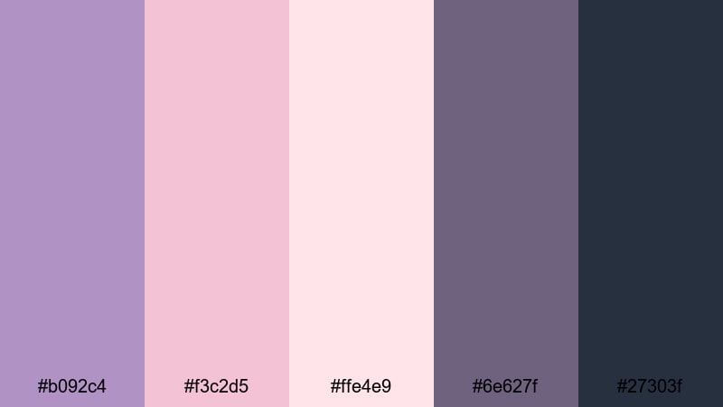
- HEX Codes: #b092c4, #f3c2d5, #ffe4e9, #6e627f, #27303f
- Mood: Intimate, poetic, and softly cinematic.
- Use for: Ideal for cinematic wedding films, proposal videos, and emotional storytelling shorts on YouTube or Instagram.
Twilight Garden Vows mixes balanced mauve, soft rose, and inky blue for a palette that feels like a secret ceremony at dusk. The midtones keep skin looking flattering, while the rich navy #27303f acts as a grounding color for text, frames, and logo marks.
Use the lighter shades for lower third backgrounds and quote overlays, and save the darkest tone for key callouts and buttons in your end screens. This combination works especially well with slow-motion B-roll and emotional storytelling where you want depth and drama without harsh contrast.
Moonlit Veil Romance
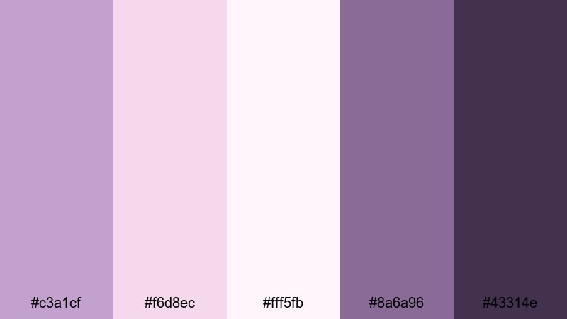
- HEX Codes: #c3a1cf, #f6d8ec, #fff5fb, #8a6a96, #43314e
- Mood: Dreamy, floaty, and slightly mysterious.
- Use for: Use for teaser trailers, romantic lyric videos, and dreamy cinematic b-roll in slow-motion edits.
Moonlit Veil Romance combines shimmering mauves with veil-like pastels and a deep violet anchor. The pale values (#f6d8ec and #fff5fb) create a soft, glowing wash that looks beautiful as a backdrop for lyrical titles or subtle overlay shapes.
Bring out the moods in teaser trailers and lyric videos by using the darker tones for vignette effects, text outlines, and animated shapes. The gentle gradient between the lightest and darkest shades helps you design title screens and YouTube thumbnails that feel both ethereal and polished.
Elegant & Modern Purple Mauve Palettes
Minimalist Loft Mauve
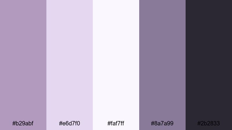
- HEX Codes: #b29abf, #e6d7f0, #faf7ff, #8a7a99, #2b2833
- Mood: Clean, sophisticated, and quietly luxurious.
- Use for: Perfect for minimalist channel branding, tech or productivity content, and sleek lower thirds in tutorials.
Minimalist Loft Mauve pairs cool mauve tones with soft off-whites and charcoal accents for a sleek, modern feel. The lighter shades (#e6d7f0 and #faf7ff) are ideal for background panels and cards, while #2b2833 brings strong contrast for typography, icons, and UI-style elements.
This palette works especially well for productivity, tech, or design channels that want to feel premium but not flashy. Use it to design minimal YouTube intros, clean lower thirds, and title slides that look professional on both desktop and mobile.
Concrete Orchid Chic
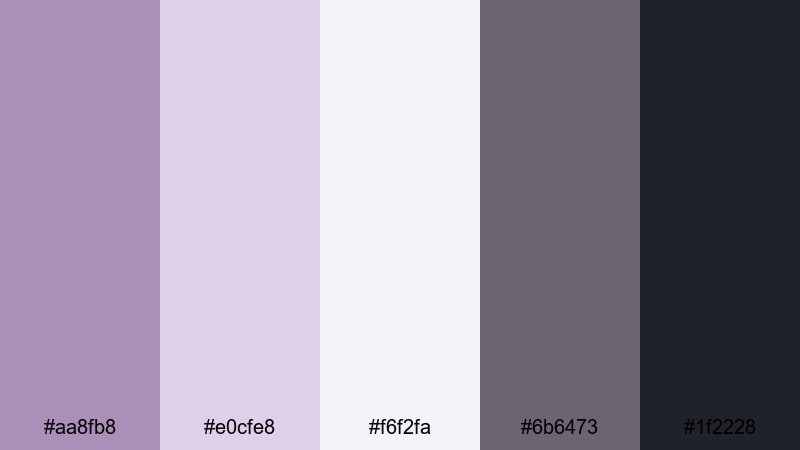
- HEX Codes: #aa8fb8, #e0cfe8, #f6f2fa, #6b6473, #1f2228
- Mood: Urban, polished, and editorial.
- Use for: Great for brand intros, fashion lookbooks, and stylish product promos that blend softness with city-edge minimalism.
Concrete Orchid Chic blends soft orchid mauve with modern grays for a look that feels both feminine and urban. The neutral tones (#6b6473 and #1f2228) act as a perfect base for text and UI elements, while the mauves keep your visuals from feeling too cold or corporate.
Use this palette in lookbooks, campaign recap videos, or product promos where you want an editorial vibe. Layer the lightest color as a card behind text, then accent buttons, dividers, and logo marks with the richest mauve for a premium, magazine-style finish.
Editorial Velvet Lines
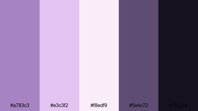
- HEX Codes: #a783c3, #e3c3f2, #f8edf9, #5e4c72, #15121e
- Mood: High-end, dramatic, and editorial.
- Use for: Ideal for fashion trailers, brand story videos, and cinematic openers that need an expensive, magazine-cover feel.
Editorial Velvet Lines leans into high contrast, combining velvety mauve tones with deep ink and crisp light accents. #15121e adds dramatic depth, making it ideal for backgrounds, while #a783c3 and #e3c3f2 bring in that luxurious purple mauve shine.
Use this palette for cinematic openers, fashion campaigns, or luxury brand stories. Dark backgrounds with light mauve typography can make your titles feel like magazine covers, while soft mauve overlays add richness to model shots and close-ups.
Gallery Spotlight Mauve
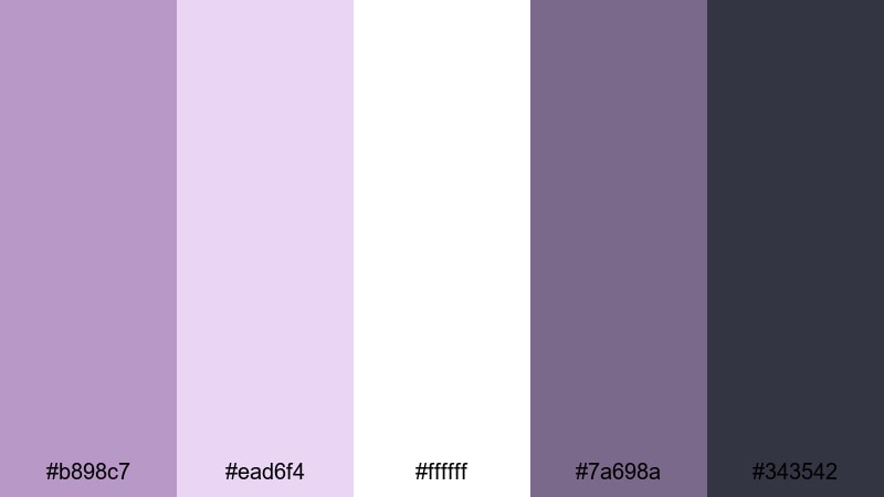
- HEX Codes: #b898c7, #ead6f4, #ffffff, #7a698a, #343542
- Mood: Curated, calm, and gallery-ready.
- Use for: Use in portfolio videos, motion graphics title cards, and clean UI overlays inside tutorials or walkthroughs.
Gallery Spotlight Mauve mimics the feel of a sunlit gallery wall, with bright whites and soft mauves framed by modern slate tones. The palette is calm yet structured, making it perfect for showcasing artwork, photography, or design portfolios.
Use the pure white #ffffff as your canvas and layer mauve panels and text blocks to guide focus to your work. The darker grays are great for navigation bars, chapter markers, and subtle shadows in your Filmora motion graphics templates.
Bold & Moody Purple Mauve Palettes
Neon Night Bloom
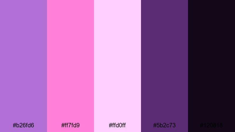
- HEX Codes: #b26fd6, #ff7fd9, #ffd0ff, #5b2c73, #120818
- Mood: Bold, electric, and nightlife-inspired.
- Use for: Perfect for music videos, dance edits, event recaps, and dynamic YouTube intros with high energy.
Neon Night Bloom is all about punchy neon mauves and hot pinks glowing against inky purple shadows. The bright tones (#b26fd6, #ff7fd9, #ffd0ff) pop when placed over the deep #120818, giving you instant nightclub energy in your visuals.
Use this palette for music videos, dance reels, or festival recaps where you want strong contrast and eye-catching thumbnails. In Filmora, combine this scheme with glitch transitions or light leak overlays for scroll-stopping channel intros and social teasers.
Electric Grape Noir
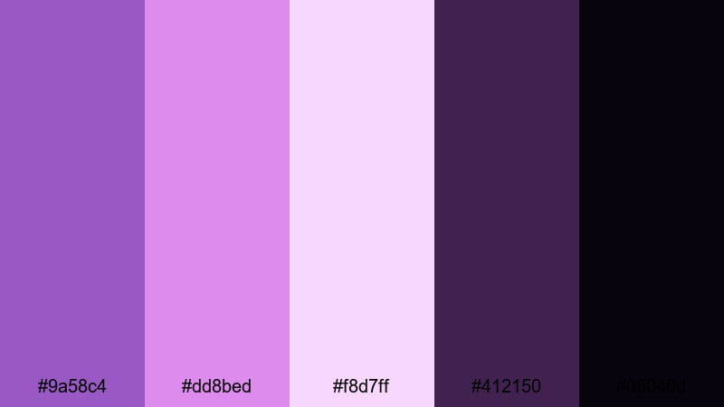
- HEX Codes: #9a58c4, #dd8bed, #f8d7ff, #412150, #08040d
- Mood: Edgy, cinematic, and slightly surreal.
- Use for: Great for gaming channels, tech reviews, and cinematic trailers where you want futuristic drama and punch.
Electric Grape Noir charges your visuals with saturated grape tones and luminous lilac highlights set against near-black shadows. It feels edgy and futuristic, perfect for motion graphics, HUD elements, and bold title cards.
Gaming channels and tech reviewers can use the brighter tones for killfeed-style titles, chapter markers, and animated lower thirds, while #08040d and #412150 give you plenty of depth for cinematic backgrounds, overlays, and frame bars.
Velvet After Dark
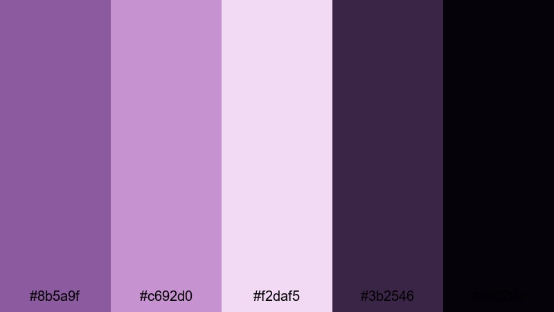
- HEX Codes: #8b5a9f, #c692d0, #f2daf5, #3b2546, #05020a
- Mood: Sultry, mysterious, and velvety.
- Use for: Ideal for perfume-style ads, moody storytelling, night city b-roll, and cinematic slow-motion sequences.
Velvet After Dark blends rich mauves and plums that fade into almost-black shadows. The result is a palette that feels decadent and mysterious, like a late-night city scene or a luxury perfume ad.
Use the darker hues to frame your footage with letterbox bars or vignettes, and reserve the lighter mauves for titles, logo animations, and subtle light streaks. This scheme works especially well with slow-motion footage and close-ups where you want to highlight texture and mood.
Stormy Mauve Horizon
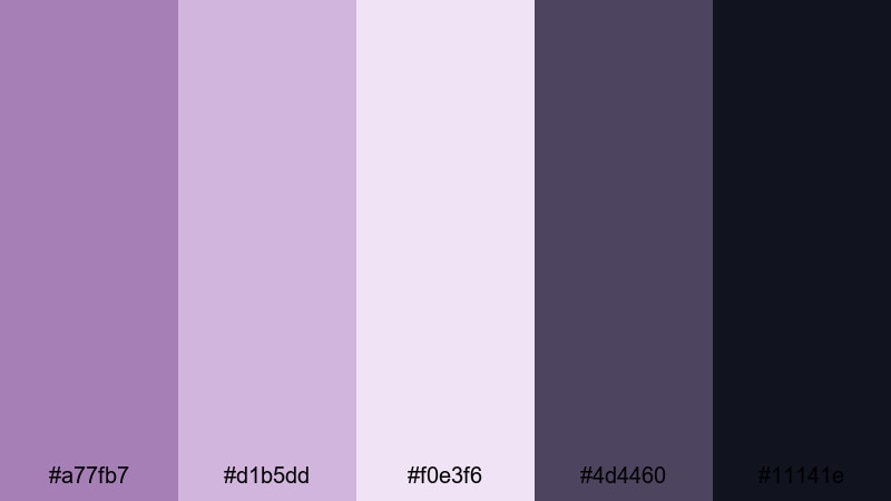
- HEX Codes: #a77fb7, #d1b5dd, #f0e3f6, #4d4460, #11141e
- Mood: Dramatic, reflective, and cinematic.
- Use for: Use for travel films, reflective vlogs, and story-driven edits that shift between calm and intensity.
Stormy Mauve Horizon layers soft horizon mauves over stormy charcoals, creating a moody, filmic feel. The palette shifts easily between calm and tension, making it ideal for narrative content where the emotional tone evolves over time.
Apply the lighter shades to calm scenes and reflective voiceovers, then transition into the deeper tones as your story builds intensity. In thumbnails and chapter cards, this gradient effect helps signal emotional shifts and keep viewers engaged.
Pastel Purple Mauve Palettes
Cotton Candy Haze
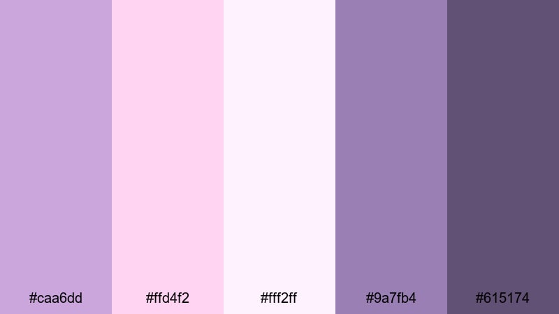
- HEX Codes: #caa6dd, #ffd4f2, #fff2ff, #9a7fb4, #615174
- Mood: Playful, sweet, and softly nostalgic.
- Use for: Great for lifestyle vlogs, stationery promos, kawaii aesthetics, and playful YouTube channel art.
Cotton Candy Haze is a sugary blend of mauves and candy pastels that feels dreamy and slightly retro. The lighter tones give you that cotton-candy cloud look, while #9a7fb4 and #615174 keep the palette grounded enough for readable text and outlines.
Use it for kawaii-inspired graphics, lifestyle vlog branding, or product shots for stationery and decor. Pastel backgrounds with mauve icons, borders, and hand-drawn doodles can turn your intros, end cards, and Instagram covers into one cohesive, charming aesthetic.
Petal Cloud Daydream
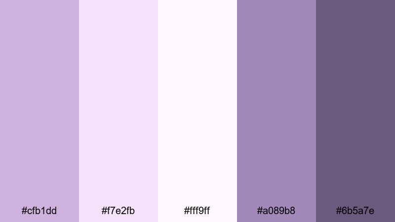
- HEX Codes: #cfb1dd, #f7e2fb, #fff9ff, #a089b8, #6b5a7e
- Mood: Light, airy, and daydreamy.
- Use for: Perfect for morning routine videos, wellness channels, coaching reels, and gentle timelapse edits.
Petal Cloud Daydream floats soft petal mauves over cloudlike whites for a fresh, hopeful aesthetic. It suits content about self-care, wellness, routines, and positive habits where you want viewers to feel encouraged and relaxed.
Use the very light tones for clean backgrounds in your titles and callouts, and the slightly deeper mauves for headings, icons, and timeline markers. This palette looks especially good with bright, natural footage and minimal, uncluttered layouts.
Soft Studio Glow
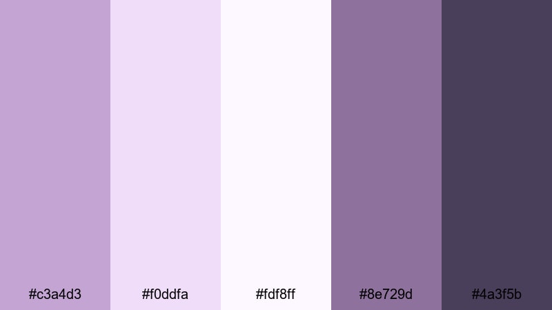
- HEX Codes: #c3a4d3, #f0ddfa, #fdf8ff, #8e729d, #4a3f5b
- Mood: Cozy, polished, and softly professional.
- Use for: Use for talking-head tutorials, creator studios, educational content, and branding where you want a friendly yet expert vibe.
Soft Studio Glow is designed for creator spaces and on-camera hosts. The gentle mauves flatter skin tones, while the deeper accents (#8e729d and #4a3f5b) give you reliable contrast for text, icons, and UI-style elements in your overlays.
Use this palette for educational or tutorial content where you want to appear approachable but still professional. Match your studio decor or LED lights to one of the mauve tones, then reuse those HEX codes in your Filmora titles, subscribe buttons, and chapter cards for a unified brand feel.
Tips for Creating Purple Mauve Color Palettes
Whether you start from these ready-made schemes or build your own, a strong purple mauve palette should balance softness with clarity, and romance with readability. Here are some practical tips to get consistent, beautiful results in your videos and designs.
- Pair mauve with a clear neutral: mix it with clean white, off-white, charcoal, or deep navy so your text and icons stay readable on any screen.
- Use the lightest mauve or blush as a background and reserve the darkest color for text, logos, and key UI elements like buttons and timestamps.
- Limit yourself to 3 main working colors (light, mid, dark) and use the remaining shades only as accents to avoid visual clutter.
- Check your thumbnails on mobile: zoom out or preview at small sizes to make sure titles and faces still stand out over your mauve backgrounds.
- Match your grading to your graphics: if your titles and overlays are purple mauve, nudge shadows or midtones in your footage slightly toward mauve for a cohesive look.
- Use contrast smartly: combine soft mauves with bold black or deep plum when you need high-impact CTAs, lower thirds, or important on-screen notes.
- Stay on-brand: once you pick a mauve palette for your channel, save those HEX codes and reuse them in Filmora presets, social templates, and thumbnail designs.
- Test with different footage: adjust saturation and brightness of your mauve hues depending on whether your content is bright daytime, cozy indoor, or moody night scenes.
Purple mauve color palettes can instantly shift your content into a more romantic, modern, or dreamy space. Whether you choose soft pastels, bold nightlife tones, or minimalist mauve accents, these combinations help shape how viewers feel about your brand and how they remember your channel.
Try importing these HEX codes into Filmora as text and graphic colors, then build matching color grades with HSL, color wheels, and LUTs. Once you have a purple mauve look you love, save it as a preset and reuse it for intros, thumbnails, and social cutdowns so every upload looks connected.
The more consistently you apply your palette, the more recognizable your videos become across YouTube, Instagram, TikTok, and beyond. Experiment, refine, and let purple mauve become a signature part of your creative style in Filmora.
secure downloadNext: Hot Pink Color Palette
