
 100% Security Verified | No Subscription Required | No Malware


 ChatGPT
 Perplexity
 Gemini
 Claude
 Grok
Grok
Renaissance color palettes are built from soft creams, sun-warmed stone, antique gold, and deep wine reds, all inspired by old master paintings and candlelit interiors. These tones feel cinematic and timeless, which is why they work so well for story-driven videos, romantic branding, and atmospheric thumbnails.
This guide brings you 15 Renaissance color palettes with exact HEX codes so you can copy them directly into your video editor, thumbnails, and design tools. Every palette is creator-friendly and ideal for Filmora users who want a cohesive aesthetic across intros, titles, B-roll, and social content.
In this article
Classic Renaissance Elegance Palettes
Florentine Dusk Salon

- HEX Codes: #f4e3d7, #d3b18c, #a06f5a, #6b4b3e, #2f3138
- Mood: Warm, nostalgic, and intimate, like golden hour in a historic villa.
- Use for: Ideal for cinematic lifestyle vlogs, heritage travel intros, and romantic title cards.
Florentine Dusk Salon mixes soft creams, terracotta, and deep slate to echo the feeling of an old-world sitting room at sunset. The lighter tones keep faces flattering and gentle, while the darker browns and charcoal give you enough contrast for elegant text, frames, and UI elements.
Use this palette for cinematic openers, lower thirds, and chapter cards in your vlogs or travel films. In thumbnails and channel banners, the warm mid-tones (#d3b18c, #a06f5a) can be your background, while the deep slate (#2f3138) carries clean, readable typography for a refined Renaissance brand.
Pro Tip: Build a Classic Renaissance Look in Filmora
To give your whole edit a Florentine dusk feeling, start by picking one of the mid-tones as your main branding shade for titles, subtitles, and simple shapes in Filmora. Then use the darkest color for contrast in lower thirds, frames, and overlay graphics so your text always stands out without breaking the Renaissance mood.
You can also sample the lighter creams for background solids and transitions, and keep your footage slightly warm in the highlights. This creates a soft glow that makes every cut, B-roll shot, and end screen feel like it belongs in the same historic villa.
AI Color Palette
If you have a reference image of a Renaissance painting or a still that perfectly captures this salon atmosphere, you can use Filmora's AI Color Palette feature to match that look across your entire video. Import the reference frame, let Filmora analyze its tones, and apply the palette to multiple clips in just a few clicks.
This is especially powerful for mixed footage shot on different cameras or in changing light. AI Color Palette helps you keep consistent warmth, cream highlights, and rich browns from your intro through to your outro, without manually grading each clip.
 secure download

HSL, Color Wheels & Curves
Once your base palette is in place, use Filmora's HSL sliders to nudge skin tones toward soft terracotta and reduce over-saturated oranges. Then fine-tune shadows and highlights with color wheels, shifting shadows slightly toward warm browns and lifting highlights into the creamy, candlelit range without blowing out detail.
If you want a deeper dive into grading, you can follow this step-by-step color grading tutorial on YouTube via this Filmora color correction guide, and then adapt the techniques to your own Renaissance palettes. Gentle S-curves in the RGB curves panel will add contrast and give your footage that polished, gallery-ready finish.
secure download1000+ Video Filters & 3D LUTs
For a faster workflow, start from Filmora's built-in filters and LUTs, then gently adjust them to match your Renaissance palette. Sepia, vintage, and cinematic LUTs can give you an instant old-master base before you dial in specific HEX-inspired tweaks.
Filmora's video filters and 3D LUTs make it easy to test multiple looks on your timeline, compare them with your chosen palette, and save your favorite combination as a reusable style for future vlogs, trailers, and reels.
secure downloadGilded Chapel Light
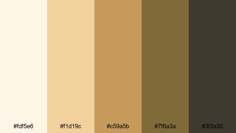
- HEX Codes: #fdf5e6, #f1d19c, #c59a5b, #7f6a3a, #3f3a30
- Mood: Serene and reverent, with a quiet glow inspired by candlelit chapels.
- Use for: Perfect for wedding highlight reels, documentary openings, and sacred or reflective scenes.
Gilded Chapel Light surrounds your visuals with ivory, honey gold, and grounded browns that feel like sunlight on gilded altars. The palette is soft enough for skin tones, yet rich enough to give rings, details, and architecture a subtle halo.
Use the lighter tones for backgrounds on titles and lower thirds, and keep the deeper browns for typography and borders. This combination is ideal for wedding highlight films, faith-based content, or reflective documentaries where you want the mood to feel calm, elevated, and timeless.
Old Master Canvas
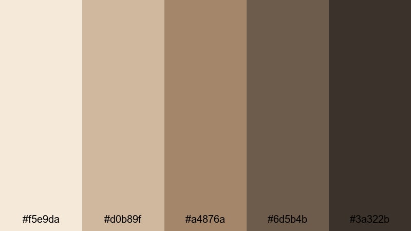
- HEX Codes: #f5e9da, #d0b89f, #a4876a, #6d5b4b, #3a322b
- Mood: Artful and grounded, like aged oil paint on linen canvas.
- Use for: Use in art documentaries, gallery promos, and educational videos about history or painting.
Old Master Canvas feels like it was lifted straight from a museum wall. The creams, ochres, and deep umber tones give footage a painterly patina, flattering skin while adding subtle depth to shadows and backgrounds.
It is a strong choice for art-focused channels, gallery promos, or history explainers. Use the mid-browns for background panels in your graphics and the darkest tone for clean, legible titles. Your thumbnails will instantly look more curated and collector-worthy.
Marble Court Ceremony

- HEX Codes: #f6f2ec, #ded6c8, #b2a897, #7f7b73, #3e4448
- Mood: Regal, calm, and architectural, evoking stone halls and marble courts.
- Use for: Best for luxury brand intros, architecture reels, and historical venue tours.
Marble Court Ceremony is all pale stone, cool grays, and steel-blue shadows, reminiscent of carved columns and grand halls. It feels luxurious but minimal, letting your subjects and clean compositions take the spotlight.
Use the lighter hues for minimalist backdrops behind product shots or architectural footage, while the darker slate (#3e4448) anchors logos and text. This palette is excellent for high-end brand intros, venue showcases, and thumbnail frames that need to communicate refinement at a glance.
Soft & Romantic Renaissance Palettes
Rose Petal Fresco
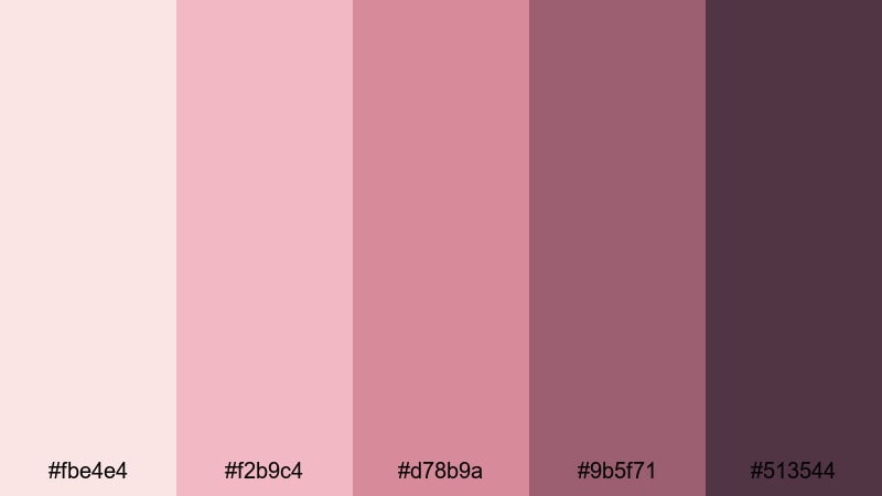
- HEX Codes: #fbe4e4, #f2b9c4, #d78b9a, #9b5f71, #513544
- Mood: Tender, romantic, and poetic, like roses painted onto plaster walls.
- Use for: Perfect for engagement films, emotional vlog stories, and beauty content.
Rose Petal Fresco layers airy blush with wine-tinted shadows, creating a soft-focus romance that flatters skin and adds emotional warmth. The palette literally feels like rose petals pressed into an old notebook.
Use the light pinks for dreamy filters, overlay shapes, and YouTube thumbnail backgrounds, then reserve the deeper mauves and wine tones for text, borders, and subtle drop shadows. It works beautifully for engagement recaps, personal storytelling vlogs, and beauty or skincare content that leans into a Renaissance-inspired, feminine aesthetic.
Velvet Lute Serenade
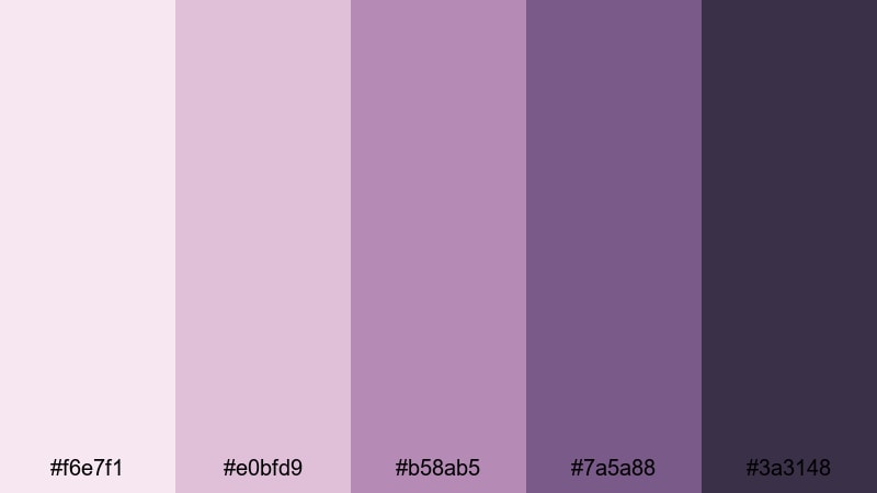
- HEX Codes: #f6e7f1, #e0bfd9, #b58ab5, #7a5a88, #3a3148
- Mood: Moody yet gentle, with a vintage musical romance feel.
- Use for: Great for lyric videos, slow dance scenes, and storytelling shorts set at night.
Velvet Lute Serenade blends dusty mauves and plum purples with a velvet-dark accent, ideal for evening scenes and musical moments. It feels nostalgic without looking too heavy, keeping your footage soft but expressive.
Use the lighter tones for gradient backdrops on lyric videos or end screens, then let the richer purples frame your typography and icons. This palette suits night-time vlogs, lo-fi performance clips, and any story where music, memory, and gentle drama are in focus.
Blush Courtyard Garden
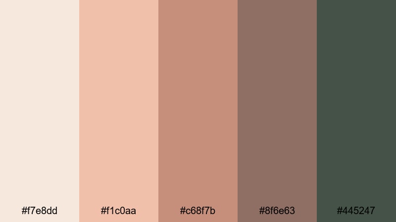
- HEX Codes: #f7e8dd, #f1c0aa, #c68f7b, #8f6e63, #445247
- Mood: Sunny, soft, and inviting, like a quiet garden hidden behind stone walls.
- Use for: Use for lifestyle vlogs, garden tours, and cozy home or cafe content.
Blush Courtyard Garden pairs peachy blush and terracotta with muted green foliage, evoking a hidden courtyard at golden hour. It is warm without being too pink, and the greens add a grounded, natural balance.
In your videos, make the soft peaches your main background and overlay color, while using the green (#445247) for accent text, icons, or call-to-action buttons. This palette is ideal for lifestyle content, plant and garden tours, cozy home walkthroughs, and cafe aesthetics on YouTube or Instagram.
Silken Letter Glow
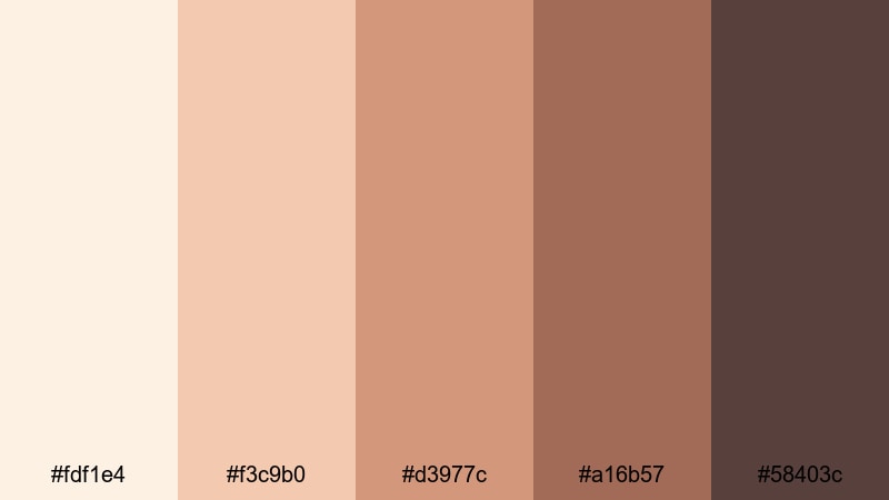
- HEX Codes: #fdf1e4, #f3c9b0, #d3977c, #a16b57, #58403c
- Mood: Intimate and nostalgic, like handwritten letters in lamplight.
- Use for: Perfect for narrative shorts, memoir-style vlogs, and family keepsake edits.
Silken Letter Glow is a suite of warm creams and sepia-leaning browns that instantly feel like aged paper and ink. It is gentle on the eyes and ideal for overlays that feature text, quotes, or personal stories.
Use the lightest shade as your main canvas for titles, journaling prompts, or lower thirds, then reach for the darker browns for headings and key callouts. This palette adds a nostalgic, storybook quality to memoir vlogs, family slideshows, and documentary-style edits about heritage or memory.
Dramatic Renaissance Chiaroscuro Palettes
Caravaggio Shadows
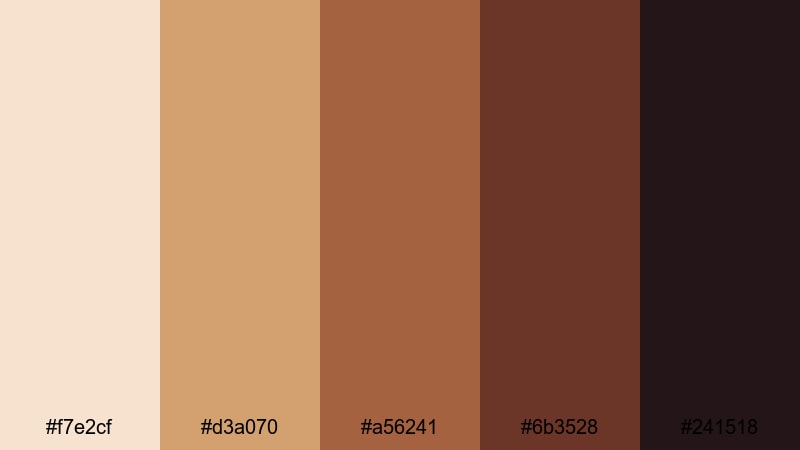
- HEX Codes: #f7e2cf, #d3a070, #a56241, #6b3528, #241518
- Mood: Intense and theatrical with strong light and deep shadow contrast.
- Use for: Ideal for trailers, dramatic scene cuts, and performance or stage videos.
Caravaggio Shadows pushes warm skin tones into bold contrast against near-black reds and browns. It is tailor-made for chiaroscuro, where faces and hands emerge from darkness in a powerful, focused way.
Use the lighter peach and tan for illuminated areas, then lean on the deepest tones for vignettes, letterbox bars, and title cards. This palette is perfect for atmospheric trailers, narrative shorts, performance videos, and any thumbnail where you want drama, mystery, and Renaissance intensity.
Torchlit Gallery Walk
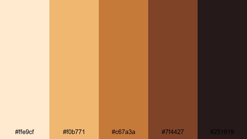
- HEX Codes: #ffe9cf, #f0b771, #c67a3a, #7f4427, #251919
- Mood: Cinematic and adventurous, like wandering a gallery by torchlight.
- Use for: Great for museum tours, mystery vlogs, and game or film reviews with historical themes.
Torchlit Gallery Walk is built from amber lights and rich browns, evoking the flicker of torches in dark corridors. It instantly turns regular interiors into something more cinematic and exploratory.
Use the bright ambers for glows, light leaks, and accent shapes in Filmora, while confining titles and key info to the dark chocolate and near-black tones. This palette shines in museum walkthroughs, lore breakdowns, and game or film reviews with historical or fantasy themes.
Candlelit Oath Hall
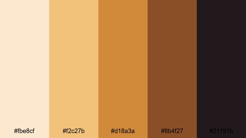
- HEX Codes: #fbe8cf, #f2c27b, #d18a3a, #8b4f27, #21191b
- Mood: Sworn, secretive, and ceremonial with warm flame against dark stone.
- Use for: Use in fantasy edits, story-driven trailers, and roleplay or cosplay videos.
Candlelit Oath Hall combines golden candlelight with inky browns, ideal for oaths, rituals, and tense dialogues. It makes even simple interiors feel like a throne room scene.
Use the light golds and oranges sparingly as accents on text, icons, or glow effects, and let the dark browns dominate your frames and letterbox bars. This keeps the mood suspenseful and is perfect for fantasy edits, cosplay showcases, DnD recaps, and story-driven channel trailers.
Crimson Banner Procession
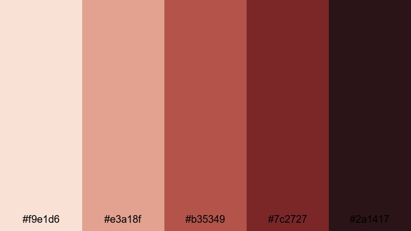
- HEX Codes: #f9e1d6, #e3a18f, #b35349, #7c2727, #2a1417
- Mood: Regal, bold, and ceremonial with a sense of movement and power.
- Use for: Perfect for event highlight reels, festival recaps, and historical montage edits.
Crimson Banner Procession uses soft neutrals to frame striking crimson and wine tones, creating a sense of royal energy and motion. The reds are commanding but balanced by gentle creams in the background.
Use the neutral shades for base backgrounds and the strong reds for logo stings, timeline markers, and on-screen callouts. This palette is great for parades, festivals, sports intros with a regal twist, or any historical montage where banners, flags, and ceremony are central.
Modern Renaissance Fusion Palettes
Neo Palazzo Minimal
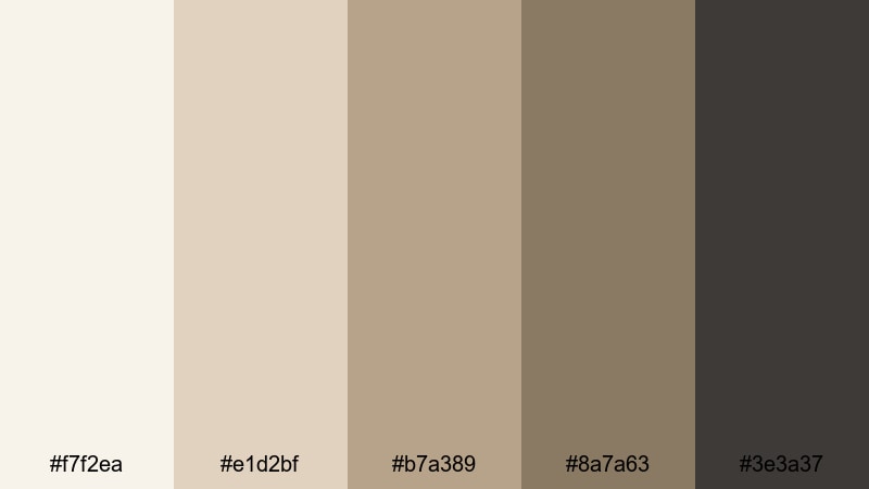
- HEX Codes: #f7f2ea, #e1d2bf, #b7a389, #8a7a63, #3e3a37
- Mood: Calm, curated, and modern with a museum-like stillness.
- Use for: Great for design portfolios, interior walkthroughs, and branding explainers.
Neo Palazzo Minimal reinterprets palace tones as soft beiges and muted taupes with a contemporary edge. It feels like a modern gallery built inside a Renaissance building: clean, quiet, and highly curated.
Use the pale tones for negative space in your layouts, giving room for clean typography and product shots, while the darker taupe and charcoal shade ground logos and headings. This palette suits design portfolios, interior or architecture reels, and explainer videos where clarity and sophistication matter.
Urban Atelier Bronze
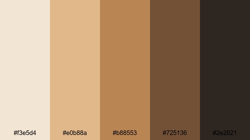
- HEX Codes: #f3e5d4, #e0b88a, #b88553, #725136, #2e2621
- Mood: Artistic and urban, blending studio warmth with city grit.
- Use for: Ideal for creator branding, studio tour videos, and behind-the-scenes content.
Urban Atelier Bronze brings bronze, caramel, and espresso together, echoing metal frames, paint-splattered floors, and warm studio light. It has a maker energy, perfect for creators who want to look both artistic and grounded.
Use the bronze and caramel hues for title bars, subscribe buttons, and chapter markers, saving the darkest espresso tone for outlines and typography. This palette works across channel art, studio tours, process reels, and any behind-the-scenes content where you want a signature Renaissance-meets-urban identity.
Digital Fresco Pop
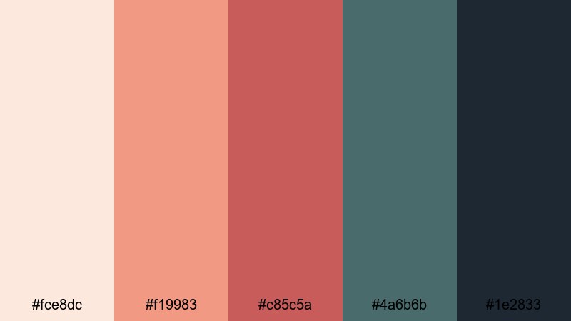
- HEX Codes: #fce8dc, #f19983, #c85c5a, #4a6b6b, #1e2833
- Mood: Playful yet rich, mixing fresco warmth with modern digital punch.
- Use for: Perfect for YouTube channel branding, reels, and upbeat creative tutorials.
Digital Fresco Pop takes classic fresco warmth and collides it with modern coral and teal accents. The result is vibrant, contemporary, and still rooted in Renaissance-inspired warmth.
Use the peach and coral tones for attention-grabbing titles and buttons, while the teal and deep navy support backgrounds, drop shadows, and UI-style overlays. This palette is ideal for creative tutorials, upbeat reels, and channel branding that needs to feel both artistic and very online.
Tips for Creating Renaissance Color Palettes
When building your own Renaissance color combinations for video and design, focus on balancing warm earth tones with deep shadows and a few lighter highlights. This keeps your visuals cinematic, readable, and consistent across thumbnails, intros, and full edits.
- Start from a reference: sample colors directly from Renaissance paintings or museum photos, then refine them into 4 to 6 key HEX values you can reuse everywhere.
- Balance light and dark: always include at least one very light shade for backgrounds and one deep shade for text and accents to maintain readability.
- Limit saturation: Renaissance palettes are usually muted rather than neon; slightly desaturate strong reds, oranges, and greens to keep a vintage, painted feel.
- Choose a hero color: pick one main shade (like terracotta, crimson, or antique gold) to repeat across titles, frames, and CTAs so your brand feels cohesive.
- Match your footage: in Filmora, use color correction tools and LUTs to nudge raw footage toward your chosen palette, rather than forcing overlays to fight against the original colors.
- Test on thumbnails: export a few frames with your palette and check them on mobile; if text is hard to read or details vanish, increase contrast or simplify the background tones.
- Use gradients thoughtfully: blend two adjacent palette colors (for example, cream into gold, or blush into mauve) for soft backdrops behind titles and end screens.
- Save presets: once you dial in a Renaissance look you love, save it as a custom preset in Filmora so you can apply it quickly to new projects and keep your channel identity consistent.
Renaissance color palettes give your videos and designs a rich, story-driven character, whether you lean into soft romantic tones, dramatic chiaroscuro, or modern palace minimalism. With a few carefully chosen HEX codes, you can make every frame feel intentional and on-brand.
Try these 15 palettes as starting points, then adjust them to match your footage, niche, and personality inside Filmora. By saving your favorite combinations as presets, you will be able to move quickly from idea to finished edit while keeping a cohesive Renaissance aesthetic across intros, thumbnails, and social clips.
Whichever palette you choose, experiment with overlays, titles, and filters in Filmora until your visuals look like they belong to the same world as your favorite paintings and period films.
secure download