
 100% Security Verified | No Subscription Required | No Malware

Slate gray sits between cool blue and neutral charcoal, giving it a balanced, grounded feel. It suggests clarity, sophistication, and calm control, which is why you see it everywhere from modern apps to minimalist interiors. On screen, slate gray can feel clean and professional, or moody and cinematic, depending on what you pair it with.
For video creators and designers, slate gray is a powerful base color for thumbnails, intros, lower thirds, and channel branding. Below are 15 slate gray color palettes with HEX codes you can copy directly into your projects or use as a reference when color grading in Filmora, so your visuals stay consistent across vlogs, reels, and long form edits.
In this article
Soft & Minimal Slate Gray Color Palettes
Morning Mist Workspace
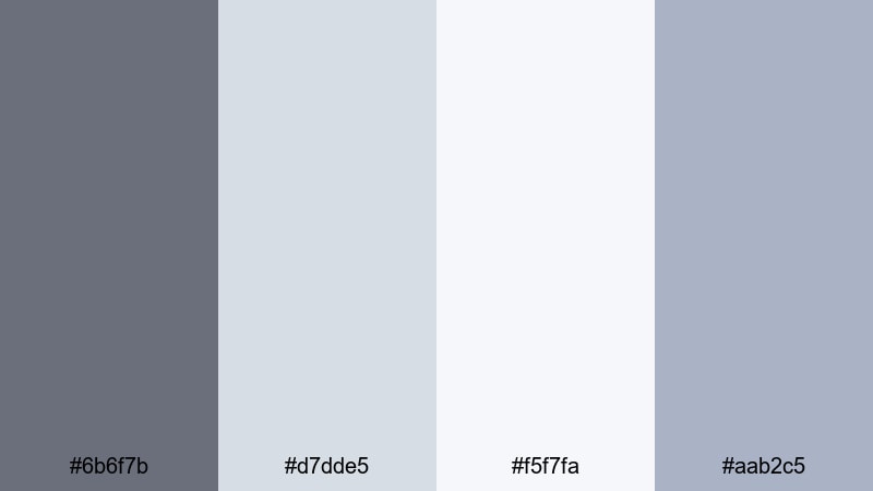
- HEX Codes: #6b6f7b, #d7dde5, #f5f7fa, #aab2c5
- Mood: Calm, focused, and airy, like an early morning edit session.
- Use for: Great for productivity vlogs, clean channel branding, and tutorial lower thirds that need a light, distraction free look.
This palette blends soft slate gray (#6b6f7b) with pale blues and near whites, mimicking the light of a quiet morning studio. It feels tidy, fresh, and uncluttered, which makes it ideal for visuals where you want viewers to focus on information and content rather than loud colors.
Use it as the base for YouTube tutorial thumbnails, minimal intros, and text boxes in how to videos. In Filmora, you can apply these HEX codes to titles, shapes, and overlays to keep everything from your workspace b roll to your screen recording frames in the same calm, modern style.
Pro Tip: Keep Your Soft Slate Gray Aesthetic Consistent in Filmora
Once you decide that Morning Mist Workspace is your signature look, consistency is everything. In Filmora, save this palette inside custom color presets for titles, lower thirds, and background shapes. That way your productivity vlogs, shorts, and community posts all share the same calm slate gray and soft blue tones.
You can also build a simple graphic pack in Filmora with intro cards, subscribe panels, and end screens that all use this palette. Reusing those assets each time you edit makes your channel instantly recognizable, without needing bold or distracting colors.
AI Color Palette
If you have a screenshot or still frame that already nails this soft slate gray mood, Filmora's AI Color Palette feature can automatically transfer that look to the rest of your clips. Just pick a reference image with the whites, blues, and grays you like, and let Filmora match the tones across your timeline.
This is especially helpful when you film on different days or cameras and want your edit to feel like one seamless morning session. The AI Color Palette keeps skin tones natural while pushing your backgrounds and midtones toward that clean, misty aesthetic.
 secure download

HSL, Color Wheels & Curves
To polish this airy slate gray style, use Filmora's HSL and color wheels to gently push blues a bit cooler while keeping whites clean and neutral. A subtle S curve in the tone curve can add contrast without making the image harsh, perfect for desk setups and minimal b roll.
For deeper control, follow a detailed guide to color correction in Filmora and save your adjustments as a preset. Then you can apply the same tonal tweaks to every video that uses your Morning Mist Workspace palette.
secure download1000+ Video Filters & 3D LUTs
If you want to stylize this soft palette in one click, Filmora's video filters and 3D LUTs make it easy to add subtle film grain, light leaks, or matte fades on top of your slate gray base. Choose gentle, low contrast looks to keep the workspace vibe clean and professional.
You can also stack filters on adjustment layers so one tweak affects an entire sequence of b roll or talking head clips. That keeps your thumbnails, intros, and full length videos perfectly aligned with your minimalist brand colors.
secure downloadCloud Loft Studio
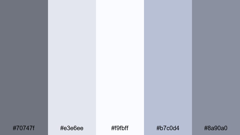
- HEX Codes: #70747f, #e3e6ee, #f9fbff, #b7c0d4, #8a90a0
- Mood: Light, dreamy, and refined with a studio loft vibe.
- Use for: Perfect for lifestyle intros, creative studio tours, and channel art that leans into a soft, professional aesthetic.
Cloud Loft Studio floats between airy whites and cool slate grays, creating the feel of a bright, window filled studio. It is soft enough for lifestyle content but polished enough for client facing work and portfolio videos.
Use the lighter tones as backgrounds for text, chapter markers, and quote overlays, while the mid grays define borders, icons, and subtle drop shadows. This palette works beautifully in Filmora for intro sequences, channel headers, and any content that shows your creative space.
Quiet Sketchbook Tones
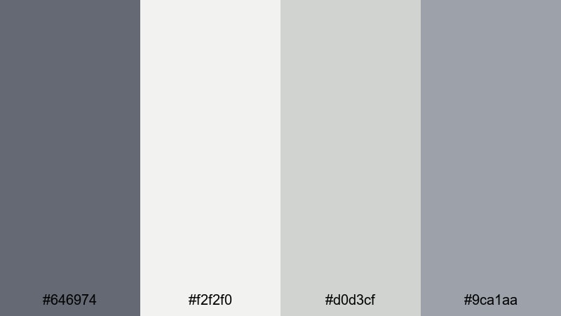
- HEX Codes: #646974, #f2f2f0, #d0d3cf, #9ca1aa
- Mood: Gentle, introspective, and creative, like sketching on a rainy day.
- Use for: Best for art timelapses, journaling videos, and subtle title cards where the visuals should feel calm and thoughtful.
Quiet Sketchbook Tones pairs muted slate gray with warm off whites for a tactile, paper like mood. It suggests pencil lines, sketchbooks, and slow, intentional creativity rather than loud, saturated visuals.
Apply these colors to your timelapse titles, chapter cards, and end screens in Filmora to give drawing or journaling content a cohesive look. The soft contrast keeps attention on your artwork while still giving overlays and text enough clarity to read comfortably on mobile.
Soft Street Overcast
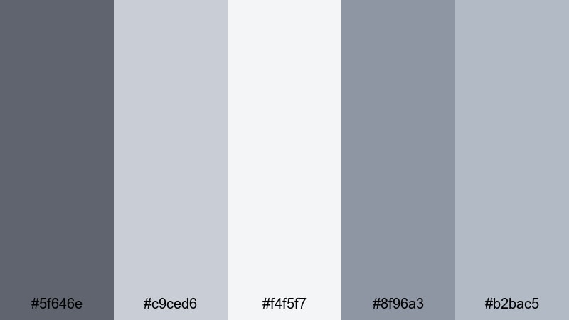
- HEX Codes: #5f646e, #c9ced6, #f4f5f7, #8f96a3, #b2bac5
- Mood: Subtle, urban, and gently overcast without feeling gloomy.
- Use for: Use in city b roll, minimalist travel vlogs, and understated thumbnail backgrounds that highlight subject faces or text.
Soft Street Overcast captures the feel of concrete sidewalks and cloudy skies, but with a gentle, almost pastel softness. It keeps the city mood while stripping away harsh contrast and heavy blacks.
Use it when you want neutral, modern thumbnails or lower thirds for travel diaries and everyday vlogs. In Filmora, you can tint your footage slightly toward these grays and use the lighter tones for text plates that sit behind your titles and location tags.
Moody & Cinematic Slate Gray Color Palettes
Urban Night Drive
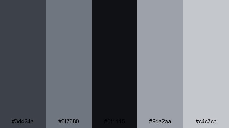
- HEX Codes: #3d424a, #6f7680, #0f1115, #9da2aa, #c4c7cc
- Mood: Cinematic, cool, and slightly mysterious like a late night drive downtown.
- Use for: Perfect for cinematic b roll, music videos, and trailer style teasers with neon signs or car light streaks.
Urban Night Drive layers deep slate shadows with steel gray highlights, creating a cool metallic base for night city footage. The near black #0f1115 gives you rich contrast while the lighter grays pick up reflections from streetlights and car headlights.
Use this palette to design title sequences, glitchy overlays, and thumbnail text that sits on top of night shots. In Filmora, combine it with subtle bloom or glow effects to make light sources feel more cinematic and surreal.
Rainy Window Reflections
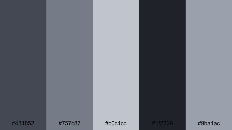
- HEX Codes: #434852, #757c87, #c0c4cc, #1f2329, #9ba1ac
- Mood: Melancholic yet cozy, like watching city lights through a rainy window.
- Use for: Great for slow vlogs, reflective monologues, and emotional storytelling sequences where mood matters more than saturation.
Rainy Window Reflections mixes inky slate grays with soft silvers to echo wet glass and blurred lights. It carries a gentle melancholy that suits voiceovers, reflective essays, or scenes where sound design and pacing are more important than bright color.
Use the darker tones as backgrounds for lower thirds and subtitles, and the mid grays for delicate borders or line graphics. In Filmora, pair this palette with slower transitions and a touch of vignette to reinforce the intimate, rainy night feeling.
Noir Title Sequence

- HEX Codes: #111318, #3b3f47, #6b7078, #9da0a8
- Mood: Dramatic, mysterious, and bold with classic film noir vibes.
- Use for: Use for opening titles, crime or mystery content, and intense commentary videos that need strong visual identity.
Noir Title Sequence is built on deep blacks and cool slate midtones, perfect for high contrast, dramatic visuals. It instantly gives your project a detective movie or thriller podcast energy.
Use the darkest shade for backgrounds and letterbox bars, then let lighter grays shape your text, lines, and simple graphic motifs. In Filmora, animate titles in and out using sharp cuts or typewriter effects to match the boldness of this palette.
Foggy Harbor Twilight
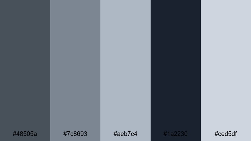
- HEX Codes: #48505a, #7c8693, #aeb7c4, #1a2230, #ced5df
- Mood: Hazy, serene, and cinematic like a harbor wrapped in twilight fog.
- Use for: Best for travel films, drone shots over water, and calm cinematic sequences that need depth without bright colors.
Foggy Harbor Twilight blends dusky blues into cool slate gray, creating depth and atmosphere without relying on strong saturation. It is ideal for seascapes, aerial shots, and moody B roll that you want to feel timeless and calm.
Use the lighter blue grays in titles and location labels, and keep the darker tones in your shadows and gradients. In Filmora, this palette pairs nicely with slow push ins, crossfades, and soft lens blur for transitions between scenic shots.
Modern & Tech Slate Gray Color Palettes
Futuristic Dashboard Glow
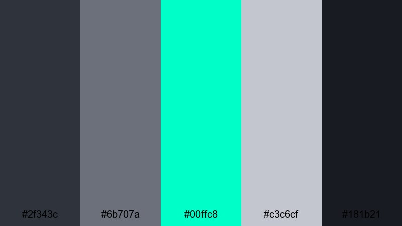
- HEX Codes: #2f343c, #6b707a, #00ffc8, #c3c6cf, #181b21
- Mood: High tech, energetic, and sharp with a neon HUD feel.
- Use for: Perfect for tech reviews, gaming overlays, and animated infographics with glowing accents.
Futuristic Dashboard Glow uses dark slate grays as the base, then explodes with a bright aqua neon accent (#00ffc8). It feels like a sci fi user interface or a high end control panel on a gaming rig.
Use the aqua sparingly as highlight lines, button accents, and key text to keep it striking but not overwhelming. In Filmora, combine this palette with animated shapes, waveforms, and speed ramping for reviews, unboxings, and overlay graphics.
Minimal UI Frame

- HEX Codes: #4e545e, #8e939c, #e5e7eb, #ffffff, #b4b8c0
- Mood: Clean, structured, and professional with a product UI aesthetic.
- Use for: Use for app demos, SaaS explainers, and channel branding focused on productivity tools or design tutorials.
Minimal UI Frame sits firmly in the world of modern software design. Slate gray lines and borders frame light gray panels and white content areas, making your footage feel like it lives inside a sleek app interface.
Use it for screen recording frames, data callouts, and simple motion graphics that explain features. In Filmora, you can build reusable templates with these HEX codes to keep every tutorial or SaaS walkthrough on brand.
Cyber Slate Neon
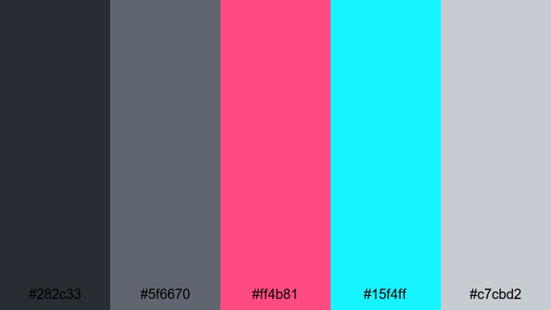
- HEX Codes: #282c33, #5f6670, #ff4b81, #15f4ff, #c7cbd2
- Mood: Energetic, edgy, and cyberpunk inspired with neon pops.
- Use for: Ideal for gaming intros, motion graphics, and fast paced edits that need high impact color accents on a neutral base.
Cyber Slate Neon takes a neutral slate gray base and electrifies it with hot pink (#ff4b81) and electric cyan (#15f4ff). It is bold, eye catching, and perfect for channels that want instant impact in thumbnails and overlays.
Use the neon tones to highlight usernames, kill streaks, or key phrases, while the grays hold everything together in the background. In Filmora, combine this palette with glitch effects, speed lines, and dynamic typography for gaming montages or music driven edits.
Data Grid Skyline

- HEX Codes: #3a3f48, #6e7480, #9fa5b0, #13a1ff, #e1e4eb
- Mood: Analytical, futuristic, and organized like a data driven cityscape.
- Use for: Great for finance explainers, analytics dashboards, and motion graphics with charts, graphs, and timelines.
Data Grid Skyline feels like a skyline made of data points and bar charts. Cool slate grays provide structure, while the clear blue accent (#13a1ff) draws attention to key metrics and callouts.
Use this palette for finance, productivity, or strategy content where you want visuals to feel trustworthy and modern. In Filmora, color code charts, icons, and key numbers with this scheme so your viewers can instantly read what matters most.
Warm & Cozy Slate Gray Color Palettes
Fireplace Storytime
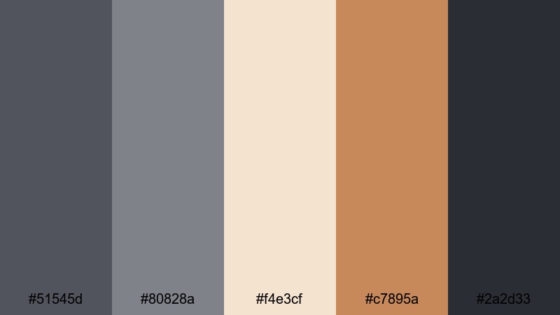
- HEX Codes: #51545d, #80828a, #f4e3cf, #c7895a, #2a2d33
- Mood: Warm, nostalgic, and intimate like talking by the fire.
- Use for: Perfect for storytelling podcasts, cozy sit down videos, and book themed channels that want a soft cinematic warmth.
Fireplace Storytime warms up cool slate grays with candlelight creams and soft brown tones. It captures the feeling of reading beside a fireplace or recording a late night storytime episode.
Use the warm accent #c7895a in small touches like icons, underline bars, or quote marks, while slate gray holds your backgrounds and typography. In Filmora, pair this palette with softer contrast and a touch of film grain to make your long form videos feel intimate and inviting.
Autumn Knit Edit
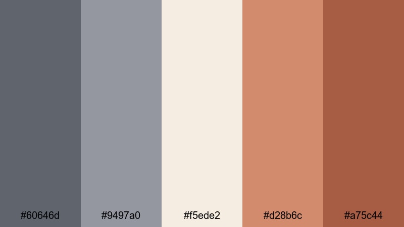
- HEX Codes: #60646d, #9497a0, #f5ede2, #d28b6c, #a75c44
- Mood: Cozy, seasonal, and comforting like layered knits in fall.
- Use for: Use for autumn vlogs, stationery hauls, and seasonal lookbooks where you want warm yet grounded tones.
Autumn Knit Edit combines steady slate gray with pumpkin and cinnamon accents, creating a gentle fall aesthetic. It feels seasonal without tipping into overly bright orange or red.
Use it for September to November thumbnails, seasonal intro animations, and preset color grades for your fall vlogs. In Filmora, color your titles and graphic elements with these HEX codes, then slightly lift shadows to mimic overcast autumn light.
Coffee Shop Bokeh
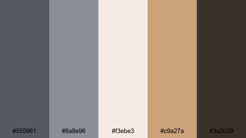
- HEX Codes: #555961, #8a8e96, #f3ebe3, #c9a27a, #3a3029
- Mood: Inviting, relaxed, and slightly romantic like a cafe afternoon.
- Use for: Great for cafe vlogs, study with me videos, and channel art where you want latte warmth with modern neutrality.
Coffee Shop Bokeh softens slate gray with latte creams and warm browns, capturing the glow of a stylish cafe. It feels modern yet cozy, great for channels built around studying, freelancing, or soft lifestyle content.
Use the cream and caramel tones in background panels for text and timers, while the grays keep your typography crisp and readable. In Filmora, pair this palette with gentle zooms, slow pans over coffee shots, and light blur transitions to reinforce the relaxed, bokeh filled mood.
Tips for Creating Slate Gray Color Palettes
Slate gray works as a flexible base for many aesthetics, from minimal and techy to warm and cinematic. When you build or adapt palettes for video and design, a few practical rules will help them look polished on every screen.
- Pick one main slate gray: Choose a single core gray for UI elements and overlays, then build lighter and darker neighbors around it for highlights and shadows.
- Control contrast for readability: Make sure text sits either much lighter or much darker than the background so titles and subtitles stay readable on phones and TVs.
- Add one accent color: Use one strong accent (aqua, orange, pink, etc.) to guide attention to CTAs, key words, or important data instead of scattering many bright colors.
- Match palette to content mood: Use cooler, bluer grays for tech and cinematic edits, and slightly warmer, brown leaning grays for cozy vlogs and storytelling videos.
- Test on real footage: Drop your color swatches on top of actual frames from your video in Filmora to see how they interact with skin tones, skies, and interiors.
- Keep branding consistent: Save your favorite HEX codes and Filmora presets so thumbnails, intros, and lower thirds always match your channel identity.
- Adjust for platforms: Increase contrast and saturation slightly for short form platforms where viewers scroll fast and watch on small screens.
- Use adjustment layers: In Filmora, apply color grading on adjustment layers so you can fine tune your slate gray look across an entire sequence with one edit.
Slate gray palettes give you a professional, flexible base that can lean soft, cinematic, techy, or cozy with just a few accent colors. By choosing a palette that fits your niche and applying it consistently, you can turn casual uploads into a recognizable visual brand.
Try these 15 palettes as starting points in Filmora: copy the HEX codes into your titles, shapes, and overlays, then refine the look with color grading tools and presets. Over time, your viewers will start to associate a particular slate gray mood with your channel and content style.
Whether you are editing productivity vlogs, gaming highlights, or storytelling podcasts, keeping a clear color language will make your work stand out and feel more cinematic.
secure downloadNext: Wheat Color Palette
