
 100% Security Verified | No Subscription Required | No Malware

Sunset colors instantly feel warm, emotional, and cinematic. They blend soft pinks, golden oranges, and deep blues that remind viewers of endings, memories, and fresh starts. In color psychology, sunset tones often suggest romance, optimism, nostalgia, and calm energy, which makes them perfect for storytelling on screen.
For video creators, YouTube channels, and social brands, a well chosen sunset color palette can tie together thumbnails, intros, lower thirds, and overlays so everything feels consistent. Below are 15 curated sunset color palettes with HEX codes you can plug directly into your designs or apply in Filmora for vlogs, reels, intros, and cinematic edits.
In this article
Soft & Romantic Sunset Color Palettes
Blush Horizon Glow
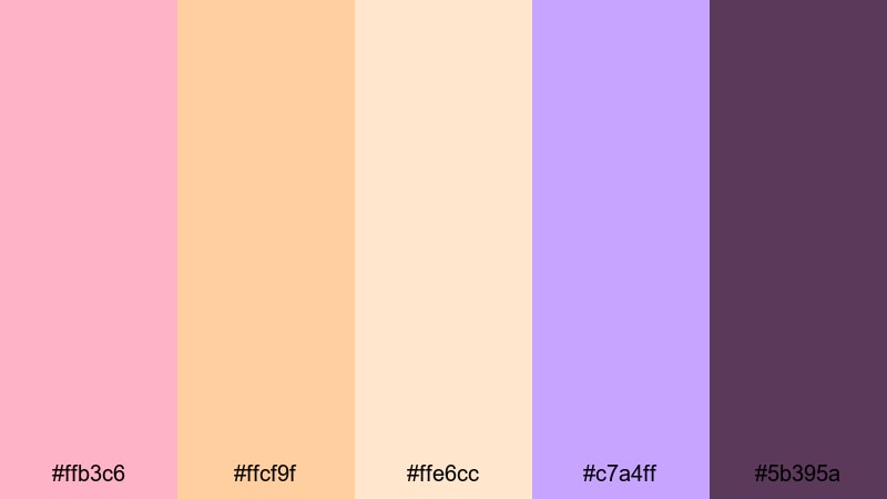
- HEX Codes: #ffb3c6, #ffcf9f, #ffe6cc, #c7a4ff, #5b395a
- Mood: Dreamy, tender, and nostalgic.
- Use for: Best for romantic vlog intros, couple travel reels, and dreamy storytelling titles.
Blush Horizon Glow mixes soft blush pink, peach, and cream with a gentle twilight plum accent. It feels like the last gentle light on the horizon, perfect when you want your visuals to feel intimate, emotional, and slightly nostalgic.
Use this palette for love story vlogs, proposal videos, or gentle lifestyle edits. Apply the lighter shades to backgrounds, text boxes, and overlays, while the deep plum works beautifully for titles, subtitles, and call to action buttons in your thumbnails and intros.
Pro Tip: Build a Romantic Sunset Look in Filmora
To keep a soft, romantic sunset vibe consistent across your edit, choose Blush Horizon Glow as your main branding palette in Filmora. Use the peach and blush tones for title cards and lower thirds, and bring the darker plum into logo stings, end screens, and transitions so your viewers instantly recognize your style.
When you color grade your footage, gently warm up the highlights to echo the peach and blush tones from the palette, while keeping shadows slightly purple toned for that twilight feeling. This will help connect your footage with your graphics, thumbnails, and channel branding.
AI Color Palette
If you already have a reference image of a beautiful blush sunset, you can turn it into a full video look in just a few clicks. Filmora's AI Color Palette feature lets you sample the colors from a still frame or a mood board and apply that same palette across your entire timeline.
Import a frame that captures the Blush Horizon Glow mood, then use AI Color Palette to match other clips, intros, and b-roll. This keeps your romantic tones consistent from the opening title to the final end screen.
 secure download

HSL, Color Wheels & Curves
To refine your sunset look, use Filmora's HSL and color wheels to gently nudge your colors into the right range. Push the reds and oranges a little warmer, desaturate overly strong magentas, and cool the shadows slightly so the plum accent feels cinematic rather than harsh. The curves panel lets you lift highlights for a soft glow while keeping midtones flattering for skin.
You can follow a detailed workflow for balancing hues and contrast in Filmora using guides like this color correction tutorial, then save your adjustments as a preset to reuse across multiple romantic vlogs.
secure download1000+ Video Filters & 3D LUTs
If you want a fast way to stylize your sunset edits, Filmora's video filters and 3D LUTs make it easy to add dreamy bloom, soft fades, or pastel tones. Combine a warm LUT with a subtle vignette to pull attention toward faces while keeping your blush and peach hues intact.
Experiment with different cinematic and vintage filters, then fine tune opacity so your Blush Horizon Glow colors stay readable for text and graphics. You can save a filter and LUT combo as your go to look for all romantic or couple themed content.
secure downloadCotton Candy Skies
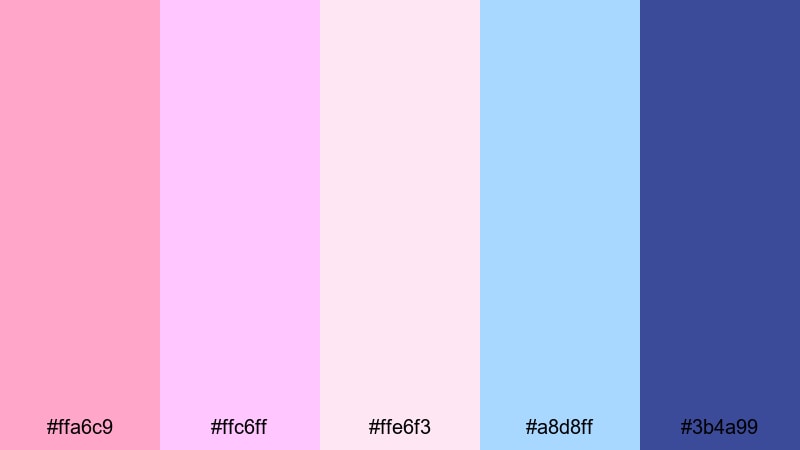
- HEX Codes: #ffa6c9, #ffc6ff, #ffe6f3, #a8d8ff, #3b4a99
- Mood: Playful, innocent, and whimsical.
- Use for: Perfect for soft aesthetic vlogs, dreamy travel montages, and kawaii-style channel branding.
Cotton Candy Skies blends pastel pinks, lilac, and baby blue with a deeper indigo accent. It feels light, airy, and a little magical, like watching clouds drift through a candy colored sky.
Use the pale hues as backgrounds for text, overlays, and end cards, while the deep blue creates contrast for titles and icons. This palette is ideal for soft aesthetic vlogs, kawaii intros, gaming overlays, and thumbnails that need an instantly cute, upbeat mood.
Rose Gold Evening
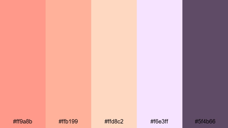
- HEX Codes: #ff9a8b, #ffb199, #ffd8c2, #f6e3ff, #5f4b66
- Mood: Luxe, warm, and gently glamorous.
- Use for: Use for beauty tutorials, product highlights, and elegant lifestyle lookbooks.
Rose Gold Evening combines warm rose gold tones with soft creams and a muted mauve accent. It gives your visuals a polished, luxurious feeling without becoming too harsh or saturated.
Try this palette for beauty channels, product close ups, and cozy lifestyle edits. Use the lighter shades for clean backgrounds and callout boxes, and apply the deep mauve for text, borders, and thumbnail frames so your brand feels refined and consistent across platforms.
Peach Cloud Drift
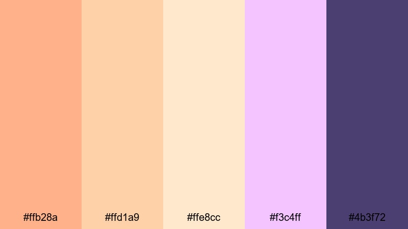
- HEX Codes: #ffb28a, #ffd1a9, #ffe8cc, #f3c4ff, #4b3f72
- Mood: Calm, tender, and softly cinematic.
- Use for: Great for calm travel diaries, journaling content, and reflective voiceover edits.
Peach Cloud Drift mixes airy peach and cream with a touch of lilac and a muted twilight violet. It feels calm and reflective, like drifting clouds at the end of a long day.
This palette works beautifully for slower paced vlogs, journaling sessions, and reflective storytelling. Use the light tones for simple, uncluttered lower thirds and titles, and reserve the darker violet for key text, chapter markers, and YouTube thumbnails where you need subtle contrast without losing the gentle aesthetic.
Bold & Tropical Sunset Color Palettes
Neon Beach Sundown
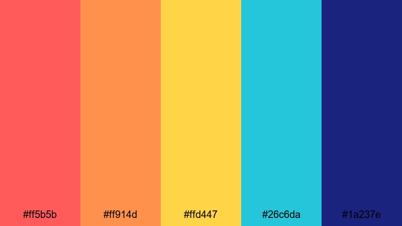
- HEX Codes: #ff5b5b, #ff914d, #ffd447, #26c6da, #1a237e
- Mood: Energetic, bold, and party ready.
- Use for: Ideal for festival recaps, travel shorts, and energetic YouTube intros.
Neon Beach Sundown throws together punchy reds, hot tangerine, electric teal, and deep night blue. It looks like a beach party right as the sun dips below the horizon, full of energy and contrast.
Use the warm reds and oranges for attention grabbing titles and thumbnail text, while the teal and navy create bold backgrounds and overlays. This palette is perfect for festival recaps, club edits, travel shorts, or any intro that needs to hook viewers in the first second.
Mango Lava Burst
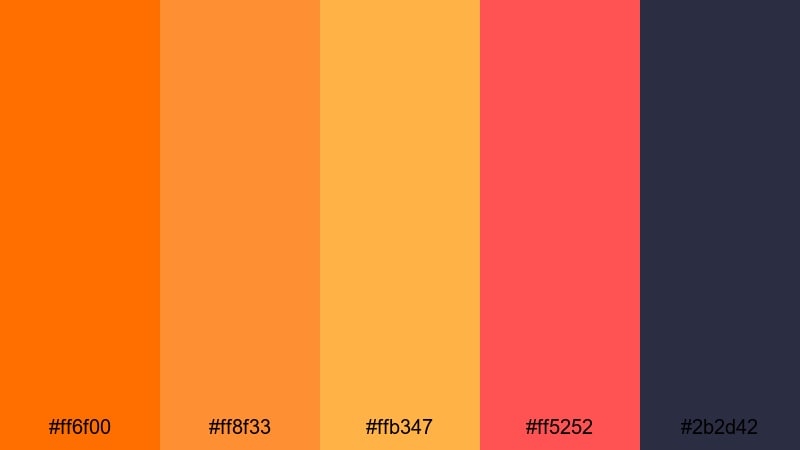
- HEX Codes: #ff6f00, #ff8f33, #ffb347, #ff5252, #2b2d42
- Mood: Fiery, intense, and adventurous.
- Use for: Use this for action montages, sports edits, and bold thumbnail designs.
Mango Lava Burst is all about impact. Fiery mango oranges and lava reds stand out strongly against a dark slate base, so your graphics cannot be missed in feeds or recommended carousels.
Use the bright shades for text, badges, and callouts on top of the dark slate background to ensure high readability. This palette fits sports highlights, action montages, gaming videos, or any bold announcement that needs to look intense and adventurous.
Tropical Afterglow
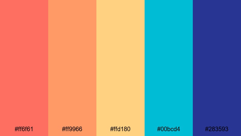
- HEX Codes: #ff6f61, #ff9966, #ffd180, #00bcd4, #283593
- Mood: Vacation ready, bright, and optimistic.
- Use for: Great for travel vlogs, resort promos, and upbeat channel branding.
Tropical Afterglow blends sun warmed corals and mango tones with cool tropical teal and deep sapphire. It feels like golden hour at a beach resort, relaxed but still bright and full of life.
Use the warm tones for skin friendly overlays and b-roll lower thirds, while teal and blue can frame your logo, subscribe buttons, and end cards. It works especially well for travel vlogs, resort or Airbnb promos, and any channel that lives in the world of holidays and outdoor adventures.
Electric Coral Dusk
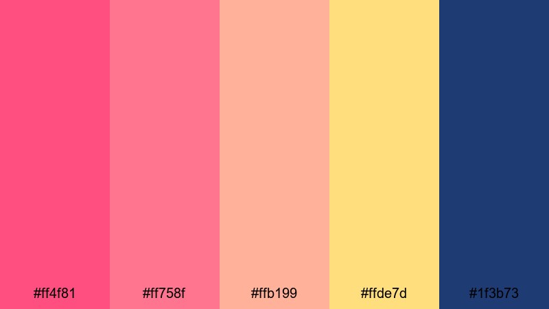
- HEX Codes: #ff4f81, #ff758f, #ffb199, #ffde7d, #1f3b73
- Mood: Vibrant, bold, and stylishly modern.
- Use for: Perfect for music videos, dance reels, and trendy social campaigns.
Electric Coral Dusk brings vivid coral and poppy pink together with a golden accent and rich twilight blue. It feels trendy and fashion forward, ideal for content that wants to look modern and bold.
Use the brighter corals for animated titles, kinetic typography, and reel covers, while the deep blue provides a strong base for text and logo marks. This palette fits music videos, dance content, short form campaigns, and social edits that aim to stand out on Instagram, TikTok, and YouTube Shorts.
Elegant & Cinematic Sunset Color Palettes
Cinematic Ember Fade
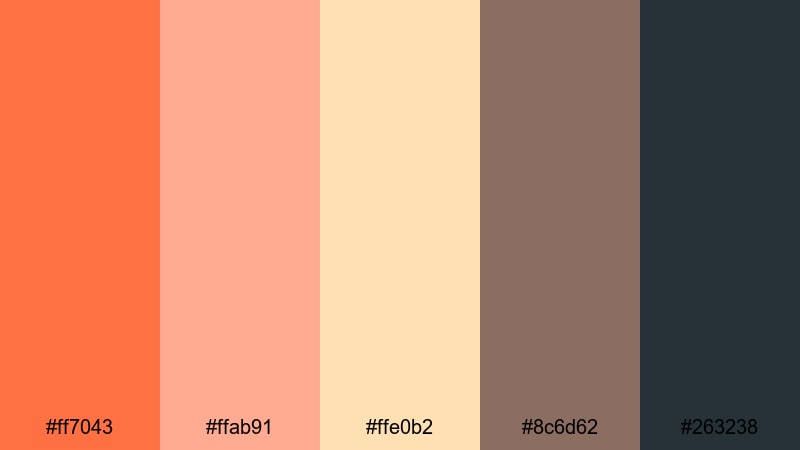
- HEX Codes: #ff7043, #ffab91, #ffe0b2, #8c6d62, #263238
- Mood: Moody, cinematic, and storytelling driven.
- Use for: Best for short films, narrative edits, and cinematic b roll sequences.
Cinematic Ember Fade uses burnt orange and ember tones that slowly fall into rich charcoal and deep shadow. It gives your footage a filmic, storytelling atmosphere without relying on overly heavy contrast.
Use the warm colors in your grade and graphics for emotional scenes, title cards, and chapter breaks, then let the darker tones shape your letterbox bars, text, and UI elements. It is an excellent choice for narrative shorts, cinematic b roll sequences, and moody storytime edits.
Amber Noir Horizon
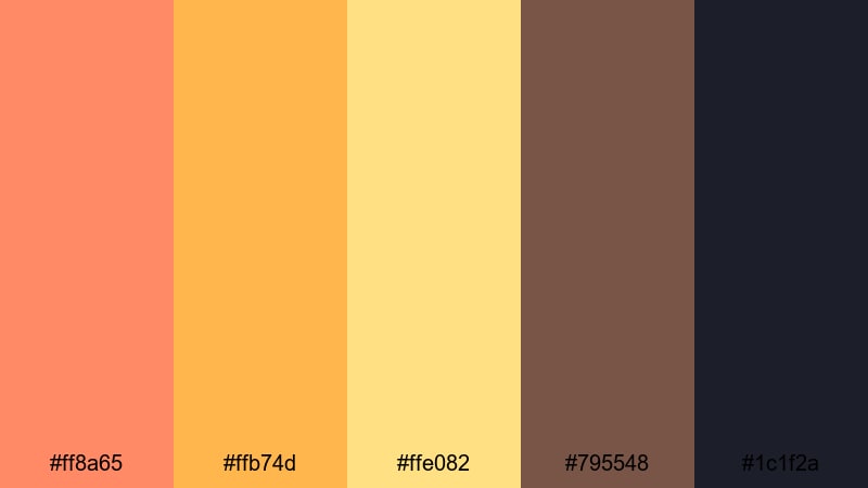
- HEX Codes: #ff8a65, #ffb74d, #ffe082, #795548, #1c1f2a
- Mood: Refined, dramatic, and slightly mysterious.
- Use for: Use in documentary style edits, moody travel films, and title cards.
Amber Noir Horizon pairs golden amber and honey yellow with deep cocoa and midnight navy. The result feels refined and a little mysterious, like an expensive commercial or a dramatic documentary opener.
Use the amber tones for accent highlights, labels, and key titles, and keep the dark cocoa and navy for backgrounds, borders, and text. This palette works especially well for documentaries, premium travel films, and any series that aims for a serious yet warm look.
Gilded Twilight Frames
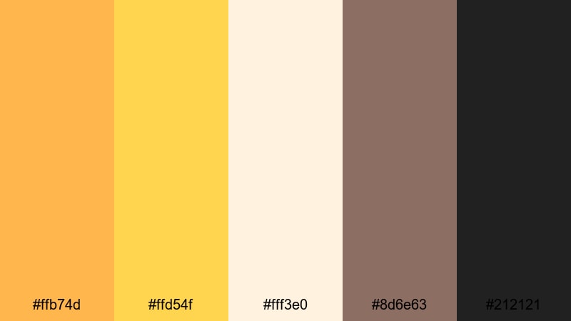
- HEX Codes: #ffb74d, #ffd54f, #fff3e0, #8d6e63, #212121
- Mood: Luxurious, polished, and editorial.
- Use for: Perfect for brand commercials, luxury product promos, and cinematic title sequences.
Gilded Twilight Frames leans into gold, cream, and rich neutrals for a premium editorial vibe. The palette looks like a sunset reflecting on polished metal and marble.
Use the gilded tones to highlight products, animate logo reveals, and design thumbnail borders that look high end. The neutral browns and near black keep things grounded and elegant, ideal for brand commercials, fashion lookbooks, and cinematic title sequences.
Smoky Sunset Grade
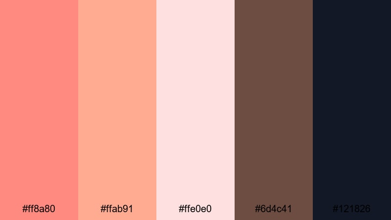
- HEX Codes: #ff8a80, #ffab91, #ffe0e0, #6d4c41, #121826
- Mood: Softly melancholic and cinematic.
- Use for: Great for reflective vlogs, storytime videos, and indie style short films.
Smoky Sunset Grade combines smoky coral, blush neutrals, earthy brown, and deep navy black. It adds a subtle, melancholic warmth that suits emotional, introspective stories.
Use the soft corals in your color grade and overlays to warm up skin and highlights, and bring the browns and navy into your typography, frames, and background elements. It pairs beautifully with indie style music, slow cuts, and cinematic b roll.
Minimal & Modern Sunset Color Palettes
Muted Sand Sunset
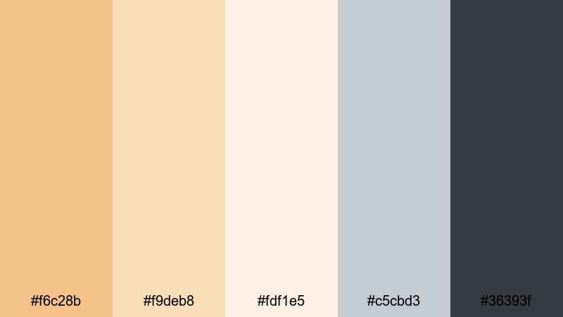
- HEX Codes: #f6c28b, #f9deb8, #fdf1e5, #c5cbd3, #36393f
- Mood: Calm, minimal, and airy.
- Use for: Ideal for productivity channels, calm study vlogs, and modern UI overlays.
Muted Sand Sunset brings soft sand, beige, and cream together with cool grays. It feels calm, tidy, and modern, like a minimalist studio at golden hour.
Use the warm neutrals for backgrounds and cards, while the gray and charcoal ensure your text stays legible. This palette is perfect for productivity channels, Notion style tutorials, study vlogs, and any modern UI overlays that should look clean and distraction free.
Clean Gradient Dusk
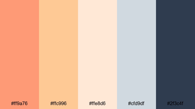
- HEX Codes: #ff9a76, #ffc996, #ffe8d6, #cfd9df, #2f3c4f
- Mood: Modern, sleek, and versatile.
- Use for: Use for YouTube channel branding, lower thirds, and gradient based motion graphics.
Clean Gradient Dusk flows from warm coral through soft cream into cool steel blue and slate. It is highly versatile and built for gradient based designs that feel polished and contemporary.
Create smooth gradient backgrounds for intros, outros, and lower thirds, placing text in the lighter zones for clarity. The darker slate shade makes a strong base for logos, icons, or subscribe buttons in thumbnails and end screens.
Soft Studio Sundown
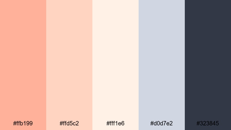
- HEX Codes: #ffb199, #ffd5c2, #fff1e6, #d0d7e2, #323845
- Mood: Professional, gentle, and approachable.
- Use for: Perfect for tutorials, talking head setups, and personal brand channels.
Soft Studio Sundown combines studio friendly peaches and creams with cool gray blue and charcoal. It feels approachable and professional at the same time, ideal when you want warmth without losing clarity.
Use the warm tones in your background gradients, info cards, and lower thirds, then rely on the gray blue and charcoal for text, icons, and UI elements. This palette suits tutorial channels, coaching content, educational videos, and any personal brand that aims to look polished yet friendly.
Tips for Creating Sunset Color Palettes
When you build your own sunset inspired color palette for video and design, focus on balancing warmth and contrast so your footage looks cinematic while your text and graphics stay clear and on brand.
- Pick 1 to 2 main sunset hues (such as coral and gold) and 2 to 3 supporting neutrals so your palette feels focused, not chaotic.
- Always test text on top of your background colors; dark navy, charcoal, or deep plum usually give better readability than pure black.
- Use gradients that move from warm (orange, pink) to cool (blue, violet) to mimic real sunsets in your intros, title cards, and thumbnails.
- Keep your brand elements (logo, subscribe button, lower thirds) in the same 2 to 3 accent colors across all videos to build recognition.
- Match your color grade to your branding by gently warming highlights and cooling shadows, so overlays and footage do not feel disconnected.
- Avoid oversaturating sunset tones; slightly muted oranges and pinks usually look more cinematic and flattering on skin.
- Create separate versions of your graphics for light and dark modes, adjusting contrast and stroke around text to stay readable on mobile.
- Save your favorite sunset looks as presets or templates in Filmora so you can apply a consistent palette quickly to new projects.
Sunset color palettes are powerful tools for shaping mood, storytelling, and brand identity. Soft blush and peach tones can make a vlog feel intimate and nostalgic, while bold corals and teals turn festival recaps and travel shorts into vibrant, scroll stopping content.
Whether you prefer romantic pastels, tropical neons, or minimal sand and charcoal, these 15 palettes give you ready to use HEX codes for thumbnails, intros, overlays, and social branding. Bring them into Filmora, build presets, and test how each palette changes the emotion of your scenes.
With consistent color grading, smart use of overlays, and a clear sunset inspired palette, your videos will look more cinematic, more memorable, and more uniquely yours.
secure downloadNext: Red Color Palette
