
 100% Security Verified | No Subscription Required | No Malware


 ChatGPT
 Perplexity
 Gemini
 Claude
 Grok
Grok
Sunset Orange sits between warm orange and soft amber, the color of beaches at golden hour and city skylines just before the lights come on. It suggests energy, optimism, and creativity without the harshness of pure red, which makes it perfect for visual storytelling where you want warmth, emotion, and attention in a single glance.
For video creators and brands, Sunset Orange works beautifully in YouTube intros, channel branding, thumbnails, lower thirds, and even cinematic color grading. Used with the right supporting tones, it can pull focus to your subject, add depth to B-roll, and give your edits a memorable signature look. Below you will find 15 curated Sunset Orange color palettes with HEX codes, designed for Filmora users and any creator who wants consistent, professional color across intros, social clips, and long-form videos.
In this article
Soft & Cinematic Sunset Orange Palettes
Golden Pier Afterglow
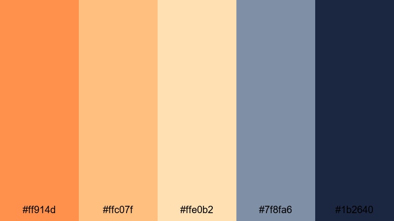
- HEX Codes: #ff914d, #ffc07f, #ffe0b2, #7f8fa6, #1b2640
- Mood: Calm, dreamy, and quietly nostalgic like the last light over a harbor.
- Use for: Perfect for cinematic travel vlogs, mellow storytelling edits, and reflective montage sequences.
Golden Pier Afterglow blends soft Sunset Orange tones (#ff914d, #ffc07f) with creamy highlights and cool dusk blues. The palette feels like watching waves slow down under a fading sun, with #1b2640 adding depth and contrast so your footage never looks flat.
Use this palette to grade cinematic B-roll, travel sequences, and reflective voiceover edits. In Filmora, you can echo these HEX tones in your titles, lower thirds, and end screens so your thumbnails, intros, and full-length videos all share the same calm, cinematic Sunset Orange atmosphere.
Pro Tip: Build A Cinematic Sunset Orange Afterglow In Filmora
To keep Golden Pier Afterglow consistent, think beyond just your footage. In Filmora, pull the warm oranges from #ff914d and #ffc07f into your text, icons, and transitions, then balance them with navy or deep blue accents that match #1b2640. This keeps your entire edit feeling cohesive, from opening title to outro card.
Create a simple style guide: one main Sunset Orange for call-to-action buttons, a lighter tone for subtitles or badges, and a deep blue for backgrounds or overlays. Save these as custom colors in Filmora so you can quickly reuse the palette across series intros, playlists, and social media cutdowns.
AI Color Palette
If you have a still frame or mood board image that nails this Golden Pier Afterglow look, you can let Filmora do the heavy lifting. Filmora's AI Color Palette feature analyzes a reference image and applies a matching color style across your whole clip or sequence.
Import your chosen Sunset Orange reference, match it to your timeline footage, and fine-tune intensity so skin tones stay natural. This is an easy way to bring that golden harbor glow into vlogs, B-roll montages, or social edits while keeping every shot in the same warm, cinematic world.
 secure download

HSL, Color Wheels & Curves
Once the base look is in place, use Filmora's HSL and color wheels to refine your Sunset Orange tones. Gently push the oranges toward a softer amber, lift the blues in the shadows, and lower saturation in the highlights to avoid banding in skies. Tools like these, combined with Filmora's advanced color correction options, help you turn a flat shot into a cinematic scene.
Curves are ideal for shaping contrast without crushing detail. Add a subtle S-curve to give Golden Pier Afterglow more depth, then slightly warm the midtones so skin and landscapes keep that dreamy harbor-glow feeling without looking overedited.
secure download1000+ Video Filters & 3D LUTs
To speed up your workflow, combine this Sunset Orange palette with Filmora presets. Filmora's video filters and 3D LUTs make it easy to give your timeline a cohesive warm tone, then you can fine-tune the oranges and blues to match the Golden Pier Afterglow HEX codes.
Stack a gentle warm filter with a cinematic LUT, then tweak intensity so details in skies and water are preserved. Once you like the result, save it as a custom preset, so every new vlog, reel, or thumbnail can instantly pick up the same romantic Sunset Orange grading.
secure downloadRose Mist Horizon
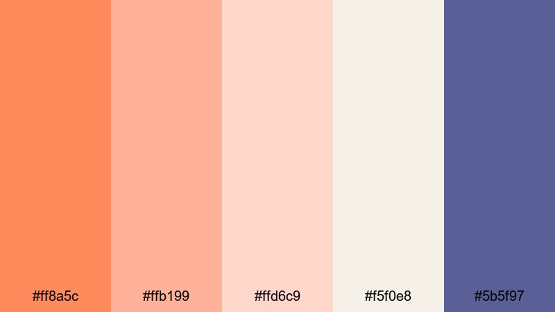
- HEX Codes: #ff8a5c, #ffb199, #ffd6c9, #f5f0e8, #5b5f97
- Mood: Romantic, airy, and softly lit with a hint of twilight drama.
- Use for: Ideal for wedding highlight films, lifestyle vlogs, and dreamy product close-ups.
Rose Mist Horizon mixes peachy oranges and blush tones with soft cream and a muted indigo accent. It feels like a slow, romantic fade from golden hour into blue hour, with #5b5f97 giving just enough contrast to keep your frames crisp.
Use this palette in wedding highlight reels, aesthetic lifestyle intros, and romantic thumbnail designs. On-screen text in #ff8a5c over light backgrounds looks warm and inviting, while indigo accents are perfect for date stamps, logo marks, or subscribe buttons that stand out without breaking the dreamy mood.
Coral Cloud Drift
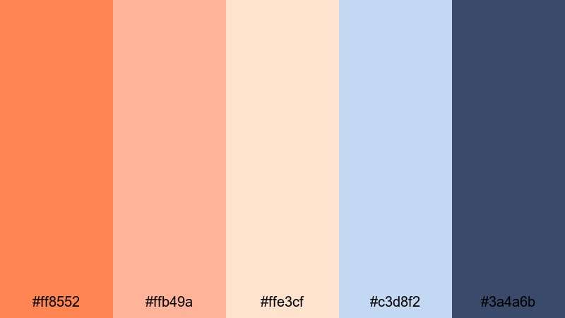
- HEX Codes: #ff8552, #ffb49a, #ffe3cf, #c3d8f2, #3a4a6b
- Mood: Floaty, hopeful, and lightly whimsical like clouds catching the last coral light.
- Use for: Great for aesthetic day-in-the-life vlogs, intros for travel channels, and soft brand stories.
Coral Cloud Drift layers warm coral oranges with creamy highlights and powdery blue shadows. The cool notes of #c3d8f2 and #3a4a6b keep everything feeling fresh and modern, so your visuals read as light and airy rather than overly pastel.
Try this palette in day-in-the-life vlogs, studio tours, or brand story videos where you want a friendly, approachable look. Use the coral shades for titles and key callouts, and let the blues anchor your backgrounds, overlays, or UI elements in app demos and screen recordings.
Ember Kissed Daydream
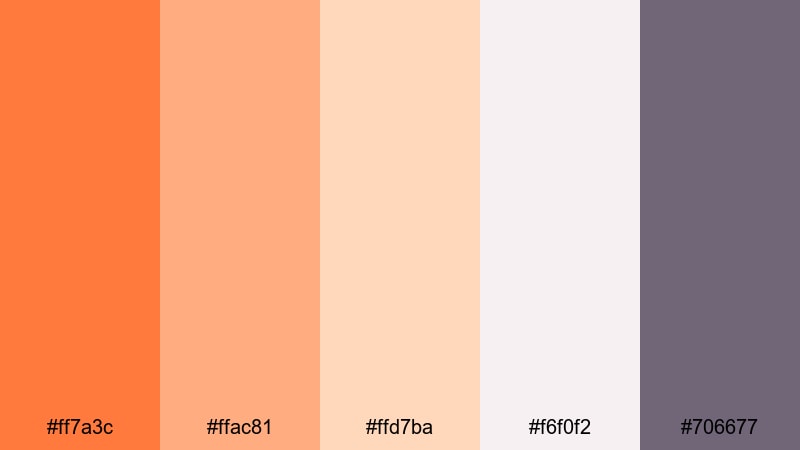
- HEX Codes: #ff7a3c, #ffac81, #ffd7ba, #f6f0f2, #706677
- Mood: Cozy, intimate, and slightly hazy like golden hour through a window.
- Use for: Use for home decor reels, cozy talking-head videos, and warm educational content.
Ember Kissed Daydream softens fiery Sunset Orange into ember-like midtones surrounded by creamy neutrals. The muted mauve gray #706677 adds gentle depth without feeling harsh, which makes it easy on the eyes for longer videos.
It is a great fit for cozy talking-head content, desk setups, or tutorials. Use the warm oranges for accents in lower thirds, chapter markers, and call-to-action banners, while the pale neutrals keep backgrounds and thumbnail frames clean and minimal.
Bold & Energetic Sunset Orange Palettes
Neon Boardwalk Blaze
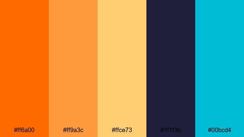
- HEX Codes: #ff6a00, #ff9a3c, #ffce73, #1f1f3b, #00bcd4
- Mood: High energy, electric, and punchy like neon signs at a seaside carnival.
- Use for: Perfect for bold YouTube thumbnails, high-impact intros, and kinetic typography.
Neon Boardwalk Blaze turns Sunset Orange into a loud, electric statement. Fiery oranges and glowing yellows sit on top of deep navy and neon teal, creating powerful contrast that jumps off any screen.
Use this palette when you want instant attention: gaming or challenge thumbnails, fast-paced montages, and kinetic text intros. Put #ff6a00 or #ff9a3c on dark #1f1f3b backgrounds for titles, and reserve #00bcd4 for key buttons or icons so your CTAs are impossible to miss.
Tropical Studio Heat
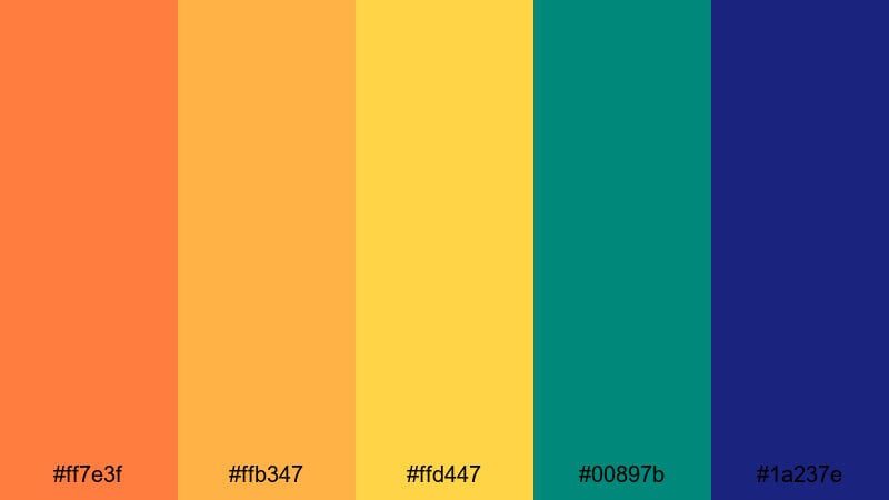
- HEX Codes: #ff7e3f, #ffb347, #ffd447, #00897b, #1a237e
- Mood: Sunny, adventurous, and vibrant like a hot island shoot day.
- Use for: Great for travel channels, festival promos, and upbeat social ads.
Tropical Studio Heat feels like stepping into a festival at sunset. Juicy oranges and mango yellows are balanced by teal and deep blue anchors, giving your visuals a playful but still professional character.
This palette is ideal for travel vlogs, summer festival recaps, and brand promos. Use the warm tones across your overlays and text, and drop teal #00897b or navy #1a237e behind logos, countdown timers, or pricing cards in social ads to keep them sharp and legible.
Creator Spotlight Flame
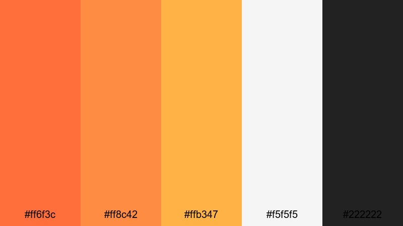
- HEX Codes: #ff6f3c, #ff8c42, #ffb347, #f5f5f5, #222222
- Mood: Confident, bold, and focused like a spotlight on center stage.
- Use for: Ideal for creator branding, channel banners, and on-screen lower thirds.
Creator Spotlight Flame is built for personal brands. The trio of bright oranges sits cleanly on black and white, so your name, logo, and thumbnails are immediately recognizable across platforms.
Use #ff6f3c or #ff8c42 for your main branding color on text and icons, #f5f5f5 for light backgrounds, and #222222 for dark themes or borders. This palette shines in YouTube banners, intro animations, and consistent thumbnail frames for a bold creator identity.
Gaming Sunset Surge
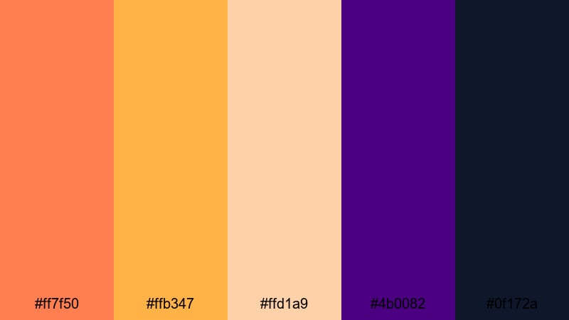
- HEX Codes: #ff7f50, #ffb347, #ffd1a9, #4b0082, #0f172a
- Mood: Intense, dynamic, and slightly futuristic with a sunset-meets-neon vibe.
- Use for: Best for gaming overlays, stream starting screens, and esports highlights.
Gaming Sunset Surge combines punchy oranges and peach accents with deep indigo and midnight blue. It feels dynamic and a bit futuristic, perfect for high-energy content that still has a warm character.
Use #ff7f50 for score counters, alerts, and buttons in overlays, #4b0082 or #0f172a as background blocks, and the lighter peaches for secondary text. This keeps HUD elements readable over gameplay while giving your channel a distinct Sunset Orange gaming identity.
Modern & Minimal Sunset Orange Palettes
Muted Terrace Glow
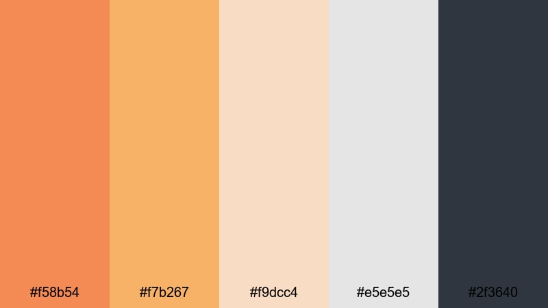
- HEX Codes: #f58b54, #f7b267, #f9dcc4, #e5e5e5, #2f3640
- Mood: Relaxed, contemporary, and lightly sunlit with a design-forward feel.
- Use for: Perfect for aesthetic studio tours, productivity content, and brand explainers.
Muted Terrace Glow tones down Sunset Orange into soft terracotta accents against sand and cool charcoal. It feels modern and curated, ideal when you want warmth without loud saturation.
Use the oranges for icons, bullet points, and key phrases in tutorials or productivity videos, while #e5e5e5 and #2f3640 keep your backgrounds neutral and easy to grade. This palette is great for clean thumbnails, minimal end cards, and interface-style lower thirds.
Urban Loft Ember
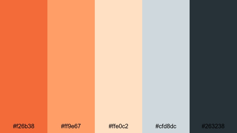
- HEX Codes: #f26b38, #ff9e67, #ffe0c2, #cfd8dc, #263238
- Mood: Stylish, editorial, and grounded like an industrial loft at sundown.
- Use for: Great for tech reviews, design portfolios, and sleek product demos.
Urban Loft Ember brings together burnt orange, creamy highlights, and cool gray blues. It feels editorial and grounded, like a minimalist loft catching the last sunlight through big windows.
Use #f26b38 sparingly as an accent on titles, subscribe buttons, and product highlights, with #cfd8dc and #263238 managing negative space and text blocks. This palette works especially well in tech reviews, UI showcases, and cinematic product close-ups.
Clean UI Sundown
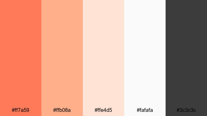
- HEX Codes: #ff7a59, #ffb08a, #ffe4d5, #fafafa, #3c3c3c
- Mood: Fresh, tidy, and user-friendly with a subtle warm accent.
- Use for: Ideal for app previews, SaaS explainer videos, and minimalist channel branding.
Clean UI Sundown is built for clarity. A bright Sunset Orange accent sits on top of soft peach, off-white, and neutral gray, giving you a warm focal point inside a very clean layout.
Use #ff7a59 for buttons, icons, and key metrics in app previews or dashboards, and keep most backgrounds in #ffe4d5 or #fafafa for readability. This palette is perfect for SaaS explainer videos, modern motion graphics, and thumbnails that feel professional but not cold.
Vintage & Nostalgic Sunset Orange Palettes
Retro Super8 Sunset
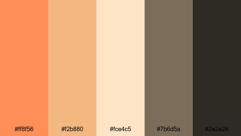
- HEX Codes: #ff8f56, #f2b880, #fce4c5, #7b6d5a, #2e2a24
- Mood: Grainy, sentimental, and warm like old home movie reels.
- Use for: Perfect for retro travel edits, family compilations, and memory-style vlogs.
Retro Super8 Sunset wraps your visuals in warm orange and butterscotch tones, grounded by muted browns. It instantly suggests vintage film, especially when paired with a little grain and soft vignettes.
Use the lighter oranges and creams for titles and date stamps, and let #7b6d5a or #2e2a24 handle borders, shadows, and lower thirds. This palette works beautifully with family footage, childhood flashbacks, or throwback travel edits that lean into nostalgia.
Dusty Desert Postcard
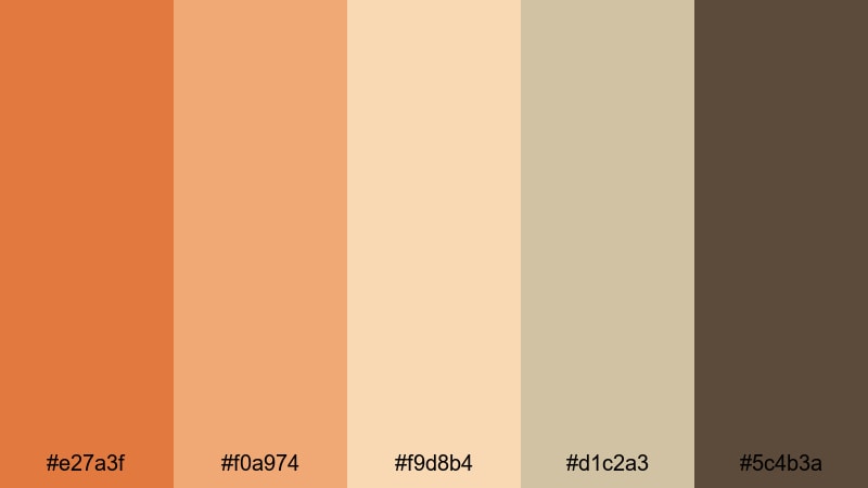
- HEX Codes: #e27a3f, #f0a974, #f9d8b4, #d1c2a3, #5c4b3a
- Mood: Earthy, weathered, and sun-faded like an old postcard from a road trip.
- Use for: Great for documentary-style travel films, camping vlogs, and analog-inspired reels.
Dusty Desert Postcard turns Sunset Orange into an earthy, sun-faded story. Dusty oranges and tan tones meet worn browns, capturing the feeling of old postcards and desert road trips.
Use this palette for camping vlogs, scenic road films, and documentary-style travel edits. Let #e27a3f highlight maps, captions, and route lines, while the softer tans and browns build subtle overlays, frames, and lower thirds that feel aged but still clean.
Old Cinema Marquee
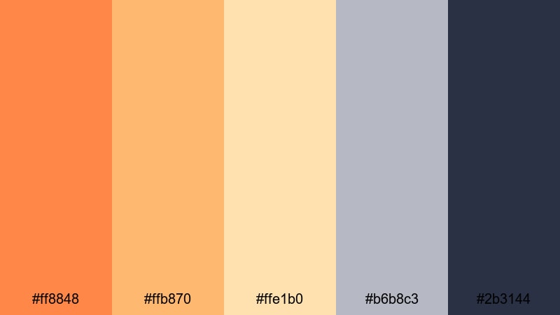
- HEX Codes: #ff8848, #ffb870, #ffe1b0, #b6b8c3, #2b3144
- Mood: Classic, theatrical, and a little glamorous like a vintage theater front.
- Use for: Use for film commentary channels, classic movie edits, and narrative shorts.
Old Cinema Marquee blends marquee-style oranges with buttery creams and dusty blues. It feels like classic theater signage glowing in the evening, with #2b3144 adding a rich backdrop.
Use this palette for film review channels, essay videos, and narrative shorts with a retro flair. Put your episode titles in #ff8848 or #ffb870 against #2b3144, and use the softer tones to frame stills, cast credits, or chapter cards in a cinematic way.
Analog Roadtrip Glow

- HEX Codes: #ff9153, #ffc38a, #ffe3c6, #a8b5a2, #3e4a3f
- Mood: Carefree, nostalgic, and slightly faded like sun-bleached film from the highway.
- Use for: Ideal for travel montages, van life content, and summer recap videos.
Analog Roadtrip Glow captures the feeling of long highways at golden hour. Glowing oranges and soft creams are balanced by sage and deep olive greens, giving your footage a relaxed, outdoorsy nostalgia.
Use the warm tones for sun flares, overlays, and title cards, while #a8b5a2 and #3e4a3f sit in maps, subtitles, or chapter markers. This palette suits van life series, summer recaps, and analog-inspired roadtrip edits where you want warmth and memory in every frame.
Tips for Creating Sunset Orange Color Palettes
When you build your own Sunset Orange color palette for video and design, balance warmth with contrast, and always think about readability across thumbnails, intros, and full-length edits.
- Pair Sunset Orange with a deep contrasting shade (navy, charcoal, or midnight blue) so titles and buttons stay readable on both mobile and desktop.
- Use light creams or off-whites instead of pure white to keep the overall mood soft and cinematic, especially for vlogs and storytelling edits.
- Limit yourself to 1 main orange and 1 accent orange; use the rest of the palette as neutrals or supporting tones to avoid a cluttered look.
- Test your palette on a real thumbnail and a lower third graphic before committing, checking readability at small sizes and on different screens.
- Match your Sunset Orange to footage lighting: push toward softer amber for golden hour scenes, or richer, deeper orange for night cityscapes and neon.
- Keep brand consistency by reusing the same HEX codes in your logo, outro screens, and channel art, then save them as favorites in Filmora.
- For cinematic color grading, slightly lower orange saturation and lift shadows so skin tones stay natural while still echoing your palette.
- Always check accessibility: pair bright oranges with dark neutrals for body text, and avoid orange-on-red combinations that are hard to read.
Sunset Orange color palettes can turn simple footage into a signature visual style, shaping how your audience feels about your channel, brand, or project. From soft cinematic tones to bold neon-inspired contrasts, the right combination of oranges, neutrals, and deep anchor colors can make your intros, thumbnails, and timelines instantly recognizable.
Try a few of these HEX-based palettes inside Filmora, then refine them with AI tools, HSL adjustments, and LUTs until they feel like your own. Once you lock in a favorite Sunset Orange scheme, reuse it across episodes, shorts, and social clips so every piece of content feels like part of the same creative world.
Whether you are grading a travel montage or designing a clean app explainer, these Sunset Orange combinations will help you keep your visuals warm, engaging, and on-brand.
secure download