
 100% Security Verified | No Subscription Required | No Malware

Vivid color instantly signals energy, clarity, and confidence. High-saturation hues pull the eye on crowded feeds, make thumbnails pop, and give intros or lower thirds a strong, memorable identity. Used well, a vivid color palette can make your brand feel more modern, upbeat, and cinematic instead of flat or washed out.
This guide gathers 15 vivid color palettes with ready-to-use HEX codes so you can drop them straight into your YouTube thumbnails, vlog graphics, titles, and overlays. Each palette is tailored for specific creative moods and is easy to apply in Filmora, whether you are grading footage, building motion graphics, or designing a full channel look.
In this article
Bold & Energetic Vivid Color Palettes
Sunrise Stadium Lights
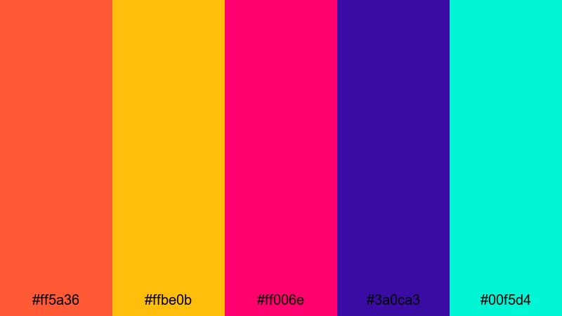
- HEX Codes: #ff5a36, #ffbe0b, #ff006e, #3a0ca3, #00f5d4
- Mood: Explosive, high-energy, and full of motion.
- Use for: Ideal for sports intros, hype reels, and event announcement thumbnails that need instant impact.
This palette feels like floodlights hitting the field just as the crowd starts to roar. Fiery orange and hot pink do the heavy lifting for urgency and excitement, while electric teal and deep violet add depth so your visuals do not feel flat or chaotic. The bright yellow pops perfectly for numbers, countdowns, or bold calls to action.
Use this set for intro titles, kinetic text, and fast-cut B-roll where you want movement and adrenaline. In thumbnails, let the deep violet or navy act as a base layer and drop the neon tones into jerseys, text blocks, and overlays so your key message is readable even on small screens.
Pro Tip: Build A High-Energy Vivid Look In Filmora
With a palette this intense, consistency is everything. In Filmora, you can color-pick the exact HEX values for titles, lower thirds, motion graphics, and even overlay shapes so your orange, pink, and teal always match from intro to end screen. Keeping the same vivid hues across your edit helps your sports or event content feel like a single, polished package instead of a mix of random clips.
Combine these colors with Filmora animations and speed ramping so your graphics hit on the same beats as your cuts and sound effects. A consistent vivid palette plus rhythmic movement is a simple way to make even simple footage look like a professional highlight reel.
AI Color Palette
If you design a hero frame or thumbnail using Sunrise Stadium Lights, you can turn that look into a full video style with Filmora. Filmora's AI Color Palette feature lets you grab the color mood from a single frame, poster, or reference image and apply it across your entire timeline.
Simply import your reference, select it as the source, and let AI Color Palette match the overall saturation, contrast, and color balance on other clips. Your match cuts, B-roll, and outro will all share the same explosive vibe without you manually adjusting every shot.
 secure download

HSL, Color Wheels & Curves
Even vivid palettes need balance. Use Filmora's HSL panel to target just the oranges and pinks, pushing saturation for jerseys or text while keeping skin tones natural. Then fine-tune overall contrast with color wheels and curves so your highlights do not clip and your deep blues stay rich instead of muddy. If you are new to grading, Filmora's color correction tools in Filmora break the process into simple, visual controls.
On hype reels, try lifting the midtones slightly and adding a gentle S-curve in RGB so the footage feels punchy without losing detail. You can also bias the shadow wheel slightly toward deep violet to unify your backgrounds with the palette while letting bright overlays carry the neon punch.
secure download1000+ Video Filters & 3D LUTs
Once your vivid colors are in place, Filmora's filters and LUTs can give them a specific style: broadcast sports, edgy esports, or dramatic trailer. Filmora's video filters and 3D LUTs make it easy to test different looks in one click without rebuilding your grade from scratch.
Stack a cinematic LUT over your vivid palette to add subtle teal-and-orange shading, or use glitchy, RGB-split filters for aggressive hype edits. You can dial filter intensity down so your HEX colors remain recognizable while gaining just enough character to feel premium.
secure downloadTropical Festival Rush
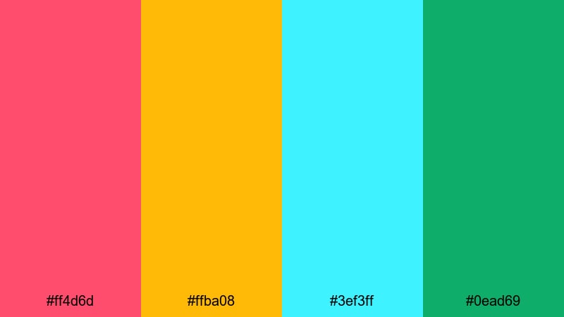
- HEX Codes: #ff4d6d, #ffba08, #3ef3ff, #0ead69
- Mood: Festive, joyful, and sun-soaked.
- Use for: Great for travel vlogs, summer party promos, and upbeat lifestyle content.
Tropical Festival Rush feels like a summer parade on a hot afternoon. Juicy pink and citrus yellow bring that sun-on-skin warmth, while bright aqua and lush green keep the set fresh and tropical instead of heavy.
Use the yellow as your main highlight color for buttons, timestamps, and CTA badges, with pink for main titles. Aqua and green work well in backgrounds, frames, and accent shapes in reels, shorts, or travel vlog lower thirds, keeping everything bright and optimistic.
Electric Carnival Stream
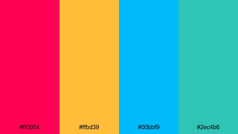
- HEX Codes: #ff0054, #ffbd39, #00bbf9, #2ec4b6
- Mood: Playful, loud, and attention-demanding.
- Use for: Perfect for streaming overlays, gaming highlight reels, and bold channel branding.
This palette is all about non-stop fun. Hot magenta and vivid yellow grab attention instantly, while electric cyan and teal keep the look modern and techy. It feels like carnival lights crossed with a high-end gaming setup.
Use magenta for your username, kill feed, or live status labels; let cyan and teal define panels, webcam borders, and alerts. The warm yellow is great for badges, donation highlights, and subscribe buttons, ensuring your most important UI elements always stand out on screen captures and thumbnails.
Vivid Action Trailer
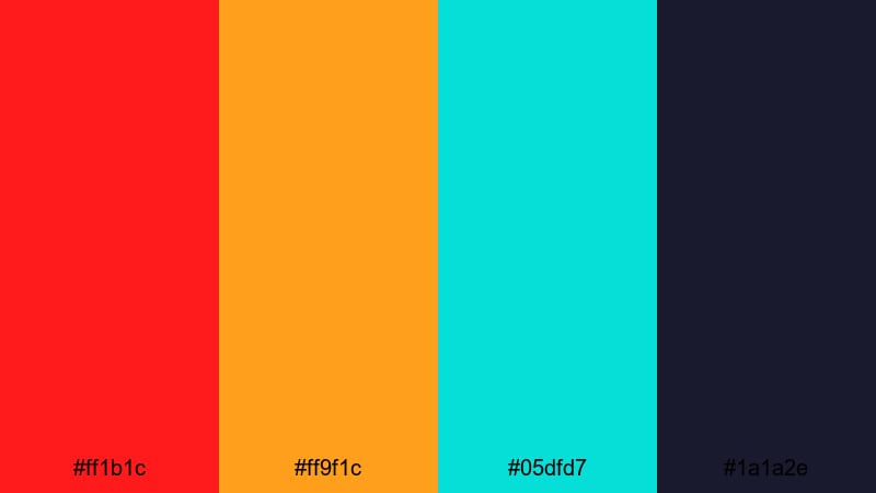
- HEX Codes: #ff1b1c, #ff9f1c, #05dfd7, #1a1a2e
- Mood: Adrenaline-fueled and cinematic.
- Use for: Best for action trailers, esports promos, and dramatic teaser graphics.
Vivid Action Trailer pairs classic blockbuster colors with neon intensity. Fiery red and amber drive tension and urgency, while icy teal floats above a deep, nearly-black navy for cinematic contrast.
Use the navy as your base background color in trailers, then reserve the red for key words, impact frames, and glitch cuts. Amber is ideal for subtitles, countdowns, and UI markers, while teal can trace light streaks, HUD elements, or lens flare-inspired overlays to give your edit a polished, high-budget tone.
Neon & Cyber Vivid Color Palettes
Neon Arcade Burst
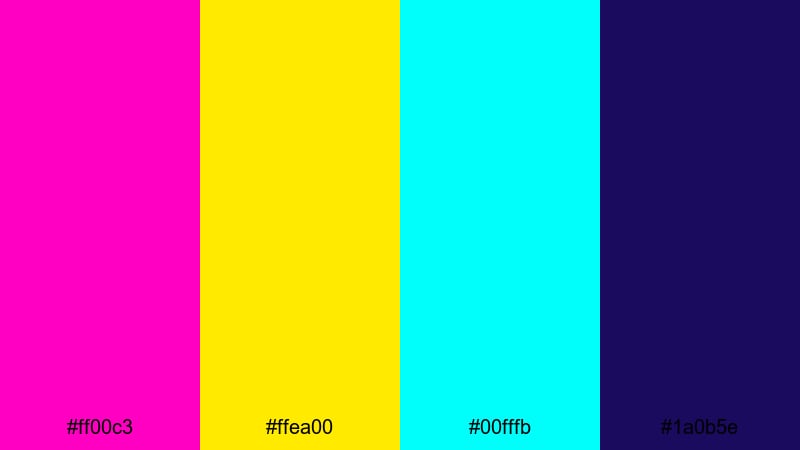
- HEX Codes: #ff00c3, #ffea00, #00fffb, #1a0b5e
- Mood: Retro-futuristic and hypercharged.
- Use for: Ideal for gaming intros, synthwave edits, and cyberpunk-style titles.
Neon Arcade Burst feels like standing in a dark arcade full of flickering cabinets. Electric magenta, laser yellow, and neon cyan explode against a deep indigo base, giving a classic 80s neon vibe wrapped in modern polish.
Use the indigo as your main background for titles and credits, then draw typography, geometric shapes, and UI frames using magenta and cyan. The laser yellow works well in progress bars, score counters, or beat markers in music visualizers, so every flash lands exactly where you want viewer attention.
Cyber Grid Pulse
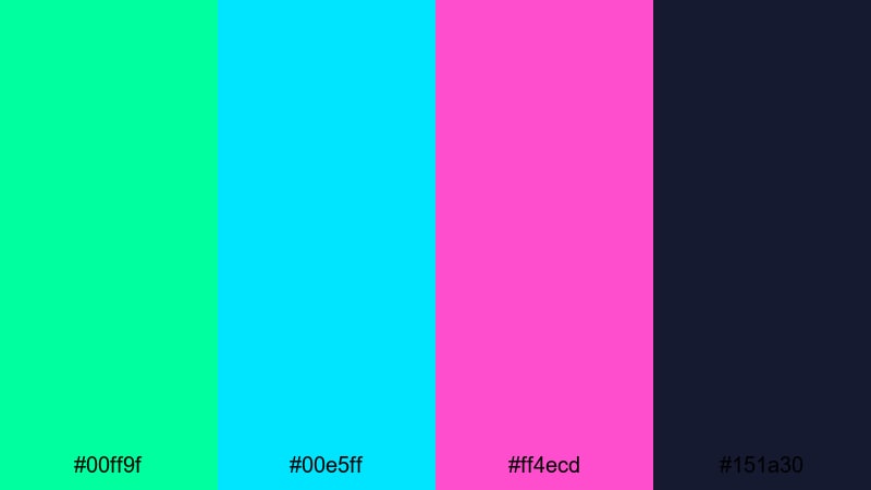
- HEX Codes: #00ff9f, #00e5ff, #ff4ecd, #151a30
- Mood: Techy, digital, and pulsing with energy.
- Use for: Great for UI overlays, lower-thirds in tech reviews, and futuristic explainer videos.
Cyber Grid Pulse mixes glowing greens and cyans with neon pink over a dark tech blue. It feels like a live data stream or holographic dashboard, perfect for videos that live in a digital or sci-fi environment.
Use the dark blue as your base, then build grids, lines, and diagrams in cyan and green. Neon pink is powerful in small amounts as a warning color, progress highlight, or key title phrase. In explainers, you can color-code information (green for success, pink for alerts) so your audience reads meaning at a glance.
Hologram Night Drive
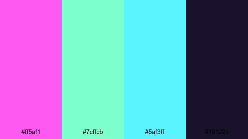
- HEX Codes: #ff5af1, #7cffcb, #5af3ff, #18122b
- Mood: Sleek, nocturnal, and slightly mysterious.
- Use for: Use for car edits, cityscape b-roll, and night-time travel montages.
Hologram Night Drive feels like neon reflections on wet asphalt. Soft neon pink, minty cyan, and bright aqua float against a dark purple night sky, giving you a subtle yet still highly vivid look.
Apply the darkest purple to backgrounds and letterboxing bars, letting the lighter tones trace outlines of cars, buildings, and UI callouts. This palette is especially strong in slow-motion city sequences, car reels, or night vlogs where you want a stylish, futuristic mood without overwhelming the footage.
Glitch Overlay Flash
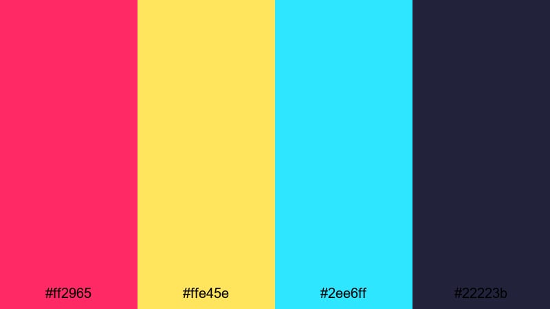
- HEX Codes: #ff2965, #ffe45e, #2ee6ff, #22223b
- Mood: Edgy, experimental, and glitchy.
- Use for: Perfect for glitch transitions, digital distortion effects, and edgy music videos.
Glitch Overlay Flash is built for chaos in a controlled way. Hot pink, harsh yellow, and vivid cyan cut across a dark blue-gray base like broken RGB channels and scan lines.
Use the dark neutral as your anchor layer, then introduce fast, jagged shapes and text in the neon tones for glitch transitions, lyric videos, or hacked-terminal graphics. Keeping backgrounds darker ensures that even with distortion and noise, your main text remains readable in thumbnails and timelines.
Playful Pop Art Vivid Color Palettes
Bubblegum Poster Pop
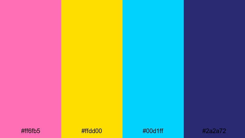
- HEX Codes: #ff6fb5, #ffdd00, #00d1ff, #2a2a72
- Mood: Cheerful, bubbly, and graphic.
- Use for: Great for creator branding, tutorial openers, and fun product promos.
Bubblegum Poster Pop brings candy pinks and sunshine yellow together with bright cyan and a solid deep blue. It feels like a bold, screen-printed poster with strong outlines and playful energy.
Use deep blue for backgrounds, then layer pink and yellow blocks behind your face cam or product shots. Cyan is perfect for captions, arrows, and sticker-style elements in shorts and TikToks. This palette works especially well for channels that want a friendly, upbeat visual brand that is still clean and easy to read.
Retro Toy Shelf
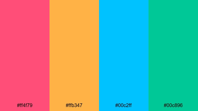
- HEX Codes: #ff4f79, #ffb347, #00c2ff, #00c896
- Mood: Nostalgic, playful, and colorful.
- Use for: Ideal for kids content, DIY channels, and unboxing videos that need a fun retro twist.
Retro Toy Shelf feels like vintage plastic toys and Saturday morning cartoons. Warm coral and tangerine add a cozy, nostalgic feel, while bright cyan and mint green keep everything feeling young and fresh.
Use warm tones for backgrounds or large shapes behind products and faces, then let cyan and mint highlight text, badges, and icons. This combination is strong for kid-friendly packaging mockups, channel logos, and thumbnail frames, because it is high-contrast but never harsh or aggressive.
Comic Panel Smash
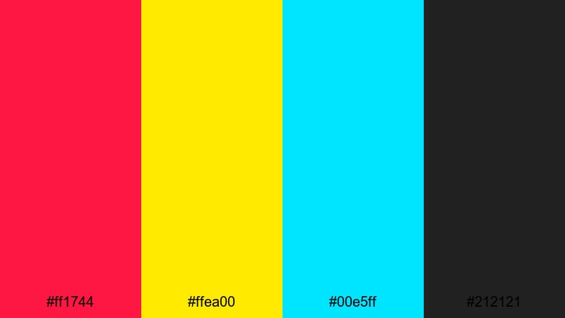
- HEX Codes: #ff1744, #ffea00, #00e5ff, #212121
- Mood: Dynamic, punchy, and graphic-novel inspired.
- Use for: Perfect for motion comics, kinetic typography, and bold meme-style edits.
Comic Panel Smash is straight out of a graphic novel. Bright red, primary yellow, and electric cyan sit on a solid black base, echoing inked outlines and printed halftones.
Use black as your line art and background, then fill shapes and speech bubbles with the bright hues. Red is great for onomatopoeia words like BOOM or WOW, while yellow makes excellent headline blocks and cyan serves as a cool accent for shadows and motion streaks. This palette translates well to meme edits, reaction videos, and animated storytelling where you want strong, comic-style contrast.
Candy Shop Spotlight
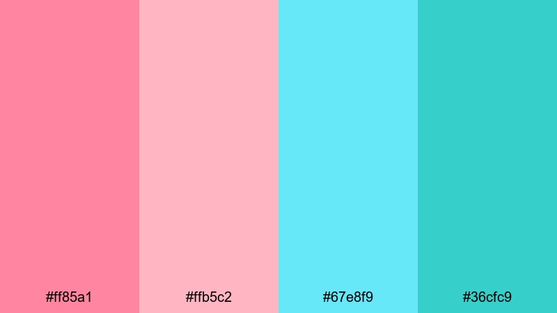
- HEX Codes: #ff85a1, #ffb5c2, #67e8f9, #36cfc9
- Mood: Sweet, friendly, and inviting.
- Use for: Use for lifestyle vlogs, beauty channels, and playful product shots.
Candy Shop Spotlight gives you softer, but still vivid, pinks and aquas. It feels like a bright, well-lit candy aisle or a pastel beauty counter, perfect when you want friendly visuals without neon intensity.
Use the lighter pinks and aquas as background washes or gradient overlays, then reserve the deeper aqua for text and outlines. This palette works beautifully with beauty tutorials, stationery hauls, and lifestyle vlogs, especially when you want your skin tones to stay natural against a colorful but gentle UI.
Elegant Cinematic Vivid Color Palettes
Jewel Tone Spotlight
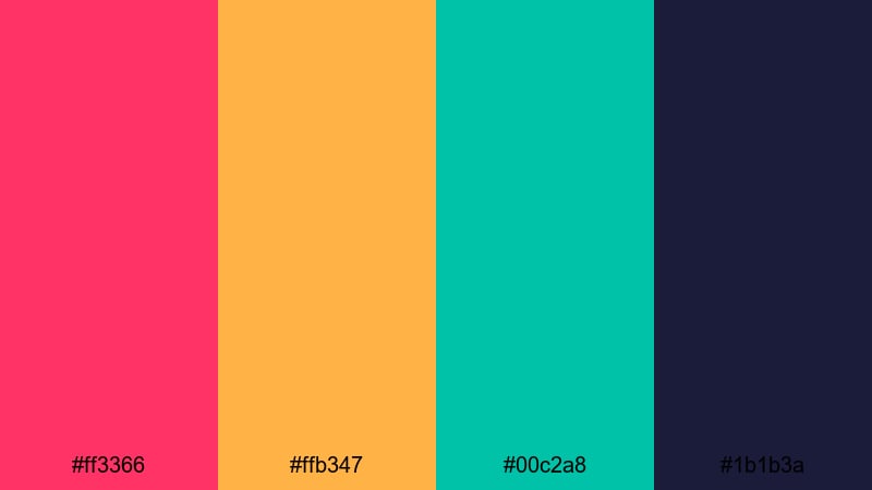
- HEX Codes: #ff3366, #ffb347, #00c2a8, #1b1b3a
- Mood: Luxurious, dramatic, and rich.
- Use for: Great for fashion lookbooks, cinematic trailers, and upscale brand intros.
Jewel Tone Spotlight marries vivid saturation with a premium feel. Ruby pink, amber gold, and emerald teal glow against a deep navy, creating the sense of stage lights in a dark theater or a high-end product display.
Use navy as your elegant backdrop, then let gold accent headlines, price tags, or key stats. Ruby and teal can highlight models, products, or logo elements in intros and end cards. This palette works especially well when you want vivid color that still feels luxurious rather than playful.
Luxe Premiere Red Carpet
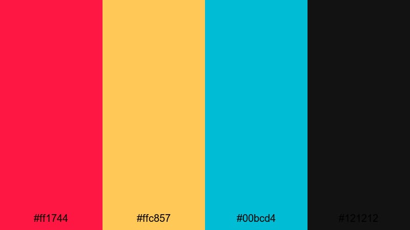
- HEX Codes: #ff1744, #ffc857, #00bcd4, #121212
- Mood: Glamorous, confident, and cinematic.
- Use for: Ideal for premiere announcements, award-style intros, and event highlight reels.
Luxe Premiere Red Carpet uses vivid red and champagne gold to echo classic award-show visuals, supported by bright cyan and deep black. It is bold and glamorous, perfect for videos that celebrate milestones, premieres, or big releases.
Use black as your main canvas, then paint the red into carpets, frames, and main title text. Gold can highlight laurels, star ratings, and award icons, while cyan keeps things modern in lower thirds and callouts. In thumbnails, let the red and gold dominate while cyan handles smaller UI and text accents so your design feels cinematic but not overcrowded.
Deep Velvet Encore
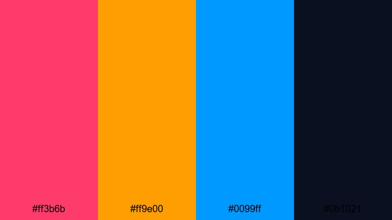
- HEX Codes: #ff3b6b, #ff9e00, #0099ff, #0b1021
- Mood: Moody, theatrical, and bold.
- Use for: Perfect for music videos, performance recaps, and dramatic storytelling edits.
Deep Velvet Encore mixes saturated rose, amber, and electric blue on top of an inky navy base, creating a moody stage-light effect. It is vivid but controlled, ideal when your story leans into drama and performance.
Use the dark navy to frame your footage with letterbox bars or gradient vignettes, then hit key beats with rose and amber text or light leaks. Electric blue works well for waveform graphics, lyric text, or rhythm markers in music videos. This palette is especially strong for performance recaps, behind-the-scenes reels, and short cinematic edits that need emotional impact plus color punch.
Tips for Creating Vivid Color Palettes
Vivid colors can make your videos and designs unforgettable, but they need balance, contrast, and consistency to stay professional. These tips will help you combine high-saturation hues with clear storytelling and strong readability.
- Pick one or two hero colors and keep the rest as supporting accents, so your visuals feel bold but not chaotic.
- Always test text readability over your bright backgrounds; use dark outlines, drop shadows, or solid blocks behind type when needed.
- Use a deep neutral (navy, charcoal, or very dark purple) as a grounding color so vivid tones have something to contrast against.
- Match your palette to your content mood: warmer vivid tones for fun and hype, cooler vivid tones for techy or sleek edits.
- Check how your colors look on mobile by zooming your thumbnail down to a tiny size; if elements blur together, increase contrast or simplify.
- Keep brand elements consistent across intros, lower thirds, and end screens so viewers start to recognize your channel at a glance.
- Use Filmora to save your favorite HEX codes in titles, shapes, and presets so you can reapply the same vivid palette across multiple projects.
- When grading footage, push saturation carefully and protect skin tones, letting overlays and graphics carry the most intense colors.
Vivid color palettes are one of the fastest ways to set a clear mood, shape your brand, and stand out in a crowded feed. From neon cyber grids to luxe red carpet tones, the right combination of saturated hues can turn simple footage into something memorable and clickable.
Try dropping these HEX codes into your next project in Filmora, starting with titles and overlays, then refining the look with color grading and filters. As you test palettes across intros, thumbnails, and shorts, you will quickly discover which vivid combinations feel most like your style and your channel.
Once you land on a favorite palette, save it as part of your go-to Filmora presets so every new edit starts with a strong, consistent visual identity.
secure downloadNext: Rust Brown Color Palette
