
 100% Security Verified | No Subscription Required | No Malware

Warm colors instantly feel human, close, and alive. Shades of peach, amber, rose, and terracotta are all linked to sunlight, skin tones, and cozy firelight, so they naturally create a sense of comfort, passion, and energy. In video and design, warm color palettes can make a scene feel more inviting, emotional, or exciting, depending on how bold or soft the tones are.
Whether you are designing YouTube thumbnails, vlogs, brand intros, or aesthetic edits, choosing the right warm color combinations will define your visual identity. Below you will find 15 ready-to-use warm color palettes with HEX codes, plus practical ideas for Filmora users who want consistent warm grading, overlays, and motion graphics across their whole project.
In this article
Soft And Romantic Warm Color Palettes
Blush Sunset Whisper
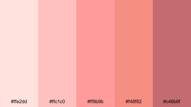
- HEX Codes: #ffe2dd, #ffc1c0, #ff9b9b, #f48f82, #c46b6f
- Mood: Gentle, nostalgic, and romantic.
- Use for: Ideal for wedding highlight reels, soft vlogs, and dreamy travel montages that need a tender, emotional glow.
Blush Sunset Whisper layers soft pinks and corals that feel like the last light after golden hour. The palette is warm without being overpowering, so it flatters skin tones and adds a subtle haze of nostalgia to any frame.
Use it for wedding titles, couple portraits, romantic storytime vlogs, or dreamy travel edits where you want viewers to feel close to the story. In thumbnails, this palette helps text and subjects stand out softly, and in branding or intro animations it suggests intimacy, kindness, and a personal touch.
Pro Tip: Build A Cinematic Warm Glow In Filmora
To keep this soft blush mood from the first frame to the last, treat Blush Sunset Whisper as your guiding light for the whole edit. In Filmora, you can color grade your A-roll, B-roll, overlays, and titles so they all lean into these pink-coral tones without losing contrast or clarity.
Start with gentle adjustments on exposure and temperature, then use the same settings across clips or save them as a preset. This keeps your wedding highlights, vlogs, and reels from feeling like a mix of random shots and instead creates one cohesive warm story.
AI Color Palette
If you have a screenshot, mood board, or still frame using Blush Sunset Whisper, you can transform it into a complete look for your video. Filmora's AI Color Palette feature analyzes your reference image and automatically matches its warm tones across other clips.
This is perfect when you want consistent blush warmth on footage from different cameras or shooting days. You keep the same romantic color language, while Filmora handles the heavy lifting of matching tones across your timeline.
 secure download

HSL, Color Wheels & Curves
Once the base look is matched, use Filmora's HSL sliders, color wheels, and curves to refine the warmth. Slightly desaturate reds and oranges to avoid oversaturated skin, then lift the midtones while keeping highlights soft for a dreamy blush effect. You can deepen shadows with a gentle S-curve to add cinematic depth without losing that romantic haze.
If you want more control, follow a step-by-step Filmora color correction guide and save your favorite warm adjustments as custom presets. That way, every new video in the same series can instantly share the same soft, emotional color style.
secure download1000+ Video Filters & 3D LUTs
If you want fast results, Filmora's video filters and 3D LUTs make it easy to add warm, cinematic tones with a single click. Choose subtle warm filters for romantic content, then fine tune intensity and blending so your footage still looks natural.
You can layer soft light leaks, film-style LUTs, and vignette filters to emphasize the blush center of the frame and gently dim the edges. This combination keeps viewers focused on faces and emotions while preserving the delicate, sunset inspired palette.
secure downloadRose Gold Daydream
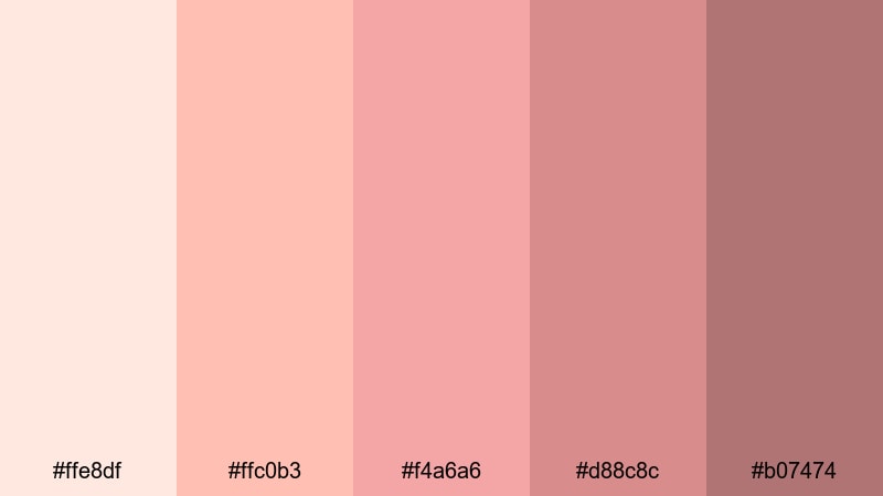
- HEX Codes: #ffe8df, #ffc0b3, #f4a6a6, #d88c8c, #b07474
- Mood: Luxurious, feminine, and softly glamorous.
- Use for: Perfect for beauty channels, lifestyle intros, and branding animations that need a chic rose gold finish.
Rose Gold Daydream wraps creamy highlights and soft metallic rose tones into one cohesive palette. It feels premium but still approachable, like a high end beauty counter lit by soft studio lights.
Use this for product shots, logo stings, and thumbnail backgrounds where you want to signal elegance and style. Paired with simple serif typography and subtle motion graphics in Filmora, this palette becomes a signature look for beauty, fashion, and lifestyle creators.
Peach Glow Serenade
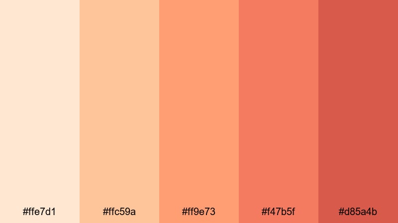
- HEX Codes: #ffe7d1, #ffc59a, #ff9e73, #f47b5f, #d85a4b
- Mood: Playful, cozy, and sunlit.
- Use for: Use for lifestyle vlogs, cozy home videos, and product promos that need a bright yet soft warmth.
Peach Glow Serenade moves from pale apricot to juicy coral, like morning light streaming through a curtain. It is bright and upbeat, but the peach tones keep it soothing rather than harsh.
This palette works well for daily vlogs, home decor tours, recipe shorts, and friendly talking head intros. Use the lighter tones for backgrounds and overlays, then reserve the deeper corals for call to action buttons, lower thirds, or titles to guide the viewer's eye.
Honeyed Champagne Kiss
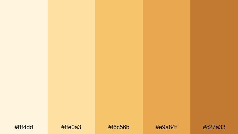
- HEX Codes: #fff4dd, #ffe0a3, #f6c56b, #e9a84f, #c27a33
- Mood: Light, celebratory, and elegant.
- Use for: Great for engagement announcements, party highlight reels, and minimal luxury intros with a soft golden shimmer.
Honeyed Champagne Kiss shimmers between creamy ivory and soft honey gold. It feels like fairy lights at a celebration or champagne bubbles caught in the sun, giving your visuals a polished but gentle gleam.
Use the palest tones for clean lower thirds and minimalist thumbnails, then bring in the deeper golds for accents, transitions, or logo reveals. In Filmora, add subtle bokeh overlays and light flares in matching hues to layer even more sparkle into party recaps and announcement videos.
Bold And Vibrant Warm Color Palettes
Tropical Ember Splash
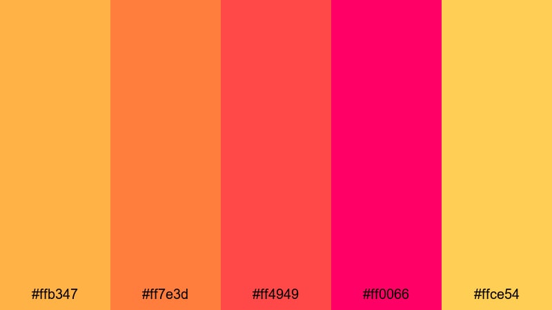
- HEX Codes: #ffb347, #ff7e3d, #ff4949, #ff0066, #ffce54
- Mood: Energetic, fiery, and fun.
- Use for: Perfect for high-energy intros, gaming highlights, and fast-cut social edits that need instant impact.
Tropical Ember Splash throws together punchy oranges, fierce reds, and hot pinks for a wild, festival-like impact. It is not subtle, and that is exactly the point: the palette screams energy and motion.
Use this for high-tempo gaming montages, hype trailers, and social media teasers. In thumbnails, stack the neon pink and ember red behind bold white or black text so your title is impossible to miss in a crowded feed.
Neon Sunset Fiesta
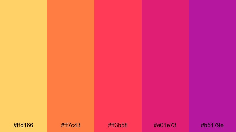
- HEX Codes: #ffd166, #ff7c43, #ff3b58, #e01e73, #b5179e
- Mood: Festival ready, electric, and upbeat.
- Use for: Best for music videos, festival recaps, and dance reels where neon warmth matches high-tempo beats.
Neon Sunset Fiesta feels like city lights and festival stages against a blazing sunset. Yellows, oranges, and magentas sit in the neon zone, giving your footage a vivid, electric personality.
Use this palette when editing dance challenges, concert highlights, or music video intros in Filmora. Combine these tones with dynamic transitions, beat-synced cuts, and animated titles to keep the visuals as lively as the soundtrack.
Citrus Heatwave Burst
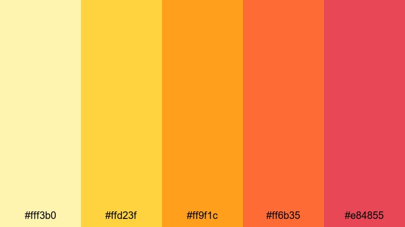
- HEX Codes: #fff3b0, #ffd23f, #ff9f1c, #ff6b35, #e84855
- Mood: Zesty, dynamic, and uplifting.
- Use for: Use for summer campaigns, food content, and energetic promos that need a crisp, citrusy kick.
Citrus Heatwave Burst runs from lemon and mango to rich tangerine and spicy red. It has the freshness of cold lemonade plus the heat of late summer afternoons.
This palette is ideal for food videos, summer sales promos, and playful UGC-style ads. Use lighter yellows for backgrounds and UI elements and the deeper oranges and reds to highlight tasty close-ups, price tags, or subscribe buttons in your Filmora edits.
Festival Marigold Blaze
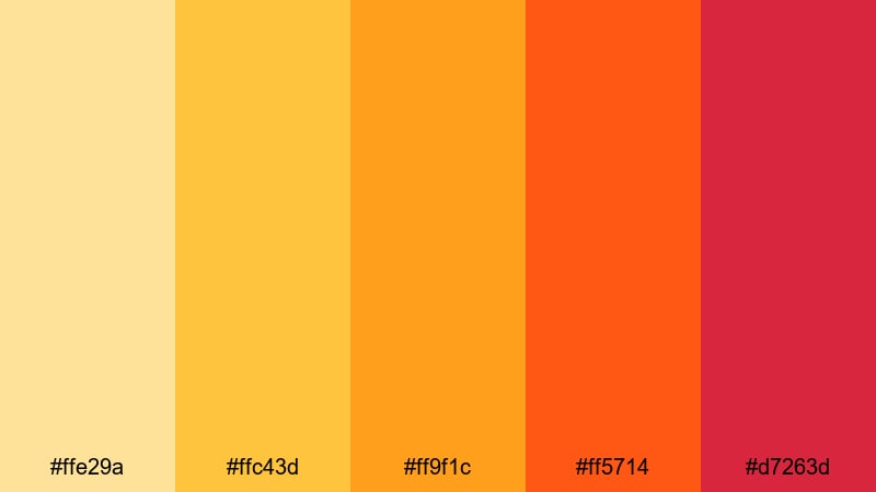
- HEX Codes: #ffe29a, #ffc43d, #ff9f1c, #ff5714, #d7263d
- Mood: Celebratory, bold, and confident.
- Use for: Ideal for event recaps, brand launches, and countdown graphics that demand bold, celebratory color.
Festival Marigold Blaze is all about rich marigold, flaming orange, and bold reds. It feels like street festivals, fireworks, and confetti explosions captured in color form.
Use this palette for launch trailers, countdown screens, and event recap videos where you want every frame to feel like a celebration. In Filmora, pair these hues with fast cuts, confetti overlays, and bold countdown animations to build anticipation.
Earthy And Natural Warm Color Palettes
Terracotta Canyon Trail
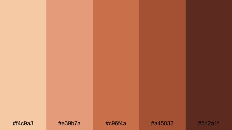
- HEX Codes: #f4c9a3, #e39b7a, #c96f4a, #a45032, #5d2a1f
- Mood: Grounded, rustic, and adventurous.
- Use for: Perfect for travel vlogs, outdoor documentaries, and lifestyle content that leans into earthy warmth.
Terracotta Canyon Trail echoes sun baked cliffs, dusty trails, and worn leather boots. Its oranges and browns feel grounded and textured, perfect for stories about nature and exploration.
Use this palette to grade hiking footage, van-life vlogs, or outdoor gear reviews. In your thumbnails and titles, combining soft sky neutrals with these rich earth tones creates a cinematic contrast that feels real and adventurous rather than overly polished.
Autumn Harvest Hearth
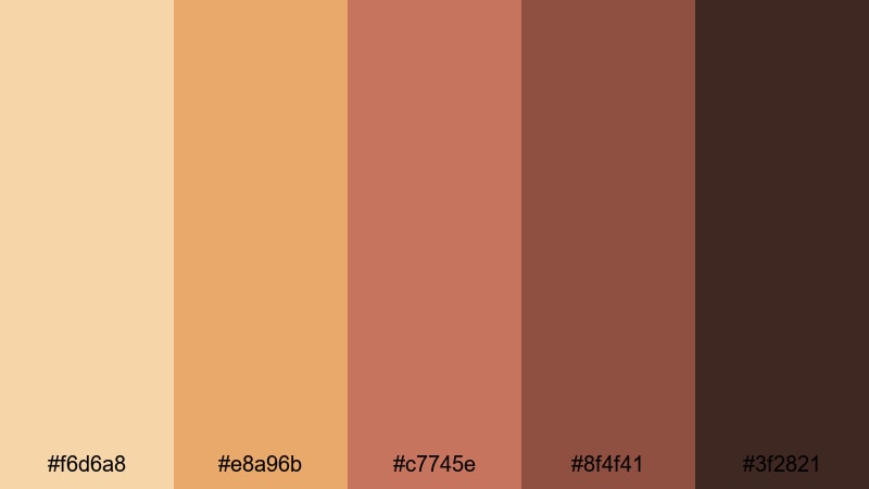
- HEX Codes: #f6d6a8, #e8a96b, #c7745e, #8f4f41, #3f2821
- Mood: Cozy, nostalgic, and homey.
- Use for: Use for fall themed vlogs, recipe videos, and family moments that need a snug, fireside feel.
Autumn Harvest Hearth combines pumpkin orange, cinnamon, and toasted wood browns to capture the comfort of a warm kitchen in fall. It instantly feels like home, with a touch of nostalgia.
Apply this palette to recipe videos, fall decor content, and family montage edits. Use warm overlays in Filmora, like subtle grain and vignette, to make every frame feel like a memory you want to keep.
Spiced Sandstone Dusk
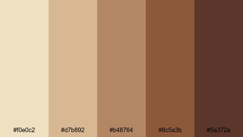
- HEX Codes: #f0e0c2, #d7b892, #b48764, #8c5a3b, #5a372a
- Mood: Calm, understated, and organic.
- Use for: Great for documentary titles, brand testimonials, and minimal edits that need subtle, natural warmth.
Spiced Sandstone Dusk moves from pale sandstone neutrals into spiced browns, giving your visuals a calm, grounded presence. It is warm enough to feel human, yet muted enough to stay professional and unobtrusive.
This palette works beautifully for brand stories, interviews, and product explainers with a natural or eco friendly angle. In titles and overlays, using the lighter tones as backgrounds keeps things clean, while the deeper browns anchor logos and key text elements.
Elegant And Modern Warm Color Palettes
Copper Velvet Luxe
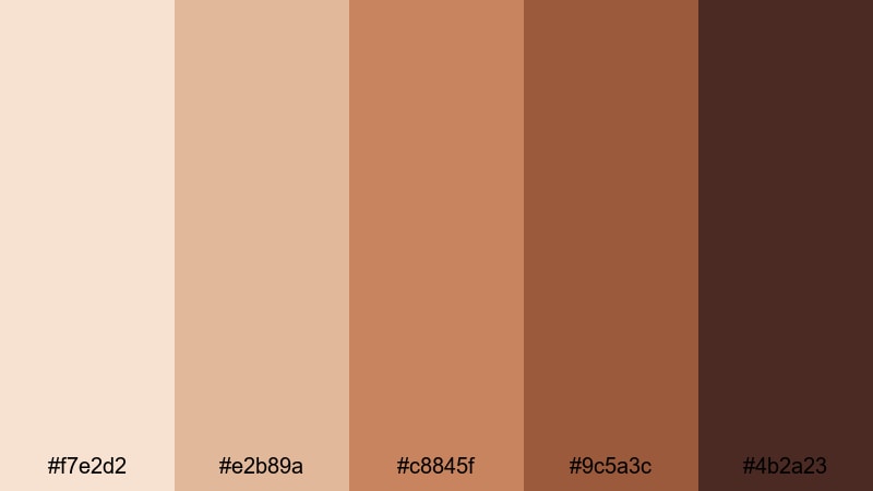
- HEX Codes: #f7e2d2, #e2b89a, #c8845f, #9c5a3c, #4b2a23
- Mood: Sophisticated, rich, and cinematic.
- Use for: Perfect for luxury brand openers, cinematic trailers, and polished portfolio reels.
Copper Velvet Luxe layers soft beige and deep copper with espresso browns, creating a velvety, premium mood. It feels like an art house cinema or a high-end boutique, captured in color.
Use this palette for cinematic trailers, showreels, and luxury product promos. In Filmora, pair these tones with slow, smooth camera moves, letterboxing, and minimal typography to amplify the cinematic, high value feel.
Amber Studio Spotlight
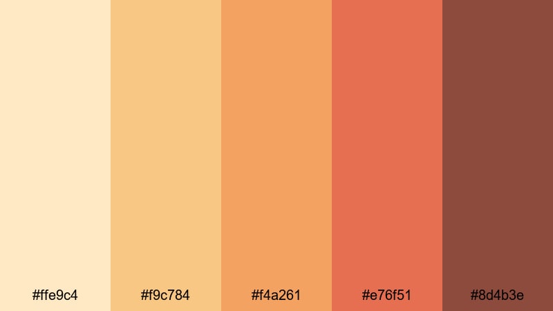
- HEX Codes: #ffe9c4, #f9c784, #f4a261, #e76f51, #8d4b3e
- Mood: Creative, polished, and inviting.
- Use for: Use for creator intros, studio tour videos, and modern brand explainers with a friendly yet professional glow.
Amber Studio Spotlight looks like soft studio lights reflected off wood and warm walls. The palette balances professional polish with a friendly warmth that works well on camera.
Apply it to creator intros, studio tours, and brand explainers where you want authority and approachability. Use the lighter ambers as background gradients and the deeper rust tones for key text, icons, or frame accents in your Filmora motion graphics.
Cinnamon Noir Contrast
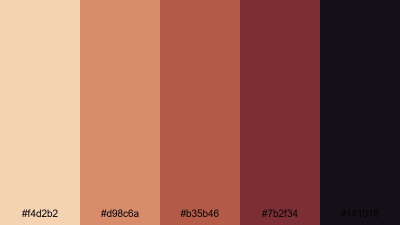
- HEX Codes: #f4d2b2, #d98c6a, #b35b46, #7b2f34, #141018
- Mood: Moody, stylish, and dramatic.
- Use for: Perfect for title cards, credits, and brand teasers that rely on bold contrast and a warm yet edgy tone.
Cinnamon Noir Contrast pairs rich red browns with deep noir shadows. The result is moody and refined, ideal when you want drama without cold, blue tones.
Use this palette for fashion content, dark romantic edits, or mysterious brand teasers. In Filmora, combine these hues with slow fades, glitch transitions, and subtle film grain to create a premium, moody style that still feels warmly human.
Golden Minimal Glow
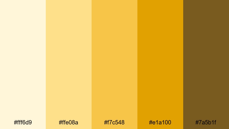
- HEX Codes: #fff6d9, #ffe08a, #f7c548, #e1a100, #7a5b1f
- Mood: Clean, bright, and confidently minimal.
- Use for: Use for sleek logo animations, lower thirds, and UI overlays where you want a simple yet luxurious warm accent.
Golden Minimal Glow moves from soft ivory to muted gold and deeper amber. It feels luxurious but stripped back, perfect for modern brands and sleek interfaces.
Use the lighter shades as clean backgrounds, and the golden tones as accent lines, icons, and progress bars in your overlays and lower thirds. This palette is ideal for tech startups, finance channels, and educational creators who want clarity with a subtle golden edge.
Tips for Creating Warm Color Palettes
Warm palettes can range from soft blush to fiery neon, so the key is balancing mood, readability, and consistency across your video or design. These tips will help you combine warm colors with neutrals and accents in a way that looks intentional and professional.
- Always anchor your palette with at least one neutral (cream, beige, soft brown, or deep charcoal) so bright warm colors have something to contrast against.
- Check text readability on thumbnails by testing white, black, or dark brown text over your warm backgrounds at small sizes.
- Pick 1 or 2 main warm accent colors for titles and buttons, and use the remaining tones more subtly for backgrounds, overlays, and details.
- Match your footage to the palette by adjusting white balance and tint first, then fine tuning saturation so skin tones still look natural.
- Use deeper warm shades (rust, terracotta, maroon) in shadows and corners to add depth and keep bright yellows or oranges from feeling flat.
- For branding, decide which warmth level fits your tone: soft peach and champagne for gentle, caring brands; bold marigold and red for high energy or entertainment channels.
- Keep your overlays, lower thirds, and transitions in the same palette so they never fight with your footage; reuse the same HEX codes in all your design assets.
- Test your warm palette in both light and dark UI modes or backgrounds to ensure it stays legible and attractive across platforms.
Warm color palettes shape how viewers feel about your stories, your brand, and even your personality on camera. From soft romantic blush to bold festival marigold, each of these 15 palettes comes with HEX codes so you can use them in thumbnails, overlays, and motion graphics with pixel perfect consistency.
Drop any of these palettes into your next Filmora project and experiment with AI powered color matching, creative filters, and custom graphics. With a consistent warm look across intros, B-roll, and social cutdowns, your channel or brand will start to feel instantly recognizable.
The more you play with warm tones, the easier it becomes to dial in the exact mood you want, whether that is cozy and nostalgic or loud and electric. Use these palettes as a starting point, then refine them into your own signature warm style inside Filmora.
secure downloadNext: Starry Sky Color Palette
