
 100% Security Verified | No Subscription Required | No Malware

Wheat Gold is one of those rare shades that feels both luxurious and approachable. It sits between soft beige and muted gold, giving off warmth, stability, and a hint of sunshine without looking flashy. In color psychology, Wheat Gold suggests comfort, reliability, and quiet confidence, which makes it a natural fit for brands and creators who want to feel welcoming but still polished.
On screen, Wheat Gold works beautifully in video intros, lower thirds, logo reveals, channel branding, and thumbnail frames. It pairs well with neutrals, deep browns, and fresh accent colors, so you can push it toward cozy, cinematic, or modern design styles. Below you will find ready made Wheat Gold color palettes with HEX codes, created for editors, designers, and Filmora users who want consistent, aesthetic visuals across their videos, thumbnails, and social posts.
In this article
Soft And Cozy Wheat Gold Color Palettes
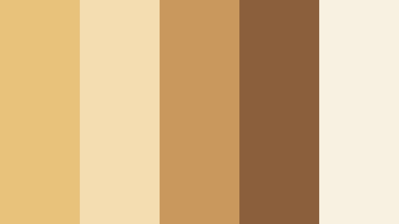
Morning Harvest Glow

- HEX Codes: #f2d399, #f7e7c3, #d9b37c, #b18c5a, #7a5b3b
- Mood: Warm, nostalgic, and gently energizing like a soft sunrise over fields.
- Use for: Ideal for vlog intros, lifestyle thumbnails, and any video needing a cozy, welcoming tone.
Morning Harvest Glow wraps your visuals in soft sunlight. The lighter tones (#f2d399, #f7e7c3) feel like early morning light washing over Wheat Gold fields, while the deeper browns (#b18c5a, #7a5b3b) add grounding shadows and texture. Together they create a calm, nostalgic palette that still feels uplifting.
This palette works especially well for lifestyle channels, journaling vlogs, morning routines, and gentle storytelling. Use the lighter shades for backgrounds, title cards, and thumbnail frames, then bring in the darker browns for text, icons, and accents so your Wheat Gold theme looks cohesive across intros, B roll, and social cutdowns.
Pro Tip: Build a Cinematic Wheat Gold Look in Filmora
To keep a soft Wheat Gold look like Morning Harvest Glow consistent, build a simple style guide inside Filmora. Use the lighter HEX codes for solid color backgrounds, lower thirds, and text boxes, then reserve the deeper browns for typography and logo marks. Once you dial in a look you like, save these elements as presets so you can apply the same warm, sunlit feel to every vlog episode.
When color grading your footage, lightly warm up the midtones and highlights to echo the Wheat Gold values you are using in your graphics. This makes your intros, talking head shots, and B roll feel like they belong to the same world, which is key for channel branding and binge worthy playlists.
AI Color Palette
If you have a still frame or mood board that captures your ideal Wheat Gold aesthetic, you can turn it into a full video look with Filmora's AI Color Palette feature. Import the image that best represents Morning Harvest Glow, then let the tool analyze its tones and apply a matching grade to your entire timeline.
This is especially helpful when you are mixing footage from different cameras or lighting conditions. Filmora's AI Color Palette feature lets you color match everything to one warm Wheat Gold reference, so your intros, B roll, and social edits feel unified without hours of manual grading.
 secure download

HSL, Color Wheels & Curves
To fine tune your Wheat Gold tones in Filmora, head to the color tools and adjust HSL, color wheels, and curves. Slightly increasing saturation in the yellow and orange ranges can make Wheat Gold feel richer, while keeping luminance controlled in the highlights will stop skin tones from looking too bright or washed out.
Use the color wheels to warm your midtones for that cozy morning feel, then pull the shadows a little toward neutral or soft brown so the image still looks natural. You can also gently lift the curve in the shadows for a low contrast, filmic look, as shown in Filmora's advanced color correction tutorials on YouTube.
secure download1000+ Video Filters & 3D LUTs
If you want to stylize your Wheat Gold palette in one move, explore Filmora's rich library of filters and LUTs. You can start from Morning Harvest Glow as your base and then layer a subtle film LUT or warm tone filter to add texture, contrast, or a specific genre vibe such as vintage vlog, documentary, or romantic travel.
Filmora's video filters and 3D LUTs make it easy to test different Wheat Gold looks without losing your underlying palette. Apply a LUT to your clip, tweak intensity, and combine it with your saved color presets so every thumbnail, intro, and reel looks consistently on brand.
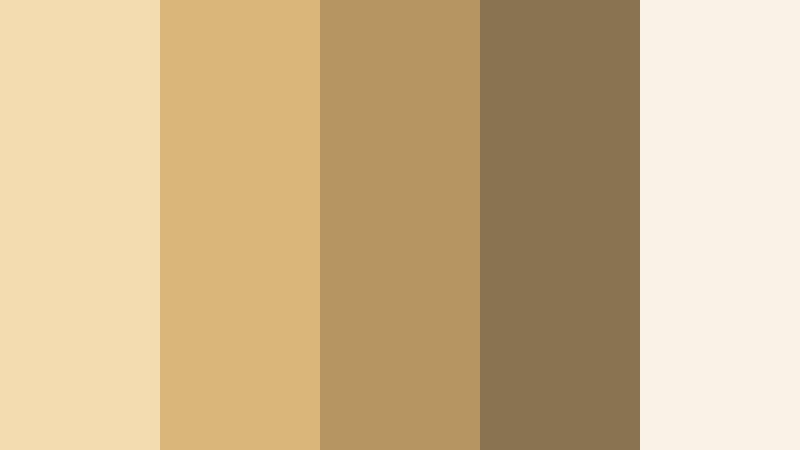
secure downloadCountry Kitchen Warmth
- HEX Codes: #e8c27a, #f4ddb0, #c8985d, #8b5f3b, #f8f1e2
- Mood: Homey, comforting, and rustic with a hint of vintage charm.
- Use for: Great for cooking channels, DIY content, and product shots that need a wholesome, at-home feeling.
Country Kitchen Warmth leans into the cozy, home cooked side of Wheat Gold. The soft creams and Wheat Gold tones suggest worn recipe cards, wooden countertops, and warm lamplight, while the richer brown (#8b5f3b) anchors the palette so it feels grounded and real.
Use the lightest shade (#f8f1e2) as a neutral background for thumbnails, recipe cards, or overlay graphics. The mid Wheat Golds (#e8c27a, #f4ddb0) are great for buttons, badges, and highlight shapes in your cooking or DIY videos. The deeper tones help text and icons stand out without breaking the warm, rustic mood.
Sunlit Loft Neutrals
- HEX Codes: #f3ddb0, #d9b77a, #b69563, #8a7351, #f9f3e7
- Mood: Airy, modern, and relaxed with subtle urban warmth.
- Use for: Perfect for minimalist vlogs, studio tours, and soft product showcases that need calm sophistication.
Sunlit Loft Neutrals balances Wheat Gold warmth with cool, airy neutrals. The palette evokes a bright apartment or studio with light streaming in over wooden floors and neutral textiles. It feels modern and uncluttered, which makes it ideal for creators who want a cleaner aesthetic.
Pair the brightest tones (#f3ddb0, #f9f3e7) with generous white space in your titles and thumbnails, then bring in the deeper neutrals (#b69563, #8a7351) for text, logo marks, and subtle framing. This palette is especially effective for design, productivity, and tech content where you want Wheat Gold warmth without losing a minimalist look.
Candlelit Storytime

- HEX Codes: #e2ba6d, #f6e2b9, #b8874e, #6f4b30, #2c1c15
- Mood: Intimate, nostalgic, and slightly dramatic like a cozy evening scene.
- Use for: Use for narrative videos, sit down chats, and title cards where you want warmth with a cinematic edge.
Candlelit Storytime adds a touch of drama to Wheat Gold by introducing deep coffee brown (#2c1c15) and rich shadow tones (#6f4b30). The lighter Wheat Golds feel like candlelight flickering across pages, which gives your visuals an intimate, storytelling quality.
Use the soft golds (#e2ba6d, #f6e2b9) for backgrounds and subtle glows, then contrast them with the darkest tone for titles and lower thirds. This combination works well for commentary videos, long form storytelling, and podcast style uploads where you want viewers to settle in and listen.
Autumn Field Stroll

- HEX Codes: #e9c879, #f7e6b4, #c89a4f, #8f6b3b, #5b3f24
- Mood: Earthy, grounded, and gently romantic with a fall sensibility.
- Use for: Ideal for travel vlogs, nature b roll, and seasonal promos that highlight warmth and comfort.
Autumn Field Stroll takes the heart of Wheat Gold and pushes it into a fall inspired direction. The golden midtones (#e9c879, #c89a4f) pair with deeper browns to suggest dried grass, knit sweaters, and late afternoon walks. It feels grounded and slightly nostalgic, perfect for seasonal content.
Use lighter tones for sky overlays, text backgrounds, or frames around your shots, and bring in the darker hues for typography and dividers. This palette is a strong choice for travel vlogs, outdoor B roll, and any fall themed promos or reels where you want a cozy yet natural look.
Elegant And Modern Wheat Gold Color Palettes
Gilded Minimal Studio

- HEX Codes: #f0d596, #f8f3e8, #c9a86a, #8f7655, #222222
- Mood: Clean, polished, and design forward with a touch of quiet luxury.
- Use for: Perfect for tech reviews, portfolio reels, and brand intros that need a refined yet subtle accent.
Gilded Minimal Studio mixes soft Wheat Gold with crisp off white and a confident black (#222222). The result is a palette that feels like a high end studio or boutique brand, but still remains understated and clean. It brings out the luxurious side of Wheat Gold without going full metallic.
Use the pale tones (#f0d596, #f8f3e8) for backgrounds and large shapes, then reserve the darkest shade for typography and line work. This palette works especially well in minimalist logo stings, UI overlays, and graphic transitions in Filmora where you want your content to feel premium and modern.
Hotel Lobby Luxe

- HEX Codes: #d7b26b, #f2e5cf, #a18355, #5b4935, #101010
- Mood: Upscale, composed, and quietly glamorous like a boutique hotel lobby.
- Use for: Use for premium product promos, fashion lookbooks, and cinematic openers needing a luxe edge.
Hotel Lobby Luxe leans into deeper, richer Wheat Gold tones paired with espresso browns and near black (#101010). It feels like marble floors, velvet seating, and dimmed lights, instantly signaling premium and curated design.
Use the soft cream (#f2e5cf) as your base, then apply the mid and dark browns for bold titles, price tags, or callouts in your promos. This palette is great for fashion, jewelry, tech accessories, or any product that benefits from luxe storytelling and cinematic transitions.
Gallery Wall Neutrals

- HEX Codes: #f1debf, #d4b67b, #b09362, #7a6350, #343434
- Mood: Artful, composed, and editorial with subtle drama.
- Use for: Great for title cards, lookbooks, and branding where you want a curated, magazine style look.
Gallery Wall Neutrals pairs Wheat Gold with muted browns and a charcoal accent (#343434), echoing the vibe of a curated art space. It feels thoughtful and editorial, ideal for creators who want their videos to look like moving magazine spreads.
Use the lightest shades as negative space around your footage, then bring in the darker neutrals for frames, captions, and lower thirds. The charcoal tone is perfect for clean, legible text in thumbnails and end screens while still keeping the palette warm and sophisticated.
Champagne Studio Lights

- HEX Codes: #f5e1c5, #e2c189, #c89d5f, #9a7750, #1f1a18
- Mood: Softly glamorous, polished, and cinematic like studio lights on satin.
- Use for: Perfect for beauty content, product shots, and cinematic intro slates needing subtle glamour.
Champagne Studio Lights puts a soft spotlight on Wheat Gold, combining champagne beige (#f5e1c5) with deeper caramel and a dark, cinematic brown (#1f1a18). It has a polished, glow filled mood that fits beauty channels, skincare, jewelry, and other visually driven niches.
Use the brighter tones for glowing backgrounds and soft gradients, then anchor your titles and UI elements with the darkest hue. In thumbnails, you can use the medium Wheat Golds for borders around product shots to create a premium, spotlighted effect that stands out in feeds.
Soft Brass Industrial

- HEX Codes: #d4ad63, #f2e5d0, #a37c43, #6b5846, #26221e
- Mood: Modern, slightly edgy, and sophisticated with an industrial twist.
- Use for: Use for creator brands, channel rebrands, and UI overlays that balance warmth with modern grit.
Soft Brass Industrial gives Wheat Gold a brassy, urban twist. The palette mixes warm brass tones (#d4ad63, #a37c43) with soft off white and industrial browns, creating a modern, slightly gritty feel that still looks refined.
This is a strong choice for creator brands, productivity or tech channels, and any rebrand where you want personality without losing professionalism. Use the off white (#f2e5d0) as your main background, the brass tones for icons and highlights, and the darkest shade (#26221e) for navigation bars, buttons, and key text in your overlays.
Sunny And Uplifting Wheat Gold Color Palettes
Weekend Brunch Table

- HEX Codes: #f3d488, #ffe9b6, #f9b26a, #f37a4b, #ffffff
- Mood: Cheerful, social, and bright like a sunny brunch with friends.
- Use for: Ideal for food content, cheerful vlogs, and social media graphics that need energy and warmth.
Weekend Brunch Table brightens Wheat Gold with citrusy oranges (#f9b26a, #f37a4b) and clean white. It instantly feels social, energetic, and fun, like clinking glasses and plates of fresh food on a sunny table.
Use white as your main background to keep things clean, then drop in Wheat Gold and orange accents for buttons, badges, and animated stickers in Filmora. This palette works perfectly for recipes, meetup vlogs, event recaps, and any thumbnail where you want to radiate warmth and positivity.
Sunflower Market Day

- HEX Codes: #f2c94c, #ffe8a3, #f2994a, #6fcf97, #2f4858
- Mood: Playful, friendly, and optimistic with a fresh outdoor feel.
- Use for: Use for travel vlogs, farmers market footage, and playful title cards with a natural twist.
Sunflower Market Day brings together bright Wheat Gold (#f2c94c), sunny orange, fresh green (#6fcf97), and a contrasting teal navy (#2f4858). The combination feels like a busy outdoor market filled with flowers, produce, and friendly conversations.
Use the Wheat Gold and orange tones for key elements like titles and shapes, then pull in the green and teal as accent strips, icons, or section headers. This palette is excellent for travel edits, city walks, and lifestyle videos where you want a playful, eco friendly vibe.
Golden Hour Boardwalk

- HEX Codes: #f3c66b, #ffdca2, #ff9f7b, #7ac7e3, #205b73
- Mood: Nostalgic, cinematic, and breezy like seaside golden hour.
- Use for: Perfect for travel reels, lifestyle montages, and cinematic B roll with warm skies and cool shadows.
Golden Hour Boardwalk balances warm Wheat Gold and peach tones with soft sky blues (#7ac7e3) and a deep teal (#205b73). It captures the contrast of warm light and cool shadows you see at sunset by the water, making footage feel instantly cinematic.
Use the warm hues for titles, overlays, and gradient washes, while the blues can frame your footage or highlight key information. This palette is ideal for travel reels, beach vlogs, and romantic lifestyle edits where you want to emphasize mood and atmosphere.
Creative Studio Splash

- HEX Codes: #f2d279, #ffecc2, #ffb347, #ff6f61, #333333
- Mood: Energetic, artistic, and bold with a professional edge.
- Use for: Great for motion graphics, creator logos, and channel art that must pop in feeds and thumbnails.
Creative Studio Splash combines bright Wheat Gold (#f2d279) with bold coral and deep gray (#333333). It feels like a modern creative agency poster, energetic but still organized and readable.
Use Wheat Gold and coral for shapes, call to action buttons, and animated accents in your intros and lower thirds. The deep gray provides strong contrast for text, making it perfect for tutorial channels, design breakdowns, and any content where you want eye catching but professional branding.
Earthy And Rustic Wheat Gold Color Palettes
Farmhouse Window Light

- HEX Codes: #e3c27b, #f4e3c0, #b3925a, #6e563c, #3f2b23
- Mood: Rustic, calm, and sincere like an old farmhouse filled with light.
- Use for: Ideal for homestead channels, craft tutorials, and documentary style pieces with a grounded tone.
Farmhouse Window Light takes Wheat Gold in a rustic direction with weathered browns (#6e563c, #3f2b23) and soft, sunlit cream (#f4e3c0). It feels authentic and unpolished in the best way, like a quiet kitchen or workshop lit by a single window.
Use the lightest tone for background cards and clean spaces around your footage, then add Wheat Gold and mid browns for titles, labels, and simple icons. This palette is especially effective for homesteading, crafts, gardening, slow living, and documentary style edits where sincerity and warmth matter more than gloss.
Tips for Creating Wheat Gold Color Palettes
Wheat Gold is versatile, but it looks best when paired thoughtfully with supporting colors and used consistently across your video and design assets. Here are practical tips to shape palettes that work on both big screens and phone feeds.
- Balance warmth and neutrality by combining Wheat Gold with off white or soft cream so your layouts feel bright, not heavy.
- Use dark browns, charcoal, or deep teal for text and icons to keep readability strong over warm Wheat Gold backgrounds.
- Pick one main accent color (for example coral, green, or blue) and repeat it across intros, lower thirds, and thumbnails for a clear brand identity.
- When color grading footage, match your highlights and midtones to your chosen Wheat Gold HEX values so your scenes and graphics feel unified.
- Use more saturated Wheat Gold and accent colors in thumbnails, but dial back saturation slightly in video grades for a cinematic look.
- Test your palette on both light and dark modes by inverting your background and text colors; keep at least one high contrast pair ready for overlays.
- Create a simple style sheet with HEX codes for background, primary text, secondary text, and accent to speed up design and editing decisions.
- In Filmora, save your favorite color grading and title presets so every new project can instantly follow the same Wheat Gold visual language.
Wheat Gold color palettes can shift your content from ordinary to memorable, turning casual uploads into a recognizable visual brand. Whether you choose soft and cozy tones, luxe neutrals, sunny mixes, or rustic combinations, this warm shade helps you communicate comfort, reliability, and subtle sophistication on screen.
Use the HEX codes above as ready made kits for your intros, lower thirds, thumbnails, and social edits. Test a few palettes in Filmora, adjust them with AI Color Palette, HSL, and LUTs, and then commit to one or two looks that truly match your story and audience.
Once your Wheat Gold style is locked in, every new video becomes faster to produce and more cohesive in your viewers feeds, helping your channel feel intentional and binge worthy from the first frame to the end screen.
secure download