
 100% Security Verified | No Subscription Required | No Malware


 ChatGPT
 Perplexity
 Gemini
 Claude
 Grok
Grok
White beige sits between pure white and classic beige, giving you a soft neutral that feels clean, warm, and quietly luxurious. It suggests calm, trust, and comfort without stealing attention from your subject, which makes it perfect for lifestyle content, vlogs, minimalist branding, and cinematic storytelling.
For video creators and designers, white beige color palettes are powerful tools for thumbnails, intros, lower thirds, overlays, and full channel branding. Below you will find curated white beige color combinations with precise HEX codes, tailored for Filmora users and other creators who want consistent, aesthetic visuals across YouTube, social reels, and design projects.
In this article
Soft & Minimal White Beige Color Palettes
Morning Linen Glow
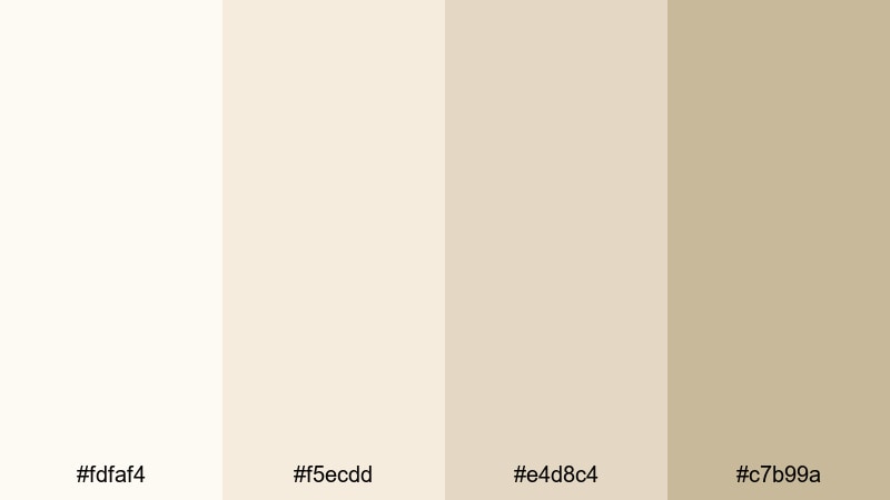
- HEX Codes: #fdfaf4, #f5ecdd, #e4d8c4, #c7b99a
- Mood: Calm, airy, and sunlit, like soft linen curtains in a quiet bedroom.
- Use for: Ideal for lifestyle vlog intros, morning routine sequences, and gentle on-screen text backgrounds.
Morning Linen Glow blends creamy whites with barely there beige, creating a light, breathable backdrop that never feels harsh. It mimics soft daylight on linen sheets, which makes it perfect when you want your video to feel relaxed, tidy, and soothing.
Use this palette for clean YouTube thumbnails, minimalist channel headers, and intro screens for wellness, productivity, and home decor content. Keep your typography in slightly darker beige or muted gray to maintain readability while preserving that quiet, sunlit atmosphere across your Filmora edits.
Pro Tip: Build A Soft White Beige Look In Filmora
To keep Morning Linen Glow consistent across your project, set one of the mid-tone beige colors as your default background in titles and graphic elements inside Filmora. Then sample the lighter whites for overlays, frames, and lower thirds so every scene feels like it belongs to the same calm, linen-inspired world.
You can also create a reusable style: design one on-brand title card using this palette, save it as a preset in Filmora, and reuse it for intros, outros, and chapter cards. That way, your audience instantly recognizes your aesthetic, no matter if they find you through a vlog, a short, or a tutorial.
AI Color Palette
If you have a reference image that already uses these soft white beige tones (for example, a photo of your bedroom or a flat lay of linen and notebooks), Filmora's AI Color Palette feature can automatically transfer that look to your entire video. You get cohesive highlights, mid-tones, and shadows without spending hours manually tweaking colors.
Simply import your reference frame, apply AI Color Palette, and let Filmora match the colors across your clips, from A-roll to B-roll and thumbnails. This is especially useful for keeping your Morning Linen Glow palette intact across different cameras, lighting setups, or shooting days.
 secure download

HSL, Color Wheels & Curves
White beige palettes are all about subtlety, so small adjustments go a long way. In Filmora, you can use the HSL controls and color wheels to warm up the highlights, slightly desaturate yellows, and push shadows toward soft beige rather than stark gray. This keeps skin tones natural while maintaining that gentle, linen-like atmosphere.
Combined with curves, you can lift the blacks a touch to avoid heavy contrast and preserve a soft, matte look. For a deeper dive into these tools, check out Filmora's advanced color correction guide and experiment with saving your favorite white beige adjustments as custom presets.
secure download1000+ Video Filters & 3D LUTs
Once your base white beige palette is in place, Filmora’s video filters and 3D LUTs make it easy to push the mood toward cinematic, nostalgic, or editorial. A gentle warm LUT can make Morning Linen Glow feel even cozier, while soft fade or matte filters can enhance the minimalist, airy style.
Apply filters lightly over your core color correction, and keep an eye on text contrast for thumbnails and titles. With over a thousand presets, you can quickly test different vibes while preserving the same calm beige foundation across your content.
secure downloadPaper Studio Calm
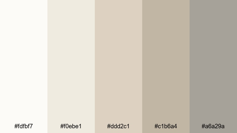
- HEX Codes: #fdfbf7, #f0ebe1, #ddd2c1, #c1b6a4, #a6a29a
- Mood: Understated, organized, and thoughtful, like an uncluttered creative desk.
- Use for: Perfect for tutorial slides, screen overlays, and channel branding that feels neat and professional.
Paper Studio Calm layers soft whites and stationery-inspired beige tones with a hint of warm gray. It feels like clean sketchbooks, neutral sticky notes, and muted pencil lines lined up on a tidy desk.
Use it for tutorial overlays, infographics inside your videos, and simple thumbnail layouts where you want information to look structured and easy to follow. In Filmora, combine these tones with clear sans-serif fonts for tech, design, and educational content that looks professional but not cold.
Dusted Porcelain Light
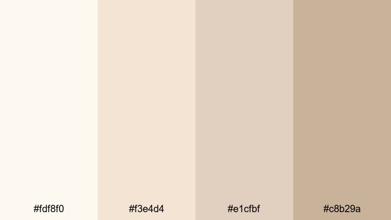
- HEX Codes: #fdf8f0, #f3e4d4, #e1cfbf, #c8b29a
- Mood: Delicate and refined, like vintage porcelain softly catching the light.
- Use for: Use for product close-ups, soft beauty b-roll, and unboxing titles that need a gentle, premium touch.
Dusted Porcelain Light mixes creamy whites with dusty beige for an elegant but approachable aesthetic. It evokes curated ceramics, delicate skincare packaging, and soft studio light.
This palette works beautifully for jewelry, skincare, home fragrance, and slow living content. Drop these hues into your title cards, end screens, and product callouts in Filmora to give everything a refined, boutique feel while keeping the overall vibe welcoming rather than overly formal.
Quiet Gallery Walls
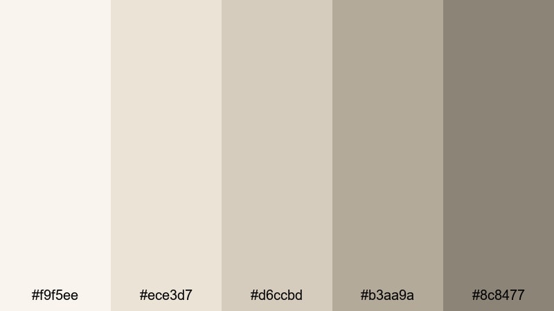
- HEX Codes: #f9f5ee, #ece3d7, #d6ccbd, #b3aa9a, #8c8477
- Mood: Serene and introspective, like walking through a minimalist art gallery.
- Use for: Ideal for cinematic titles, talking-head backgrounds, and subtle lower thirds.
Quiet Gallery Walls steps slightly deeper into off-whites and taupes, creating a palette with more depth but still minimal distraction. It feels like museum walls that allow the artwork to stand out.
Use the lighter tones for backgrounds and the darker taupes for text, frame lines, or minimalist icons. This palette is great for commentary videos, documentaries, and thought pieces where you want the audience to focus on your words while your visuals stay refined and cohesive.
Warm & Cozy White Beige Color Palettes
Vanilla Latte Corner
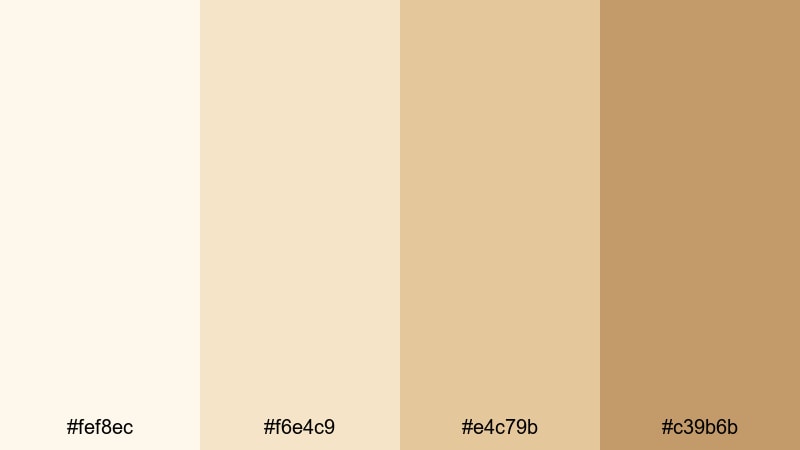
- HEX Codes: #fef8ec, #f6e4c9, #e4c79b, #c39b6b
- Mood: Cozy, inviting, and cafe-like, with hints of creamy coffee tones.
- Use for: Perfect for vlog intros, cafe reviews, and warm lifestyle thumbnails that feel comforting.
Vanilla Latte Corner is a creamy blend of off-white and latte beige with richer caramel accents. It instantly suggests coffee shops, warm lights, and relaxed afternoons.
Use the lightest shades for backgrounds and soft overlays, and reserve the deeper caramel tone for buttons, CTAs, or bold title words in your thumbnails. This palette fits daily vlogs, cozy study-with-me videos, and any film that aims for a gentle, friendly first impression.
Fireside Cream Hues
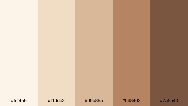
- HEX Codes: #fcf4e9, #f1ddc3, #d9b89a, #b48463, #7a5540
- Mood: Warm, nostalgic, and slightly rustic, like evenings by a fireplace.
- Use for: Use for cozy storytime videos, podcast visuals, and heartfelt montage scenes.
Fireside Cream Hues moves from soft cream through warm beige into richer browns, giving you a full range from highlight to shadow within one palette. It feels nostalgic, like wooden furniture and old photo albums.
Apply the lighter colors to lower thirds and text boxes, and use the medium and dark browns for borders, drop shadows, and emphasis words. This palette suits autumn vlogs, family recaps, and podcast visuals where you want a fireside storytelling mood.
Autumn Macaron Mix
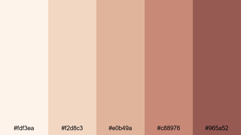
- HEX Codes: #fdf3ea, #f2d8c3, #e0b49a, #c88976, #965a52
- Mood: Sweet, nostalgic, and seasonal, like a box of fall pastries.
- Use for: Great for recipe videos, baking shorts, and lifestyle thumbnails with a soft seasonal touch.
Autumn Macaron Mix combines buttery whites and pastry-inspired beige with warm terracotta and cocoa notes. It suggests fall desserts, baked goods, and cozy afternoons cooking at home.
Use the paler tones as canvas for text and the deeper terracotta hues as accents on buttons, badges, or hand-drawn doodles in your overlays. It is ideal for recipe cards, food shots, and seasonal vlogs edited in Filmora where you want warmth without overly saturated oranges.
Candlelit Storytime
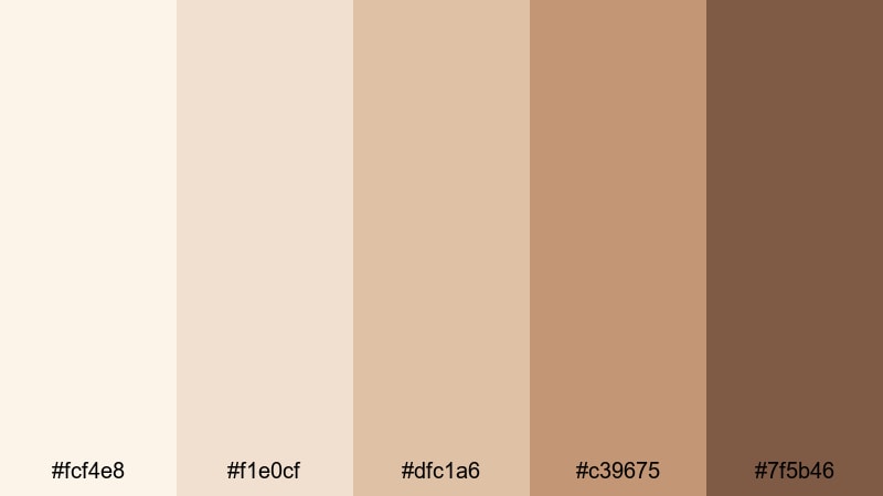
- HEX Codes: #fcf4e8, #f1e0cf, #dfc1a6, #c39675, #7f5b46
- Mood: Intimate and soothing, like reading under soft candlelight.
- Use for: Ideal for voiceover storytelling, book reviews, and gentle background frames for subtitles.
Candlelit Storytime moves through milky whites, honeyed beige, and warm brown accents, echoing the flicker of candles and cozy evenings indoors. It feels intimate and close, perfect for voiceover-driven videos.
Use the lightest beige as background for subtitles and the mid-tone honey hues for title cards and timestamps. The deepest brown works well for icons or subtle borders around your frame. This palette helps your narration feel soft and safe while keeping everything easy to read.
Modern & Luxurious White Beige Color Palettes
Marble Lobby Luxe
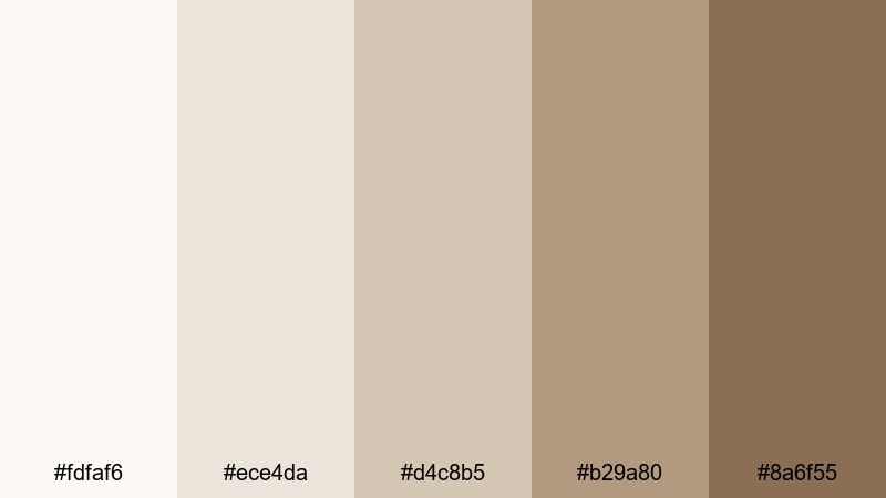
- HEX Codes: #fdfaf6, #ece4da, #d4c8b5, #b29a80, #8a6f55
- Mood: Polished and upscale, like a hotel lobby with marble and warm stone.
- Use for: Perfect for brand idents, real estate reels, and premium product promos.
Marble Lobby Luxe pairs soft white marble tones with stone-inspired beige and refined browns. It immediately feels high-end and architectural, like polished floors and designer lighting.
Use this palette in Filmora for logo animations, lower thirds in real estate or interior design videos, and product promo titles. The mid and dark browns add structure to your layouts, while the light neutrals keep everything clean and premium.
Champagne Lobby Lights
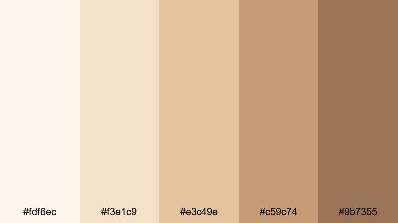
- HEX Codes: #fdf6ec, #f3e1c9, #e3c49e, #c59c74, #9b7355
- Mood: Festive, glamorous, and softly sparkling, like champagne under warm lights.
- Use for: Use for event highlight reels, wedding films, and glamorous social promos.
Champagne Lobby Lights is all about celebration. Champagne-tinted whites and golden beige tones are grounded by richer tan accents, creating a glamorous but tasteful palette.
Apply the brighter shades to overlays and animated titles, and use the deeper golden browns for name tags, date stamps, or logo locks in your edits. It works especially well for weddings, launches, and social media highlight reels where you want a golden, celebratory glow.
Ivory Cashmere Brand
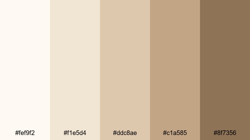
- HEX Codes: #fef9f2, #f1e5d4, #ddc8ae, #c1a585, #8f7356
- Mood: Softly luxurious and tactile, like a cashmere sweater in a studio setting.
- Use for: Ideal for fashion lookbooks, brand decks, and premium channel branding.
Ivory Cashmere Brand combines ivory whites with warm cashmere beige and softly shaded browns. It feels tactile and luxurious, great for brands that lean into texture, fabric, and detail.
Use the lighter tones as clean backdrops for product shots or lookbook titles, and the darker hues for logos, social handles, and key text. This palette keeps your channel or brand deck cohesive across intros, transitions, and end screens in Filmora.
Stoneware Boutique Chic
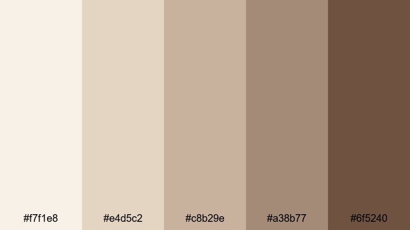
- HEX Codes: #f7f1e8, #e4d5c2, #c8b29e, #a38b77, #6f5240
- Mood: Earthy yet refined, like curated ceramics in a boutique window.
- Use for: Perfect for product showcases, shop promos, and elegant typography screens.
Stoneware Boutique Chic brings together stoneware-inspired beige with clay browns for an earthy yet polished look. It is ideal for artisan brands, small boutiques, and handmade product lines.
Use the lighter shades to frame your products and the darker browns for price tags, call-to-action labels, or section titles. In Filmora, pair this palette with simple transitions and clean typography to keep the focus on craftsmanship and detail.
Fresh & Natural White Beige Color Palettes
Beach Sand Morning
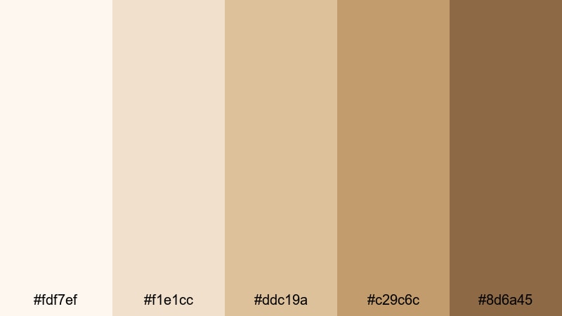
- HEX Codes: #fdf7ef, #f1e1cc, #ddc19a, #c29c6c, #8d6a45
- Mood: Relaxed and breezy, like a quiet walk on the shore at sunrise.
- Use for: Use for travel vlogs, beach footage, and calm B-roll sequences.
Beach Sand Morning captures the warmth of sunlit sand and driftwood, mixing soft whites with golden beige and warm brown. It feels like calm waves, early light, and slow travel days.
Use the lighter shades as overlays for location titles and timestamps, and bring in the deeper browns for map pins, icons, or highlight words. This palette is perfect for travel vlogs, day-in-the-life edits, and relaxed recap videos with a coastal feel.
Olive Orchard Breeze
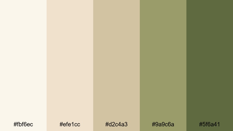
- HEX Codes: #fbf6ec, #efe1cc, #d2c4a3, #9a9c6a, #5f6a41
- Mood: Organic, grounded, and airy, like a sunlit orchard path.
- Use for: Ideal for sustainable brand stories, garden content, and nature-inspired intros.
Olive Orchard Breeze pairs soft white beige with muted olive greens, balancing airy lightness with earthy stability. It feels organic and grounded without becoming too rustic.
Use beige for primary backgrounds and the olive tones as accents on icons, badges, and underline strokes. This palette is ideal for eco brands, gardening channels, and nature-focused intros where you want to communicate sustainability and calm.
Dune Grass Horizon
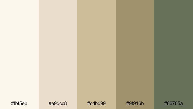
- HEX Codes: #fbf5eb, #e9dcc8, #cdbd99, #9f916b, #66705a
- Mood: Calm and windswept, with a subtle sense of movement and space.
- Use for: Perfect for cinematic travel openings, drone shots, and contemplative montage edits.
Dune Grass Horizon brings together windblown dune beige with muted green-grays, echoing coastal meadows and wide horizons. It has a contemplative quality that suits slower, more cinematic edits.
Use this palette in opening sequences, chapter cards, and end screens for travel films or reflective vlogs. The cooler greens keep the beige from feeling too warm, giving your visuals a balanced, natural tone that works well with landscape footage and drone shots.
Tips for Creating White Beige Color Palettes
White beige is versatile and forgiving, but a few simple rules will help you design palettes that look clean on screen and support your storytelling in Filmora or any other editor.
- Pair light beige with one or two deeper accent tones so text and icons stay readable on thumbnails and title cards.
- Check your palette on both light and dark devices; what looks soft on a desktop can turn washed out on a phone if contrast is too low.
- Keep skin tones in mind: avoid pushing your beige too yellow or too pink in color correction, especially for beauty or talking-head content.
- Use slightly darker beige or taupe for text instead of pure black to maintain a gentle, cohesive aesthetic while still keeping clarity.
- Choose one main beige family for your channel branding and reuse it across intros, lower thirds, and end screens to build instant recognition.
- Add subtle accent colors (olive, terracotta, champagne gold) sparingly for buttons, highlights, or progress bars so the palette stays calm and minimal.
- Test your HEX codes directly on overlays and frames in short sample edits before rolling them out across a full series or playlist.
- Export a few frames from your Filmora timeline and compare them side by side to check that your white beige tones remain consistent across different scenes and lighting conditions.
White beige color palettes can completely change how your content feels: from clean and minimal, to cozy and nostalgic, to modern and luxurious. By choosing the right combination of creamy whites, soft beige, and carefully selected accents, you shape your brand identity and guide how viewers experience your videos.
Whether you are building a lifestyle channel, launching a product line, or polishing a travel film, these white beige HEX palettes give you a reliable starting point. Drop them into your titles, overlays, and color grading inside Filmora, then fine-tune with AI tools, HSL, and LUTs until the whole edit feels seamless.
Save your favorite combinations as presets and reuse them across intros, thumbnails, and reels. Over time, your consistent white beige aesthetic will help your content stand out while still feeling soft, timeless, and easy on the eyes.
secure downloadNext: Gold Red Color Palette
