
 100% Security Verified | No Subscription Required | No Malware


 ChatGPT
 Perplexity
 Gemini
 Claude
 Grok
Grok
White, blue, and gray together create a cool, balanced color story that feels clean and trustworthy. White keeps things bright and minimal, blue adds calm focus and professionalism, and gray grounds everything with a neutral, modern edge. In video, these tones are perfect for tech, productivity, study, and cinematic styles where you want clarity without loud colors.
Whether you are designing YouTube thumbnails, intros, overlays, channel branding, or a full color grade, a well-chosen white blue gray color palette can instantly tighten your visual identity. Below you will find 15 curated white blue gray color palettes with HEX codes, plus ideas on how Filmora users and other creators can apply them across intros, B-roll, social cuts, and more.
In this article
Minimal & Modern White Blue Gray Palettes
Studio Loft Neutrals
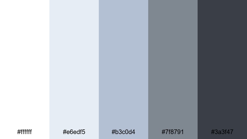
- HEX Codes: #ffffff, #e6edf5, #b3c0d4, #7f8791, #3a3f47
- Mood: calm, pared-back, and architectural
- Use for: Use for minimalist YouTube studio tours, productivity vlogs, and clean lower thirds that need a sleek neutral base.
Studio Loft Neutrals feels like daylight bouncing off white walls and brushed metal hardware. The bright white and misty blue tones keep your frame open and airy, while the deeper charcoal grays add structure, like window frames and tech gear in a modern city apartment.
This palette works beautifully for minimalist channel branding, clean YouTube intros, and overlay graphics that should not distract from your subject. Use the lighter colors for backgrounds in title cards and end screens, and reserve the darkest gray for text, icons, and subscribe buttons where you need strong readability without pure black.
Pro Tip: Build a Cohesive White Blue Gray Setup in Filmora
When you shoot in a real studio or desk space, your lighting and wall tones can shift between clips. In Filmora, you can nudge your footage toward this Studio Loft Neutrals palette by slightly cooling the temperature, lifting highlights toward white, and softening saturation in busy colors. This helps your intros, A-roll, and B-roll match visually, even if they were shot on different days.
Use the same white blue gray accent color for lower thirds, chapter markers, and on-screen text, so your whole edit feels like one intentional design system instead of separate segments stitched together.
AI Color Palette
If you already have a reference image that nails your dream white blue gray aesthetic (for example, a photo of your studio or a custom color card), Filmora's AI Color Palette feature can automatically transfer that look to the rest of your clips. The tool analyzes the color balance and contrast, then matches your footage with a single click.
This is especially helpful when you are editing vlogs, channel trailers, and short-form content at scale. Instead of color grading each clip by hand, you set one hero frame that represents your brand and let AI spread that clean, modern palette across the entire timeline.
 secure download

HSL, Color Wheels & Curves
To fine-tune your white blue gray tones, use Filmora's HSL sliders, color wheels, and curves. You can desaturate warm hues that creep into your frame, then gently boost blues in the midtones for a cooler, more consistent look. With the color wheels, try cooling shadows slightly and keeping highlights neutral so skin tones stay natural while backgrounds feel modern.
For more structured adjustments, follow a color correction workflow similar to the one shown in this Filmora color correction guide, then add a subtle S-curve to stretches of white and gray. This gives your footage soft contrast and that polished, editorial finish without crushing detail.
secure download1000+ Video Filters & 3D LUTs
Once your base white blue gray balance is in place, you can push the style further using Filmora's filters and LUTs. A subtle cinematic LUT can deepen grays and cool the midtones for a sleek, high-end feel, while soft focus or glow filters help whites feel more airy for aesthetic vlogs and desk tours.
Filmora's video filters and 3D LUTs make it easy to test different moods without rebuilding your grade from scratch. Try a few presets on adjustment layers above your timeline, then fine-tune opacity until your chosen white blue gray palette feels perfectly on-brand.
secure downloadClean Interface Glow
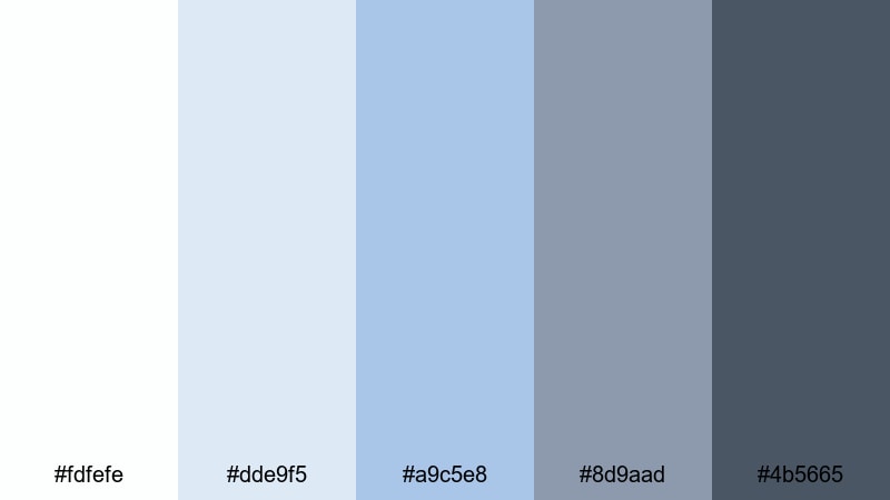
- HEX Codes: #fdfefe, #dde9f5, #a9c5e8, #8d9aad, #4b5665
- Mood: fresh, focused, and tech-forward
- Use for: Perfect for app UI mockups, explainer video graphics, and channels focused on tech reviews or productivity tools.
Clean Interface Glow captures the feeling of a polished app dashboard or SaaS landing page. Soft whites and interface-style blues give screens a professional sheen, while the mid grays keep things legible and balanced.
Use this palette for motion graphics that mimic UI, lower thirds that look like floating panels, and YouTube thumbnails for tech reviews or tutorials. The brighter blues can highlight buttons or key stats, while the darkest shade is ideal for icons and concise, readable headlines.
Glass Skyline Fade
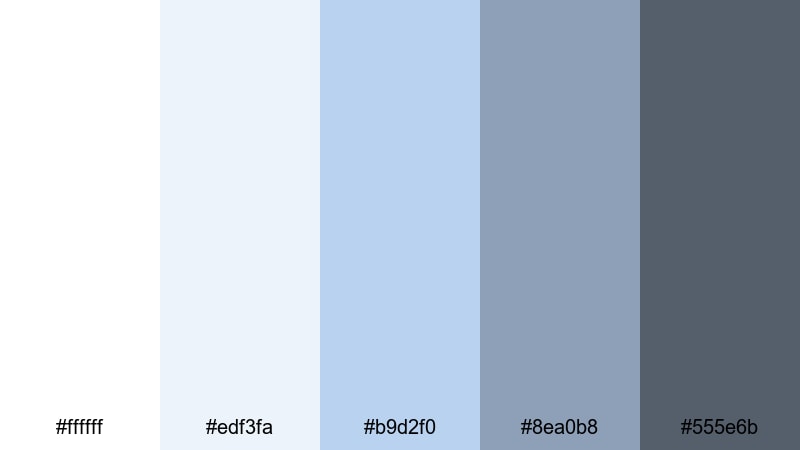
- HEX Codes: #ffffff, #edf3fa, #b9d2f0, #8ea0b8, #555e6b
- Mood: professional, airy, and corporate chic
- Use for: Use in corporate intros, pitch videos, and LinkedIn content where clarity and professionalism are key.
Glass Skyline Fade feels like sunlight on glass office towers. The crisp white and glassy blues create an open, corporate atmosphere, while the slate gray shades echo suits, laptops, and city streets.
It works especially well for corporate explainer videos, pitch decks turned into motion graphics, and LinkedIn promos. Use the lightest tones as clean backgrounds, the mid blues for graphs and infographics, and the darker grays for titles that need to stay serious but not gloomy.
Monochrome Desk Setup
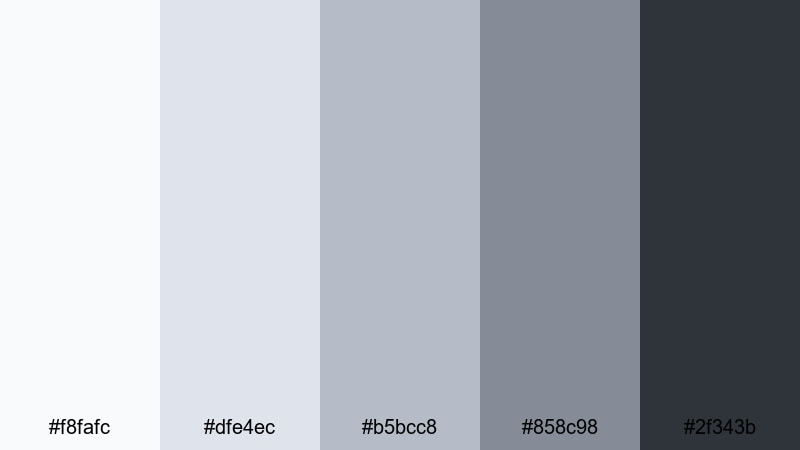
- HEX Codes: #f8fafc, #dfe4ec, #b5bcc8, #858c98, #2f343b
- Mood: organized, muted, and quietly focused
- Use for: Great for study-with-me videos, desk tours, and B-roll sequences where you want a tidy, neutral aesthetic.
Monochrome Desk Setup is all about calm focus. Layered grays with a hint of cool blue feel like matching accessories on a carefully curated desk: keyboard, notebook, and headphones all in the same aesthetic family.
Use these tones to design chapter cards, timers, and subtle lower thirds for productivity vlogs or study-with-me live streams. The lightest gray-blue works well as a background for playlist covers, while the darkest charcoal is perfect for time stamps, icons, and progress bars.
Soft & Airy White Blue Gray Palettes
Cloud Drift Morning
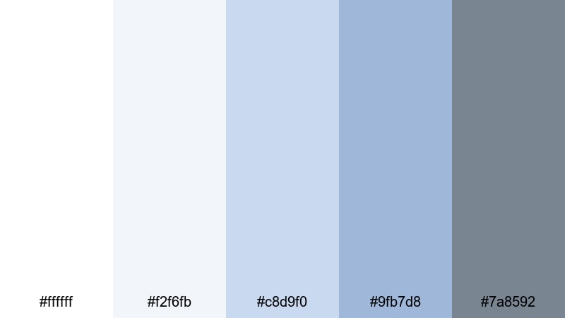
- HEX Codes: #ffffff, #f2f6fb, #c8d9f0, #9fb7d8, #7a8592
- Mood: gentle, hopeful, and morning fresh
- Use for: Use for lifestyle vlogs, morning routines, and wellness content where you want a soft, uplifting atmosphere.
Cloud Drift Morning feels like opening the curtains on a bright but gentle day. The whites and pale blues mimic soft daylight filtering through sheer fabric, and the subdued gray holds everything together without harsh contrast.
This is a lovely choice for morning routines, skincare or wellness content, and calming lifestyle vlogs. Use the lighter shades for lower thirds and captions that float above your footage, and the deeper blue-gray for subtle text on thumbnails so they stay easy to read while keeping a dreamy vibe.
Snowy Harbor Mist

- HEX Codes: #fdfefe, #eef3f7, #cdd9e4, #9fb1c0, #67707a
- Mood: serene, hazy, and contemplative
- Use for: Perfect for travel diaries, documentary-style shorts, and ambient B-roll with a quiet, cinematic softness.
Snowy Harbor Mist captures the calm of a foggy waterfront morning. Frosted whites and muted harbor blues create a low-contrast, misty feeling that invites viewers to slow down and observe.
It is ideal for reflective travel diaries, slow B-roll montages, and documentary-style shorts where narration or music should take center stage. Use the softer colors for backgrounds in quote cards or credits, and bring in the darkest gray sparingly for text and key markers so the overall image stays gentle.
Pastel Icebreaker
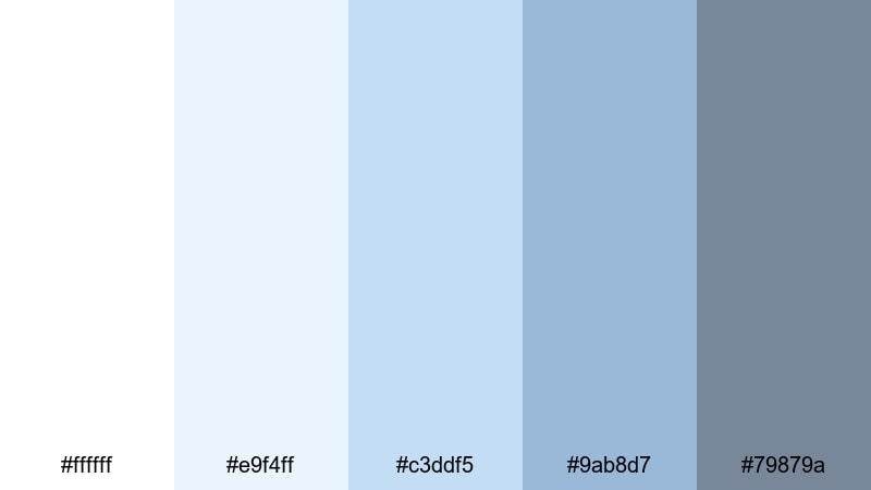
- HEX Codes: #ffffff, #e9f4ff, #c3ddf5, #9ab8d7, #79879a
- Mood: light, approachable, and friendly
- Use for: Use in intro sequences, tutorial slides, and reels where you want a cool but welcoming vibe.
Pastel Icebreaker mixes clear whites with soft baby blues and a stabilizing gray accent, giving your visuals a friendly, approachable chill. It feels modern and cool-toned without being cold or clinical.
Apply this palette to tutorial slides, reel covers, or channel banners where you want to look professional but still inviting. The mid blues are great accent colors for buttons, pointers, and progress steps, while the darker gray keeps text readable on overlays and end screens.
Gentle Breeze Workspace
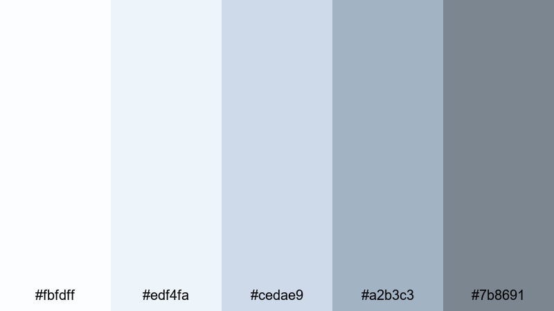
- HEX Codes: #fbfdff, #edf4fa, #cedae9, #a2b3c3, #7b8691
- Mood: breezy, optimistic, and lighthearted
- Use for: Great for coworking promos, lighthearted productivity content, and soft branded overlays on TikTok or Shorts.
Gentle Breeze Workspace feels like a bright coworking space with big windows and light furniture. Feathery whites and breeze-like blues create a soft sense of motion and optimism, while the gray notes keep the palette grounded.
Use these colors for playful yet professional captions, timers, and animated headers on TikTok, Shorts, or Reels. The mid blues make excellent backgrounds for text bubbles or sticky-note style callouts, and the darker gray ensures your typography remains readable on small screens.
Cinematic White Blue Gray Palettes
Nordic Noir Frame
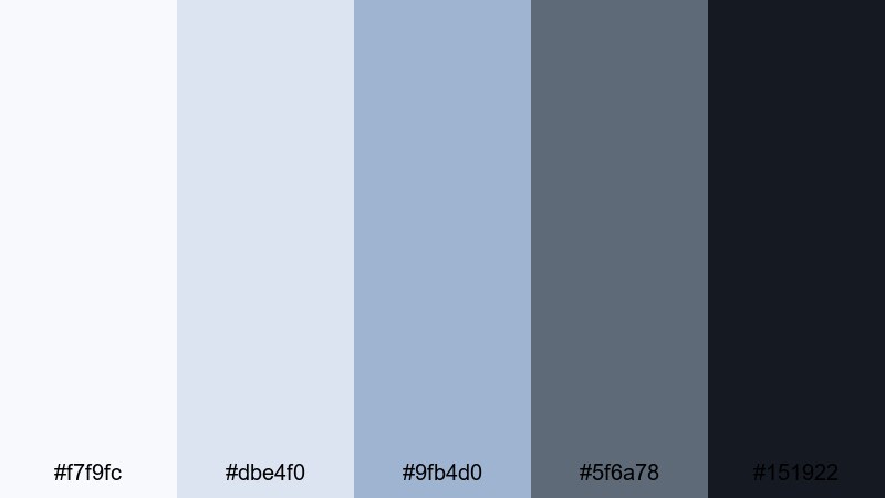
- HEX Codes: #f7f9fc, #dbe4f0, #9fb4d0, #5f6a78, #151922
- Mood: moody, cinematic, and introspective
- Use for: Ideal for narrative shorts, thriller trailers, and moody city montages that need a cool, dramatic grade.
Nordic Noir Frame channels the atmosphere of Scandinavian crime dramas. Icy highlights blend into stormy midtones and near-black shadows, creating strong depth and a slightly mysterious tension.
This palette is perfect for narrative shorts, thriller-style teasers, and moody city B-roll. Use the lighter blues in titles and chapter cards, then lean on the deep charcoal for dramatic lower thirds and end cards that feel cinematic and serious.
Blue Hour Apartment
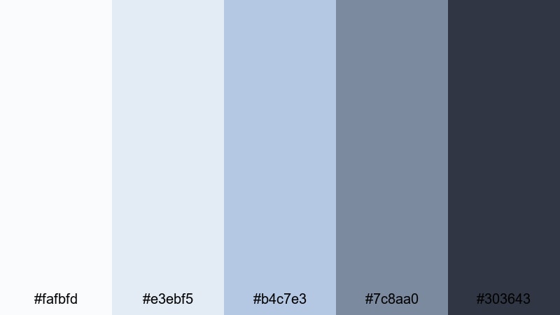
- HEX Codes: #fafbfd, #e3ebf5, #b4c7e3, #7c8aa0, #303643
- Mood: intimate, nostalgic, and filmic
- Use for: Use for dialogue scenes, indoor B-roll, and cinematic vlogs captured at dusk or in low light.
Blue Hour Apartment feels like that quiet moment just after sunset, when interior lights are on but the sky still glows blue through the windows. Soft whites and dusk blues wrap your scenes in a cozy yet cinematic atmosphere.
It is great for dialogue scenes, indoor B-roll, and cinematic vlogs shot in apartments, cafes, or studios. Use the lighter tones for subtitles and scene labels, and the deeper blues and grays for frame lines, borders, and credits that gently separate segments without pulling viewers out of the mood.
Icy Tech Thriller
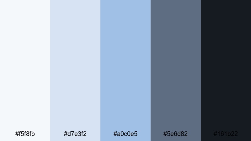
- HEX Codes: #f5f8fb, #d7e3f2, #a0c0e5, #5e6d82, #161b22
- Mood: tense, high-tech, and sleek
- Use for: Perfect for cyberpunk edits, tech explainers, and high-energy trailers needing a cool, digital edge.
Icy Tech Thriller is all sharp edges and digital glow. Glacial whites and cool interface blues drop into deep obsidian gray, evoking terminals, HUDs, and city lights at night.
Use this palette for glitchy title sequences, cyberpunk edits, tech explainers, and intense promos. The brighter blues and whites work well for hologram-style text and HUD details, while the darkest tone makes a powerful background for end screens, call-to-action cards, and logo reveals.
Winter Documentary Light
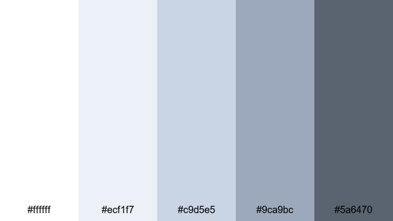
- HEX Codes: #ffffff, #ecf1f7, #c9d5e5, #9ca9bc, #5a6470
- Mood: honest, calm, and observational
- Use for: Great for documentaries, educational videos, and brand stories shot in natural light.
Winter Documentary Light feels like a quiet overcast day in a city or on a campus. Snowy whites and muted blues give your footage a low-contrast, authentic mood, while the concrete-inspired gray anchors titles and graphics.
This palette is a strong match for documentaries, educational content, and brand stories where realism matters. Use the softer tones for captions and data callouts, and the deeper gray for name straps, speaker IDs, and section headers that must stay clear in any lighting condition.
Bold Contrast White Blue Gray Palettes
Headline Pop Overlay
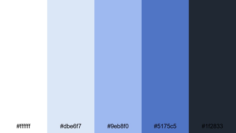
- HEX Codes: #ffffff, #dbe6f7, #9eb8f0, #5175c5, #1f2833
- Mood: confident, punchy, and eye-catching
- Use for: Use for YouTube thumbnails, dynamic title screens, and social ads where you need bold text to stand out.
Headline Pop Overlay is built for impact. Bright white and punchy blues sit against a deep charcoal background, creating powerful contrast that instantly pulls the eye toward headlines and buttons.
Use this palette for YouTube thumbnails, bold title sequences, and social ads that must stand out in a crowded feed. The darker tone is perfect for full-width background bars, while the mid and bright blues highlight key phrases like New Video, Subscribe, or Limited Offer.
Deep Focus Title Card
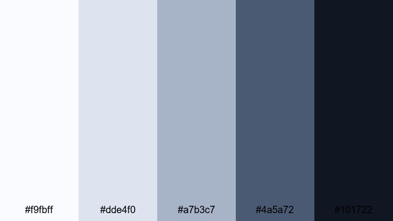
- HEX Codes: #f9fbff, #dde4f0, #a7b3c7, #4a5a72, #101722
- Mood: serious, focused, and editorial
- Use for: Perfect for commentary channels, film essays, and documentary title cards that need gravitas without being too dark.
Deep Focus Title Card combines soft whites and controlled blues with an inky gray that feels editorial and grounded. It gives you strong contrast without slipping into a harsh, high-contrast look.
Use it for commentary channels, critical essays, and documentary packages where your titles and lower thirds need weight. The darkest shade is ideal for main backgrounds or letterbox bars, while the mid blues are perfect accent colors for section labels, pull quotes, and subtle graphical dividers.
Electric Frost Gaming HUD
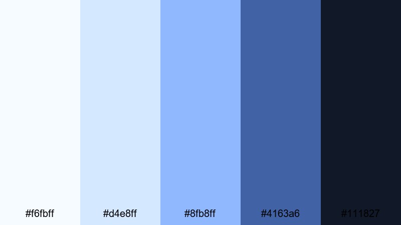
- HEX Codes: #f6fbff, #d4e8ff, #8fb8ff, #4163a6, #111827
- Mood: energetic, futuristic, and immersive
- Use for: Great for gaming intros, streaming overlays, esports highlight reels, and techy motion graphics.
Electric Frost Gaming HUD glows like neon UI elements in a dark game lobby. Frosty whites and bright electric blues stand out sharply against a deep gray-blue background, creating that classic HUD-style contrast.
Use this palette for Twitch or YouTube streaming overlays, gaming intros, and esports highlight reels. Reserve the brightest blue for alerts, kill feeds, and follower popups, and use the darkest tone as the main background for chat boxes, facecam frames, and scoreboard panels so everything stays readable in fast-moving scenes.
Tips for Creating White Blue Gray Color Palettes
White blue gray color combinations are flexible enough for minimalist branding, cinematic grading, and bold thumbnails, as long as you balance contrast, readability, and consistency with your footage.
- Decide on your mood first: soft and airy (more white and light blue), or bold and cinematic (more deep gray and richer blues).
- Keep text highly readable by pairing dark gray or deep blue text with light white or pale blue backgrounds, especially on mobile thumbnails.
- Limit the number of accent colors: choose one main blue, one background white or very light gray, and one deep gray for anchors and outlines.
- Match your grade to your graphics: if your overlays are cool blue gray, cool down your footage slightly in Filmora so the tones feel unified.
- Use gray as a neutral buffer between white and blue in UI-style designs, like lower thirds, chapter cards, and information panels.
- Test your palette in both light and dark modes by previewing titles over bright shots and darker scenes to make sure everything remains legible.
- For branding, stick to the same HEX codes across intros, overlays, end screens, and channel art so your white blue gray theme becomes recognizable.
- When mixing other colors, use them sparingly as accents (like Peach Coral for CTAs) so the white blue gray base remains the core identity.
White blue gray color palettes can make your videos feel clean, trustworthy, and cinematic, whether you are shooting productivity vlogs, tech explainers, or atmospheric documentaries. By choosing a palette that fits your story and sticking to a few key HEX codes, you give your channel or brand a clear, recognizable look.
Filmora makes it easy to bring these palettes into real projects with color tools, AI Color Palette, filters, and LUTs that help your footage match your design. Try a few of the palettes above, build matching titles and overlays, and then grade your clips so everything flows together from intro to end screen.
The more intentional you are with white, blue, and gray, the more your viewers will feel the mood you want to create and remember your style from video to video.
secure download