
 100% Security Verified | No Subscription Required | No Malware

White is the color of clarity, simplicity, and fresh beginnings. On screen, it can feel pure and minimal or dramatic and high contrast, depending on what you pair it with. In video and design, white spaces guide the viewer's eye, make text easier to read, and give thumbnails and intros a polished, professional finish.
To help you build a clean, cohesive look, here are 15 ready made white color palettes with HEX codes. They are ideal for YouTube intros, thumbnails, channel branding, cinematic edits, and social posts, especially when you edit in Filmora and want a consistent white themed style across your projects.
In this article
Minimalist White Color Palettes
Crisp Studio Light
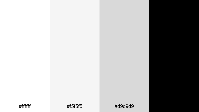
- HEX Codes: #ffffff, #f5f5f5, #d9d9d9, #000000
- Mood: Clean, modern, and sharply focused.
- Use for: Perfect for minimalist YouTube channel branding, tech explainer videos, and clean lower thirds.
Crisp Studio Light is all about controlled simplicity. Pure white, soft light gray, and mid gray create a subtle depth, while the solid black accent locks in legibility for titles, icons, and logos. It feels like a bright, tidy studio where every detail is intentional.
Use this palette when you want your content to feel modern and distraction free. It is ideal for white themed intros, software tutorials, gear reviews, and thumbnails where screenshots or product shots sit on clean white backgrounds with sharp black text and icons.
Pro Tip: Enhance Your White Visuals With Filmora
With white heavy palettes, even small exposure shifts are noticeable. In Filmora, you can keep your Crisp Studio Light look consistent by balancing brightness and contrast across all your clips, then adding simple titles and lower thirds that stick to your white, gray, and black scheme.
Build a reusable style by saving title presets with your chosen HEX values, then drop them onto intros, b roll, tutorials, and shorts. This keeps your channel branding cohesive without having to rebuild the design for every new edit.
AI Color Palette
If you already have a reference image that captures your ideal white studio vibe, you can turn it into a global look using Filmora's AI tools. Filmora's AI Color Palette feature lets you sample the colors from a photo or previous video and apply that same palette across your full timeline.
Just choose your reference, let AI detect the whites, grays, and blacks, and then match the rest of your clips to it. This is a quick way to keep your talking head shots, product close ups, and screen captures sitting in the same clean white universe.
 secure download

HSL, Color Wheels & Curves
Maintaining clean whites without blowing out detail is easier when you fine tune them. In Filmora, use HSL to nudge any unwanted color cast out of your whites, then refine contrast with the color wheels and curves to keep faces and products looking natural. Filmora's color correction tools help you balance highlights and shadows so your background stays bright without losing texture.
A gentle S curve can add subtle punch to your monochrome palette, while a slight adjustment to the midtone wheel keeps skin tones flattering against a pure white backdrop. These small tweaks make your minimalist aesthetic feel cinematic instead of flat.
secure download1000+ Video Filters & 3D LUTs
Once your whites are balanced, you can instantly shift the mood with creative looks. Filmora's video filters and 3D LUTs make it easy to add soft warmth, cool tech vibes, or subtle grain without breaking your minimalist palette.
Try gentle film style LUTs over your white backgrounds for a more cinematic feel, or use sleek modern filters for tech reviews and app demos. Apply these at adjustment layer level so your entire edit inherits the same polished white aesthetic in just a few clicks.
secure downloadPaper And Ink Calm
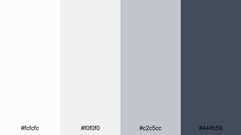
- HEX Codes: #fcfcfc, #f0f0f0, #c2c5cc, #444b59
- Mood: Quiet, thoughtful, and editorial.
- Use for: Ideal for documentary titles, productivity vlog graphics, and understated typography overlays.
Paper And Ink Calm uses soft whites and muted grays that feel like premium stationery and print layouts. The gentle contrast keeps everything readable without shouting, while the deeper slate tone is perfect for key headings and subtle icons.
This palette works well for documentary intros, study vlogs, and Notion style overlays. Use the lighter whites for backgrounds, the mid gray for lines and UI shapes, and the darkest tone for titles, chapter markers, and thumbnail text that looks smart but never aggressive.
Gallery Wall White
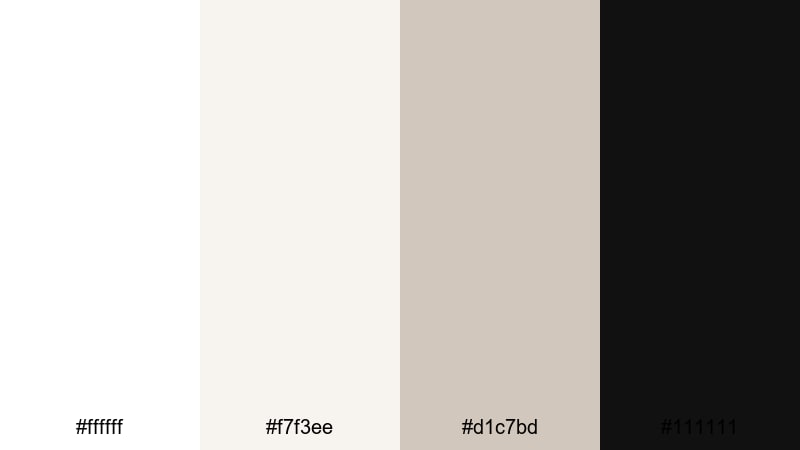
- HEX Codes: #ffffff, #f7f3ee, #d1c7bd, #111111
- Mood: Curated, artistic, and slightly warm.
- Use for: Great for portfolio reels, photography slideshows, and art-focused thumbnails.
Gallery Wall White pairs bright white with warm, gallery inspired neutrals, echoing the feeling of a clean exhibition space. The soft beige tones mimic frames and walls, while the deep black accent works like a classic picture frame around your visuals.
Use this palette when you showcase photography, illustration, or design work. In Filmora, you can create white frames, title cards, and lower thirds in the off white and beige tones, then reserve the darkest shade for artist names, dates, and calls to action on thumbnails or end screens.
Scandinavian Snow Drift
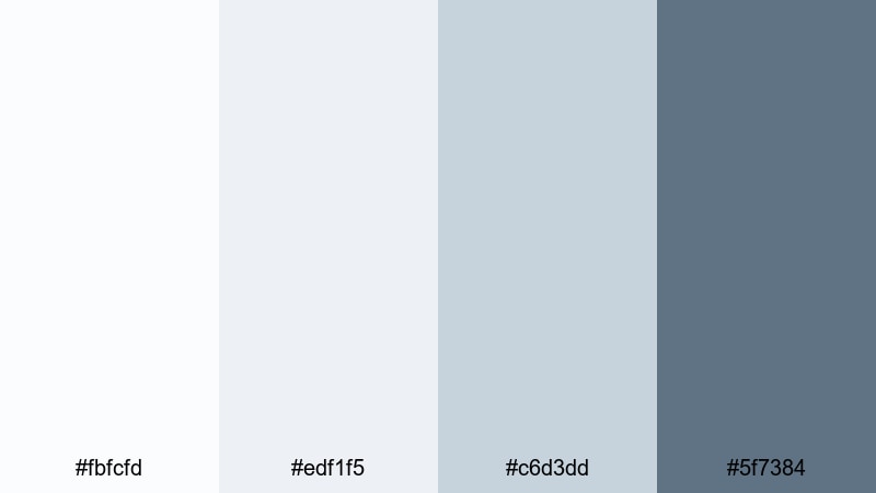
- HEX Codes: #fbfcfd, #edf1f5, #c6d3dd, #5f7384
- Mood: Airy, fresh, and subtly cool.
- Use for: Use in lifestyle vlogs, home decor videos, and clean UI overlays for tutorials.
Scandinavian Snow Drift blends cool whites and misty blues for a calm, Nordic atmosphere. It feels like natural daylight reflecting off snow and pale wood, giving your visuals a breathable and uncluttered style.
This palette is great for home tours, productivity routines, or minimalist app overviews. Use the lightest tones for backgrounds and panels, the mid blue grays for section dividers and icons, and the darkest blue gray for overlay text on thumbnails and intro cards.
Soft And Cozy White Color Palettes
Vanilla Daydream Glow
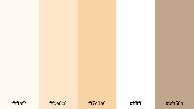
- HEX Codes: #fffaf2, #fde6c8, #f7d3a6, #ffffff, #bfa58a
- Mood: Warm, nostalgic, and dreamy.
- Use for: Perfect for cozy vlog intros, lifestyle thumbnails, and branding for comfort or self care content.
Vanilla Daydream Glow wraps your visuals in creamy whites, soft vanilla, and caramel hues. It suggests golden hour sunlight coming through curtains, giving your footage a nostalgic, comforting warmth.
Use the softer creams for backgrounds and frames, and the richer caramel tone for key text, highlight boxes, or small icons on intros and end screens. This palette works beautifully for self care vlogs, journaling content, baking videos, and channel branding that aims to feel safe and inviting.
Winter Morning Blanket
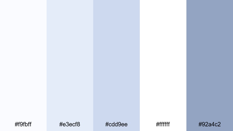
- HEX Codes: #f9fbff, #e3ecf8, #cdd9ee, #ffffff, #92a4c2
- Mood: Gentle, serene, and comforting.
- Use for: Use in morning routine videos, calm productivity edits, and subtle animated titles.
Winter Morning Blanket mixes frosted whites and powdery blues to recreate the feeling of a quiet, chilly morning under a warm duvet. It is gentle and relaxing, ideal for slower edits and soft background motion graphics.
Apply the lightest blues as overlays behind typography, and keep pure white for text so it stays easy to read. This palette suits morning routines, deep work or study sessions, and ASMR style thumbnails where you want calm, soothing visuals that still look polished.
Marshmallow Cloud Soft
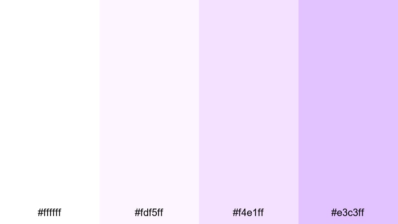
- HEX Codes: #ffffff, #fdf5ff, #f4e1ff, #e3c3ff
- Mood: Playful, fluffy, and lighthearted.
- Use for: Great for playful thumbnails, kids content, or dreamy creator branding.
Marshmallow Cloud Soft combines bright white with pastel purples, creating a candy like, airy look. It is light, sweet, and fun without being visually overwhelming, perfect for friendly, upbeat channels.
Use the pastel tones for softly rounded shapes, buttons, and badges around your footage, while keeping titles in white or the slightly deeper lavender for contrast. This palette is ideal for kids content, DIY crafts, aesthetic edits, or creator branding where you want a dreamy, approachable vibe.
Cream And Cotton Haze
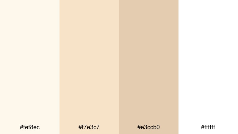
- HEX Codes: #fef8ec, #f7e3c7, #e3ccb0, #ffffff
- Mood: Organic, gentle, and homely.
- Use for: Lovely for cooking channels, cozy home tours, and DIY project overlays.
Cream And Cotton Haze features off whites and warm creams that feel like sunlight on fabric and natural materials. It brings an organic, homemade character to your visuals, perfect for content filmed in real homes and kitchens.
Use this palette for recipe cards, measurement overlays, or soft borders around your clips. The deeper beige tone can highlight key steps, chapter titles, and thumbnail text that should stand out while still matching your cozy, homely atmosphere.
High-Contrast White Color Palettes
Monochrome Spotlight Edge
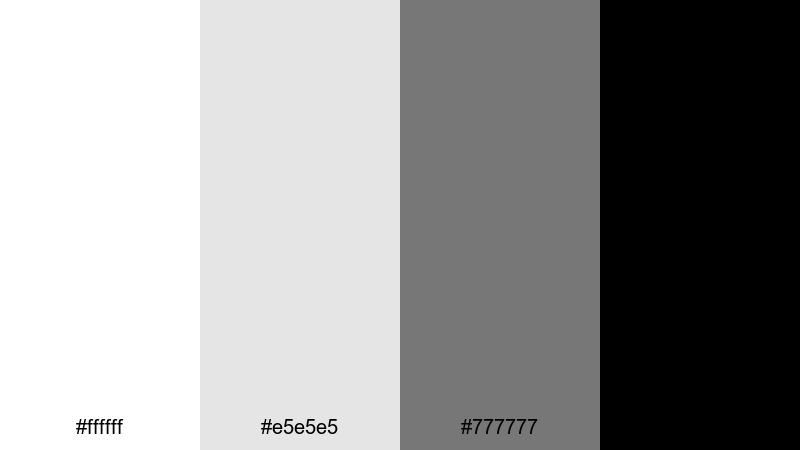
- HEX Codes: #ffffff, #e5e5e5, #777777, #000000
- Mood: Bold, graphic, and confident.
- Use for: Perfect for high impact titles, cinematic trailers, and tech or gaming intros.
Monochrome Spotlight Edge pushes white and black to their extremes, with two supporting grays for structure. It delivers a clear, graphic punch that immediately focuses attention on titles, logos, or central objects.
Use pure white as the stage, mid gray for shadows and panels, and solid black for impactful text, borders, and logo lockups. This palette is ideal for dramatic YouTube intros, high energy gaming announcements, and commentary videos where you want maximum clarity and contrast.
Night Sky On White
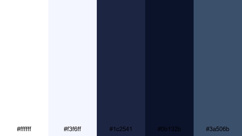
- HEX Codes: #ffffff, #f3f6ff, #1c2541, #0b132b, #3a506b
- Mood: Cinematic, moody, and polished.
- Use for: Great for cinematic vlog openings, travel edits, and story driven shorts.
Night Sky On White balances bright, clean whites with deep, inky blues inspired by a clear night sky. The contrast delivers drama while keeping your layouts structured and professional.
Use white and very light blue for backgrounds, then reserve the darker blues for bold titles, story chapter cards, and callouts on maps or travel footage. This palette suits cinematic storytelling, travel documentaries, and tech reviews that lean into a more serious, polished tone.
Cinematic Noir Frame
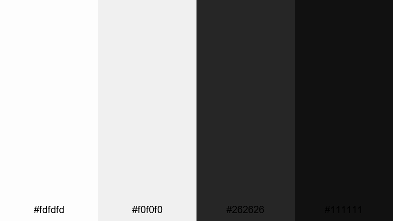
- HEX Codes: #fdfdfd, #f0f0f0, #262626, #111111
- Mood: Stylish, dramatic, and focused.
- Use for: Use in suspenseful edits, commentary videos, and trailer style title cards.
Cinematic Noir Frame softens the whites slightly and pairs them with charcoal blacks, echoing classic black and white cinema. It feels stylish and intense without being harsh, ideal for narrative driven or critical content.
Use the off whites as letterbox bars, credits backgrounds, or minimalistic title screens. The deep grays are perfect for bold typography, lower thirds, and drop shadows on thumbnails where you want a sophisticated, noir inspired look.
Neon On Fresh White
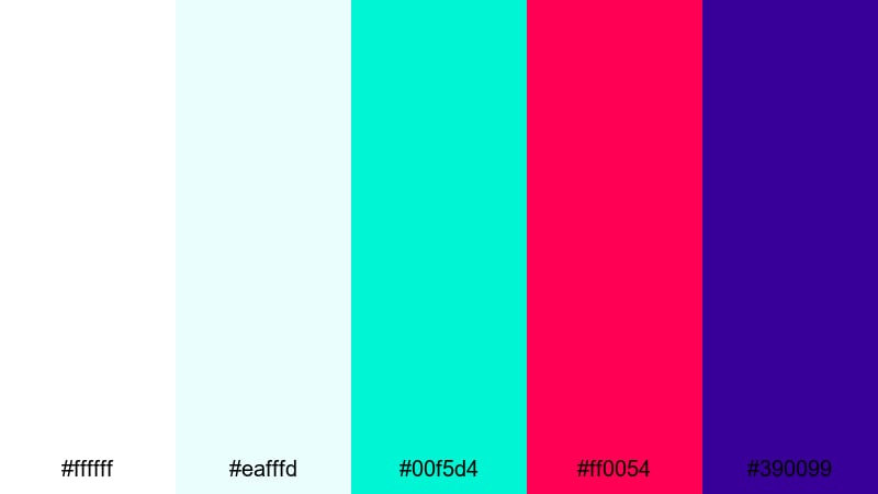
- HEX Codes: #ffffff, #eafffd, #00f5d4, #ff0054, #390099
- Mood: Energetic, futuristic, and bold.
- Use for: Ideal for gaming channels, reaction thumbnails, and fast paced social edits.
Neon On Fresh White sets a crisp white stage and fires bright teal, magenta, and deep violet on top. The neon accents demand attention and instantly communicate high energy and modern, digital aesthetics.
Use white and pale cyan for most of the background, then deploy neon teal and magenta for text, streaks, glitch elements, and progress bars. The rich violet anchors logos or key icons. This palette is especially effective on YouTube banners, short form vertical videos, and reaction thumbnails that need to stand out in crowded feeds.
Luxury White Color Palettes
Pearl And Champagne Shine
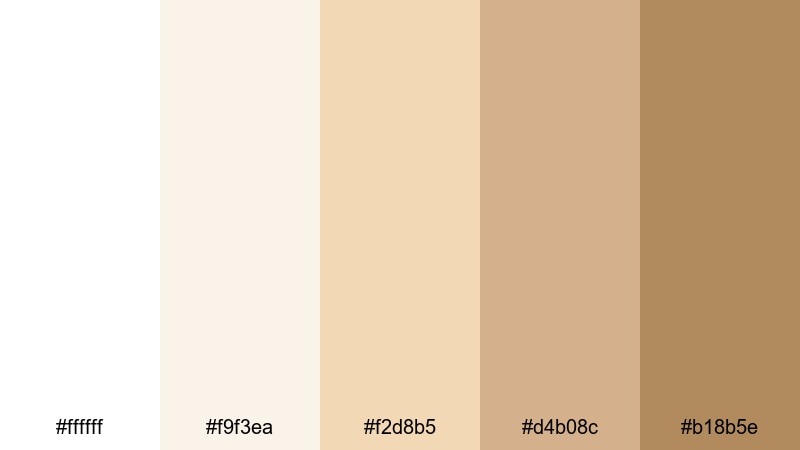
- HEX Codes: #ffffff, #f9f3ea, #f2d8b5, #d4b08c, #b18b5e
- Mood: Luxurious, polished, and celebratory.
- Use for: Perfect for wedding films, brand launch videos, and premium product promos.
Pearl And Champagne Shine blends bright white with soft champagne and gold tones for a refined, upscale mood. It feels celebratory and elegant, like a high end event or premium packaging reveal.
Use the light neutrals as backdrops for names, logos, and simple line illustrations, and rely on the richer golden tones for accents on lower thirds, call to action buttons, or product details in your thumbnails. This palette is a natural fit for wedding highlights, luxury launches, jewelry features, and any content aimed at a premium audience.
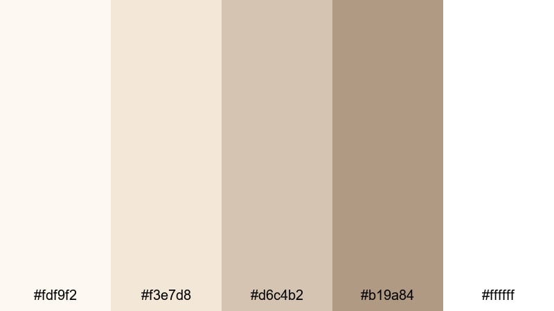
Ivory Marble Lobby
- HEX Codes: #fdf9f2, #f3e7d8, #d6c4b2, #b19a84, #ffffff
- Mood: Sophisticated, calm, and architectural.
- Use for: Great for real estate tours, hotel promos, and high end brand intros.
Ivory Marble Lobby takes inspiration from polished stone, combining ivory whites with subtle, marble like neutrals. It feels spacious, calm, and expensive, with a quiet confidence that suits professional brands.
Use the mid neutrals as overlays for floor plans, pricing cards, or feature lists in your videos, and keep pure white for text and clean space. This palette works especially well for real estate walkthroughs, hotel or spa promos, corporate profiles, and stylish typography based intro sequences.
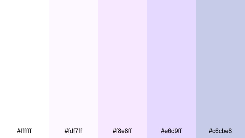
Opal Wedding Highlight
- HEX Codes: #ffffff, #fdf7ff, #f8e8ff, #e6d9ff, #c6cbe8
- Mood: Romantic, ethereal, and celebratory.
- Use for: Ideal for wedding highlight reels, engagement announcements, and romantic montages.
Opal Wedding Highlight pairs soft white with delicate lilac and lavender tones, echoing opal reflections and bridal details. The mood is light, dreamy, and emotional, perfect for once in a lifetime moments.
Use the pale purples for frames around vows, quotes, and key dates, keeping the brightest white for names and titles. This palette shines in wedding highlight films, proposal edits, anniversary recaps, and even romantic channel branding where you want a gentle, emotional glow without heavy color saturation.
Tips for Creating White Color Palettes
White is powerful because it can shift from minimal to luxurious to high energy with just a few supporting colors. When you design your own white color palette for video and design, keep these practical tips in mind.
- Always test readability: place your text colors over your lightest white in thumbnails and lower thirds to make sure they are easy to read, even on small screens.
- Balance warmth and coolness: decide whether your brand feels warm (creams and beiges) or cool (blues and grays) and keep that consistent across intros, overlays, and end screens.
- Use white as negative space: let white or near white backgrounds give breathing room around faces, logos, and key messages instead of filling every corner with color.
- Limit accent colors: when working with white, 1 to 2 strong accent colors are usually enough to keep things focused and professional.
- Match your footage: use Filmora color tools or LUTs to bring your video footage closer to the temperature and brightness of your chosen white palette so overlays and backgrounds feel unified.
- Control exposure: slightly underexpose your footage if needed so bright whites keep their texture and do not clip into pure, detail free white.
- Create reusable presets: save title styles, color cards, and graphics elements with exact HEX codes so every new video automatically follows your chosen white aesthetic.
- Preview on multiple devices: check your thumbnails and intros on phone, tablet, and desktop to confirm that pale tones stay visible and contrast feels strong enough.
White color palettes are some of the most versatile tools for shaping mood and brand identity. From calm, cozy creams to sharp monochrome or luxurious champagne tones, the right combination can make your channel feel instantly more intentional and recognizable.
Try these 15 white palettes as starting points in Filmora. Apply them to your intros, lower thirds, subtitles, and thumbnails, then adjust brightness and accents until they match your footage and storytelling style.
As you keep using the same HEX codes and layout choices, your videos will begin to share a unified look that viewers can spot at a glance in their feeds.
secure downloadNext: Plum Color Palette
