
 100% Security Verified | No Subscription Required | No Malware


 ChatGPT
 Perplexity
 Gemini
 Claude
 Grok
Grok
White Gold sits between bright white and muted gold, carrying the softness of ivory and the refinement of subtle metallic sheen. It signals luxury without being loud, making it perfect for creators who want their videos, thumbnails, and branding to feel elevated, calm, and modern at the same time. In color psychology, White Gold evokes trust, warmth, and quiet confidence, which is why it works so well for wedding films, beauty content, and polished brand visuals.
Below you will find 15 curated White Gold color palettes with HEX codes you can plug straight into your branding, thumbnails, intros, overlays, and color grading in Filmora. Whether you create vlogs, cinematic edits, or promo videos, these White Gold color combinations will help you build a consistent, aesthetic style across YouTube, Instagram, TikTok, and beyond.
In this article
Soft & Romantic White Gold Color Palettes
Blush Champagne Glow
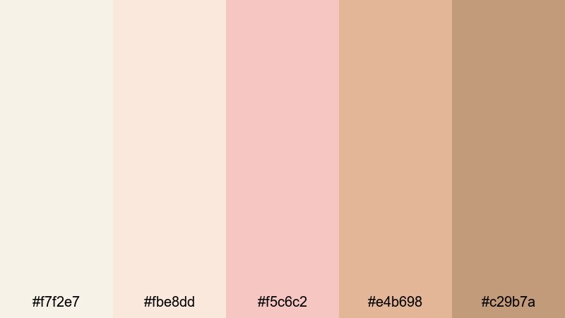
- HEX Codes: #f7f2e7, #fbe8dd, #f5c6c2, #e4b698, #c29b7a
- Mood: Warm, romantic, and softly luminous.
- Use for: Perfect for wedding highlight videos, romantic reels, and soft lifestyle thumbnails that need a gentle yet polished feel.
Blush Champagne Glow feels like soft candlelight on silk. The mix of airy White Gold, peachy champagne, and muted rose tones creates a dreamy, flattering palette that makes skin tones look gentle and luminous. It is ideal for couples portraits, first-look moments, and any scene where you want emotions to feel intimate and timeless.
Use this palette in wedding highlight films, proposal reels, or bridal branding graphics. In thumbnails and titles, pair the lightest White Gold for backgrounds with the deeper champagne and tan tones for text and accents, so everything stays romantic but still easy to read. In Filmora, you can base your color grade on these HEX codes for overlays, lower thirds, and end screens to keep your whole project feeling cohesive.
Pro Tip: Build a Cinematic White Gold Look in Filmora
To keep a soft White Gold aesthetic consistent, start by choosing Blush Champagne Glow as your visual foundation: use the lightest tones for backgrounds, the mid tones for overlays and frames, and the deeper shades for titles and call-to-action buttons. In Filmora, save these hues as custom colors and apply them across intros, subtitles, and lower thirds so every clip looks like part of one romantic story.
For wedding and lifestyle edits, combine this palette with gentle transitions and subtle vignettes in Filmora. Add a slight warm tint to highlights and soften contrast so your White Gold tones stay velvety rather than harsh, especially in close-ups and B-roll of details like flowers, rings, and dresses.
AI Color Palette
If you already have a favorite wedding photo, bouquet shot, or mood board that captures this Blush Champagne Glow look, you can use Filmora to transfer that exact White Gold mood to your entire edit. Filmora's AI Color Palette feature analyzes your reference image and applies similar color balance, warmth, and contrast to every clip in your timeline.
This is a fast way to keep your White Gold and blush tones consistent across different cameras and lighting conditions. You can color match your main sequence, then tweak saturation and exposure slightly so skin tones remain natural while the Champagne Glow stays intact from intro to outro.
 secure download

HSL, Color Wheels & Curves
Once you have the general Blush Champagne Glow mood, use Filmora's HSL controls and color wheels to refine your White Gold tones. Slightly desaturate yellows and reds to keep highlights creamy instead of orange, and push midtones a touch warmer while keeping shadows neutral or slightly cool for depth. With curves, lift the shadows just a bit so your soft romantic look does not get too contrasty.
Inside Filmora, combine these tools with the built-in scopes to keep whites from clipping and to preserve detail in dresses, table linens, and decor. This makes your White Gold grading look cinematic in both bright bridal prep scenes and darker reception shots.
secure download1000+ Video Filters & 3D LUTs
If you want to speed up your grading, Filmora’s video filters and 3D LUTs make it easy to build a White Gold look with one click and then refine from there. Choose a soft, warm cinematic preset, dial back the intensity, and then nudge your highlights and midtones until they align with the Blush Champagne Glow HEX codes.
You can also save your custom adjustments as a preset in Filmora. That way, every time you edit a wedding, engagement, or romantic reel, you can apply the same White Gold aesthetic instantly to maintain brand consistency across your channel and social platforms.
secure downloadIvory Lace Afternoon
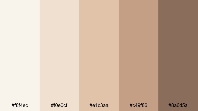
- HEX Codes: #f8f4ec, #f0e0cf, #e1c3aa, #c49f86, #8a6d5a
- Mood: Nostalgic, cozy, and vintage-inspired.
- Use for: Use for nostalgic vlogs, family moments, and storytelling shorts where you want a soft, sunlit warmth.
Ivory Lace Afternoon feels like flipping through an old family album in warm window light. The creamy Whites and soft tans create a look that is nostalgic but not faded, perfect for vintage-inspired storytelling and gentle, cozy content.
Apply this palette to family vlogs, home movies, bookish content, or intro cards for storytime and podcasts. Use the lightest tones for backgrounds and overlays, and the richer browns for typography on thumbnails and lower thirds so your text stays readable while keeping that heirloom warmth.
Petal Veil Harmony
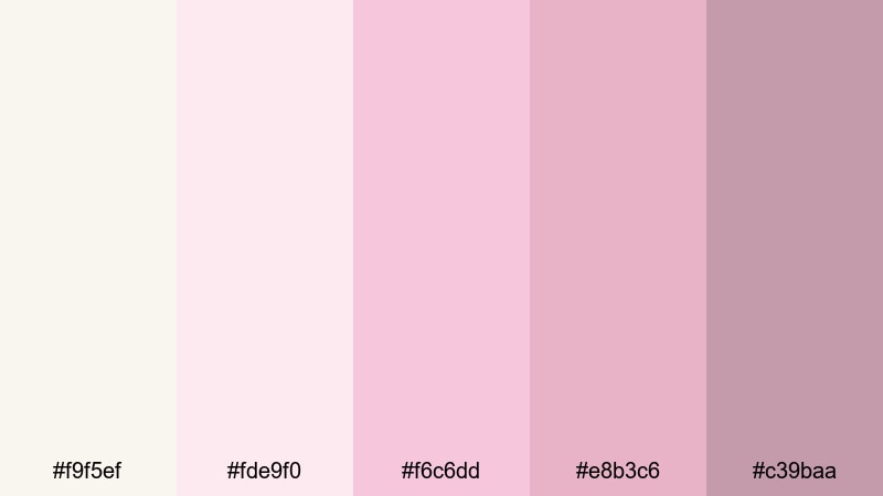
- HEX Codes: #f9f5ef, #fde9f0, #f6c6dd, #e8b3c6, #c39baa
- Mood: Softly feminine and poetic.
- Use for: Perfect for beauty channels, skincare promos, and dreamy Instagram reels needing a romantic pastel touch.
Petal Veil Harmony blends airy White Gold with petal pinks for an editorial, feminine mood. It feels like a soft-focus filter made of color, ideal for content where you want products and faces to look delicate, glowy, and refined.
Use this palette for skincare routines, make-up tutorials, or aesthetic reels. In branding, let the pale White Gold sit behind product mockups, and use the deeper rose tones for price tags, call-to-action buttons, and icons in your thumbnails or overlays so important details stand out gently.
Candlelit Storybook
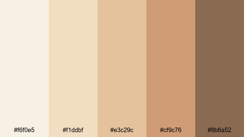
- HEX Codes: #f6f0e5, #f1ddbf, #e3c29c, #cf9c76, #8b6a52
- Mood: Cozy, intimate, and storytelling focused.
- Use for: Great for cozy reading vlogs, podcast cover art, and narrative shorts with a warm, candlelit mood.
Candlelit Storybook wraps your visuals in warm amber and gentle White Gold, like reading a favorite novel by a fireplace. The gradient from pale cream to rich brown gives you a full range for backgrounds, midtone overlays, and text.
It suits commentary videos, book reviews, podcast visuals, and any spoken word format. Use lighter shades for frames and chapter cards, and the deeper browns for subtitles, story titles, and timestamp markers, keeping everything easy on the eyes during longer watch sessions.
Pearled Dawn Whisper
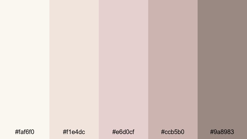
- HEX Codes: #faf6f0, #f1e4dc, #e6d0cf, #ccb5b0, #9a8983
- Mood: Quiet, airy, and ethereal.
- Use for: Use for morning routine videos, calm ASMR, and minimalist lifestyle feeds with a serene glow.
Pearled Dawn Whisper is all about soft, early-morning quiet. The pale neutrals with a hint of rose create a calm, spacious feeling that works beautifully for slow-living, wellness, and ASMR content.
Use the lightest hues for negative space in your thumbnails and opening frames, with the deeper taupes and mauves for subtle icons and titles. This palette keeps visuals minimal yet warm, helping your audience relax into the content without harsh contrasts or loud accent colors.
Elegant & Modern White Gold Color Palettes
Urban Marble Suite
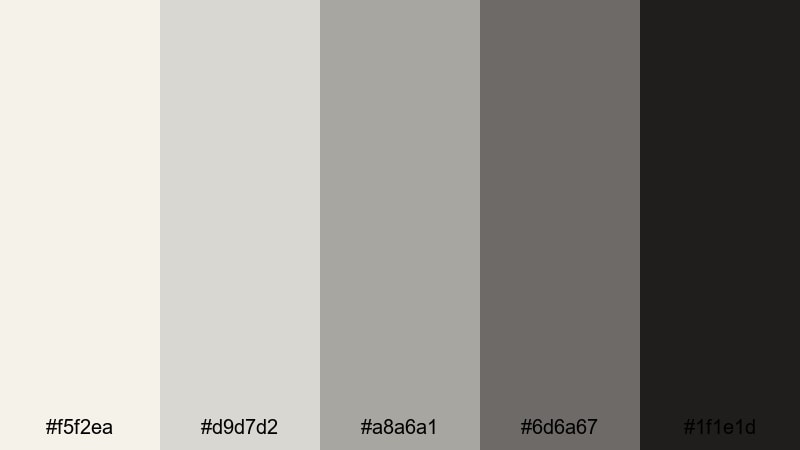
- HEX Codes: #f5f2ea, #d9d7d2, #a8a6a1, #6d6a67, #1f1e1d
- Mood: Sleek, modern, and architectural.
- Use for: Ideal for tech reviews, workspace tours, and modern brand intros needing a clean, elevated look.
Urban Marble Suite feels like a minimalist gallery or a high-end showroom. Soft White Gold tones are paired with cool grays and deep charcoal, giving your visuals a clean, structured look that suits tech and design-forward content.
Use lighter tones as backgrounds for product shots and UI overlays, the mid grays for borders and separators, and the darkest charcoal for logos and headings. This palette keeps your thumbnails and lower thirds sharp and professional without looking overly harsh.
Slate Ribbon Luxe
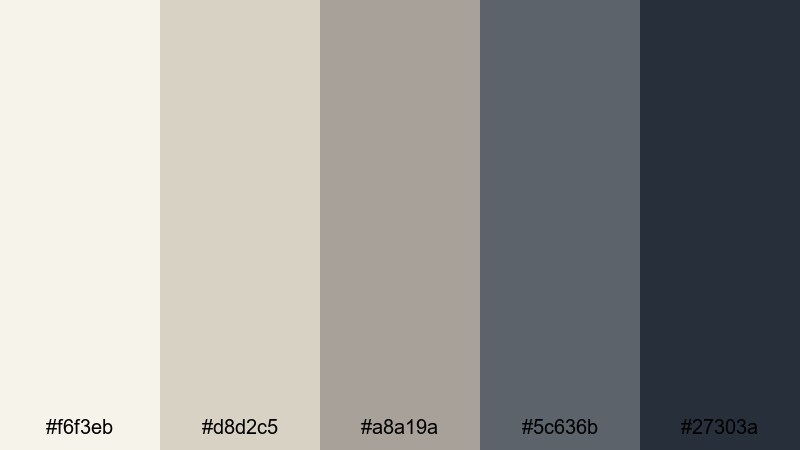
- HEX Codes: #f6f3eb, #d8d2c5, #a8a19a, #5c636b, #27303a
- Mood: Refined, confident, and editorial.
- Use for: Use for cinematic YouTube intros, fashion lookbooks, and stylish product trailers.
Slate Ribbon Luxe weaves together gentle White Gold neutrals with cool slate and midnight accents. It feels like a high-end magazine layout, perfect for fashion, lifestyle, and cinematic brand pieces.
Try this palette in channel intros, lookbooks, and launch videos. Let the lighter neutrals fill the frame behind your subject, and use the dark blues for bold titles, accent bars, or animated ribbons that slide across the screen to introduce chapters or product names.
Nordic Loft Sheen
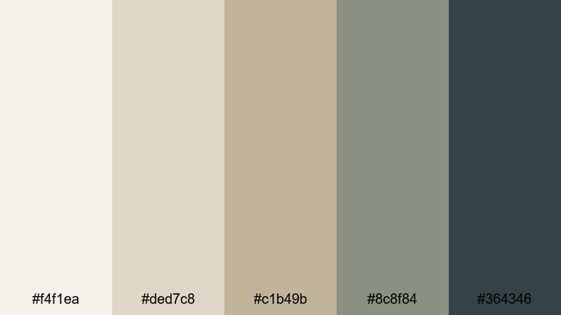
- HEX Codes: #f4f1ea, #ded7c8, #c1b49b, #8c8f84, #364346
- Mood: Calm, airy, and design-forward.
- Use for: Perfect for interior design tours, productivity vlogs, and UI overlays inside tutorials.
Nordic Loft Sheen brings a Scandi-inspired clarity to your visuals. The White Gold base paired with muted greige and soft dark accents feels crisp yet welcoming, ideal for minimalism, interior design, and productivity content.
Use the lighter shades for full-screen backgrounds, room overlays, and text boxes, and the darker hues for icons, checklists, and interface elements in tutorials. This palette keeps your UI graphics readable while matching the calm mood of tidy workspaces and airy homes.
Graphite Halo Minimal
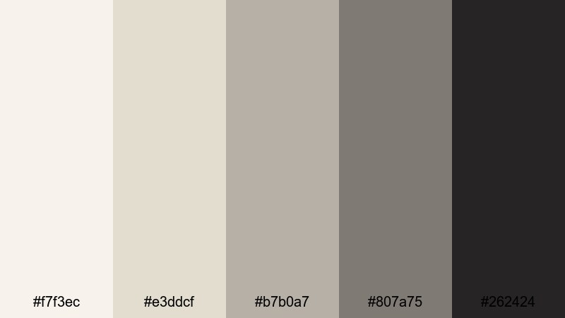
- HEX Codes: #f7f3ec, #e3ddcf, #b7b0a7, #807a75, #262424
- Mood: Minimal, chic, and professional.
- Use for: Best for brand explainers, SaaS promos, and clean tutorial graphics where clarity matters.
Graphite Halo Minimal pairs soft White Gold with layered graphite tones, giving your edits a sleek, neutral business feel. It is understated but polished, making it perfect for B2B content, software explainers, and portfolio reels.
Use the brightest hues for clean backgrounds and the mid grays for panels or code blocks. Save the deepest shade for titles, logos, and key metrics so your most important information cuts through clearly on any screen.
Luxury & Glam White Gold Color Palettes
Champagne Gala Night
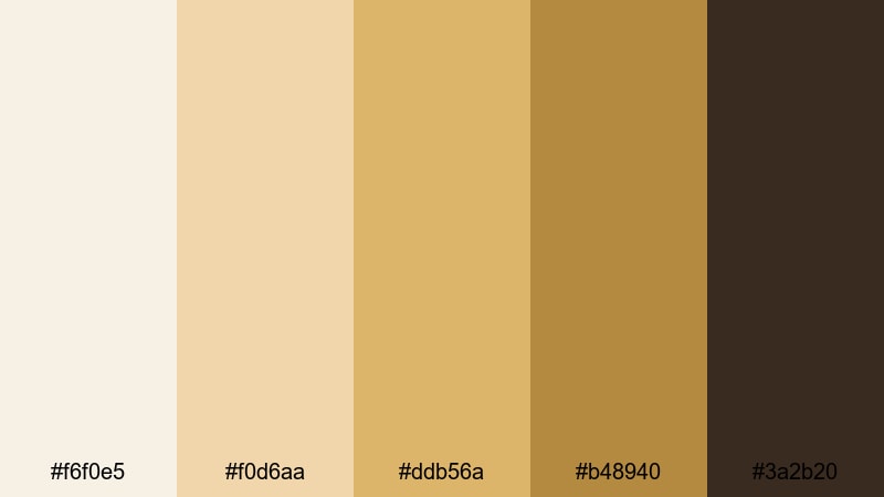
- HEX Codes: #f6f0e5, #f0d6aa, #ddb56a, #b48940, #3a2b20
- Mood: Opulent, celebratory, and glamorous.
- Use for: Use for luxury product promos, event recaps, and glamorous channel branding with a party-ready shine.
Champagne Gala Night captures the energy of a red-carpet evening. Luminous White Gold tones step down into rich champagne and deep brown, perfect for event coverage, luxury brand promos, or launch teasers.
Use the pale hues as a soft glow behind products, and the richer golds for borders, frames, and animated spark elements. The darkest brown works well for logo locks, price tags, and call-to-action text in thumbnails and end cards.
Regal Pearl Monogram
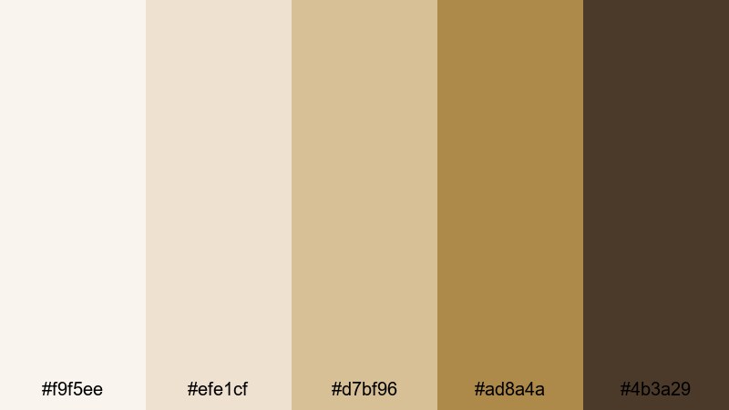
- HEX Codes: #f9f5ee, #efe1cf, #d7bf96, #ad8a4a, #4b3a29
- Mood: Royal, formal, and timeless.
- Use for: Great for logo stings, luxury intros, and premium course branding that needs a crest-like prestige.
Regal Pearl Monogram feels like a five-star hotel branding system in color form. Pearl Whites and stately golds give your visuals a formal, ceremonial tone that is great for high-end intros and educational products positioned as premium.
Use the lighter tones to frame your logo or course name, and the mid to deep golds for seals, badges, and monogram-style animations. This palette makes even simple lower thirds or title cards feel like part of a luxury experience.
Midnight Gilded Frame
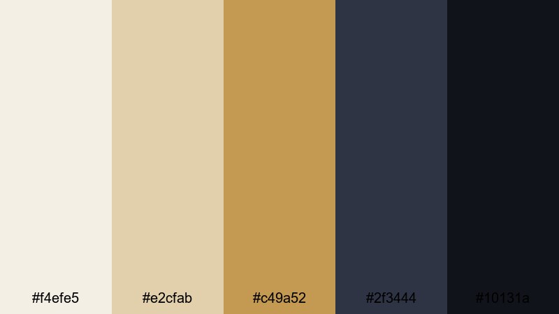
- HEX Codes: #f4efe5, #e2cfab, #c49a52, #2f3444, #10131a
- Mood: Dramatic, cinematic, and luxurious.
- Use for: Ideal for trailers, cinematic travel edits, and bold thumbnails that need strong contrast and shine.
Midnight Gilded Frame brings together warm White Gold and striking golds with deep, inky blues. It offers strong contrast and a cinematic edge, ideal for trailers, teasers, and any video that should feel like a premiere.
Use the darkest blues as background or letterbox bars, with gold accents framing key visuals or text. The lighter White Gold hues help soften harsh transitions and give your thumbnails a sophisticated but eye-catching glow.
Minimal & Neutral White Gold Color Palettes
Soft Studio Neutral
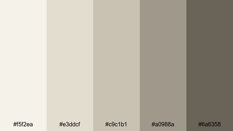
- HEX Codes: #f5f2ea, #e3ddcf, #c9c1b1, #a0988a, #6a6358
- Mood: Balanced, calm, and versatile.
- Use for: Perfect as a base grade for vlogs, educational videos, and channels wanting a cohesive neutral identity.
Soft Studio Neutral is a dependable everyday palette built around White Gold and quiet taupes. It looks good on almost any footage, making it a strong base look for channels that want cohesive branding without drawing attention to the color grade itself.
Apply the brighter tones to background plates and info cards, with the mid and darker taupes for headings and icons. This palette supports a wide range of topics from tutorials to lifestyle vlogs, giving you a calm, unified look from thumbnails to end screens.
Sandstone Air Layers
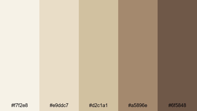
- HEX Codes: #f7f2e8, #e9ddc7, #d2c1a1, #a5896e, #6f5848
- Mood: Earthy, grounded, and relaxed.
- Use for: Use for travel vlogs, coffee shop scenes, and lifestyle shorts that lean into warm neutrals.
Sandstone Air Layers stacks White Gold with sun-warmed sand and stone hues to create a relaxed, lifestyle-friendly palette. It feels earthy and grounded without going too dark or heavy.
Use it for travel diaries, cafe b-roll, and creative workspace tours. Let the lightest colors carry sky, wall, or paper textures, and lean on the darker tans and browns for lower thirds, text highlights, and subtle stickers in your shorts and vertical edits.
Driftwood Calm Edit
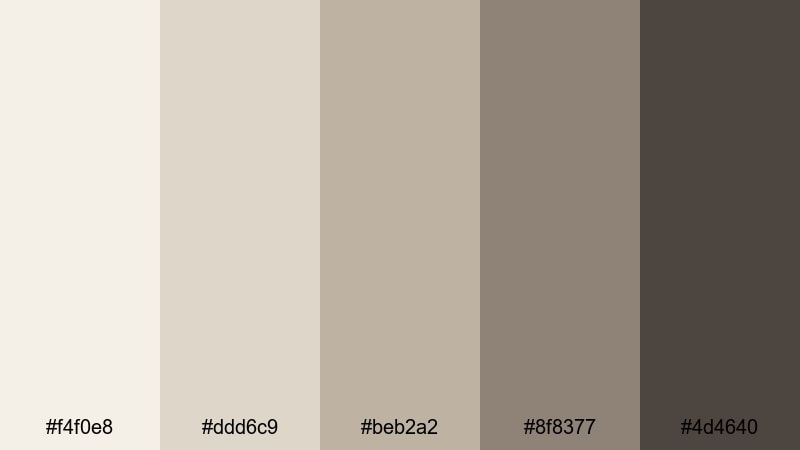
- HEX Codes: #f4f0e8, #ddd6c9, #beb2a2, #8f8377, #4d4640
- Mood: Subtle, soothing, and organic.
- Use for: Best for meditation videos, nature b-roll, and soft-spoken tutorials that need a calm visual bed.
Driftwood Calm Edit feels like polished wood and soft sand under overcast light. The balanced White Gold core with driftwood grays and browns creates a gentle, natural base that never distracts from the content.
It is a strong fit for meditation and mindfulness content, nature footage, and slow-spoken educational videos. Use the lighter hues as spacious backgrounds and the deeper tones sparingly for essential text and icons, keeping the frame quiet and soothing for longer watch times.
Tips for Creating White Gold Color Palettes
White Gold works best when you balance its softness with thoughtful contrast and clear hierarchy. These tips will help you combine White Gold with other tones for clean, readable, and consistent visuals across your videos and designs.
- Pair White Gold with one dark anchor color (charcoal, navy, or deep brown) so text and key UI elements stay readable on small screens.
- Limit your accent colors to one or two supporting hues (such as blush, slate, or sand) to keep your branding focused and recognizable.
- Use the brightest White Gold tones for backgrounds and highlight areas, and reserve deeper neutrals for titles, buttons, and icons.
- Check your thumbnails in grayscale to make sure contrast between text and background is strong enough for quick scanning.
- Match your color palette to your footage temperature; warm White Gold palettes suit golden-hour and indoor tungsten light, while cooler ones suit daylight and tech content.
- Save your chosen HEX codes inside Filmora so you can reuse the same White Gold shades for lower thirds, transitions, and end cards across different projects.
- Keep on-screen White Gold overlays slightly transparent so live footage still feels dynamic and does not look washed out.
- Test your palette on mobile first, since many viewers watch on phones; adjust saturation and brightness so White Gold areas do not appear dull or blown out.
White Gold color palettes are a powerful way to shape mood, signal quality, and create a recognizable identity for your channel or brand. From soft romantic stories to sleek modern explainers and high-glam launches, these 15 palettes give you ready-made combinations with HEX codes that you can apply directly to your thumbnails, titles, and color grades.
Try a few of these palettes inside Filmora and see how they change the feeling of your footage. Once you find a White Gold look that fits your style, turn it into a repeatable workflow so every new upload feels like part of the same polished visual universe.
Whether you are editing vlogs, promos, or cinematic shorts, using a consistent White Gold scheme will help your videos stand out in feeds and keep your brand looking refined across every platform.
secure downloadNext: Gray Tan Color Palette
