
 100% Security Verified | No Subscription Required | No Malware


 ChatGPT
 Perplexity
 Gemini
 Claude
 Grok
Grok
Yellow cream sits between soft pastel yellow and warm neutral beige. It feels cozy, optimistic, and approachable, which makes it a great base color for calm storytelling, lifestyle branding, and cinematic warmth. On screen, yellow cream adds glow without overpowering skin tones, so it works beautifully for vlogs, product shots, and thumbnails that should feel bright but not harsh.
For creators and Filmora users, a good yellow cream palette keeps your intros, titles, B-roll, and channel art visually consistent. Below are 15 ready-made yellow cream color palettes with HEX codes you can copy straight into your designs, overlays, and color grading presets, whether you are building a YouTube brand, editing Reels, or designing video thumbnails and backgrounds.
In this article
Soft & Romantic Yellow Cream Palettes
Morning Latte Glow
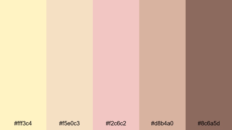
- HEX Codes: #fff3c4, #f5e0c3, #f2c6c2, #d8b4a0, #8c6a5d
- Mood: Warm, cozy, and intimate with a gentle morning light feel.
- Use for: Perfect for wedding highlight reels, lifestyle vlogs, and aesthetic B-roll where you want a soft, coffeehouse warmth in your color grade or thumbnail design.
Morning Latte Glow is like sunlight over a fresh latte: creamy yellows, blush tones, and soft mocha browns blend into a gentle, flattering haze. It feels slow, calm, and welcoming, which is ideal for storytelling where you want viewers to relax and stay a while.
Use this palette for romantic wedding edits, cozy day-in-the-life vlogs, or brand intros for cafes, skincare, or slow-living channels. In thumbnails and titles, apply the lighter yellow cream tones as backgrounds and use the deeper mocha (#8c6a5d) for text or icons so everything stays readable but still warm and dreamy.
Pro Tip: Build a Cinematic Yellow Cream Look in Filmora
To keep this latte-style yellow cream look consistent across an entire edit in Filmora, start by designing one key reference frame. Color grade a hero shot from your vlog or wedding sequence using these HEX values as a guide for text, overlays, and background blocks.
Then reuse that frame as your visual blueprint. Apply the same colors to your intro title, lower thirds, and end screen elements, and save them as presets. This way, every reel, short, or long-form upload will share the same warm, creamy signature look without having to rebuild it for each project.
AI Color Palette
Filmora's AI Color Palette feature lets you turn one yellow cream reference image into a look that covers your whole video. Export a still frame or use a custom graphic that embodies Morning Latte Glow, then feed it into AI Color Palette as your source.
Filmora will analyze the hues, saturation, and contrast, and then match the rest of your clips to that same warm, creamy mood. It is a fast way to unify A-roll, B-roll, and even smartphone footage so all your scenes share that cozy coffeehouse glow.
 secure download

HSL, Color Wheels & Curves
Once your base look is matched, use Filmora's HSL sliders to gently shift yellows and oranges toward a softer cream so skin tones stay natural. In the color wheels, warm up the midtones for that sunlit cafe feeling, then pull the shadows slightly cooler or more neutral to keep depth and contrast.
If you want a more cinematic finish, use the curves panel to add a subtle S-curve: lift the highlights to make yellow cream areas glow, and lower the deepest shadows for richer mocha accents. For more detailed steps on balancing tones, follow this color correction guide and adapt the workflow to your chosen palette.
secure download1000+ Video Filters & 3D LUTs
If you want to stylize your yellow cream palettes even faster, Filmora's video filters and 3D LUTs make it easy to add mood in one click. Start with a warm cinematic LUT, then fine-tune intensity so your creamy highlights stay soft instead of turning orange.
You can stack subtle filters like vignettes, glow, or grain over your yellow cream base to create a dreamy, film-like finish. Save your favorite combinations as custom presets so every new vlog, teaser, or short can instantly match the same Morning Latte Glow atmosphere.
secure downloadSunlit Linen Romance
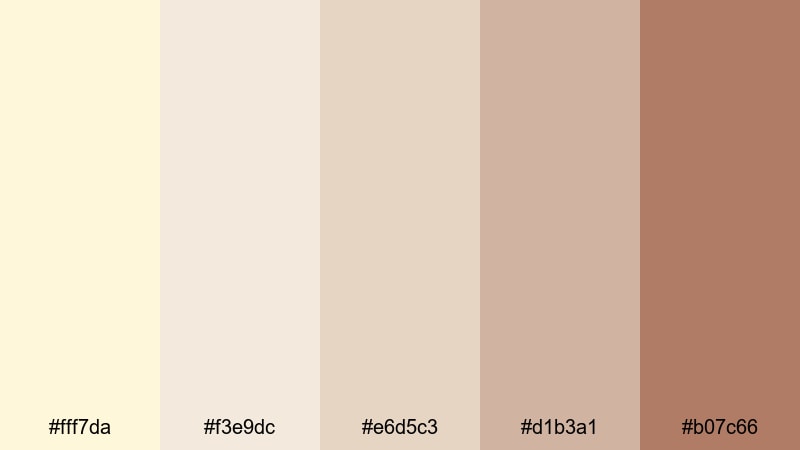
- HEX Codes: #fff7da, #f3e9dc, #e6d5c3, #d1b3a1, #b07c66
- Mood: Airy, tender, and nostalgic like golden light on linen sheets.
- Use for: Use this palette for dreamy travel vlogs, bedroom makeovers, and soft product videos where you want a sun-washed, intimate aesthetic.
Sunlit Linen Romance layers pale yellow cream with linen neutrals and a chestnut accent, giving your visuals that feeling of sunlight spilling onto clean sheets. It is gentle and nostalgic, ideal when you want your footage to look effortless and emotionally warm.
Use the lightest shades as background colors for titles and social story covers, while the deeper browns anchor text, price tags, or callout shapes. This palette works especially well for interior tours, lifestyle lookbooks, and soft-focus product shots where subtle warmth and comfort matter more than contrast.
Buttercream Blossom
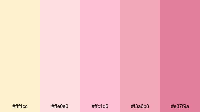
- HEX Codes: #fff1cc, #ffe0e0, #ffc1d6, #f3a6b8, #e37f9a
- Mood: Sweet, feminine, and gently playful with a bakery-fresh charm.
- Use for: Ideal for beauty tutorials, bridal content, cake decorating shorts, and any video needing a soft pastel pop in overlays and lower thirds.
Buttercream Blossom swirls yellow cream with pastel pinks, creating a palette that feels like icing, petals, and confetti all at once. It is soft and feminine but still has enough saturation to stand out on a busy feed.
Use the lighter tones as backgrounds behind faces in beauty videos to flatter skin, and bring in the brighter pinks for accents on buttons, subscribe reminders, and logo reveals. This palette is perfect for thumbnails and Reels that should look cute, romantic, and instantly shareable.
Tender Dawn Studio
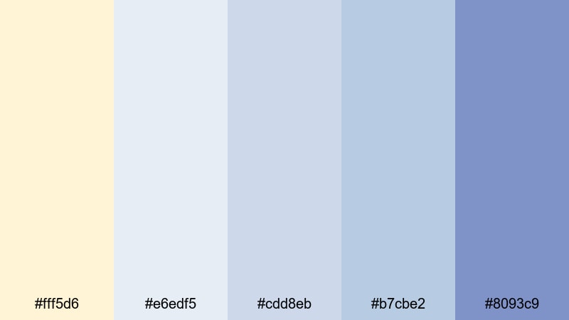
- HEX Codes: #fff5d6, #e6edf5, #cdd8eb, #b7cbe2, #8093c9
- Mood: Calm, reflective, and gently optimistic like the first light of day.
- Use for: Great for calm day-in-the-life vlogs, study-with-me videos, and channel banners where you want serenity with a hint of creative blue.
Tender Dawn Studio blends a creamy sunrise yellow with powdery blues, resulting in a calm, slightly dreamy atmosphere. The blue tones keep everything feeling clear and focused, while the yellow cream adds warmth and optimism.
Use this palette for productivity content, study sessions, or creator studios where you want to balance comfort and clarity. In layouts, let yellow cream carry the backgrounds and highlights, and rely on the mid to deep blues for text, icons, and progress bars so your visuals stay soothing but still legible.
Modern Minimal Yellow Cream Palettes
Cream Loft Minimal
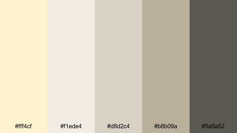
- HEX Codes: #fff4cf, #f1ede4, #d8d2c4, #b8b09a, #5a5a52
- Mood: Clean, sophisticated, and understated with a warm minimalist edge.
- Use for: Use this palette for tech explainers, productivity channels, and UI overlays where you want a soft but professional neutral base.
Cream Loft Minimal combines yellow cream with stone neutrals, anchored by a charcoal gray. It feels editorial and modern without looking cold, ideal for creators who want a professional look that still feels human and inviting.
Use the mid neutrals for panels, cards, and frames in your overlays, and keep the darkest gray for typography and icons. This palette suits talking-head explainers, SaaS demos, and workspace tours where design clarity and subtle warmth are both important.
Muted Marigold Interface
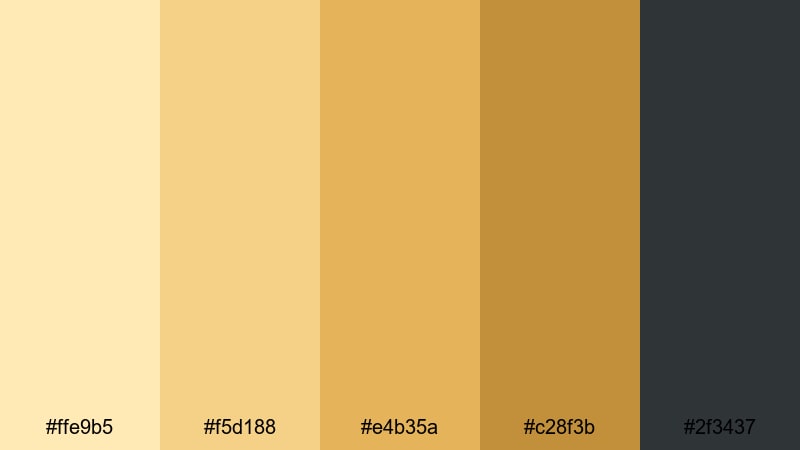
- HEX Codes: #ffe9b5, #f5d188, #e4b35a, #c28f3b, #2f3437
- Mood: Focused, contemporary, and slightly bold with grounded warmth.
- Use for: Perfect for modern app demos, dashboard-style motion graphics, and UI walkthroughs where accent colors must stay readable and refined.
Muted Marigold Interface leans into structured, UI-friendly color blocking: creamy yellow for backgrounds, muted marigold for highlights, and deep graphite for key information. It feels modern and confident but avoids the harshness of neon or pure white.
Apply the lighter tones to backgrounds and charts in your motion graphics, then use the darker accent for labels, graphs, and timing markers. This palette is great for infographics, interface tours, and any content where you need clear hierarchy and warm but serious design.
Nordic Butter Light
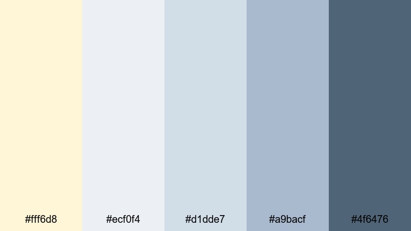
- HEX Codes: #fff6d8, #ecf0f4, #d1dde7, #a9bacf, #4f6476
- Mood: Quiet, airy, and design-forward with a Scandinavian calm.
- Use for: Great for workspace tours, minimalist home setups, and design portfolio reels that need a high-end, uncluttered color system.
Nordic Butter Light marries a soft buttercream with cool grays and slate blue. The result is a Scandinavian-inspired mood: bright, clean, and breathable, with just enough color to avoid feeling sterile.
Use the lightest shades for backgrounds and negative space, and rely on the slate blue for key text, dividers, and logo marks. This palette is ideal for minimal portfolio videos, architecture tours, or gear reviews where you want to highlight form and function with a gentle, modern touch.
Almond Highlight Grid
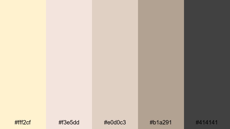
- HEX Codes: #fff2cf, #f3e5dd, #e0d0c3, #b1a291, #414141
- Mood: Balanced, editorial, and polished with a subtle magazine feel.
- Use for: Use for talking-head videos, minimal brand kits, and channel rebrands where you want sophisticated titles and frames without harsh contrast.
Almond Highlight Grid layers yellow cream with almond and taupe neutrals, grounded by a dark gray. The palette feels like a clean magazine layout, making it ideal for structured frames, text blocks, and grids.
Use the mid-tones for borders, cards, and split-screen layouts, while the darkest shade (#414141) holds your typography and logos. It works especially well for rebranding channels, educational content, and interview formats where understated elegance is the goal.
Vintage & Retro Yellow Cream Palettes
Retro Kitchen Sunshine
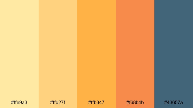
- HEX Codes: #ffe9a3, #ffd27f, #ffb347, #f68b4b, #43657a
- Mood: Cheerful, nostalgic, and a bit funky like a vintage diner set.
- Use for: Perfect for recipe videos, retro-themed intros, and playful lower thirds that reference mid-century poster styles.
Retro Kitchen Sunshine is packed with sunny yellow cream, tangerine, and teal, echoing classic 50s and 60s kitchens. It feels bold, cheerful, and slightly quirky, perfect when you want a retro punch that still looks fresh on modern screens.
Use the bright oranges for titles and subtitles, keep yellow cream for backgrounds and frames, and use teal as an accent for badges, buttons, or stickers. This palette suits recipe shorts, retro challenge videos, or nostalgic intros that hint at old-school posters and signage.
Polaroid Custard Fade
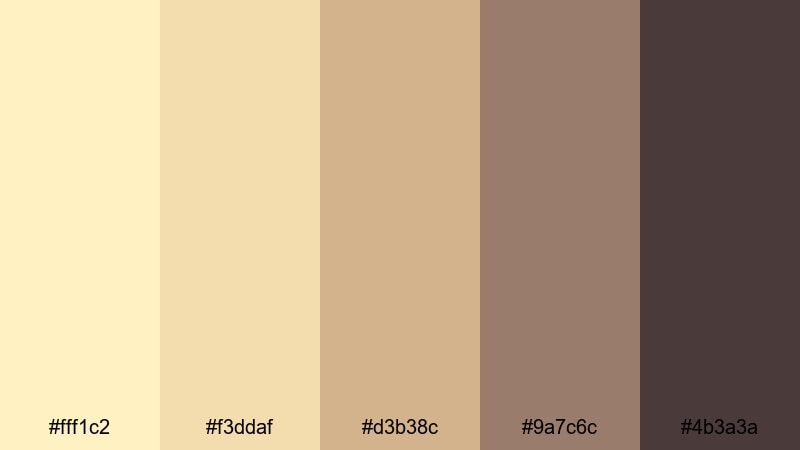
- HEX Codes: #fff1c2, #f3ddaf, #d3b38c, #9a7c6c, #4b3a3a
- Mood: Softly faded, sentimental, and cozy like old instant photos.
- Use for: Use this palette for nostalgia edits, memory montages, and documentary-style vlogs where warmth and age matter.
Polaroid Custard Fade mimics the creamy highlights and soft browns of aged instant film. The yellow cream tones feel like custard, while the deeper sepias hint at prints that have lived on a fridge door for years.
It is perfect for throwback vlogs, family compilations, travel memories, and documentary intros. Use lighter hues for overlays and frames, then place text and date stamps in the darker browns. Add grain and subtle fade in your edit to complete the vintage impression.
Old Vinyl Afternoon
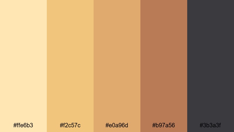
- HEX Codes: #ffe6b3, #f2c57c, #e0a96d, #b97a56, #3b3a3f
- Mood: Earthy, soulful, and mellow with a record-store mood.
- Use for: Great for music sessions, studio diaries, and cinematic b-roll where you want analog warmth with just enough contrast.
Old Vinyl Afternoon blends buttery yellow with ochres, warm woods, and a charcoal accent. It feels like flipping through records in soft afternoon light: mellow, textured, and a bit moody.
Use it for music videos, jam session diaries, or studio BTS footage. Let the mid-tone browns dominate backgrounds and frames, and drop your key titles and track names in the darkest charcoal for a strong but tasteful contrast.
Cafe Poster Nostalgia
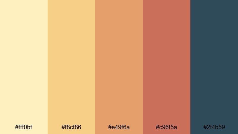
- HEX Codes: #fff0bf, #f8cf86, #e49f6a, #c96f5a, #2f4b59
- Mood: Warm, friendly, and slightly bold like old cafe ad prints.
- Use for: Ideal for coffee shop promos, travel vlogs, and channel art where you want a retro postcard feel with modern clarity.
Cafe Poster Nostalgia recalls vintage cafe and travel posters, with creamy yellows, caramel oranges, and a teal navy accent. It feels inviting and social, great for content that centers on food, city walks, and warm spaces.
Use yellow cream and light caramel for poster-style backgrounds, then reserve the teal navy for logos, menu prices, or location tags. This palette works well in animated transitions, thumbnail frames, and end screens where you want to highlight your channel name or call to action.
Bold & Playful Yellow Cream Palettes
Citrus Pop Storytime
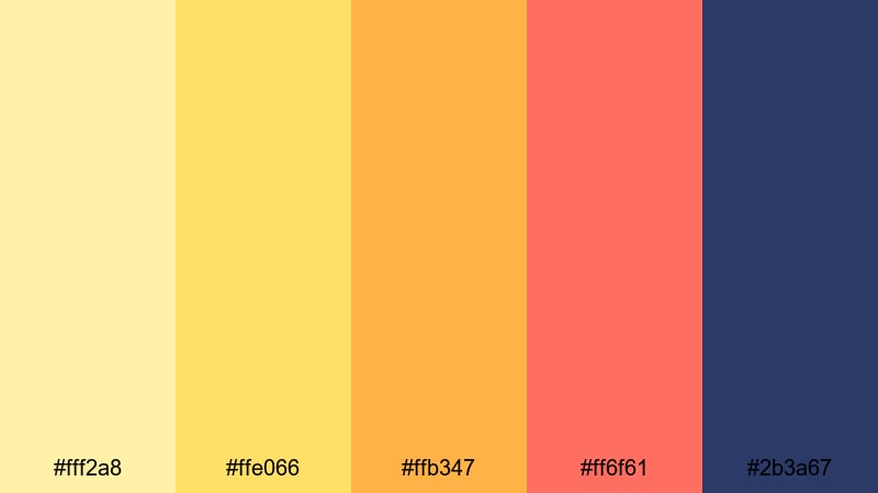
- HEX Codes: #fff2a8, #ffe066, #ffb347, #ff6f61, #2b3a67
- Mood: Energetic, youthful, and storytelling-ready with citrusy impact.
- Use for: Perfect for kids content, animated explainers, and punchy YouTube thumbnails that need to stand out in a busy feed.
Citrus Pop Storytime is zesty and bright, combining lemon cream, bold yellow, juicy orange, and coral against a deep navy. It radiates energy and fun, making it ideal for content aimed at younger audiences or playful brands.
Use the navy as your main text color so titles stay readable, and let the citrus tones drive backgrounds, speech bubbles, arrows, and subscribe buttons. This palette is especially strong in thumbnails, intros, and animated callouts where fast, clear communication matters.
Arcade Lemon Cream
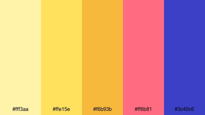
- HEX Codes: #fff3aa, #ffe15e, #f6b93b, #ff6b81, #3c40c6
- Mood: Fun, neon-tinged, and dynamic like an 80s arcade revival.
- Use for: Use this palette for gaming intros, challenge videos, and motion graphics where you want high-energy color blocking.
Arcade Lemon Cream mixes bright lemon, gold, hot pink, and electric blue for a modern retro arcade feel. It is bold and slightly neon without going full neon green or magenta, which keeps it more flexible for different niches.
Use the yellow cream shade as a buffer between strong colors in your overlays, and reserve the electric blue and hot pink for key accents like score counters, challenge titles, or animated transitions. This palette is perfect for gaming channels, reaction videos, and any format where movement and color are part of the entertainment.
Festival Confetti Drizzle
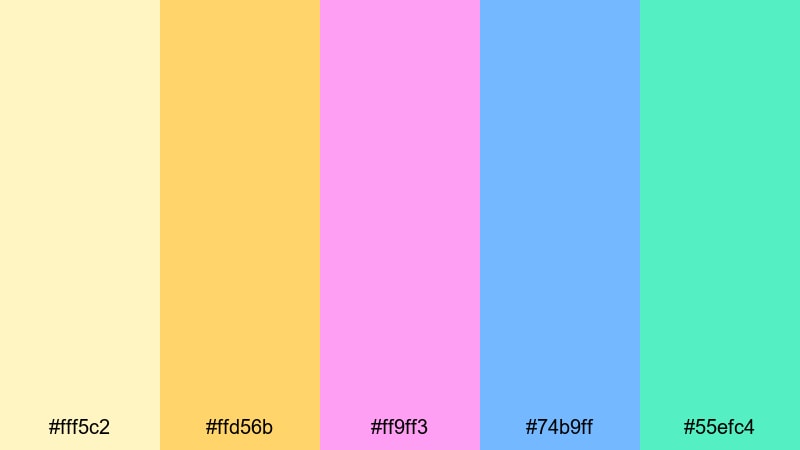
- HEX Codes: #fff5c2, #ffd56b, #ff9ff3, #74b9ff, #55efc4
- Mood: Joyful, celebratory, and confetti-bright with a sunny base.
- Use for: Great for event recaps, festival reels, party promos, and social ads that need a fun, colorful frame around footage.
Festival Confetti Drizzle anchors a cloud of candy colors with soft yellow cream. Pink, sky blue, and mint fling pops of color across your layout like confetti, while the warm base keeps everything from feeling chaotic.
Use yellow cream and soft yellow for your main panels and frames, then sprinkle the brighter colors on text highlights, stickers, countdown timers, and animated emojis. It is a natural fit for concerts, birthday promos, graduation recaps, or any clip that should feel like a celebration.
Tips for Creating Yellow Cream Color Palettes
Yellow cream is flexible enough to work in romantic, minimal, retro, or playful styles. These tips will help you combine it with other colors so your videos and designs stay clear, stylish, and on-brand.
- Pair yellow cream with at least one darker accent (navy, charcoal, deep teal, or chocolate) to keep text and icons easy to read.
- Use yellow cream for backgrounds, highlights, and UI panels, and limit strong accent colors to buttons, badges, and key callouts.
- Keep skin tones in mind: avoid pushing yellow cream too saturated in your grade, or faces may look overly warm and unnatural.
- Stay consistent with HEX codes across thumbnails, lower thirds, and end screens so viewers instantly recognize your channel branding.
- When color grading, match your overlays and text colors to the tones in your footage so they feel integrated, not pasted on top.
- Test your palette on both light and dark devices; make sure important text remains readable in YouTube, Instagram, and TikTok interfaces.
- Use one primary yellow cream shade as your anchor, then build supporting colors around it (one light neutral, one mid-tone, one dark accent, and one optional pop color).
- Export a still frame with your final palette applied and keep it as a reference when editing new projects so your style remains cohesive over time.
Yellow cream palettes can shift the mood of your content from cozy and romantic to sleek and modern or bright and playful. By choosing the right combination of neutrals, accents, and contrast colors, you build a visual identity that your audience can recognize in a split second.
Use these 15 palettes as a starting kit for your thumbnails, intros, overlays, and color grading experiments. Try them inside Filmora, save your favorite looks as presets, and refine the tones until they match your channel personality and niche.
Once you have a yellow cream style you love, carry it across your whole ecosystem: YouTube banners, shorts, Reels, and even your website. Consistent color is one of the fastest ways to make your brand feel polished, intentional, and memorable on every screen.
secure downloadNext: Floral Color Palette
