
 100% Security Verified | No Subscription Required | No Malware


 ChatGPT
 Perplexity
 Gemini
 Claude
 Grok
Grok
Zen inspired color palettes lean into soft neutrals, muted greens, gentle blues, and warm natural browns. These hues feel calm, grounded, and balanced, so they are perfect when you want your audience to relax, focus, or feel safe. In color psychology, this style of palette lowers visual noise, reduces tension, and gently guides attention instead of shouting for it.
For video creators and designers, a Zen color palette is ideal for YouTube thumbnails, intros, lower thirds, titles, vlogs, and personal branding. Below you will find 15 ready made Zen color combinations with HEX codes, crafted for Filmora users and other creators who want consistent, soothing visuals across thumbnails, edits, and social clips.
In this article
Calm & Minimal Zen Color Palettes
Still Water Studio
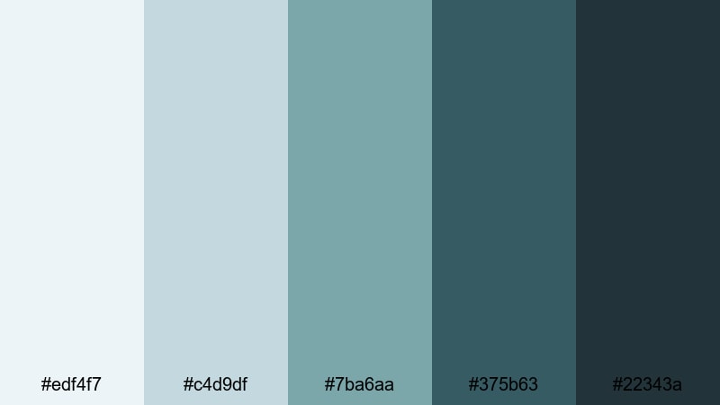
- HEX Codes: #edf4f7, #c4d9df, #7ba6aa, #375b63, #22343a
- Mood: Quiet, introspective, and gently refreshing.
- Use for: Use for tutorial intros, study-with-me vlogs, and minimalist channel branding.
Still Water Studio blends pale blue grays with deeper teal and charcoal, like a calm studio that looks out over a glassy lake. The lighter tones (#edf4f7, #c4d9df) feel clean and airy, while the darker shades (#375b63, #22343a) add focus and depth without feeling harsh.
This palette is ideal for YouTube intros, productivity thumbnails, and channels that want a quiet, efficient look. Use the lightest hue for backgrounds, the mid blue green for accents and buttons, and the deep teal or charcoal for typography, logo marks, and lower thirds. It works especially well for educational overlays, screen recordings, and minimal motion graphics where you want clarity and calm at the same time.
Pro Tip: Keep Your Zen Visuals Consistent In Filmora
When you build a subtle palette like Still Water Studio, consistency matters more than saturation. In Filmora, you can create a custom color preset based on this teal and blue gray mix, then apply it across your intro, A roll, B roll, and end screens so your channel always feels like the same quiet studio space.
Use the lighter tones as background colors for titles and subscribe prompts, and lean on the deeper teal for icons and callouts. Once you like the balance on one clip, save that look in Filmora so every new video drops into the same Zen atmosphere without manual tweaking each time.
AI Color Palette
If you already have a thumbnail or reference image that nails this calm, watery look, you can turn it into a template for your entire edit. Filmora's AI Color Palette feature reads the colors from a still frame or branding graphic and applies that palette across other clips in your timeline.
Drop in a frame that shows your ideal mix of blue gray and teal, then let AI Color Palette match your other shots to that mood. It is an easy way to make talking head clips, B roll, and even screen recordings feel like they belong in the same Zen studio without heavy manual grading.
 secure download

HSL, Color Wheels & Curves
To fine tune this Zen palette, adjust your clips with HSL, color wheels, and curves in Filmora. You can push the cyan and teal tones slightly cooler for a crisp study vibe, or warm them a touch for a softer, cozy desk aesthetic. The color wheels help you keep shadows in the deeper teal range while holding highlights in clean off white so nothing feels muddy.
Use curves to lift the darkest shadows just a bit, so your deep blue grays stay gentle instead of harsh. Filmora's advanced color correction tools give you enough control to stay cinematic while still preserving that calm, minimalist atmosphere.
secure download1000+ Video Filters & 3D LUTs
Once you like your base Zen palette, you can stylize it further with Filmora's filters and LUTs. A light film grain, a soft fade, or a subtle teal and orange LUT can turn a neutral desk setup into something more cinematic while keeping the overall mood calm and focused.
Filmora's video filters and 3D LUTs make it easy to test different looks on your Still Water Studio palette without rebuilding your grade from scratch. Apply a preset to one clip, then quickly copy that look across your entire timeline for intros, tutorials, and social cuts.
secure downloadTatami Morning Light
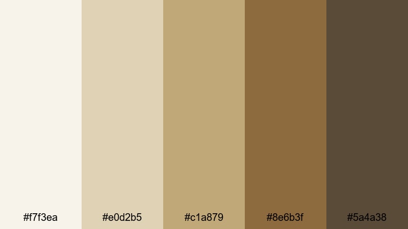
- HEX Codes: #f7f3ea, #e0d2b5, #c1a879, #8e6b3f, #5a4a38
- Mood: Warm, grounded, and meditative.
- Use for: Perfect for lifestyle vlogs, journaling reels, and cozy channel headers.
Tatami Morning Light captures the warmth of soft sunlight hitting straw mats and wooden beams. Cream and straw tones create a gentle base, while the darker browns add structure and a feeling of heritage.
Use the lightest shades for backgrounds in journaling reels or calm podcast covers, and the mid browns for text, frames, and icons. In Filmora, this palette works beautifully for lifestyle vlogs, morning routine intros, or cozy YouTube thumbnails that promise slow, mindful content.
Soft Incense Haze
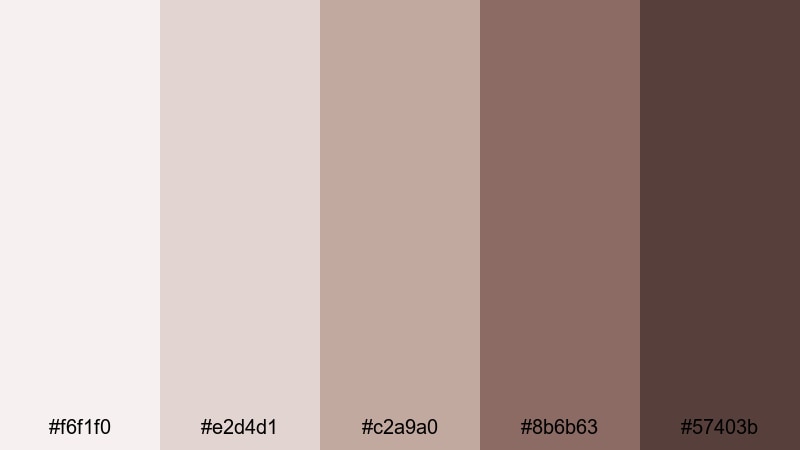
- HEX Codes: #f6f1f0, #e2d4d1, #c2a9a0, #8b6b63, #57403b
- Mood: Airy, nostalgic, and slightly mysterious.
- Use for: Use for voiceover videos, poetry shorts, and reflective channel trailers.
Soft Incense Haze leans into dusty pinks and muted browns that feel like faded film and curling incense smoke. It has a nostalgic, introspective character that is great for storytelling and reflective content.
Try this palette for poetry shorts, cinematic vlogs, or voiceover montages. The lighter pink toned neutrals make tender backgrounds for text, while the deeper browns and mauves are perfect for titles, logo locks, and end screen layouts that feel soft rather than stark.
Pebble Garden Path
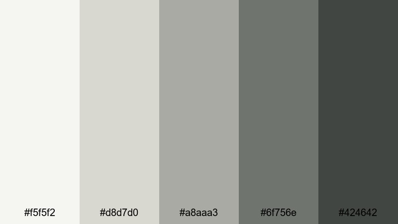
- HEX Codes: #f5f5f2, #d8d7d0, #a8aaa3, #6f756e, #424642
- Mood: Neutral, balanced, and contemplative.
- Use for: Great for UI elements, lower thirds, and neutral grading on educational videos.
Pebble Garden Path is a harmony of cool grays and stone hues, like walking along a raked gravel path in a Zen garden. It is intentionally low contrast, which keeps attention on your subject instead of the background.
Use this palette for educational content, tutorials, and UI style overlays where clarity is key. Light gray tones work well for panels, charts, and interface elements, while the darker stones are ideal for legible text, callouts, and titles without breaking the calm mood of your frame.
Natural & Organic Zen Color Palettes
Bamboo Grove Breeze
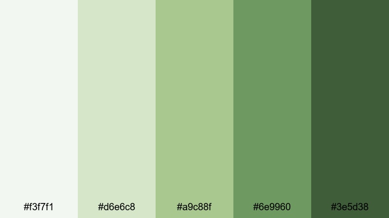
- HEX Codes: #f3f7f1, #d6e6c8, #a9c88f, #6e9960, #3e5d38
- Mood: Fresh, hopeful, and naturally energizing.
- Use for: Use for eco brand intros, wellness content, and outdoor travel vlogs.
Bamboo Grove Breeze mixes leafy greens with soft, misty whites to capture the feeling of walking through a bright bamboo forest. The palette feels fresh and breathable instead of intense or neon.
It is a natural fit for wellness channels, yoga intros, eco brand explainers, and outdoor travel vlogs. Use the paler greens for backgrounds and overlays, while the deeper forest tones emphasize key text, subscribe buttons, or logo marks without losing that organic calm.
Moss Temple Courtyard
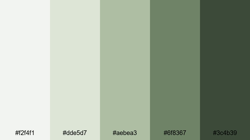
- HEX Codes: #f2f4f1, #dde5d7, #aebea3, #6f8367, #3c4b39
- Mood: Ancient, rooted, and quietly powerful.
- Use for: Ideal for cinematic b roll, slow travel edits, and documentary style sequences.
Moss Temple Courtyard reflects weathered stone, aged wood, and moss that has grown for decades in the shade. The soft greens and neutral grays give a sense of history and patience rather than bright, fresh growth.
This palette suits cinematic B roll, slow travel edits, and documentary style footage. In Filmora, use the lighter tones for subtitles and captions over darker scenes, and reserve the deep moss greens for chapter titles, timelines, or maps in storytelling sequences.
Tea House Retreat
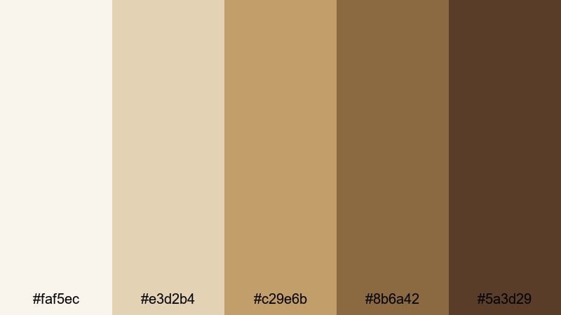
- HEX Codes: #faf5ec, #e3d2b4, #c29e6b, #8b6a42, #5a3d29
- Mood: Comforting, intimate, and grounded.
- Use for: Use in tea ceremony videos, cooking vlogs, and cozy sit down chats.
Tea House Retreat blends cream, honey, and tea brown tones to create a deeply comforting atmosphere. It feels like sitting in a wooden teahouse, listening to water boil and conversation soften.
Choose this palette for cooking vlogs, tea ceremony videos, and intimate sit down chats. The lighter beige tones are gentle enough for backgrounds and title cards, while the richer browns highlight your logo, time stamps, or call to action text in thumbnails and end screens.
Rainwashed Garden Stone
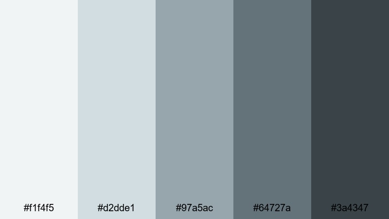
- HEX Codes: #f1f4f5, #d2dde1, #97a5ac, #64727a, #3a4347
- Mood: Cool, refreshed, and introspective.
- Use for: Great for rainy day montages, productivity vlogs, and reflective music videos.
Rainwashed Garden Stone is built from muted blues and stone grays, like a courtyard just after a gentle rain. It is cool and reflective without turning bleak.
Use this palette for rainy day montages, chill study playlists, lo fi music videos, or productivity vlogs. In Filmora, the lighter tones work well for clean gradient backgrounds or title slates, while the deeper grays and blues carry your typography and icons with good readability.
Elegant & Modern Zen Color Palettes
Charcoal Shoji Glow
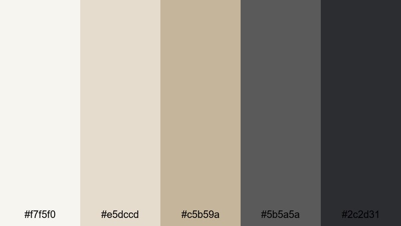
- HEX Codes: #f7f5f0, #e5dccd, #c5b59a, #5b5a5a, #2c2d31
- Mood: Minimal, sophisticated, and gently dramatic.
- Use for: Perfect for tech reviews, brand explainers, and modern channel idents.
Charcoal Shoji Glow pairs ivory and taupe with sleek charcoals, like shoji paper lanterns lighting up a dark minimalist room. It feels professional and modern but still soft enough to stay Zen.
This palette is ideal for tech reviews, software walkthroughs, and brand explainers. Use the bright neutrals for clean UI inspired backgrounds and lower thirds, and the dark charcoals for bold titles, product names, and logo animations that feel premium without being aggressive.
Ink Wash Horizon
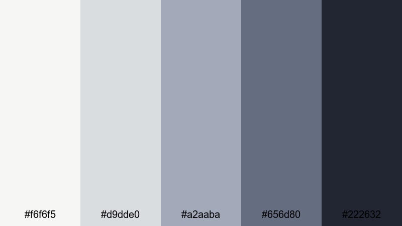
- HEX Codes: #f6f6f5, #d9dde0, #a2aaba, #656d80, #222632
- Mood: Artistic, cinematic, and contemplative.
- Use for: Use for cinematic titles, documentary openers, and moody channel branding.
Ink Wash Horizon draws on traditional ink wash paintings, with cool grays and inky blues that look like layered mountains and mist. It feels artistic and cinematic, perfect for more serious or reflective content.
Choose this palette for documentary openers, cinematic title sequences, or channels focused on art, film, or storytelling. In thumbnails and intros, let the light gray be your sky, and use the deep navy and charcoal for powerful typography and logo silhouettes.
Lotus Mist Luxe
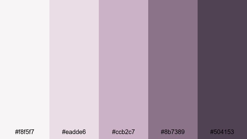
- HEX Codes: #f8f5f7, #eadde6, #ccb2c7, #8b7389, #504153
- Mood: Softly luxurious, romantic, and serene.
- Use for: Ideal for beauty channels, self care content, and dreamy product promos.
Lotus Mist Luxe is a blend of powdery mauves and misty purples that suggests flower petals in morning fog. It feels elegant and feminine while staying muted and calm.
Use this palette for beauty channels, skincare or self care videos, and dreamy product promos. Light mauves make flattering backgrounds for product shots and transitions, while deeper purples help titles, price tags, and logo marks stand out in thumbnails and Instagram stories.
Porcelain Ink Minimal
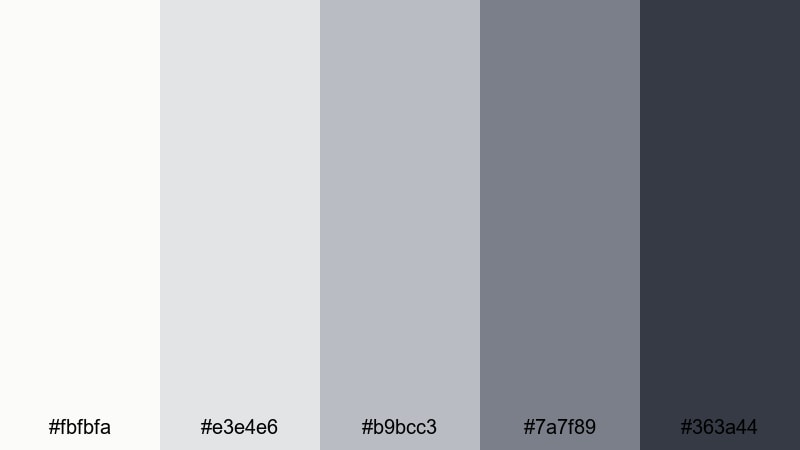
- HEX Codes: #fbfbfa, #e3e4e6, #b9bcc3, #7a7f89, #363a44
- Mood: Clean, professional, and quietly confident.
- Use for: Use for app demos, UI mockups, and minimalist motion graphics packages.
Porcelain Ink Minimal stays almost monochrome, mixing porcelain whites and layered cool grays. It looks like a high end UI, keeping everything crisp, readable, and distraction free.
This is a great choice for app demos, SaaS explainers, or minimalist motion graphics. Let the lightest shades carry data, screenshots, and interface mockups, and use the darker grays for headings, buttons, and key labels so your message is clear even on small screens.
Warm & Cozy Zen Color Palettes
Amber Tatami Sunset
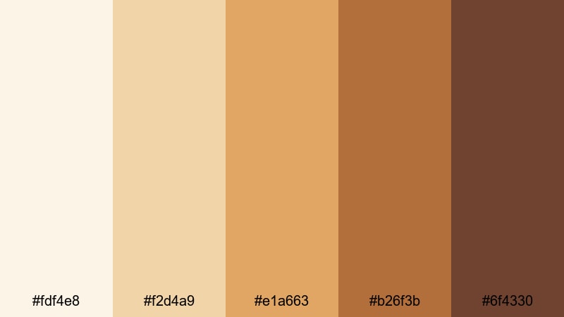
- HEX Codes: #fdf4e8, #f2d4a9, #e1a663, #b26f3b, #6f4330
- Mood: Warm, nostalgic, and comforting.
- Use for: Great for sunset montages, memory videos, and heartfelt storytelling.
Amber Tatami Sunset is all about golden light: amber, honey, and clay hues that look like late afternoon sun across tatami floors. It carries a nostalgic, emotional warmth that is great for personal stories.
Use this palette for memory videos, family montages, or emotional vlogs. In thumbnails, let the bright ambers frame your subject, and use the deeper browns for text that feels intimate rather than clickbait. In Filmora, you can grade your footage slightly warmer to match these HEX codes and reinforce that sunset feeling.
Candlelit Meditation
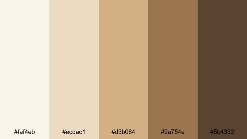
- HEX Codes: #faf4eb, #ecdac1, #d3b084, #9a754e, #5b4332
- Mood: Intimate, soothing, and inward focused.
- Use for: Use for meditation guides, ASMR content, and slow living vlogs.
Candlelit Meditation mixes soft creams with gentle, muted browns that resemble candle glow on wooden surfaces. It feels like a quiet space meant for breathing, journaling, or resting.
This palette is perfect for meditation guides, ASMR channels, and slow living vlogs. Use the pale creams for backgrounds in intro cards and timestamps, and reserve the warm browns for soft, readable typography in thumbnails, chapter markers, or affirmations over video.
Herbal Steam Sanctuary
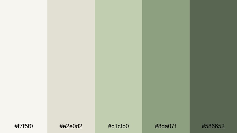
- HEX Codes: #f7f5f0, #e2e0d2, #c1cfb0, #8da07f, #586652
- Mood: Spa like, restorative, and nurturing.
- Use for: Perfect for wellness routines, spa promos, and yoga or stretching videos.
Herbal Steam Sanctuary blends cream and stone neutrals with soft herbal greens and olives. It feels like a spa room filled with steam, plants, and gentle light.
Use this palette for wellness routines, spa or massage promos, yoga and stretching videos, or skincare walkthroughs. In your edits, keep text subtle and use the deeper olives for small accents such as progress bars, section dividers, or call to action buttons, so the overall frame stays nurturing and relaxing.
Tips for Creating Zen Color Palettes
When you build your own Zen color palette for video and design, the key is balancing softness with clarity. You want calm, low noise visuals that still support readable text, clear branding, and a distinct mood across intros, thumbnails, and full edits.
- Limit your main colors to 3 to 5 hues, then use tints and shades of those to avoid visual clutter while keeping flexibility for overlays and graphics.
- Keep one darker shade in every palette for text and icons so titles and lower thirds stay readable against soft, light backgrounds.
- Use warm neutrals (beige, soft brown) when you want intimacy and storytelling, and cooler neutrals (blue gray, stone) for focus, study, and tech content.
- Test your palette on a real thumbnail and a short intro in Filmora to ensure it works both at small sizes and in motion.
- Match your grading to your graphics: if your overlays use warm Zen tones, tilt your footage slightly warmer so scenes and titles feel unified.
- Reserve accent colors (like deeper green or charcoal) for CTAs and important labels so viewers instinctively know where to look.
- Save custom presets in Filmora once you like a look, then reuse them across episodes to build a recognizable, Zen aligned channel identity.
- Check contrast on mobile: view your thumbnails on a phone screen to confirm that soft Zen backgrounds and text still stand out clearly.
Zen color palettes are a powerful way to shape how your audience feels about your content and your brand. Soft greens, stone grays, and warm neutrals can turn any vlog, tutorial, or promo into a calm, focused experience that viewers want to stay in.
Use the 15 palettes above as ready made options, or as inspiration for your own combinations. Drop the HEX codes into your design tools, then bring the same tones into Filmora for your color grading, text cards, and lower thirds so everything looks connected.
As you experiment, keep saving looks and presets in Filmora until you land on a Zen visual style that is uniquely yours. With consistent color across thumbnails, intros, and full edits, your channel or brand will feel calmer, clearer, and more intentional.
secure downloadNext: Wenge Color Palette
