
 100% Security Verified | No Subscription Required | No Malware


 ChatGPT
 Perplexity
 Gemini
 Claude
 Grok
Grok
Alice Blue is a pale, almost weightless blue with a hint of cool white. It feels fresh, honest, and calm, which is why it works so well in clean user interfaces, minimalist branding, and soft cinematic looks. In video, it often shows up as airy backgrounds, glowing titles, or subtle highlights that make footage feel more spacious and modern.
For creators and Filmora users, Alice Blue is a powerful base color for intros, YouTube thumbnails, lower thirds, and overall channel identity. Below you will find 15 ready made Alice Blue color palettes with HEX codes you can copy directly into your designs, color grading, and branding systems.
In this article
Soft & Airy Alice Blue Color Palettes
Morning Window Light
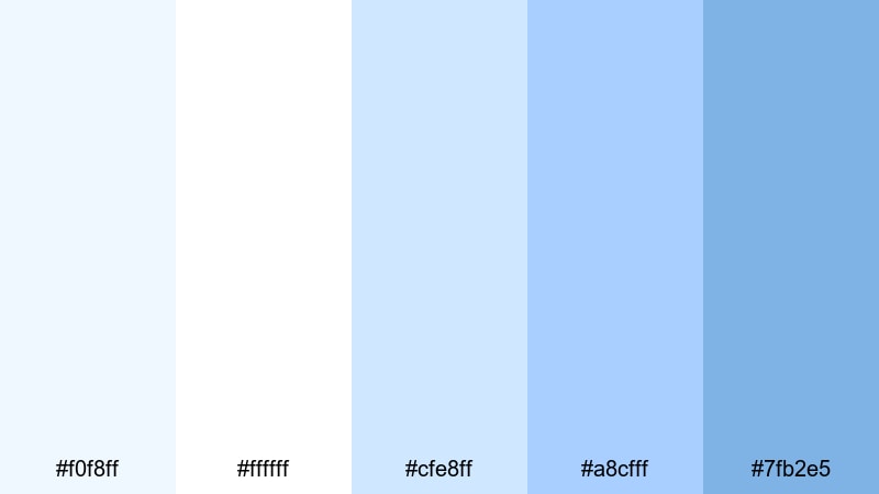
- HEX Codes: #f0f8ff, #ffffff, #cfe8ff, #a8cfff, #7fb2e5
- Mood: Calm, optimistic, and gently refreshing, like early daylight filtering through sheer curtains.
- Use for: Use for clean vlog intros, productivity channel branding, and minimalist tutorial thumbnails.
This palette wraps Alice Blue in soft whites and pale sky tones, creating the feeling of early morning light on a tidy desk. It is bright without being harsh, so your videos can feel inviting and organized instead of overexposed.
Apply these colors to intro slates, lower thirds, and simple title cards to build a friendly productivity brand. On YouTube thumbnails, use the deeper blue (#7fb2e5) for text or borders against Alice Blue and white backgrounds to keep everything readable and crisp.
Pro Tip: Enhance Your Alice Blue Visuals With Filmora
When you edit with a light palette like Morning Window Light, consistency matters. In Filmora, you can build a simple style system by reusing the same Alice Blue and accent blues across titles, transitions, and overlays so your channel looks cohesive from intro to end screen.
Save your favorite title presets with this palette applied, then reuse them for vlog episodes, reels, and shorts. This keeps your Alice Blue aesthetic recognizable even when you mix different footage, cameras, or locations.
AI Color Palette
If you design this palette in a thumbnail or mood board, you can turn it into a full video look with Filmora's AI tools. Filmora's AI Color Palette feature lets you use a reference frame that already has your Alice Blue tones and automatically match the rest of your clips to that style.
Simply choose a shot or still image with the perfect Morning Window Light colors, then use AI Color Palette to apply its mood across your entire timeline. Your A-roll, B-roll, and cutaway shots will share the same soft, airy feeling without manual grading every clip.
 secure download

HSL, Color Wheels & Curves
Soft palettes like this can easily drift too warm or too cold across different cameras. Use Filmora's HSL and color wheels to keep whites slightly cool and skies softly blue, while curves help you lift highlights for that bright window look without crushing shadows. The Filmora color correction guide walks through balancing tones so Alice Blue stays clean instead of looking gray.
Adjust the blue and cyan channels in HSL to fine tune how strong your Alice Blue appears in walls, screens, and clothing. Then add a gentle S-curve to increase contrast just enough to keep your thumbnails and intros from looking flat.
secure download1000+ Video Filters & 3D LUTs
If you prefer quick workflows, start with this palette and then refine the mood using Filmora's filters and LUTs. Filmora's video filters and 3D LUTs make it easy to test different levels of softness or contrast without rebuilding your grade from scratch.
You can stack a gentle pastel LUT over your Alice Blue base for an even dreamier vlog, or choose a clean modern filter to keep things crisp for productivity and tech content. Save the combination as a custom preset so every new episode instantly matches your established look.
secure downloadCloud Drift Daydream
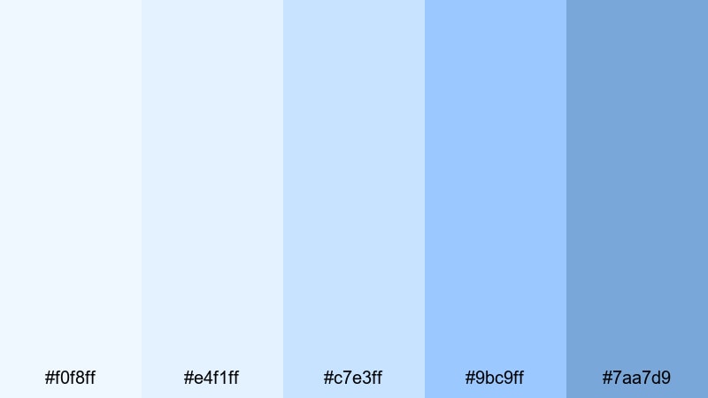
- HEX Codes: #f0f8ff, #e4f1ff, #c7e3ff, #9bc9ff, #7aa7d9
- Mood: Dreamy and weightless, evoking drifting clouds and quiet afternoons.
- Use for: Use for calm travel vlogs, slow living content, and channel backgrounds that should feel airy and relaxed.
Cloud Drift Daydream stacks several airy blues around Alice Blue to mimic layers of soft clouds. The gradient from very light to mid blue gives your graphics a sense of depth without using harsh contrast.
Use this palette in travel and slow living edits where you want the viewer to relax. It works well in gradient backgrounds, animated lower thirds, and end screens. On thumbnails, try using the darker blue (#7aa7d9) for short text while letting the pale tones fill the frame like sky.
Porcelain Studio Glow
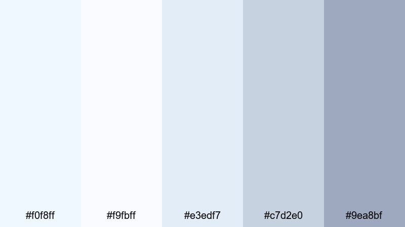
- HEX Codes: #f0f8ff, #f9fbff, #e3edf7, #c7d2e0, #9ea8bf
- Mood: Delicate, polished, and slightly artistic, like a sunlit porcelain studio.
- Use for: Use for design breakdowns, craft tutorials, and aesthetic studio tours that need a refined, soft backdrop.
Porcelain Studio Glow combines Alice Blue with misty whites and soft gray blues, evoking a gallery or ceramic studio lit by indirect daylight. It feels refined but not cold, which is ideal for creative channels that want to look professional without losing warmth.
Use the lightest tones for background panels and overlay cards, and reserve the deeper gray blue (#9ea8bf) for headings and icons. This palette suits design explainers, product shots, and tutorial screens where legibility and elegance are both important.
Powder Sky Workspace

- HEX Codes: #f0f8ff, #e8f2ff, #d0e0ff, #a6bfe6, #7f99c2
- Mood: Focused and tranquil, like a tidy desk under a pale morning sky.
- Use for: Use for productivity dashboards, study with me videos, and clean UI inspired lower thirds.
Powder Sky Workspace leans into cool blues that feel structured and calm, with Alice Blue softening the overall impression. It suggests clarity and focus, which fits productivity and study content perfectly.
Apply the lighter colors to background blocks and overlays, and use the darker blues (#a6bfe6 and #7f99c2) for key text, charts, and call to action buttons. This palette translates well into dashboard styled motion graphics and chapter markers inside Filmora.
Modern Minimal Alice Blue Color Palettes
Nordic App Interface
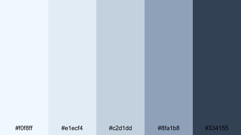
- HEX Codes: #f0f8ff, #e1ecf4, #c2d1dd, #8fa1b8, #334155
- Mood: Cool, organized, and understated with a Scandinavian inspired minimal feel.
- Use for: Use for tech explainer videos, SaaS product demos, and modern UI overlays.
Nordic App Interface pairs Alice Blue with misty grays and a deep slate accent, giving your visuals a clean, product ready look. It feels like a modern app dashboard translated into video.
Use Alice Blue and the light grays as backgrounds for screen mockups and feature callouts, while the dark slate (#334155) grounds navigation bars, subtitles, or key numbers. This palette keeps your tech content approachable and premium without flashy colors.
Clean Tech Dashboard
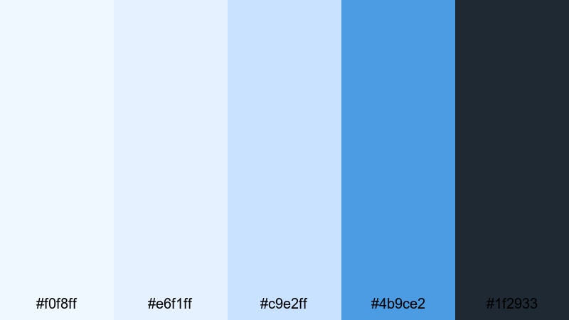
- HEX Codes: #f0f8ff, #e6f1ff, #c9e2ff, #4b9ce2, #1f2933
- Mood: Energetic yet controlled, evoking crisp dashboards and smart devices.
- Use for: Use for analytics videos, crypto or finance dashboards, and futuristic motion graphics.
Clean Tech Dashboard keeps the base light and airy with Alice Blue, then injects energy via a bright accent blue (#4b9ce2) and deep charcoal. It feels analytical but not intimidating, ideal for data heavy content.
Let the light tones carry charts, tables, and overlays, and reserve the saturated blue for highlights like growth numbers or important metrics. The charcoal (#1f2933) provides strong contrast for headings and small text in YouTube thumbnails or chapter labels.
Frosted Glass UI

- HEX Codes: #f0f8ff, #e5f0fb, #cad7f5, #a3b9e8, #566187
- Mood: Softly futuristic and slightly luxurious, like frosted glass panels and blur effects.
- Use for: Use for app promo videos, portfolio websites, and layered UI graphic packs.
Frosted Glass UI layers pale and mid blues around Alice Blue to mimic blurred glass and depth of field. The muted navy (#566187) keeps everything grounded so the palette still reads as modern and professional.
Combine these colors with Filmora's blur and glow effects to build glassmorphism style panels for text and callouts. This works especially well for UI promos, SaaS explainers, and portfolio reels where you want a high tech, premium aesthetic.
Coastal Startup Branding
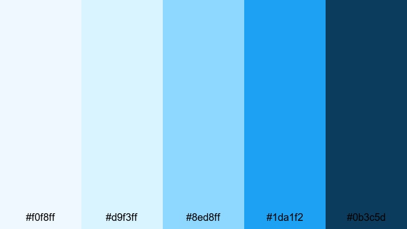
- HEX Codes: #f0f8ff, #d9f3ff, #8ed8ff, #1da1f2, #0b3c5d
- Mood: Fresh, optimistic, and coastal, with a techy ocean side energy.
- Use for: Use for startup brand stories, podcast cover art, and bold yet clean thumbnails.
Coastal Startup Branding is built around Alice Blue and bright ocean blues, backed by a strong navy (#0b3c5d). It feels like a tech team working from a seaside co working space: optimistic, energetic, and modern.
Use the brighter blues (#8ed8ff and #1da1f2) for logo accents, buttons, and bold titles, while Alice Blue and #d9f3ff soften the backgrounds. This mix is great for pitch videos, podcast branding, and social banners where you want energy without neon.
Romantic Pastel Alice Blue Color Palettes
Blush Horizon Whisper
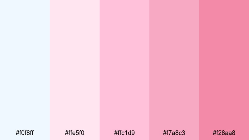
- HEX Codes: #f0f8ff, #ffe5f0, #ffc1d9, #f7a8c3, #f28aa8
- Mood: Soft, romantic, and emotional, like a pastel sunrise with hints of blush.
- Use for: Use for couple vlogs, engagement highlight reels, and dreamy lifestyle content.
Blush Horizon Whisper blends Alice Blue with soft pinks and rosy tones, creating a gentle sunrise effect. The blues keep the palette fresh, while the blush shades add warmth and emotion.
Use Alice Blue as your canvas for titles and overlays, and frame your romantic footage with the pinks in borders, shapes, and accent text. This palette is perfect for engagement teasers, anniversary edits, and heartfelt lifestyle thumbnails.
Seaside Wedding Suite

- HEX Codes: #f0f8ff, #fdf6f0, #ffe2e0, #f5c8d0, #b4cfe9
- Mood: Elegant, light, and sentimental, inspired by coastal wedding stationery.
- Use for: Use for wedding films, save the date motion graphics, and soft title cards.
Seaside Wedding Suite feels like fine wedding stationery translated into pixels. Alice Blue and seashell pinks are soft and upscale, while the muted blue (#b4cfe9) balances the warmth.
Use the warm neutrals (#fdf6f0 and #ffe2e0) behind names and dates, then accent them with Alice Blue frames and flourishes. This palette suits wedding highlight videos, invitation animations, and elegant channel branding for event filmmakers.
Soft Storybook Frames
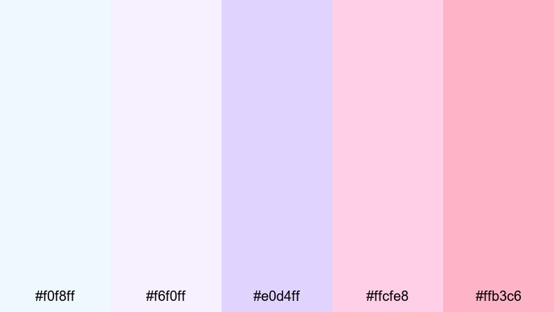
- HEX Codes: #f0f8ff, #f6f0ff, #e0d4ff, #ffcfe8, #ffb3c6
- Mood: Whimsical and nostalgic, like illustrations from a pastel storybook.
- Use for: Use for family vlogs, baby announcement videos, and cozy narrative edits.
Soft Storybook Frames mixes Alice Blue with lilacs and cotton pinks for a whimsical, child friendly feel. It suggests pages from an illustrated storybook and works beautifully for family focused channels.
Use the purples for decorative elements and section dividers, and let Alice Blue and the lightest shades frame your footage in rounded panels or Polaroid style borders. Titles and captions in this palette instantly feel gentle and welcoming.
Cotton Candy Skies
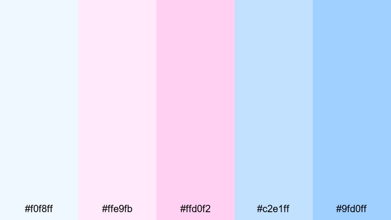
- HEX Codes: #f0f8ff, #ffe9fb, #ffd0f2, #c2e1ff, #9fd0ff
- Mood: Playful, sugary, and optimistic, like carnival sunsets and cotton candy clouds.
- Use for: Use for lifestyle vlogs, K pop inspired edits, and playful short form content.
Cotton Candy Skies is a bright, sugary mix of pastel pinks and sky blues orbiting around Alice Blue. It gives your content a fun, youthful vibe that works well for fashion, music, or daily vlogs.
Use the pinks for playful shapes, stickers, and emojis in your edits, and rely on the blues to balance everything so it does not become too sweet. This palette is especially strong for vertical shorts and reels where vibrant color quickly grabs attention.
Cinematic Night Sky Alice Blue Color Palettes
Moonlit Harbor Scene
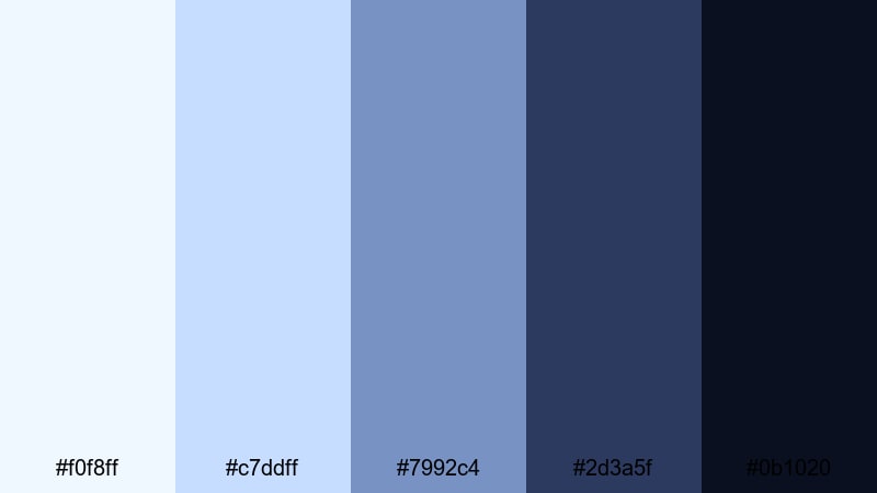
- HEX Codes: #f0f8ff, #c7ddff, #7992c4, #2d3a5f, #0b1020
- Mood: Quiet and cinematic, balancing moonlit softness with deep harbor shadows.
- Use for: Use for travel montages, reflective night sequences, and moody B roll.
Moonlit Harbor Scene places soft Alice Blue highlights against layered navies and deep shadow tones. It feels like reflections on water at night, calm but slightly mysterious.
Use the darkest colors (#2d3a5f and #0b1020) in your backgrounds, frames, or letterboxing, and keep the light blues reserved for titles, outlines, and subtle glows. This palette is excellent for travel montages and reflective scenes where you want mood without losing detail.
Neon Mist Cyberpunk
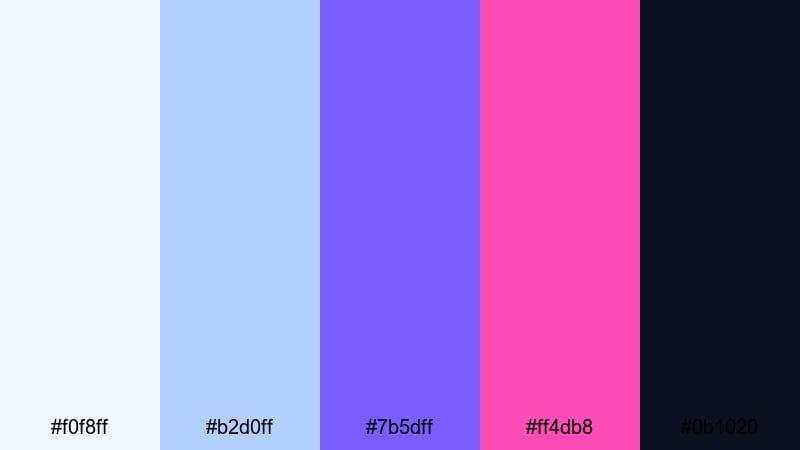
- HEX Codes: #f0f8ff, #b2d0ff, #7b5dff, #ff4db8, #0b1020
- Mood: Edgy, futuristic, and electric, with misty highlights cutting through neon nights.
- Use for: Use for gaming intros, cyberpunk edits, and high energy trailer graphics.
Neon Mist Cyberpunk contrasts cool Alice Blue haze with striking violet (#7b5dff) and magenta (#ff4db8) over near black. The result is a neon city atmosphere that still leaves room for legible text and UI elements.
Use Alice Blue and #b2d0ff for light beams, HUD elements, and misty overlays, and drop the neons into key accents like logo reveals or glitch transitions. This palette suits gaming channels, tech trailers, and any edit that leans into futuristic cityscapes.
Midnight Trailer Titles
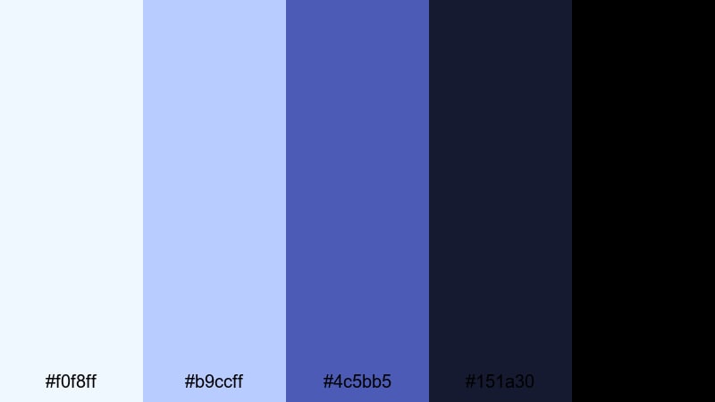
- HEX Codes: #f0f8ff, #b9ccff, #4c5bb5, #151a30, #000000
- Mood: Dramatic and focused, like minimalist movie titles over a midnight sky.
- Use for: Use for cinematic channel intros, thriller style trailers, and bold title cards.
Midnight Trailer Titles uses Alice Blue as a sharp highlight against midnight blues and full black. The palette is simple but powerful, making it perfect for bold title sequences and cinematic intros.
Place your titles in Alice Blue or #b9ccff over the darkest tones (#151a30 and black) to get that strong theatrical contrast. Add small accents with #4c5bb5 for logos or supporting text to keep the palette cohesive across thumbnails, end screens, and main trailers.
Tips for Creating Alice Blue Color Palettes
Alice Blue is flexible enough to feel airy, romantic, or cinematic depending on how you combine it with other colors. Use these tips to build palettes that look great on screen and stay consistent in Filmora.
- Pair Alice Blue with one dark anchor color (navy, charcoal, or black) so text and UI elements remain readable on thumbnails and titles.
- Limit yourself to 3 to 5 active colors in any one frame to avoid visual noise; keep the rest of the palette for subtle accents.
- Use warmer accent tones (pinks, peaches) when you want emotional or romantic storytelling, and cooler accents (slates, teals) for tech or productivity content.
- Check contrast at small sizes by zooming out or previewing your thumbnail in Filmora's export window to ensure Alice Blue backgrounds do not wash out text.
- Match your color palette to your footage by adjusting white balance first, then nudging blues and cyans to line up with your chosen HEX values.
- Save title and lower third presets in Filmora using your Alice Blue palette so every new project automatically follows your brand colors.
- Use gradients from Alice Blue into slightly darker blues for smooth sky or glass effects instead of flat, single color blocks.
- Test how your palette looks in both light mode and dark mode layouts if you repurpose these colors for websites or UI designs.
Alice Blue is more than just a pale blue; it is a mood. Whether you lean into soft daylight, romantic pastels, or dramatic night scenes, these palettes give you a starting point to shape how your channel, brand, or project feels.
Try dropping a few of these HEX codes into your Filmora titles, overlays, and color grading to see which combinations match your style. Once you find a palette that fits, save it as presets and reuse it across intros, B roll sequences, shorts, and social posts to build a strong visual identity.
With Filmora's color tools, filters, and AI features, it is easy to keep your Alice Blue aesthetic consistent while still experimenting and evolving over time.
secure downloadNext: Fern Green Color Palette
