
 100% Security Verified | No Subscription Required | No Malware


 ChatGPT
 Perplexity
 Gemini
 Claude
 Grok
Grok
Baroque color is all about drama, depth, and ornament. Think of candlelit gold, dark plum, wine red, velvety browns, and inky blues layered together like a painting in an old European gallery. These tones instantly suggest luxury, history, and emotion, echoing the lavish aesthetics found in the Baroque design style. This makes them perfect for cinematic video, ornate branding, and standout YouTube thumbnails that feel rich rather than flat or minimal.
This guide gathers Baroque color palettes with ready-to-use HEX codes, so creators and Filmora users can style titles, intros, lower thirds, and thumbnails with confidence. Whether you want a romantic wedding reel, a dark historical docuseries, or a modern gilded aesthetic for your channel, you can copy these HEX codes straight into your designs and color grading workflow.
In this article
Luxurious Baroque Color Palettes
Gilded Opera House

- HEX Codes: #3b1f2b, #7b3f61, #d9a441, #f3e3c3, #261417
- Mood: Opulent, theatrical, and richly nostalgic.
- Use for: Use for dramatic title cards, historical documentary intros, and luxury brand reveals in your videos.
Gilded Opera House layers deep plum and rose tones with antique gold and parchment cream, echoing velvet seats, carved balconies, and stage lights caught on gilt ornament. The contrast between the dark wine shades and the warm gold (#d9a441) instantly reads as premium and old-world luxurious.
Use this palette for opening title cards, logo stings, or animated frames that need a grand, cinematic entrance. In Filmora, you can color your text, lower thirds, and motion graphics with the purples and roses, then reserve the gold and cream for accents and highlights. It also works beautifully for YouTube thumbnails promoting historical content, luxury travel vlogs, or any video where you want viewers to feel they are entering an ornate opera house.
Pro Tip: Build A Gilded Baroque Look In Filmora
To keep this gilded Baroque palette consistent, start by defining roles for each color: use the darkest plum and near-black for backgrounds, the rose and mid-tones for text blocks or shapes, and the gold for key accents like frames, dividers, or call-to-action buttons. In Filmora, you can save these HEX values into custom color presets and reuse them across titles, subtitles, and graphic elements throughout your timeline.
When you are editing a full project, apply the same color logic to your B-roll overlays and transitions. For example, tint subtle light leaks toward the rose tone, use gold for glow effects behind text, and keep shadows closer to the deep plum. This way your intros, chapter cards, and social cuts will all feel like they belong to the same Baroque visual universe.
AI Color Palette
If you have a reference image of an opera house, museum interior, or branding mood board in these colors, Filmora's AI Color Palette feature can analyze it and apply a similar tone across your clips. This is a fast way to make raw footage feel cohesive and cinematic without spending hours dialing in individual shots.
Simply import your reference image, use it as a source for the AI Color Palette, and let Filmora match your entire sequence to that rich, gilded Baroque mood. You can then fine-tune the intensity so your skin tones stay natural while your shadows and highlights carry the opera house atmosphere from intro to end screen.
 secure download

HSL, Color Wheels & Curves
Once the overall look is in place, use Filmora's HSL sliders, color wheels, and curves to polish the Baroque tones. You can push reds toward wine and magenta for a more theatrical feel, deepen blues and shadows for extra contrast, and lift highlights just enough to make the gold accents shimmer without blowing out details. A dedicated Filmora color grading tutorial can help you see how subtle changes in curves and wheels dramatically affect mood.
For a classic chiaroscuro style, darken the shadow curve and gently raise midtones so faces remain visible against deep backgrounds. Use the color wheels to add a warm tint to highlights and a cooler touch to shadows, which keeps your Baroque golds rich while your plums stay moody and refined.
secure download1000+ Video Filters & 3D LUTs
If you want an instant Baroque mood without deep manual grading, Filmora's video filters and 3D LUTs make it easy to experiment. Choose warm, cinematic filters that boost contrast, saturate reds and golds, and gently fade the blacks for a slightly vintage feel. Then adjust opacity so your palette still matches the Gilded Opera House HEX values.
You can stack filters with LUTs to push your footage toward a specific narrative: warmer, more romantic for performances and love stories, or slightly cooler and darker for backstage or rehearsal content. Save your favorite combinations as presets, so every new video on your channel keeps the same luxurious Baroque identity.
secure downloadVelvet Gallery Nights
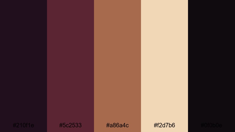
- HEX Codes: #210f1e, #5c2533, #a86a4c, #f2d7b6, #0f0b0e
- Mood: Moody, intimate, and gallery-chic.
- Use for: Perfect for cinematic B-roll sequences, art channel branding, and moody vlog thumbnails.
Velvet Gallery Nights feels like wandering through a private exhibition after hours. Dark wine and maroon tones wrap the frame in softness, while the coppery brown (#a86a4c) and creamy highlight (#f2d7b6) recreate candlelight glinting off frames and polished floors.
Use the darkest shades for backgrounds, title bars, or thumbnail borders, then let the copper and cream pick out subject details, brush strokes, or product shots. This palette suits art channels, studio vlogs, gallery recaps, and any content that wants a curated, cultural mood instead of flat white backgrounds.
Royal Chamber Gold
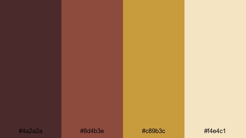
- HEX Codes: #4a2a2a, #8d4b3e, #c89b3c, #f4e4c1
- Mood: Regal, warm, and welcoming.
- Use for: Use for logo animations, lower thirds, and opening credits on luxury, travel, or lifestyle content.
Royal Chamber Gold mixes earthy reds and bronzes with a soft, royal gold centerpiece. The warm cream (#f4e4c1) adds approachability, preventing the palette from feeling too stiff or formal. It is the visual equivalent of a grand room that still feels inviting.
Apply the bronze and red browns to backgrounds and frames, use the gold for logos or key icons, and reserve the cream for text and key information. This palette is excellent for luxury hotel tours, premium product videos, lifestyle vlogs, and channel branding where you want regal energy without cold minimalism.
Antique Gilded Frame
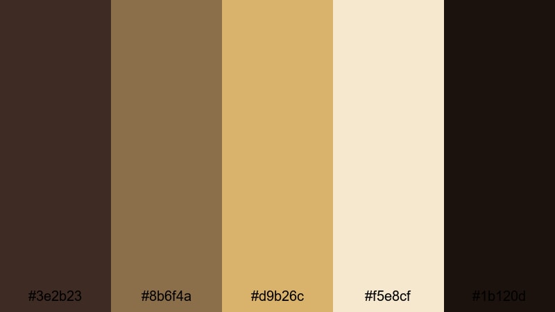
- HEX Codes: #3e2b23, #8b6f4a, #d9b26c, #f5e8cf, #1b120d
- Mood: Vintage, ornate, and gallery-inspired.
- Use for: Great for frame-style overlays, end screens, and chapter cards that reference classic art or history.
Antique Gilded Frame is built around walnut browns, tarnished gold, and ivory, mimicking the patina of old mirror frames and museum moldings. The near-black (#1b120d) anchors your design with depth, while #d9b26c and #f5e8cf provide a buttery, aged glow.
Use this scheme to create picture-frame overlays for reaction videos, art analysis, museum walks, or educational history content. In thumbnails, a dark brown or black border makes the central still feel like a painting, while gold details highlight titles, episode numbers, or playlists.
Romantic Baroque Color Palettes
Rose Petal Masquerade
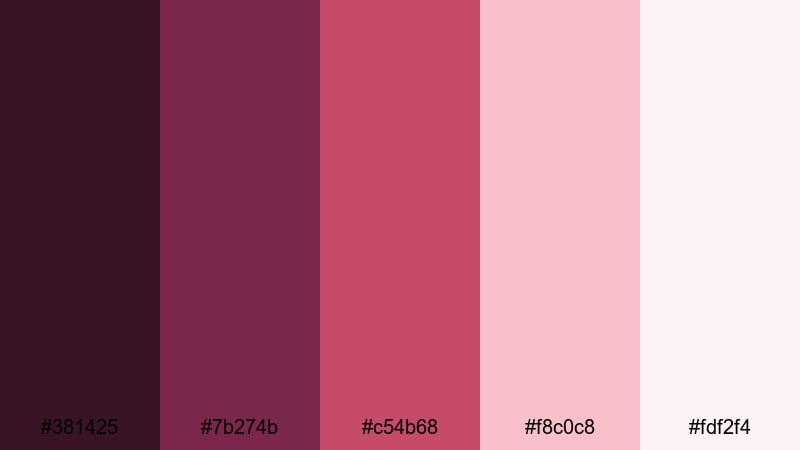
- HEX Codes: #381425, #7b274b, #c54b68, #f8c0c8, #fdf2f4
- Mood: Passionate, romantic, and slightly mysterious.
- Use for: Use for wedding highlight reels, romantic travel vlogs, and dreamy teaser trailers.
Rose Petal Masquerade blends berry reds and magenta tones with soft blush and petal pinks. The deep wine base (#381425) adds mystery, while the lighter pinks (#f8c0c8, #fdf2f4) keep everything delicate and dreamy, like a masked ball lit by chandeliers.
It is a natural fit for wedding videos, proposal stories, honeymoon travel vlogs, and romantic cinematic edits. Frame your titles in the darker shades, set subtitles or captions in the pale pinks for readability, and use the vivid rose (#c54b68) on key graphics or call-to-action buttons in thumbnails.
Candlelit Sonata
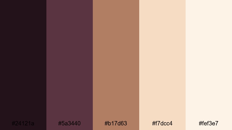
- HEX Codes: #24121a, #5a3440, #b17d63, #f7dcc4, #fef3e7
- Mood: Soft, nostalgic, and candle-warm.
- Use for: Ideal for piano covers, acoustic sessions, and reflective storytelling videos.
Candlelit Sonata pairs smoky plums and chocolate tones with caramel and peachy candlelight colors. The result is gentle, nostalgic, and perfect for quiet stories or slow, expressive performances.
Use the darker tones behind your footage or titles to frame the scene, and let the warm peaches dance in your highlights, overlays, or animated light leaks. This palette works especially well in Filmora when you want piano covers, acoustic sessions, journaling vlogs, or essays to feel intimate and inviting.
Powdered Court Rouge

- HEX Codes: #4a2730, #9a3858, #e27a7f, #f3c5b8, #f9ece1
- Mood: Playful, elegant, and fashion-forward.
- Use for: Perfect for fashion lookbooks, GRWM videos, and beauty channel branding.
Powdered Court Rouge borrows from historic court makeup: rouge reds, soft peach, and powdered skin tones. The combination feels flirty and elegant at the same time, with enough saturation in #9a3858 and #e27a7f to make thumbnails and titles stand out in feeds.
Apply the strongest reds to lipstick graphics, outfit callouts, or key icons in fashion and beauty videos. Use the lighter peaches and creams for background blocks, social handles, or chapter cards so on-screen text remains legible while still fitting the romantic, Baroque-inspired aesthetic.
Blush Silk Tapestry
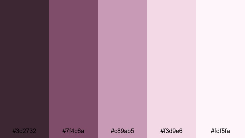
- HEX Codes: #3d2732, #7f4c6a, #c89ab5, #f3d9e6, #fdf5fa
- Mood: Delicate, feminine, and softly luxurious.
- Use for: Use for lifestyle vlogs, stationery mockups, and dreamy intro animations.
Blush Silk Tapestry weaves muted mauves, dusty rose, and silky blush into a calm, elegant scheme. The deeper mauve (#7f4c6a) prevents the palette from feeling washed out, while the upper tones (#f3d9e6, #fdf5fa) add an airy, fabric-like softness.
This palette is great for lifestyle and journaling channels, stationery or digital planner mockups, and gentle intro animations. Base layers, borders, and drop shadows can use the darker mauves, while text and icons sit on the lightest tones for a clean, legible, yet romantic look.
Dark Dramatic Baroque Color Palettes
Midnight Cathedral Vaults

- HEX Codes: #050712, #122032, #2e4c5e, #8b9fb3, #c5d0dd
- Mood: Mysterious, solemn, and architecturally grand.
- Use for: Great for true crime intros, historical mysteries, and cinematic travel walkthroughs.
Midnight Cathedral Vaults layers inky blues and stone grays, evoking towering arches, stained glass shadows, and cold marble floors. The near-black navy (#050712) delivers depth, while the soft grays (#8b9fb3, #c5d0dd) suggest diffused light from high windows.
Use this palette in true crime openings, dark historical explainers, or moody city and cathedral tours. Dark blues are ideal for full-frame backgrounds and overlay bars, while mid-grays carry text, icons, and maps. When used in Filmora with subtle vignettes and low-key lighting effects, this scheme immediately gives your footage more gravity and structure.
Crimson Velvet Stage
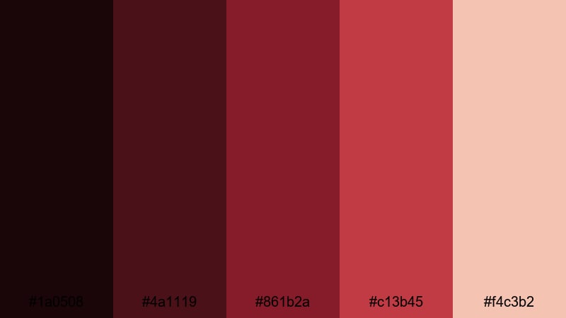
- HEX Codes: #1a0508, #4a1119, #861b2a, #c13b45, #f4c3b2
- Mood: Intense, theatrical, and performance-ready.
- Use for: Perfect for performance reels, cinematic trailers, and bold YouTube thumbnails.
Crimson Velvet Stage is all about saturated red curtains, stage lights, and the tension before a performance. Deep crimson and wine reds sit against a warm spotlight peach (#f4c3b2), giving you strong focal points amid dark surroundings.
Use this palette to highlight performers, emphasize action titles, or advertise shows and premieres. Let the darkest shades take over backgrounds, use #861b2a and #c13b45 for large text and shapes, and reserve the peach for facial highlights, date and time info, or subscribe prompts in your thumbnails.
Emerald Sanctuary Shadows
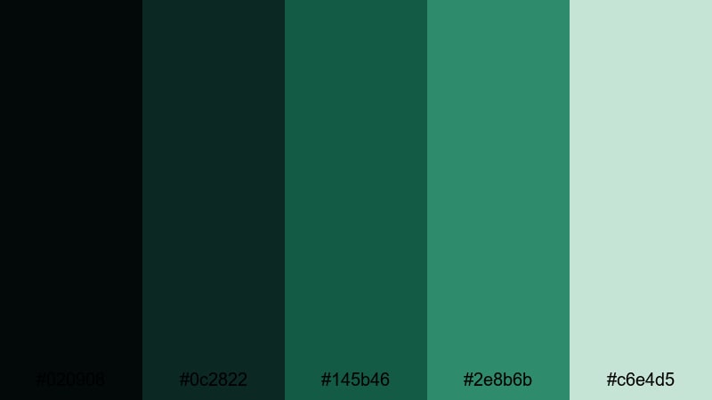
- HEX Codes: #020908, #0c2822, #145b46, #2e8b6b, #c6e4d5
- Mood: Serene yet enigmatic, with a sacred stillness.
- Use for: Use for nature documentaries, meditative edits, and moody fantasy content.
Emerald Sanctuary Shadows climbs from nearly black green to misty jade, echoing hidden cloisters, moss-covered stone, and dappled garden light. The deep base colors create a quiet, sacred feeling, while #2e8b6b and #c6e4d5 bring in fresher, breathable highlights.
For nature and fantasy edits, use the darker greens as your foundational tone throughout the grade. Introduce the lighter hues in titles, lower thirds, map graphics, or magical effects. In thumbnails, a dark green frame combined with pale jade text can hint at mystery without sliding into pure horror.
Obsidian Gold Overture
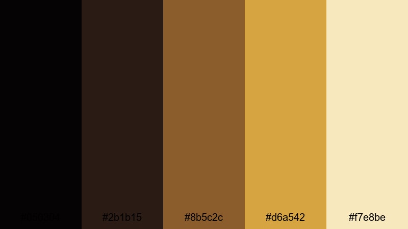
- HEX Codes: #050304, #2b1b15, #8b5c2c, #d6a542, #f7e8be
- Mood: Bold, high-contrast, and powerfully cinematic.
- Use for: Ideal for logo stings, esports intros with a luxe twist, and impactful trailer titles.
Obsidian Gold Overture pairs near-black tones with glowing, molten golds to create a strong chiaroscuro effect. It instantly makes logos, titles, and symbols feel important, like the opening overture of a big-budget production.
Use #050304 and #2b1b15 as your dominant background and shadow colors, then deploy #d6a542 and #f7e8be as sharp highlights on text, icons, borders, and flares. This palette is ideal for powerful channel idents, gamer intros with a luxury twist, and short trailers where you want viewers to feel the weight and prestige of your brand.
Modern Baroque Color Palettes
Minimal Gilded Loft
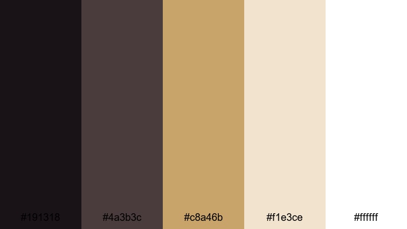
- HEX Codes: #191318, #4a3b3c, #c8a46b, #f1e3ce, #ffffff
- Mood: Clean, upscale, and editorial.
- Use for: Use for productivity channels, design breakdowns, and modern lifestyle branding.
Minimal Gilded Loft blends charcoal neutrals and bright white with a single, refined gold accent. It is Baroque richness translated into a contemporary, minimalist setting: think white walls, black steel, and a few standout brass details.
This palette is ideal if you want your content to look clean and professional but still a little ornate. Use white and cream as your main backgrounds, lean on deep neutrals for typography and navigation elements, and apply the gold (#c8a46b) sparingly on logos, icons, or important text so your viewers always know where to look first.
Neo Baroque Title Card
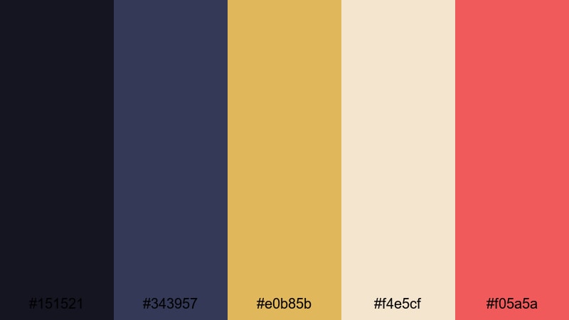
- HEX Codes: #151521, #343957, #e0b85b, #f4e5cf, #f05a5a
- Mood: Trendy, bold, and motion-graphic ready.
- Use for: Perfect for YouTube intros, animated lower thirds, and dynamic channel rebrands.
Neo Baroque Title Card sets cool midnight blues against a modern gold and a punchy coral red (#f05a5a). The palette is energetic but still grounded in classic contrast, making it a strong choice for motion graphics and animated titles.
Place your titles over the darker blue gradients for drama, outline or accent them with gold, and deploy the coral as a pop color for subscribe buttons, on-screen prompts, and callouts. It is particularly effective for tech, design, or commentary channels that want a stylish look without losing readability on smaller mobile screens.
Streaming Vintage Drama
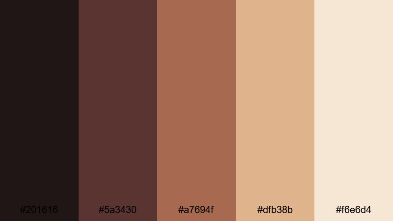
- HEX Codes: #201616, #5a3430, #a7694f, #dfb38b, #f6e6d4
- Mood: Cinematic, nostalgic, and binge-worthy.
- Use for: Great for series branding, episode thumbnails, and long-form storytelling on streaming-style channels.
Streaming Vintage Drama mixes smoky browns, caramel midtones, and soft cream to feel like a modern period drama thumbnail. The palette feels cinematic and cohesive, perfect for episodic content that you want viewers to binge.
Use the darker browns as a base for your series titles and season labels, the caramel for character name cards or location tags, and the light creams for readable text overlays. Across your channel, this palette can unify intro sequences, thumbnails, and end screens so each new upload clearly belongs to the same world and story arc.
Tips for Creating Baroque Color Palettes
Baroque color palettes shine when you balance depth, contrast, and warmth while keeping text clear and branding consistent. Here are practical ways to combine Baroque tones with other colors for video and design.
- Start With A Dark Base: Choose one deep shade (navy, plum, espresso, or forest green) as your main background so lighter accents and gold details have something to glow against.
- Limit Your Gold: Treat gold as a highlight, not a base color. Use it on logos, key icons, and short lines of text rather than filling entire frames; this keeps the palette rich, not gaudy.
- Protect Readability: Always check text contrast on mobile. Light text on dark backgrounds or dark text on light creams usually works best; avoid mid-tones for long paragraphs or small captions.
- Use One Strong Accent: In addition to gold, pick one saturated accent (crimson, emerald, or coral) for calls to action, subscribe buttons, or important labels so viewers know where to focus.
- Match Grade To Graphics: When color grading in Filmora, nudge your footage shadows and highlights toward the same hues you use in titles and overlays, so everything looks like part of a single design system.
- Stay Consistent Across Episodes: Reuse the same 4 or 5 HEX codes for titles, lower thirds, and end screens across a series or entire channel. Consistency makes your videos more recognizable in feeds.
- Test On Different Screens: Export a short sample and check it on phones, laptops, and TVs; adjust brightness and saturation if blacks crush too much detail or golds look overly neon.
- Balance Old And New: If your Baroque palette feels too heavy, introduce one clean neutral like white or soft gray to open up space around your ornate elements and modernize the look.
Baroque color palettes can turn simple footage into something that feels curated, cinematic, and brand-ready. Deep shadows, glowing golds, and rich reds or greens do a lot of the storytelling before a single word appears on screen, shaping how viewers feel about your channel, your series, or your brand.
Use the HEX codes in this guide as starting points, then refine them in Filmora to match your footage and niche. Whether you are building moody thumbnails, romantic wedding reels, or modern gilded intros, a consistent Baroque palette will make your projects feel more intentional and memorable.
Open a new project in Filmora, drop in your favorite palette from this list, and start experimenting with AI Color Palette, color grading tools, and filters until your videos carry the exact mood you want.
secure downloadNext: Brick Red Color Palette
