Brick red sits between classic red and earthy brown, bringing warmth, strength, and a grounded feeling into any visual. It suggests passion without screaming for attention, and it feels handcrafted, nostalgic, and cinematic at the same time. In video and branding, brick red is often used to signal trust, depth, and a touch of drama, whether you are designing a logo, a channel banner, or a moody film intro.
For editors and creators using Filmora, brick red is a powerful anchor color for thumbnails, intros, lower thirds, and color grading across vlogs, documentaries, and product videos. Below you will find 15 ready made brick red color palettes with HEX codes, so you can quickly build cohesive looks for your edits, social content, and brand style.
In this article
Warm Rustic Brick Red Palettes
Terracotta Loft Glow

- HEX Codes: #8c2f2a, #c45a3b, #f2b179, #f7e1c6, #3b2620
- Mood: Cozy, earthy, and intimate with a soft cinematic warmth.
- Use for: Great for travel vlogs, recipe videos, and interior B-roll where you want a handcrafted, artisanal feel.
Terracotta Loft Glow layers deep brick red with sunlit terracotta and creamy highlights, like golden hour pouring into a studio apartment. The darker brown anchors the palette, while the peach and sand tones soften everything, so your visuals feel handmade, authentic, and welcoming.
This palette works beautifully for lifestyle channels, food content, and organic product brands. Use the brick red for titles, buttons, and logo accents; the warm mid tones for backgrounds and overlays; and the light creams for text and UI in thumbnails and intros. In Filmora, you can also grade your footage slightly warmer to echo this palette across B-roll shots, talking head segments, and end cards.
Pro Tip: Build Warm Brick Red Stories In Filmora
When you base a video on a palette like Terracotta Loft Glow, keep brick red as your hero color and let the softer terracotta and cream tones support it. In Filmora, you can use matching title presets, lower thirds, and overlays tinted to your HEX codes to carry that cozy mood from the opener to the outro.
Try picking one main brick tone for call to action elements, then use the lighter beige and peach as background solids behind text. This keeps your brand consistent across thumbnails, intros, chapter cards, and social cutdowns without feeling visually heavy.
AI Color Palette
If you have a still frame, moodboard, or color card built around Terracotta Loft Glow, you can turn it into a full video look with almost no manual tweaking. Filmora's AI Color Palette feature analyzes your reference colors and transfers that warm brick red balance to every clip in your timeline.
Import your reference image, apply the AI Color Palette to your sequence, and Filmora will harmonize skin tones, shadows, and highlights so they sit comfortably inside this brick red scheme. It is an easy way to match A-roll, B-roll, and overlay footage while preserving a handcrafted, cinematic warmth.
HSL, Color Wheels & Curves
To fine tune your brick red look, use Filmora's HSL, color wheels, and curves controls. You can nudge reds and oranges toward a softer terracotta for lifestyle content, or deepen them for a more cinematic result, while keeping skin tones natural. Gentle S-curves add contrast that makes brick walls, wood textures, and textiles pop without crushing the warm highlights.
For a deeper dive into color grading, Filmora's color correction tools let you selectively adjust shadows and midtones so your brick reds stay rich but do not overpower the frame. Balance them against creamy highlights and dark browns to maintain that intimate, loft like atmosphere across your entire edit.
1000+ Video Filters & 3D LUTs
If you want a fast way to stylize brick red footage, Filmora's video filters and 3D LUTs make it easy to lock in a mood. Apply a warm cinematic LUT to push reds and oranges into a terracotta range, then stack subtle film grain or vignette filters for a rustic, intimate finish.
You can save your favorite combination as a preset so every new project using brick red, from travel diaries to recipe shorts, feels on brand. Adjust filter intensity per clip to keep faces natural while your locations and details lean into that rich, handcrafted color story.
Heritage Brick Courtyard

- HEX Codes: #7a2624, #b34735, #d6a56b, #f2e2c4, #374047
- Mood: Nostalgic and grounded, with a timeless vintage charm.
- Use for: Ideal for documentary intros, historical pieces, and brand stories that need a sense of legacy and authenticity.
Heritage Brick Courtyard feels like sun on old bricks, faded signage, and worn stone. The deep brick reds pair with warm ochre and cream, while the muted blue gray adds a subtle urban edge, giving your visuals an instant sense of history and craft.
Use the rich reds for logo marks, title bars, and lower thirds, while the beige and cream help text stay clean and readable in thumbnails and end screens. In Filmora, this palette suits documentaries, heritage brands, and craft stories where you want viewers to feel the weight of time in every frame.
Autumn Clay Market

- HEX Codes: #9b3329, #e07a5f, #f2cc8f, #264653, #faf3dd
- Mood: Lively and bustling with warm, seasonal energy.
- Use for: Use in travel guides, food reels, and market montages to highlight spices, textiles, and autumn street scenes.
Autumn Clay Market mixes brick red and clay orange with a deep teal accent and soft cream, giving you the feeling of a busy bazaar filled with spices and textiles. The contrast between warm foreground tones and cool teal shadows creates dynamic, story rich frames.
Use the teal sparingly for callouts, icons, or timeline markers, while brick and clay drive your main titles and text boxes. This palette is ideal for travel vlogs, recipe compilations, and lifestyle reels edited in Filmora where you want viewers to almost smell the coffee and street food.
Desert Kiln Horizon

- HEX Codes: #a53a33, #d96a3b, #f4a259, #f6e2b3, #2d2a32
- Mood: Sun drenched, adventurous, and cinematic.
- Use for: Perfect for travel films, outdoor brand lookbooks, and nature B-roll that leans into warm, rugged landscapes.
Desert Kiln Horizon pushes brick red toward burnt orange, backed by pale sand and a moody charcoal. It feels like driving into a desert sunset or exploring clay kilns and canyon paths, with a strong sense of heat and adventure.
Let brick and kiln orange define your titles and frames, while the sand tones balance bright skies and skin. The dark charcoal is ideal for text and icons in thumbnails. In Filmora, this palette suits adventure montages, hiking B-roll, and outdoor brand campaigns that need a rugged yet cinematic warmth.
Bold Cinematic Brick Red Palettes
Neon Marquee Brick

- HEX Codes: #af2525, #ff4b3a, #ffd166, #1b1b3a, #05c3dd
- Mood: High energy, urban, and attention grabbing.
- Use for: Great for YouTube thumbnails, gaming intros, and music videos that need instant impact in the feed.
Neon Marquee Brick feels like a city street under glowing signage. Intense brick red and neon coral dominate the frame, while electric cyan and deep navy create a dramatic, night time contrast. The yellow highlight works as a spotlight accent that instantly draws the eye.
Use this palette when you need your video or thumbnail to pop in a crowded feed: gaming intros, beat synced edits, and performance teasers. In Filmora, combine bold red title cards with cyan outlines or glows, and place text over the navy to keep things readable even at small sizes.
Midnight Metro Brick
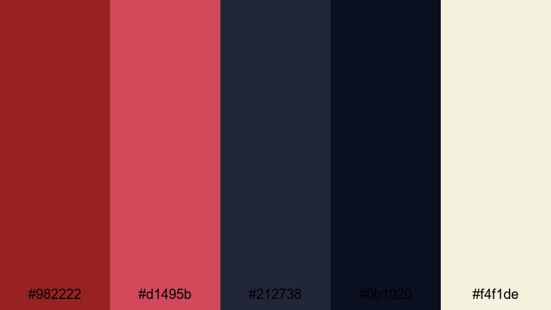
- HEX Codes: #982222, #d1495b, #212738, #0b1020, #f4f1de
- Mood: Moody, stylish, and slightly mysterious.
- Use for: Ideal for tech reviews, city night B-roll, and cinematic vlog openings with a polished edge.
Midnight Metro Brick pairs deep brick reds with inky blues and a soft off white, evoking subway platforms, alleyways, and city lights reflected on wet pavement. It feels refined and stylish, perfect for creators who want a sleek but emotional city look.
Use the dark blues for backgrounds and overlays, brick red for key titles and progress bars, and the off white for text. This palette suits Filmora edits like tech reviews, gadget showcases, and urban vlogs where you want a cinematic night city story rather than a flat, neutral grade.
Action Trailer Ember
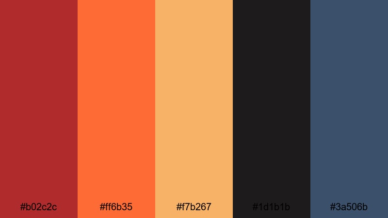
- HEX Codes: #b02c2c, #ff6b35, #f7b267, #1d1b1b, #3a506b
- Mood: Intense, dramatic, and high contrast.
- Use for: Use for trailers, product launches, and hype reels that need dynamic, adrenaline filled visuals.
Action Trailer Ember uses a fierce brick red alongside hot orange and golden highlights, anchored by near black and stormy blue. It instantly reads as cinematic and high stakes, like a blockbuster movie trailer or esports intro.
In your Filmora projects, use the darkest tones as backdrops for bold red and orange typography. Add animated light leaks or fire embers in similar hues to tie motion graphics and footage together. This palette works for product launches, countdowns, and promo edits where intensity and urgency are essential.
Streetwear Brick Pop
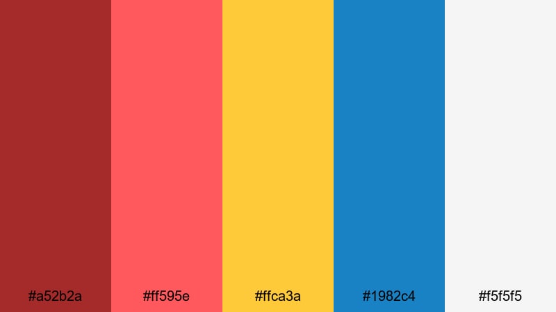
- HEX Codes: #a52b2a, #ff595e, #ffca3a, #1982c4, #f5f5f5
- Mood: Playful, youthful, and trend driven.
- Use for: Perfect for streetwear lookbooks, fashion reels, and social ads targeting a younger audience.
Streetwear Brick Pop blends a classic brick base with bubblegum red, bold yellow, and bright blue for a graphic, poster like energy. The nearly white tone keeps everything fresh and gives you clean areas for bold typography.
Choose this palette for fashion reels, outfit edits, and pop culture content. In Filmora, let brick red and hot red drive your logo and main title, use yellow and blue as accent blocks, and keep text on the lightest color for clarity. Animated shapes and split screens in these hues will instantly feel modern and social ready.
Soft Romantic Brick Red Palettes
Blush Brick Harmony

- HEX Codes: #9d2e2e, #d65a5a, #f4a6a0, #ffe0d9, #41353a
- Mood: Gentle, sentimental, and warm hearted.
- Use for: Great for wedding highlight reels, engagement stories, and romantic brand campaigns.
Blush Brick Harmony softens brick red into rosy tones and peach highlights, wrapped in creamy neutrals and a muted plum. It feels tender and emotional, like a warm hug or sunset at a celebration.
Use the deeper brick and rose for titles, names, and date overlays; keep text on the pale peach and cream for easy reading. This palette is ideal in Filmora for wedding highlights, love story montages, and soft branded content that needs warmth without harsh contrast.
Rose Brick Keepsake
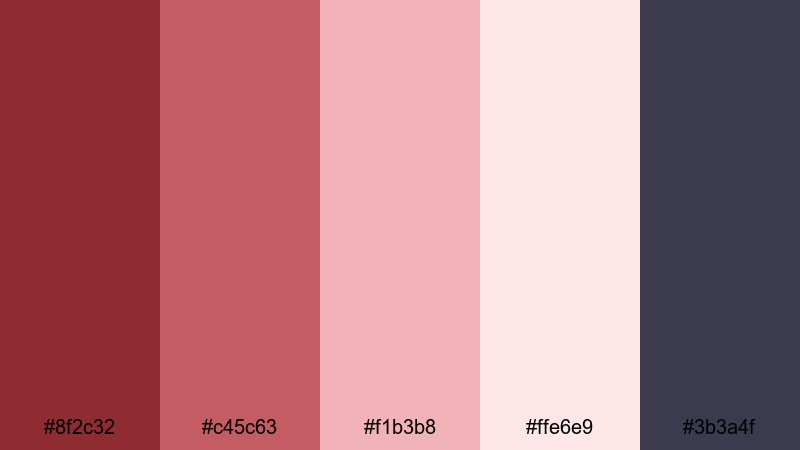
- HEX Codes: #8f2c32, #c45c63, #f1b3b8, #ffe6e9, #3b3a4f
- Mood: Delicate, nostalgic, and dreamy.
- Use for: Ideal for memory montages, photo slideshows, and brand videos that celebrate milestones.
Rose Brick Keepsake feels like an old box of prints and letters. Dusty brick and rose tones melt into pale pinks, while the muted indigo adds depth and a gentle, dreamy contrast that feels nostalgic rather than dramatic.
Use this palette for anniversary edits, childhood retrospectives, and brand milestones. In Filmora, tint photo frames and slide transitions in the lighter pinks, keep text in deep indigo or brick for contrast, and let the mid rose tones carry your key titles and badges.
Evening Candle Brick
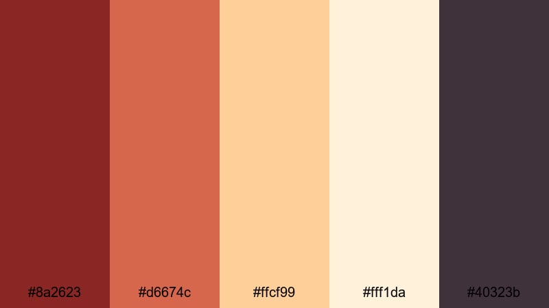
- HEX Codes: #8a2623, #d6674c, #ffcf99, #fff1da, #40323b
- Mood: Intimate, glowing, and comforting.
- Use for: Use for cozy home vlogs, lifestyle content, and product stories built around warmth and comfort.
Evening Candle Brick captures the look of warm candlelight on brick walls and wooden tables. A rich brick core is surrounded by glowing orange, caramel, and creamy ivory, with a muted plum brown adding gentle shadow.
Choose this palette for cozy home vlogs, self care content, or product stories about comfort and ritual. In Filmora, use the ivory and pale peach for text backgrounds, let the brick and warm orange shape your titles and overlays, and bring a subtle vignette in the deeper tone for that candlelit feeling.
Vintage Postcard Brick
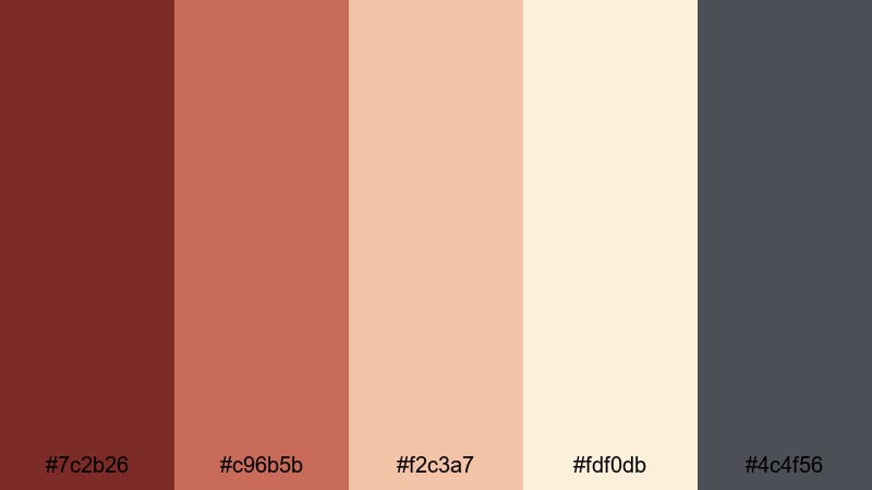
- HEX Codes: #7c2b26, #c96b5b, #f2c3a7, #fdf0db, #4c4f56
- Mood: Retro, gentle, and storybook like.
- Use for: Perfect for travel diaries, analog inspired edits, and brand stories that lean into nostalgia.
Vintage Postcard Brick blends muted brick and coral with postcard beige and a soft slate accent. It feels sun faded and gentle, like old travel cards and film prints that have softened over time.
Use this palette for travel diaries, retro inspired vlogs, and brand pieces that celebrate history. In Filmora, apply slight film grain or vignette effects while keeping text on the lighter beige tones, and use brick red for stamps, badges, map markers, and chapter titles.
Modern Minimal Brick Red Palettes
Concrete And Brick Grid
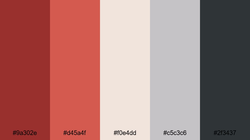
- HEX Codes: #9a302e, #d45a4f, #f0e4dd, #c5c3c6, #2f3437
- Mood: Urban, minimal, and design forward.
- Use for: Ideal for UI overlays, typography driven openers, and architectural reels.
Concrete And Brick Grid mixes refined brick reds with concrete grays and warm off white, giving you a city inspired yet minimal color system. It feels like clean architecture photography and grid based editorial design.
Use the lighter neutrals for backgrounds and panels, brick red for accent lines and key titles, and the darkest gray for text and icons. In Filmora, this palette suits app demos, architectural reels, productivity channels, and any brand that wants a modern, structured brick red identity.
Minimal Studio Brick
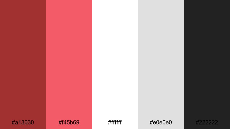
- HEX Codes: #a13030, #f45b69, #ffffff, #e0e0e0, #222222
- Mood: Crisp, contemporary, and brand ready.
- Use for: Great for logo stings, channel branding, and product explainers needing a sharp, modern identity.
Minimal Studio Brick keeps things clean and high contrast. A strong brick red and punchy accent sit alongside pure white, cool gray, and solid black, giving you a flexible palette for modern, minimal designs.
Use brick red as your primary brand color for logos and CTAs, the accent red for hovers and highlights, and black and gray for typography. In Filmora, this palette is ideal for explainer videos, SaaS intros, and channel branding where you want clarity, simplicity, and a recognizable, brick led identity.
Nordic Brick Accent
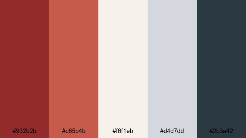
- HEX Codes: #932b2b, #c65b4b, #f6f1eb, #d4d7dd, #2b3a42
- Mood: Calm, sophisticated, and understated.
- Use for: Use for design portfolios, tech brands, and lifestyle channels that want subtle warmth in a cool, minimal frame.
Nordic Brick Accent introduces soft brick notes into a world of pale neutrals and cool blue gray. It feels like a Nordic interior with a single brick wall: calm, bright, and understated, yet warmed by a confident accent color.
Use brick red sparingly for logos, buttons, and key labels, while neutrals and blue gray handle backgrounds and large shapes. In Filmora, this palette works well for design portfolios, productivity and tech channels, and lifestyle videos where you want a clean, airy look with just a hint of warmth.
Tips for Creating Brick Red Color Palettes
Brick red is versatile, but it can quickly overwhelm a frame if not balanced. These practical tips will help you combine brick red with other colors for video, thumbnails, and brand design in a way that stays readable, cinematic, and on brand.
- Use brick red as an accent, not a flood. Reserve it for logos, titles, CTAs, and key shapes, while neutrals or soft tones cover large background areas.
- Pair brick red with light creams or off whites for clean typography. Dark text on brick can be hard to read in small thumbnails, so test legibility at mobile sizes.
- Add a cool contrast color (teal, navy, slate blue) to keep palettes from feeling too hot or flat, especially in cinematic or urban edits.
- Match your footage: if your scene already has warm walls or wood, nudge your grade slightly cooler in the shadows so brick red graphics still stand out.
- Keep skin tones natural by adjusting HSL rather than just raising overall warmth. Let the palette influence shadows, mids, and graphics more than faces.
- Stay consistent across assets: reuse the same 3 to 5 HEX codes on thumbnails, titles, lower thirds, and end cards so viewers instantly recognize your brand.
- Use darker, desaturated brick reds for serious, documentary style content and brighter, more saturated bricks for lifestyle, fashion, or youth focused channels.
- Test your palette on both light and dark modes. In Filmora, preview titles over bright and dark footage to make sure brick red elements remain visible and balanced.
Brick red color palettes can completely redefine the mood of a video, from rustic and nostalgic to modern and bold. Whether you lean into warm terracotta, cinematic night tones, or clean minimal grids, keeping a consistent brick red scheme helps your channel feel intentional and memorable.
With Filmora, you can quickly apply these 15 palettes to your intros, overlays, B-roll, and social edits, then refine them with AI Color Palette, HSL tools, and filters. Try building a few presets based on your favorite brick red combinations so every new project starts from a strong, branded look.
Experiment with different brick red pairings, save what works for your audience, and let your color choices tell as much of the story as your footage and music.
Next: Violet Color Palette


 100% Security Verified | No Subscription Required | No Malware
