
 100% Security Verified | No Subscription Required | No Malware

Beach color palettes blend soft sands, seafoam blues, and sunlit corals into a visual language of calm, freedom, and escape. These hues feel warm and welcoming, which makes them ideal for travel vlogs, lifestyle channels, wellness content, and any project that wants to evoke sea breeze and slow mornings by the shore.
For creators and Filmora users, a consistent Beach color palette can tie together your intros, lower thirds, thumbnails, channel art, and color grading so every frame feels on-brand. Below you will find 15 ready-made Beach color combinations with HEX codes, moods, and use cases you can copy straight into your projects, whether you are designing thumbnails or styling full video edits.
In this article
Soft & Airy Beach Color Palettes
Morning Shore Haze
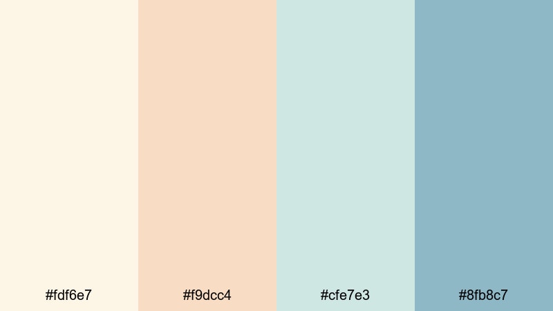
- HEX Codes: #fdf6e7, #f9dcc4, #cfe7e3, #8fb8c7
- Mood: Calm, gentle, and optimistic like the first light on quiet sand.
- Use for: Use for soft lifestyle vlogs, morning routines, wellness intros, and gentle title cards.
Morning Shore Haze combines pale sand, soft peach, and muted seafoam blues for a light, breathable Beach look. It feels like waking up just after sunrise, when the beach is empty and the light is still milky and diffused.
This palette works beautifully for wellness intros, cozy talking head setups, and understated thumbnails. Use the light sand and peach for backgrounds and lower thirds, while the soft blue tones highlight important text or icons without breaking the calm. In Filmora, you can mirror these HEX colors in your titles, overlays, and color grading, so every shot carries the same gentle morning glow.
Pro Tip: Build a Soft Beach Aesthetic in Filmora
To keep a dreamy, soft Beach aesthetic across a whole edit, start by designing one reference frame in Filmora that perfectly uses Morning Shore Haze. Set your title colors, background plates, and any shape elements with these HEX codes, then reuse that frame as a visual template for your other scenes.
Save your preferred text presets, overlays, and transitions so every new sequence inherits the same warm sand and muted seafoam tones. This makes your intros, b-roll, and social edits feel like they belong to one cohesive Beach-inspired brand.
AI Color Palette
If you have a photo of a calm beach morning or a still frame that already nails this look, Filmora's AI Color Palette feature lets you lift its colors and apply them to other clips. The tool analyzes the reference shot and transfers the same soft highlights and pastel shadows to the rest of your footage.
Import your reference image or clip, choose it as the source, and then color-match your entire timeline. This is a quick way to make all your b-roll, cutaways, and even multi-camera scenes share the same Morning Shore Haze mood without manually tweaking each shot.
 secure download

HSL, Color Wheels & Curves
Once your Beach palette is in place, use Filmora's HSL sliders and color wheels to fine-tune the balance between sand warmth and seafoam coolness. Slightly desaturating blues while warming up yellows and oranges will keep skin tones flattering while still suggesting a soft coastal breeze. For a more cinematic look, drop the shadows a little in the curves panel and gently lift the highlights for a hazy, backlit feel.
You can also isolate the teal and aqua ranges and nudge their hue closer to your chosen HEX codes so all water and sky tones match your brand. For more guidance on creative color control, explore Filmora's color correction tools, then apply what you learn to lock in your Beach aesthetic across full playlists.
secure download1000+ Video Filters & 3D LUTs
If you want to stylize your Beach footage even faster, Filmora's video filters and 3D LUTs make it easy to push Morning Shore Haze into a pastel vintage look or a modern lifestyle aesthetic. Stack soft glow filters, slight film grain, or subtle vignette effects to intensify the dreamy morning mood without losing clarity.
Once you have a look you like, save it as a custom preset and reuse it every time you create beachy routines, slow-living montages, or wellness promos. Your audience will start to recognize the gentle, airy color signature as part of your brand.
secure downloadSeashell Whisper Tones
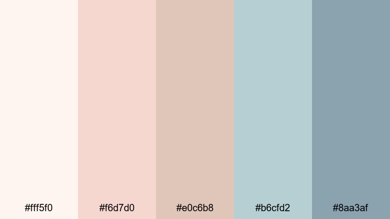
- HEX Codes: #fff5f0, #f6d7d0, #e0c6b8, #b6cfd2, #8aa3af
- Mood: Delicate and nostalgic, with a hint of seaside romance.
- Use for: Use for beauty content, aesthetic reels, wedding highlight edits, and dreamy lower thirds.
Seashell Whisper Tones feels like rifling through a box of old beach souvenirs. Creamy whites, tender pinks, and muted aquas create a romantic, slightly nostalgic Beach palette that flatters skin tones and soft light.
These colors are ideal for wedding highlight videos, beauty tutorials shot near a window, and tenderness-focused vlogs. In thumbnails or YouTube channel banners, use the palest cream for background, the soft pink for titles, and the muted aqua for accents like subscribe buttons or icons so everything feels cohesive yet gentle.
Foam Kissed Pastels
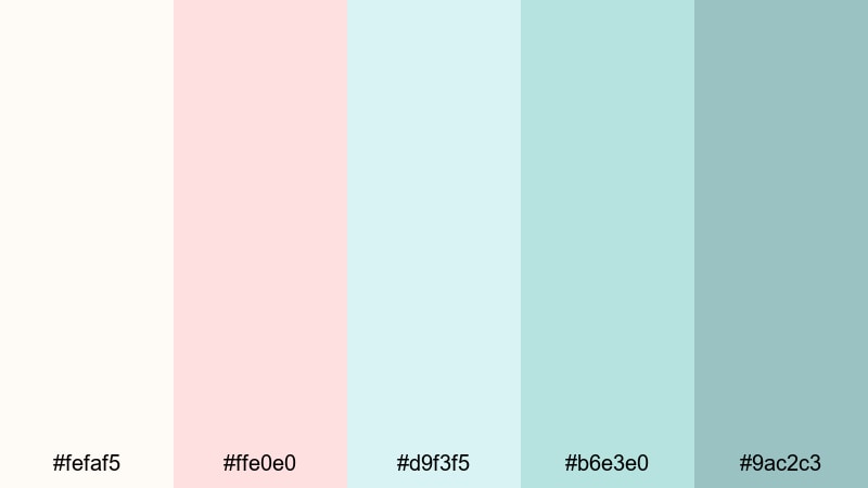
- HEX Codes: #fefaf5, #ffe0e0, #d9f3f5, #b6e3e0, #9ac2c3
- Mood: Airy, playful, and lightly refreshing, like waves fizzing over soft sand.
- Use for: Use for playful travel vlogs, lighthearted product spots, and upbeat title cards.
Foam Kissed Pastels brings in cotton candy pinks and pastel turquoise, echoing bubbly surf and seaside treats. It feels youthful and upbeat, while still sitting comfortably in a soft Beach aesthetic.
Use this palette when you want thumbnails and intros to look fun and clickable without loud neon. The whites and pale blues work well as lower-third backgrounds, while the pastel pink draws the eye to key text such as video titles or discount codes. It is a great choice for summer travel hauls, beach outfit lookbooks, or product promos shot on location.
Saltwater Daydream
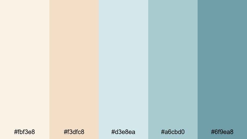
- HEX Codes: #fbf3e8, #f3dfc8, #d3e8ea, #a6cbd0, #6f9ea8
- Mood: Dreamy and introspective with a gentle coastal serenity.
- Use for: Use for reflective voiceovers, cinematic b-roll sequences, and calming channel branding.
Saltwater Daydream blends warm sand neutrals with powdery blue tones to create a slow-living, reflective Beach palette. It feels hazy and introspective, perfect for storytelling and cinematic pacing.
For video, use the light beige and cream shades in your background plates and text boxes, while the deeper blue-greens color your overlays, progress bars, or end screen elements. This keeps visuals relaxed but still structured, ideal for essays, quiet travel films, or calming productivity vlogs.
Sunlit Tropical Beach Color Palettes
Coral Reef Glow
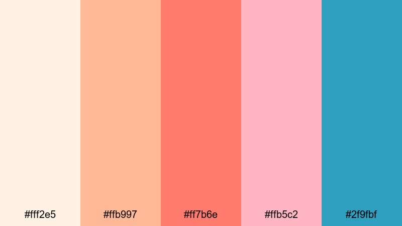
- HEX Codes: #fff2e5, #ffb997, #ff7b6e, #ffb5c2, #2f9fbf
- Mood: Vibrant and energetic, bursting with tropical vacation excitement.
- Use for: Use for summer travel vlogs, energetic intros, festival promos, and clickable thumbnails.
Coral Reef Glow is a high-energy Beach palette with vivid coral, sunlit peach, and punchy aqua. It feels like reef snorkeling, sunset cocktails, and crowded beach festivals all at once.
This is perfect for thumbnails that must stand out in busy feeds. Use the bright coral for bold title text, the peach as a background gradient, and the aqua as accent strokes or outlines. In Filmora, you can echo these colors in your transitions, animated stickers, and motion graphics to give your entire video a tropical pop.
Palm Shade Escape
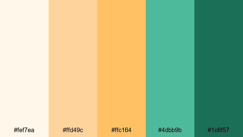
- HEX Codes: #fef7ea, #ffd49c, #ffc164, #4dbb9b, #1c6f57
- Mood: Sunny but grounded, blending tropical warmth with lush greenery.
- Use for: Use for island travel guides, eco tourism content, and outdoorsy brand intros.
Palm Shade Escape mixes golden sand tones with rich greens, capturing the feeling of lying in a hammock under palm trees. It is bright but not overwhelming, with enough green to feel natural and eco-conscious.
In your graphics, let the warm yellows carry background areas and subtle gradients, while the mid green and deep teal create strong buttons, social handles, or logo marks. This Beach color combination suits eco travel channels, nature tours, and sustainable product spots that balance adventure with responsibility.
Coconut Water Splash
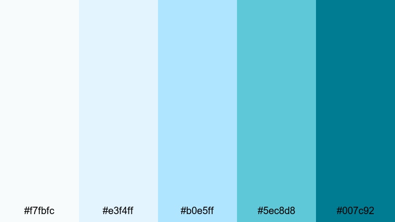
- HEX Codes: #f7fbfc, #e3f4ff, #b0e5ff, #5ec8d8, #007c92
- Mood: Crisp, refreshing, and invigorating like a dive into clear water.
- Use for: Use for techy travel apps, clean motion graphics, and refreshing product launches.
Coconut Water Splash leans into icy whites and layered turquoise blues. It feels fresh, modern, and slightly techy, like a minimalist travel app or hydration brand.
Use the very light blues as clean backgrounds and panel fills, while the deeper turquoise and teal carry logos, call-to-action buttons, or kinetic typography. This palette is great for app promos, gadget reviews shot on the coast, or any Beach-themed project that needs a more digital, polished vibe.
Golden Sand Horizon
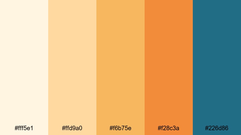
- HEX Codes: #fff5e1, #ffd9a0, #f6b75e, #f28c3a, #226d86
- Mood: Radiant and cinematic, like a late afternoon sun sinking over the sea.
- Use for: Use for cinematic travel montages, title sequences, and warm color grading for drone shots.
Golden Sand Horizon pairs glowing golds and burnt apricot with a strong teal accent. It captures that magic hour moment when sand, sky, and sea all turn warm and cinematic.
Try using the deepest teal for your text and logo to cut through the warm backgrounds. The lighter golds make perfect overlays and gradient washes over drone footage, while the orange tones can color accent lines or animated frames around your main subject. It is a powerful Beach palette for cinematic intros and travel films.
Dusky Coastal Beach Color Palettes
Twilight Tide Drift
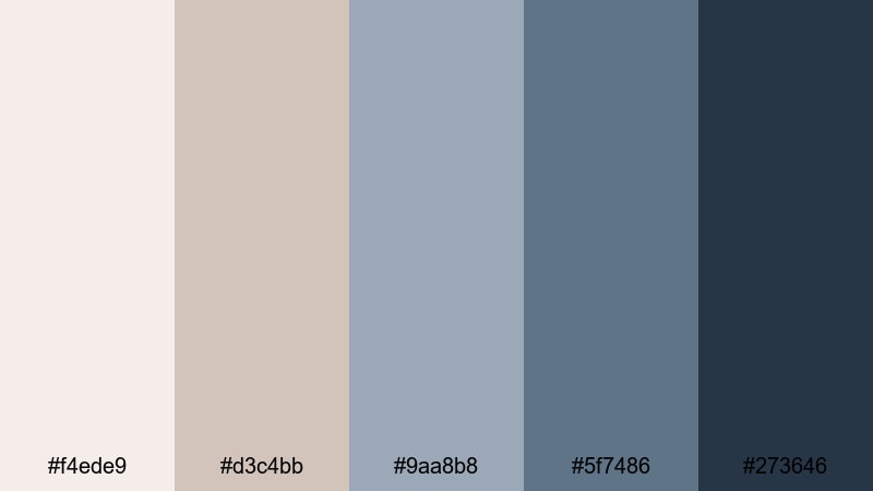
- HEX Codes: #f4ede9, #d3c4bb, #9aa8b8, #5f7486, #273646
- Mood: Moody and cinematic, channeling quiet evenings by the water.
- Use for: Use for introspective travel films, lo-fi music visuals, and atmospheric end screens.
Twilight Tide Drift moves the Beach mood into evening. Dusty taupes and steel blues fade into inky navy, ideal for projects that feel reflective, moody, or slightly melancholic.
Use the light taupes and grays for subtle backgrounds and overlays, while the darker blues anchor titles, playlists, and lower thirds. This palette works nicely with lo-fi beats, slow-motion shots, and night-time b-roll of waves and city lights on the water.
Stormy Dune Skies
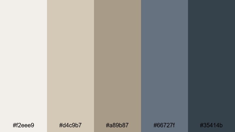
- HEX Codes: #f2eee9, #d4c9b7, #a89b87, #66727f, #35414b
- Mood: Dramatic and grounded, with a windswept, documentary edge.
- Use for: Use for coastal documentaries, nature reels, and serious brand narratives.
Stormy Dune Skies is a rugged Beach palette that mixes muted sand, driftwood taupe, and stormy blues. It feels raw and authentic, making it a strong fit for documentary-style content and honest storytelling.
In practice, this color scheme is great for coastal conservation videos, surf stories in rough weather, or brand films that want depth over gloss. Keep titles in the deeper blue-gray, while your neutral sand tones support maps, captions, and infographics.
Moonlit Boardwalk Lights
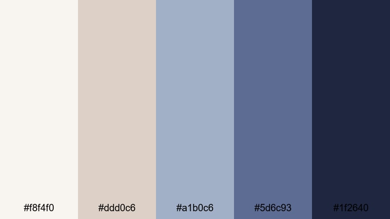
- HEX Codes: #f8f4f0, #ddd0c6, #a1b0c6, #5d6c93, #1f2640
- Mood: Nostalgic and cinematic, mixing soft romance with night time energy.
- Use for: Use for evening city by the sea edits, date night vlogs, and stylized transitions.
Moonlit Boardwalk Lights balances creamy neutrals with slate blues and deep indigo. It evokes Ferris wheels, reflections in wet sand, and neon signs near the shoreline.
This palette is perfect for night vlogs, seaside date montages, or city-by-the-sea edits. Use the creams for subtitles and info cards so they remain readable over dark footage, and reserve the deeper blues for frames, outlines, and animated elements that echo the night sky.
Sea Mist Evening
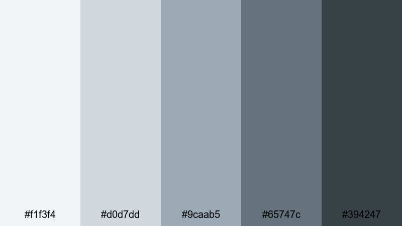
- HEX Codes: #f1f3f4, #d0d7dd, #9caab5, #65747c, #394247
- Mood: Quiet, misty, and restrained with a refined coolness.
- Use for: Use for minimal travel logs, calm voiceover essays, and subtle UI overlays on footage.
Sea Mist Evening is a cool, misty Beach palette built from foggy grays and softened blue slates. It feels clean, quiet, and slightly minimalist, like walking alone along the shoreline in low clouds.
Use this palette when you want your footage to speak first and your graphics to stay in the background. Gray-blues are great for simple lower thirds, subtle progress bars, and UI elements in screen recordings that need a coastal twist without bright colors.
Minimal Modern Beach Color Palettes
Driftwood Neutrals
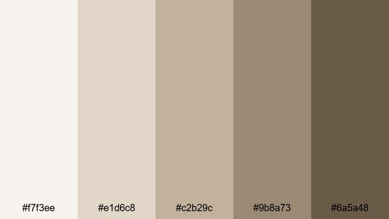
- HEX Codes: #f7f3ee, #e1d6c8, #c2b29c, #9b8a73, #6a5a48
- Mood: Warm, minimal, and organic with a slow-living feel.
- Use for: Use for branding packages, minimal travel channels, and lifestyle product shots.
Driftwood Neutrals delivers a warm, minimal Beach palette built from sand, stone, and driftwood browns. It feels editorial and grounded, perfect for creators who want coastal influence without obvious blues.
These neutrals work especially well for logos, packaging mockups, and hero images in thumbnails. Use lighter tones for clean backgrounds and the darker browns for text, icons, and borders. It is a strong base palette for lifestyle brands or slow-living channels that occasionally feature the beach but focus on calm daily routines.
Concrete Pier Calm
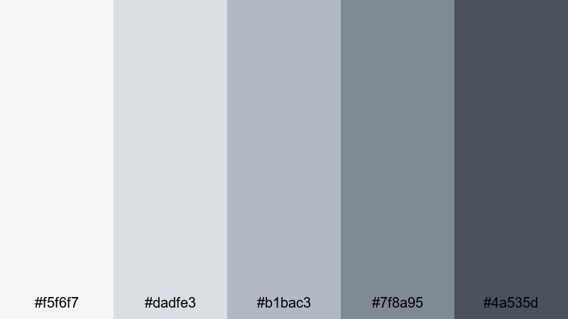
- HEX Codes: #f5f6f7, #dadfe3, #b1bac3, #7f8a95, #4a535d
- Mood: Cool, urban, and composed with a hint of seaside industrial.
- Use for: Use for travel and lifestyle channels that mix city and shore, as well as clean title cards and lower thirds.
Concrete Pier Calm leans into soft concrete grays and muted blue-grays, suggesting piers, harbor rails, and coastal cities. It blends an urban feel with a subtle Beach influence.
This palette is excellent for creators whose content moves between city streets and harbor views. In Filmora, combine these tones with minimal typography and simple motion graphics for a magazine-style look. The darker blue-gray is strong enough for headings, while the paler grays keep your backgrounds sleek and distraction-free.
Barefoot Studio Sand
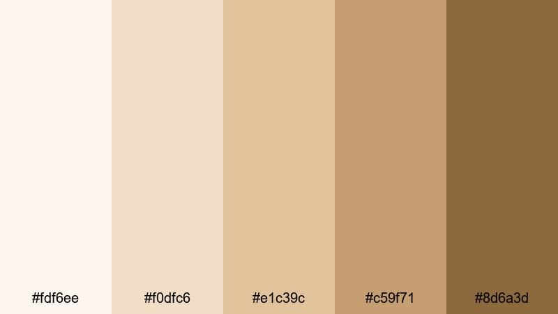
- HEX Codes: #fdf6ee, #f0dfc6, #e1c39c, #c59f71, #8d6a3d
- Mood: Warm, creative, and grounded like an artist loft near the beach.
- Use for: Use for creator logos, tutorial backgrounds, and cohesive thumbnail sets with a neutral yet sun kissed vibe.
Barefoot Studio Sand is a sun warmed Beach palette full of creams, caramel, and soft brown. It feels creative yet neutral, like an artist studio with sand still on the floor.
Because these tones flatter most skin shades, they are great for talking head videos, tutorials, and product demos. Use the deeper browns for logos and recurring icons, and keep backgrounds in the light, creamy tones. Over time, this creates a recognizable, sun kissed branding system you can carry across thumbnails, intros, and end screens.
Tips for Creating Beach Color Palettes
Designing an effective Beach color palette is about more than picking pretty blues. You need balance between sand, sea, and sky tones so your footage stays readable, on-brand, and emotionally consistent from thumbnail to end screen.
- Decide on your Beach mood first: soft and airy, tropical and bold, dusky and cinematic, or minimal and neutral. Let that guide how saturated and contrasty your colors should be.
- Always test text contrast: pair light sand backgrounds with darker teal or brown text, and avoid placing pastel text over bright footage without a semi-transparent overlay.
- Limit yourself to 3 to 5 main colors per project: one background, one primary text color, one accent, plus optional highlight and shadow tones for gradients.
- Match your palette to your actual footage: if your beach clips lean cool and gray, choose palettes with more slate and mist; if they are golden and warm, lean into coral and sand.
- Keep branding consistent: reuse the same HEX codes for logos, lower thirds, and channel art so viewers recognize your Beach aesthetic at a glance.
- Use accent colors sparingly: reserve bright corals or deep teals for CTAs, subtitles, or important information so the viewer knows where to look.
- Check your designs on mobile: make sure your Beach colors stay readable and punchy on small, bright screens as well as larger monitors.
- Save presets in your editor: in Filmora, turn successful combinations into reusable title, filter, and LUT presets so you can keep your Beach palette consistent video after video.
Beach color palettes are powerful mood-setters. Soft sands, seafoam blues, and tropical corals can make your channel feel calming, adventurous, nostalgic, or editorial depending on how you combine them. With clear HEX codes and defined roles for each shade, you can design thumbnails, intros, and overlays that all point toward the same visual identity.
Use these 15 Beach color combinations as starting points, then refine them inside Filmora with your own footage and style. Whether you shoot sunrise yoga, surf trips, or minimal coastal living, a consistent palette will help your content stand out and feel more professional.
The fastest way to see what works is to experiment. Drop these HEX colors into Filmora titles, layer them over b-roll, pair them with filters or LUTs, and build a few test sequences. Once you find the Beach look that fits your story, save it as your signature style and apply it across playlists, shorts, and social clips.
secure download