
 100% Security Verified | No Subscription Required | No Malware


 ChatGPT
 Perplexity
 Gemini
 Claude
 Grok
Grok
Beige Sand sits between warm cream and light tan, carrying the calm of natural linen and sunlit beaches. Psychologically, it feels safe, stable, and inviting, which makes it a favorite base color for lifestyle brands, minimalist creators, and cinematic vloggers who want a soft, timeless mood instead of loud saturation.
In video editing, thumbnails, intros, and channel branding, Beige Sand works like a visual anchor: it softens harsh contrast, makes skin tones look flattering, and keeps text overlays easy on the eyes. Below are 15 ready-to-use Beige Sand color palettes with HEX codes, designed for creators and Filmora users who want cohesive, aesthetic color combinations for everything from YouTube thumbnails and Instagram reels to logo stings and full cinematic edits.
In this article
Soft & Serene Beige Sand Color Palettes
Morning Dune Haze
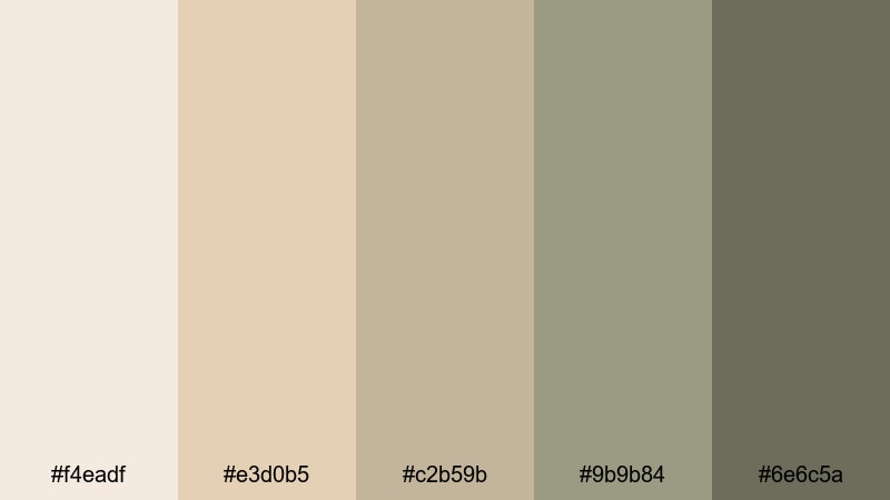
- HEX Codes: #f4eadf, #e3d0b5, #c2b59b, #9b9b84, #6e6c5a
- Mood: Calm, airy, and reflective, like the first light over quiet dunes.
- Use for: Ideal for slow-paced travel vlogs, reflective storytelling, or cinematic title cards that need a soft, natural base.
Morning Dune Haze blends ivory, Beige Sand, and muted olive grays into a quiet, grounded palette. It feels like early-morning light before the day gets bright, perfect when you want viewers to slow down and sink into your story.
Use this palette for minimalist YouTube thumbnails, chapter cards, and intro sequences where text sits over soft gradients or blurred B-roll. The deeper olive-gray tones help your titles stand out, while the lighter Beige Sand shades keep your backgrounds clean and gentle for vlogs, journaling videos, or calm cinematic edits.
Pro Tip: Build a Cinematic Beige Sand Look in Filmora
To keep a Morning Dune Haze vibe across your entire edit, set one of the Beige Sand tones as your base background color in Filmora, then reuse it in titles, lower thirds, and transition screens. This creates a subtle but consistent identity from the first frame of your intro to the last end screen.
You can also create a custom color preset in Filmora that matches these HEX codes, then apply it to shapes, overlays, and text. This way, your thumbnails, shorts, and long-form videos all share the same Beige Sand mood without manually eye-dropping colors every time.
AI Color Palette
If you have a still image that captures your ideal Morning Dune Haze look, you can use Filmora's AI Color Palette feature to transfer that Beige Sand aesthetic to the rest of your footage. Filmora analyzes the reference frame and automatically matches tones, contrast, and warmth across your clips.
Import your B-roll and talking-head shots, choose your reference image or shot, and let AI Color Palette harmonize everything. This is especially useful when some scenes were filmed at different times of day, but you still want that soft dune glow for your entire video.
 secure download

HSL, Color Wheels & Curves
To perfect your Beige Sand tones, use Filmora's HSL and color wheels to nudge warm hues slightly towards a soft golden tint while keeping shadows neutral. Subtle S-curves in the curves panel can add contrast without losing that airy dune feeling, while HSL lets you tame any oversaturated greens or blues that break the calm mood.
You can follow Filmora's tutorials on color correction tools in Filmora to see how professionals balance highlights, midtones, and shadows. Apply these adjustments to adjustment layers so every clip in your timeline holds the same Beige Sand softness.
secure download1000+ Video Filters & 3D LUTs
If you want to stylize your Beige Sand palette faster, Filmora's video filters and 3D LUTs make it easy to test different moods. Start with a neutral base grade that matches Morning Dune Haze, then layer subtle warm filters or film-style LUTs to add grain, halation, or a soft cinematic fade.
You can save custom LUTs or presets once you like the result, and reuse them on new vlogs or branded intros so your channel always feels cohesive. This keeps your Beige Sand aesthetic recognizable across platforms, from YouTube thumbnails to Instagram reels.
secure downloadCoastal Linen Breeze
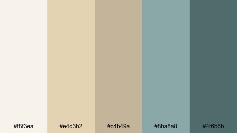
- HEX Codes: #f8f3ea, #e4d3b2, #c4b49a, #8ba8a8, #4f6b6b
- Mood: Fresh, breezy, and relaxed with a coastal softness.
- Use for: Great for lifestyle channels, beach vlogs, and wellness content needing a clean yet warm visual identity.
Coastal Linen Breeze mixes creamy whites and Beige Sand with soft teal and sea-glass greens. The palette feels like open windows, clean sheets, and ocean air, relaxed but still bright enough for polished visuals.
Use the light Beige Sand tones as backgrounds for text overlays, then pull in the teal shades for buttons, subscribe reminders, or lower thirds in Filmora. This combination works well for wellness thumbnails, yoga intros, and beach vlog titles where you want a coastal vibe without going full tropical neon.
Quiet Studio Light
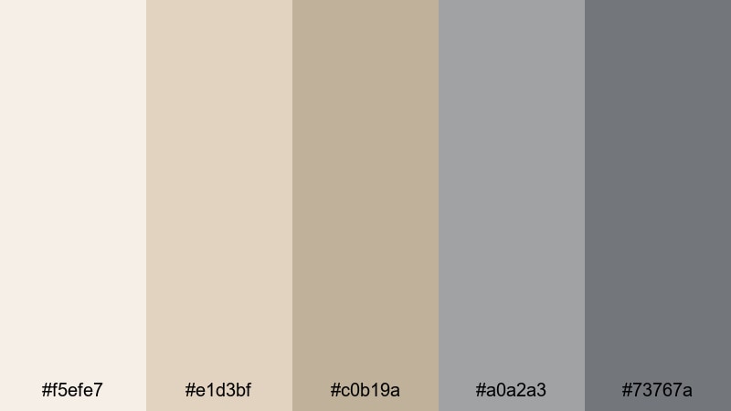
- HEX Codes: #f5efe7, #e1d3bf, #c0b19a, #a0a2a3, #73767a
- Mood: Thoughtful and minimal, like an artist studio on a cloudy morning.
- Use for: Perfect for educational videos, tutorial backdrops, and subtle UI elements in editing templates.
Quiet Studio Light balances warm Beige Sand with cool, misty grays. It feels restrained and focused, ideal for creators who want their content to look smart and minimal rather than flashy.
In video thumbnails and intro slates, use the warmer tones for backgrounds and the cooler grays for icons, progress bars, or chapter labels. This palette suits design tutorials, coding walkthroughs, or study-with-me videos where clarity and calm are more important than bright color pops.
Blush Driftwood Calm
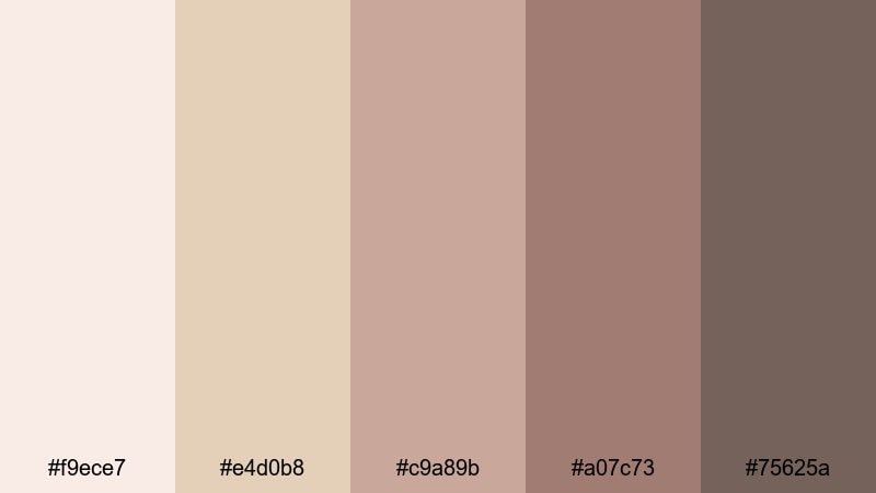
- HEX Codes: #f9ece7, #e4d0b8, #c9a89b, #a07c73, #75625a
- Mood: Romantic, soft, and slightly nostalgic.
- Use for: Use for wedding reels, cozy storytelling edits, or feminine brand intros with a gentle, cinematic look.
Blush Driftwood Calm wraps Beige Sand in dusty pinks and driftwood browns. The result is warm, nostalgic, and flattering on skin tones, making it perfect for emotional storytelling.
Apply the lighter blush tones as gradient backgrounds in Filmora title templates, then use the deeper browns for accent lines, frame borders, or logo marks. Wedding highlight videos, couple portraits, and soft lifestyle thumbnails will all benefit from this tender Beige Sand aesthetic.
Modern & Minimal Beige Sand Color Palettes
Architects Neutral Grid
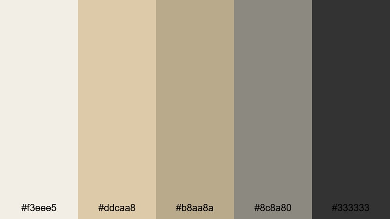
- HEX Codes: #f3eee5, #ddcaa8, #b8aa8a, #8c8a80, #333333
- Mood: Clean, structured, and professional with a design-driven edge.
- Use for: Ideal for productivity channels, tech explainers, and portfolio reels that need a polished neutral base.
Architects Neutral Grid combines soft Beige Sand and taupe with strong charcoal. It feels like a modern studio or architectural blueprint, giving your visuals a crisp, organized style.
Use the lighter neutrals for backgrounds, and reserve the deep #333333 for typography and UI elements in your Filmora layouts. This palette is excellent for grid-based motion graphics, resume reels, or minimalist product demos where legibility and structure are key.
Muted Interface Shell
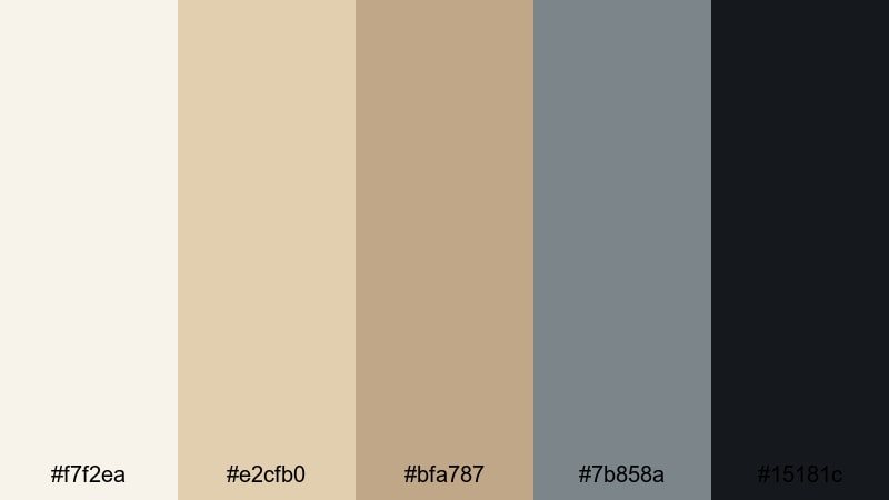
- HEX Codes: #f7f2ea, #e2cfb0, #bfa787, #7b858a, #15181c
- Mood: Quietly confident and contemporary, with a digital-ready feel.
- Use for: Great for app demos, UI mockups in video, and sleek channel branding that feels both warm and tech friendly.
Muted Interface Shell pairs shell-like Beige Sand tones with steely blue grays and a deep ink black. It feels like a modern app interface: calm, minimal, and designed for clarity.
For UI walkthroughs and tech reviews, use the warm Beige Sand hues for device frames or background cards, and the cooler accents for icons, progress indicators, or keyboard shortcuts. This palette helps you present complex information in Filmora while keeping the screen visually comfortable.
Desert Concrete Balance
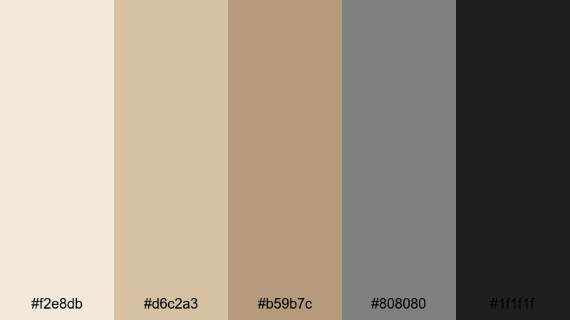
- HEX Codes: #f2e8db, #d6c2a3, #b59b7c, #808080, #1f1f1f
- Mood: Grounded and balanced, mixing organic warmth with urban cool.
- Use for: Use in branding packages, intro sequences, and minimalist product feature videos.
Desert Concrete Balance contrasts desert-inspired Beige Sand with cool mid-gray and deep black. It feels both natural and urban, making it highly versatile for modern brands.
Use the Beige Sand shades for backgrounds and product mockups, then bring in the grays and black for bold typography, borders, and motion lines in Filmora. This palette is strong enough for tech and lifestyle brands yet soft enough for interiors or sustainable product storytelling.
Scandi Workflow Desk
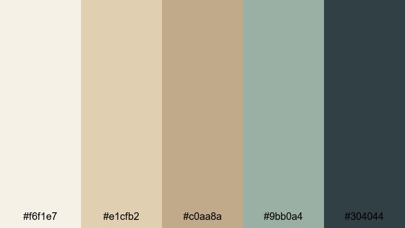
- HEX Codes: #f6f1e7, #e1cfb2, #c0aa8a, #9bb0a4, #304044
- Mood: Productive, airy, and stylish with a Scandinavian touch.
- Use for: Perfect for desk setup tours, productivity vlogs, and minimalist motion graphics.
Scandi Workflow Desk echoes light wood desks, soft textiles, and muted blue-greens. It feels organized and cozy at the same time, ideal for productivity-focused content.
Use the Beige Sand tones as base colors for your title backgrounds and end screens, layering the muted greenish accents for icons, timers, or task checklists. This palette keeps your Study With Me thumbnails, notion templates, and workstation tours looking clean and on-brand.
Warm & Cozy Beige Sand Color Palettes
Candlelit Storytime
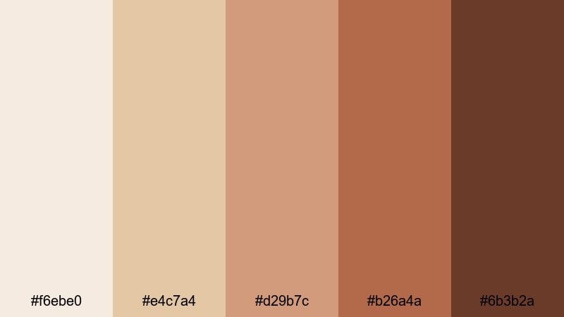
- HEX Codes: #f6ebe0, #e4c7a4, #d29b7c, #b26a4a, #6b3b2a
- Mood: Warm, intimate, and nostalgic, like reading by candlelight.
- Use for: Ideal for narrative shorts, cozy home vlogs, and podcast visuals that lean into warmth and comfort.
Candlelit Storytime surrounds Beige Sand with amber and rich terracotta browns. It feels like a glowing lamp in a dark room, perfect for storytelling content and voice-over videos.
In Filmora, you can use the lighter Beige Sand as a soft vignette around your frame while the deeper browns shape titles, quote cards, and lower thirds. This palette works beautifully for bedtime stories, podcast thumbnails, and narrative shorts where warmth and intimacy are central.
Autumn Market Stroll
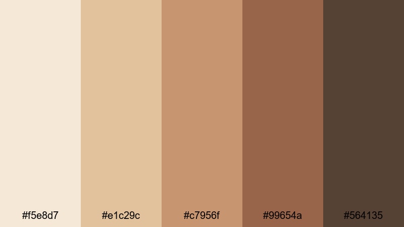
- HEX Codes: #f5e8d7, #e1c29c, #c7956f, #99654a, #564135
- Mood: Earthy and lively, capturing the energy of a fall marketplace.
- Use for: Great for travel diaries, food content, and seasonal promos with a warm, storytelling aesthetic.
Autumn Market Stroll pairs Beige Sand with caramel, copper, and deep coffee browns. It feels bustling yet cozy, like wandering through stalls full of spices and baked goods.
Use the lighter tones as overlays for your food shots or cafe B-roll, and apply the darker hues to headline text, price tags, and location markers in your edits. This palette suits fall vlogs, seasonal sale promos, and travel thumbnails featuring markets, streets, and festive decor.
Spiced Chai Studio
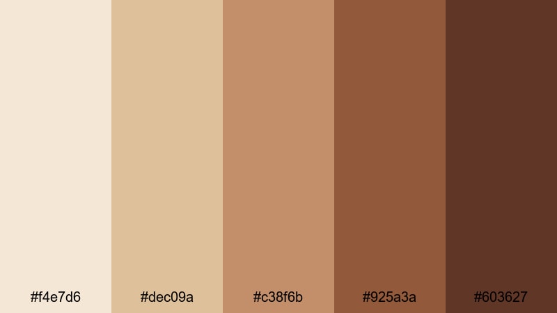
- HEX Codes: #f4e7d6, #dec09a, #c38f6b, #925a3a, #603627
- Mood: Comforting, grounded, and slightly indulgent.
- Use for: Perfect for cooking channels, studio sit-down videos, and brand kits that want a cozy, artisanal feel.
Spiced Chai Studio layers creamy Beige Sand with chai-orange and deep cinnamon browns. The palette feels handcrafted and rich, like a well-lit cafe or small batch studio.
Use these tones in Filmora as textured backgrounds for recipe cards, ingredient lists, or handmade product showcases. The deeper browns are ideal for logos and watermarks, while the lighter Beige Sand provides a soft canvas for legible text overlays on your thumbnails.
Sunbaked Terrace Glow
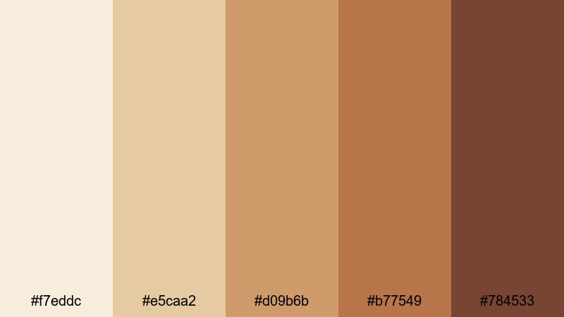
- HEX Codes: #f7eddc, #e5caa2, #d09b6b, #b77549, #784533
- Mood: Radiant and relaxed, like a late afternoon on a sunlit terrace.
- Use for: Use for travel reels, resort promos, or lifestyle edits that celebrate warmth and sunlight.
Sunbaked Terrace Glow blends golden Beige Sand with terracotta and sun-aged browns. It has a radiant, cinematic warmth that suits summer travel and luxury lifestyle content.
Apply the lighter shades behind text and motion graphics to keep them readable, while using the deeper terracotta hues for borders, frames, and location tags. In Filmora, this palette can shape intros for resort tours, poolside vlogs, or sunset city breaks.
Editorial & Luxe Beige Sand Color Palettes
Gilded Sand Editorial
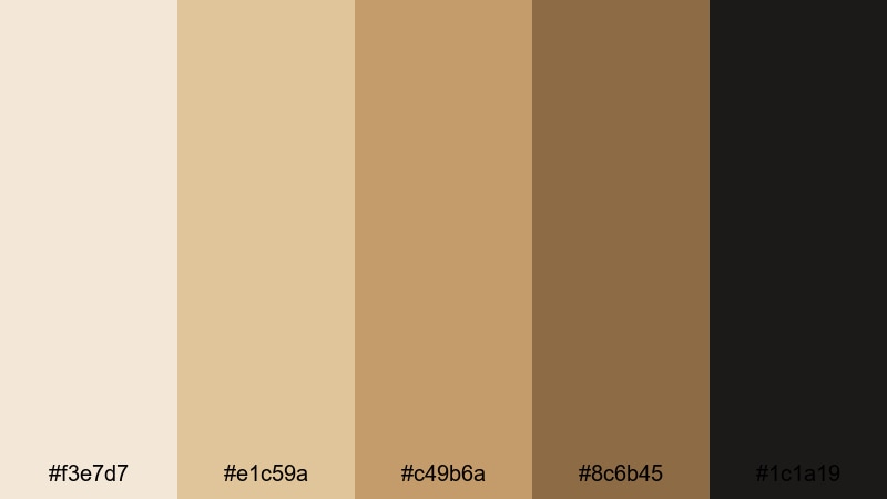
- HEX Codes: #f3e7d7, #e1c59a, #c49b6a, #8c6b45, #1c1a19
- Mood: Elegant, polished, and slightly dramatic.
- Use for: Great for fashion lookbooks, brand films, and cinematic trailers that need a luxe neutral story.
Gilded Sand Editorial pushes Beige Sand toward gold, anchored by a deep espresso black. It feels luxurious and editorial, like a high-end magazine spread brought to motion.
Use the mid and dark tones for bold serif headlines, logo reveals, and slide-in captions, with the lighter Beige Sand as a backdrop. This palette works especially well in Filmora for fashion reels, jewelry promos, and cinematic brand stories with slow, elegant transitions.
Champagne Gallery Night
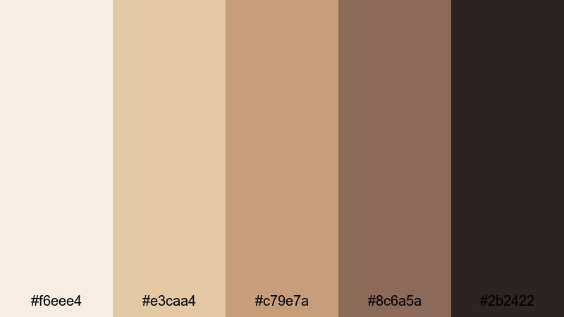
- HEX Codes: #f6eee4, #e3caa4, #c79e7a, #8c6a5a, #2b2422
- Mood: Chic, social, and refined, like an evening gallery opening.
- Use for: Ideal for event recaps, launch trailers, and luxury product promos.
Champagne Gallery Night pairs champagne creams and Beige Sand with rose browns and deep cocoa. It has a social, after-dark elegance that suits events and product launches.
Use the soft tones for highlight reels and recap intros, then accent key details like dates, hashtags, and product names with the darker shades. In Filmora, this palette is perfect for animated invites, launch trailers, or recap videos from fashion shows, openings, or brand events.
Beige Sand Monogram
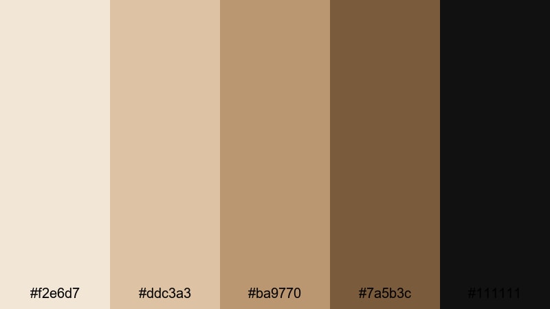
- HEX Codes: #f2e6d7, #ddc3a3, #ba9770, #7a5b3c, #111111
- Mood: Timeless, confident, and brand focused.
- Use for: Use for logo stings, watermark animations, and channel branding that aims for a classic, premium feel.
Beige Sand Monogram layers soft Beige Sand with chestnut brown and crisp black. It feels timeless and branded, like a heritage logo or embossed stationery.
Use the mid-browns for monograms, icons, and signatures, while the deep black provides sharp contrast for names and taglines. In Filmora, this palette is ideal for building consistent channel branding: intro animations, lower third templates, end screens, and subtle watermarks that always reference the same Beige Sand family.
Tips for Creating Beige Sand Color Palettes
Beige Sand is a flexible base that can lean coastal, cozy, or editorial depending on what you pair it with. When you build your own palettes for video and design, focus on balance, readability, and how your colors look across thumbnails, intros, and full-length edits.
- Pair Beige Sand with one dark anchor color (charcoal, espresso, deep teal) to keep your titles and UI elements readable on small screens.
- Limit bright accent colors to 1 or 2 shades and use them only for calls to action, subscribe buttons, or key timestamps so they stand out.
- Test your Beige Sand palettes on both light and dark devices by previewing thumbnails and title cards at small sizes to avoid washed-out text.
- Keep skin tones in mind: warm Beige Sand usually flatters faces, so use it behind talking-head shots instead of pure white or bright colors.
- Use slightly different values of Beige Sand (lighter for backgrounds, slightly darker for containers) to create depth without clutter.
- Stay consistent across platforms by reusing the same HEX codes for YouTube thumbnails, channel banners, Instagram stories, and in-video graphics.
- In Filmora, build one reusable title preset using your Beige Sand palette and duplicate it for chapter cards and end screens to speed up editing.
- When grading footage, avoid heavy color shifts that fight your Beige Sand overlays; instead, gently warm midtones and mute overly saturated backgrounds.
Beige Sand color palettes can shape how your audience feels from the very first frame. Soft, serene palettes calm the viewer, while luxe and editorial combinations add a premium edge to your brand. With the right mix of supporting colors, Beige Sand becomes a reliable foundation for vlogs, tutorials, trailers, and social content.
Try these 15 palettes as starting points, then refine them inside Filmora to match your own footage and style. Save your favorite combinations as presets so every new video, reel, or thumbnail carries the same recognizable Beige Sand identity.
The more consistently you use color, the more your audience will intuitively recognize your work. Open Filmora, drop in one of these Beige Sand palettes, and start turning your channel or brand into a cohesive visual experience.
secure downloadNext: Baroque Color Palette
