
 100% Security Verified | No Subscription Required | No Malware

Blue burgundy blends the calm reliability of deep blue with the richness and passion of burgundy wine. Together they create palettes that feel cinematic, romantic, and premium, making them perfect for brands and creators who want mood, depth, and elegance in the same frame.
Below you will find ready‑to‑use blue burgundy color palettes with HEX codes tailored for video editors, thumbnail designers, and content creators using Filmora. Use them to guide your titles, overlays, color grading, channel branding, and social intros so your visuals stay consistent and recognizable.
In this article
Soft & Romantic Blue Burgundy Color Palettes
Midnight Rose Fade
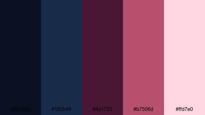
- HEX Codes: #0b1020, #182b49, #4a1733, #b7506d, #ffd7e0
- Mood: Dreamy, intimate, and quietly dramatic.
- Use for: Beautiful for wedding highlight videos, emotional story vlogs, and soft-focus thumbnails that need a hint of drama.
Midnight Rose Fade feels like a slow dance at the end of the night. Deep navy and wine tones wrap the frame in shadow, while the soft rose and blush highlights keep everything tender and nostalgic instead of harsh.
Use the darker blues for backgrounds, overlays, and lower thirds, then bring in the burgundy and rose for titles, subtitles, and key accents in your thumbnails. It works especially well for wedding reels, love stories, anniversary edits, and cinematic vlogs where you want viewers to feel close to the subject.
Pro Tip: Build a Cinematic Blue Burgundy Look in Filmora
When you fall in love with a palette like Midnight Rose Fade, consistency is everything. In Filmora you can save your favorite HEX codes for titles, shapes, and overlays so every lower third, intro, and end screen shares the same midnight navy and soft rose tones.
Try designing one master scene with your preferred blue burgundy colors for text, borders, and background gradients. Then duplicate that sequence across your edit, swapping only the footage while keeping the color styling locked, so your film feels cohesive from first frame to last.
AI Color Palette
If you have a reference image of your dream blue burgundy mood, you can use Filmora's AI Color Palette feature to transfer that look across your entire video. Pull color information from a still photo, a thumbnail draft, or a single graded clip, then match the rest of your timeline with just a few clicks.
This is perfect for wedding highlights, love story edits, or dreamy day-in-the-life vlogs where you want the same midnight navy shadows and fading rose highlights to appear in every shot without manual tweaking.
 secure download

HSL, Color Wheels & Curves
Once your base blue burgundy look is in place, you can perfect it using Filmora's HSL controls, color wheels, and curves. Slightly desaturate the blues for a softer, filmic feeling, deepen burgundy in the shadows, and warm up the highlights so skin tones stay flattering next to your cooler backgrounds.
Tools like HSL and curves let you lock in a signature style similar to a custom grade. Combined with a solid guide to video color correction, you can shape your footage so it feels like it was shot during the same romantic midnight scene, even if clips come from different cameras or days.
secure download1000+ Video Filters & 3D LUTs
To push your blue burgundy aesthetic even further, experiment with Filmora's library of filters and LUTs. A gentle film LUT or soft fade filter can give Midnight Rose Fade a nostalgic, analog feeling, while glow or vignette effects draw the eye toward the center of the frame.
Filmora's video filters and 3D LUTs make it easy to test different cinematic looks on top of your chosen palette, so you can decide whether your project should feel dreamy, vintage, or sharply modern without regrading every clip from scratch.
secure downloadVelvet Letters
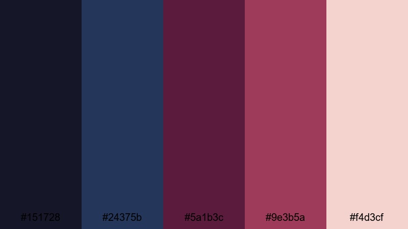
- HEX Codes: #151728, #24375b, #5a1b3c, #9e3b5a, #f4d3cf
- Mood: Tender, handwritten, and vintage-chic.
- Use for: Perfect for handwritten title cards, journaling vlogs, and cozy lifestyle thumbnails.
Velvet Letters combines inky blue with velvety burgundy and a gentle blush highlight, evoking love notes, diaries, and old letters tucked in a box. It feels warm and personal but still polished enough for modern branding.
Use the deep blues for backgrounds or frames, burgundy for calligraphy-style titles, and the soft blush tone for paper textures or text highlights. This palette works beautifully for lifestyle vlogs, journaling series, cozy channel art, and intro screens with a handwritten or scrapbook aesthetic.
Twilight Garden Whisper
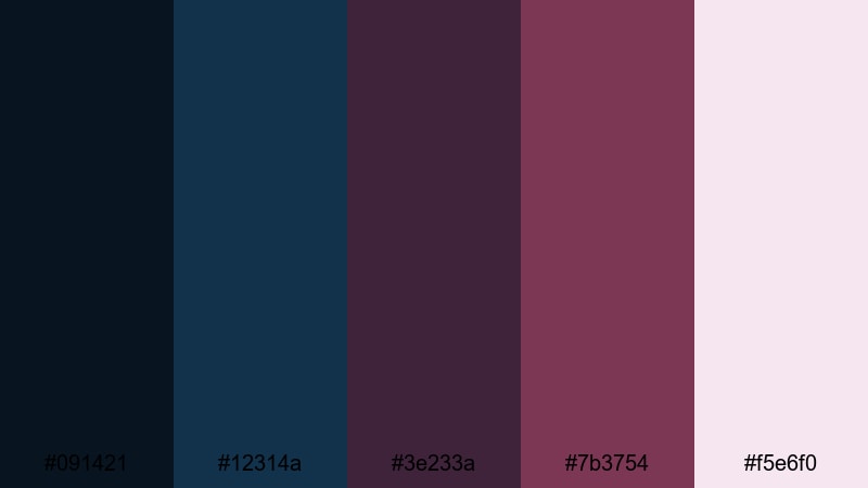
- HEX Codes: #091421, #12314a, #3e233a, #7b3754, #f5e6f0
- Mood: Poetic, hushed, and slightly mysterious.
- Use for: Use in lyrical shorts, poetry overlays, and dreamy B-roll sequences that need subtle elegance.
Twilight Garden Whisper feels like a quiet garden at blue hour, when colors start to blur and soften. Dusky blues and muted burgundy petals meet a pale, almost misty highlight that keeps the palette light enough for readable text.
Let the darker blues sit behind your footage as gradient overlays, while the burgundy shades outline titles, frames, or icons. The soft pink-white works well for subtitles, social handles, and small UI elements in cinematic reels, poetry overlays, and dreamy montage edits.
Burgundy Horizon Glow
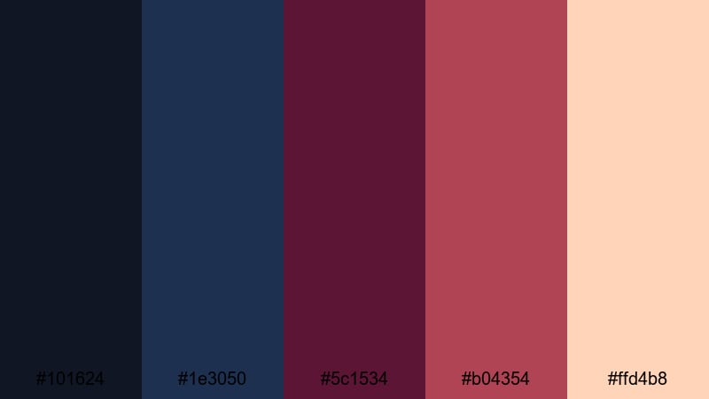
- HEX Codes: #101624, #1e3050, #5c1534, #b04354, #ffd4b8
- Mood: Warm, hopeful, and cinematic at sunset.
- Use for: Great for golden hour travel vlogs, engagement teasers, and uplifting title sequences.
Burgundy Horizon Glow mirrors a warm sunset where navy shadows meet glowing burgundy clouds and peach light on the skin. It feels optimistic and cinematic, ideal for love stories, travel journeys, and reveal moments.
Use the navy tones in your backgrounds or lower thirds, weave the rich burgundy through logo accents and bold titles, and let the peach highlight touch faces, flares, and typography. This combination is strong enough for thumbnails yet soft enough for romantic intros, engagement teasers, and golden-hour B-roll in Filmora.
Bold & Cinematic Blue Burgundy Color Palettes
Neo Noir Royale
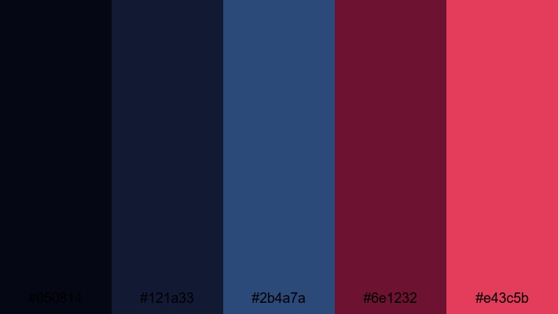
- HEX Codes: #050814, #121a33, #2b4a7a, #6e1232, #e43c5b
- Mood: Edgy, dramatic, and high-contrast.
- Use for: Designed for bold movie-style trailers, series intros, and thriller-inspired thumbnails.
Neo Noir Royale is pure drama: inky midnight blues, saturated royal accents, and a sharp hit of burgundy and crimson. It screams tension, luxury, and high stakes, perfect for narrative content that feels like a movie trailer.
Let the darkest blues fill your backgrounds and shadows, then cut through with burgundy text, neon-style line accents, and crimson details. This palette works especially well in Filmora for thriller teasers, crime series intros, intense gaming highlights, and any thumbnail that must stand out in a crowded feed.
Electric Cabernet Storm
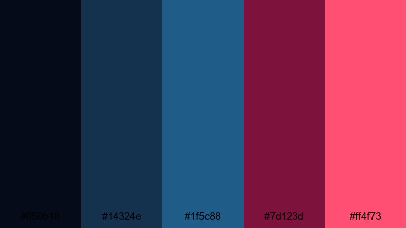
- HEX Codes: #050b18, #14324e, #1f5c88, #7d123d, #ff4f73
- Mood: Charged, intense, and energetic.
- Use for: Ideal for music videos, gaming montages, and energetic channel rebrands that need striking visuals.
Electric Cabernet Storm feels like a stormy city drenched in neon signs. Cool, stormy blues dominate the frame while electric burgundy and hot pink slice through as energy bursts.
Use the darker tones as base fills or overlays, and reserve the pink and burgundy for beats, transitions, and typography that sync with music or game action. This palette thrives in fast cuts, motion graphics, glitch transitions, and bold channel rebrands built inside Filmora.
Crimson Tide Overture
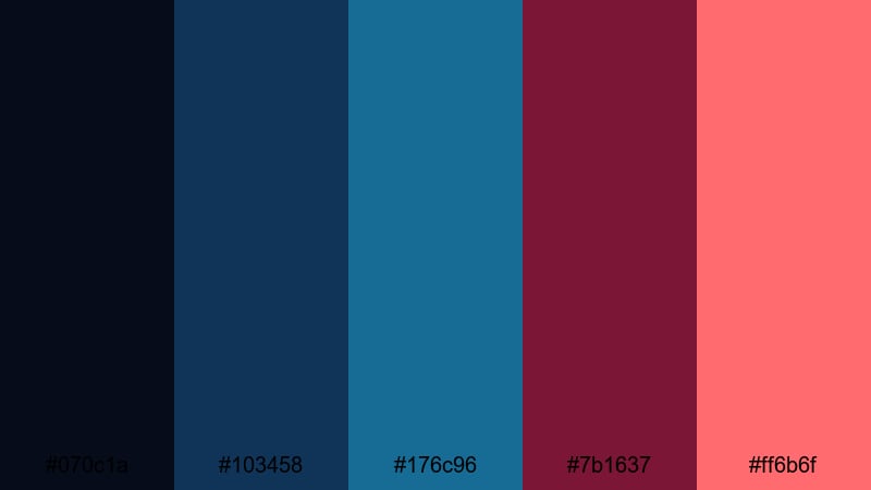
- HEX Codes: #070c1a, #103458, #176c96, #7b1637, #ff6b6f
- Mood: Epic, adventurous, and dynamic.
- Use for: Use for trailers, travel adventures, and cinematic B-roll that needs an epic, modern grade.
Crimson Tide Overture is all about movement and scale. Deep ocean blues and turquoise-leaning midtones create a sense of depth, while the crimson and coral notes feel like waves crashing into the frame.
Use the blue range for your sky, sea, and environment grades, then overlay burgundy in titles, strokes, and accent graphics. It is ideal for travel trailers, drone B-roll, sports edits, and cinematic YouTube intros where you want an adventurous but stylish blue burgundy look.
Indigo Premiere Lights
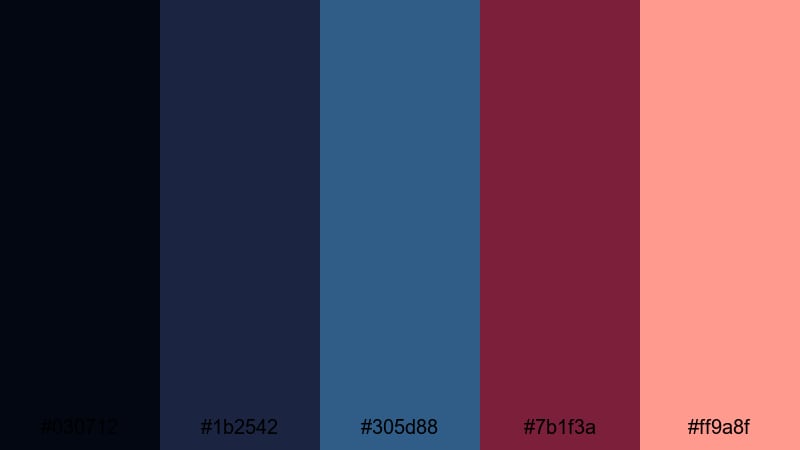
- HEX Codes: #030712, #1b2542, #305d88, #7b1f3a, #ff9a8f
- Mood: Stylish, polished, and studio-ready.
- Use for: Great for channel intros, branded explainer videos, and polished product promos.
Indigo Premiere Lights mixes studio indigo with controlled burgundy and a soft coral highlight, giving you a cinematic but corporate-friendly palette. It feels sleek enough for tech brands and creative agencies.
Make the indigo tones your main canvas color in backgrounds, lower thirds, and shapes, with burgundy as a bold accent for key words or calls to action. The coral highlight keeps buttons, tags, and timestamps readable. Use this palette for intros, explainers, webinars, and product spots to keep your channel looking consistently premium in Filmora.
Modern & Minimal Blue Burgundy Color Palettes
Editorial Ink & Wine
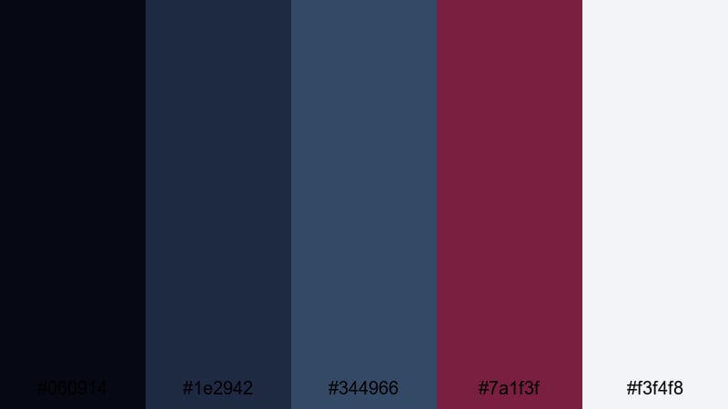
- HEX Codes: #060914, #1e2942, #344966, #7a1f3f, #f3f4f8
- Mood: Sophisticated, clean, and design-forward.
- Use for: Perfect for minimalist title cards, documentary lower thirds, and sleek YouTube channel branding.
Editorial Ink & Wine looks like a high-end magazine layout: deep ink blues, a refined wine accent, and a cool off-white background. It communicates trust, clarity, and taste without loud colors.
Use the off-white as your main background for titles and info screens, with blues for headings and icons. Drop in the wine tone only for emphasis, such as chapter markers, logo details, and key stat numbers. This palette works for documentaries, educational content, and stylish minimal YouTube branding made in Filmora.
Clean Studio Merlot
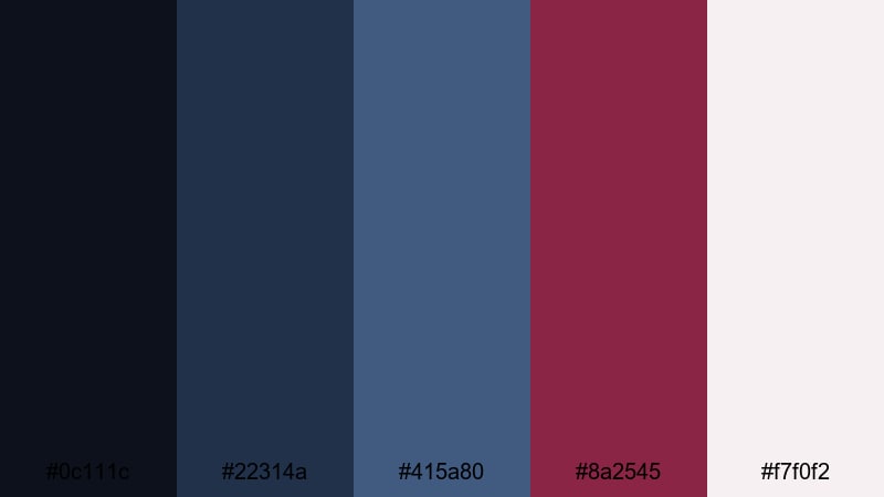
- HEX Codes: #0c111c, #22314a, #415a80, #8a2545, #f7f0f2
- Mood: Calm, professional, and contemporary.
- Use for: Use in course visuals, tutorials, and brand kits that need trust-building yet stylish color.
Clean Studio Merlot balances cool studio blues with a single merlot accent and soft white. It feels professional and calm, ideal for educators, coaches, and SaaS brands that still want personality.
Keep most of the frame in blue and white, reserving merlot for buttons, progress bars, on-screen notes, or key phrases in your titles. In Filmora, this palette is perfect for building reusable templates for tutorials, online courses, and presentation-style videos.
Gridline Plum Blueprint
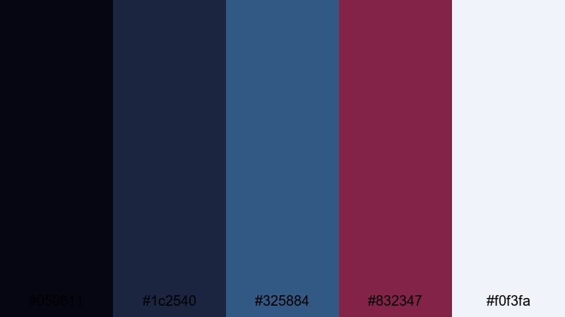
- HEX Codes: #050611, #1c2540, #325884, #832347, #f0f3fa
- Mood: Techy, structured, and imaginative.
- Use for: Great for UI mockups, app promos, and motion graphics with clean lines and minimal shapes.
Gridline Plum Blueprint pairs blueprint-style blues with a structured plum accent and bright off-white. It feels like a design system or wireframe brought to life, mixing logic and creativity.
Use the lighter blue and off-white for UI backgrounds and cards, darker blue for contrast blocks, and plum to highlight features, pricing, or CTAs. This palette is ideal for UI animations, app promo videos, and infographic explainers, especially when you lean on simple shapes and line work inside Filmora.
Moody & Atmospheric Blue Burgundy Color Palettes
Rainy Alley Reverie
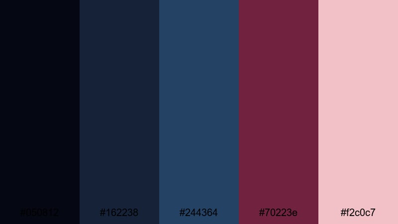
- HEX Codes: #050812, #162238, #244364, #70223e, #f2c0c7
- Mood: Moody, reflective, and cinematic.
- Use for: Perfect for city vlogs in the rain, lo-fi music visuals, and introspective storytime edits.
Rainy Alley Reverie captures the feeling of wet streets and distant lights. Cool, rain-washed blues do the heavy lifting, while muted burgundy reflections and a warm blush tone add a human, emotional touch.
Use the deep blues for your base grade and frames, tapping burgundy for accent text, neon-style signs, or subtle overlays. The soft blush highlight is great for captions, channel names, and subtle glow effects in lo-fi edits, rainy city B-roll, and personal storytime videos.
Fogbound Harbor Wine
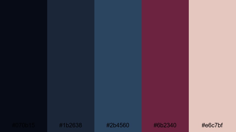
- HEX Codes: #070b15, #1b2638, #2b4560, #6b2340, #e6c7bf
- Mood: Hazy, quiet, and cinematic-coastal.
- Use for: Use for slow travel films, harbor sequences, and minimalist title cards with a somber tone.
Fogbound Harbor Wine feels like a calm harbor at dawn, wrapped in mist. Muted blues define the atmosphere, with a wine accent and sandy highlight that keep things from feeling flat or cold.
Let the blues set the overall tone of your footage, then use wine sparingly in title bars, line accents, or logo marks. The warm sand tone is perfect for legible subtitles and end screens. This palette is ideal for slow travel films, coastal sequences, and minimalist intros where silence and space are part of the story.
Nocturne Lantern Bloom

- HEX Codes: #040710, #1a2236, #313f57, #72213e, #f6d9c8
- Mood: Gentle, lantern-lit, and storybook-like.
- Use for: Great for fairytale edits, night markets, and cozy street photography slideshows.
Nocturne Lantern Bloom mixes deep night blues with lantern-like burgundy and a peachy glow. It feels magical but grounded, like a storybook version of a city night.
Use the darkest tones for your hero backgrounds and vignettes, with burgundy as the color of lanterns, signs, or key text. The peach highlight adds warmth to faces and important overlays, making the palette ideal for night market footage, cozy street photography slideshows, and whimsical reels built in Filmora.
Smoked Berry Skyline

- HEX Codes: #05060d, #181f30, #283957, #6c2342, #f4c3c8
- Mood: Urban, smoky, and stylishly melancholic.
- Use for: Ideal for skyline timelapses, fashion lookbooks, and aesthetic reels with a cool-city vibe.
Smoked Berry Skyline layers smoky urban blues with berry and blush highlights. It gives cityscapes and portraits a fashionable, slightly melancholic edge, perfect for style-forward content.
Use the blues to grade the city and background elements, bringing in berry for outfits, titles, or key accents, and the blush for subtle text and highlight flares. This palette shines in skyline timelapses, fashion lookbooks, nighttime walks, and aesthetic reels where mood and style go hand in hand.
Tips for Creating Blue Burgundy Color Palettes
Blue burgundy palettes can be soft, bold, minimal, or moody. A few simple guidelines will help you balance contrast, readability, and emotional impact in both design and video editing.
- Decide the hero: choose whether blue or burgundy is your main color, then let the other act as a supporting accent so the palette does not feel chaotic.
- Control contrast: pair deep blues and burgundy with a light neutral (off-white, blush, or sand) to keep titles, subtitles, and UI elements readable.
- Limit accents: pick one strong accent (hot pink, coral, or peach) and use it only for CTAs, key phrases, or important markers in your timeline.
- Match footage temperature: if your footage is warm (sunset, tungsten), lean into peach and coral highlights; if it is cool (overcast, night), increase blue and reduce saturation for a cohesive feel.
- Use layers and gradients: in Filmora, combine solid blue backgrounds with translucent burgundy overlays to add depth behind titles and lower thirds.
- Keep branding consistent: save your HEX codes in title templates and presets so every intro, end card, and thumbnail looks like part of the same brand.
- Test in small sizes: always check how your palette looks on mobile thumbnails; adjust brightness and contrast if text or faces disappear.
- Balance emotion and clarity: more saturated burgundy feels passionate and bold, while desaturated tones feel calm and sophisticated; adjust saturation to match your story.
Blue burgundy color palettes are powerful tools for shaping mood, emotion, and brand identity. Whether you aim for romantic softness, neo-noir intensity, clean minimalism, or moody city nights, the right combination of blues, burgundies, and highlights can make your videos instantly recognizable.
Use these 15 palettes as starting points, then refine them inside Filmora by tweaking color grading, titles, overlays, and filters until they match your channel and story. Once you lock in your signature blue burgundy look, you can reuse it across intros, B-roll, shorts, and social posts to build a strong visual identity.
Open Filmora, drop in your footage, and start applying these HEX codes to your timelines. With AI tools, HSL controls, and LUTs on your side, turning blue burgundy ideas into polished cinematic edits becomes fast and repeatable.
secure downloadNext: Beach Color Palette
