
 100% Security Verified | No Subscription Required | No Malware


 ChatGPT
 Perplexity
 Gemini
 Claude
 Grok
Grok
Blue Cream color palettes blend the calm reliability of blue with the warmth and softness of cream. Together, they feel gentle, cinematic, and trustworthy, which makes them perfect for vlogs, lifestyle channels, aesthetic edits, and brands that want to look friendly yet polished. Compared with stark black-and-white, Blue Cream gives your visuals a softer, more human touch while still feeling clean and modern.
In video editing, these palettes work beautifully for YouTube thumbnails, intros, lower thirds, end screens, and even color grading across entire projects. Below you will find 15 ready-to-use Blue Cream color palettes with HEX codes, plus ideas for how to apply them in Filmora for thumbnails, vlogs, brand intros, overlays, and more.
In this article
Soft & Dreamy Blue Cream Color Palettes
Morning Latte Sky
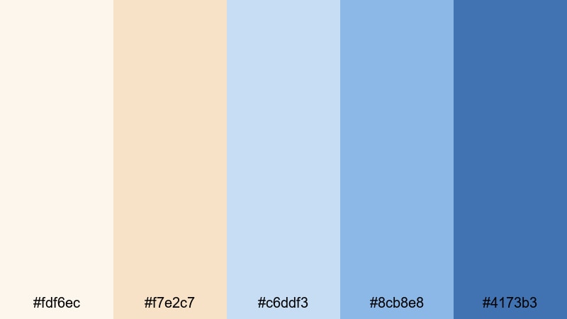
- HEX Codes: #fdf6ec, #f7e2c7, #c6ddf3, #8cb8e8, #4173b3
- Mood: Gentle, uplifting, and quietly optimistic.
- Use for: Use this palette for cozy vlog intros, lifestyle thumbnails, and calm talking-head backgrounds.
Morning Latte Sky starts with creamy latte tones and drifts gradually into airy sky blues. It feels like opening your window on a calm morning, with warm sunlight on the walls and a soft blue horizon in the distance.
This palette is ideal if you want your vlogs or talking-head videos to look inviting without feeling loud. Use the lighter creams as your background, pick the mid blues for titles and icons, and reserve the darkest blue for CTAs and channel elements like subscribe buttons or logo accents.
Pro Tip: Build a Soft Blue Cream Look in Filmora
To keep a Morning Latte Sky mood consistent, design your whole edit around these shades in Filmora. Use the lighter cream colors for background shapes in your titles, then match your lower thirds and end screens to the mid and deep blues so everything feels like part of one visual story.
When you are building a series or a brand, save a custom title preset and a color grading preset that both use this palette. That way your intros, B-roll overlays, and shorts all share the same gentle Blue Cream signature without needing to rebuild the look every time.
AI Color Palette
You can turn Morning Latte Sky into a full video grade with Filmora's AI tools. Grab a still frame or color card using these HEX codes, then let Filmora's AI Color Palette feature analyze the reference and apply the Blue Cream look across all your clips.
This is especially helpful when you work with mixed lighting or different cameras. Instead of grading each shot by hand, AI Color Palette keeps your creams soft and your blues consistent from the intro to the final scene.
 secure download

HSL, Color Wheels & Curves
After you apply a base Blue Cream grade, use Filmora's HSL sliders and color wheels to refine the look. Gently desaturate strong blues, warm up the cream tones in the midtones wheel, and lift shadows slightly to maintain that soft morning feel.
If you want more control, curves and other color correction tools let you add a subtle S-curve for contrast while keeping highlights creamy instead of harsh white. This makes your footage feel cinematic while still matching the Morning Latte Sky palette.
secure download1000+ Video Filters & 3D LUTs
If you do not want to grade from scratch, Filmora's video filters and 3D LUTs make it easy to get close to a Blue Cream aesthetic in seconds. Choose a soft cinematic or pastel filter, then fine-tune the colors so your highlights lean cream and your shadows lean blue.
You can also stack gentle filters on adjustment layers above your clips and tweak opacity until the look fits the Morning Latte Sky palette. Save those layers as presets so future thumbnails, intros, and reels stay on-brand with minimal effort.
secure downloadCloudsoft Storytime
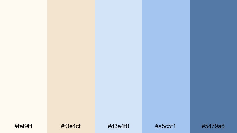
- HEX Codes: #fef9f1, #f3e4cf, #d3e4f8, #a5c5f1, #5479a6
- Mood: Nostalgic, tender, and storytelling-focused.
- Use for: Perfect for cinematic vlogs, animated story explainers, and gentle typography overlays.
Cloudsoft Storytime layers creamy whites with powdery blues, like pages of a favorite bedtime story under soft lamp light. It has a nostalgic, slightly dreamy feel that works beautifully for narrative-driven content.
Use the pale creams as background for text, the light blues for frames or lower thirds, and the darker blue as your highlight accent for important keywords or subscribe prompts. This palette keeps your visuals soothing and readable for long storytime videos, animations, or aesthetic voiceover edits.
Vanilla Tide Whisper
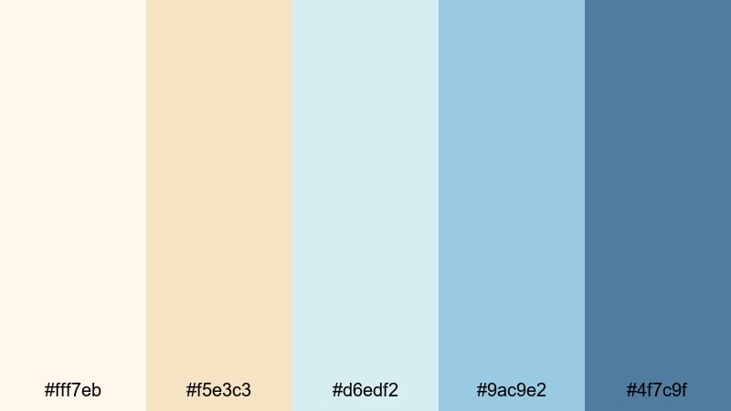
- HEX Codes: #fff7eb, #f5e3c3, #d6edf2, #9ac9e2, #4f7c9f
- Mood: Relaxed, breezy, and lightly coastal.
- Use for: Use this palette for aesthetic day-in-the-life vlogs, soothing travel diaries, and B-roll overlays.
Vanilla Tide Whisper feels like a soft coastal breeze. Warm vanilla creams blend into muted sea blues so you get a hint of the ocean without strong contrast or harsh saturation.
It is an excellent choice for day-in-the-life, journaling, and slower travel edits where you want the colors to support the mood instead of stealing attention. Use it for YouTube thumbnails, chapter screens, or subtle motion graphics overlays that sit on top of your footage without overpowering it.
Frosted Porcelain Glow
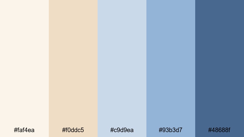
- HEX Codes: #faf4ea, #f0ddc5, #c9d9ea, #93b3d7, #48688f
- Mood: Elegant, quiet, and slightly vintage.
- Use for: Ideal for sit-down videos, booktube content, and calm product demos where subtlety matters.
Frosted Porcelain Glow pairs ivory creams with cool china blues, creating a look that feels like old porcelain or a quiet reading room. The overall effect is gentle and refined, with just enough depth in the darker blue to anchor your design.
Use this palette for intros and lower thirds in book reviews, calm commentary videos, or vintage-inspired product demos. Keep your backgrounds in the lighter tones, and apply the deeper blue to frames, outlines, and logo accents for a polished, editorial aesthetic.
Baby Blue Daydream

- HEX Codes: #fffaf2, #f5e4ce, #d5e8ff, #9fc3f5, #5c80c1
- Mood: Playful, innocent, and airy.
- Use for: Great for lifestyle channels, kids content, and whimsical animated lower thirds.
Baby Blue Daydream mixes buttery cream tones with baby blues and cornflower accents. It feels playful and light, like sketching ideas in a sunny notebook or filming a carefree afternoon.
This palette is great for kids content, lifestyle channels, or creators who want a welcoming, non-intimidating brand presence. Use the brighter blues for fun icons, badges, or callout shapes in Filmora, while keeping large text blocks on the soft cream for maximum readability.
Coastal & Airy Blue Cream Color Palettes
Seaside Foam Morning
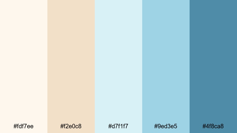
- HEX Codes: #fdf7ee, #f2e0c8, #d7f1f7, #9ed3e5, #4f8ca8
- Mood: Fresh, coastal, and energizing without being harsh.
- Use for: Use for beach travel vlogs, surf edits, and holiday recap videos with a soft seaside flair.
Seaside Foam Morning combines warm sand creams with seafoam and shallow-water blues. It captures the feeling of sunrise on the coast, when the light is bright but still soft.
For beach and travel content, use this palette on title cards, overlay graphics, and social cutdowns to keep everything tied to your main vlog. The deeper teal-blue works well for section labels or timestamps, while the pale blues and creams can sit behind text or animated stickers without distracting from your footage.
Harbor Mist Linen
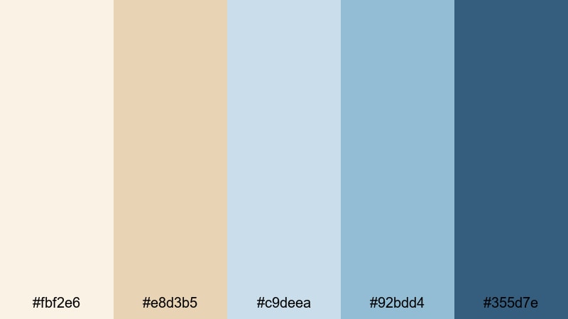
- HEX Codes: #fbf2e6, #e8d3b5, #c9deea, #92bdd4, #355d7e
- Mood: Calm, grounded, and subtly nautical.
- Use for: Perfect for branding for coastal cafes, channel banners, and intro titles with a refined marine touch.
Harbor Mist Linen feels like a quiet marina morning. Linen creams and sandy beiges meet misty harbor blues, giving your visuals a soft nautical character without obvious anchors or stripes.
It is ideal for channel branding, especially if you create coffee, food, or slow-living content near the coast. Use the darker navy tone for your logo or main title, and rely on the mid blues and creams in Filmora titles, transitions, and overlay shapes so your whole channel feels like one cohesive harbor-inspired brand.
Sailcloth Horizon
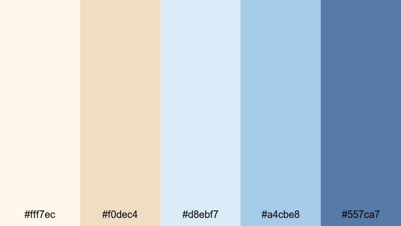
- HEX Codes: #fff7ec, #f0dec4, #d8ebf7, #a4cbe8, #557ca7
- Mood: Open, adventurous, and light-hearted.
- Use for: Great for travel intros, drone shots over water, and dynamic text overlays on sailing or road trip videos.
Sailcloth Horizon balances creamy sailcloth neutrals with hazy sky and ocean blues. The palette feels open and adventurous, like a wide horizon line on a sailing trip.
Use it for cinematic travel intros, drone shot titles, or map-style overlays in your edits. Light creams can frame your footage or sit behind animated text, while the darker blue can emphasize route lines, locations, or key moments in your travel story.
Tidal Sand Light
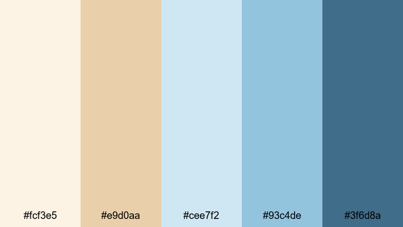
- HEX Codes: #fcf3e5, #e9d0aa, #cee7f2, #93c4de, #3f6d8a
- Mood: Soothing, balanced, and quietly cinematic.
- Use for: Use for ambient B-roll sequences, spa or wellness content, and product shots with a beach-inspired aesthetic.
Tidal Sand Light combines soft sand and sunlit cream with gentle tidal blues and a darker accent. It has a calm, spa-like feel that still leaves room for cinematic depth.
Apply this palette to wellness content, skincare demos, or relaxed B-roll sequences. In Filmora, you can color grade your footage toward these HEX values, then design minimal lower thirds and product labels in the same shades to keep your brand feeling luxurious and consistent.
Driftwood Beach House
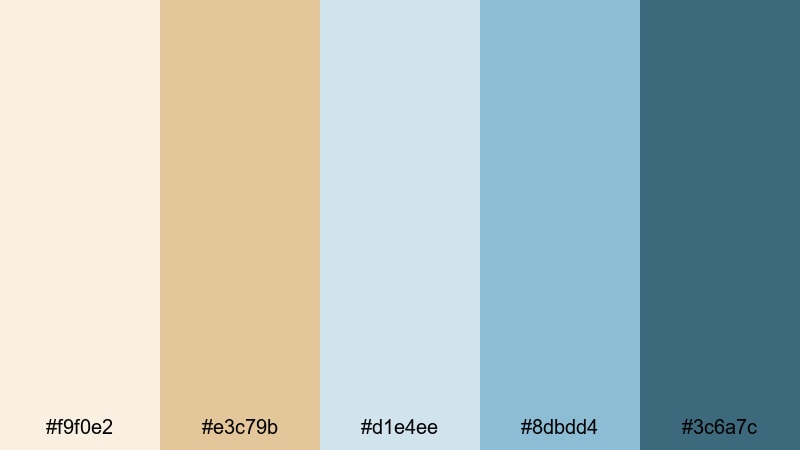
- HEX Codes: #f9f0e2, #e3c79b, #d1e4ee, #8dbdd4, #3c6a7c
- Mood: Cozy, rustic, and beach-house chic.
- Use for: Ideal for interior tours, home makeover videos, and brand intros for decor or lifestyle channels.
Driftwood Beach House mixes creamy wall tones, driftwood tans, and weathered blue accents. The result feels like a well-loved seaside home: comfortable, rustic, and effortlessly stylish.
This palette is perfect for interior tours, home makeovers, decor hauls, or any lifestyle content centered on space and atmosphere. Use the tans and creams for backgrounds or frames, and bring in the deeper blue for callouts, room labels, and lower thirds that highlight key details in your design shots.
Modern & Minimal Blue Cream Color Palettes
Nordic Screen Title
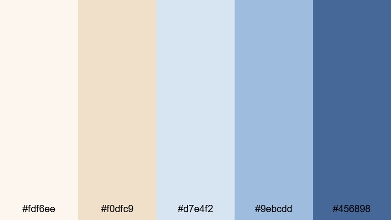
- HEX Codes: #fdf6ee, #f0dfc9, #d7e4f2, #9ebcdd, #456898
- Mood: Clean, modern, and design-forward.
- Use for: Use this palette for minimalist channel branding, tech explainers, and sleek lower thirds.
Nordic Screen Title is inspired by Scandinavian interiors and clean UI design. Soft creams and muted interface blues keep your visuals minimal and professional without feeling cold.
For tech explainers, productivity videos, and tutorials, use the lightest tones for backgrounds and the mid blues for icons, buttons, and diagrams. The darkest blue makes an excellent primary brand color for titles, logos, and thumbnail text that needs to stand out in a crowded feed.
Gallery Studio Calm
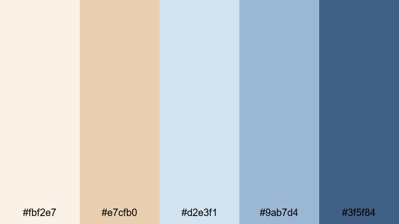
- HEX Codes: #fbf2e7, #e7cfb0, #d2e3f1, #9ab7d4, #3f5f84
- Mood: Artistic, refined, and subtly moody.
- Use for: Perfect for portfolio reels, studio tours, and cinematic short films with a creative edge.
Gallery Studio Calm feels like walking through a quiet art gallery or a designer studio. Creamy wall tones, light wood shades, and soft studio blues come together for a mature, creative mood.
Use this palette for portfolio reels, cinematography showcases, or studio tour videos. In Filmora, you can design title cards that look like gallery labels, keeping text in darker blue and letting your footage sit against light cream or pale blue frames for a sophisticated, curated look.
Clean UI Breeze
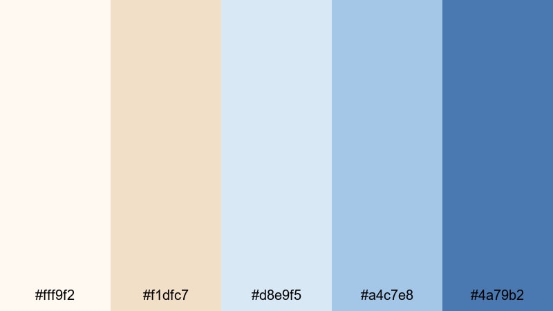
- HEX Codes: #fff9f2, #f1dfc7, #d8e9f5, #a4c7e8, #4a79b2
- Mood: Bright, efficient, and product-focused.
- Use for: Great for app demos, SaaS promos, UI mockups, and tutorial overlays inside Filmora.
Clean UI Breeze is all about clarity. Sharp cream backgrounds paired with breezy interface blues make menus, cursors, and window callouts stand out in a polished, modern way.
For product demos and tutorials, use the lightest tones as your canvas and apply the vivid mid blues to highlight buttons, tools, and important steps. This palette keeps educational content legible and professional, while the Blue Cream combo still feels friendly enough for creators and small brands.
Urban Loft Chill

- HEX Codes: #f7eee2, #e1c59b, #c6d9ea, #8caecc, #365a7a
- Mood: Trendy, relaxed, and slightly urban.
- Use for: Use for city vlogs, creator brand packages, and lo-fi background animations.
Urban Loft Chill feels like a calm afternoon in a sunlit studio apartment. Warm creams and tan highlights contrast with cool, steely blues to create a modern but relaxed city vibe.
This palette works well for city vlogs, creative entrepreneur content, and lo-fi backgrounds. In Filmora, mix these colors into your title designs, social lower thirds, and animated elements like progress bars or chapter markers to give your channel a consistent, urban-casual identity.
Techy Pastel Stream
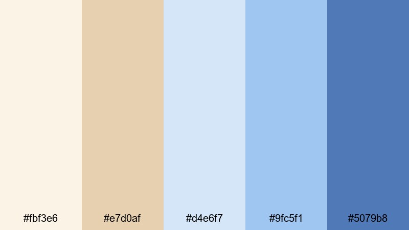
- HEX Codes: #fbf3e6, #e7d0af, #d4e6f7, #9fc5f1, #5079b8
- Mood: Softly futuristic and creator-friendly.
- Use for: Ideal for streaming overlays, gaming intros, and motion graphics that need a gentle tech vibe.
Techy Pastel Stream blends pastel creams with digital-looking blues to create a soft, futuristic aesthetic. It is techy enough for gaming or software streams but gentle enough for cozy creator spaces.
Use this palette for stream overlays, webcam frames, starting soon screens, and animated alerts. In Filmora, design panels and lower thirds in the lighter shades, then apply the deeper blue to text, icons, and badges so your on-screen information is easy to read even at smaller sizes.
Tips for Creating Blue Cream Color Palettes
When you build your own Blue Cream color palette for video and design, you want a balance between softness, readability, and brand personality. Here are some practical tips to keep your visuals consistent and viewer-friendly.
- Pick one anchor blue and one main cream, then choose 3 supporting shades (lighter and darker versions) for depth and flexibility.
- Use cream or off-white tones for large backgrounds and text blocks to keep your layouts bright and easy on the eyes.
- Reserve the darkest blue for key elements like titles, CTAs, and logo marks so they always stand out, even on small mobile screens.
- Test your palette on a thumbnail and a full-screen frame from your video; adjust contrast so text and icons remain clear in both formats.
- In Filmora, create a simple style guide: title preset, subtitle preset, and lower third preset using the same Blue Cream colors for consistent branding.
- Match your footage to the palette with light color grading: warm the highlights toward cream and nudge shadows toward blue rather than pushing strong tints everywhere.
- Use accent colors sparingly (such as a soft coral or muted gold) alongside Blue Cream to highlight reactions, important stats, or limited-time offers.
- Revisit your palette on different devices and backgrounds (dark mode vs light mode thumbnails) to ensure it stays readable and attractive in real-world feeds.
Blue Cream color palettes are versatile enough for vlogs, tech explainers, home tours, and cinematic edits. They can make your channel feel calm, trustworthy, and carefully designed, without losing personality or warmth.
Try a few of these palettes inside Filmora, save your favorite as presets, and apply them to intros, B-roll, overlays, and shorts. Over time, that consistent Blue Cream look can become part of your recognizable brand style across YouTube, TikTok, Instagram, and beyond.
Whether you prefer dreamy, coastal, or modern minimal Blue Cream combinations, the tools in Filmora make it easy to keep your colors aligned from the first thumbnail to the final end screen.
secure download