
 100% Security Verified | No Subscription Required | No Malware

Blue gray sits between cool blue and neutral gray, creating a calm, modern tone that feels both emotional and professional. It often suggests clarity, focus, and quiet confidence, which is why it works so well for cinematic grading, productivity content, and minimalist branding. Depending on how dark or light you go, blue gray can feel like soft morning fog or a dramatic night skyline.
For video creators, YouTubers, and designers, a polished blue gray color palette can unify thumbnails, intros, lower thirds, and channel branding. Below you will find 15 ready-made blue gray color palettes with HEX codes you can plug straight into Filmora, your design tools, and your style guides to keep your visuals consistent across videos, shorts, and social posts.
In this article
Soft & Airy Blue Gray Color Palettes
Misty Harbor Hush
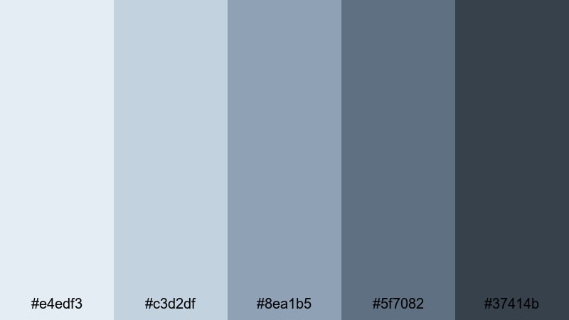
- HEX Codes: #e4edf3, #c3d2df, #8ea1b5, #5f7082, #37414b
- Mood: Calm, reflective, and quietly optimistic, like a foggy seaside morning.
- Use for: Works well for vlog intros, minimal lifestyle thumbnails, and soft cinematic overlays.
Misty Harbor Hush drifts from pale mist into muted blue gray and down to deeper harbor tones, wrapping your visuals in a soft, reflective atmosphere. The lighter shades are perfect for backgrounds and negative space, while the darker notes anchor text, icons, and framing elements.
Use this palette in Filmora for aesthetic vlogs, quiet B-roll sequences, and minimalist channel branding that feels thoughtful rather than flashy. It works especially well for YouTube thumbnails with clean typography, intro cards for travel or lifestyle content, and subtle color washes over footage to create a cohesive blue gray story.
Pro Tip: Build a Cinematic Blue Gray Look in Filmora
To keep a gentle blue gray mood running through an entire edit, treat Misty Harbor Hush as your visual backbone. In Filmora, you can set titles, lower thirds, and background solids with these HEX codes, then reuse them as presets across intro, B-roll, and end screen templates.
Combine the light tones for backgrounds with the darkest shade for text or logo accents so your channel looks unified whether it is a full-length vlog, a YouTube Short, or a looping intro. Saving these as custom colors and templates in Filmora helps you lock in a recognizable blue gray brand without rebuilding from scratch every time.
AI Color Palette
If you already have a reference image that captures this misty blue gray mood, you can let Filmora match it for you. Filmora's AI Color Palette feature analyzes your reference frame and automatically applies a similar color style to other clips in your timeline.
Import a still frame that uses the Misty Harbor Hush colors, then apply the AI Color Palette across vlog intros, talking-head shots, and B-roll. This keeps skin tones natural while gently shifting your footage toward a cohesive, cinematic blue gray aesthetic with almost no manual adjustments.
 secure download

HSL, Color Wheels & Curves
Once your footage has a blue gray base, you can fine-tune the look with Filmora's HSL, color wheels, and curves controls. Slightly lowering saturation in blues and cyans, lifting the shadows, and cooling midtones will enhance that misty harbor feeling without crushing detail.
Tools like HSL and curves, as shown in Filmora's color grading tutorials, help you protect skin tones while nudging skies, shadows, and backgrounds deeper into your chosen palette. A gentle S-curve and a cool shift in the shadow wheel can instantly make your blue gray visuals feel more cinematic and intentional.
secure download1000+ Video Filters & 3D LUTs
To move even faster, you can start from Filmora's presets and then nudge them toward a blue gray aesthetic. Filmora's video filters and 3D LUTs make it easy to add film-like contrast, soften highlights, or introduce subtle tints that complement Misty Harbor Hush.
Stack a soft cinematic filter with reduced saturation, then adjust opacity until your footage feels airy but not washed out. Saving this as a custom preset means you can give every vlog, study session, or travel recap the same consistent blue gray mood with one click.
secure downloadFoggy Morning Coast
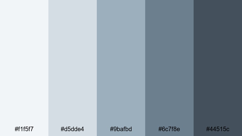
- HEX Codes: #f1f5f7, #d5dde4, #9bafbd, #6c7f8e, #44515c
- Mood: Serene and introspective with a soft coastal chill.
- Use for: Great for travel vlogs, B-roll title cards, and understated cinematic lower thirds.
Foggy Morning Coast layers soft whites over muted blue gray tones, evoking a hazy shoreline at sunrise. The palette feels calm and slightly cool, ideal when you want serenity without losing structure in your design.
Use the lighter tones for clean YouTube thumbnail backgrounds and the darker blues for text, borders, and lower thirds in Filmora. It is a strong choice for travel or journal-style vlogs where you want your footage to feel reflective, with minimalist overlays that never distract from the story.
Silver Lining Skies
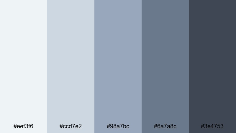
- HEX Codes: #eef3f6, #ccd7e2, #98a7bc, #6a7a8c, #3e4753
- Mood: Hopeful and airy with a gentle atmospheric glow.
- Use for: Perfect for inspirational quote screens, channel trailers, and intro slates with light typography.
Silver Lining Skies combines cool silver blues with grounding charcoal accents, giving your visuals a subtle glow. The gradient from soft sky tones to deeper blue gray makes it easy to create depth without adding bright, distracting colors.
Apply the palest shades to full-screen quotes, title cards, and intro backgrounds, then use the darkest tone for high-contrast text and logo marks. In Filmora, this palette works beautifully for motivational videos, creator trailers, and brand bumpers where you want a polished, uplifting blue gray identity.
Gentle Tide Drift
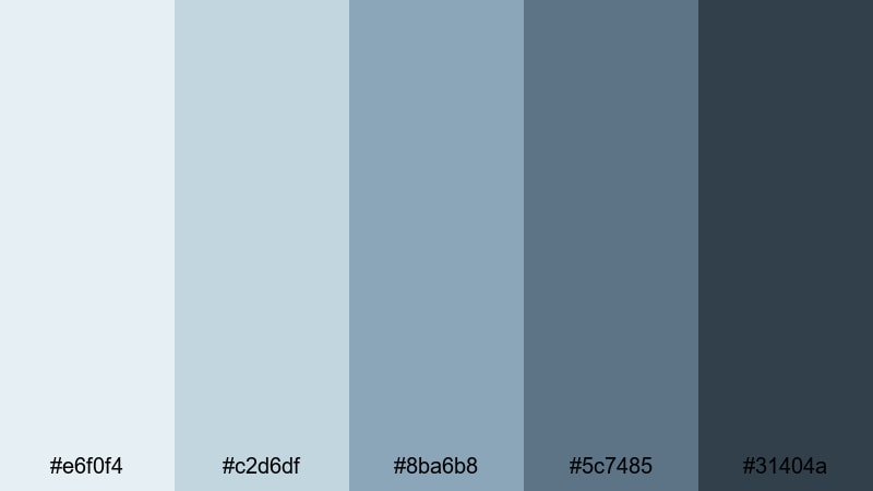
- HEX Codes: #e6f0f4, #c2d6df, #8ba6b8, #5c7485, #31404a
- Mood: Relaxed, fluid, and coastal with a meditative feel.
- Use for: Use for wellness channels, study-with-me videos, and calm motion graphics backgrounds.
Gentle Tide Drift moves from tidewashed blues to softened grays, creating a soothing, meditative palette. It feels like slow waves on a quiet beach, ideal when you want your visuals to encourage focus and relaxation.
Use this palette in Filmora for study-with-me layouts, pomodoro timer overlays, and ASMR channel branding. The mid and dark tones are excellent for progress bars and captions, while the lighter shades keep backgrounds airy and easy on the eyes during long viewing sessions.
Cloudlight Whisper
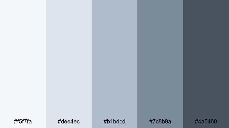
- HEX Codes: #f5f7fa, #dee4ec, #b1bdcd, #7c8b9a, #4a5460
- Mood: Light, dreamy, and unobtrusive, like soft daylight through clouds.
- Use for: Ideal for background graphics in tutorials, screen overlays, and subtle gradient frames.
Cloudlight Whisper features feather-soft whites and muted blue gray accents, giving your design a dreamy, low-contrast look. It stays out of the way visually, which is perfect for content where the on-screen information matters most.
Try this palette for tutorial backgrounds, screen recordings, and UI walkthroughs inside Filmora. The subtle gradients and muted tones keep text, diagrams, and cursor movements clear while still delivering a calm blue gray aesthetic across your thumbnails and title slides.
Moody & Cinematic Blue Gray Color Palettes
Stormfront Cinema
- HEX Codes: #e2e4e8, #a5afba, #6a7785, #3b4652, #171d24
- Mood: Dramatic, tense, and cinematic with a stormy edge.
- Use for: Great for trailers, dramatic storytimes, and title cards with bold typography.
Stormfront Cinema pushes blue gray into a high-contrast, stormy direction. Light steel tones sit above deep charcoal shadows, creating a dynamic range that instantly feels more cinematic and intense.
Use this palette in Filmora for storytime videos, mini documentaries, and suspenseful channel teasers. The darkest shade makes a strong backdrop for bold white text, while midtones are perfect for lower thirds, frames, and animated shapes that echo a moody, dramatic blue gray style.
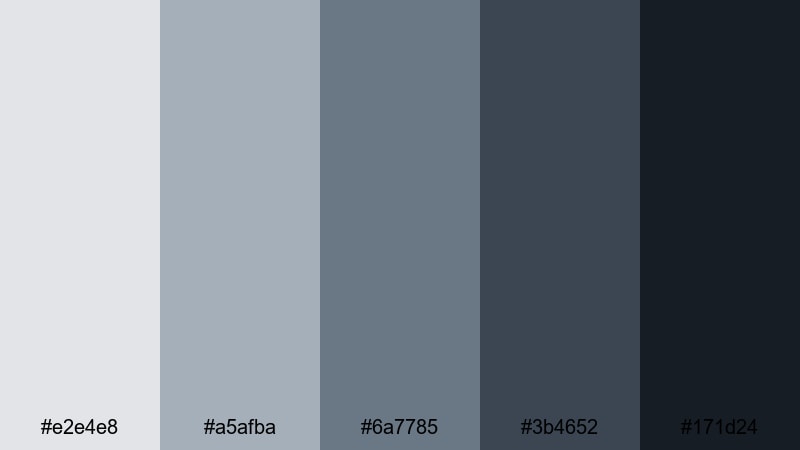
Noir Harbor Night

- HEX Codes: #d5dae1, #9aa3b1, #5f6a7b, #303945, #0f141a
- Mood: Dark, urban, and mysterious, with a subtle vintage noir feel.
- Use for: Use in crime, mystery, or commentary channels needing a moody yet polished look.
Noir Harbor Night leans into smoky blue gray tones and almost-black shadows, evoking a quiet harbor after dark. It feels urban and slightly vintage, perfect for content with intrigue or critical commentary.
Use the darker colors as backgrounds for talking-head commentary, reaction videos, or true crime stories, and add lighter grays for captions and chapter titles. In Filmora, this palette works well with vignette effects and subtle film grain to reinforce a noir-inspired blue gray aesthetic.
Deep Current Drama
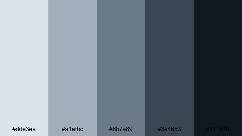
- HEX Codes: #dde3ea, #a1afbc, #6b7a89, #3a4653, #111820
- Mood: Intense and immersive, like being pulled into a deep current.
- Use for: Ideal for cinematic color grading, dramatic intros, and lower thirds in docu-style videos.
Deep Current Drama dives from misty highlights into inky blue gray depths, giving you a wide tonal range for powerful storytelling. It adds seriousness and focus, making footage feel more like a short film than a casual upload.
Grade your clips in Filmora with this palette in mind: let the lighter shades live in highlights and text, while the darker hues dominate shadows, frames, and end-screen backgrounds. It is a strong pick for docu-style pieces, cinematic B-roll, and impactful openers that need a consistent, dramatic blue gray finish.
Midnight Rainfall
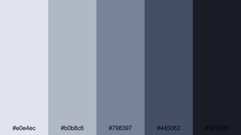
- HEX Codes: #e0e4ec, #b0b8c6, #798397, #445063, #181d25
- Mood: Brooding yet romantic, like rain on city streets at midnight.
- Use for: Great for music videos, night city montages, and aesthetic reels or shorts.
Midnight Rainfall mixes cool raindrop blues with urban blue gray shadows, building a palette that feels both moody and romantic. It captures that late-night city energy without relying on neon or harsh contrast.
Try it for music videos, dance edits, or aesthetic reels made in Filmora. Use the midtones for overlays and motion graphics, while the deep shades frame your footage and transitions. The result is a cohesive night-time blue gray look that pairs nicely with lens flares, bokeh, and slow-motion shots.
Thunderhead Horizon
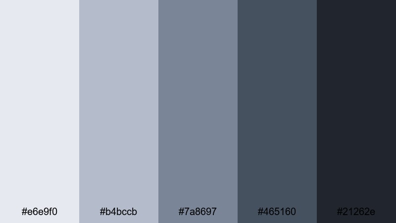
- HEX Codes: #e6e9f0, #b4bccb, #7a8697, #465160, #21262e
- Mood: Powerful and expansive, with the energy of a building storm.
- Use for: Use in tech reviews, high-stakes gaming intros, and bold cinematic title screens.
Thunderhead Horizon pairs expansive sky blues with dark thunderhead grays, creating a palette that feels big, bold, and confident. It has enough contrast to make titles pop while still staying in a refined blue gray family.
Use this palette for tech reviews, reveal trailers, or gaming intros in Filmora. The lighter colors work well for info panels and specs callouts, while the darkest shades make intense backgrounds for animated titles, glitch transitions, or logo stings.
Minimal & Modern Blue Gray Color Palettes
Nordic Desk Setup
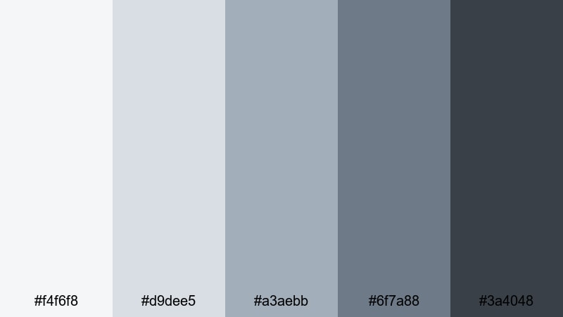
- HEX Codes: #f4f6f8, #d9dee5, #a3aebb, #6f7a88, #3a4048
- Mood: Clean, focused, and contemporary with a Scandinavian touch.
- Use for: Perfect for productivity channels, desk tours, and minimalist branding packages.
Nordic Desk Setup echoes a tidy Scandinavian workspace with soft off-whites and structured blue gray tones. It feels organized and uncluttered, ideal for content about productivity, workflow, or tech gear.
Apply this palette to desk setup videos, planning routines, and workspace tours in Filmora. Use the lightest tones for backgrounds and cards, midtones for icons and UI elements, and the darkest shade for headings, logos, and call-to-action buttons on your end screens or channel art.
Urban Loft Interface
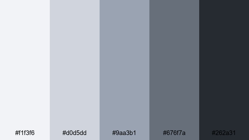
- HEX Codes: #f1f3f6, #d0d5dd, #9aa3b1, #676f7a, #262a31
- Mood: Sleek, urban, and design-forward like a modern loft UI.
- Use for: Ideal for app demos, UI walkthroughs, and tech startup explainer videos.
Urban Loft Interface combines neutral interface grays with cool blue gray accents, mimicking modern software dashboards and city interiors. It feels professional but not cold, which is great for tech and SaaS-focused content.
In Filmora, build your explainer videos, app demos, or product walk-throughs around this palette. Use the lighter tones for background plates behind screen captures and the darker ones for key lines, icons, and text overlays, so your blue gray branding matches the digital products you are showcasing.
Clean Slate Branding
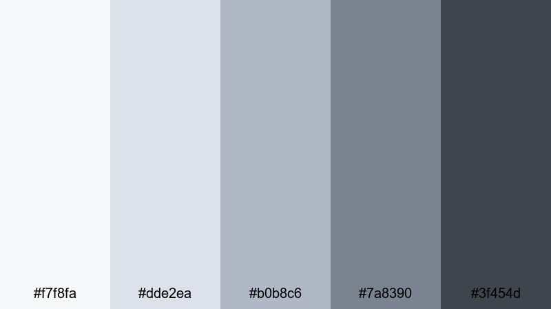
- HEX Codes: #f7f8fa, #dde2ea, #b0b8c6, #7a8390, #3f454d
- Mood: Fresh, professional, and uncluttered, ready for a new brand story.
- Use for: Great for logo reveals, end screens, and cohesive channel branding kits.
Clean Slate Branding offers a refined mix of pale neutrals and structured blue grays, perfect for building a timeless visual identity. It feels like a fresh start, making it ideal when you are rebranding a channel or launching a new series.
Use this palette to design logo reveals, lower thirds, and end screens in Filmora so that every touchpoint of your channel matches. The midtones are strong choices for buttons and social handles, while the lightest shades keep backgrounds polished and uncluttered.
Glass Tower UI
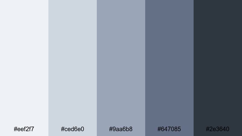
- HEX Codes: #eef2f7, #ced6e0, #9aa6b8, #647085, #2e3640
- Mood: Polished and corporate with a sleek glass-and-steel vibe.
- Use for: Use in corporate explainers, fintech dashboards, and data-driven motion graphics.
Glass Tower UI brings a glass-and-steel feeling to your visuals with cool glassy blues and structural gray shades. It instantly communicates professionalism and reliability, especially for business or finance content.
In Filmora, pair this palette with clean line animations, bar charts, and subtle motion graphics. Use darker tones for title bars and data labels, while lighter hues fill charts, panels, and background layers to keep your data-driven videos crisp and easy to read.
Focus Mode Workspace
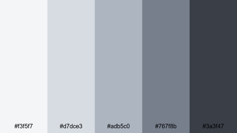
- HEX Codes: #f3f5f7, #d7dce3, #adb5c0, #767f8b, #3a3f47
- Mood: Productive, calm, and distraction-free.
- Use for: Ideal for coding streams, study channels, and tutorial backgrounds that need clarity.
Focus Mode Workspace balances blue grays with soft contrast to create a quiet, distraction-free environment on screen. It supports long-form content where viewers need to concentrate, like coding, studying, or in-depth tutorials.
Use this palette for overlays, sidebars, and code or note highlights in Filmora. The gentle contrast keeps everything legible without overwhelming the eye, making it easier for your audience to stay engaged with the content itself over longer videos.
Tips for Creating Blue Gray Color Palettes
Blue gray is flexible enough to feel soft, cinematic, or ultra-modern, as long as you balance contrast, saturation, and supporting colors. Here are practical tips for building and using your own blue gray color combinations in video and design.
- Pick a base blue gray and build around it with at least one lighter highlight shade and one deeper shadow tone for contrast.
- Use warm neutrals (like soft beige or muted cream) sparingly alongside blue gray to keep skin tones natural and avoid a cold, clinical look.
- Check text readability by testing your thumbnail or title frames at small sizes; increase contrast or darken backgrounds if headlines are hard to see.
- Limit accent colors to one or two hues (for example a muted gold or teal) so your blue gray branding stays consistent across videos and platforms.
- Match your palette to your footage: cooler, desaturated blue grays suit rainy, urban, or night scenes, while softer, lighter blue grays fit lifestyle and study content.
- Create preset color styles in Filmora for titles, lower thirds, and backgrounds using your chosen HEX codes so you can reuse them across projects.
- When color grading, reduce saturation slightly and cool the midtones to nudge footage into a blue gray mood without making it look unnatural.
- Always preview on multiple devices if possible; some monitors push blues harder, so adjust your palette for balanced contrast and comfort on phones and laptops.
Blue gray color palettes can completely reshape the mood of your videos, from calm productivity sessions to dramatic cinematic edits. Whether you prefer soft, airy tones or deep, moody shadows, choosing a consistent palette gives your channel a recognizable identity.
Use the HEX codes above as starting points in Filmora, then refine them with AI tools, HSL adjustments, and LUTs until they match your style. Saving these looks as presets and reusing them in your intros, thumbnails, and overlays will help your content feel cohesive and professional.
The more you experiment with blue gray combinations, the faster you will find a signature look that fits your storytelling. Open a new project, drop in a few test clips, and start applying these palettes to see which one feels most like your brand.
secure downloadNext: Brown Blue Color Palette
