
 100% Security Verified | No Subscription Required | No Malware


 ChatGPT
 Perplexity
 Gemini
 Claude
 Grok
Grok
Brown Blue is a powerful mix of grounded earth tones and calming ocean hues. Browns feel warm, stable, and nostalgic, while blues signal trust, clarity, and depth. Together, they create cozy yet sophisticated visuals that are perfect for cinematic storytelling, lifestyle content, and modern branding. Depending on the exact shades, a Brown Blue palette can feel anything from soft and pastel to dark and dramatic.
For video creators, this combo works beautifully in YouTube thumbnails, vlog intros, lower thirds, channel banners, and full brand kits. Below are 15 carefully curated Brown Blue color palettes with ready-to-use HEX codes, designed for editors, designers, and Filmora users who want repeatable, professional color schemes across all their content.
In this article
Warm Cinematic Brown Blue Color Palettes
Rustic Harbor Dusk

- HEX Codes: #2b4a5f, #476d7c, #8b5a3c, #c89b6e, #f4e3c3
- Mood: Cozy, nostalgic, and gently dramatic like a sunset over an old pier.
- Use for: Perfect for cinematic vlog openings, travel films, and storytelling thumbnails with a warm, grounded feel.
This palette mixes deep harbor blues with sunlit browns, capturing the glow of golden hour over weathered wood. The darker blues (#2b4a5f, #476d7c) add depth and contrast, while the caramel and cream tones (#8b5a3c, #c89b6e, #f4e3c3) soften everything with a nostalgic warmth.
Use the darkest blue as your background for titles and end cards, the mid blue for overlays or lower thirds, and the lighter browns for skin-friendly highlights in thumbnails. The soft cream is perfect for legible text bars and logo marks, so your Brown Blue branding stays cinematic but easy to read across intros, chapter cards, and social cutdowns.
Pro Tip: Build a Cinematic Brown Blue Harbor Look in Filmora
To keep this Rustic Harbor Dusk palette consistent, start by using one of the deep blues as your base for backgrounds and overlays in Filmora. Then sample the warm browns for title text, shapes, and graphic accents so every frame of your vlog intro, B-roll montage, and outro feels like it belongs to the same harbor at dusk.
You can also create a custom color preset for text, elements, and borders in Filmora. Once your Brown Blue combo is set, reuse it across your entire series so your thumbnails, openers, and social teasers all carry the same cinematic mood.
AI Color Palette
If you have a reference still that perfectly captures this Brown Blue sunset mood, load it into Filmora and let AI do the heavy lifting. Filmora's AI Color Palette feature can analyze the look and automatically apply a similar color treatment to the rest of your timeline.
This is ideal when you want your A-roll, drone shots, and B-roll overlays to share the same warm blues and rustic browns. Instead of grading each clip manually, you get a unified, cinematic palette in a few clicks.
 secure download

HSL, Color Wheels & Curves
Once your Brown Blue base is in place, refine it using Filmora's HSL controls, color wheels, and curves. You can deepen the harbor blues in the shadows while gently lifting the warm browns in the midtones, giving your footage that cinematic dusk look without crushing detail.
If you want more guidance on shaping color contrast and mood, follow the steps in this Filmora color correction tutorial. Adjusting hue and saturation for blues and oranges separately lets you fine-tune skin tones, skies, and wood textures so they match your chosen palette exactly.
secure download1000+ Video Filters & 3D LUTs
To move even faster, start from one of Filmora's built-in cinematic looks. Filmora's video filters and 3D LUTs make it easy to get a Brown Blue base grade, then you can tweak it slightly to match the exact HEX codes in Rustic Harbor Dusk.
Apply a warm, teal-and-orange style LUT to your clips, then adjust intensity until the blues and browns line up with your palette. This is an efficient way to keep shorts, reels, and long-form videos visually consistent without custom grading every shot from scratch.
secure downloadCabin Lake Reflections
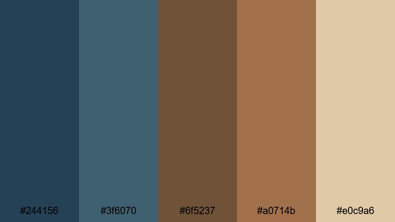
- HEX Codes: #244156, #3f6070, #6f5237, #a0714b, #e0c9a6
- Mood: Calm, grounded, and intimate, evoking a lakeside cabin retreat.
- Use for: Use for outdoor adventure vlogs, documentary-style intros, and cozy channel branding.
Cabin Lake Reflections pairs deep lake blues with woody browns to create a grounded, outdoorsy feel. The darker tones are ideal for titles and frames, while the lighter beige (#e0c9a6) keeps your text and icons readable.
Use this palette for camping or hiking vlogs, slow living edits, or nature B-roll. Apply the blues to overlays, transitions, and lower thirds, and reserve the browns for logos, end screens, and thumbnail text boxes to add warmth to your Brown Blue theme.
Cocoa Tide Serenity
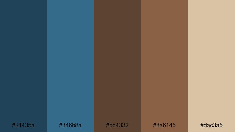
- HEX Codes: #21435a, #346b8a, #5d4332, #8a6145, #dac3a5
- Mood: Serene and reassuring with a hint of cinematic depth.
- Use for: Great for wellness channels, calming B-roll overlays, and understated brand packs.
Cocoa Tide Serenity brings together smooth cocoa browns and soft ocean blues for a balanced, soothing aesthetic. The blues are muted enough to feel gentle, while the browns add comforting warmth without overpowering the frame.
This Brown Blue combination works well for meditation videos, educational explainers, or quiet travel diaries. Use the deeper tones for backgrounds and subtitles, with the lighter beige as a subtle highlight on buttons, chapter labels, and social handles.
Autumn Dockline

- HEX Codes: #2c3e4f, #486c86, #7b4a2e, #b26f3a, #f0d7b2
- Mood: Warm, seasonal, and storytelling-focused like a fall day at the marina.
- Use for: Ideal for seasonal video promos, episodic series graphics, and narrative thumbnails.
Autumn Dockline combines crisp dockside blues with pumpkin-tinted browns for a distinctly fall mood. The darker navy and teal create a stable base, while the orange-brown accents feel like leaves and late afternoon light.
Use this palette when launching autumn series on your channel, highlighting special episodes, or designing seasonal thumbnail frames. The light beige (#f0d7b2) is great for date stamps, video titles, or playlist labels that need to remain clear on both mobile and desktop.
Soft Pastel Brown Blue Color Palettes
Powder Shore Daybreak
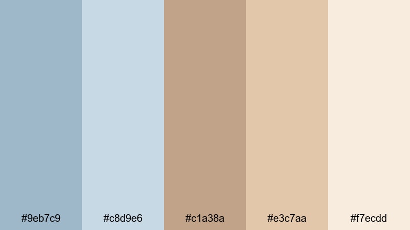
- HEX Codes: #9eb7c9, #c8d9e6, #c1a38a, #e3c7aa, #f7ecdd
- Mood: Light, airy, and optimistic like first light on a quiet beach.
- Use for: Perfect for lifestyle vlogs, morning routine videos, and gentle channel rebrands.
Powder Shore Daybreak uses pastel sky blues and milky browns to create a breezy, uplifting tone. The soft blues feel clean and modern, while the pale browns keep everything warm and approachable.
This palette is ideal for morning routines, aesthetic study vlogs, and minimalist branding. Use the lightest tones (#e3c7aa, #f7ecdd) for backgrounds and cards, and reserve the slightly deeper blue (#9eb7c9) for headline text or icons so your Brown Blue design stays subtle but readable.
Dusty Porcelain Sky
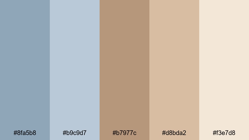
- HEX Codes: #8fa5b8, #b9c9d7, #b7977c, #d8bda2, #f3e7d8
- Mood: Delicate and refined with a hint of vintage porcelain charm.
- Use for: Use in beauty reviews, stationery-inspired graphics, and subtle lower thirds.
Dusty Porcelain Sky blends muted blues with porcelain-like browns for a refined yet friendly look. Nothing is overly saturated, which helps your footage feel soft, calm, and slightly vintage.
Use this Brown Blue palette for beauty tutorials, stationery hauls, or journaling content. The pale beige (#f3e7d8) works well behind product names and timestamps, while the dusty blue (#8fa5b8) can highlight key words or call-to-action buttons in your thumbnails and end screens.
Faded Denim Latte

- HEX Codes: #7f9bb2, #a9bfd0, #b68f71, #d5b294, #f5e6d5
- Mood: Casual, soft, and comforting like your favorite jeans and coffee.
- Use for: Great for day-in-the-life vlogs, study-with-me videos, and relaxed channel art.
Faded Denim Latte pairs washed denim blues with creamy latte browns to create a cozy, everyday aesthetic. It feels informal and lived-in, which suits realistic, behind-the-scenes content.
Apply the mid blue (#7f9bb2) to titles and progress bars, and use the latte browns for backgrounds, borders, and thumbnail frames. This Brown Blue scheme will help day-in-the-life vlogs, campus diaries, and casual chat videos feel warm and consistent without looking too polished.
Soft Driftwood Breeze
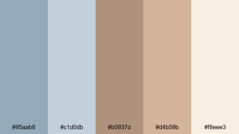
- HEX Codes: #95aab8, #c1d0db, #b0937d, #d4b59b, #f8eee3
- Mood: Breezy, gentle, and organic with coastal softness.
- Use for: Perfect for coastal travel reels, soft product promos, and clean UI overlays.
Soft Driftwood Breeze combines airy shoreline blues with driftwood browns for an organic, coastal feel. The palette is light and desaturated, ideal for creators who prefer minimal, white-space-heavy layouts.
Use the blues on overlays, icons, and simple line art, and keep the browns for subtle accents on product frames or call-out boxes. This Brown Blue color scheme shines in soft product promos, eco-conscious branding, and clean UI elements on intros and lower thirds.
Bold Modern Brown Blue Color Palettes
Indigo Espresso Contrast
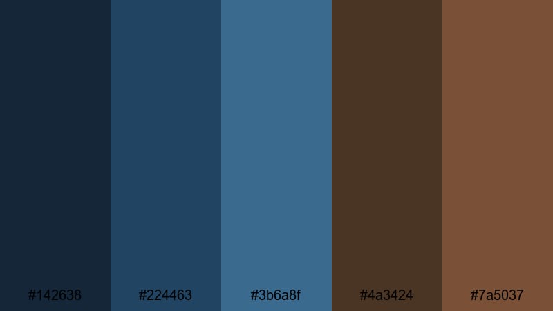
- HEX Codes: #142638, #224463, #3b6a8f, #4a3424, #7a5037
- Mood: Bold, sleek, and confident with strong cinematic contrast.
- Use for: Ideal for tech intros, bold YouTube banners, and impactful title cards.
Indigo Espresso Contrast leans into deep indigo blues and espresso browns for a high-impact, modern aesthetic. The dark shades create strong contrast that instantly draws attention to your titles and graphics.
Use the darkest blue (#142638) as a backdrop for kinetic typography, with the bright blue (#3b6a8f) and warm browns as accent colors. This palette is excellent for tech channels, productivity content, or any Brown Blue branding that needs to feel sharp and premium.
Cobalt Cedar Statement

- HEX Codes: #0f3b5f, #236a96, #3f7fb0, #5a3a23, #8b5630
- Mood: Energetic and assertive with a polished editorial edge.
- Use for: Use for bold channel rebrands, product launches, and kinetic typography sequences.
Cobalt Cedar Statement combines striking cobalt blues with rich cedar browns to create a confident, editorial look. The blues command attention on screen, while the browns provide a grounded counterbalance.
This Brown Blue palette works especially well for product launches, rebrands, and motion graphics. Use the saturated blues for backgrounds, transitions, and animated shapes, and apply the cedar browns to logos, taglines, and thumbnail borders.
Electric Timber Edge
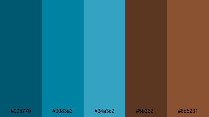
- HEX Codes: #005770, #0083a3, #34a3c2, #5b3621, #8b5231
- Mood: Vibrant, youthful, and edgy with a digital twist.
- Use for: Great for gaming highlights, motion graphics, and high-energy social cuts.
Electric Timber Edge pushes the blues into electric turquoise territory, then anchors them with deep timber browns. The result feels youthful and digital, without losing a sense of groundedness.
Use the bright aquas for streaks, glitch transitions, and overlay elements in gaming or reaction videos. The dark browns (#5b3621, #8b5231) make excellent accent colors for username tags, lower thirds, and thumbnail frames, keeping your Brown Blue identity unique among neon-heavy channels.
Midnight Walnut Neon
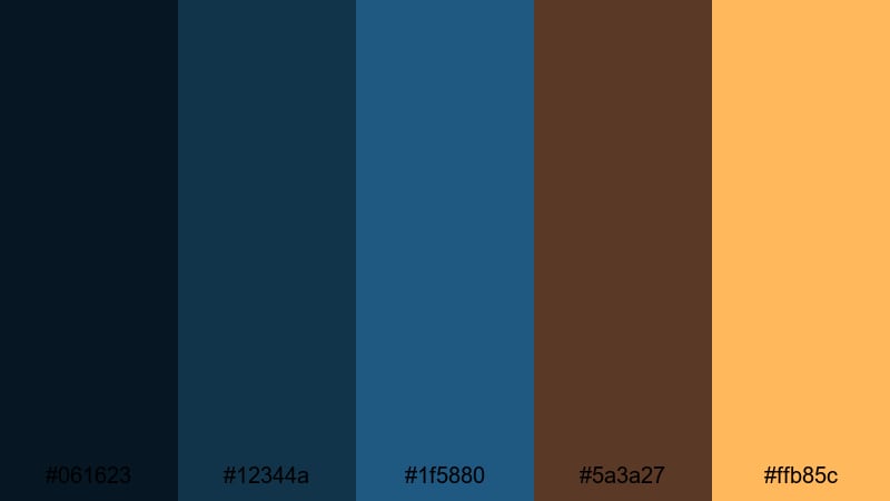
- HEX Codes: #061623, #12344a, #1f5880, #5a3a27, #ffb85c
- Mood: Dark, cinematic, and punchy with a neon accent pop.
- Use for: Perfect for cinematic trailers, music videos, and bold thumbnail text blocks.
Midnight Walnut Neon is built on rich midnight blues and walnut browns, punctuated by a neon amber accent (#ffb85c). It feels like a night scene lit by warm streetlights or stage spots.
Use the near-black blue (#061623) as your main background color for titles and outro cards. The neon amber is ideal for highlighting important words, call-to-action buttons, or play icons in your thumbnails, giving your Brown Blue visuals a bold, click-worthy punch.
Moody Vintage Brown Blue Color Palettes
Weathered Blueprint

- HEX Codes: #273646, #4a5c6f, #6e7f92, #765741, #a37d5b
- Mood: Thoughtful, intellectual, and slightly industrial with a vintage twist.
- Use for: Use in documentary titles, educational explainers, and portfolio reels.
Weathered Blueprint mixes blueprint-style blues with worn, industrial browns. The palette feels archival and intellectual, perfect for content that needs to look serious but still designed.
Use the deep blues for title slates, infographics, and chapter cards, and bring in the browns for subtle borders, lower thirds, and logo treatments. This Brown Blue set is great for case studies, design portfolios, and documentary-style edits.
Old Film Marina
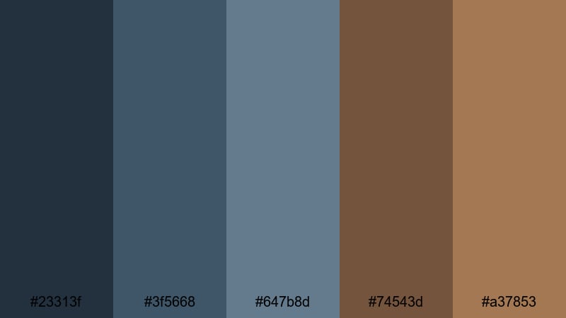
- HEX Codes: #23313f, #3f5668, #647b8d, #74543d, #a37853
- Mood: Nostalgic and cinematic, like faded film from a dockside afternoon.
- Use for: Perfect for retro-styled edits, film emulation looks, and story-heavy vlogs.
Old Film Marina uses faded marina blues and sepia browns that resemble aged film stock. The tones are slightly washed, which instantly adds a nostalgic, storytelling feel.
Use this Brown Blue palette with film grain effects, slow pans, and voiceover-heavy content. Let the darker blues sit in the shadows of your footage, while the sepia browns color titles, date stamps, and chapter markers to complete the retro vibe.
Smoky Ocean Leather
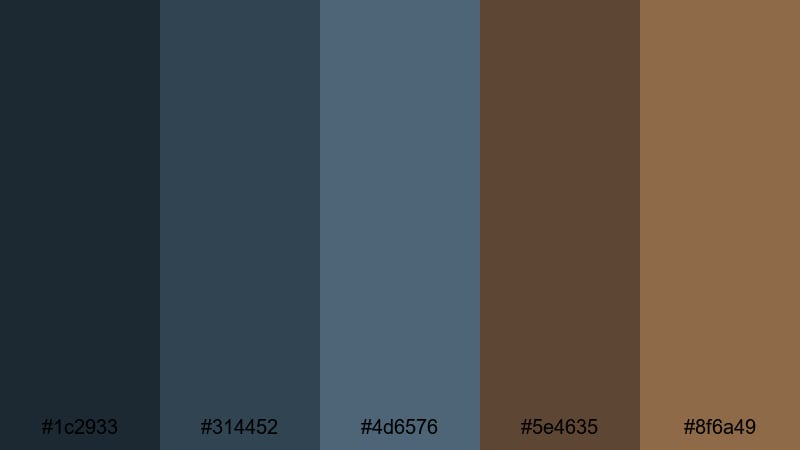
- HEX Codes: #1c2933, #314452, #4d6576, #5e4635, #8f6a49
- Mood: Brooding, textured, and sophisticated with a rugged finish.
- Use for: Great for menswear lookbooks, coffee brand visuals, and moody title sequences.
Smoky Ocean Leather brings together smoky ocean blues and worn leather browns for a rugged, premium atmosphere. It feels masculine and crafted, with enough contrast to stay cinematic.
Use the blues for backgrounds and gradient overlays, and add the leather browns to typography, logo frames, and product close-up borders. This Brown Blue palette fits menswear lookbooks, coffee or craft brands, and moody title sequences that need to look intentional and high-end.
Tips for Creating Brown Blue Color Palettes
Brown Blue color schemes are flexible, but they work best when you balance warmth, contrast, and readability across your video frames, thumbnails, and graphic overlays. Keep these practical tips in mind when building or customizing your own palettes.
- Decide the hero: choose whether blue or brown is the dominant color, then use the other mainly for accents and emphasis.
- Control contrast for text: pair dark blues or browns with very light creams or beiges so titles stay legible on small mobile screens.
- Match your footage: if your clips already lean warm (sunset, interiors), shift blues slightly towards teal; if they are cool (overcast, city), keep browns more neutral.
- Limit saturation: for cinematic Brown Blue looks, keep saturation moderate and lean on contrast and brightness instead of overly vivid color.
- Use one accent color: add just one bright accent (like amber or turquoise) to guide the eye to CTAs, buttons, or important text.
- Stay consistent across assets: reuse the same HEX codes for intros, lower thirds, thumbnails, and end cards so your channel feels instantly recognizable.
- Test on dark and light modes: check how your palette looks against both dark and light backgrounds if you design for different platforms.
- Build presets in Filmora: save your favorite Brown Blue combinations as presets for titles, shapes, and color grading so you can apply them quickly to every new project.
Brown Blue palettes can make your videos feel warm and trustworthy while still looking modern and cinematic. From cozy travel diaries to bold tech intros, the right combination of harbor blues and woody browns can define your channel identity and keep your visuals cohesive everywhere viewers see you.
Use these 15 palettes as ready-made starting points: plug the HEX codes into your thumbnail designs, apply matching grades in Filmora, and adjust HSL or LUT intensity until they suit your footage. Over time, you can refine one or two Brown Blue schemes into a signature look that audiences instantly associate with your content.
Open Filmora, drop in your next project, and experiment with these color combinations across intros, title cards, B-roll, and shorts. With AI Color Palette, HSL controls, and 3D LUTs, it is easy to keep your Brown Blue theme consistent, cinematic, and on brand.
secure downloadNext: Black Gold Color Palette
