
 100% Security Verified | No Subscription Required | No Malware


 ChatGPT
 Perplexity
 Gemini
 Claude
 Grok
Grok
Snow-inspired whites and icy tones often feel calm, pure, and intentional. In color psychology, snow shades suggest clarity, freshness, and quiet focus, which is why they work so well in minimal branding, aesthetic vlogs, winter-themed edits, and clean YouTube thumbnails. Soft whites and pale blues can make footage feel airy and cinematic, while deeper accents add structure and contrast.
This guide collects 15 snow color palettes with ready-to-use HEX codes so you can grade videos, design thumbnails, and build cohesive branding more easily. Whether you edit in Filmora, design channel art, or create social content, these palettes give you a solid starting point for a polished snow aesthetic.
In this article
Soft & Serene Snow Color Palettes
Morning Frost Glow

- HEX Codes: #ffffff, #f7fbff, #e3f2ff, #cfd8ff
- Mood: Calm, airy, and quietly optimistic like a clear winter morning.
- Use for: Ideal for dreamy vlog intros, calm study videos, and minimalist lifestyle thumbnails.
This palette feels weightless and bright, like the first light hitting fresh snow. Pure white pairs with pale sky blues to keep everything clean, open, and breathable. It softens harsh footage and instantly adds a gentle, uplifting mood.
Use Morning Frost Glow for study-with-me videos, morning routines, or lifestyle channels that lean into clarity and focus. In Filmora, apply these tones to your intro scenes, lower thirds, and thumbnails so your entire presence stays consistent across YouTube, Instagram Reels, and TikTok edits.
Pro Tip: Build A Cinematic Snow Look In Filmora
To keep a snow aesthetic consistent, start by balancing exposure and white balance so your whites stay neutral rather than yellow or blue. Then, nudge your highlights slightly toward the soft blues in this palette and keep midtones clean to preserve that crisp morning feel.
In Filmora, you can save your look as a custom preset and reuse it on your vlog intro, talking-head A-roll, B-roll, and shorts. That way, every piece of content has the same frosty clarity, from your main videos to your social teasers and channel trailer.
AI Color Palette
If you already have a still frame or a reference image that captures your ideal snow look, you can turn it into a video-wide grade. Filmora's AI Color Palette feature analyzes the colors in your reference and applies that palette across other clips for consistent whites and icy blues.
Drop your snow reference onto the Filmora timeline, match other shots to it with a few clicks, and fine-tune intensity. This is perfect when you want your thumbnails, openers, B-roll, and outro cards to share the same elegant snow tonality without manually grading every clip.
 secure download

HSL, Color Wheels & Curves
Once the base palette is in place, use HSL controls to gently desaturate blues and push any yellowish highlights back toward neutral snow white. Color wheels help you cool down shadows for a subtle icy undertone, while curves let you add soft contrast without crushing details in bright snow.
Filmora's color correction tools in Filmora give you precise control over highlights, midtones, and shadows, so you can decide how dreamy or dramatic your snow scenes should look. This is ideal for cinematic winter b-roll, time-lapses, or quiet storytelling edits.
secure download1000+ Video Filters & 3D LUTs
To speed up your workflow, you can start from creative presets and adjust from there. Filmora's video filters and 3D LUTs make it easy to test different snow moods, from soft matte winter looks to high-contrast editorial styles.
Apply a filter that fits the vibe, then refine the whites and blues so they match the HEX codes of this palette. This approach is perfect when you need consistent snow aesthetics across multiple videos, shorts, and promotional graphics without manually building every grade from scratch.
secure downloadSilent Alpine Drift
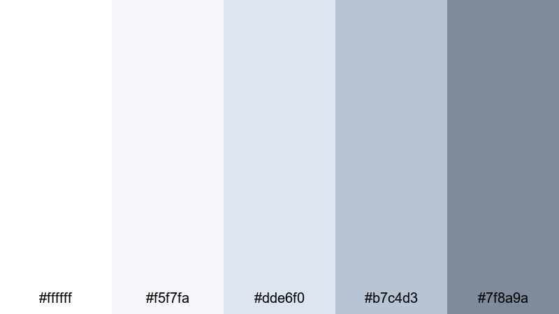
- HEX Codes: #ffffff, #f5f7fa, #dde6f0, #b7c4d3, #7f8a9a
- Mood: Quiet, contemplative, and slightly cool, like standing alone in fresh snow.
- Use for: Perfect for nature documentaries, travel vlogs, and reflective storytelling edits.
Silent Alpine Drift leans into cool whites and misty blue-grays, creating a sense of isolation and stillness. The gentle gradient from bright white to deeper gray-blue gives your frames depth without feeling harsh or gloomy.
This palette works beautifully for winter hikes, mountain drone shots, and reflective narration segments. Use it for YouTube thumbnails, cinematic lower thirds, and chapter cards when you want your visuals to feel calm, serious, and slightly introspective.
Featherlight Daybreak
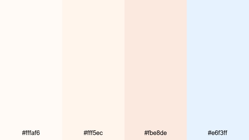
- HEX Codes: #fffaf6, #fff5ec, #fbe8de, #e6f3ff
- Mood: Gentle, hopeful, and softly glowing with first light.
- Use for: Lovely for wedding highlight reels, lifestyle reels, and morning routine content.
Featherlight Daybreak mixes warm off-whites and blush tones with a hint of pale blue, mirroring sunrise light on snow. It feels comforting and optimistic, with just enough color to avoid looking flat or clinical.
Apply this palette to wedding highlights, skincare content, or soft lifestyle edits where you want warmth without losing that snowy cleanliness. It is also a strong choice for YouTube banners, logo stings, and Instagram cover icons that aim for a gentle, romantic identity.
Snow Petal Whisper
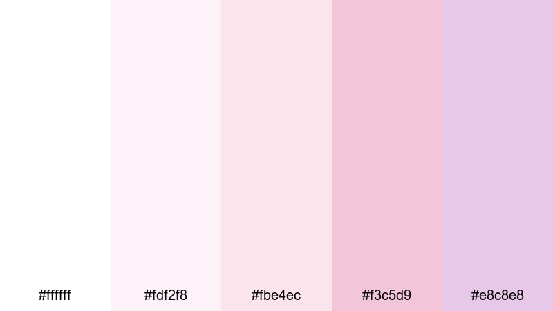
- HEX Codes: #ffffff, #fdf2f8, #fbe4ec, #f3c5d9, #e8c8e8
- Mood: Romantic, delicate, and slightly nostalgic.
- Use for: Great for beauty tutorials, soft product showcases, and romantic montage sequences.
Snow Petal Whisper blends crisp snow white with gentle petal pinks and lavender tints. The result is a dreamy, feminine palette that still feels fresh rather than overly sweet.
Use it to color grade beauty content, perfume or jewelry shots, and dreamy montage sequences. In your thumbnails and channel art, this palette signals softness and elegance, making it ideal for beauty, self-care, and romantic storytelling brands.
Modern Minimal Snow Color Palettes
Gallery White Focus
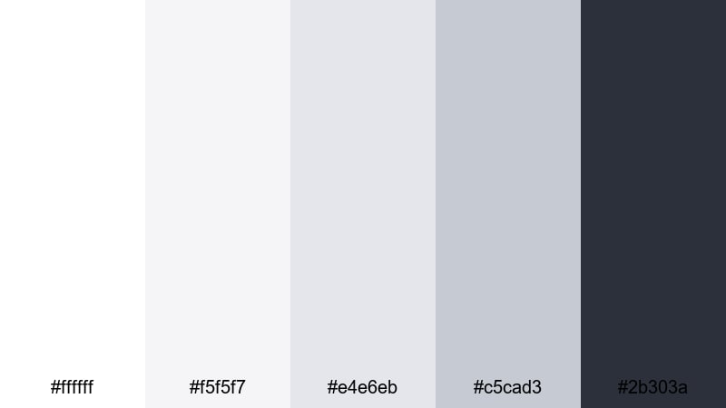
- HEX Codes: #ffffff, #f5f5f7, #e4e6eb, #c5cad3, #2b303a
- Mood: Clean, professional, and gallery-like with subtle structure.
- Use for: Ideal for YouTube channel branding, tech reviews, and sleek title cards.
Gallery White Focus stacks subtle shades of white and cool gray, anchored by a deep, almost ink-like accent. It feels like a modern art gallery wall: neutral enough to showcase your content, but structured enough to look high-end.
This palette shines in tech reviews, digital product breakdowns, and portfolio reels where clarity and professionalism matter. Use the darker shade for text, buttons, or logo marks, and keep backgrounds in the soft whites for easy-to-read thumbnails, intros, and lower thirds.
Nordic Apartment Snow
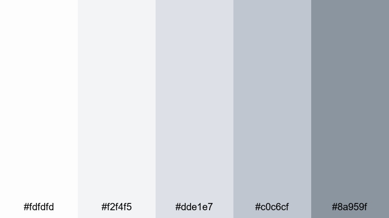
- HEX Codes: #fdfdfd, #f2f4f5, #dde1e7, #c0c6cf, #8a959f
- Mood: Scandinavian minimal, cozy but structured and design-forward.
- Use for: Perfect for interior design tours, productivity videos, and minimalist brand intros.
Nordic Apartment Snow layers soft whites and restrained grays that recall a bright Scandinavian loft. It feels tidy, airy, and design-savvy, but not cold or sterile.
Use it to grade interior b-roll, desk setups, and productivity workflows. For branding, apply the darkest gray to your text and icons, and keep background areas in the palest shades for that signature Nordic minimalism on banners, end screens, and channel trailers.
Slate And Snow Interface
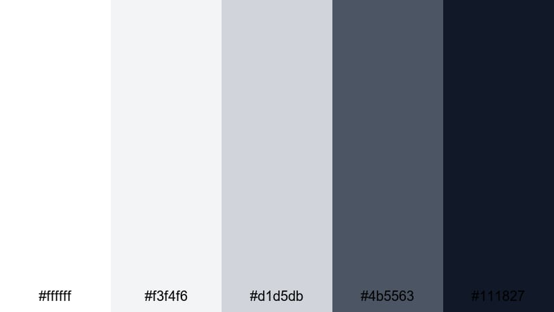
- HEX Codes: #ffffff, #f3f4f6, #d1d5db, #4b5563, #111827
- Mood: Crisp, digital, and confident with strong contrast for readability.
- Use for: Great for app promos, UI mockups, lower thirds, and modern explainer videos.
Slate And Snow Interface pairs bright snowy whites with slate and near-black accents, giving your visuals a sleek, product-design look. The strong contrast keeps text and icons razor sharp while the light grays prevent the frame from feeling too stark.
This is an excellent palette for UI walkthroughs, SaaS promos, and tutorial overlays. Use the darker tones for interface elements and typography while keeping backgrounds clean and snowy to highlight cursor movements, annotations, and key callouts.
Clean Frame Title Card
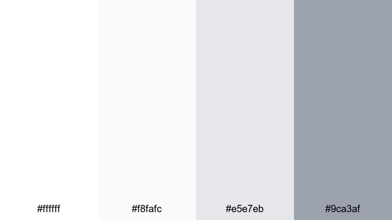
- HEX Codes: #ffffff, #f8fafc, #e5e7eb, #9ca3af
- Mood: Light, orderly, and understated with a studio feel.
- Use for: Ideal for simple title screens, tutorial overlays, and typography-led content.
Clean Frame Title Card is all about balance. White and soft grays keep the frame neutral so your titles, diagrams, or talking points stay center stage. It gives your channel a timeless, studio-like finish without distracting textures or colors.
Use this palette for how-to videos, coding tutorials, or educational content. In your thumbnails, combine a white or pale-gray background with a single accent image and strong typography in the darker gray to create a clear visual hierarchy.
Cozy Winter Snow Color Palettes
Fireplace Snow Evening
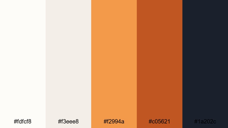
- HEX Codes: #fdfcf8, #f3eee8, #f2994a, #c05621, #1a202c
- Mood: Warm, intimate, and storybook cozy against a snowy backdrop.
- Use for: Perfect for holiday vlogs, family moments, and cozy night-in montages.
Fireplace Snow Evening contrasts soft snowy whites and creams with glowing ember oranges and deep charcoal. It feels like sitting by the fire while snow falls quietly outside, combining warmth and winter in a single frame.
Use this palette to grade holiday vlogs, baking sessions, or reading-by-the-fire clips. In thumbnails and social posts, keep the background light and bring attention to warm accents like candles, sweaters, and lights to instantly signal comfort and nostalgia.
Cabin Window Frost
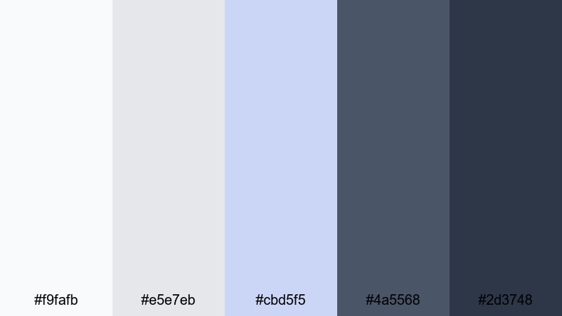
- HEX Codes: #f9fafb, #e5e7eb, #cbd5f5, #4a5568, #2d3748
- Mood: Snug yet crisp, like watching snowfall through a frosted window.
- Use for: Great for travel cabins, winter retreats, and calm storytelling edits.
Cabin Window Frost balances frosty whites and blue-grays with deeper interior tones, creating a gentle contrast between the cold outdoors and a cozy cabin interior. It feels snug but still maintains a cool winter edge.
Use it in travel vlogs, retreat recaps, or storytelling edits that alternate between interior coziness and snowy landscapes. For branding, employ the deeper blues for titles and callouts, and reserve the lighter tones for backgrounds and overlays.
Wool Scarf Snowday
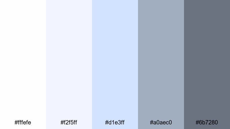
- HEX Codes: #fffefe, #f2f5ff, #d1e3ff, #a0aec0, #6b7280
- Mood: Playful, soft, and nostalgic like a childhood snow day.
- Use for: Ideal for family vlogs, playful reels, and cozy fashion lookbooks.
Wool Scarf Snowday combines soft whites with pastel blues and gentle grays, reminiscent of scarves, mittens, and overcast sky. It feels innocent and playful, yet still polished enough for branded content.
Use it in family vlogs, snowball fights, or winter outfit lookbooks. For thumbnails and Reels covers, contrast a white or pale-blue background with slightly darker blue-gray text to keep everything readable and on-theme.
Holiday Market Snow
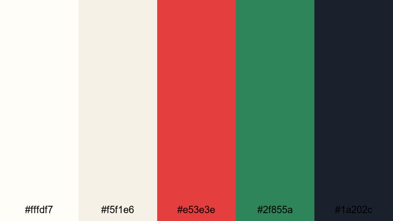
- HEX Codes: #fffdf7, #f5f1e6, #e53e3e, #2f855a, #1a202c
- Mood: Festive, lively, and full of cheerful winter energy.
- Use for: Perfect for Christmas markets, festive promos, and seasonal social content.
Holiday Market Snow sets warm snowy creams against rich red and green accents, plus a dark grounding shade. It instantly reads as festive and seasonal without needing extra graphics or text.
Use it for Christmas market vlogs, New Year promos, and holiday sale graphics. Keep backgrounds light, then highlight key elements like titles, buttons, and decorations in the red and green shades to deliver unmistakable holiday energy in your videos and thumbnails.
Bold Contrast Snow Color Palettes
Ink On Fresh Snow
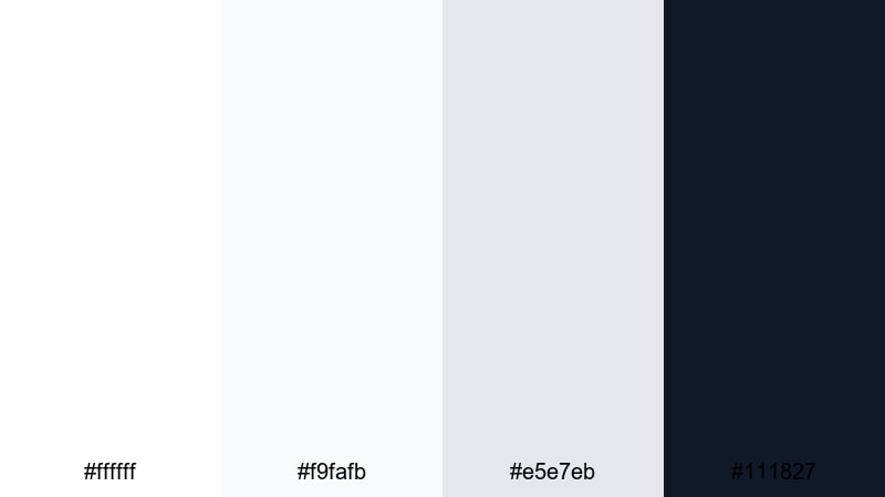
- HEX Codes: #ffffff, #f9fafb, #e5e7eb, #111827
- Mood: Graphic, striking, and editorial with high contrast.
- Use for: Great for bold title sequences, cinematic credits, and high-impact thumbnails.
Ink On Fresh Snow contrasts bright whites and light grays with deep black, creating an immediate editorial punch. It feels sharp and decisive, like ink on a clean page.
Use this palette when you want your titles, end cards, and key messages to stand out. It is perfect for cinematic intros, bold credit sequences, and thumbnails that need to pop on crowded homepages while still feeling minimal and refined.
Neon Tracks In Snow
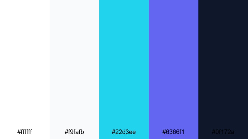
- HEX Codes: #ffffff, #f9fafb, #22d3ee, #6366f1, #0f172a
- Mood: Energetic, futuristic, and vibrant against a clean snowy base.
- Use for: Ideal for gaming intros, sports edits, and energetic social promos.
Neon Tracks In Snow turns a bright snow field into a canvas for electric cyan and violet accents. The result is energetic and futuristic, ideal for dynamic and fast-paced content.
Use the neon tones for animated titles, progress bars, and call-to-action buttons, while the whites and dark navy keep everything grounded. It works especially well in gaming intros, sports highlight reels, and motion graphics-driven social ads.
Midnight Ski Patrol
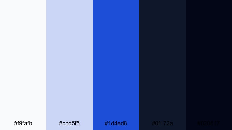
- HEX Codes: #f9fafb, #cbd5f5, #1d4ed8, #0f172a, #020617
- Mood: Adventurous, cinematic, and slightly mysterious.
- Use for: Perfect for night skiing clips, action trailers, and moody travel edits.
Midnight Ski Patrol blends icy whites and pale blues with deep midnight tones, giving your footage a sense of adventure and mystery. It feels cinematic, like a night run lit by distant lamps and moonlight.
Use this palette in night skiing, city-at-night, or moody travel edits where you want strong atmosphere. Reserve the brightest tones for snow highlights and text, while using the darker blues and near-black shades to frame the action and guide the viewer's eye.
Tips for Creating Snow Color Palettes
Snow palettes look simple, but small choices in warmth, contrast, and accent colors can completely change the mood. Here are practical tips to combine snow whites with other tones for clean, cinematic video and design work.
- Decide on warmth first: choose cooler blues for crisp, digital or outdoorsy vibes, and warmer creams for cozy, lifestyle, or festive content.
- Keep text readable: pair light snow backgrounds with dark grays, navy, or charcoal instead of pure black to stay legible but less harsh.
- Limit saturated accents: 1 or 2 strong accent colors (like ember orange or neon cyan) are enough to stand out against snowy whites.
- Match footage to graphics: when designing thumbnails or titles, sample colors from your graded video frames so overlays and footage share the same snow tones.
- Watch highlight clipping: in editing, protect bright areas so snow keeps detail instead of turning into flat white blobs.
- Use gradients, not pure flat white: introduce very subtle gradients from white to soft gray or blue to add depth to backgrounds and title cards.
- Stay consistent across platforms: reuse the same HEX codes for your channel banner, lower thirds, and social templates so your snow aesthetic becomes recognizable.
- Test on multiple screens: check your snow palette on phone, laptop, and TV to make sure whites do not look too yellow, blue, or blown out.
Snow color palettes can make your content feel clean, cinematic, and intentional, whether you lean into soft serenity, cozy warmth, or high-contrast drama. The right combination of whites, blues, and accents shapes how viewers experience your brand and stories.
Use these 15 palettes and HEX codes as ready-made recipes for grading footage, building thumbnails, and designing intros and end screens. In Filmora, you can quickly adapt each palette to your own clips, save your favorite looks, and keep your snow aesthetic consistent across long-form videos and short social edits.
Experiment, mix, and tweak until your snow visuals match your channel personality, then turn that look into your signature winter style.
secure downloadNext: Pixel Art Color Palette
