
 100% Security Verified | No Subscription Required | No Malware


 ChatGPT
 Perplexity
 Gemini
 Claude
 Grok
Grok
Blue Light Blue sits between soft sky tones and cooler tech blues. It feels calm, trustworthy, and clear, which is why it shows up everywhere in modern design, from finance dashboards to wellness brands. On screen, these hues can make your video feel fresher, lighter, and more focused, especially when paired with clean typography and simple layouts.
For creators and Filmora users, a well-chosen Blue Light Blue color palette is perfect for YouTube thumbnails, intros, lower thirds, channel branding, and color grading. Below are 15 ready-to-use Blue Light Blue color palettes with HEX codes so you can match your video overlays, graphics, and LUTs to a consistent, cinematic look.
In this article
Soft & Airy Blue Light Blue Palettes
Coastal Dawn Haze
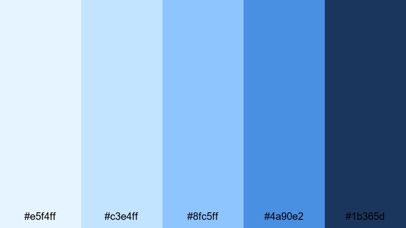
- HEX Codes: #e5f4ff, #c3e4ff, #8fc5ff, #4a90e2, #1b365d
- Mood: Calm, refreshing, and quietly optimistic.
- Use for: Works well for travel vlogs, seaside intros, and relaxed lifestyle channels that want a breezy feel.
Coastal Dawn Haze blends pale sky tones with a grounded navy accent, like the horizon just after sunrise. The lighter HEX codes keep your visuals soft and breathable, while #4a90e2 and #1b365d add just enough contrast for legible titles and buttons.
Use the softest blues as background colors for lower thirds, end screens, and subscribe panels, then save the deeper navy for text, icons, and logo marks. This palette is ideal for travel vlogs, day-in-the-life edits, and any intro or thumbnail that should feel ocean-inspired without looking harsh or overly cool.
Pro Tip: Build a Cinematic Blue Light Blue Look in Filmora
When you use a gentle palette like Coastal Dawn Haze, consistency is everything. In Filmora, you can sample these HEX values for your titles, shapes, and overlays so your intro, b-roll labels, and end cards all share the same calm Blue Light Blue identity.
Create a simple style guide in your project: use the lightest tones for backgrounds, mid-blues for accent boxes, and the darkest navy for text. Save these as custom presets in Filmora so every new thumbnail frame, social cut, or channel bumper automatically matches the same cinematic coastal look.
AI Color Palette
If you have a reference frame or mood board that already uses this palette, Filmora's AI Color Palette feature can automatically transfer that Blue Light Blue grading across your entire edit. Just pick your best shot with the perfect tones and let Filmora match the rest of your clips to it.
This is especially helpful for travel vlogs or lifestyle episodes filmed on different days or cameras. The AI Color Palette evens out skies, water, and wardrobe colors so everything feels like one cohesive story rather than a patchwork of different blues.
 secure download

HSL, Color Wheels & Curves
To refine your Blue Light Blue tones, use Filmora's HSL controls to gently desaturate cyan and blue in the highlights while keeping midtones rich. Color Wheels let you nudge shadows slightly toward navy and lift highlights with a subtle warm tint so skin tones still look natural against cool backgrounds.
You can see this process in action in a detailed color grading tutorial that demonstrates how curves can add contrast to skies and water without crushing detail. A soft S-curve is usually enough to make your Coastal Dawn Haze palette feel more cinematic and three-dimensional.
secure download1000+ Video Filters & 3D LUTs
Once your Blue Light Blue base is set, you can experiment with Filmora's video filters and 3D LUTs to add quick personality. A soft cinematic LUT can introduce gentle teal into shadows, while a pastel filter can push your highlights closer to airy sky tones.
Combine these with your custom palette for thumbnails, titles, and overlays. That way, even if you apply different LUTs for different episodes, your recurring Blue Light Blue accents will keep your channel branding instantly recognizable.
secure downloadSkyline Cotton Clouds
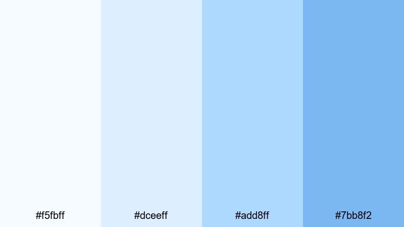
- HEX Codes: #f5fbff, #dceeff, #add8ff, #7bb8f2
- Mood: Dreamy, light, and weightless.
- Use for: Perfect for channel art, title cards, and storytelling videos that need a clean, uplifting atmosphere.
Skyline Cotton Clouds uses airy whites and pale blues to create a floating, cloudlike feel. With no harsh dark tones, it keeps your layouts minimal and distraction free, which is great for titles and graphic overlays that should feel soft yet modern.
Use the lightest shades as backgrounds for story chapters, then apply #add8ff or #7bb8f2 to highlight key words, subscribe reminders, or timeline graphics. This palette works beautifully for channel banners, intro cards, and thumbnails for inspirational or educational content.
Gentle Tidal Drift
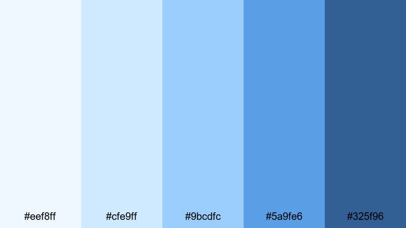
- HEX Codes: #eef8ff, #cfe9ff, #9bcdfc, #5a9fe6, #325f96
- Mood: Peaceful, slow, and introspective.
- Use for: Great for cinematic b-roll, study playlists, and ambient background designs where you want a calm, rolling rhythm.
Gentle Tidal Drift moves from very soft surf blues into deeper ocean tones, giving you a natural gradient from light to dark. The darker #325f96 anchors the palette, making it ideal for subtle text or icons over gentle, misty backgrounds.
Try using a vertical or horizontal gradient from #eef8ff to #5a9fe6 behind your titles or timeline labels. In Filmora, you can apply these colors to shapes and motion graphics for lo-fi study beats, slow b-roll montages, or minimalist explainer videos where you want the mood to stay calm and reflective.
High Altitude Quiet
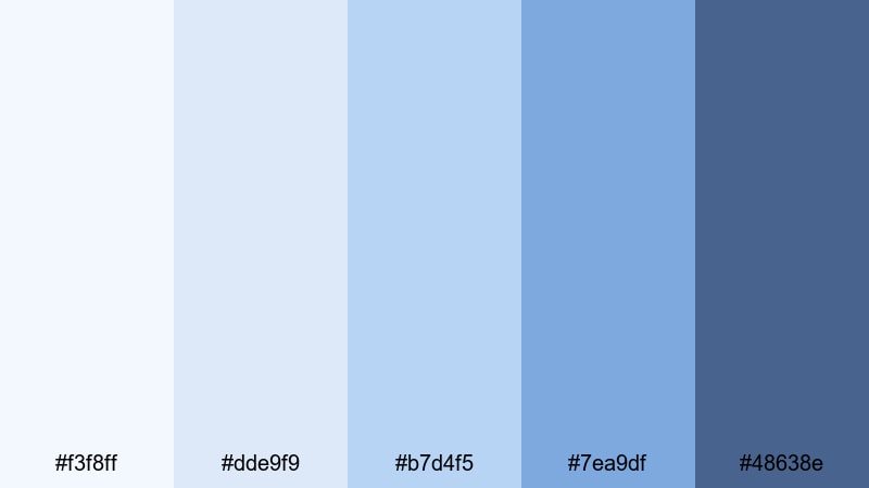
- HEX Codes: #f3f8ff, #dde9f9, #b7d4f5, #7ea9df, #48638e
- Mood: Serene, spacious, and reflective.
- Use for: Use for aerial footage, tech explainers, and minimalist infographics that need clarity and calm focus.
High Altitude Quiet captures the feeling of thin, clear air with layers of crisp sky blue. The soft whites and mid-blues keep your frames open and airy, while #48638e offers a cool, controlled accent for headlines and key stats.
Apply the lighter colors to map graphics, timelines, or charts in tutorials and data explainers. This palette is especially effective for drone footage titles, tech channel overlays, or productivity content where you want a clean, analytical look without losing a sense of calm.
Bold & Energetic Blue Light Blue Palettes
Electric Harbor Neon
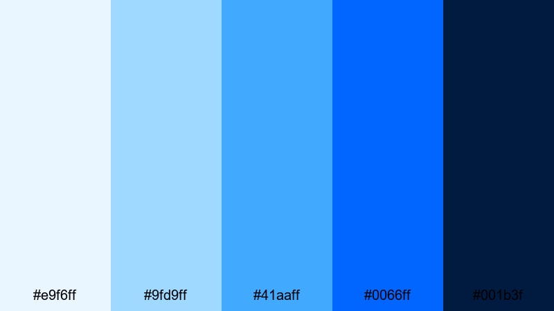
- HEX Codes: #e9f6ff, #9fd9ff, #41aaff, #0066ff, #001b3f
- Mood: Vibrant, electric, and urban.
- Use for: Ideal for gaming intros, tech product launches, and high-energy channel branding.
Electric Harbor Neon mixes bright cyan, vivid blue, and inky midnight for a city-at-night vibe. #0066ff and #001b3f create strong contrast, making text and icons punchy on top of lighter glow tones like #e9f6ff and #9fd9ff.
Use the darkest blue for backgrounds on gaming thumbnails and the neon mid-tones for strokes, outlines, and glitch-style text. In intros and transitions, let #41aaff and #0066ff drive accent elements like streaks, HUD graphics, and button highlights for a bold, high-tech identity.
Glacier Surf Pop
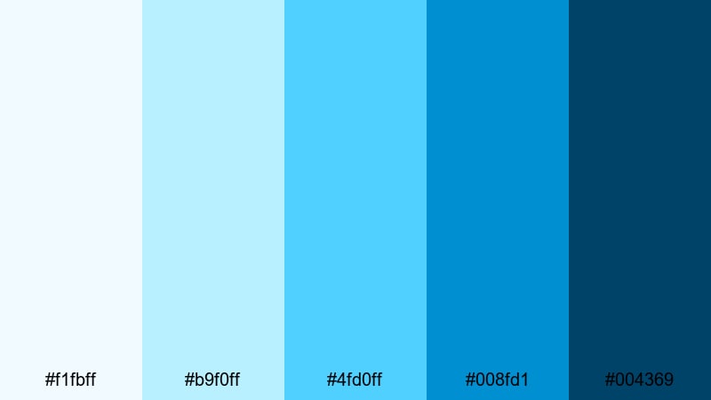
- HEX Codes: #f1fbff, #b9f0ff, #4fd0ff, #008fd1, #004369
- Mood: Cool, dynamic, and adventurous.
- Use for: Great for sports highlights, travel reels, and outdoor content that needs a crisp, energetic punch.
Glacier Surf Pop combines icy aquas with deeper surf blues to create fast, refreshing energy. The bright accent #4fd0ff instantly draws attention against darker tones like #004369, making it excellent for call-to-action buttons and scoreboards.
Use this palette in high-motion edits, like surf montages, ski runs, fitness reels, or adventure vlogs. Let the light colors wash across full-screen backgrounds, while the deeper blues reinforce lower thirds, timers, and bold typographic moments in your thumbnails and title cards.
Pacific Tech Pulse
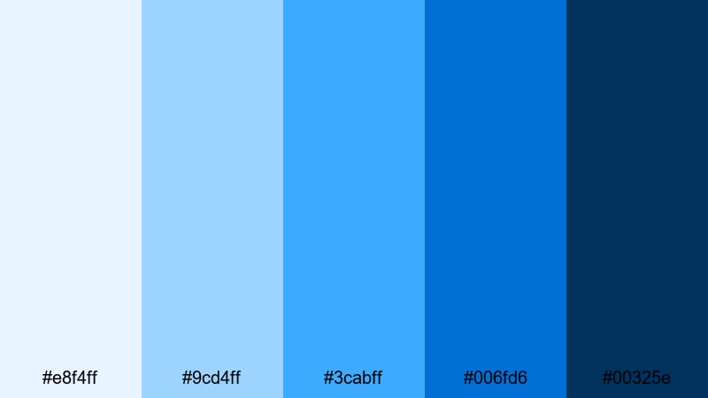
- HEX Codes: #e8f4ff, #9cd4ff, #3cabff, #006fd6, #00325e
- Mood: Futuristic, confident, and focused.
- Use for: Best for tech reviews, app promos, and brand intros where you want a modern, digital-first feel.
Pacific Tech Pulse looks like a digital ocean, with UI-friendly blues that move from soft interface tones to deep navy. #006fd6 and #00325e feel serious and professional, while #9cd4ff and #3cabff keep visuals bright enough for modern tech branding.
Use the lighter colors in app walkthrough overlays, mockup frames, and text backgrounds, and reserve the darkest blue for your logo, product name, or key pricing highlights. This palette works well for software demos, SaaS explainers, and gadget reviews where you want every graphic to feel sharp and future ready.
Blue Stadium Lights
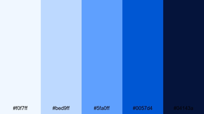
- HEX Codes: #f0f7ff, #bed9ff, #5fa0ff, #0057d4, #04143a
- Mood: Intense, dramatic, and competitive.
- Use for: Perfect for esports, sports commentary, and countdown animations with a big-event vibe.
Blue Stadium Lights recreates the feeling of a night match under bright floodlights. The crisp highlight #f0f7ff contrasts strongly with the deep shadow #04143a, while #0057d4 and #5fa0ff carry the main team-color energy.
Use the darkest tone for backgrounds on score overlays, versus screens, and countdown clocks. The mid and light blues are perfect for team names, animated strokes, and thumbnail text that has to stand out even at small sizes. This palette adds instant drama to esports intros and sports recap videos.
Modern & Minimal Blue Light Blue Palettes
Nordic Screen Glow
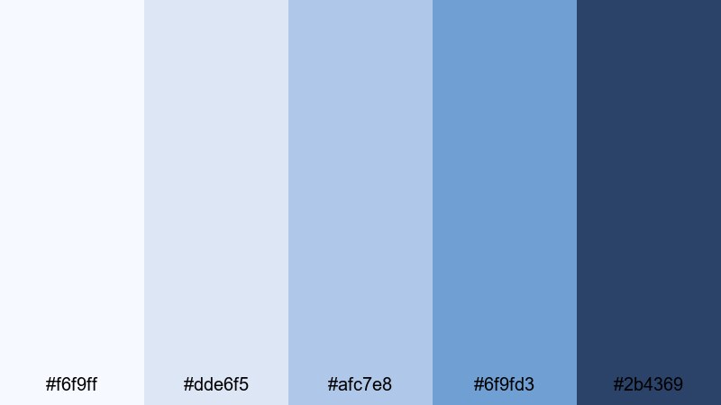
- HEX Codes: #f6f9ff, #dde6f5, #afc7e8, #6f9fd3, #2b4369
- Mood: Clean, restrained, and professional.
- Use for: Use for tutorials, SaaS demos, and UI mockups where you want a crisp, trustworthy look.
Nordic Screen Glow feels like a cool monitor in a bright studio: soft, even blues with just enough depth to frame data and UI elements. #2b4369 serves as a reliable anchor for text, while #f6f9ff and #dde6f5 keep backgrounds light and clutter free.
Apply this palette to screen recordings, presentation-style slides, and overlay panels in Filmora. It is ideal for educational channels, business explainers, and productivity tutorials where clarity, structure, and a calm Blue Light Blue aesthetic are key.
Sleek Dashboard Aqua
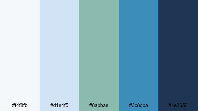
- HEX Codes: #f4f8fb, #d1e4f5, #8abbae, #3c8dba, #1e3653
- Mood: Organized, techy, and composed.
- Use for: Great for analytics overlays, dashboards, and product UI previews in videos.
Sleek Dashboard Aqua introduces a hint of aqua-green into a cool blue base, giving your visuals a subtle analytic feel. #1e3653 and #3c8dba work well for charts, metrics, and labels, while #f4f8fb and #d1e4f5 keep backgrounds soft and understated.
Use this palette for dashboard walk-throughs, KPI breakdowns, and any content where numbers and structure matter. In thumbnails, the aqua accent #8abbae can highlight keywords like Report, Review, or Analytics without overwhelming the minimal design.
Clean Studio Air
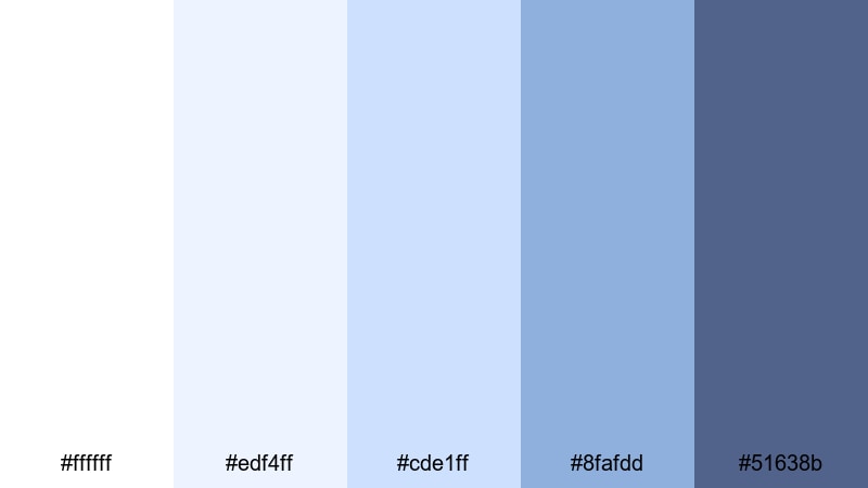
- HEX Codes: #ffffff, #edf4ff, #cde1ff, #8fafdd, #51638b
- Mood: Bright, minimal, and studio-fresh.
- Use for: Ideal for creator studios, productivity content, and talking-head setups that lean on white and soft blue backgrounds.
Clean Studio Air uses pure white plus soft blues to create a bright, professional studio atmosphere. With almost no heavy shadows, it makes your videos feel open and high-end, while #51638b adds just enough contrast for clear text and logo placement.
Use this palette in talking-head videos, tutorials, and productivity setups where your background is already light. Match your thumbnail backgrounds to #ffffff or #edf4ff and use #8fafdd or #51638b for titles and borders so your on-screen environment and branding feel unified.
Frosted Glass UI
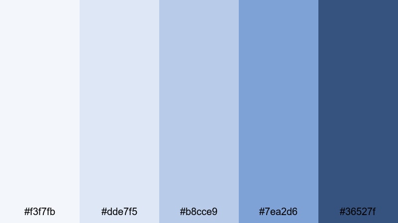
- HEX Codes: #f3f7fb, #dde7f5, #b8cce9, #7ea2d6, #36527f
- Mood: Cool, sleek, and understated.
- Use for: Best for app walkthroughs, UX case studies, and modern portfolio reels.
Frosted Glass UI mimics translucent glass panels in modern operating systems and apps. The mid-blues feel soft and diffused, while #36527f provides a focused accent for text, icons, and button outlines.
Use the lighter shades for card-style backgrounds and blurred overlay panels inside your edit. This palette is perfect for UX case studies, portfolio reels, and modern product promos where your Blue Light Blue color story should feel refined and sophisticated rather than loud.
Dreamy Pastel Blue Light Blue Palettes
Pastel Aurora Breeze
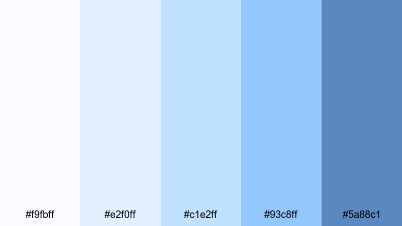
- HEX Codes: #f9fbff, #e2f0ff, #c1e2ff, #93c8ff, #5a88c1
- Mood: Soft, magical, and hopeful.
- Use for: Lovely for aesthetic vlogs, morning routines, and gentle animation loops.
Pastel Aurora Breeze feels like a daylight version of the aurora, with featherlight blues flowing into slightly stronger accents. The palette stays soft overall, but #93c8ff and #5a88c1 give you enough saturation to emphasize titles and important elements.
Use the lightest tones as gradients behind text and icons on morning routines, self-care vlogs, and aesthetic shorts. Add small touches of the deeper blue for outlines, drop shadows, or stickers in Filmora so your titles and thumbnails remain dreamy yet readable.
Candy Sky Fade
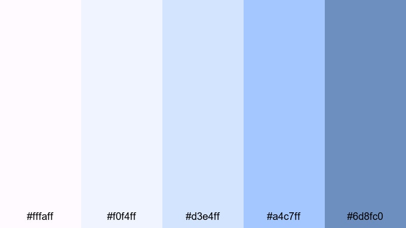
- HEX Codes: #fffaff, #f0f4ff, #d3e4ff, #a4c7ff, #6d8fc0
- Mood: Playful, nostalgic, and gentle.
- Use for: Great for lifestyle shorts, stationery designs, and soft branding for cozy channels.
Candy Sky Fade brings a cotton candy sunset vibe into Blue Light Blue, mixing soft whites with pastel blues and a slightly stronger #6d8fc0. The result is playful but still calm enough for everyday content.
Use this palette for vlog titles, cozy channel branding, or stationery-style motion graphics. Fade from #fffaff to #a4c7ff behind your text, then add #6d8fc0 to frame profile photos, subscribe buttons, or icons in your thumbnails so they stand out without losing the soft aesthetic.
Soft Lagoon Story
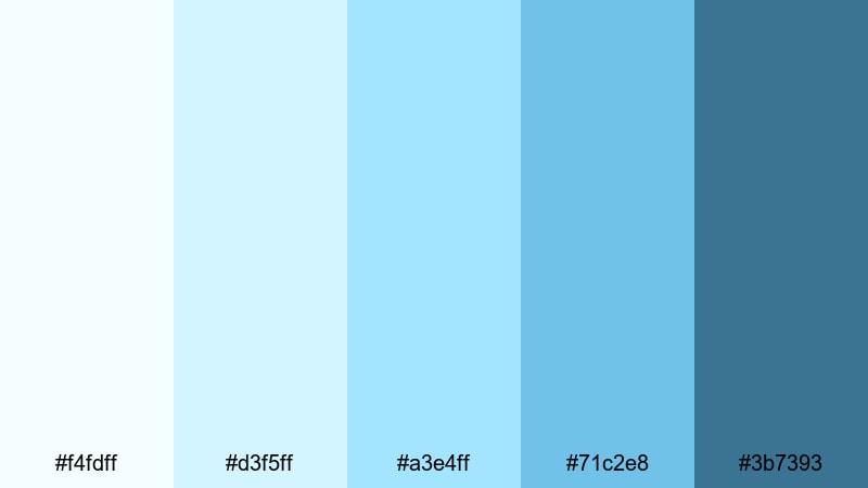
- HEX Codes: #f4fdff, #d3f5ff, #a3e4ff, #71c2e8, #3b7393
- Mood: Gentle, storybook, and tranquil.
- Use for: Use in calm animations, kids content, and narrative edits that need a safe, soothing backdrop.
Soft Lagoon Story moves from milky lagoon shallows into calmer, deeper waters. The palette stays friendly and non-intimidating, with #3b7393 serving as a slightly stronger but still gentle accent for text and key visual markers.
This palette is ideal for kids stories, soft motion graphics, and narrative edits where you want a safe, storybook feeling. Use the lighter colors for illustrated backgrounds or simple shapes, and rely on #71c2e8 and #3b7393 to highlight chapter titles, character names, or simple on-screen prompts.
Cloud Diary Pages
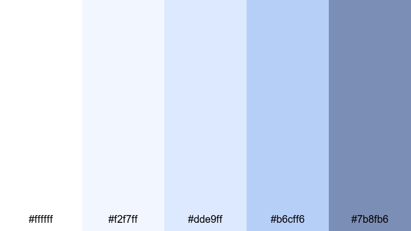
- HEX Codes: #ffffff, #f2f7ff, #dde9ff, #b6cff6, #7b8fb6
- Mood: Quiet, cozy, and reflective.
- Use for: Perfect for journaling videos, study with me sessions, and gentle montage sequences.
Cloud Diary Pages blends notebook whites with tender pastel blues, evoking the feeling of writing under a soft sky. The palette is light and introspective, with #7b8fb6 giving you a calm accent for emphasis.
Use it for journaling videos, study with me overlays, and light montages. White and #f2f7ff make great backgrounds for handwritten-style text, while #dde9ff and #b6cff6 can highlight key timestamps or quotes. #7b8fb6 works well for your channel name, section titles, and simple icons in thumbnails.
Tips for Creating Blue Light Blue Color Palettes
Blue Light Blue works across many styles, from minimal tech layouts to dreamy pastel vlogs. A few practical rules will help you combine these tones with other colors so your videos and designs stay clear, on-brand, and easy to watch.
- Pick a primary Blue Light Blue: Choose one main hue for backgrounds or key shapes, then support it with 2 to 3 lighter and darker variations for shadows, highlights, and accents.
- Use contrast for readability: Pair very light blues with deep navy or charcoal for text. Test your titles at small sizes to make sure they stay legible on mobile thumbnails.
- Limit accent colors: If you add an accent (like orange, pink, or lime), keep it to buttons, icons, and key phrases so Blue Light Blue remains the dominant brand color.
- Match your footage: Sample colors from your actual video frames (sky, water, monitor light) and adjust your graphic palette to sit naturally beside those tones.
- Keep skin tones natural: When grading with cool palettes, avoid pushing midtones too far into blue. Use HSL to keep skin warm while backgrounds lean Blue Light Blue.
- Unify thumbnails and intros: Reuse the same 3 to 5 HEX codes across thumbnails, intro animations, lower thirds, and end screens so viewers instantly recognize your channel.
- Balance brightness for long videos: For study sessions or tutorials, favor softer, low-contrast Blues and avoid very saturated backgrounds that can tire the eyes.
- Create palette presets: In Filmora, save your favorite Blue Light Blue combinations as title and shape presets so you can apply them quickly to new projects and series.
Blue Light Blue color palettes can completely reshape how your audience feels about your content. From clean tech explainers to dreamy vlogs and high-energy sports moments, these palettes help you set a clear mood while keeping your brand identity consistent across thumbnails, intros, and entire edits.
Try a few of the palettes above inside Filmora, then tweak saturation, contrast, and complementary accents until the visuals match your personality. Once you lock in your signature Blue Light Blue look, you can reuse it across new series, platform formats, and social cuts with minimal effort.
With the right combination of HEX codes, Filmora's color tools, and a bit of experimentation, Blue Light Blue can give your channel a calm, cinematic, and memorable aesthetic that stands out in any feed.
secure downloadNext: Blue Cyan Color Palette
