
 100% Security Verified | No Subscription Required | No Malware


 ChatGPT
 Perplexity
 Gemini
 Claude
 Grok
Grok
Blue Rust blends deep, dependable blues with weathered rust oranges and browns. The result feels cinematic, industrial, and nostalgic at the same time, like metal docks under blue hour light or a vintage postcard from the harbor. These tones suggest trust, stability, and calm, while the warm rust adds emotion, grit, and human warmth.
For video creators and designers, Blue Rust is ideal for cinematic color grading, YouTube thumbnails, title cards, intros, overlays, and cohesive branding. Below are 15 ready-to-use Blue Rust color palettes with HEX codes, crafted for creators and Filmora users who want consistent, stylish visuals across vlogs, reels, trailers, and channel graphics.
In this article
Cinematic Moody Blue Rust Color Palettes
Harbor Dusk Drama
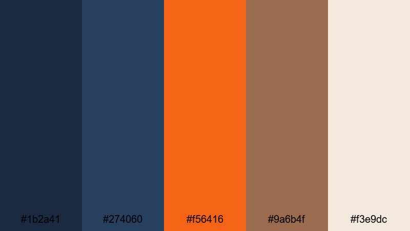
- HEX Codes: #1b2a41, #274060, #f56416, #9a6b4f, #f3e9dc
- Mood: Cinematic, dramatic, and nostalgic with strong contrast.
- Use for: Perfect for cinematic B-roll sequences, travel vlogs, and moody story intros in Filmora.
Harbor Dusk Drama feels like the moment the sun drops behind a shipping yard skyline. Deep navy and muted blue-gray (#1b2a41, #274060) carry most of the frame, while the rich rust and brown (#f56416, #9a6b4f) punch through like glowing dock lights and aged metal. The soft cream highlight (#f3e9dc) keeps the palette from getting too heavy, adding just enough light for readable text and UI elements.
Use this palette when you want emotional weight and contrast in your video. It works beautifully for cinematic intros, B-roll of cityscapes or harbors, dramatic storytime vlogs, and even YouTube thumbnails that need a strong, moody hook. Let the dark blues dominate your footage or background, and reserve the rust tones for titles, call-to-action buttons, logo accents, or key moments in your edit.
Pro Tip: Build a Cinematic Blue Rust Harbor Look in Filmora
To keep this Harbor Dusk Drama palette consistent, start by setting your darkest blues as the base look across your entire timeline in Filmora. Apply a subtle contrast boost and gently cool the shadows so your footage leans into the deep navy tones, then use rust orange on titles, lower thirds, and overlays as your main accent color.
For channel branding, stick to the cream tone for backgrounds or panels behind text, and use the strongest rust shade only for important elements like Subscribe graphics or end screen CTAs. This way, your viewers start to associate that specific Blue Rust combination with your cinematic style.
AI Color Palette
If you already have a Blue Rust harbor photo you love, you can turn it into a full video look in just a few clicks. Filmora's AI Color Palette feature lets you sample the colors from a reference image or short clip, then apply that same palette to the rest of your timeline.
Simply import your reference shot, match it to your main clips, and let AI handle the heavy lifting. This keeps your intros, B-roll, and outro scenes tied together with the same deep blues and glowing rust highlights, without manually grading every clip.
 secure download

HSL, Color Wheels & Curves
Once your overall look is in place, you can fine-tune the Blue Rust mood using Filmora's HSL sliders, Color Wheels, and Curves. Slightly deepen the blues in the shadows, push the rust tones a bit more toward orange or copper, and raise the highlights to keep faces and text readable. A dedicated color correction workflow in Filmora helps you keep this grading fast and repeatable.
Use Curves to add a gentle S-curve for cinematic contrast, then adjust HSL so your oranges, reds, and blues stay within your chosen palette instead of drifting into random hues. The result is a cohesive, moody harbor look that still feels polished and professional.
secure download1000+ Video Filters & 3D LUTs
To speed up your Blue Rust workflow, start from a preset and refine it instead of grading from scratch. Filmora's video filters and 3D LUTs make it easy to drop in cinematic contrast, vintage fades, and teal-orange style looks that already lean toward the Blue Rust family.
Layer a filmic LUT over your footage, then adjust opacity and tweak the colors so your deep blues and rust accents still match the Harbor Dusk Drama HEX codes. You can save this as a custom preset to reuse across intros, trailers, social clips, and client projects for a consistent brand identity.
secure downloadStormy Shipyard Fade
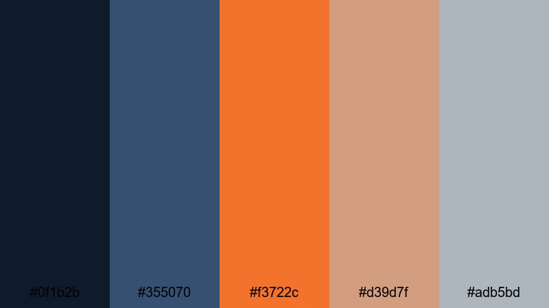
- HEX Codes: #0f1b2b, #355070, #f3722c, #d39d7f, #adb5bd
- Mood: Brooding, industrial, yet warmly grounded.
- Use for: Great for documentary-style edits, tech reviews, and cinematic title cards with gritty atmosphere.
Stormy Shipyard Fade mixes inky navy (#0f1b2b) with desaturated blue-gray (#355070) and a burnt rust accent (#f3722c). The muted beige and steel gray (#d39d7f, #adb5bd) soften the palette just enough to keep it practical for text and UI without losing that industrial edge.
Use this palette in documentary intros, equipment B-roll, or tech reviews where you want a grounded, serious mood. Let the darkest blue sit in your backgrounds, use the gray tones for lower thirds and charts, and reserve the rust orange for progress bars, button highlights, and key words in thumbnails or titles.
Industrial Nightfall
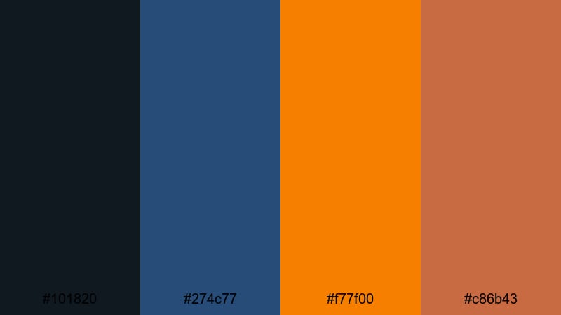
- HEX Codes: #101820, #274c77, #f77f00, #c86b43
- Mood: Edgy, urban, and high contrast.
- Use for: Ideal for urban montages, product promos, and bold lower thirds that need a strong visual punch.
Industrial Nightfall pushes the contrast higher, with charcoal black-blue (#101820) and strong steel blue (#274c77) slammed against neon-like rust and orange (#f77f00, #c86b43). It feels like glowing signage against a dark city corridor, perfect when you want your visuals to hit hard.
Apply this palette to fast-paced promos, city B-roll, or kinetic typography. Use the darkest tone for backgrounds and letterboxing, the bright rust for animated titles and icons, and the mid blue for buttons, chapter markers, or subtitle bars in your Filmora projects.
Rusty Ocean Echo
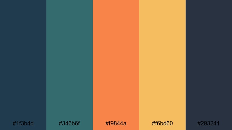
- HEX Codes: #1f3b4d, #346b6f, #f9844a, #f6bd60, #293241
- Mood: Atmospheric, coastal, and slightly nostalgic.
- Use for: Use for coastal travel vlogs, reflective storytelling, and cinematic transitions with a warm yet moody feel.
Rusty Ocean Echo layers sea blue and teal (#1f3b4d, #346b6f) with glowing rust and sand tones (#f9844a, #f6bd60), anchored by a deep smoky navy (#293241). It captures the feeling of waves hitting an old metal pier at golden hour, where cool shadows and warm highlights balance each other.
For travel vlogs or reflective story chapters, grade your footage toward the cooler blues while using the rust and sand tones in text, badges, and overlays. This creates cinematic transitions between scenes and gives your titles and thumbnails a soft coastal nostalgia without losing clarity.
Soft Vintage Blue Rust Color Palettes
Faded Dock Memories
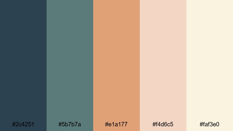
- HEX Codes: #2c4251, #5b7b7a, #e1a177, #f4d6c5, #faf3e0
- Mood: Soft, sentimental, and vintage-inspired.
- Use for: Perfect for memory montages, family films, and nostalgic vlog episodes with gentle grading.
Faded Dock Memories softens the Blue Rust idea into muted teal blues (#2c4251, #5b7b7a) paired with a gentle rust-peach (#e1a177) and creamy highlights (#f4d6c5, #faf3e0). It feels like looking through slightly aged film or an old printed photo with warm fade.
Use this palette for family recaps, childhood storytime, or nostalgic vlogs. Let the light creams fill your backgrounds and frames, while the blues and soft rust accent photos, lower thirds, and handwritten-style titles. A touch of film grain in Filmora will amplify the vintage mood.
Weathered Canvas Breeze
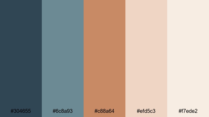
- HEX Codes: #304655, #6c8a93, #c88a64, #efd5c3, #f7ede2
- Mood: Airy, artistic, and gently worn-in.
- Use for: Great for aesthetic lifestyle vlogs, studio tours, and soft brand intros that feel handcrafted.
Weathered Canvas Breeze combines muted teal blues (#304655, #6c8a93) with brushed rust brown (#c88a64) over warm neutral creams (#efd5c3, #f7ede2). It feels like textured paper or a canvas painting, ideal when you want a handcrafted aesthetic.
Apply this palette to lifestyle content, studio or workspace tours, and subtle brand intros. Keep your layouts light and airy with the neutral shades, then use the teal and rust for accent lines, icons, and logo marks. It also works well for Pinterest-style thumbnails or reels where you want a soft, editorial vibe.
Muted Harbor Postcard
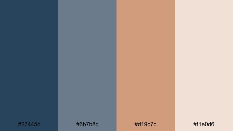
- HEX Codes: #27445c, #6b7b8c, #d19c7c, #f1e0d6
- Mood: Calm, nostalgic, and softly cinematic.
- Use for: Works well for travel postcards, on-screen quotes, and mellow vlog chapters between high-energy segments.
Muted Harbor Postcard leans into calm blues (#27445c, #6b7b8c) with a powdered rust accent (#d19c7c) and a soft paper beige (#f1e0d6). It feels like a slightly faded postcard or scrapbook page, with enough color to stay interesting but never shouty.
Use this palette between louder sections of your video to create breathing room. It is ideal for chapter cards, on-screen quotes, and simple map or location graphics. In thumbnails, let the beige ground the layout and use the rust for a single standout word or badge.
Sunwashed Pier Nostalgia
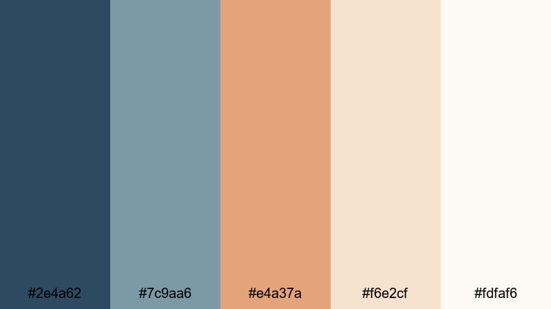
- HEX Codes: #2e4a62, #7c9aa6, #e4a37a, #f6e2cf, #fdfaf6
- Mood: Warm, sunbleached, and sentimental.
- Use for: Use for sunlit travel edits, morning routines, and memory recaps with light film grain in Filmora.
Sunwashed Pier Nostalgia pairs ocean blues (#2e4a62, #7c9aa6) with a sunbleached rust-peach (#e4a37a) and very light creams (#f6e2cf, #fdfaf6). It feels like early morning light on a pier, when everything is washed in gentle warmth.
Try this palette for morning routines, romantic travel edits, or recap videos that blend joy with nostalgia. Use the creams as your base for title cards and frames, the blues to hint at water and sky, and the rust-peach for buttons, rating stars, or subtle highlight boxes in your thumbnails and end screens.
Modern Minimal Blue Rust Color Palettes
Slate And Rust Mono
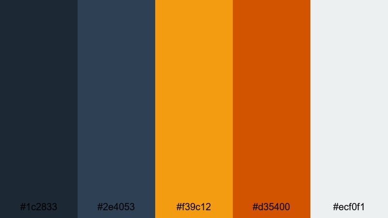
- HEX Codes: #1c2833, #2e4053, #f39c12, #d35400, #ecf0f1
- Mood: Modern, confident, and design-forward.
- Use for: Ideal for sleek channel branding, tech explainers, and clean UI-style lower thirds.
Slate And Rust Mono mixes deep slate blues (#1c2833, #2e4053) with sharp rust and amber accents (#f39c12, #d35400) set against a crisp light gray (#ecf0f1). The overall feel is modern and confident, like a clean dashboard or a SaaS landing page translated into motion.
Use the light gray as your base for slides, info cards, and lower thirds in explainers. Let the slate blues frame your footage and navigation, and reserve the rust accents for key actions, data highlights, or logo elements. This palette is very thumbnail-friendly, especially for tech and productivity channels.
Teal Oxide Grid
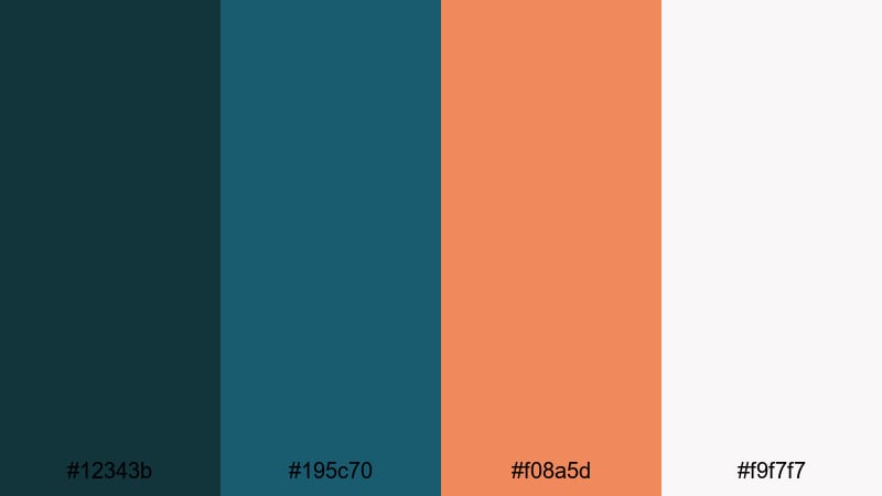
- HEX Codes: #12343b, #195c70, #f08a5d, #f9f7f7
- Mood: Clean, slightly futuristic, and balanced.
- Use for: Great for app promos, UI mockups, and motion graphics that need a modern industrial twist.
Teal Oxide Grid leans into structured teal blues (#12343b, #195c70) contrasted with a refined rust-peach (#f08a5d) on a bright white base (#f9f7f7). It has a light futuristic edge, like oxidized metal in a digital dashboard.
Use it for app demos, UI animations, and motion graphics that need to feel clean but not sterile. Keep backgrounds mostly white, line work and panels in teal, and use the rust-peach sparingly for CTAs, notifications, and logo details, both in video overlays and static channel artwork.
Clean Dock Interface
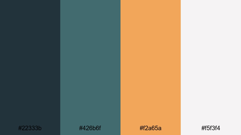
- HEX Codes: #22333b, #426b6f, #f2a65a, #f5f3f4
- Mood: Professional, approachable, and tidy.
- Use for: Use for tutorial overlays, corporate explainers, and channel branding that needs to stay friendly yet sharp.
Clean Dock Interface uses cool dockside blues (#22333b, #426b6f) with a smooth rust-gold accent (#f2a65a) over an off-white background (#f5f3f4). It feels tidy and professional, with just enough warmth to stay friendly.
This palette is perfect for tutorials, webinars, and explainer videos. Use the off-white for backgrounds, the blues for titles and line work, and the rust-gold for bullets, icons, and call-out boxes. In thumbnails, this combination delivers high readability while still looking carefully branded.
Nordic Cargo Minimal
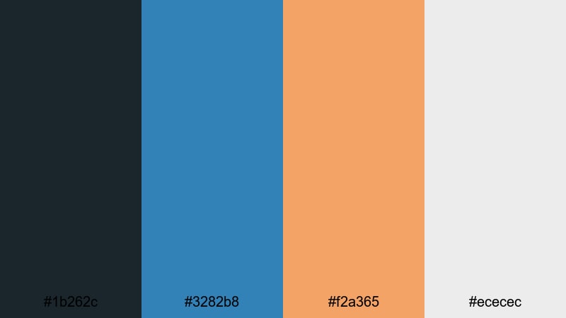
- HEX Codes: #1b262c, #3282b8, #f2a365, #ececec
- Mood: Scandinavian-inspired, crisp, and grounded.
- Use for: Perfect for minimalist intros, startup videos, and product showcases with clean typography.
Nordic Cargo Minimal pairs a deep muted blue-black (#1b262c) with a clear Nordic blue (#3282b8), a soft rust orange (#f2a365), and pale gray (#ececec). The vibe is Scandinavian industrial: clean, grounded, and unfussy.
Use this palette for startup pitches, product overviews, and minimalist channel intros. Let the pale gray be your main canvas, the blues define structure and headings, and the rust orange highlight features, pricing, or key phrases. In Filmora, this palette keeps your scenes uncluttered while giving your brand a distinct Blue Rust twist.
Bold Energetic Blue Rust Color Palettes
Turbo Harbor Neon
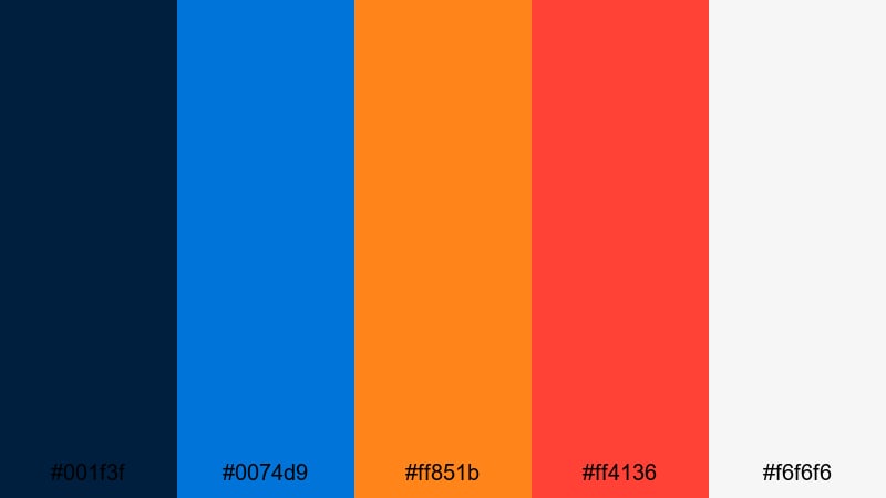
- HEX Codes: #001f3f, #0074d9, #ff851b, #ff4136, #f6f6f6
- Mood: High-energy, bold, and eye-catching.
- Use for: Ideal for YouTube thumbnails, gaming intros, and fast-cut edits that need to stand out in the feed.
Turbo Harbor Neon slams deep navy (#001f3f) and electric blue (#0074d9) against blazing rust and red (#ff851b, #ff4136) on a bright base (#f6f6f6). It is loud, high-contrast, and built to grab attention instantly.
This is a thumbnail powerhouse for gaming, reaction, and fast-cut content. Use the white or light gray for backgrounds, the dark navy for outlines and frames, and the electric blue plus rust tones for bold text and badges. Animated intros using these colors will feel punchy and energetic without losing a subtle Blue Rust anchor.
Electric Rust Surf
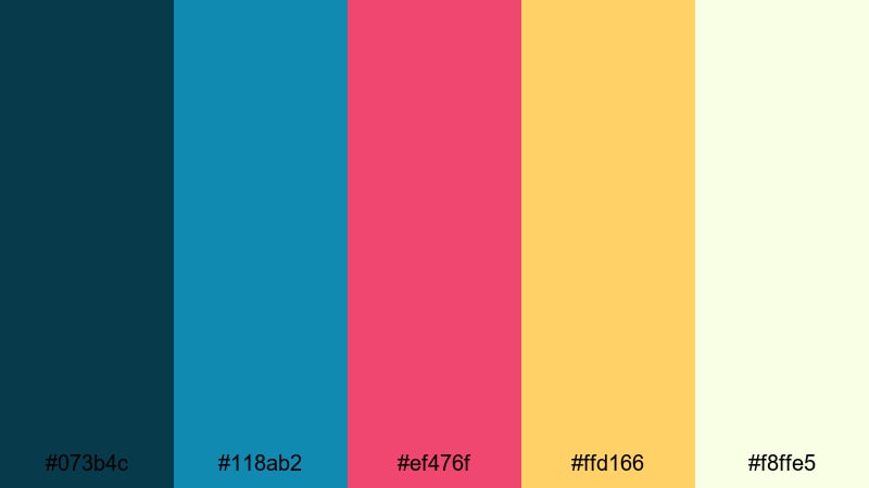
- HEX Codes: #073b4c, #118ab2, #ef476f, #ffd166, #f8ffe5
- Mood: Playful, surfy, and energetic.
- Use for: Great for travel reels, action sports edits, and upbeat lifestyle content on social media.
Electric Rust Surf blends ocean blues (#073b4c, #118ab2) with a hot rust-pink (#ef476f), sunny yellow (#ffd166), and soft foam white (#f8ffe5). It feels like a neon surf poster animated into motion, full of movement and joy.
Use this palette for action sports, beach trips, and upbeat lifestyle content. Keep the foam white and yellow as bright touches, not full backgrounds, so your blues still anchor the frame. The rust-pink is perfect for playful stickers, emojis, and kinetic text elements in Filmora titles and transitions.
Copper Wave Motion
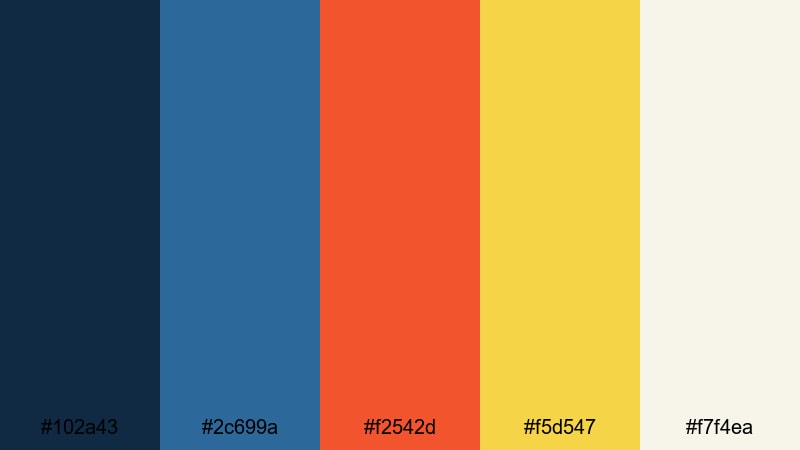
- HEX Codes: #102a43, #2c699a, #f2542d, #f5d547, #f7f4ea
- Mood: Energetic, cinematic, and slightly retro.
- Use for: Use for bold title sequences, logo stings, and kinetic typography with a polished edge.
Copper Wave Motion mixes dark ocean blue and steel blue (#102a43, #2c699a) with glowing copper and gold (#f2542d, #f5d547) on a soft off-white (#f7f4ea). It feels like retro cinema graphics updated for modern motion design.
Apply this palette to title sequences, logo stings, and animated typography. Let the off-white fill the screen while blue bars and shapes frame your content, then punch in copper and gold for dynamic transitions, outlines, and shadow glows. It is especially strong for channels that want a bold, cinematic Blue Rust identity without going fully dark and moody.
Tips for Creating Blue Rust Color Palettes
When you build your own Blue Rust color combinations for video and design, the goal is to balance cool stability with warm character. These tips will help you keep your visuals cinematic, readable, and consistent across Filmora projects and brand assets.
- Choose a dominant blue: Pick one main blue tone (deep navy, teal, or slate) to anchor your footage and UI, and keep it consistent across intros, overlays, and thumbnails.
- Use rust as an accent, not the base: Warm rust and copper shades are powerful; reserve them for titles, buttons, and key call-outs so they really stand out.
- Mind text readability: When designing titles or lower thirds, check contrast between your Blue Rust background and foreground text, especially on mobile screens.
- Limit your palette: Stick to 3–5 working colors from a palette (dark base, mid blue, rust accent, light neutral) to avoid visual clutter.
- Match footage and graphics: In Filmora, nudge your footage toward the same blue temperature and contrast you use in your graphic elements so nothing feels mismatched.
- Adjust warmth for mood: Cooler, desaturated rusts feel serious and cinematic; brighter, orange-leaning rusts feel energetic and playful. Choose based on your video tone.
- Test in different scenes: Check how your Blue Rust palette looks on daytime, nighttime, and indoor clips to make sure important elements remain visible.
- Create reusable presets: Once you dial in a look you love, save custom color presets or LUT-like settings in Filmora so you can apply your Blue Rust branding in seconds.
Blue Rust color palettes are a powerful way to shape mood, tell stories, and build a recognizable visual identity. From moody harbor scenes to modern minimal dashboards and neon surf edits, this color family can adapt to almost any niche while still feeling cohesive and cinematic.
As you experiment with the 15 palettes above, try them in your Filmora timelines for intros, B-roll, overlays, and thumbnails. Tweak the balance between blue and rust to match your story, then save your favorite combinations as reusable looks so every new upload feels on-brand.
The more consistently you use your chosen Blue Rust palette, the faster viewers will start to associate those tones with your channel or brand. Filmora gives you the tools to keep that style polished, repeatable, and easy to apply across all your creative projects.
secure download