Blush pink sits between soft rose and neutral beige, giving it a calm, approachable energy. It is often linked to romance, warmth, and self-care, but because it is less saturated than hot pink, it also feels modern and minimal. In color psychology, blush pink can signal trust, comfort, and tenderness, which is why so many lifestyle brands, wedding creatives, and beauty channels lean on this shade to make viewers feel relaxed and welcomed.
On screen, blush pink color palettes work beautifully for YouTube thumbnails, intros, vlogs, talking-head backgrounds, and channel branding. Used well, they can make your edits look cohesive across feeds and platforms. Below are 15 blush pink color palettes with HEX codes you can copy into your design tools or apply in Filmora, whether you are building a romantic highlight film, a minimalist workspace vlog, or playful pastel content.
In this article
Soft And Romantic Blush Pink Color Palettes
Rose Quartz Morning
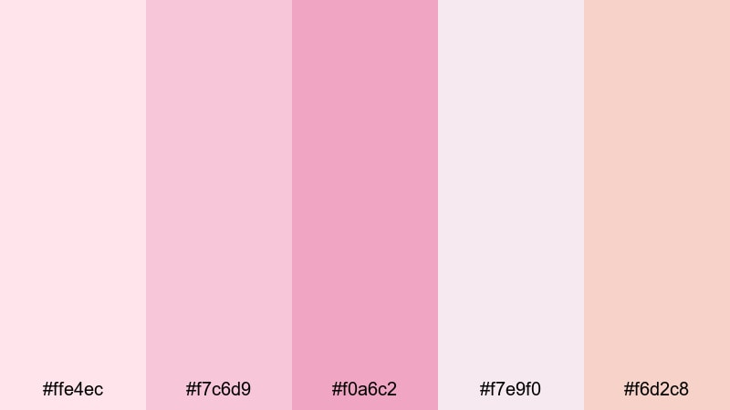
- HEX Codes: #ffe4ec, #f7c6d9, #f0a6c2, #f7e9f0, #f6d2c8
- Mood: Tender, hopeful, and softly illuminated like early morning light.
- Use for: Ideal for dreamy wedding highlight reels, engagement announcements, and romantic title cards.
Rose Quartz Morning is a whisper-soft blend of pale blush, rose, and warm light neutrals. It feels like sunlight slipping through sheer curtains, perfect for moments that should feel intimate and calm. The lighter tones are ideal for backgrounds, overlays, and subtle gradients, while the slightly deeper blush can guide the eye to key text or call-to-action buttons.
Use this palette in wedding highlight videos, proposal edits, or soft cinematic vlogs where you want emotion without harsh contrast. In thumbnails and intros, pair the lightest pinks with clean typography for legible titles, and keep text in a muted cocoa or soft charcoal to preserve the gentle mood while staying readable on small screens.
Pro Tip: Build A Cinematic Blush Pink Look In Filmora
To keep a romantic blush pink look consistent across an entire edit, treat this palette as your visual north star. In Filmora, design your intro, lower thirds, and end screen using these HEX codes, then reuse the same colors for subtitles, overlays, and subscribe buttons. This locks in a signature style so your audience recognizes your content at a glance on YouTube, Instagram, and TikTok.
You can also create a simple graphics pack inside Filmora: save title templates, frame borders, and soft gradient mattes that match Rose Quartz Morning. Drop them into every wedding film, engagement announcement, or love story reel to build a cohesive, high-end brand experience without rebuilding assets each time.
AI Color Palette
Working from a mood board or reference image? Filmora's AI Color Palette feature lets you lift the blush pink tones from a single still frame or design and spread them across your entire project. Choose a frame that perfectly captures the Rose Quartz Morning mood, then use AI Color Palette to match the rest of your footage to that look.
This is especially helpful when you shoot with multiple cameras or in mixed lighting. The AI will unify contrast, hue, and warmth so your vlogs, b-roll, and talking-head clips all share the same soft romantic glow, without manual keyframing or complicated grading.
HSL, Color Wheels & Curves
Once your base palette is in place, you can fine-tune blush tones in Filmora with HSL, color wheels, and curves. Use HSL to gently desaturate strong reds and magentas, nudging them closer to soft blush. Then, with the color wheels, warm up midtones for skin-friendly romantic scenes while keeping highlights slightly rosy and shadows neutral so the image does not feel too pink overall.
To push things into a more cinematic direction, shape contrast using the curves panel and keep an eye on how it interacts with your chosen palette. Slight S-curves add depth without crushing the delicate blush tones you have set using Filmora's color grading tools, creating a polished, filmic finish that still feels airy and gentle.
1000+ Video Filters & 3D LUTs
To speed up your workflow, you can start from ready-made looks and then adapt them to your blush pink palette. Filmora's video filters and 3D LUTs make it easy to add soft pastel, vintage, or cinematic styles with one click, then tweak saturation and tint until they match Rose Quartz Morning.
Stack a gentle pastel filter with a light vignette to keep attention on faces and text. Save your favorite combinations as custom presets so every wedding film, love story reel, or romantic vlog can instantly reuse the same blush pink aesthetic, keeping your brand consistent without reinventing the grade for each project.
Vintage Peony Letters
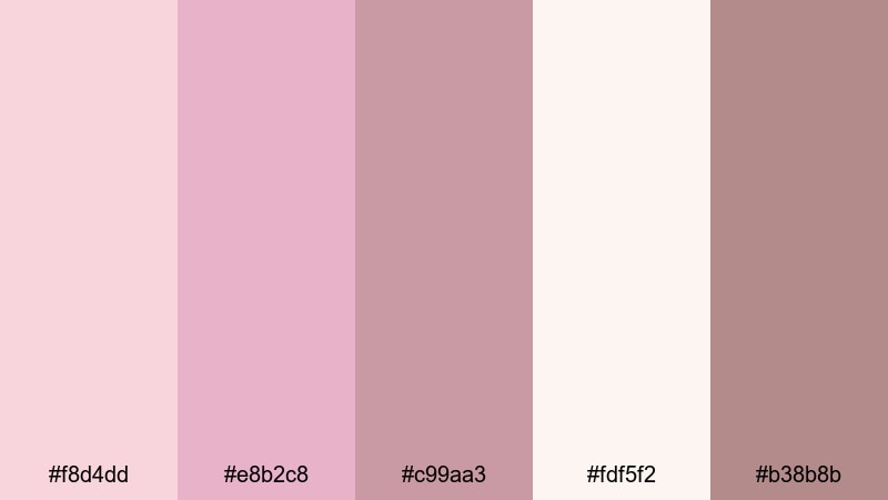
- HEX Codes: #f8d4dd, #e8b2c8, #c99aa3, #fdf5f2, #b38b8b
- Mood: Nostalgic, sentimental, and slightly vintage.
- Use for: Works beautifully for nostalgic travel vlogs, memory montages, and handwritten-style lower thirds.
Vintage Peony Letters pairs dusty blush pinks with soft browns, creating the feeling of old postcards and faded photo albums. It is emotional without being overly sweet, making it ideal for storytelling edits where you want to highlight memories and personal milestones.
Use the lighter blush and cream tones for background cards, frames, and overlay shapes, then reserve the deeper brownish pink and cocoa shade for text, doodles, or signature-style logos. In thumbnails and chapter cards, combine a hand-drawn font with these colors to instantly signal nostalgia for travel recaps, year-in-review videos, or reflective vlogs.
Champagne Blush Vows
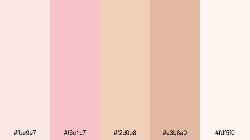
- HEX Codes: #fbe9e7, #f6c1c7, #f2d0b8, #e3b8a0, #fdf5f0
- Mood: Elegant, warm, and celebratory with a soft glow.
- Use for: Perfect for wedding films, luxury event promos, and elegant brand intros.
Champagne Blush Vows blends creamy blush with champagne beige and soft apricot, creating a luxe yet tender atmosphere. It feels like warm candlelight on silk, ideal for luxury wedding edits, bridal brand intros, or event highlight reels.
Use the palest tones for full-screen backgrounds, lower thirds, and simple frames around your footage. The warmer beige and deeper champagne shades work well for call-to-action buttons, accent lines, or text boxes in invitations, thumbnails, and animated overlays. This palette also pairs nicely with elegant serif fonts and subtle gold foil textures for premium-looking branding.
Cloudy Rose Afternoon
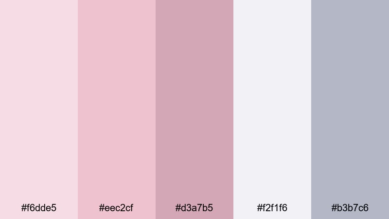
- HEX Codes: #f6dde5, #eec2cf, #d3a7b5, #f2f1f6, #b3b7c6
- Mood: Calm, reflective, and softly muted like an overcast day.
- Use for: Great for lifestyle vlogs, cozy study videos, and reflective voiceover edits.
Cloudy Rose Afternoon brings together muted blush tones and cool, hazy grays. The result is calm and introspective, like journaling near a window on a cloudy day. It offers softness without overwhelming your visuals with too much pink.
Use the grays and light off-white for main backgrounds and overlays, then let the blush shades appear in details: icons, section dividers, progress bars, and subtle title highlights. This palette is perfect for minimalist thumbnails, aesthetic study vlogs, gentle productivity content, or any voiceover piece that leans into reflection and quiet moments.
Modern Minimal Blush Pink Color Palettes
Concrete Loft Blush
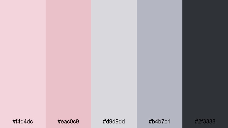
- HEX Codes: #f4d4dc, #eac0c9, #d9d9dd, #b4b7c1, #2f3338
- Mood: Clean, modern, and urban with a soft edge.
- Use for: Ideal for tech reviews, productivity channels, and sleek logo animations with a subtle feminine twist.
Concrete Loft Blush balances soft blush tones with cool grays and a deep charcoal accent. It feels like a modern studio or city loft, mixing industrial structure with a gentle, human touch. The dark neutral gives you strong contrast for text and UI-style elements, while the lighter blush keeps the overall look inviting.
Use the darker gray for typography and icons on your thumbnails, end screens, and in-video titles, and let the blush shades act as accent bars, backgrounds behind product shots, or subtle glows behind your logo. This palette is great for tech, productivity, and design-focused content where you want minimalism without losing warmth.
Scandinavian Rosewood
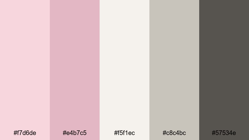
- HEX Codes: #f7d6de, #e4b7c5, #f5f1ec, #c8c4bc, #57534e
- Mood: Calm, grounded, and design-focused with natural warmth.
- Use for: Use for interior design videos, aesthetic desk tours, and brand identities that feel curated and cozy.
Scandinavian Rosewood combines airy blush pinks with stone neutrals and a wood-inspired deep tone. It evokes clean Scandinavian interiors, making it perfect for design-conscious creators and lifestyle channels that lean into home, decor, or slow living.
Let the soft pinks and off-white carry most of the frame in backgrounds, frames, and overlays. Use the stone gray and deep wood tone for text, UI elements, and logo marks. This palette works beautifully for room makeover thumbnails, aesthetic desk tours, and any branding that needs to feel both minimal and cozy.
Blush Workspace Glow
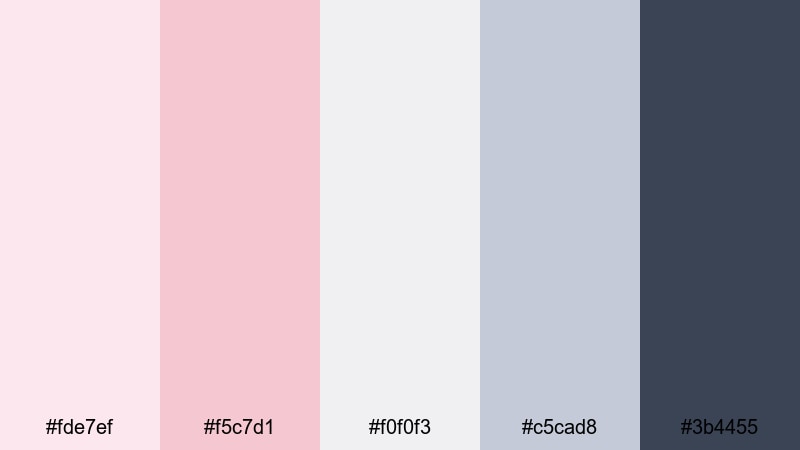
- HEX Codes: #fde7ef, #f5c7d1, #f0f0f3, #c5cad8, #3b4455
- Mood: Productive, bright, and softly professional.
- Use for: Perfect for tutorial videos, Notion or workspace walkthroughs, and course branding.
Blush Workspace Glow brings together bright blush tones and cool blue-grays for a clean yet friendly feeling. It looks like a tidy digital workspace, making it a natural fit for tutorials, webinars, and productivity content.
Use the pale blush and light gray as clean backgrounds, then highlight key buttons, timestamps, and CTAs with the deeper blush or navy-blue shade. In thumbnails, frame screenshots of apps or workflows with blush-colored borders and title bars to keep your educational content visually consistent and approachable.
Soft Tech Interface
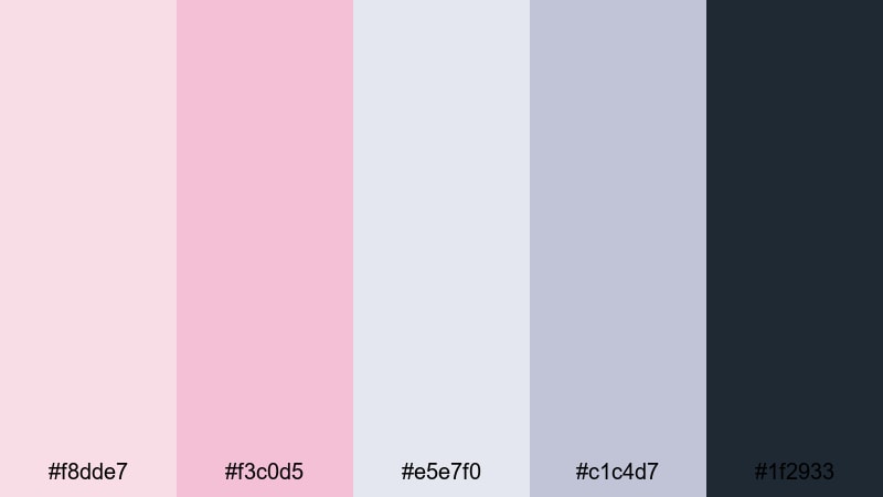
- HEX Codes: #f8dde7, #f3c0d5, #e5e7f0, #c1c4d7, #1f2933
- Mood: Sleek, future-ready, and gently feminine.
- Use for: Great for app demos, UI mockups in motion graphics, and startup explainer videos.
Soft Tech Interface blends blush pink with cool interface grays and a deep, almost teal-tinted charcoal. It feels professional and techy, but still soft and human. This is ideal for SaaS explainers, mobile app promos, or motion graphics that show dashboards and user flows.
Use the darkest tone for key text and major UI outlines, the light grays for panels and cards, and reserve the blush tones for buttons, notification badges, and highlight elements. In thumbnails and intro animations, this palette instantly suggests a modern product with a user-friendly, slightly feminine twist.
Bold And Moody Blush Pink Color Palettes
Midnight Blush Drama
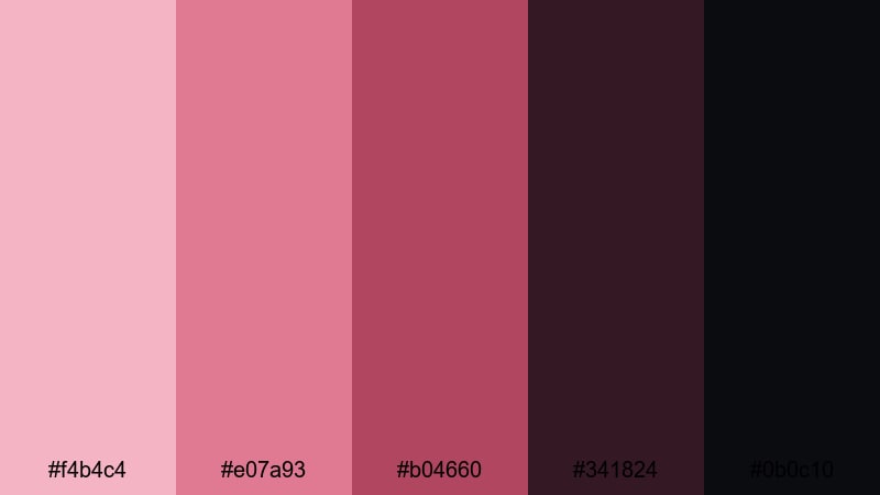
- HEX Codes: #f4b4c4, #e07a93, #b04660, #341824, #0b0c10
- Mood: Dramatic, cinematic, and passionately intense.
- Use for: Ideal for trailers, fashion lookbooks, and dramatic short films or teasers.
Midnight Blush Drama pairs vivid blush and berry tones with deep, inky shadows. The contrast is strong and cinematic, perfect for projects where emotion and impact matter more than softness.
Use the darkest shades as backgrounds or letterbox bars, letting the richer blush and berry tones appear in typography, graphic accents, and color blocks behind your subject. In trailers, fashion edits, and dramatic thumbnails, this palette makes titles pop while keeping the overall frame moody and intense.
Crimson Rose Studio
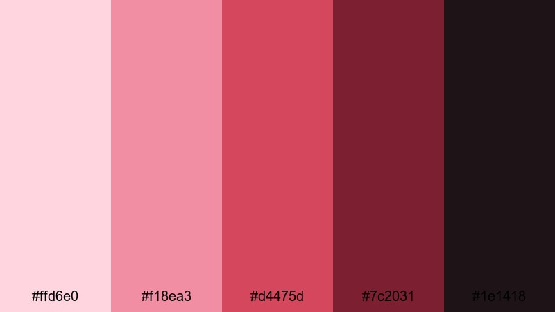
- HEX Codes: #ffd6e0, #f18ea3, #d4475d, #7c2031, #1e1418
- Mood: Energetic, confident, and studio-ready.
- Use for: Great for music videos, energetic channel intros, and fashion or beauty promos.
Crimson Rose Studio combines soft blush highlights with punchy crimson and deep wine shadows. It feels like a lit photo studio or music set, buzzing with confidence and style.
Use the lighter blush for skin-friendly backgrounds, gradients, or soft light flares. The richer crimson and wine tones can drive your logo, call-to-action frames, and bold typography. This palette shines in music video graphics, bold channel intros, and beauty or fashion promos where you want both strength and a nod to softness.
Velvet Noir Blush
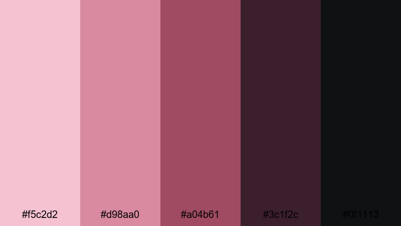
- HEX Codes: #f5c2d2, #d98aa0, #a04b61, #3c1f2c, #0f1113
- Mood: Luxurious, mysterious, and velvety rich.
- Use for: Perfect for perfume ads, luxury product spots, and moody cinematic b-roll.
Velvet Noir Blush is a deep, velvety mix of blush, wine, and near-black tones. It feels expensive and mysterious, like a fragrance ad or luxury fashion campaign.
Let the deepest tones take over backgrounds and negative space, with the mid blush and wine shades highlighting product silhouettes, bottle labels, or hero text. This palette is excellent for dark, glossy thumbnails, dramatic slow-motion b-roll, and any video where you want blush pink to feel grown-up and luxurious instead of cute.
Stormy Mauve Skyline
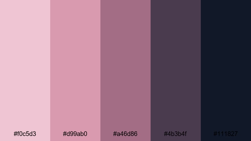
- HEX Codes: #f0c5d3, #d99ab0, #a46d86, #4b3b4f, #111827
- Mood: Atmospheric, urban, and slightly moody.
- Use for: Use for city night b-roll, travel edits, and aesthetic reels with skyline shots.
Stormy Mauve Skyline merges blush pink with mauve and stormy blues, echoing city lights against a dark evening sky. It is moody but not heavy, giving your footage an atmospheric, urban edge.
Use the darker blue and mauve tones for backgrounds, lower thirds, or title cards over night city shots, while the lighter blush tones can highlight key phrases, location tags, and transitions. This palette works especially well for travel edits, time-lapse skyline reels, and city-based vlogs that need a sophisticated, cinematic look.
Playful Pastel Blush Pink Color Palettes
Cotton Candy Studio
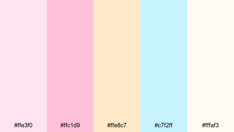
- HEX Codes: #ffe3f0, #ffc1d9, #ffe8c7, #c7f2ff, #fffaf3
- Mood: Sweet, airy, and whimsical like a pastel carnival.
- Use for: Great for lifestyle vlogs, kids content, and fun channel intros or subscribe animations.
Cotton Candy Studio is a sugary mix of blush pink, peach, sky blue, and soft cream that feels light, fun, and playful. It is perfect for channels that want a cheerful, pastel universe around their content.
Use the brighter pinks and blues for title shapes, badges, and call-to-action bubbles, and keep the cream and peach for soft backgrounds. This palette shines in kids content, lifestyle vlogs, and playful intro animations, where you can animate floating shapes, stickers, or doodles in these tones to build a bubbly on-screen identity.
Pastel Pop Vlog
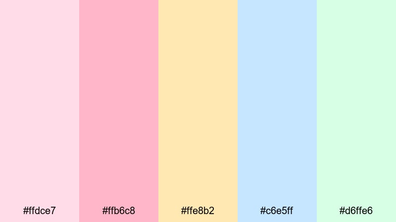
- HEX Codes: #ffdce7, #ffb6c8, #ffe8b2, #c6e5ff, #d6ffe6
- Mood: Cheerful, energetic, and creator-friendly.
- Use for: Ideal for daily vlogs, GRWM videos, and upbeat social media edits and thumbnails.
Pastel Pop Vlog puts bright blush pink alongside pastel yellow, blue, and mint for an energetic yet still soft aesthetic. It feels like an organized, colorful planner brought to life on screen.
Use these tones to color-code segments in your vlogs: one color for morning routines, another for outfits, another for Q&A sections. In thumbnails, you can divide the frame into blocks of these colors with bold, legible white or dark gray text on top. This makes your GRWM content, daily diaries, and short-form edits instantly recognizable in crowded feeds.
Dreamy Kawaii Stream
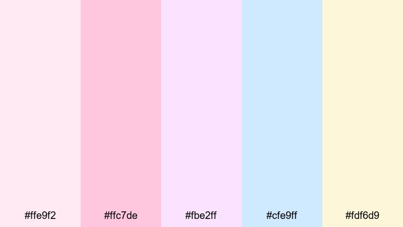
- HEX Codes: #ffe9f2, #ffc7de, #fbe2ff, #cfe9ff, #fdf6d9
- Mood: Cute, dreamy, and softly fantastical.
- Use for: Perfect for streaming overlays, kawaii gaming channels, and playful animated lower thirds.
Dreamy Kawaii Stream mixes pale blush with lilac, baby blue, and cream for a soft, magical vibe. It feels like cotton candy clouds and pastel avatars, ideal for kawaii gaming, cozy streams, and VTuber-style branding.
Use the different pastels to separate overlay areas: one color for chat boxes, another for webcam frames, another for alerts or donation banners. In thumbnails, combine cute icons, stickers, and rounded shapes in these hues with clear bold text so your content looks adorable without losing readability on mobile.
Tips for Creating Blush Pink Color Palettes
Blush pink works with many styles, from minimal tech visuals to romantic wedding films. A few simple guidelines will help you combine it with other colors so your videos and designs stay beautiful, legible, and on-brand.
- Pair blush pink with at least one strong neutral (charcoal, deep navy, or dark taupe) so text and icons stay readable, especially on small mobile screens.
- Use lighter blush tones for backgrounds and overlays, and reserve deeper accents for titles, buttons, and key UI elements to guide the viewer's eye.
- Check your thumbnails in grayscale to ensure enough contrast; if everything looks similar, darken your neutrals or lighten your blush backgrounds.
- Stay consistent with HEX codes across all templates in Filmora so intros, lower thirds, and end screens share the same blush pink identity.
- Match your color palette to your footage: warm blush works better with golden-hour shots, while cooler blush pairs nicely with cloudy or indoor lighting.
- Limit yourself to 3–5 main colors per project (for example, two blush tones, one neutral light, one neutral dark) to avoid a cluttered or childish look when you want minimalism.
- Test overlays and text on both light and dark footage, adjusting opacity and shadow behind text if needed to keep everything clear.
- For branding, define where each color lives (backgrounds, accents, typography) and stick to that system in every video so your blush pink style feels intentional, not random.
Blush pink is more than just a pretty shade. Used thoughtfully, it can signal romance, softness, or modern professionalism, shaping how viewers feel about your content and your brand. Whether you lean into soft and romantic, bold and moody, or playful pastels, a clear palette keeps your visuals memorable.
Try dropping these HEX codes into your next Filmora project, then build titles, overlays, and color grading around them. With tools like AI Color Palette, HSL controls, and LUTs, it is easy to keep your blush pink aesthetic consistent across intros, vlogs, and social cuts.
As you experiment, save your favorite combinations as presets and reusable templates. Over time, your blush pink style will become part of your visual identity, making your channel and brand instantly recognizable wherever your videos appear.
Next: Cobalt Color Palette


 100% Security Verified | No Subscription Required | No Malware
