
 100% Security Verified | No Subscription Required | No Malware


 ChatGPT
 Perplexity
 Gemini
 Claude
 Grok
Grok
Champagne pink sits between blush and beige, giving you a soft, sparkling warmth without feeling too sweet or too saturated. It is often linked with romance, nostalgia, and understated luxury, which makes it a favorite for weddings, lifestyle branding, and gentle storytelling. On screen, this color instantly softens skin tones, calms busy frames, and adds a subtle glow that feels classy rather than flashy.
For video creators, designers, and Filmora users, champagne pink works beautifully in title cards, YouTube thumbnails, wedding films, Instagram reels, and brand intros. Below you will find ready-made champagne pink color palettes with HEX codes so you can keep your visuals consistent across overlays, text, backgrounds, and color grading.
In this article
Soft & Romantic Champagne Pink Color Palettes
Blush Morning Light
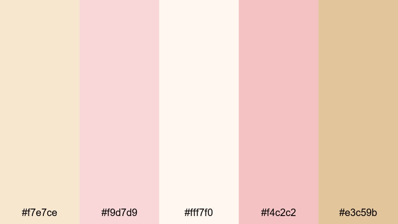
- HEX Codes: #f7e7ce, #f9d7d9, #fff7f0, #f4c2c2, #e3c59b
- Mood: Gentle, hopeful, and airy.
- Use for: Ideal for wedding highlight reels, proposal videos, and dreamy vlog intros.
This palette feels like soft light filtering through sheer curtains at sunrise. Champagne pink, blush, and warm neutrals create a delicate glow that flatters skin tones and makes every frame feel peaceful and romantic.
Use it for wedding titles, lower thirds, and YouTube thumbnails by pairing the lighter shades as backgrounds with the warmer tones for text and accents. In Filmora, you can also apply these HEX codes to gradients, overlays, and call-to-action cards so your entire love story, from intro to closing credits, keeps the same tender blush mood.
Pro Tip: Build A Cinematic Champagne Pink Look In Filmora
To keep a soft champagne pink aesthetic consistent, start by setting your title cards, subtitles, and motion graphics to these HEX values inside Filmora. Then, add light vignette and a subtle glow or haze over your b-roll so the footage feels as gentle as your graphic elements.
You can duplicate your most successful champagne pink title or thumbnail layout in Filmora and reuse it as a template for future wedding films, romantic vlogs, and reels. This gives your channel a recognizable, cinematic blush identity without redesigning everything from scratch.
AI Color Palette
If you have a mood board or photo that perfectly captures your ideal champagne pink, you can turn it into a full video look with Filmora. Filmora's AI Color Palette feature lets you sample colors from one reference clip and apply that style across your entire edit.
Import a still of your favorite champagne pink scene, then use AI Color Palette to match that tone in your A-roll, B-roll, and overlay graphics. This keeps your intros, transitions, and end screens visually aligned, even if the original footage was shot in different lighting conditions.
 secure download

HSL, Color Wheels & Curves
Once your champagne pink base is in place, use HSL, color wheels, and curves in Filmora to refine it. Slightly lowering saturation in the reds and oranges will keep blush tones sophisticated, while lifting the midtones gives faces a soft, luminous finish that suits romantic stories.
You can deepen shadows with the curves tool to add a cinematic contrast, then push the highlight tint gently toward warm champagne. This combination keeps the palette airy but avoids washed-out whites, so your footage feels polished and intentional around your chosen champagne pink look.
secure download1000+ Video Filters & 3D LUTs
If you want a champagne pink vibe without manual tweaking on every shot, Filmora's video filters and 3D LUTs make it easy to stylize a full project. Start with a soft pastel or romantic film LUT, then fine-tune the result so skin tones and blush elements align with your chosen HEX palette.
You can stack gentle glow filters, vignette, and color LUTs to quickly build a dreamy look for weddings, proposals, and anniversary edits. Save your favorite combination as a preset so you can apply your champagne pink signature style to every new video in just a few clicks.
secure downloadRosy Vow Whisper
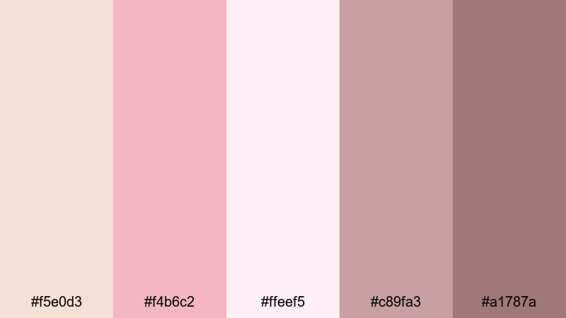
- HEX Codes: #f5e0d3, #f4b6c2, #ffeef5, #c89fa3, #a1787a
- Mood: Sentimental and intimate.
- Use for: Use for engagement announcements, love-story edits, and bridal brand visuals.
Rosy Vow Whisper layers soft roses and muted mauves around champagne pink for a palette that feels like a handwritten letter. The mix of pale highlights and deeper mauve shadows adds emotional depth while still looking gentle and refined.
Use the lightest tones for background cards and lower thirds, with the darker mauves for names, dates, and elegant logo marks. In Filmora, these colors work beautifully in split screens, overlay graphics, and subtle frames around your engagement footage or bridal content on Instagram and YouTube.
Petal Confetti Glow
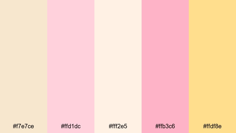
- HEX Codes: #f7e7ce, #ffd1dc, #fff2e5, #ffb3c6, #ffdf8e
- Mood: Celebratory and playful.
- Use for: Great for party highlights, birthday shorts, and cheerful social media bumpers.
Petal Confetti Glow mixes champagne tones with candy-like pinks and a soft golden yellow, creating a bubbly, party-ready energy. It feels like tossed petals and confetti frozen in mid-air.
Use it for upbeat birthday edits, baby showers, or milestone celebration videos. In your thumbnails and intro screens, pair the pale background shades with the brighter pink and yellow for text, stickers, and animated shapes so your audience instantly reads your content as fun and joyful.
Vintage Lace Keepsake
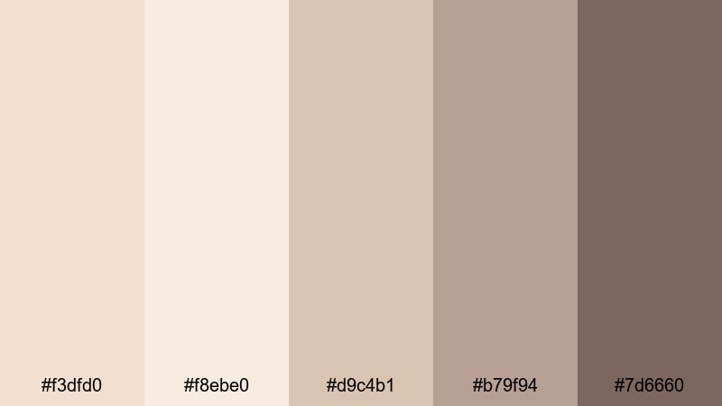
- HEX Codes: #f3dfd0, #f8ebe0, #d9c4b1, #b79f94, #7d6660
- Mood: Nostalgic, cozy, and timeless.
- Use for: Perfect for memory montages, heirloom product reels, and heritage brand storytelling.
Vintage Lace Keepsake captures the feeling of old photo albums and lace-covered keepsake boxes. Dusty champagne pink blends into warm browns, giving your visuals a soft, aged glow without turning everything strictly sepia.
Use the lighter shades for background panels and scrapbook-style frames, then bring in the deeper browns for typography and logo elements. This palette is ideal for family history videos, vintage-inspired reels, or brands that want to communicate tradition and craftsmanship.
Cloudy Prosecco Skies
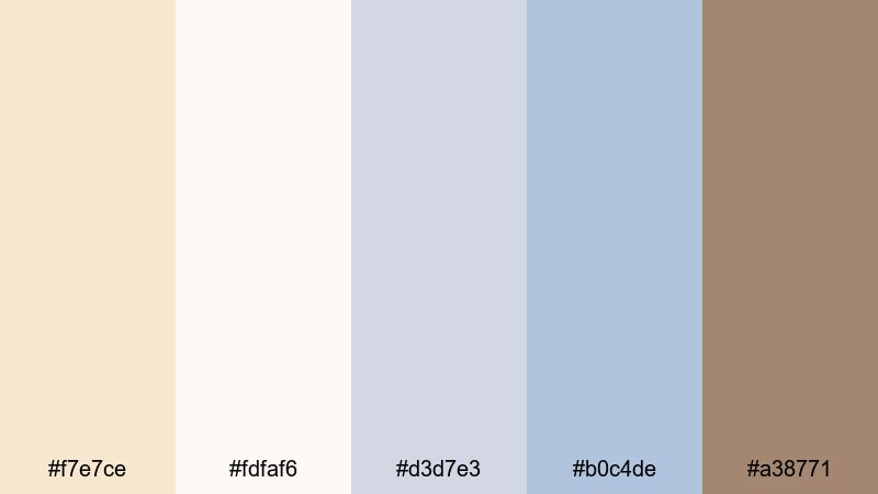
- HEX Codes: #f7e7ce, #fdfaf6, #d3d7e3, #b0c4de, #a38771
- Mood: Calm, reflective, and slightly dreamy.
- Use for: Use in cinematic travel vlogs, slow mornings, and reflective voiceover scenes.
Cloudy Prosecco Skies pairs champagne pink with misty blues and soft off-white, echoing dawn clouds and quiet seaside mornings. The palette feels serene and thoughtful, perfect for more introspective storytelling.
Use it in travel vlog titles, day-in-the-life videos, or reflective voiceover edits. Let champagne pink and off-white handle your backgrounds, while the blues become accent lines, map graphics, or minimal icons that guide the viewer through your story.
Modern Minimal Champagne Pink Color Palettes
Nordic Loft Blush
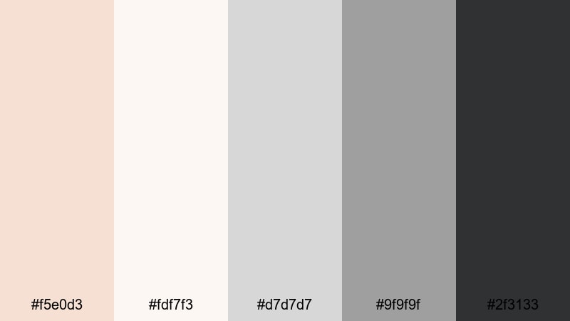
- HEX Codes: #f5e0d3, #fdf7f3, #d7d7d7, #9f9f9f, #2f3133
- Mood: Clean, stylish, and grounded.
- Use for: Ideal for minimalist studio tours, productivity vlogs, and modern brand intros.
Nordic Loft Blush balances champagne pink and soft whites with cool grays and near-black, giving you a minimal, design-forward look. It is warm enough to feel approachable but structured enough to stay professional.
Use the pink and off-white for backgrounds in your workspace tours or productivity vlogs, then rely on the darker grays for legible text, icons, and UI-style overlays. This palette works especially well for Notion-inspired layouts, tech reviews, and clean channel branding.
Editorial Dusty Neutrals
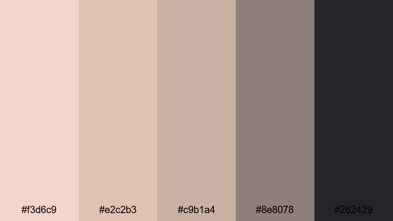
- HEX Codes: #f3d6c9, #e2c2b3, #c9b1a4, #8e8078, #262429
- Mood: Sophisticated and editorial.
- Use for: Great for fashion lookbooks, lifestyle reels, and homepage hero visuals.
Editorial Dusty Neutrals feels like a high-end magazine spread. Dusty pink-beige tones meet inky charcoal, creating a muted yet confident palette that makes product shots and fashion details stand out.
Use the lighter neutrals as background for text overlays and product descriptions, while the charcoal shade anchors headlines, logos, and navigation elements in your videos. It is ideal for lookbooks, capsule wardrobe reels, and polished website hero sections.
Soft Tech Interface
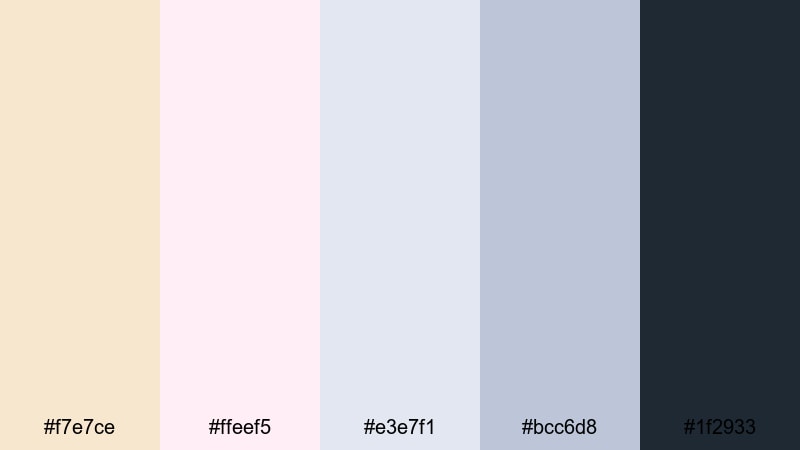
- HEX Codes: #f7e7ce, #ffeef5, #e3e7f1, #bcc6d8, #1f2933
- Mood: Friendly, polished, and slightly futuristic.
- Use for: Use for app demos, UI animations, SaaS explainers, and channel branding.
Soft Tech Interface softens cool tech blues with champagne pink and blush, making software demos and UI walkthroughs feel warmer and more human. The deep navy tone keeps everything grounded and readable.
Assign champagne pink to highlight panels or buttons, use the pale blues for UI backgrounds, and reserve the darkest shade for typography. In Filmora, apply this palette to on-screen mockups, pointer graphics, and animated callouts to turn complex features into approachable visuals.
Clean Desk Sunrise
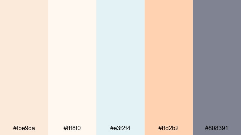
- HEX Codes: #fbe9da, #fff8f0, #e3f2f4, #ffd2b2, #808391
- Mood: Productive, optimistic, and fresh.
- Use for: Perfect for study-with-me videos, morning routines, and workspace flat-lays.
Clean Desk Sunrise feels like opening your laptop with a coffee at first light. Light champagne, airy off-white, minty aqua, and peachy accents create a fresh and focused atmosphere.
Use the softest tones for your background and timer overlays in study-with-me content, with the peach and aqua for progress trackers, checklists, and chapter markers. This palette is also great for thumbnail designs that promise calm productivity rather than hustle overload.
Muted Studio Grid
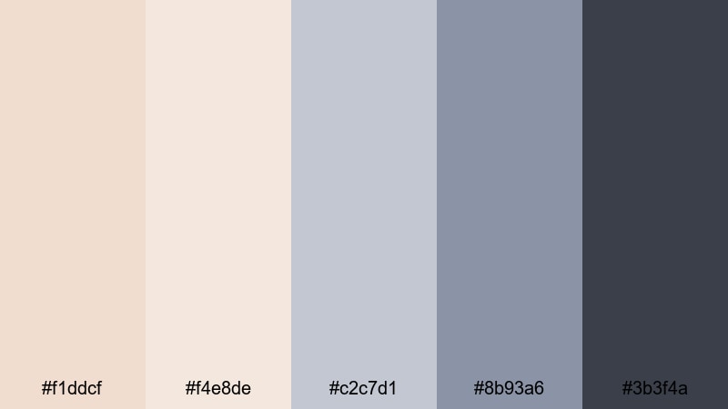
- HEX Codes: #f1ddcf, #f4e8de, #c2c7d1, #8b93a6, #3b3f4a
- Mood: Structured, calm, and creative.
- Use for: Use in design breakdowns, tutorial overlays, and motion graphics backdrops.
Muted Studio Grid places soft champagne pink next to cool slate blues and grays, giving you a neat, grid-friendly palette. It feels organized but still creative, ideal for educational or design-focused content.
Use the champagne tones as your canvas and bring in the muted blues for section dividers, progress bars, or over-the-shoulder notes. In Filmora, this palette helps your diagrams, layer breakdowns, and keyframe explanations stay clear and visually consistent.
Luxury Event Champagne Pink Color Palettes
Champagne Gala Sparkle
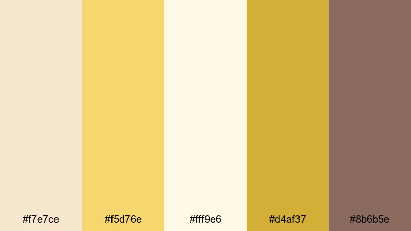
- HEX Codes: #f7e7ce, #f5d76e, #fff9e6, #d4af37, #8b6b5e
- Mood: Opulent, festive, and glamorous.
- Use for: Ideal for gala recaps, upscale event teasers, and luxury brand promos.
Champagne Gala Sparkle blends creamy champagne pink with shimmering gold tones and a grounding brown. It instantly reads as high-end and celebratory, like ticketed galas, award nights, or luxury launches.
Use the lighter champagne and off-white for backgrounds, with the gold and darker brown for headlines, borders, and animated flourishes. This palette is perfect for event highlight reels, sponsor slides, and polished countdowns leading into live streams or premieres.
Rose Gold Ballroom
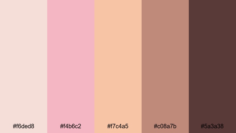
- HEX Codes: #f6ded8, #f4b6c2, #f7c4a5, #c08a7b, #5a3a38
- Mood: Romantic yet extravagant.
- Use for: Perfect for wedding films, ballroom dance reels, and jewelry showcases.
Rose Gold Ballroom takes champagne pink into a richer, rose-gold territory with warm metallic browns and deep, dramatic accents. It is romantic but with a sense of grandeur, ideal for dance floors, chandeliers, and sparkling accessories.
Use the lighter pinks and peaches in title cards and transition wipes, while the darkest shade becomes your signature accent for monograms, logo reveals, and text shadows. This palette works beautifully for luxury wedding films and jewelry brand videos that want a lush, cinematic glow.
Velvet Macaron Tower
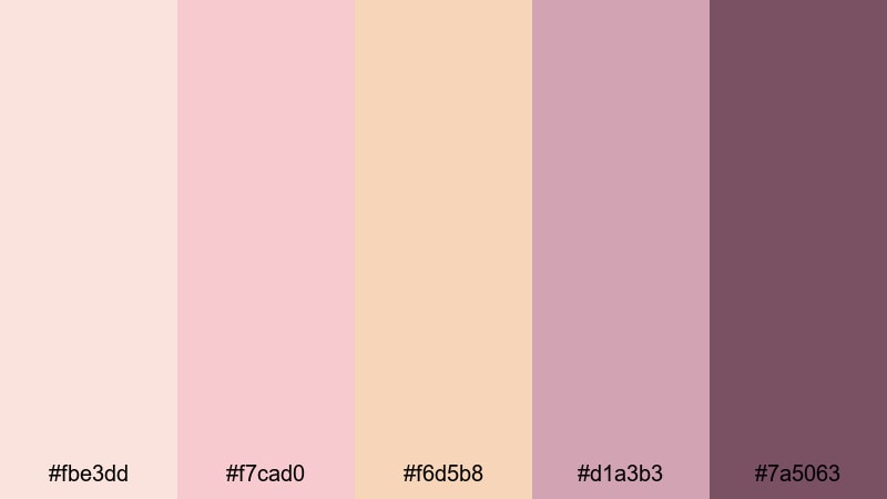
- HEX Codes: #fbe3dd, #f7cad0, #f6d5b8, #d1a3b3, #7a5063
- Mood: Indulgent, sweet, and chic.
- Use for: Great for dessert shots, patisserie branding, and lifestyle content around celebrations.
Velvet Macaron Tower is inspired by dessert tables and patisserie windows. Macaron pastels meet velvety plums, wrapping champagne pink in an indulgent, Instagram-ready aesthetic.
Use the softest tones as backgrounds for recipe cards, menu overlays, or carousel slides, with the richer plum for price tags, call-to-actions, and logo details. This palette is ideal for bakers, cafes, and lifestyle creators who want their food content to feel both sweet and stylish.
Evening Soiree Lights

- HEX Codes: #f5ddca, #f9e9dc, #f0c0a3, #a28a8b, #252338
- Mood: Intimate, cinematic, and moody.
- Use for: Use for cocktail hours, rooftop parties, and night-time highlight reels.
Evening Soiree Lights captures the glow of string lights against a dark sky. Warm champagne pinks sit beside muted mauves and inky blue-violet, creating a moody, cinematic feeling that still feels inviting.
Use the lighter shades for on-screen text and lower thirds, and let the deep navy-violet guide transitions or full-screen overlays into key scenes. This palette is great for after-movie recaps, rooftop party reels, and hotel or bar promos that want to look intimate rather than flashy.
Crystal Flute Highlights
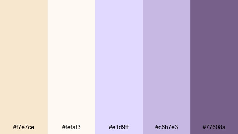
- HEX Codes: #f7e7ce, #fefaf3, #e1d9ff, #c6b7e3, #77608a
- Mood: Sparkling, refined, and celebratory.
- Use for: Ideal for New Year countdowns, launch announcements, and product close-ups in glass or metallics.
Crystal Flute Highlights combines champagne tones with pearl white and soft lilac, echoing reflections in glass and crystal. It feels crisp and sparkling, perfect for launches and celebrations that need a modern, refined look.
Use the lighter tones as clean backdrops for countdown timers, product stats, and typography, while the lilac and purple-grey add depth to outlines and accents. This palette is excellent for premium product reveals, holiday campaigns, and any video that features glass, metallic packaging, or glittering details.
Tips for Creating Champagne Pink Color Palettes
Champagne pink is versatile, but it really shines when paired thoughtfully with neutrals, metallics, and carefully chosen accent colors. Keep these tips in mind when building or adapting palettes for video, thumbnails, and branding.
- Balance warm and cool tones: pair champagne pink with a touch of cool gray or blue to avoid your visuals feeling too sugary or flat.
- Protect readability: use darker browns, charcoals, or navy for text so titles and subtitles stay legible against pale champagne backgrounds.
- Limit accent colors: choose one or two accent shades (gold, lilac, teal, or deep plum) so your palette looks intentional, not chaotic.
- Match footage temperature: if your clips are very warm, cool down the shadows slightly in Filmora so champagne pink does not drift into orange.
- Keep skin tones natural: avoid pushing midtones too pink; instead, add champagne pink mainly to highlights, overlays, and graphics.
- Use gradients and overlays: soft champagne-to-blush gradients over footage can instantly tie mismatched clips into one cohesive look.
- Create reusable presets: once you find a champagne pink combination you like, save color settings, filters, and titles as presets in Filmora for consistent branding.
- Test on small and large screens: preview your palette on phones and desktops to ensure contrast and mood hold up everywhere your audience watches.
Champagne pink color palettes are powerful tools for shaping mood, from romantic storytelling and lifestyle vlogs to luxury event promos and polished brand intros. The right combination of blush tones, neutrals, and accents can make your channel look cohesive, calm, and instantly recognizable.
Experiment with these 15 palettes, plug the HEX codes into your titles, overlays, and graphics, and then refine the look using Filmora's color tools. With a few saved presets, you can build a signature champagne pink style that carries across thumbnails, intros, full edits, and social cutdowns.
Open a new project in Filmora, try a couple of these palettes on your next video, and see how much a focused color story can elevate your visuals and brand identity.
secure download