
 100% Security Verified | No Subscription Required | No Malware

Coral pink sits between warm orange and playful pink, so it naturally feels friendly, flattering, and human. It suggests warmth, optimism, and romance without being as loud as pure red or as sweet as baby pink. On screen, coral pink easily draws the eye, which makes it a powerful choice for branding, YouTube thumbnails, intros, and on-screen text that needs to stand out without feeling aggressive.
For video creators and designers, coral pink can shape the entire mood of a channel or project, from soft romantic highlight reels to bold, high-energy promos. Below are 15 curated coral pink color palettes with HEX codes you can plug directly into your thumbnails, lower thirds, titles, and overlays in Filmora. Use them to keep your look consistent across YouTube intros, Instagram Reels, TikTok edits, and brand graphics.
In this article
Soft And Romantic Coral Pink Color Palettes
Sunset Blush Harmony
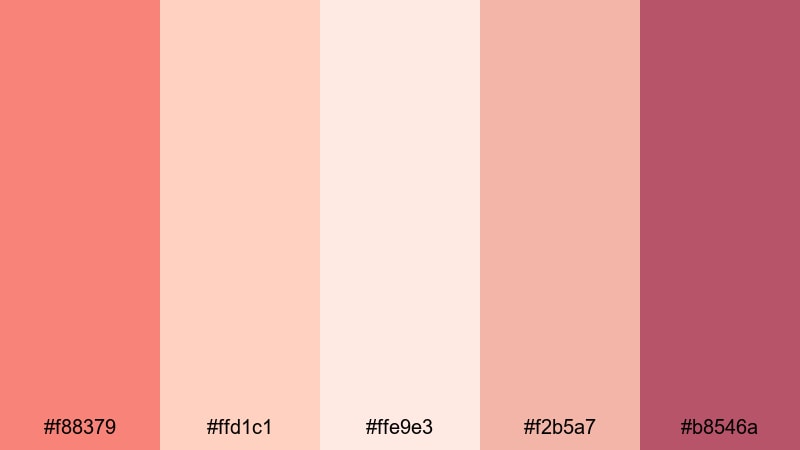
- HEX Codes: #f88379, #ffd1c1, #ffe9e3, #f2b5a7, #b8546a
- Mood: Warm, nostalgic, and gently romantic.
- Use for: Perfect for wedding highlight videos, engagement reels, and sentimental travel montages.
Sunset Blush Harmony feels like golden hour captured in a color palette. Medium coral pink (#f88379) is softened by creamy peaches and delicate off-whites, while the deeper rose-plum accent (#b8546a) adds just enough contrast for text, borders, or title bars. Together they create a cozy, nostalgic look that flatters skin tones and soft light.
Use this palette in Filmora for romantic wedding edits, proposal stories, or heartfelt travel vlogs. Apply the lighter tones to backgrounds and lower thirds, keep the mid coral for buttons and key titles, and save the darkest shade for logos or call-to-action text in your YouTube thumbnails and intro cards so everything stays readable and on-brand.
Pro Tip: Build a Soft Coral Pink Aesthetic in Filmora
To keep a romantic coral pink aesthetic consistent, design one master look in Filmora and reuse it across every part of your edit: intro animation, title cards, lower thirds, and end screen. Use #f88379 as your hero accent for key text or shapes, the soft creams for backgrounds, and #b8546a for subtle outlines or drop shadows that keep overlays legible on bright footage.
Save your favorite title, transition, and overlay presets with these exact HEX codes, so each new wedding highlight or engagement reel automatically matches your signature coral pink brand. This makes your channel feel cohesive, professional, and instantly recognizable.
AI Color Palette
Filmora's AI Color Palette feature helps you carry this soft coral sunset vibe through your entire video. You can grab a still frame or a mood board that uses Sunset Blush Harmony, then let AI analyze the colors and apply a matching palette across other clips.
This is perfect if your B-roll was shot in mixed lighting. Instead of manually matching every shot, AI Color Palette pushes all your footage toward the same warm coral pink mood, so wedding details, couple portraits, and reception scenes all feel like they belong to one story.
 secure download

HSL, Color Wheels & Curves
Once your base look is in place, use HSL controls to fine-tune the coral range so it stays soft, not oversaturated. Gently pull down saturation in oranges and reds, and use the color wheels to warm up midtones while keeping highlights creamy. If your footage feels too flat, add a soft S-curve so the lighter coral tones glow while shadows stay rich and cinematic.
For more control, combine HSL with subtle vignettes and selective color adjustments. This lets you keep faces natural while pushing backgrounds slightly toward your chosen coral pink palette, so the scene feels stylized without looking fake.
secure download1000+ Video Filters & 3D LUTs
If you want a faster workflow, Filmora's video filters and 3D LUTs make it easy to push your entire project toward a cohesive coral pink mood. Start with a soft cinematic or warm wedding LUT, then tweak the coral tones with HSL so they line up with the HEX codes in Sunset Blush Harmony.
You can save your adjusted LUT or effect preset and reuse it across multiple wedding seasons or series playlists. This keeps your content looking unified, even if you shoot on different cameras or in different venues.
secure downloadRosewater Storytelling

- HEX Codes: #ff8f87, #ffe2dd, #f9c5d1, #f6abb6, #5b3b58
- Mood: Tender, dreamy, and emotional.
- Use for: Use in narrative vlogs, poetry shorts, and soft-spoken ASMR intros where emotion is key.
Rosewater Storytelling layers muted coral pinks with rosy tones and a deep plum accent. The result is a cinematic, slightly vintage atmosphere that feels perfect for emotional storytelling or reflective content. The darker #5b3b58 shade grounds the palette and adds a poetic, nighttime quality.
Use the light rose tones for lower thirds and captions, keep the mid corals for title cards, and use the plum shade for outlines, drop shadows, and key call-to-action text in thumbnails. In Filmora, this palette works wonderfully with slow dissolves, soft blur transitions, and gentle zooms for vlogs, spoken word, or ASMR channels.
Warm Coral Embrace
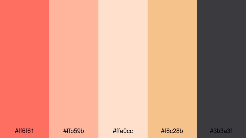
- HEX Codes: #ff6f61, #ffb59b, #ffe0cc, #f6c28b, #3b3a3f
- Mood: Comforting, optimistic, and heartfelt.
- Use for: Ideal for family recap videos, cozy home styling content, and lifestyle brand intros.
Warm Coral Embrace combines a classic, lively coral (#ff6f61) with honeyed neutrals and a grounding charcoal gray. It feels like a hug on screen: friendly and uplifting, but still clean enough for modern lifestyle brands or home decor content.
Use coral for your logo mark, subscribe buttons, and key titles, while the neutrals support backgrounds and overlays so the frame never feels cluttered. The charcoal shade is ideal for legible text over light footage, whether you are designing YouTube thumbnails, Instagram Reels covers, or animated openers in Filmora.
Peachy Candlelight Glow
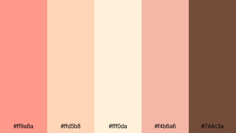
- HEX Codes: #ff9a8a, #ffd5b8, #fff0da, #f4b6a6, #744c3a
- Mood: Soft, intimate, and cozy.
- Use for: Great for slow evenings in vlogs, recipe videos, and cozy productivity edits.
Peachy Candlelight Glow feels like warm candles and late-night journaling sessions. Gentle coral and peach tones pair with a creamy highlight shade and a rich brown (#744c3a) that mimics wood, coffee, or chocolate. This creates an inviting atmosphere that is perfect for cozy content.
In Filmora, use the lighter colors for backgrounds behind timers, to-do lists, or recipe steps, and reserve the deeper brown for headers and icons. This palette suits study vlogs, cooking shorts, or any video where you want viewers to feel calm, grounded, and at home with you.
Bold And Vibrant Coral Pink Color Palettes
Neon Coral Splash
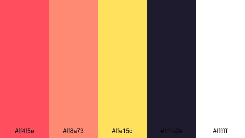
- HEX Codes: #ff4f5e, #ff8a73, #ffe15d, #1f1b2e, #ffffff
- Mood: Energetic, bold, and attention grabbing.
- Use for: Designed for high-impact YouTube thumbnails, gaming intros, and energetic promo cuts.
Neon Coral Splash is made for clicks and instant impact. Electric coral shades sit next to a bright yellow highlight (#ffe15d) and a deep midnight violet (#1f1b2e), creating huge contrast that pops on any screen. White balances the palette so things still feel clean and readable.
Try using the darkest color for background blocks, then lay neon coral and yellow on top for titles, streaks, and glitch elements in Filmora. This palette is perfect for fast-paced edits, gaming montages, and promotional cuts where you want viewers to stop scrolling the instant your thumbnail appears.
Tropical Coral Fiesta

- HEX Codes: #ff6b6b, #ffb86b, #ffeaa7, #00b894, #1d3557
- Mood: Festive, playful, and adventurous.
- Use for: Perfect for travel vlogs, summer festival recaps, and beach trip highlight reels.
Tropical Coral Fiesta is a party on screen. Punchy coral (#ff6b6b), mango orange, and soft yellow pair with palm green (#00b894) and a cool navy (#1d3557). It feels like cocktails, sunsets, and ocean water all in one frame.
Use coral and mango for your main titles and transitions, then bring in palm green for badges, map pins, or on-screen stickers. Navy is ideal for small, high-contrast text like dates or locations in your travel vlogs. In Filmora, combine this palette with whip pans and rhythmic cuts to match upbeat music and festival energy.
Coral Spotlight Energy
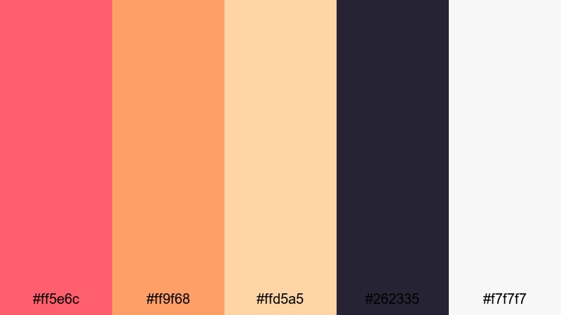
- HEX Codes: #ff5e6c, #ff9f68, #ffd5a5, #262335, #f7f7f7
- Mood: Dynamic, modern, and powerful.
- Use for: Use for creator brand stings, sports edits, and high-energy product promos.
Coral Spotlight Energy mixes hot coral and tangerine with a pale peach and deep indigo. The dark #262335 background shade works like a stage or arena, while the bright corals feel like a spotlight cutting through the dark.
This palette is great for strong logo reveals, motion graphics, and kinetic typography in Filmora. Place your logo or product in the brightest tones, and let the navy backdrop keep everything focused. For thumbnails, pair coral headlines with small white text and indigo accents to create a premium yet energetic vibe.
Citrus Coral Pop
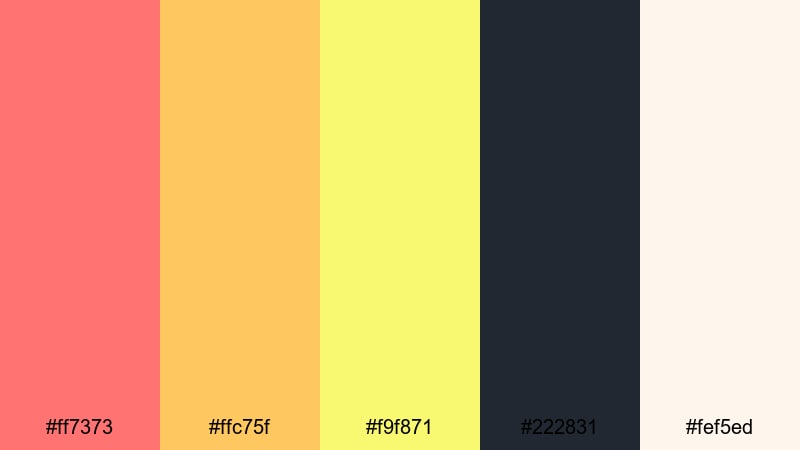
- HEX Codes: #ff7373, #ffc75f, #f9f871, #222831, #fef5ed
- Mood: Fresh, zesty, and upbeat.
- Use for: Ideal for short-form social clips, product teasers, and playful channel art.
Citrus Coral Pop feels juicy and bright. Coral pink combines with citrusy yellows and a creamy off-white, anchored by a dark gray (#222831). It has strong contrast without feeling heavy, which works well on small mobile screens.
Use this palette for TikTok and Instagram Reels where you need quick visual impact. Let coral and yellow handle your titles and motion graphics, with the off-white for background cards. The dark gray is perfect for shadows, icons, and small text to keep everything crisp and easy to read in fast-moving edits.
Modern And Minimal Coral Pink Color Palettes
Coral And Charcoal Minimal
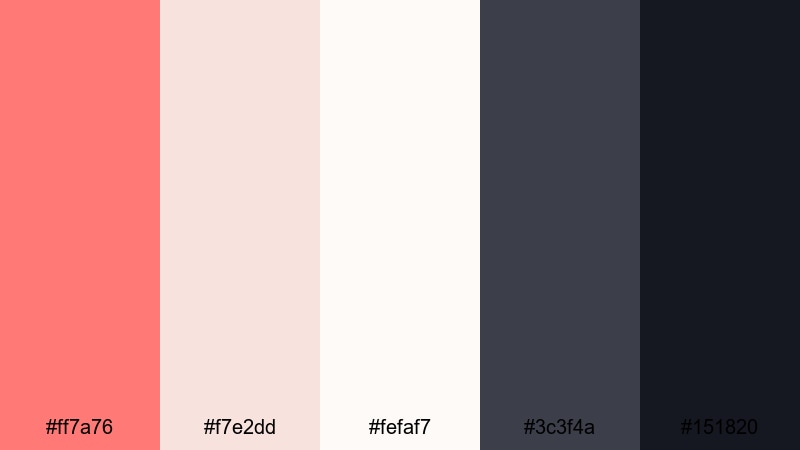
- HEX Codes: #ff7a76, #f7e2dd, #fefaf7, #3c3f4a, #151820
- Mood: Clean, sophisticated, and understated.
- Use for: Great for portfolio reels, startup explainers, and minimal UI overlays in tutorials.
Coral And Charcoal Minimal uses coral as a warm accent against ivory and deep charcoal grays. The palette feels polished and professional, but the coral keeps it friendly and human, which is ideal for personal brands, tech explainers, or UX walk-throughs.
Use the lightest tones as backgrounds for UI mockups, screen recordings, or text panels in Filmora. Coral is best saved for key highlights: subscribe buttons, progress bars, or important labels. The darker grays will keep text highly readable on both desktop and mobile, especially for tutorial thumbnails and LinkedIn-ready videos.
Studio Loft Coral

- HEX Codes: #ff8c82, #f6d4c8, #f1f1f1, #4b4e57, #22252b
- Mood: Urban, creative, and refined.
- Use for: Use in creator logo reveals, design studio promos, and aesthetic desk setup videos.
Studio Loft Coral pairs soft coral pinks with cool grays and clean white. It feels like a daylight-filled creative studio: artistic but controlled. The palette balances warmth and coolness, which works nicely for design, photography, and productivity channels.
Lean on coral for logo animations, callouts, and subtle gradients, and let the grays handle backgrounds, dividers, and device frames. In Filmora, mix this palette with smooth camera moves, slow pans across desk setups, and minimal typography for a sleek, editorial look.
Clean Coral Interface
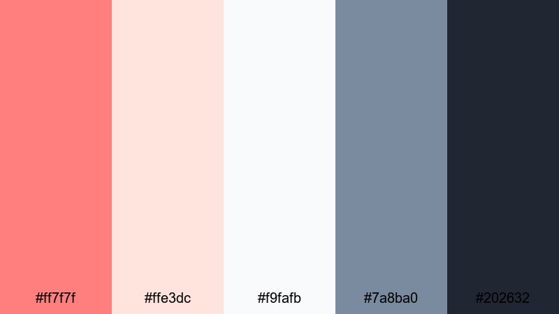
- HEX Codes: #ff7f7f, #ffe3dc, #f9fafb, #7a8ba0, #202632
- Mood: Bright, focused, and user friendly.
- Use for: Perfect for app walkthroughs, SaaS explainers, and modern UI themed edits.
Clean Coral Interface is all about clarity. A clear coral highlight (#ff7f7f) stands out over soft backgrounds and cool bluish grays. It feels like a modern app UI: simple, intuitive, and easy to navigate.
Use coral sparingly in Filmora to draw attention to buttons, feature names, or key steps in tutorials. The pale neutrals and grays can handle larger panels behind UI screenshots or screen recordings, ensuring text overlays stay readable. This palette is ideal for product demos, onboarding videos, and website or app explainers.
Pastel Dreamy Coral Pink Color Palettes
Cotton Candy Coral
- HEX Codes: #ffb3ab, #ffd6e0, #ffeef5, #b5c7ff, #a5a6f6
- Mood: Whimsical, sweet, and lighthearted.
- Use for: Great for kawaii edits, stationery promos, and playful vlog aesthetics.
Cotton Candy Coral blends sugary coral pinks with pastel lilac and baby blue, creating a dreamy, candy-sky vibe. It is soft, airy, and perfect for cute, aesthetic content aimed at younger audiences or playful brands.
Use the softest colors as backgrounds and frames, with coral for titles and stickers and the lavender blues for icons or outlines. In Filmora, combine this palette with bubbly music, animated doodles, and simple motion graphics for kawaii edits, bullet journal videos, or stationery product promos.
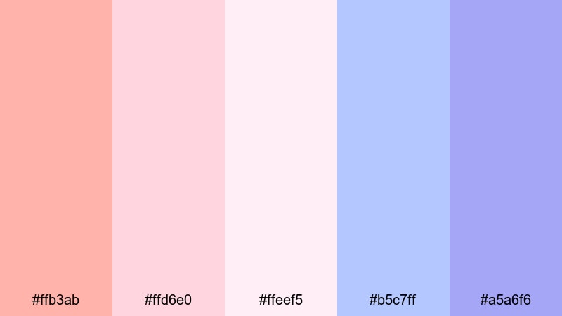
Soft Coral Cloudscape
- HEX Codes: #ff9aa2, #ffdac1, #e2f0ff, #c7ceea, #faf3dd
- Mood: Airy, serene, and imaginative.
- Use for: Ideal for morning routine vlogs, mindfulness content, and calm cinematic b-roll.
Soft Coral Cloudscape feels like drifting clouds at sunrise. Coral and peach tones mix with pale sky blues and a soft cream, giving you a balanced, airy palette that never feels heavy or over-saturated.
Apply this palette to opening sequences, journaling overlays, or guided meditation titles in Filmora. Let the blue tones appear in gradients or background shapes, while coral highlights key phrases or timestamps. It works beautifully with slow motion b-roll, nature shots, and everyday rituals like coffee making or stretching routines.
Peach Coral Sorbet

- HEX Codes: #ffb199, #ffe0b5, #fff3e2, #fcd5ce, #99c1b9
- Mood: Refreshing, mellow, and friendly.
- Use for: Use in food reels, brunch vlogs, and light lifestyle branding that needs a sweet touch.
Peach Coral Sorbet looks and feels like dessert. Creamy coral, peach, and a soft minty green (#99c1b9) create a refreshing palette that is gentle on the eyes. It is perfect for relaxed, joyful content that still feels polished.
Use these colors in Filmora for recipe steps, labels, and transitions in food reels or brunch vlogs. Coral and peach can highlight dish names or prices, while mint works well for accents, icons, and callout boxes. This palette is also great for light lifestyle branding, small businesses, or cafes that want to project a friendly, welcoming vibe.
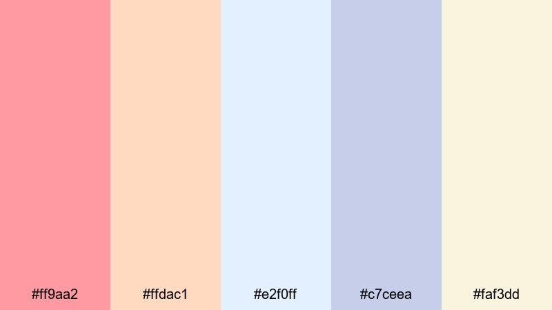
Daybreak Coral Mist
- HEX Codes: #ff9580, #ffd2c2, #f5f7fb, #c3d9ff, #6c7b95
- Mood: Calm, hopeful, and cinematic.
- Use for: Perfect for sunrise time-lapses, travel opens, and reflective talking-head intros.
Daybreak Coral Mist brings together soft coral with misty blues and gentle grays. It feels like early morning light before the day fully wakes up: calm, open, and quietly optimistic.
Use the coral tones in Filmora for opening titles and key phrases, with the blues and grays supporting as overlays, background panels, or gradient washes over footage. This palette pairs well with time-lapses, wide landscape shots, or reflective talking-head content where you want a cinematic but hopeful mood.
Tips for Creating Coral Pink Color Palettes
Coral pink is versatile, but it works best when you balance warmth, contrast, and readability. Use these tips to design your own coral pink color combinations for video, branding, and thumbnails that look great in Filmora.
- Pair coral pink with a grounding dark tone (charcoal, navy, or plum) so text and icons stay readable over bright footage.
- Add at least one very light neutral (ivory, cream, or soft gray) to use as a background behind titles and UI-style overlays.
- Limit your strong accent colors to 1 or 2 (for example, coral plus yellow or mint) so your thumbnails do not become chaotic.
- Check legibility on mobile by previewing your designs at small sizes; if coral text on light backgrounds feels weak, darken or desaturate the background slightly.
- Match your palette to your content type: soft, low-saturation corals for vlogs and storytelling; vivid neon corals for gaming, promos, and high-energy edits.
- Use HEX codes consistently in your logo, lower thirds, and end screens so your channel identity feels unified across platforms.
- When color grading in Filmora, nudge oranges and reds toward your chosen coral HEX code so skin tones and backgrounds subtly echo your brand palette.
- Save your favorite title templates and overlay presets in Filmora with coral pink already applied to speed up future edits.
Used well, coral pink can become a signature part of your visual identity. Soft coral palettes create warmth and intimacy for vlogs, weddings, and lifestyle edits, while bold coral combinations make product launches, gaming intros, and social ads feel energetic and clickable.
Experiment with these 15 coral pink color palettes in Filmora by applying the exact HEX codes to titles, graphics, and overlays, then shaping your footage with color grading to match. Over time, you will discover which shades feel most like your brand and audience.
Once you have a favorite coral pink look, turn it into reusable presets in Filmora so every new video, thumbnail, and Reel feels consistent from the first frame to the final end screen.
secure downloadNext: Vivid Color Palette
