
 100% Security Verified | No Subscription Required | No Malware


 ChatGPT
 Perplexity
 Gemini
 Claude
 Grok
Grok
Daffodil yellow sits between soft sunshine and clear optimism. It is bright enough to grab attention, but still gentle and friendly, which makes it perfect for content that feels happy, hopeful, or freshly inspired. In color psychology, daffodil tones are linked with joy, creativity, and new beginnings, so they are a natural fit for spring campaigns, launches, and any storyline about growth or transformation.
For video creators and brands, daffodil works brilliantly in YouTube thumbnails, channel intros, title cards, overlays, and logo animations. It can be the main brand color or a highlight that wakes up neutrals and pastels. Below you will find ready-to-use daffodil color palettes with HEX codes, designed for creators and Filmora users who want consistent, eye-catching visuals across thumbnails, reels, shorts, and full edits.
In this article
Bright & Cheerful Daffodil Color Palettes
Sunlit Confetti Burst
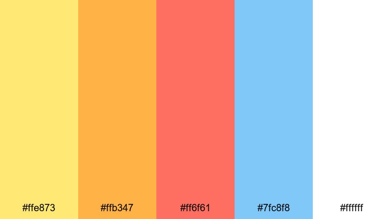
- HEX Codes: #ffe873, #ffb347, #ff6f61, #7fc8f8, #ffffff
- Mood: Playful, energetic, and full of celebration vibes.
- Use for: Great for upbeat vlogs, party highlight reels, and splashy YouTube thumbnails that need instant sunshine energy.
Sunlit Confetti Burst feels like a burst of balloons and streamers across your frame. Daffodil yellow and tangerine keep everything bright, while coral adds warmth and the fresh sky blue keeps the palette from feeling too hot. White brings in just enough breathing room so your text and icons stay readable.
Use this palette in fast cuts, confetti transitions, and bold thumbnail designs for birthdays, festivals, challenges, and celebratory announcements. In Filmora, you can apply the yellows and corals to titles, button-style CTAs, and motion graphics, while reserving the blue for accents like subscribe badges or social handles.
Pro Tip: Enhance Your Daffodil Visuals With Filmora
When you use a punchy palette like Sunlit Confetti Burst, consistency across different clips is what makes the whole video feel intentional. In Filmora, save your favorite yellows, corals, and blues as custom swatches, then reuse them for titles, callouts, and lower thirds so every element shares the same daffodil glow.
You can also build simple templates for intros, transitions, and end screens that lock in this color scheme. That way, future party vlogs, celebrations, or highlight reels can all reuse the same bright identity with just a few quick edits.
AI Color Palette
If you have a reference image of balloons, party decor, or a daffodil-themed brand board, Filmora's AI Color Palette feature can automatically transfer that look to your footage. Import the image, choose it as your source, and let Filmora match the tones across your clips so the yellows, oranges, and blues stay cohesive from start to finish.
This is especially useful when you are mixing smartphone, camera, and screen recordings in the same edit. AI Color Palette helps you keep one unified color story for your intro, B-roll, talking head shots, and social teasers.
 secure download

HSL, Color Wheels & Curves
To keep your daffodil tones flattering on different skin tones and lighting conditions, use Filmora's HSL sliders, color wheels, and curves. You can push the yellow hue slightly warmer for a golden sunset feeling or pull saturation back in the highlights so bright areas do not clip. The midtone and shadow wheels make it easy to balance warm yellows with cooler blues for a more cinematic split-tone look.
If you are new to grading, Filmora's color correction tools in Filmora give you a simple workflow to refine contrast and color depth. Apply your base adjustment to one clip, then copy those settings across your sequence so every shot shares the same daffodil-driven style.
secure download1000+ Video Filters & 3D LUTs
Once your daffodil palette is in place, Filmora's video filters and 3D LUTs make it easy to stylize everything with one click. You can choose film-inspired looks, soft pastel filters, or high-contrast modern grades that keep your yellows bright while giving the rest of the frame a unified mood.
Stack subtle filters on top of your base correction to add glow, texture, or a seasonal vibe to the footage. This is a quick way to build a recognizable visual style for your channel while still letting the Sunlit Confetti Burst colors shine through.
secure downloadLemonade Stand Pop
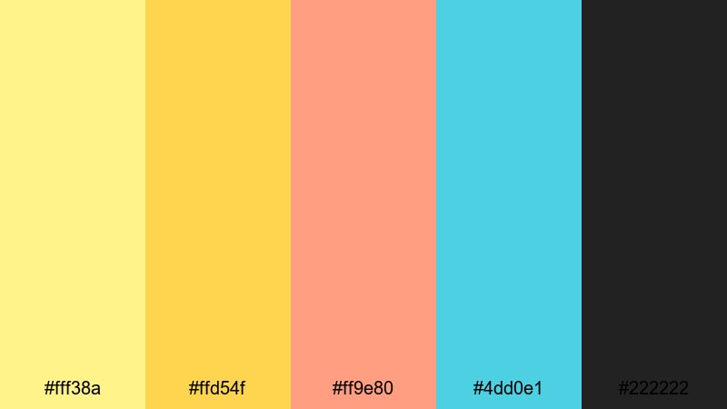
- HEX Codes: #fff38a, #ffd54f, #ff9e80, #4dd0e1, #222222
- Mood: Fresh, zesty, and entrepreneurial.
- Use for: Perfect for small business promos, product launch teasers, and creator intro cards that should feel friendly and approachable.
Lemonade Stand Pop combines zingy daffodil yellows with soft coral and aqua, grounded by a deep charcoal accent. It feels like a sunlit street stall or a fresh product label come to life on screen, which makes it ideal for channels built around creativity, crafts, or small business stories.
Use the darkest shade as your background for thumbnails and end screens, then let the yellows and aqua carry buttons, price tags, and title overlays. In Filmora, this palette works beautifully in animated lower thirds, product callouts, and logo stings that need to feel both modern and playful.
Festival Lantern Glow
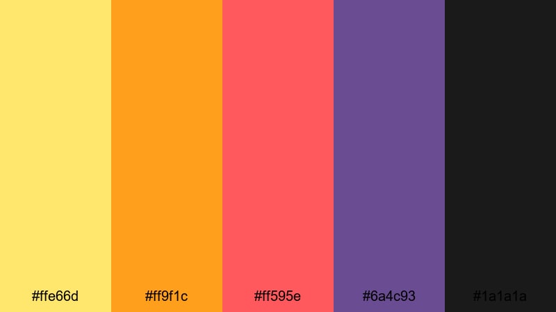
- HEX Codes: #ffe66d, #ff9f1c, #ff595e, #6a4c93, #1a1a1a
- Mood: Festive, cinematic, and dramatic at night.
- Use for: Use for music festival recaps, event trailers, and nightlife montages that need warm glow and strong contrast.
Festival Lantern Glow captures the feeling of warm lanterns and neon signs against a dark night sky. Daffodil and amber tones supply the glow, coral adds a pop of excitement, deep violet brings mood, and the near black anchors everything with high contrast.
Apply this palette to kinetic typography, countdown screens, and animated outlines around performers or dancers. It is also a great choice for YouTube thumbnails that need to stand out in dark mode, as the bright warm colors against near black immediately pull the eye.
Citrus Splash Intro
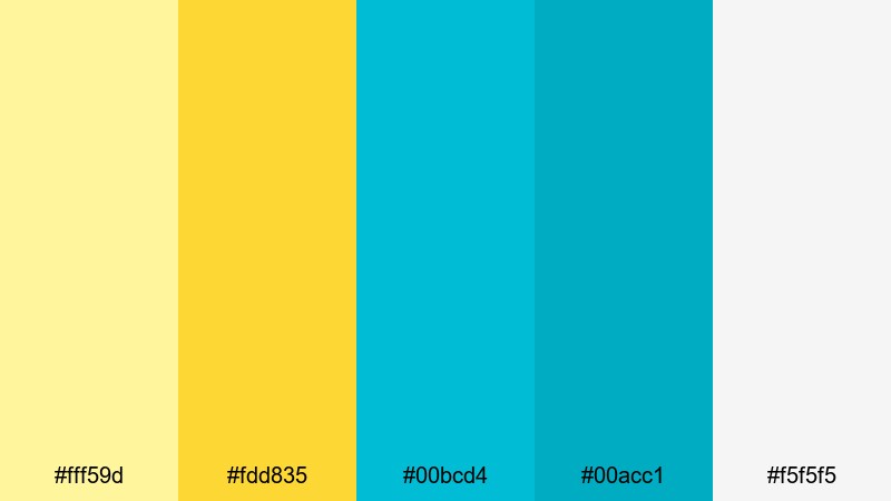
- HEX Codes: #fff59d, #fdd835, #00bcd4, #00acc1, #f5f5f5
- Mood: Crisp, refreshing, and modern.
- Use for: Great for tech channels, app promos, and lifestyle reels that want a sunny yet clean motion-graphics look.
Citrus Splash Intro pairs bright citrus yellows with cool tropical teals on a soft light gray base. The result is energetic but not overwhelming, ideal for channels that want to feel both sunny and technology forward.
Try this palette in animated intros, explainers, and UI mockups. Use light gray as the canvas, then let the yellow and teal blocks slide in for key points or chapter markers. On thumbnails, the yellow can frame your face or product, while teal highlights text and icons for a crisp, clickable look.
Soft & Pastel Daffodil Color Palettes
Morning Meadow Haze
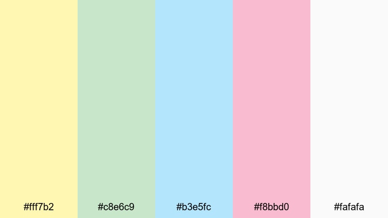
- HEX Codes: #fff7b2, #c8e6c9, #b3e5fc, #f8bbd0, #fafafa
- Mood: Gentle, optimistic, and calming.
- Use for: Perfect for morning routines, wellness vlogs, and soft-spoken tutorials where you want a light and airy feel.
Morning Meadow Haze feels like soft sunlight over a quiet field. Pale daffodil yellow, mint, baby blue, and blush float on a delicate white base, creating a comforting palette that never shouts for attention.
It works beautifully for wellness content, ASMR, and calm storytelling. In Filmora, use these colors for transparent overlays, subtle chapter labels, and minimalist thumbnail backgrounds so your subject remains center stage while the palette adds a gentle, optimistic glow.
Buttercream Daydream
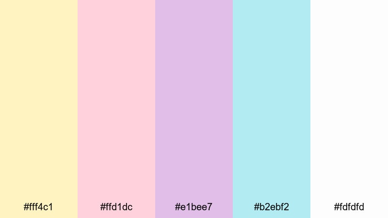
- HEX Codes: #fff4c1, #ffd1dc, #e1bee7, #b2ebf2, #fdfdfd
- Mood: Sweet, dreamy, and nostalgic.
- Use for: Use for cozy storytime videos, baby or family content, and whimsical brand intros.
Buttercream Daydream mixes buttery daffodil with pastel pink, lilac, and aqua for a sugar soft aesthetic. It feels nostalgic and comforting, like vintage stationery or a favorite childhood storybook.
Use this scheme on illustrated lower thirds, rounded titles, and gentle gradients behind text. For family vlogs or baby milestones, it creates a warm, safe feeling that pairs well with soft background music and slower edits.
Pastel Spring Story
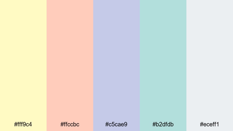
- HEX Codes: #fff9c4, #ffccbc, #c5cae9, #b2dfdb, #eceff1
- Mood: Balanced, airy, and storybook-soft.
- Use for: Ideal for lookbooks, spring campaign edits, and aesthetic B-roll sequences.
Pastel Spring Story combines light daffodil yellow with peach, lavender blue, and seafoam on a cool gray base. It is delicate without feeling overly cute, making it suitable for fashion, lifestyle, and brand storytelling.
Apply the softer tones to background shapes and frames, reserving the yellow and peach for key overlays or CTA text. On thumbnails, this palette helps you design collages, outlines, and text blocks that look curated and aesthetic rather than loud.
Petal Breeze Whispers
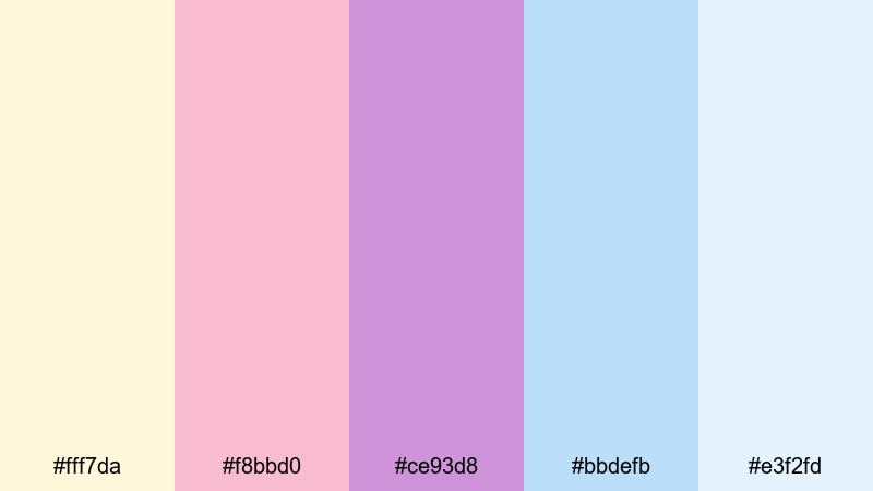
- HEX Codes: #fff7da, #f8bbd0, #ce93d8, #bbdefb, #e3f2fd
- Mood: Romantic, soft-focus, and delicate.
- Use for: Great for wedding highlights, proposal videos, and romantic lyric edits with a light touch of yellow.
Petal Breeze Whispers lets creamy daffodil sit beside blush, lilac, and powder blues in a feather light mix. It feels dreamy and romantic, like petals drifting across your screen.
Use it to style title cards, love story timelines, or lyric overlays. The soft yellow is best kept as a highlight in calligraphy titles or decorative borders, while the pinks and blues can wash over the frame in gradients or subtle vignette effects.
Elegant & Modern Daffodil Color Palettes
Daffodil Noir Chic
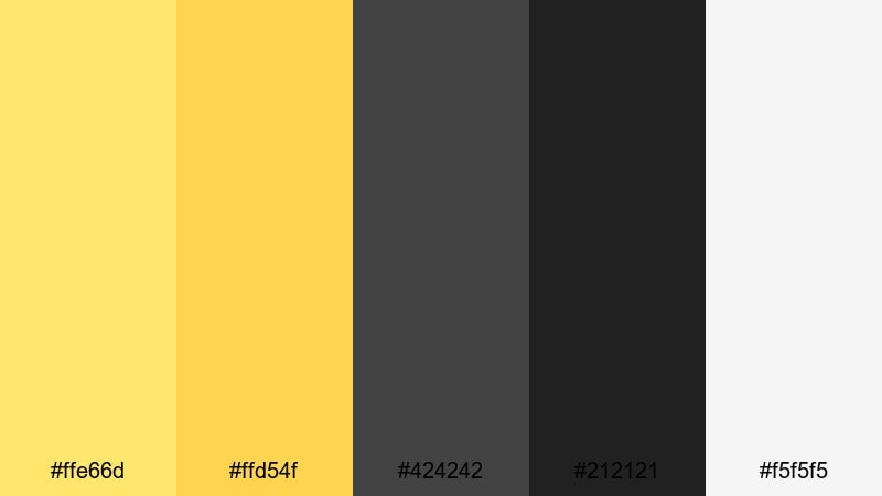
- HEX Codes: #ffe66d, #ffd54f, #424242, #212121, #f5f5f5
- Mood: Sophisticated, bold, and fashion-forward.
- Use for: Perfect for luxury product spots, high-end brand reels, and cinematic openers needing a chic yellow accent.
Daffodil Noir Chic contrasts rich daffodil yellows with charcoal, near black, and soft gray. The result is sharp and editorial, like a high fashion magazine layout translated into motion.
Use deep grays or black as your base, then let daffodil highlight product edges, underlines, and key words in your titles. This palette is ideal for slow motion beauty shots, unboxings, and logo reveals where you want one signature accent color to define your brand.
Urban Golden Hour
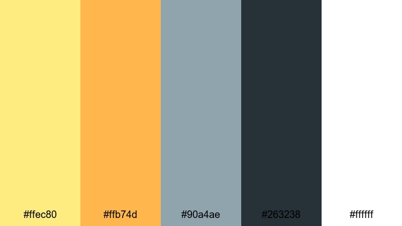
- HEX Codes: #ffec80, #ffb74d, #90a4ae, #263238, #ffffff
- Mood: Warm, urban, and editorial.
- Use for: Use for city vlogs, travel films, and fashion edits that mimic golden-hour light against concrete tones.
Urban Golden Hour pairs soft golden daffodil and amber with cool slate blues and crisp white. It captures that moment when sunlight bounces off city buildings and streets, balancing warmth with urban cool.
Use the warm tones to lift highlights in your footage and color overlays, while the slate blue shades work well in backgrounds, drop shadows, and text. In split screen layouts, you can reserve yellows for lifestyle shots and blues for text panels, creating a structured yet cinematic feel.
Minimal Studio Bloom
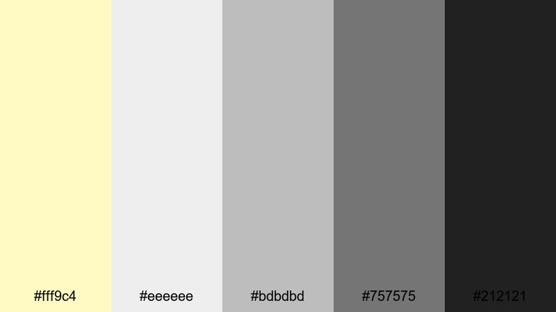
- HEX Codes: #fff9c4, #eeeeee, #bdbdbd, #757575, #212121
- Mood: Clean, understated, and design-driven.
- Use for: Ideal for tutorials, tech explainers, and brand style guides needing just a hint of warmth.
Minimal Studio Bloom uses pale daffodil as a single warm accent against a ladder of cool grays. It feels like a design studio mood board, where everything is neutral until a tiny pop of color reveals the brand personality.
This palette is great for channels that want a professional, minimal look. Use gray as your default and bring in the yellow only for important buttons, callouts, and timeline markers in your edits. It keeps your workspace and your final video tidy, modern, and easy to follow.
Luxe Marble Daffodil
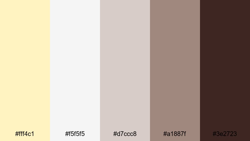
- HEX Codes: #fff4c1, #f5f5f5, #d7ccc8, #a1887f, #3e2723
- Mood: Opulent, grounded, and editorial.
- Use for: Great for jewelry showcases, interior design reels, and premium unboxing videos with a warm luxury feel.
Luxe Marble Daffodil blends soft daffodil yellow with marble whites and rich browns. It feels expensive and tactile, like polished stone and warm wood under studio lighting.
Use light tones for backgrounds and flat lay surfaces, reserving the deeper browns for text, shadows, and framing. This palette is ideal for premium unboxings, decor tours, and product close ups that aim for a classy, editorial aesthetic.
Earthy & Natural Daffodil Color Palettes
Countryside Picnic Light
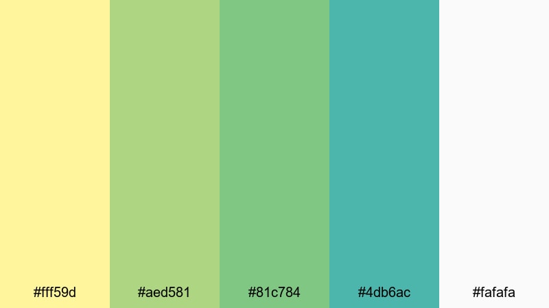
- HEX Codes: #fff59d, #aed581, #81c784, #4db6ac, #fafafa
- Mood: Relaxed, wholesome, and outdoorsy.
- Use for: Perfect for farm-to-table content, nature vlogs, and picnic or camping highlight reels.
Countryside Picnic Light brings together sunny daffodil yellow, fresh greens, teal, and soft white. It feels like a day in the park, with open skies and soft grass underfoot.
Use it to grade nature vlogs, gardening content, and slow living reels. Yellows and greens can be used in titles and badges, while teal makes a refreshing accent in maps, info cards, and chapter markers.
Rustic Harvest Bloom
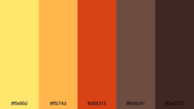
- HEX Codes: #ffe66d, #ffb74d, #d84315, #6d4c41, #3e2723
- Mood: Cozy, autumnal, and cinematic.
- Use for: Use for harvest festivals, baking videos, and rustic brand stories with warm storytelling vibes.
Rustic Harvest Bloom combines glowing daffodil and pumpkin tones with deep terracotta and wood browns. It instantly suggests autumn, baking, and stories told around a table.
Use these colors in textured title cards, recipe step overlays, and lower thirds that feel handcrafted. The darker browns make beautiful backgrounds and frames, while the yellows and oranges can emphasize important steps, temperatures, or key messages in your edit.
Coastal Dune Sunrise
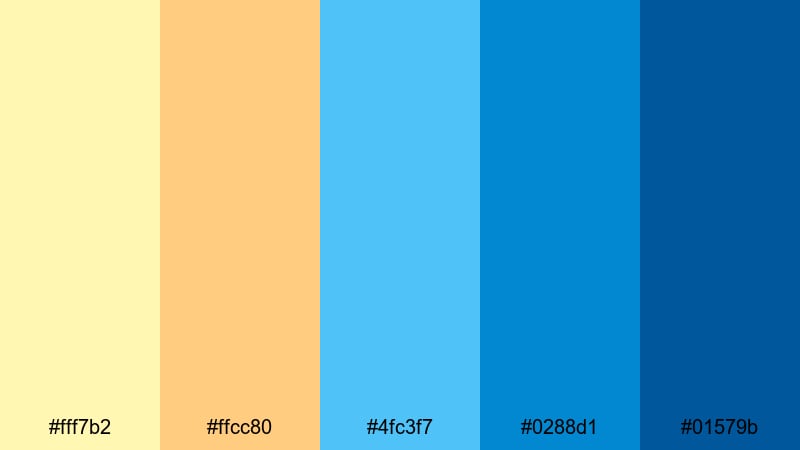
- HEX Codes: #fff7b2, #ffcc80, #4fc3f7, #0288d1, #01579b
- Mood: Serene, coastal, and refreshing.
- Use for: Ideal for beach trips, surf edits, and travel vlogs that capture early morning shore light.
Coastal Dune Sunrise pairs soft daffodil and sandy peach with layered ocean blues. It feels like watching the first light hit the water from a quiet shoreline.
Use the yellows and peach tones for overlays and titles, while the blues can carry transitions, borders, and maps. This palette is perfect for travel intros, holiday recap thumbnails, and any edit that blends warm sand with cool sea tones.
Tips for Creating Daffodil Color Palettes
Daffodil is a flexible color that can feel playful, elegant, or natural depending on what you pair it with. These tips will help you combine daffodil with other hues in a way that looks polished in both video and graphic design.
- Use dark accents for readability. Pair daffodil with deep charcoal or navy so on screen text and UI elements remain clear on bright thumbnails and intro cards.
- Balance warmth with cool tones. Offset warm yellows and oranges with blues, teals, or soft grays to avoid a flat or overly hot image.
- Limit your hero colors. Choose one main daffodil tone plus two or three supporting colors so your brand looks consistent across thumbnails, banners, and lower thirds.
- Match your footage lighting. For golden hour or indoor tungsten light, lean into warmer daffodil shades; for daylight or tech content, use cleaner, lighter yellows.
- Test in small elements first. Apply your palette to titles, icons, and overlays before changing your entire grade, so you can adjust saturation and contrast easily.
- Check mobile and dark mode. Preview your thumbnails and graphics in small sizes and against dark YouTube backgrounds to be sure daffodil elements still pop.
- Use neutrals as a base. Whites, creams, and grays give your daffodil accents more impact and keep overall compositions from feeling busy.
- Create reusable presets. In Filmora, save your favorite color combinations as presets or templates so every video on your channel keeps the same daffodil identity.
Daffodil palettes are powerful tools for shaping mood, from bright celebration and entrepreneurial energy to calm mornings and elegant brand stories. With thoughtful pairings, you can make your thumbnails, intros, and overlays instantly recognizable while still leaving room for seasonal or thematic variations.
Experiment with the palettes in this guide to see how each combination influences your footage and audience perception. Using Filmora, you can quickly test different daffodil schemes on the same edit, save your favorites, and build a cohesive visual style across all your platforms.
Whether you are designing your first channel look or refreshing an existing brand, daffodil gives you a friendly, optimistic color base that works beautifully with Filmora's editing and color tools.
secure downloadNext: Bisque Color Palette
