
 100% Security Verified | No Subscription Required | No Malware


 ChatGPT
 Perplexity
 Gemini
 Claude
 Grok
Grok
Bisque sits between warm beige and soft peach, which makes it one of the most versatile neutrals you can use on screen. It feels calm, approachable, and slightly nostalgic, so it works beautifully for skin tones, cozy interiors, and any shot where you want warmth without harsh orange. In color psychology, Bisque suggests comfort, safety, and understated elegance, which is why it shows up so often in lifestyle branding, cafes, and editorial photography.
For video creators and designers, Bisque is a perfect base color for YouTube thumbnails, intro cards, lower thirds, and even full color grades on vlogs and cinematic edits. Below you will find 15 ready to use Bisque color palettes with HEX codes, all tailored to common creative scenarios. Each palette is explained with mood and use cases so Filmora users and other creators can quickly apply them to titles, overlays, backgrounds, and color grading presets.
In this article
Soft & Romantic Bisque Color Palettes
Blush Morning Light
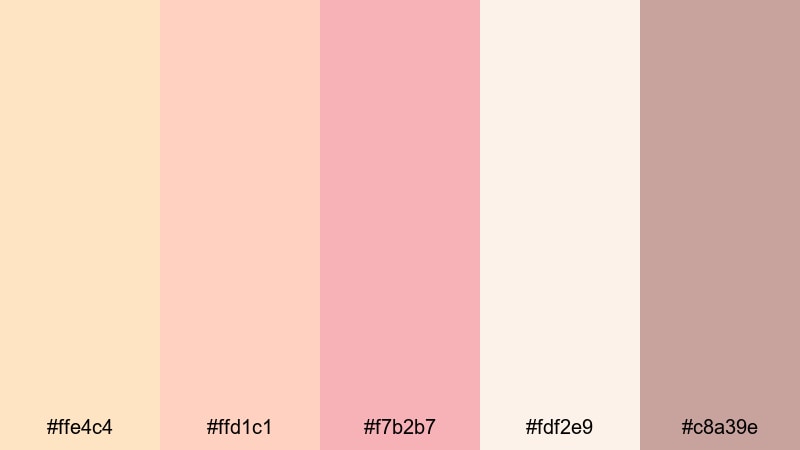
- HEX Codes: #ffe4c4, #ffd1c1, #f7b2b7, #fdf2e9, #c8a39e
- Mood: Gentle, dreamy, and softly nostalgic like an early sunrise.
- Use for: Lovely for wedding highlight reels, couple vlogs, and dreamy lifestyle thumbnails.
Blush Morning Light wraps classic Bisque in rosy pinks and soft off whites, creating a hazy, romantic glow. It feels like the first light filtering through curtains, flattering skin and adding a tender blush to everything in frame. The muted mauve accent grounds the palette so it never looks overly sweet.
Use this combination for wedding highlight edits, anniversary slideshows, couple vlogs, and dreamy lifestyle thumbnails or shorts. In Filmora, you can apply these tones to backgrounds, titles, lower thirds, and subtle color grading to give your entire channel a soft, romantic identity that viewers instantly recognize.
Pro Tip: Build a Cinematic Bisque Glow in Filmora
To keep this blush Bisque look consistent across an edit, start by using one of your softest shots as a reference. In Filmora, balance exposure first, then nudge warmth and tint toward peach and pink so skin retains that morning light feeling. Save this as a custom preset so your intros, A roll, and B roll all share the same delicate glow.
For thumbnails and title cards, combine a Bisque background with your deeper mauve accent for text or borders. This adds contrast while staying within the same palette, so your grid on YouTube, Instagram, and TikTok feels cohesive without looking over edited.
AI Color Palette
You can turn Blush Morning Light into a one click look using Filmora's AI tools. Grab a still frame, a screenshot of this palette, or even a photo from your mood board and use it as a reference. Filmora's AI Color Palette feature analyzes the tones and spreads that Bisque and blush balance across your whole sequence.
This is especially useful for wedding highlights and aesthetic vlogs filmed in mixed lighting, where some clips feel cooler or flatter than others. With AI Color Palette, you can push the cooler shots toward that same warm, creamy blush so the final video feels like one continuous moment rather than a collection of mismatched clips.
 secure download

HSL, Color Wheels & Curves
Once your base match is in place, refine the Bisque tones using HSL and color wheels. In Filmora, slightly reduce saturation in the reds and oranges to avoid overly pink skin, then lift the midtone wheel toward warm hues to keep that sunrise softness. Curves are perfect for adding a gentle S shape contrast so highlights glow while shadows stay rich but not muddy.
If you want more guidance on fine tuning color, Filmora's tutorials on creative color correction techniques show how to control highlights, midtones, and shadows without breaking your overall palette. Apply those techniques here to keep Bisque creamy and cinematic rather than flat.
secure download1000+ Video Filters & 3D LUTs
If you prefer quick workflows, you can use Filmora's built in looks as a starting point for your Bisque palette. Browse soft cinematic and pastel filters, then adjust intensity so they complement rather than overpower your blush tones. This is an easy way to get a polished, romantic grade for wedding reels, save the date trailers, and soft lifestyle edits.
For more control, Filmora's video filters and 3D LUTs make it easy to stack effects and create your own signature Bisque preset. Once you are happy with the look, save it and apply it to future projects so every video on your channel carries the same warm visual identity.
secure downloadVintage Lace Bisque
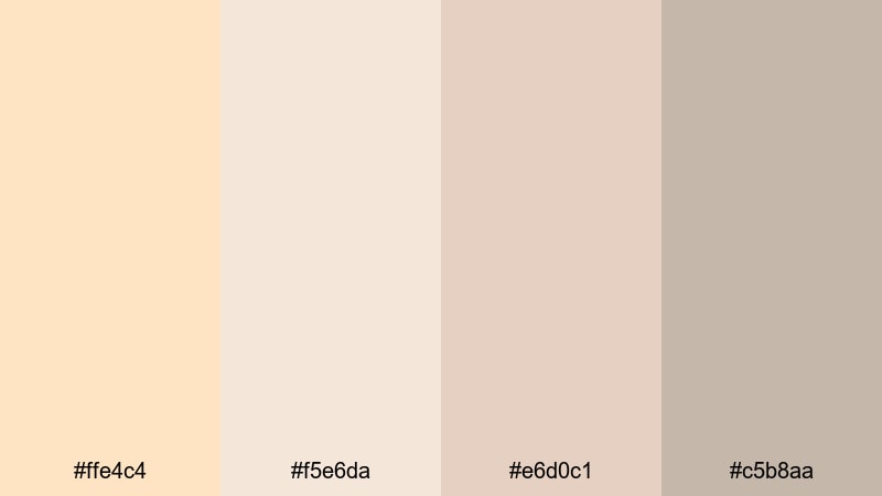
- HEX Codes: #ffe4c4, #f5e6da, #e6d0c1, #c5b8aa
- Mood: Delicate, nostalgic, and slightly antique.
- Use for: Ideal for nostalgic photo montages, heritage documentaries, and retro-styled YouTube intros.
Vintage Lace Bisque softens pure Bisque with powdery tans and faded neutrals, echoing old photo albums and heirloom fabrics. The palette feels gentle and timeworn, perfect when you want to evoke memory, history, or a slower pace of life.
Use it as a base for heritage documentaries, family retrospectives, or retro styled YouTube intros. In your editor, keep backgrounds and frames in the lighter tones, and reserve the deepest beige for text, logos, and subtle vignette effects that give your footage a softly aged look.
Peach Macaron Glow

- HEX Codes: #ffe4c4, #ffcab0, #ffb3a7, #ffe9d6, #f6cbb5
- Mood: Sweet, playful, and appetizing with a cozy warmth.
- Use for: Perfect for baking channels, cozy cafes, and playful lifestyle shorts or Reels.
Peach Macaron Glow turns Bisque into a dessert inspired treat by pairing it with creamy peaches and soft coral. The result is friendly and almost edible, making food, hands, and table settings look instantly inviting.
Use this palette for baking tutorials, coffee shop B roll, brunch vlogs, and cute lifestyle shorts. Set your thumbnail backgrounds to the lightest Bisque and peach shades, then use the richer coral for titles, buttons, and callouts like recipe steps or discount codes so they stand out without breaking the cozy mood.
Rose Gold Afternoon
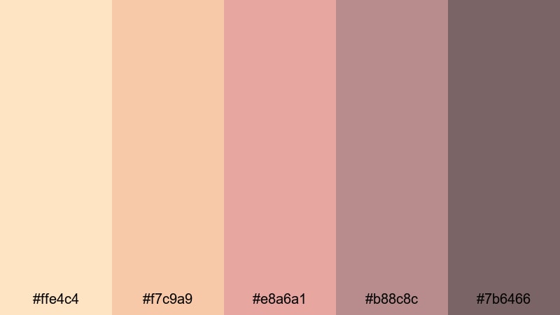
- HEX Codes: #ffe4c4, #f7c9a9, #e8a6a1, #b88c8c, #7b6466
- Mood: Luxurious, feminine, and softly dramatic.
- Use for: Great for beauty tutorials, jewelry promos, and cinematic lifestyle branding.
Rose Gold Afternoon pairs Bisque with rose gold, muted mauves, and a gently smoky accent. It feels chic and feminine, like golden hour light reflecting off jewelry or makeup packaging. The deeper mauve and plum tones add just enough drama for a cinematic touch.
Apply this palette to beauty thumbnails, product close ups, and lifestyle branding. Use Bisque and light peach for skin and backgrounds, then bring in the darker mauve for eyeliner, typography, or frame bars to add visual weight. Across your channel art, this combo can create a premium, fashion forward identity.
Modern Neutral Bisque Color Palettes
Minimal Studio Loft
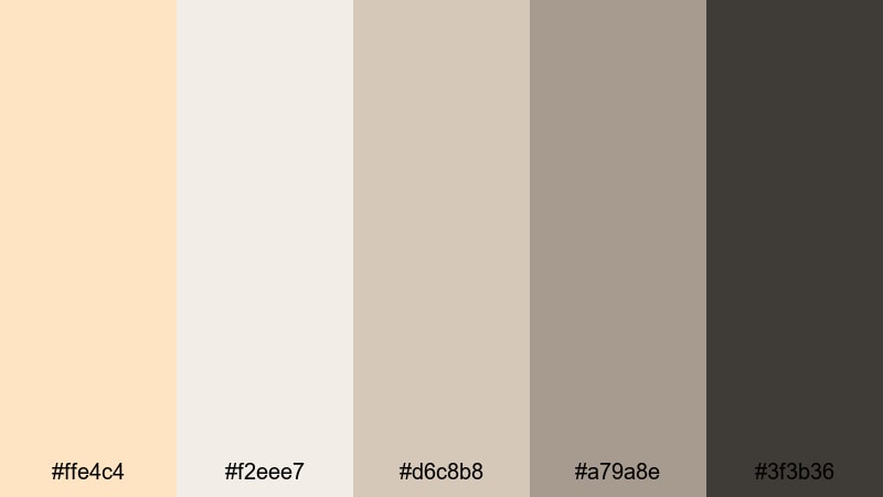
- HEX Codes: #ffe4c4, #f2eee7, #d6c8b8, #a79a8e, #3f3b36
- Mood: Clean, modern, and quietly sophisticated.
- Use for: Ideal for productivity channels, workspace tours, and minimalist brand openers.
Minimal Studio Loft keeps Bisque warm but surrounds it with stony neutrals and a soft charcoal accent. The palette feels like a bright, well designed workspace with concrete, linen, and brushed metal, perfect for creators who want professionalism without cold, clinical whites.
Use the lighter tones for backgrounds in screen recordings, workspace B roll, and minimalist openers. Reserve the deepest charcoal for typography, icons, and UI style overlays in your tutorials or productivity videos so everything remains legible and on brand.
Creamy Workspace UI
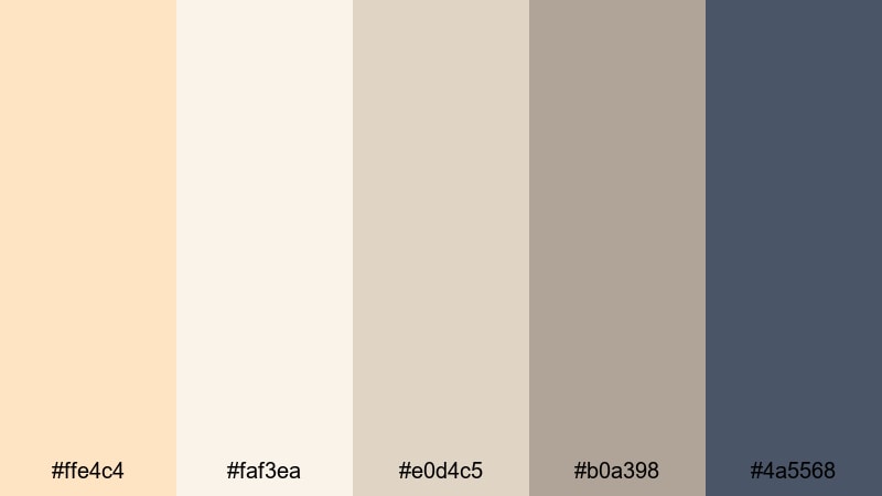
- HEX Codes: #ffe4c4, #faf3ea, #e0d4c5, #b0a398, #4a5568
- Mood: Focused, airy, and productivity driven.
- Use for: Great for app walkthroughs, SaaS explainers, and user interface shots in tutorials.
Creamy Workspace UI wraps Bisque in pale cream, soft greige, and a slate blue gray accent. This makes software interfaces and text overlays feel friendly and modern while keeping plenty of contrast for readability.
Use the light Bisque and cream for your canvas or background and use the slate shade for key UI elements, arrows, and labels on tutorials. This palette is especially strong for SaaS demos, Notion or productivity system tours, and any tech content where you want a warm yet professional look.
Soft Beige Branding
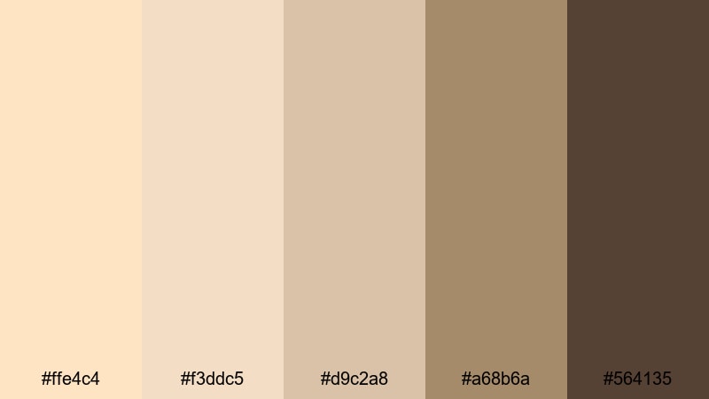
- HEX Codes: #ffe4c4, #f3ddc5, #d9c2a8, #a68b6a, #564135
- Mood: Trustworthy, grounded, and brand ready.
- Use for: Designed for logos, channel banners, and consistent YouTube brand systems.
Soft Beige Branding anchors Bisque with earthy beiges and coffee toned browns, delivering a grounded, trustworthy feel. It works well for creators who want a natural, lifestyle forward brand that does not lean too feminine or too corporate.
Use the lighter three colors as core backgrounds and blocks in your intros, lower thirds, and end screens. Apply the deeper browns to your logo, channel name, and navigation buttons to create a repeatable system you can carry across thumbnails, overlays, and social media covers.
Warm Product Spotlight
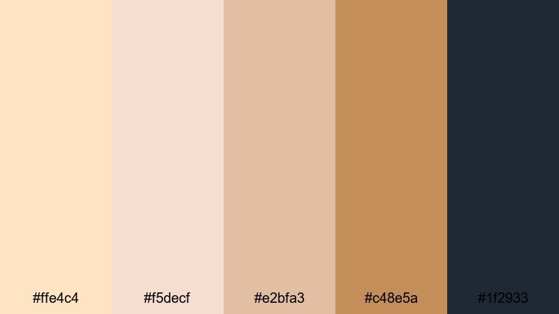
- HEX Codes: #ffe4c4, #f5decf, #e2bfa3, #c48e5a, #1f2933
- Mood: Commercial, confident, and product focused.
- Use for: Perfect for product reviews, unboxings, and ecommerce spotlights with a premium feel.
Warm Product Spotlight enhances Bisque with caramel and toffee tones plus a deep navy accent. This gives your frame a polished, commercial mood while still feeling welcoming and human.
Use Bisque and soft caramel for tabletops and backgrounds in unboxing videos or product flatlays. Highlight callouts, prices, and CTAs using the deep navy for text and badges. This palette is ideal for ecommerce oriented content, Amazon review channels, and any video where you want the product to stand out clearly against a warm, premium backdrop.
Sunlit Bisque Color Palettes
Desert Sunrise Frame
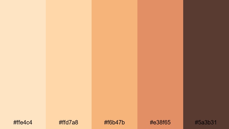
- HEX Codes: #ffe4c4, #ffd7a8, #f6b47b, #e38f65, #5a3b31
- Mood: Adventurous, cinematic, and sun drenched.
- Use for: Great for travel vlogs, drone shots, and desert road trip edits.
Desert Sunrise Frame mixes Bisque with sun baked oranges and deep clay browns, echoing first light spilling over dunes or canyon walls. It feels bold and cinematic while still flattering skin and highlights.
Use this palette to grade travel vlogs, road trip sequences, and drone shots over warm landscapes. Let Bisque and pale orange handle skies and highlights, while the deeper terracotta and brown sculpt silhouettes, mountains, or city skylines. In thumbnails, this combo immediately signals warmth and adventure.
Coastal Sand Daybreak
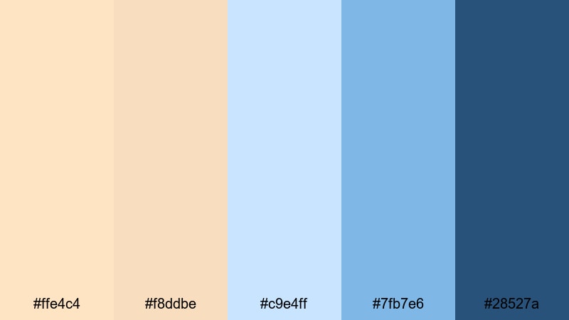
- HEX Codes: #ffe4c4, #f8ddbe, #c9e4ff, #7fb7e6, #28527a
- Mood: Fresh, breezy, and optimistic.
- Use for: Ideal for travel intros, beach montages, and lifestyle channels with a seaside aesthetic.
Coastal Sand Daybreak balances warm Bisque sands with cool ocean blues, giving your visuals a fresh, breezy feel. The contrast between peachy neutrals and sky blues makes water and skies pop without feeling overly saturated.
Use the two warm tones for beaches, skin, and text backgrounds, while the three blues take care of water, horizon lines, and accent graphics. This palette shines in beach vlogs, surf edits, coastal Airbnb tours, or any lifestyle channel built around seaside living.
Sunlit Terracotta Courtyard
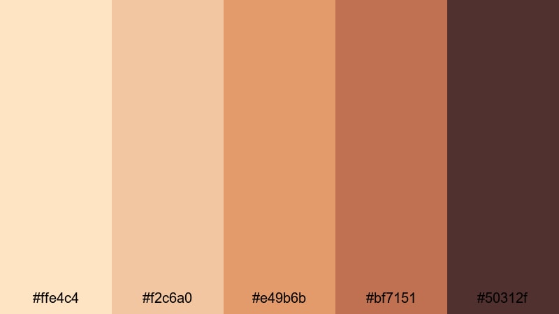
- HEX Codes: #ffe4c4, #f2c6a0, #e49b6b, #bf7151, #50312f
- Mood: Rustic, warm, and intimate.
- Use for: Perfect for home decor tours, cooking videos, and slow living aesthetics.
Sunlit Terracotta Courtyard pairs Bisque with terracotta oranges and earthy browns, capturing the feeling of warm clay walls and tiled floors. The palette is rustic and homely, ideal for content that celebrates slow living and handcrafted details.
Grade interior shots, kitchen scenes, and garden spaces with these hues to make wood, ceramics, and fabrics feel rich and tactile. On thumbnails, combine a Bisque background with terracotta blocks and a deep brown title to evoke cozy, Mediterranean inspired living.
Golden Hour Kitchen
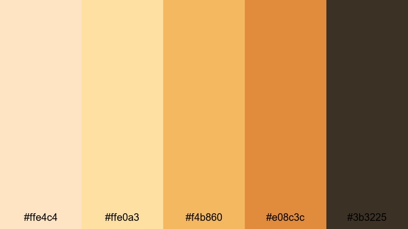
- HEX Codes: #ffe4c4, #ffe0a3, #f4b860, #e08c3c, #3b3225
- Mood: Inviting, wholesome, and mouthwatering.
- Use for: Great for recipe videos, brunch vlogs, and food photography slideshows.
Golden Hour Kitchen layers Bisque with honey golds and toasted amber, recreating the look of late afternoon light across countertops. It flatters both food and interiors, making baked goods, coffee, and fresh produce look extra appetizing.
Use the lighter tones for walls, table surfaces, and overall exposure, then let the deeper gold and brown reinforce crusts, grill marks, and shadows under plates. In recipe videos and food photo slideshows, this palette gives viewers that cozy, just cooked feeling that keeps them watching.
Moody Evening Bisque Color Palettes
Candlelit Storytime
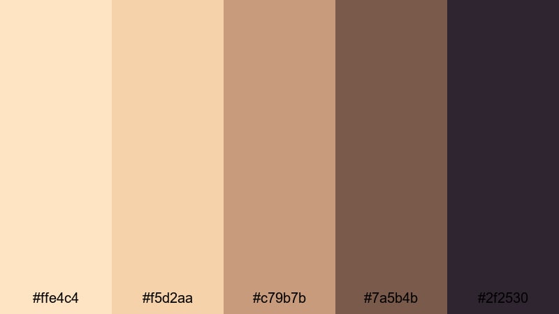
- HEX Codes: #ffe4c4, #f5d2aa, #c79b7b, #7a5b4b, #2f2530
- Mood: Cozy, intimate, and softly dramatic.
- Use for: Ideal for narration videos, bedtime stories, and reflective sit down talks.
Candlelit Storytime mixes warm Bisque and amber browns with a deep plum shadow tone, like faces lit by candles against a dark room. The result is intimate and slightly dramatic, perfect for storytelling content.
Use the lighter shades on skin and nearby objects, and let the darker browns and plum fall into the background for contrast. This palette suits narration videos, bedtime stories, reflective sit down monologues, or any video podcast where you want viewers to feel close and comfortable.
Cinematic Cafe Scene
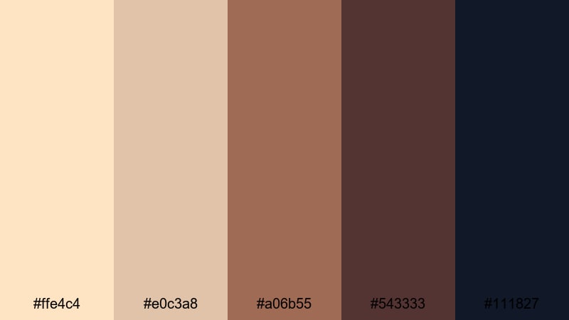
- HEX Codes: #ffe4c4, #e0c3a8, #a06b55, #543333, #111827
- Mood: Urban, cinematic, and slightly mysterious.
- Use for: Great for coffee shop b roll, city diaries, and indie short films.
Cinematic Cafe Scene uses Bisque as the glow of tabletop highlights and foam on coffee, surrounded by rich cafe browns and deep charcoal. It feels urban and slightly mysterious, like a quiet corner in a busy city.
Grade your cafe B roll, city diaries, and indie short films with this palette to carve out silhouettes and pockets of warm light. Use the darkest navy charcoal for frames, letterboxes, and title cards to reinforce that movie like mood while the Bisque tones keep faces inviting.
Retro Film Glow
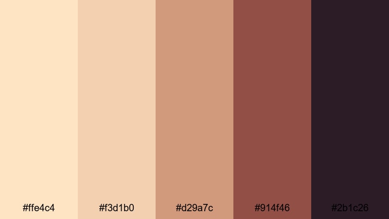
- HEX Codes: #ffe4c4, #f3d1b0, #d29a7c, #914f46, #2b1c26
- Mood: Nostalgic, analog, and richly toned.
- Use for: Perfect for film look grades, title cards, and retro inspired channel branding.
Retro Film Glow pushes Bisque toward muted reds and deep maroons, echoing faded film prints and old photo chemistry. It feels nostalgic and analog, especially when combined with grain, dust, or light leak overlays.
Use the lighter tones as base exposure and the richer reds for shadows, text, and graphic elements on title cards or end screens. This palette is ideal for creators building a retro inspired channel identity, film essayists, or anyone who loves the look of classic cinema and vintage home movies.
Tips for Creating Bisque Color Palettes
Bisque is a friendly, flexible neutral that can lean soft, modern, sunlit, or moody depending on what you pair it with. Use these tips to build your own combinations for video, thumbnails, and design assets.
- Decide on the mood first. Pair Bisque with blush and cream for romance, blues for freshness, terracotta for rustic warmth, or deep charcoals for cinematic drama.
- Keep text readable. On Bisque backgrounds, choose darker accents like charcoal, navy, or deep brown for titles and subtitles so they stay crisp even on small screens.
- Limit your palette. For consistent branding, stick to 3 to 5 core colors per project and reuse them across intros, lower thirds, and end screens.
- Match your footage. When grading video, nudge highlights toward Bisque while keeping whites slightly warm, then balance shadows with either neutral greys or rich browns, not both.
- Use contrast thoughtfully. Combine light Bisque with one or two deeper accent shades to guide the viewer’s eye toward key elements like faces, buttons, and CTAs.
- Adapt for platforms. For YouTube thumbnails, push saturation and contrast a bit more; for cinematic edits, keep Bisque softer and let midtones carry most of the color.
- Create presets. Once you find a Bisque look you love in Filmora, save the color grade and graphic styles as templates so you can recreate the same mood on future videos in seconds.
- Test on mobile. Always check how your Bisque palette looks on a phone, especially for text overlays, to make sure colors are not too light or washed out.
Bisque color palettes are powerful tools for shaping mood, storytelling, and brand identity. From soft romance and minimalist studios to sunlit kitchens and moody cafes, a well chosen Bisque combination can make your footage feel intentional and cohesive.
Use the HEX codes above as ready made starting points, then refine them in Filmora to fit your own channel or client project. Whether you are building thumbnails, end screens, or full cinematic grades, locking in a signature Bisque look can help your content stand out and feel instantly recognizable.
Experiment with these palettes on your next edit, save your favorite grades as presets, and keep iterating until your visuals match the tone of your stories. The more consistently you apply your Bisque colors, the stronger and more memorable your visual brand will become.
secure downloadNext: Lime Color Palette
