
 100% Security Verified | No Subscription Required | No Malware

Dark Pastel Blue sits between soft sky tones and muted navy, which makes it feel calm, trustworthy, and quietly sophisticated. It carries the serenity of classic blue but with a gentle, pastel softness that works beautifully for aesthetic videos, minimalist branding, and soothing interfaces. In video, it can cool down harsh highlights, soften skin, and add a dreamy or cinematic atmosphere without feeling too bold or saturated.
For creators, Dark Pastel Blue is a powerful base color for YouTube thumbnails, intros, lower thirds, and channel branding because it pairs well with both warm and cool accents. Below, you will find Dark Pastel Blue color palettes with HEX codes designed for vlogs, cinematic edits, product demos, and more, so you can easily recreate these looks in your designs or inside Filmora.
In this article
Soft & Dreamy Dark Pastel Blue Palettes
Coastal Morning Haze
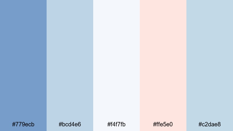
- HEX Codes: #779ecb, #bcd4e6, #f4f7fb, #ffe5e0, #c2dae8
- Mood: Calm, airy, and uplifting like an early walk by the sea.
- Use for: Perfect for soft vlog intros, travel montages, and lighthearted lifestyle thumbnails.
This palette mixes Dark Pastel Blue with pale surf tones and a hint of blush, giving your visuals the feeling of misty waves and gentle sea breeze. The combination is bright but not harsh, ideal for content that should feel peaceful, optimistic, and easy on the eyes.
Use Coastal Morning Haze for channel banners, cover photos, and YouTube thumbnails where you want a consistent seaside identity. In Filmora, it works especially well for morning routines, beach holiday recaps, and calm B-roll, where the soft blues and warm peach highlights can guide your color grading and title cards.
Pro Tip: Keep Your Dark Pastel Blue Aesthetic Consistent with Filmora
When you build a look around Coastal Morning Haze, consistency is everything. In Filmora, you can save your favorite Dark Pastel Blue color values for titles, lower thirds, and overlays, then reuse them across intros, B-roll, and end screens so your channel feels like one cohesive brand.
Try designing one reference frame: a clip with your chosen Dark Pastel Blue background, text color, and accent tones. Then duplicate those settings across your edit so every scene carries the same airy coastal mood, whether viewers are on desktop or mobile.
AI Color Palette
If you have a still image of a pastel coastline, a mood board, or a thumbnail mockup in this palette, you can use Filmora's AI Color Palette feature to spread that look across your entire video. The tool analyzes your reference colors and automatically matches other clips to the same Dark Pastel Blue balance.
This is perfect when you are combining footage from different cameras or lighting conditions. With a single reference shot in Coastal Morning Haze, AI Color Palette helps all your vlogs, travel sequences, and shorts share the same soft blue atmosphere.
 secure download

HSL, Color Wheels & Curves
To fine-tune Dark Pastel Blue, use Filmora's HSL controls to nudge blues and cyans slightly toward teal or purple, depending on whether you want a warmer sunrise or cooler foggy feel. Then refine with color wheels to keep skin tones natural while highlights stay in that soft coastal blue range. Filmora's color correction tools in Filmora make it easy to adjust midtones and shadows without losing your pastel softness.
Curves are ideal for cinematic control: you can add a gentle S-curve to deepen shadows and lift highlights, giving your footage more depth while keeping the Dark Pastel Blue midtones intact. This combination is powerful for dreamy intros and cinematic montage sequences.
secure download1000+ Video Filters & 3D LUTs
If you do not want to build a look from scratch, Filmora's video filters and 3D LUTs make it easy to stylize any Dark Pastel Blue palette in a few clicks. Apply pastel or cinematic LUTs, then tweak intensity so your blues stay soft while contrast and warmth match your story.
You can save your favorite combination of filter, LUT, and manual adjustments as your channel preset. Next time you edit a beach vlog or coastal montage, a single preset will instantly recreate the Coastal Morning Haze mood across the timeline.
secure downloadPowder Sky Whispers
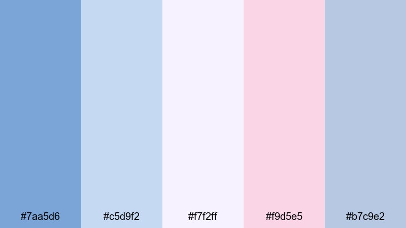
- HEX Codes: #7aa5d6, #c5d9f2, #f7f2ff, #f9d5e5, #b7c9e2
- Mood: Delicate, romantic, and lightly nostalgic.
- Use for: Works well for wedding highlight videos, dreamy reels, and soft brand reveals.
Powder Sky Whispers layers washed-out blues with soft pinks and lilac-tinted whites, creating a romantic, hazy glow. It flatters skin tones and brings out subtle warmth without losing the breezy Dark Pastel Blue base.
Use this palette for wedding highlight films, love stories, or dreamy engagement content. In thumbnails, pair the deeper blue (#7aa5d6) for text or borders with the pale backgrounds for a high-end, bridal-inspired aesthetic that still feels modern.
Pastel Harbor Breeze
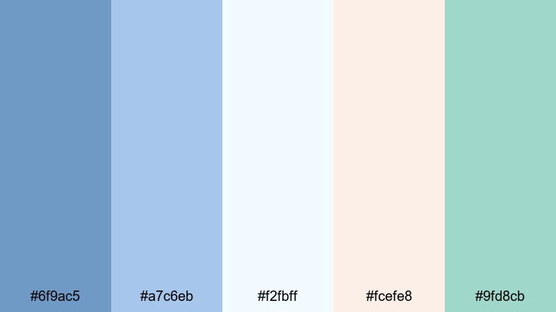
- HEX Codes: #6f9ac5, #a7c6eb, #f2fbff, #fcefe8, #9fd8cb
- Mood: Fresh, coastal, and slightly playful.
- Use for: Ideal for travel vlogs, seaside B-roll, and relaxed brand stories with a pastel twist.
Pastel Harbor Breeze blends Dark Pastel Blue with minty seafoam and light coral for a palette that feels like boats, boardwalks, and sunshine. It is fresh and playful without being too saturated, so it still suits minimalist brands.
Use the airy blue and off-white tones for backgrounds and overlays, then drop in the coral and seafoam accents for call-to-action buttons, subscribe badges, or key titles in your videos and thumbnails. This palette works especially well for travel channels, sailing content, or coastal cafes and lifestyle brands.
Soft Studio Daylight
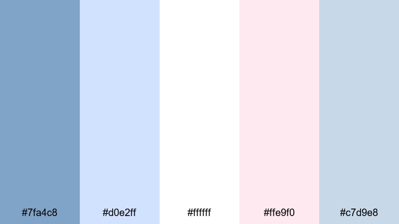
- HEX Codes: #7fa4c8, #d0e2ff, #ffffff, #ffe9f0, #c7d9e8
- Mood: Clean, bright, and softly professional.
- Use for: Great for creator studio tours, educational content, and talking-head videos needing a polished yet gentle look.
Soft Studio Daylight mimics a white studio flooded with diffused light. The crisp whites and powdery Dark Pastel Blue create a very clean frame, while the subtle pink tint adds a friendly, human touch.
It is a strong choice for educators, productivity creators, and tech reviewers who want their set to look professional but not cold. Use the darker blue for typography and overlays, keep backgrounds mostly white or pale blue, and use the blush tone sparingly for highlights and buttons in your channel graphics.
Dreamy Bedroom Glow
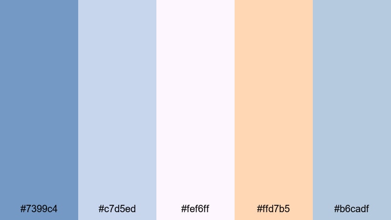
- HEX Codes: #7399c4, #c7d5ed, #fef6ff, #ffd7b5, #b6cadf
- Mood: Cozy, intimate, and softly nostalgic.
- Use for: Perfect for morning routines, room makeovers, and aesthetic lifestyle shorts.
Dreamy Bedroom Glow wraps Dark Pastel Blue in warm peach and creamy off-white, capturing the feeling of sunlight slipping through curtains. It is cozy and personal, great for slow, intimate storytelling.
Try this palette for bedroom makeovers, study-with-me videos, or self-care vlogs. Use the darker blue for shadows and accents in your color grade, the peach for lamps and text highlights, and the creamy whites as safe, neutral backgrounds for quotes or overlays.
Modern & Minimal Dark Pastel Blue Palettes
Clean Tech Overlay
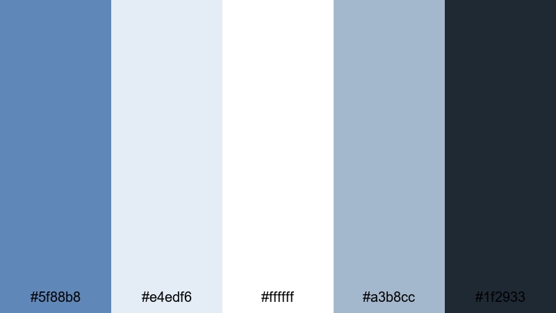
- HEX Codes: #5f88b8, #e4edf6, #ffffff, #a3b8cc, #1f2933
- Mood: Sleek, trustworthy, and tech-forward.
- Use for: Ideal for SaaS promos, UI walkthroughs, and explainer videos with a modern edge.
Clean Tech Overlay balances soft Dark Pastel Blue with light neutrals and a deep charcoal anchor color. The result feels polished and reliable, ideal for tech startups, dashboards, and product demos that need clarity and confidence.
Use the darker blue for accent panels and the charcoal (#1f2933) for text to maintain strong readability. Meanwhile, the pale blues and whites keep your interface-style graphics airy and easy to follow in tutorials, slide decks, and website hero videos.
Nordic UX Breeze
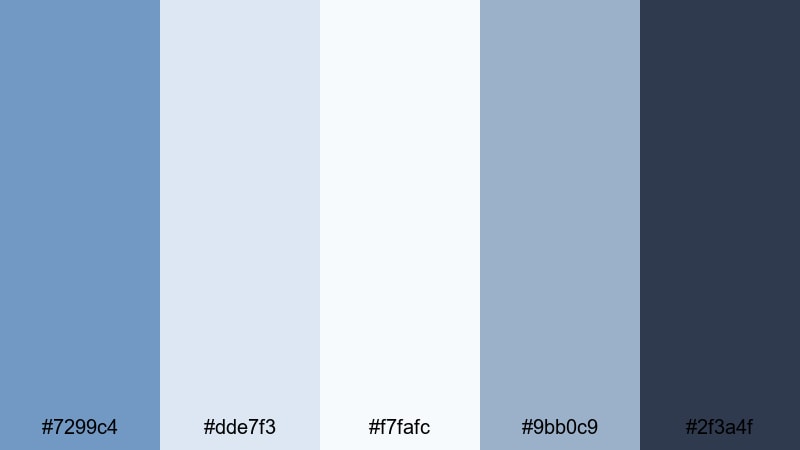
- HEX Codes: #7299c4, #dde7f3, #f7fafc, #9bb0c9, #2f3a4f
- Mood: Minimal, airy, and quietly confident.
- Use for: Great for app UI mockups, portfolio reels, and clean tutorial overlays.
Nordic UX Breeze is inspired by Scandinavian design: lots of negative space, calm blues, and a grounded dark accent. The Dark Pastel Blue tones keep everything soft, while the deep slate (#2f3a4f) lets important labels and titles stand out.
Use this palette for UI animations, SaaS landing page videos, or portfolio reels where the product should be the hero. Keep backgrounds very light and use blue in subtle cards, icons, and hover states for a professional, uncluttered feel.
Product Demo Clarity
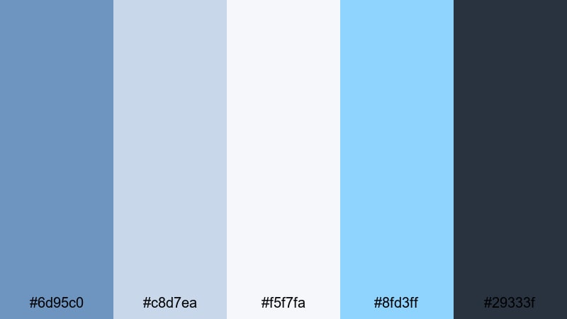
- HEX Codes: #6d95c0, #c8d7ea, #f5f7fa, #8fd3ff, #29333f
- Mood: Clear, focused, and slightly energetic.
- Use for: Perfect for product demos, software intros, and callout graphics in explainer videos.
Product Demo Clarity adds a bright cyan pop (#8fd3ff) to a Dark Pastel Blue base, giving your frames a subtle energetic spark without overwhelming viewers. The deep slate text color keeps everything highly readable over light UI backgrounds.
Use the cyan sparingly for important callouts, progress indicators, or buttons in your overlays. In thumbnails, pair the darkest blue with the cyan highlight to draw attention to core features or pricing while the soft background colors keep the frame clean.
Minimal App Shell
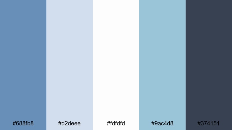
- HEX Codes: #688fb8, #d2deee, #fdfdfd, #9ac4d8, #374151
- Mood: Structured, neutral, and user-friendly.
- Use for: Best for UI kits, mobile previews, and minimalist motion graphics in pitch decks.
Minimal App Shell uses muted blues and near-white backgrounds to create a clean container for app demos and dashboards. The blue tones define structure, while the dark gray (#374151) ensures sharp, professional typography.
Use this palette to design onboarding flows, app walk-throughs, or feature highlight clips. In your editing, keep transitions simple and linear so the orderly feel of the palette matches the user-friendly message of your product.
Startup Slide Deck
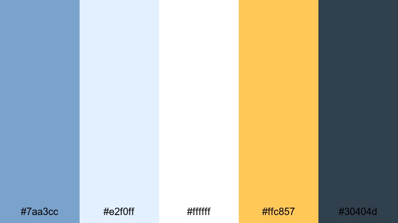
- HEX Codes: #7aa3cc, #e2f0ff, #ffffff, #ffc857, #30404d
- Mood: Optimistic, sharp, and pitch-ready.
- Use for: Great for investor decks, launch teasers, and animated infographics.
Startup Slide Deck combines confident Dark Pastel Blue with a bold, warm yellow (#ffc857). The contrast makes charts, numbers, and key claims pop against calm, pale blue backgrounds.
Use blue for primary backgrounds and cards, yellow for key metrics or CTAs, and the dark slate for body text. In motion graphics, animate yellow accents onto screen to emphasize big milestones while keeping the overall tone cool and trustworthy.
Cinematic & Moody Dark Pastel Blue Palettes
Midnight Pier Reflections
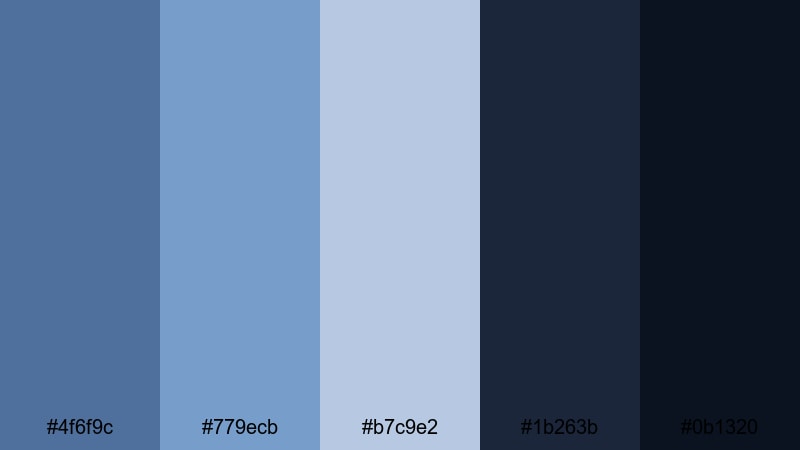
- HEX Codes: #4f6f9c, #779ecb, #b7c9e2, #1b263b, #0b1320
- Mood: Moody, reflective, and slightly dramatic.
- Use for: Perfect for cinematic b-roll, travel night sequences, and emotional storytelling edits.
Midnight Pier Reflections mixes misty Dark Pastel Blue highlights with deep navy shadows, mimicking city lights bouncing off water at night. It is cinematic and introspective, ideal for quieter, emotional narratives.
Use the lighter blues on faces and key objects, while the nearly black tones (#0b1320) hold the background in shadow. In thumbnails, a gradient from dark navy into soft blue can frame your subject and make white or pale text stand out with a filmic look.
Rainy Window Bokeh
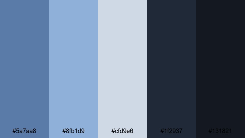
- HEX Codes: #5a7aa8, #8fb1d9, #cfd9e6, #1f2937, #131821
- Mood: Melancholic, introspective, and cozy.
- Use for: Great for lo-fi edits, study-with-me videos, and narrative shorts with a reflective tone.
Rainy Window Bokeh pairs desaturated blues with almost-black shadows, capturing the feeling of sitting by a window while city lights blur in the rain. It is perfect for lo-fi beats, journaling content, or any scene that should feel calm and slightly melancholic.
Use the lightest blue-grays for text blocks or animated captions and keep most of the frame in dark blues so highlights feel like soft glows. This palette also works well for Spotify-style cover art and looping background visuals.
Indie Film Title Card
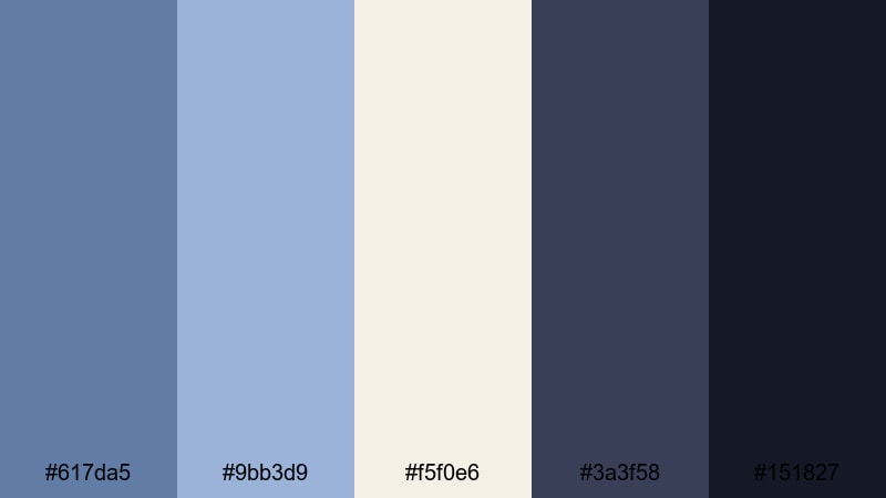
- HEX Codes: #617da5, #9bb3d9, #f5f0e6, #3a3f58, #151827
- Mood: Artful, narrative, and subtly vintage.
- Use for: Ideal for opening titles, credit sequences, and narrative vlogs inspired by indie cinema.
Indie Film Title Card brings together dusty Dark Pastel Blues, cream highlights, and inky shadows for a slightly vintage, analog-inspired look. It feels like a modern take on 35mm film titles.
Use the cream tone for background plates and the darkest navy for text, or reverse this combo for more dramatic title cards. This palette is ideal for directors notes, chapter cards, and credit sequences where you want a handcrafted but polished mood.
Neon Vaporwave Mist
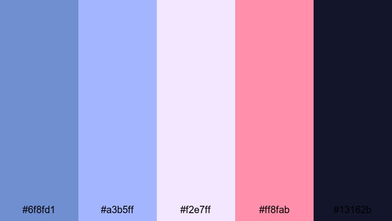
- HEX Codes: #6f8fd1, #a3b5ff, #f2e7ff, #ff8fab, #13162b
- Mood: Surreal, retro-futuristic, and energetic.
- Use for: Perfect for music videos, gaming montages, and stylized channel intros.
Neon Vaporwave Mist leans into glowing purples and neon pinks floating over a Dark Pastel Blue base. It is bold yet slightly softened by the pastel treatment, giving your visuals a dreamy retro-futuristic vibe.
Use the darkest blue-violet (#13162b) as your base, then add neon pink accents for text glows, UI frames, or spectrum-style equalizers. This palette works brilliantly for synthwave edits, gaming intros, and TikTok-style looping animations.
Twilight City Timelapse
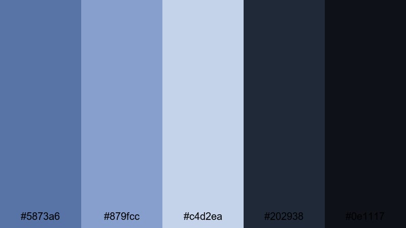
- HEX Codes: #5873a6, #879fcc, #c4d2ea, #202938, #0e1117
- Mood: Urban, cinematic, and quietly epic.
- Use for: Great for skyline timelapses, drone shots, and city-night b-roll in travel content.
Twilight City Timelapse stacks soft twilight blues against deep charcoal shadows, echoing the sky as it fades from day to night. The Dark Pastel Blue tones keep everything from becoming too heavy, so shots remain elegant and watchable.
Use this palette for drone passes, skyline timelapses, and city b-roll in travel or lifestyle content. Let the pastel blues sit in the midtones while the darkest shades anchor buildings and streets, giving your edit a cinematic but still approachable look.
Tips for Creating Dark Pastel Blue Color Palettes
When you design a Dark Pastel Blue color palette for video or branding, aim for a balance between softness and clarity so your visuals stay calm but still readable and on-brand.
- Pair Dark Pastel Blue with a strong neutral (deep charcoal or dark navy) for text to maintain readability on thumbnails and end screens.
- Add one warm accent color (peach, coral, or soft yellow) to keep the palette from feeling too cold, especially for lifestyle or beauty content.
- Use the lightest blues and off-whites as background colors so UI elements, subtitles, and logos stand out without harsh contrast.
- Keep brand consistency by reusing the same HEX codes for titles, lower thirds, and overlays across all your videos.
- Test your palette on mobile: check that Dark Pastel Blue text over light backgrounds remains readable at small sizes.
- Match your color grade to your graphics: if your overlays use cool Dark Pastel Blue, cool down your footage highlights slightly so everything feels unified.
- Reserve the brightest or most saturated color in the palette for CTAs like Subscribe, Download, or Watch Next to guide the viewer's eye.
- Create light and dark variants of the same palette so you can switch between them for day vs. night scenes while staying on-brand.
Dark Pastel Blue palettes are versatile enough to feel dreamy, modern, or cinematic, depending on how you combine them with warm accents and deep neutrals. They can soften harsh footage, give your channel a calm and trustworthy identity, and make your thumbnails instantly recognizable.
Use the HEX codes in this guide as a starting point, then refine them inside Filmora until they match your story, niche, and personality. Whether you are building soft vlogs, clean product demos, or moody city montages, a well-planned Dark Pastel Blue palette can tie every frame together.
Open Filmora, drop in a few clips, and try these palettes on your titles, overlays, and color grades. A few thoughtful color choices can turn casual edits into a consistent visual brand your audience remembers.
secure download