
 100% Security Verified | No Subscription Required | No Malware


 ChatGPT
 Perplexity
 Gemini
 Claude
 Grok
Grok
Fall colors instantly suggest warmth, comfort, and a touch of nostalgia. Think roasted pumpkin orange, maple gold, cinnamon brown, and muted forest greens. In video and design, these tones feel welcoming and human, which is why creators turn to fall palettes for vlogs, cinematic b-roll, lifestyle branding, and story-driven intros.
Whether you are designing YouTube thumbnails, motion graphics, or a full visual identity for your channel, a clear fall color palette with HEX codes makes it easy to stay consistent. Below you will find 15 ready-to-use fall color palettes with HEX values, mood notes, and use cases, all tailored for creators and Filmora users who want cozy, cinematic, and modern fall aesthetics.
In this article
Warm Rustic Fall Color Palettes
Harvest Market Morning
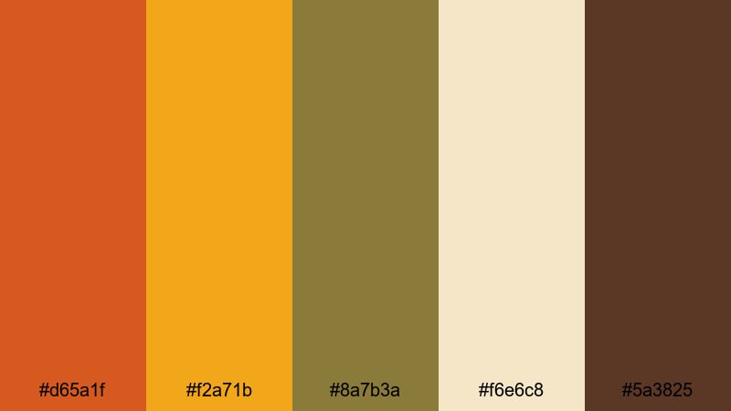
- HEX Codes: #d65a1f, #f2a71b, #8a7b3a, #f6e6c8, #5a3825
- Mood: Inviting, nostalgic, and earthy.
- Use for: Great for lifestyle vlogs, farmers market montages, and warm intro sequences.
This palette feels like a slow walk through a local farmers market on a chilly morning. Sun-baked oranges and maple-gold highlights are grounded by earthy olive and deep brown, with soft cream keeping everything easy on the eyes.
Use Harvest Market Morning to color your channel intro, lower thirds, and thumbnail text so your brand instantly reads as cozy and down-to-earth. The contrast between the warm oranges and the dark brown is strong enough for readable titles, while the cream tone makes a perfect background for YouTube end screens, overlays, and social posts that match your video edit.
Pro Tip: Keep Your Rustic Fall Look Consistent in Filmora
Once you decide that Harvest Market Morning is your signature fall palette, use Filmora to repeat it across every asset: openers, b-roll transitions, callout boxes, and even your outro screen. Sample the oranges and creams with the color picker, then apply them to title presets, shapes, and overlay elements so everything feels like it belongs to the same warm story.
You can also save customized title templates and color presets in Filmora. That way, every new vlog or reel automatically reuses the same fall oranges, browns, and creams, keeping your channel recognizable without extra setup time.
AI Color Palette
If you have a still frame or reference image that perfectly captures this harvest look, Filmora's AI Color Palette feature can analyze the colors and apply that mood to any clip. This is ideal for matching A-roll and B-roll, or syncing the look of shots from different cameras.
Drop your reference shot with strong oranges and soft creams into Filmora, run AI Color Palette on your other footage, and the software will intelligently push your tones toward the same rustic fall feel. It is a fast way to keep farmers market scenes, talking-head segments, and cutaway shots visually unified.
 secure download

HSL, Color Wheels & Curves
To fine-tune your fall tones, use Filmora's HSL controls, color wheels, and curves. You can gently desaturate greens so they feel more olive than neon, deepen oranges to look like baked pumpkin instead of bright summer, and use curves to lift the shadows for a softer, filmic matte look. Tools like those described in this color correction guide help you balance warmth with clarity so skin tones still look natural.
Color wheels are great for pushing midtones slightly warmer while keeping highlights creamy and shadows rich. Combined with curves, you can add just enough contrast for thumbnails without breaking the gentle, nostalgic mood that makes fall palettes so comforting.
secure download1000+ Video Filters & 3D LUTs
If you want to stylize your fall palette in one move, Filmora's video filters and 3D LUTs make it easy to test different moods. You can start with your Harvest Market Morning tones, then layer a cinematic LUT on top to add film grain, cooler shadows, or a gentle fade.
Experiment with warm vintage filters for cozy vlogs, or high-contrast looks for YouTube thumbnails that need to pop. Once you find a filter blend you love, save it as a custom preset so every fall project you edit in Filmora feels instantly on brand.
secure downloadPumpkin Patch Glow
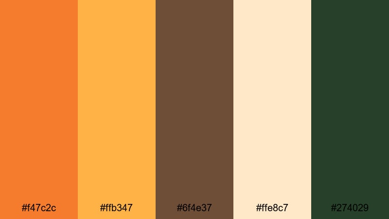
- HEX Codes: #f47c2c, #ffb347, #6f4e37, #ffe8c7, #274029
- Mood: Playful, cheerful, and seasonal.
- Use for: Perfect for YouTube thumbnails, event promos, and family-focused social content.
Bright pumpkin orange and golden yellow make this palette feel like a weekend at the patch, complete with hayrides and caramel apples. Creamy beige softens the intensity, while chocolate brown and deep green add just enough seriousness to keep designs from looking childish.
This is a go-to palette for family vlogs, school events, and kid-friendly channels. Use the bold orange for thumbnail text and call-to-action buttons, lean on the beige for backgrounds, and reserve the dark green or brown for outlines, drop shadows, or logo elements that need to stand out on small mobile screens.
Cider By The Fire
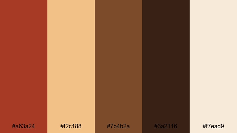
- HEX Codes: #a63a24, #f2c188, #7b4b2a, #3a2116, #f7ead9
- Mood: Cozy, intimate, and comforting.
- Use for: Use in storytelling edits, fireplace b-roll, or nostalgic product spots and title cards.
Deep spiced reds and toasted browns feel like a mug of mulled cider held close to a crackling fire. Buttery beige and cream tones add softness, preventing the palette from becoming too heavy or dark.
Apply this palette when you want your footage to feel intimate and close, such as confession-style vlogs, autumn routines, or nostalgic brand campaigns. Use the dark brown for cinematic bars or title backgrounds, the red for accents in lower thirds and subscribe buttons, and the creams for gentle gradients behind text so everything stays readable.
Golden Maple Trail
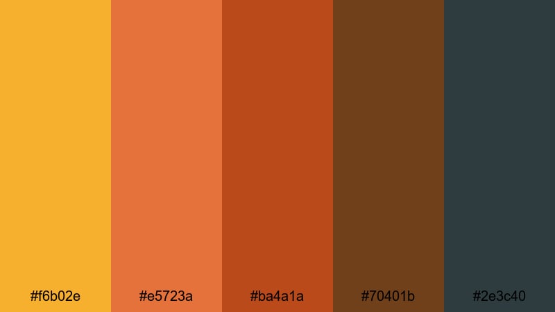
- HEX Codes: #f6b02e, #e5723a, #ba4a1a, #70401b, #2e3c40
- Mood: Adventurous, energetic, and crisp.
- Use for: Great for travel montages, hiking reels, and outdoor brand bumpers.
Golden yellow and fiery orange dominate this palette, perfectly capturing sunlight cutting through a canopy of changing leaves. Rich browns and a slate blue-gray anchor the brightness, suggesting cool air and distant mountains.
It works especially well for travel vlogs and outdoor gear content. Use the yellows and oranges as accent colors for maps, route graphics, or kinetic typography, and use the slate blue as a background or shadow color that keeps everything feeling cinematic instead of overly saturated.
Soft Cozy Fall Color Palettes
Sweater Weather Neutrals
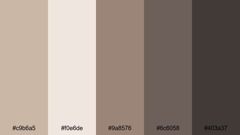
- HEX Codes: #c9b6a5, #f0e6de, #9a8576, #6c6058, #403a37
- Mood: Calm, soft, and comforting.
- Use for: Ideal for sit-down talking head videos, cozy study vlogs, and minimalist branding.
This palette layers gentle taupes, warm grays, and charcoal browns, echoing knitwear and soft blankets. There is no harsh contrast, which makes it perfect for content that should feel slow, quiet, and relaxing.
Use Sweater Weather Neutrals for channels focused on study, journaling, productivity, and slow living. The light beige and taupe tones are great for clean thumbnail backgrounds and title cards, while the darker grays give you just enough contrast for text, icons, and UI-style overlays without breaking the calm mood.
Cinnamon Latte Foam
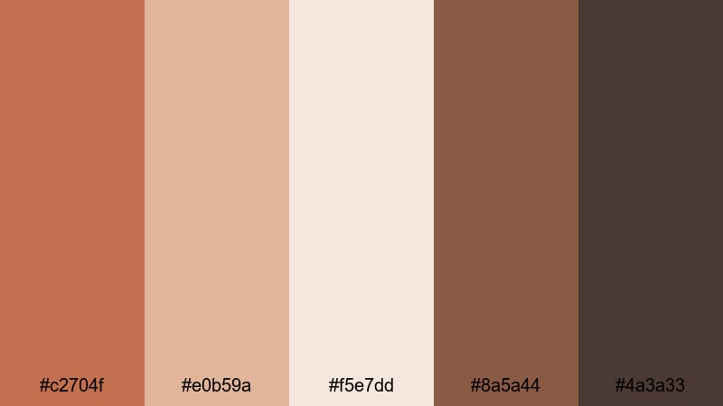
- HEX Codes: #c2704f, #e0b59a, #f5e7dd, #8a5a44, #4a3a33
- Mood: Warm, creamy, and indulgent.
- Use for: Perfect for café b-roll, food content, and product packaging mockups.
Milky creams, caramel browns, and a touch of cinnamon warmth give this palette a delicious, café-inspired mood. It feels soft and inviting, like diffused light through a coffee shop window.
For food vlogs, barista reels, and dessert branding, use the lighter tones as the main canvas and reserve the deeper browns for borders, logo marks, and callouts that highlight ingredients or prices. This palette is especially effective in thumbnails where latte, pastry, and packaging shots need to feel cohesive and mouth-watering.
Storybook Cabin Dust
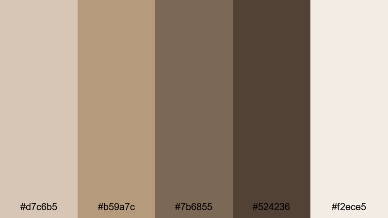
- HEX Codes: #d7c6b5, #b59a7c, #7b6855, #524236, #f2ece5
- Mood: Nostalgic, gentle, and homely.
- Use for: Use for journaling videos, booktube channels, and rustic intro screens.
Muted browns and parchment creams create a palette that feels like old books, handwritten letters, and worn wooden tables. Nothing is too bright, which keeps the overall look subtle and timeless.
Booktube creators, journaling channels, and analog-inspired brands can lean on this palette for intros, lower thirds, and thumbnail frames. Let the parchment tones be your default background, then use the darker browns for typewriter-style typography, chapter markers, and animated page-turn transitions.
First Frost Sunrise
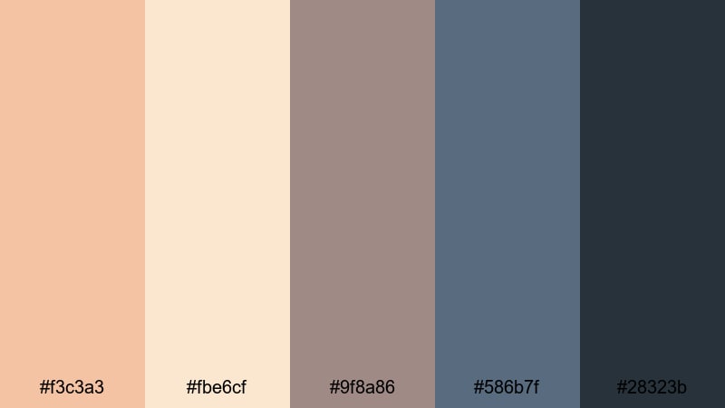
- HEX Codes: #f3c3a3, #fbe6cf, #9f8a86, #586b7f, #28323b
- Mood: Peaceful, reflective, and airy.
- Use for: Nice for morning routines, wellness content, and cinematic time-lapses.
Soft peach highlights and creamy whites meet cool blue-grays, suggesting a chilly sunrise where the air is crisp but the light is gentle. The balance of warm and cool makes this palette feel fresh without being stark.
Use it for wellness, yoga, and morning routine content where you want viewers to feel calm and clear-headed. The lighter shades are great for lower thirds and quote overlays, while the blue-grays can tone your footage for dawn scenes, reflection segments, and minimalist YouTube banner designs.
Moody Cinematic Fall Color Palettes
Foggy Forest Drive
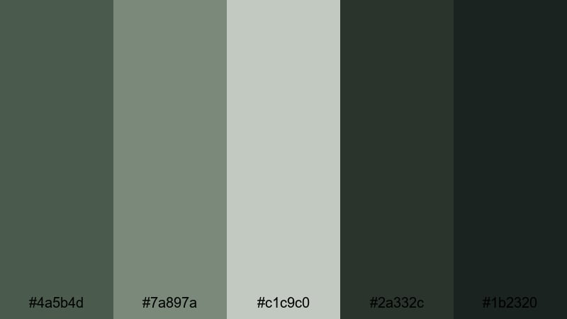
- HEX Codes: #4a5b4d, #7a897a, #c1c9c0, #2a332c, #1b2320
- Mood: Mysterious, cinematic, and grounded.
- Use for: Use for travel films, drone shots, and moody title cards or lower thirds.
Dusky greens and misty grays give this palette the feel of a forest road wrapped in early-morning fog. The dark onyx-like tones at the bottom of the palette make it perfect for dramatic shadows and letterboxing.
Foggy Forest Drive works well for travel diaries, autumn road trips, and drone passes over pine forests or mountain valleys. Use the light gray as a subtle title background, the mid greens to tint your midtones, and the darkest tones for cinematic borders, logo reveals, and chapter cards.
Ember Night Skyline
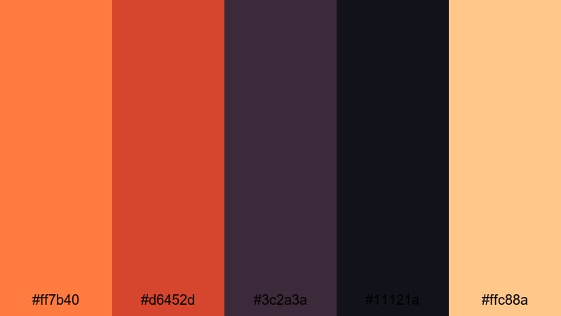
- HEX Codes: #ff7b40, #d6452d, #3c2a3a, #11121a, #ffc88a
- Mood: Dramatic, urban, and intense.
- Use for: Great for cityscape b-roll, nightlife promos, and bold cinematic trailers.
Electric oranges and ember reds contrast sharply against inky purples and deep navy, evoking neon reflections on wet pavement and glowing windows in a fall city night. A pale peach highlight adds just enough softness for text and UI details.
Use this palette for bold intros, trailers, and promo spots where you need impact. Let the darkest tones dominate the background while you use the bright oranges for title strokes, outlines, and motion graphics accents. It is especially effective for music videos, nightlife content, and cinematic city timelapses.
Cranberry Noir Drama
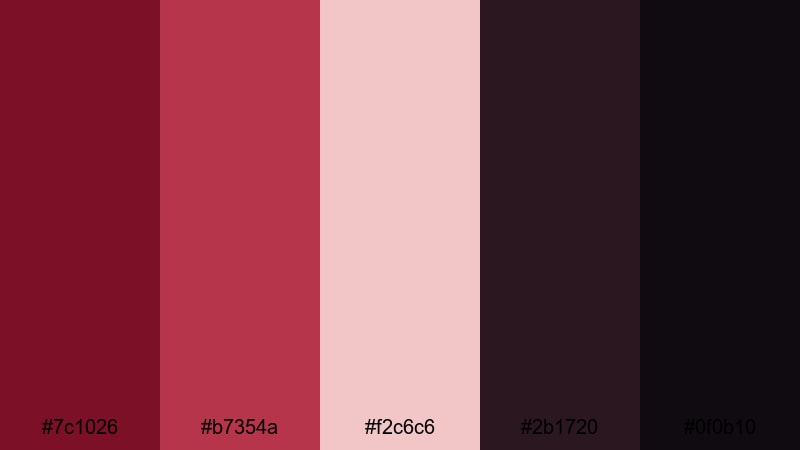
- HEX Codes: #7c1026, #b7354a, #f2c6c6, #2b1720, #0f0b10
- Mood: Romantic, intense, and stylish.
- Use for: Perfect for fashion edits, music videos, and dramatic title sequences.
Rich cranberry reds paired with blush highlights and almost-black shadows create a glamorous, noir-inspired fall palette. It feels like velvet, lipstick, and candlelight all at once.
Apply Cranberry Noir Drama to fashion lookbooks, performance videos, and cinematic mini-series. Use the blush tone for minimal lower-thirds and credits, the cranberry for logos and emphasis words, and the darkest shades for backgrounds that make your subject and typography pop in a sophisticated way.
Stormy Orchard Twilight
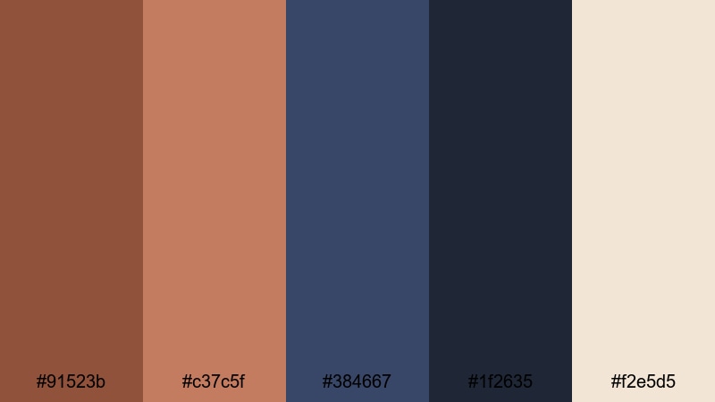
- HEX Codes: #91523b, #c37c5f, #384667, #1f2635, #f2e5d5
- Mood: Brooding, poetic, and cinematic.
- Use for: Use in narrative shorts, moody travel diaries, and branded mini-docs.
Weathered browns and muted corals meet stormy blue-grays, capturing the feeling of an orchard under gathering clouds at dusk. The soft cream highlight adds a quiet, hopeful touch amid the tension.
Stormy Orchard Twilight is ideal for narrative storytelling, introspective voiceovers, and documentary-style branding. Grade your footage toward the browns and blues, use the cream tone for subtitles or captions, and reserve the deepest blue for frames, dividers, and transitions that guide viewers through your story.
Modern Minimal Fall Color Palettes
Muted Terra Studio
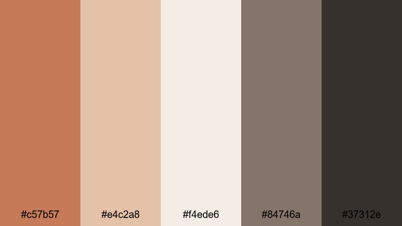
- HEX Codes: #c57b57, #e4c2a8, #f4ede6, #84746a, #37312e
- Mood: Clean, creative, and grounded.
- Use for: Ideal for studio setups, design portfolios, and minimalist channel branding.
Soft terracotta, chalky beige, and warm charcoal give this palette a modern, editorial fall feeling. The tones are desaturated enough to stay minimal, but still clearly rooted in earthy warmth.
Use Muted Terra Studio for design portfolios, tutorial channels, and product demos that need a creative yet professional look. Make the light beige your primary background, use terracotta for buttons and graphic accents, and lean on the dark charcoal for text, icons, and UI-inspired frames.
Burnt Sienna Grid
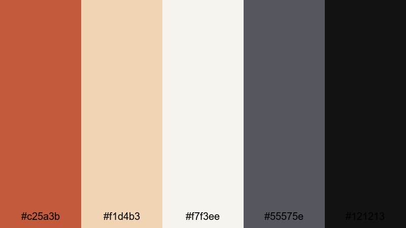
- HEX Codes: #c25a3b, #f1d4b3, #f7f3ee, #55575e, #121213
- Mood: Sleek, structured, and modern.
- Use for: Use for tech reviews, motion graphics, and clean lower-third designs.
Burnt sienna accents stand out sharply against pale neutrals and cool grays, giving this palette a crisp, grid-based look. It feels like a design magazine layout translated into motion.
Tech reviewers and productivity creators can use this palette for lower thirds, chapter markers, and infographic overlays. Let the off-white and light beige fill the screen as backgrounds, then use the deep gray and near-black for typography, and the burnt sienna for data points, icons, and subtle animated lines.
Soft Clay Interface
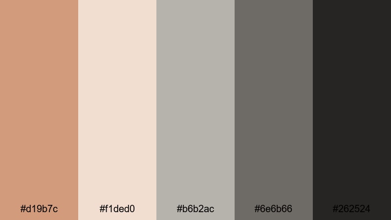
- HEX Codes: #d19b7c, #f1ded0, #b6b2ac, #6e6b66, #262524
- Mood: Balanced, understated, and polished.
- Use for: Perfect for UI-style graphics, app promos, and branding for creative tools.
Clay pinks and muted grays create a subtle, UI-friendly fall palette that never feels too loud. It delivers warmth without sacrificing a clean, modern interface look.
Use Soft Clay Interface when designing app walkthroughs, software tutorials, or branding for digital tools. The clay and cream tones can mimic interface backgrounds, while the deeper grays and near-black provide high legibility for text, icons, and buttons in thumbnails and motion graphics.
Tips for Creating Fall Color Palettes
When you build your own fall palette for video and design, aim for a balance between warmth, readability, and emotional tone so your thumbnails, intros, and branding feel cohesive across every platform.
- Start with one dominant fall hue (pumpkin orange, maple gold, cranberry, or terracotta) and build around it using softer neutrals and one or two deep shadow tones.
- Check contrast for readability: test your text color over both light and dark backgrounds to make sure titles and subtitles are clear on small mobile screens.
- Limit your core palette to 4–6 colors (including light and dark variants) so your channel art, overlays, and social graphics do not look chaotic.
- Match your palette to your content style: softer neutrals for study and wellness videos, bold oranges and reds for energetic vlogs or promos, and moody darks for cinematic travel or storytelling.
- Use one accent color sparingly for CTAs, subscribe buttons, and key icons so viewers quickly recognize what to click or tap.
- When grading footage, keep skin tones in mind; push the environment warmer or cooler while keeping people looking natural and flattering.
- Save presets: in Filmora, reuse title templates, color grading presets, and overlays based on your chosen HEX codes to keep all your content on brand.
- Preview on multiple devices (phone, tablet, laptop) to ensure your fall colors stay rich and readable in both bright and dark viewing conditions.
Fall color palettes are powerful storytelling tools. From rustic oranges and cider browns to moody cranberries and modern terra neutrals, the right combination instantly sets mood, frames your brand identity, and makes your videos look thoughtfully designed.
Use the HEX codes above as ready-made recipes for your thumbnails, lower thirds, transitions, and LUT choices. Then refine them inside Filmora so your intros, b-roll, and short-form edits all share the same cozy, cinematic fall energy.
The more consistently you apply your palette, the more your audience will recognize your style at a glance. Open Filmora, try these fall combinations on your next project, and build a visual identity that feels warm, polished, and uniquely yours.
secure downloadNext: Onyx Color Palette
