
 100% Security Verified | No Subscription Required | No Malware


 ChatGPT
 Perplexity
 Gemini
 Claude
 Grok
Grok
Gold Bronze is a rich, metallic-inspired tone that sits between warm gold and earthy bronze. It suggests confidence, heritage, and quiet luxury, which is why you see it everywhere from movie posters and perfume ads to game UI and premium YouTube branding. In video, it instantly adds depth to shadows, glow to highlights, and a feeling of polished production value when used in titles, overlays, and color grading.
This guide brings together 15 Gold Bronze color palettes with ready-to-use HEX codes so you can build cinematic thumbnails, cohesive intros, and stylish channel branding. Every palette is tuned for creators and Filmora users who want consistent, professional color across vlogs, trailers, tutorials, and social edits.
In this article
Cinematic Gold Bronze Color Palettes
Royal Premiere Glow
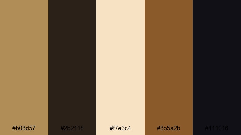
- HEX Codes: #b08d57, #2b2118, #f7e3c4, #8b5a2b, #111016
- Mood: Opulent, cinematic, and dramatic with a red-carpet feel.
- Use for: Perfect for YouTube intros, channel trailers, and film title cards that need a high-end, movie-premiere look.
Royal Premiere Glow mixes a classic Gold Bronze (#b08d57) with deep espresso and almost-black shadows, then lifts everything with a soft spotlight cream. The result feels like standing under theater lights with velvet curtains behind you: rich, glamorous, and made for a premiere moment.
Use this palette for opening titles, logo stings, and thumbnails where you want your name or logo to feel premium. Gold Bronze and cream can handle main typography, while the darkest tones become your background for contrast and legibility. In Filmora, it works beautifully across cinematic b-roll, awards-style lower thirds, and channel branding that leans into a luxurious movie aesthetic.
Pro Tip: Build a Cinematic Gold Bronze Premiere Look in Filmora
To keep this red-carpet style consistent, design a simple system around Gold Bronze and deep espresso. Use the darkest shades as your base in Filmora titles and backgrounds, then accent key words, icons, or logos with #b08d57. The cream tone is ideal for legible text over darker footage, especially in trailers and intro sequences.
Once you have a look you like, save your favorite titles, overlays, and color settings as custom presets inside Filmora. This lets you reuse the Royal Premiere Glow vibe in every upload, from short social edits to full-length trailers, without rebuilding your style each time.
AI Color Palette
You can capture this exact Gold Bronze mood from a reference image, poster, or color card and spread it across an entire timeline. Filmora's AI Color Palette feature analyzes your reference frame and automatically matches the color feel of your other clips to it.
Drop a still frame graded with Royal Premiere Glow onto Filmora, set it as your source, and let AI Color Palette unify your b-roll, talking-head segments, and overlays. It is an efficient way to keep your highlights warm, your shadows rich, and your overall tone consistently cinematic.
 secure download

HSL, Color Wheels & Curves
To perfect a Gold Bronze look, use HSL to nudge your yellows and oranges slightly warmer while desaturating any competing colors. In Filmora's color wheels, give your midtones a gentle push toward amber and keep shadows neutral or slightly cool so the Gold Bronze highlights stand out. For more control, Filmora's color grading tools let you use curves to deepen contrast: raise the highlights just enough to make metallic tones glow and slightly crush the blacks for drama.
Apply these tweaks to your main hero shot first, then copy and paste color settings across the timeline or use them as a base before running AI Color Palette. This workflow keeps your premiere-style golds stable whether you are cutting a 10-second bumper or a full trailer.
secure download1000+ Video Filters & 3D LUTs
Once your base Gold Bronze grade is in place, filters and LUTs can quickly push it toward specific moods like vintage film, modern blockbuster, or glossy fashion. Filmora's video filters and 3D LUTs make it easy to add halation, crush blacks, or cool the shadows while preserving your golden highlights.
Try layering a subtle cinematic LUT over your Royal Premiere Glow footage, then dial back the intensity until skin tones and metallic accents still look natural. Save combinations you like as presets so your channel always keeps the same Gold Bronze signature, no matter what you are filming.
secure downloadSunset Harbor Bronze
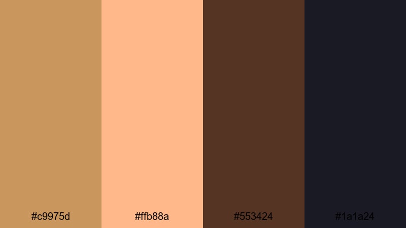
- HEX Codes: #c9975d, #ffb88a, #553424, #1a1a24
- Mood: Warm, cinematic sunset mood with a hint of mystery.
- Use for: Great for travel vlogs, cinematic b-roll sequences, and moody end screens with a sunset story arc.
Sunset Harbor Bronze blends glowing oranges and Gold Bronze with deep cocoa and navy-black shadows. It feels like the last light hitting water and buildings just before night falls, giving your frames both warmth and intrigue.
Use the lighter tones for titles and location labels, while the darker hues form gradients behind them for readability. This palette is ideal for travel vlogs, romantic highlight reels, or thumbnails that tease a sunset adventure, especially when you grade your footage to lean into orange-gold highlights and inky blues.
Festival Marigold Sparks
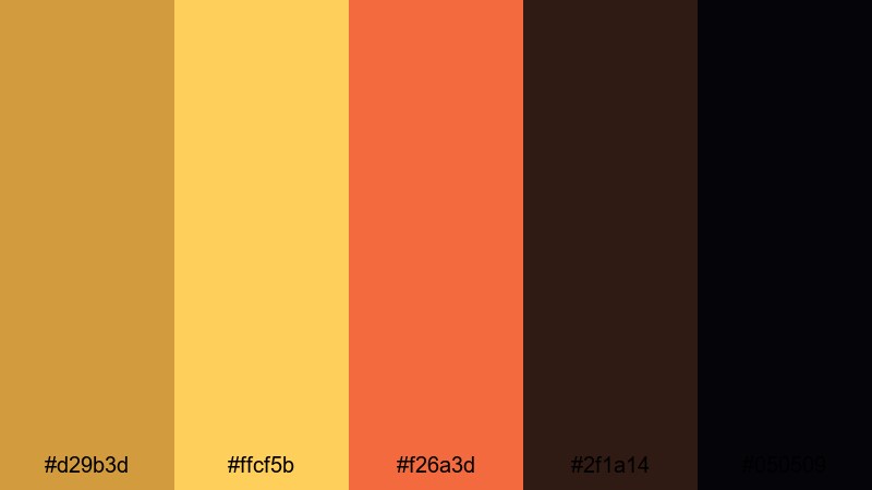
- HEX Codes: #d29b3d, #ffcf5b, #f26a3d, #2f1a14, #050509
- Mood: Energetic, festive, and bold with glowing highlights.
- Use for: Use this palette for event highlight videos, music festival recaps, and dynamic social shorts that need punchy color.
Festival Marigold Sparks is all about vibrant marigold and ember orange over a Gold Bronze base, anchored by deep, nearly-black shadows. It feels like stage lights, fireworks, and neon signs compressed into one high-energy scheme.
Apply these colors to bold lower thirds, animated title cards, and fast-cut montage frames. The darker tones work perfectly for backgrounds and vignettes, while the marigold and orange shades can highlight performers, key phrases in your thumbnails, or countdown numbers in hype reels.
Candlelit Studio Warmth
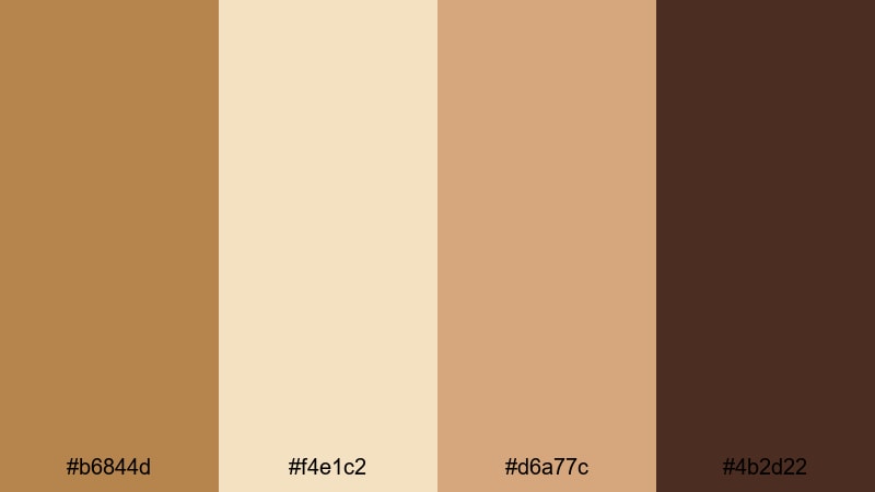
- HEX Codes: #b6844d, #f4e1c2, #d6a77c, #4b2d22
- Mood: Soft, intimate, and cozy like a candlelit set.
- Use for: Ideal for talking-head videos, tutorials, and product showcases that aim for a warm, approachable look.
Candlelit Studio Warmth layers gentle Gold Bronze with creamy highlights and chocolate shadows. The mood is cozy and close-up, as if your viewer is sitting just across the table from you under soft studio lights.
Use the cream and lighter bronze tones for titles, product callouts, and background panels behind text. The deeper browns are great for subtle frames, borders, or overlays in Filmora that keep attention on your face or subject. This palette suits lifestyle channels, beauty tutorials, and any brand that wants to feel warmly personal rather than flashy.
Luxury Gold Bronze Color Palettes
Gilded Penthouse Night
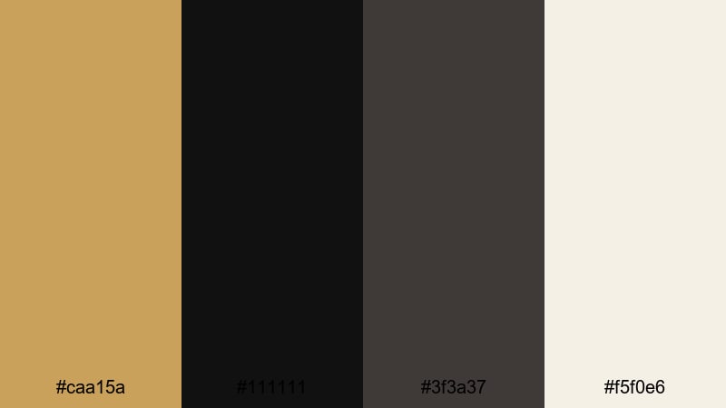
- HEX Codes: #caa15a, #111111, #3f3a37, #f5f0e6
- Mood: Ultra-luxurious and sleek with high-contrast glamour.
- Use for: Best for luxury brand intros, fashion lookbooks, and premium product reels that demand sleek sophistication.
Gilded Penthouse Night contrasts polished Gold Bronze with inky black and urban charcoal, finished with a soft ivory accent. It feels like a nighttime city skyline seen from a glass-walled penthouse: sharp, modern, and expensive.
Use the near-black as your primary background color in titles, lower thirds, and end screens, then let Gold Bronze highlight logos, product names, and key details. Ivory keeps text readable without losing the high-end mood. This palette is perfect for fashion lookbooks, luxury tech reviews, and brand bumpers that want a black-and-gold signature.
Champagne Bronze Soiree
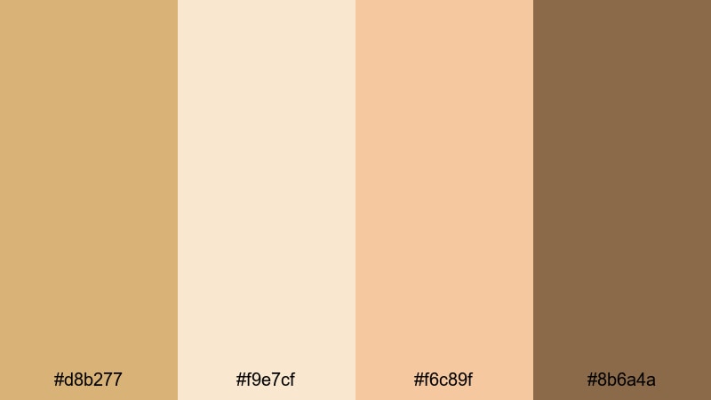
- HEX Codes: #d8b277, #f9e7cf, #f6c89f, #8b6a4a
- Mood: Elegant, celebratory, and softly glamorous.
- Use for: Perfect for wedding films, event highlight reels, and brand videos for beauty or lifestyle channels.
Champagne Bronze Soiree brings together creamy champagne, soft peach, and Gold Bronze with a grounded brown accent. It feels like a wedding reception or a celebration in soft-focus, full of candles and sparkling glasses.
Use the light tones as the base for title cards, date stamps, and chapter screens, while the darker bronze and brown define dividers, lines, and subtle frames. This palette is ideal for wedding videos, engagement announcements, event highlights, and thumbnails that need a romantic but polished atmosphere.
Velvet Curtain Spotlight
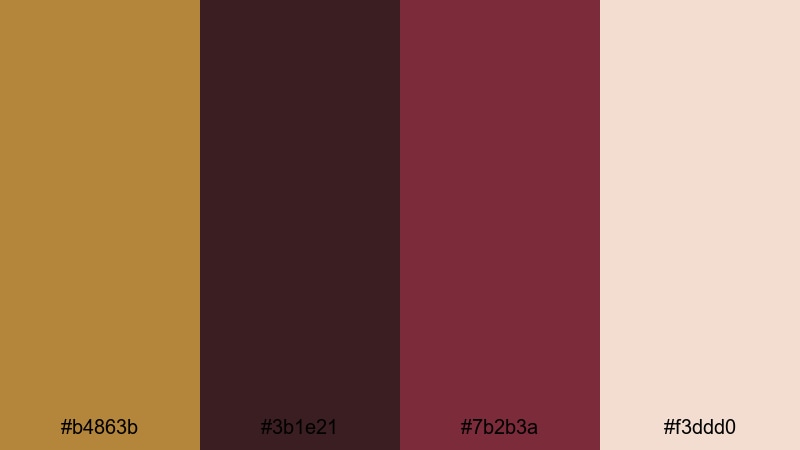
- HEX Codes: #b4863b, #3b1e21, #7b2b3a, #f3ddd0
- Mood: Theatrical, rich, and dramatic like a velvet stage.
- Use for: Use this for fashion campaigns, teaser trailers, and dramatic brand reveals that feel like a stage performance.
Velvet Curtain Spotlight pairs Gold Bronze with deep wine reds and a blush highlight. It feels like a spotlight cutting through darkness to reveal a performer in front of heavy velvet drapes.
Use the red tones to frame your subject or call attention to key phrases, while Gold Bronze and blush carry your typography and icons. This palette works well for fashion teasers, performance promos, dramatic announcement posts, and thumbnails where you want an unmistakable showtime energy.
Golden Hour Runway
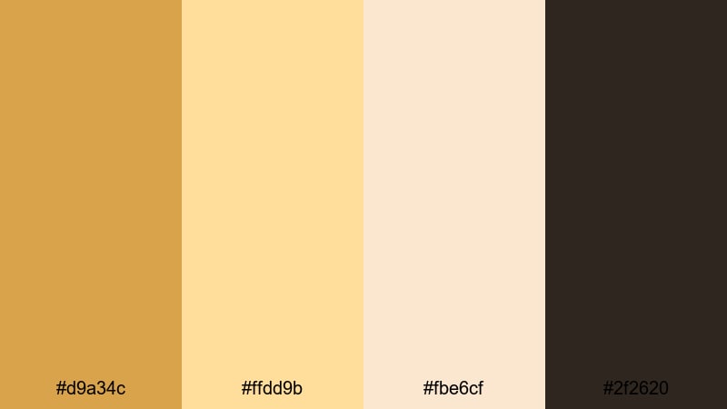
- HEX Codes: #d9a34c, #ffdd9b, #fbe6cf, #2f2620
- Mood: High-fashion, sunlit, and polished.
- Use for: Great for lookbooks, outfit reels, and beauty tutorials where warm, editorial lighting is the hero.
Golden Hour Runway combines Gold Bronze with honeyed highlights, soft cream, and rich coffee shadows. It feels like a fashion runway shot at sunset, where every edge is softly glowing.
Use the lighter tones as backgrounds and panels for text overlays that describe outfits, makeup products, or style tips. The deepest color anchors borders, drop shadows, and subtle frames. It is especially strong for fashion thumbnails, beauty intro cards, and Reels or Shorts where warm, editorial light plays a starring role.
Vintage Gold Bronze Color Palettes
Antique Record Sepia
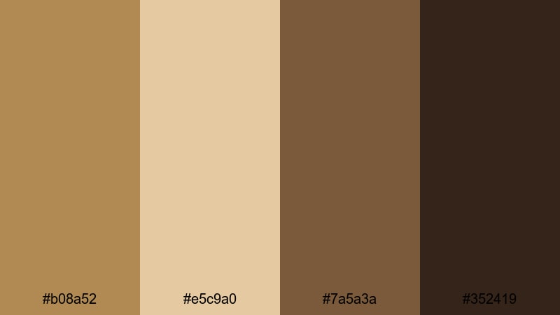
- HEX Codes: #b08a52, #e5c9a0, #7a5a3a, #352419
- Mood: Nostalgic, sepia-toned, and warm like aged film.
- Use for: Perfect for retro vlog edits, memory montages, and documentary titles with a vintage feel.
Antique Record Sepia uses muted Gold Bronze, parchment cream, and sepia browns to mimic old film prints and vintage photographs. It has a gently faded look that feels nostalgic and timeless.
Use these tones to grade travel memories, family archives, or documentary intros. In thumbnails and title cards, parchment and light bronze can carry your text, while the darker browns frame key photos or stills. It is a great palette when you want your footage to feel like it has a story stretching back in time.
Old Cinema Marquee
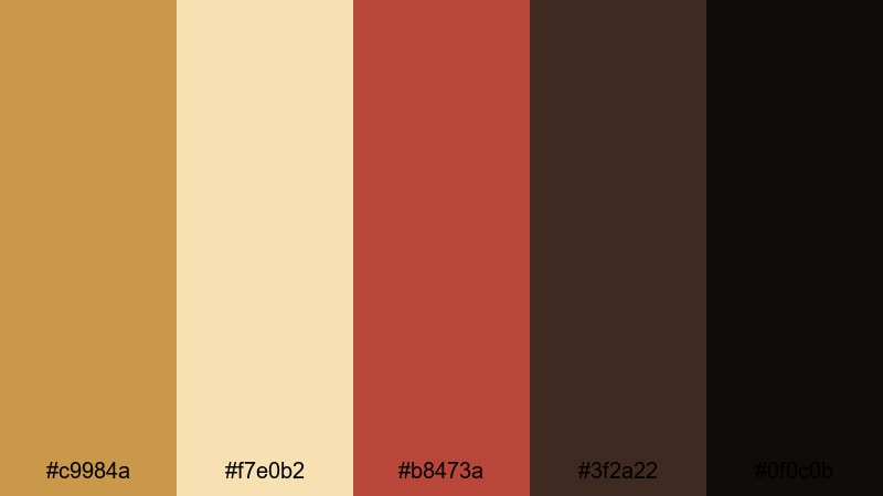
- HEX Codes: #c9984a, #f7e0b2, #b8473a, #3f2a22, #0f0c0b
- Mood: Retro, bold, and theatrical like classic cinema signage.
- Use for: Use for movie review channels, retro title cards, and channel banners inspired by old theaters.
Old Cinema Marquee mixes Gold Bronze lights with warm ivory bulbs, marquee red, and deep shadow tones. It instantly calls up the feeling of vintage theater signs and classic movie nights.
Use the red and Gold Bronze as accent colors for rating badges, review scores, or call-to-action buttons in your video graphics. The darkest hues are perfect for backgrounds behind text, while cream and ivory keep titles readable. This palette fits movie review channels, classic film retrospectives, and playlists that celebrate cinema history.
Dusty Library Gleam
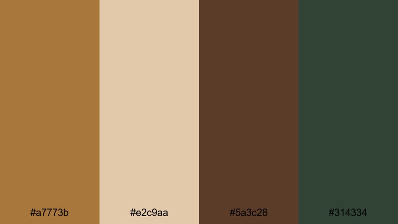
- HEX Codes: #a7773b, #e2c9aa, #5a3c28, #314334
- Mood: Bookish, intellectual, and quietly luxurious.
- Use for: Best for educational channels, essay videos, and storytelling content that leans thoughtful and refined.
Dusty Library Gleam combines weathered Gold Bronze and parchment with coffee wood and a muted green accent. It feels like leather-bound books, brass lamps, and quiet study rooms.
Use parchment and bronze for your main typography, lower thirds, and chapter screens. The deeper brown and green can act as background blocks or sidebars for quotes, definitions, or key points in essay-style videos. This palette is especially strong for education, commentary, and storytelling channels that want a calm, intelligent visual identity.
Retro Trophy Shine
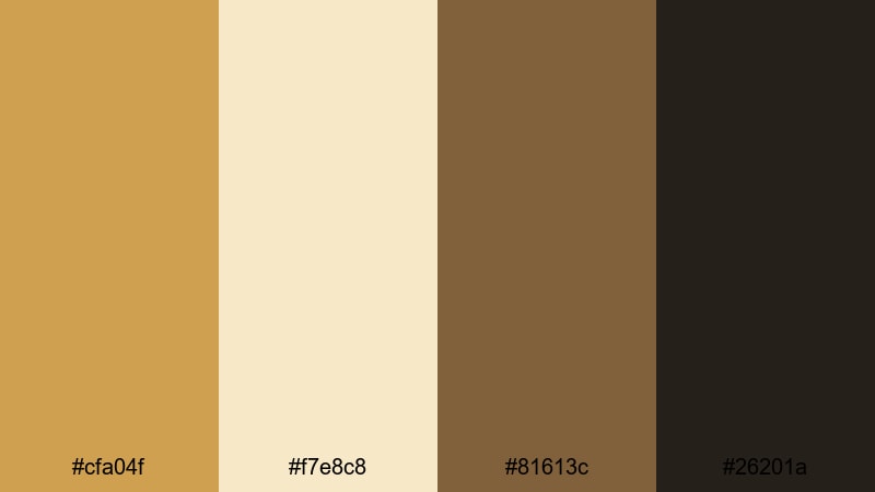
- HEX Codes: #cfa04f, #f7e8c8, #81613c, #26201a
- Mood: Sporty, nostalgic, and confident like a classic trophy shelf.
- Use for: Ideal for sports recaps, achievement reels, and milestone celebration videos.
Retro Trophy Shine pairs shiny Gold Bronze with cream plaques, medium wood tones, and dark shadow browns. It has the confident, nostalgic look of vintage trophies and award cabinets.
Use this palette for winner graphics, scoreboards, and achievement badges in your edits. The Gold Bronze and cream are perfect for medals, ribbons, and milestone text in thumbnails. Darker tones help separate overlays from busy footage, so stats, rankings, and highlights stay easy to read.
Modern Minimal Gold Bronze Color Palettes
Bronze Line Art
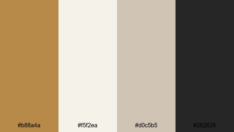
- HEX Codes: #b88a4a, #f5f2ea, #d0c5b5, #262626
- Mood: Clean, modern, and artistic with subtle warmth.
- Use for: Great for minimalist channel branding, UI overlays, and lower thirds that feel current and uncluttered.
Bronze Line Art balances refined Gold Bronze accents with off-white, soft neutrals, and charcoal outlines. It has a crisp, minimal look where the warmth comes from small golden details instead of full-screen color.
Use the light neutrals as the base for your titles and interface-style graphics, with Gold Bronze reserved for lines, icons, and key words. The charcoal shade is ideal for body text and subtle borders. This palette is perfect for tech explainers, design-focused channels, and clean thumbnails that still have a touch of luxury.
Graphite And Gold Grid
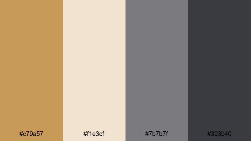
- HEX Codes: #c79a57, #f1e3cf, #7b7b7f, #393b40
- Mood: Tech-forward, sleek, and balanced between warm and cool.
- Use for: Use for tech reviews, productivity content, and UI mockups that need subtle luxury without losing clarity.
Graphite And Gold Grid sets Gold Bronze accents against cool grays and a soft beige. It feels like a modern dashboard or interface where everything is precise, but there is still a hint of luxury.
Use the mid and dark grays for your main backgrounds and grids, then pop important numbers, icons, and CTAs in Gold Bronze. The light beige keeps headings readable while maintaining a soft, professional tone. This palette works well for productivity breakdowns, app walkthroughs, and gear reviews that need structure and clarity.
Soft Sand Interface
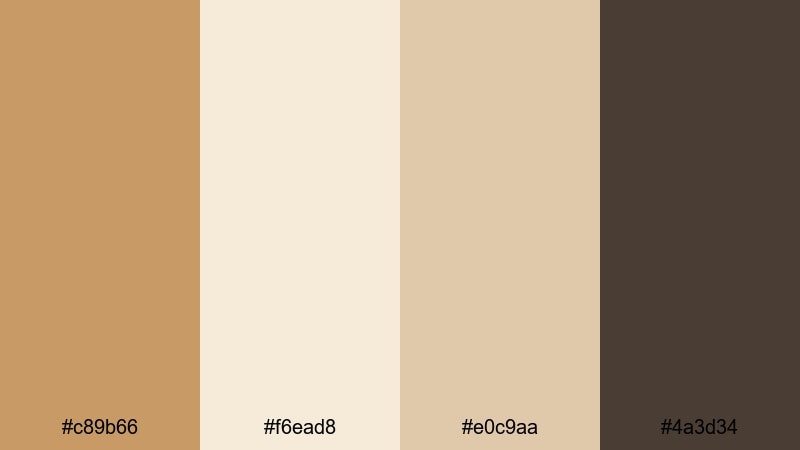
- HEX Codes: #c89b66, #f6ead8, #e0c9aa, #4a3d34
- Mood: Calm, grounded, and user-friendly with gentle warmth.
- Use for: Perfect for app-style screens, tutorial explainers, and channel branding that aims for a soft, modern look.
Soft Sand Interface uses sandy Gold Bronze and warm neutrals with a grounded brown accent. It feels calm and approachable, like a clean app interface with a subtle human touch.
Use the lighter tones for card-style layouts, text panels, and info boxes in your tutorials. Gold Bronze can highlight buttons, progress steps, and icons, while the deepest brown emphasizes headings or key separators. This palette is excellent for how-to videos, onboarding sequences, and channel branding that wants to feel modern but not sterile.
Tips for Creating Gold Bronze Color Palettes
Gold Bronze pairs beautifully with creams, deep browns, muted greens, and cool charcoals, but it needs careful balance to stay readable and cinematic on screen. Use these tips to build and apply your own Gold Bronze combinations for video and design.
- Always test contrast: place your Gold Bronze text over your darkest background tone and check readability on both desktop and mobile thumbnails.
- Limit strong accent colors: pair Gold Bronze with one or two supporting hues (like deep red or muted green) so your palette stays focused and premium.
- Use dark tones for depth: rich browns and charcoals behind Gold Bronze help titles, logos, and UI overlays feel more cinematic and less flat.
- Keep skin tones natural: when grading toward Gold Bronze, warm up highlights but avoid pushing midtones too far, or faces can start looking orange.
- Build a hierarchy: reserve Gold Bronze for your most important elements (logo, key words, CTAs), and use neutrals for body text and background panels.
- Match brand assets: convert your chosen Gold Bronze and supporting colors into HEX codes and reuse them in thumbnails, banners, and Filmora titles for a consistent identity.
- Check different lighting: preview your edits on bright and dim screens to be sure metallic tones do not blow out highlights or disappear in shadows.
- Create reusable presets in Filmora: save titles, color grades, and overlays built around your Gold Bronze palette so every new video starts with a consistent visual base.
Gold Bronze color palettes can make your videos feel cinematic, luxurious, or warmly nostalgic with just a few carefully chosen shades. Whether you lean into high-contrast black and gold, soft champagne tones, or vintage sepias, these HEX-based combinations give you a starting point you can trust.
Try dropping these palettes into your next intro, thumbnail set, or full edit in Filmora, then fine-tune the grade until it matches your brand personality. With AI Color Palette, HSL and curves, and ready-made filters and LUTs, you can lock in a signature Gold Bronze look that viewers recognize instantly.
As you experiment, save your favorite combinations as presets and reuse them across your channel. Over time, that consistent Gold Bronze styling becomes part of your storytelling and your brand memory.
secure download