
 100% Security Verified | No Subscription Required | No Malware


 ChatGPT
 Perplexity
 Gemini
 Claude
 Grok
Grok
Gold instantly signals luxury, success, and celebration. In video and brand design, gold color palettes can make an intro feel premium, turn a simple product shot into a high end story, or give your YouTube thumbnail a polished, cinematic edge. Depending on how you mix it with neutrals, dark tones, or pastels, gold can feel glamorous and bold or soft and understated.
This guide gathers 15 carefully built gold color palettes with HEX codes you can plug straight into your thumbnails, lower thirds, channel branding, titles, and color grading. Whether you are editing in Filmora or designing assets for your next gold themed video, you will find ready made gold color combinations tailored to different moods and creative styles.
In this article
Elegant & Modern Gold Color Palettes
Champagne Lobby Luxe
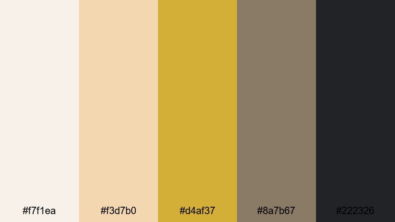
- HEX Codes: #f7f1ea, #f3d7b0, #d4af37, #8a7b67, #222326
- Mood: sophisticated, polished, and calm
- Use for: Ideal for luxury brand intros, unboxing videos, and sleek product promos.
Champagne Lobby Luxe feels like stepping into a quiet five star hotel lobby. Soft champagne and cream tones keep the frame light, while the classic gold accent (#d4af37) and deep charcoal base (#222326) add structure and authority. It is elegant without being loud, which is perfect when you want the product or message to stay center stage.
Use this gold color palette for unboxing sequences, minimalist logo stings, or premium brand explainers. In YouTube thumbnails and channel art, let the pale neutrals carry the background and use the gold for key text, borders, or call to action buttons, with the charcoal tone anchoring lower thirds and navigation bars so everything feels cohesive across your Filmora projects.
Pro Tip: Build a Champagne Gold Brand Look in Filmora
To keep a refined gold aesthetic like Champagne Lobby Luxe consistent, set up a simple branding system inside Filmora. Use the off white and champagne tones for backgrounds and panel colors, assign the rich gold to titles and icons, and reserve the charcoal shade for outlines, drop shadows, and footer bars. Saving these as custom presets means every intro, B roll cutaway, and end screen instantly matches your gold brand identity.
You can also create a few reusable title templates that lock in this palette. Once your font and color choices are saved in Filmora, all you need to do for the next video is change the wording, and your gold color combinations stay perfectly aligned across your whole channel.
AI Color Palette
If you already have a brand shot or thumbnail design that nails this champagne gold look, you can turn it into a reference for your entire video. Filmora's AI Color Palette feature analyzes the colors in your reference frame and applies a similar palette to other clips, so your A roll, B roll, and overlays all share the same soft gold cast.
Simply choose a frame that shows your ideal gold tones, open AI Color Palette, and let Filmora match the rest of your footage to that style. It saves you from manual tweaking clip by clip and keeps your gold hues steady from the intro animation to the final call to action screen.
 secure download

HSL, Color Wheels & Curves
To fine tune your gold tones even more, use Filmora's HSL controls, color wheels, and curves. Slightly lifting the warm midtones while keeping blacks deep helps your gold accents glow without washing out skin tones. You can desaturate oranges and yellows just a bit to keep the look sophisticated instead of overly vivid.
Color wheels are ideal for balancing shadows and highlights so that your dark charcoal background stays neutral while the champagne whites stay clean. If you want a more cinematic gold effect, add a gentle S curve to increase contrast and make the metallic highlights pop. For more ideas, you can follow Filmora's color correction tips guide and adapt the same workflow to your gold aesthetic.
secure download1000+ Video Filters & 3D LUTs
Once your base gold palette looks right, you can push it into different styles with Filmora's effects library. Vintage filters will warm up your champagne tones for nostalgic brand stories, while clean, modern LUTs keep the palette neutral and sharp for tech or product content. You can stack a soft glow effect on top to make the gold accents feel even more luminous.
Filmora's video filters and 3D LUTs make it easy to test different looks without rebuilding your gold color combinations from scratch. Apply a LUT, adjust intensity, and quickly decide whether your project needs a more cinematic, retro, or glossy commercial grade finish.
secure downloadGlass Tower Gilded
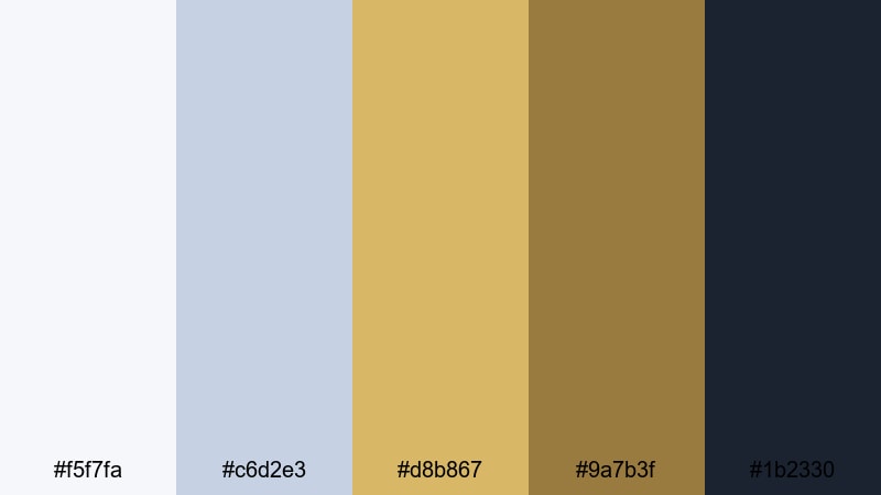
- HEX Codes: #f5f7fa, #c6d2e3, #d8b867, #9a7b3f, #1b2330
- Mood: clean, urban, and aspirational
- Use for: Great for tech brand explainers, corporate reels, and modern real estate walkthroughs.
Glass Tower Gilded pairs cool sky blues and crisp whites with structured golds and deep navy. It feels like sunrise reflecting on glass skyscrapers: professional, optimistic, and very modern. The muted yellow gold (#d8b867) becomes a subtle accent instead of a flashy highlight, so the overall look stays clean.
Use this palette in corporate intros, SaaS demos, or real estate tours where you want to communicate trust and growth. Light blues and whites work well for backgrounds and charts, while the gold tones can highlight key metrics or calls to action in thumbnails and lower thirds created in Filmora.
Minimal Monogram Gold
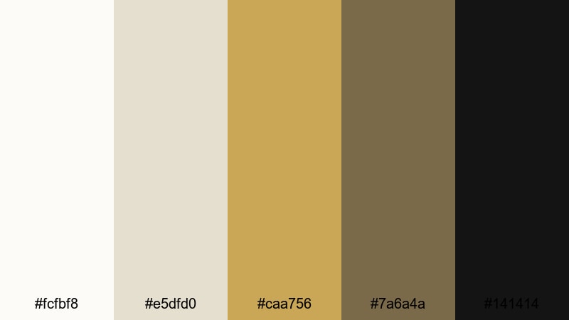
- HEX Codes: #fcfbf8, #e5dfd0, #caa756, #7a6a4a, #141414
- Mood: minimal, elegant, and understated
- Use for: Perfect for logo animations, signature lower thirds, and clean UI overlays in videos.
Minimal Monogram Gold focuses on warm off white and parchment shades, with a soft gold accent and inky black. This combination feels like luxury stationery or a high end fashion label tag, making it ideal for brands that want quiet confidence instead of loud shine.
In Filmora, use the light neutrals for background plates, the gold for initials or logo marks, and the deep black for typography. This aesthetic gold palette is excellent for subtle intro animations, watermark logos on footage, and polished end cards with simple, readable calls to action.
Midnight Gala Highlight
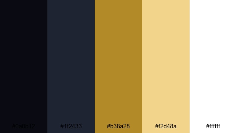
- HEX Codes: #0a0b12, #1f2433, #b38a28, #f2d48a, #ffffff
- Mood: glamorous, dramatic, and high end
- Use for: Ideal for award show intros, fashion lookbooks, and upscale event recaps.
Midnight Gala Highlight mixes inky midnight blues with rich gold highlights and bright white. The deep background tones feel like a dark theater or backstage area, letting the golden accents and light text glow like spotlights.
Use the darkest shades for full screen title backgrounds and overlay them with gold typography for red carpet intros or fashion lookbooks. In thumbnails, a black or navy base with a diagonal stripe of gold and white text instantly suggests prestige and special events.
Warm & Cinematic Gold Color Palettes
Golden Hour Lens Flare
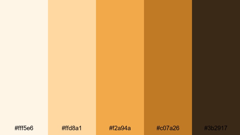
- HEX Codes: #fff5e6, #ffd8a1, #f2a94a, #c07a26, #3b2917
- Mood: warm, nostalgic, and cinematic
- Use for: Great for travel vlogs, outdoor lifestyle edits, and romantic highlight reels.
Golden Hour Lens Flare captures the feeling of sunlit creams and amber golds fading into toasty browns. It echoes the natural warmth of late afternoon light, giving your footage a cinematic, sun drenched mood even if it was shot at a different time of day.
Apply these HEX codes for gold themed overlays on travel vlogs, dreamy B roll, or romantic highlight reels. In thumbnails, use the light cream as the background, then bring in the richer gold and brown tones for text, borders, and subtle gradients that suggest warmth and nostalgia.
Desert Sun Storyboard
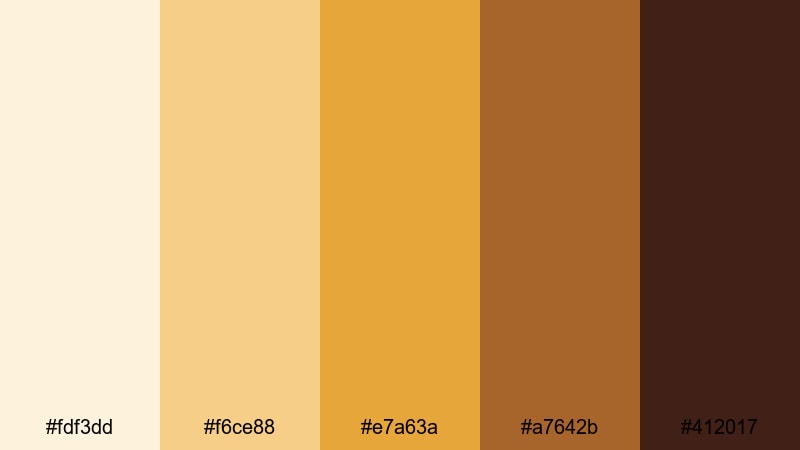
- HEX Codes: #fdf3dd, #f6ce88, #e7a63a, #a7642b, #412017
- Mood: earthy, adventurous, and bold
- Use for: Ideal for travel documentaries, adventure montages, and brand films with a natural edge.
Desert Sun Storyboard blends sand, clay, and burnt sienna with a vivid golden accent. It feels rugged but inviting, like a road trip through canyons or a hike at sunset. The darker browns give you strong grounding tones for text and overlays.
This gold color palette is great for documentary frames, maps, or chapter cards in adventure edits. Use the light sand for backgrounds, the bold gold for markers and icons, and the deep brown for readable lower thirds in Filmora when your footage is already busy.
Vintage Reel Sepia Gold
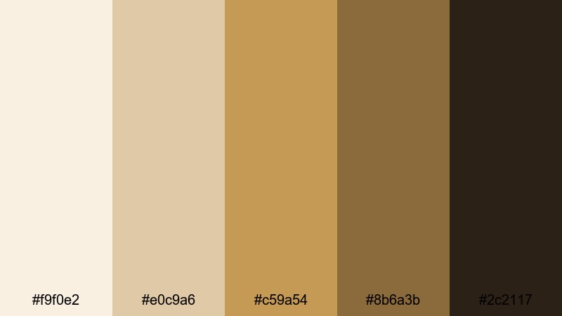
- HEX Codes: #f9f0e2, #e0c9a6, #c59a54, #8b6a3b, #2c2117
- Mood: retro, cozy, and storytelling focused
- Use for: Perfect for nostalgic edits, wedding films, and memory montages with a filmic grade.
Vintage Reel Sepia Gold leans into sepia tans, caramel browns, and muted gold, instantly suggesting old film stock. It is warm and soft, ideal for telling emotional stories, looking back on memories, or giving new footage a timeless character.
Use this palette to color grade wedding films, family montages, or heritage brand pieces where you want gentle, non aggressive gold. In thumbnails or title cards, the darker brown and deep espresso shade give you enough contrast for text while the lighter tones hold a soft vignette or film grain effect in Filmora.
Candlelit Cinema Frame
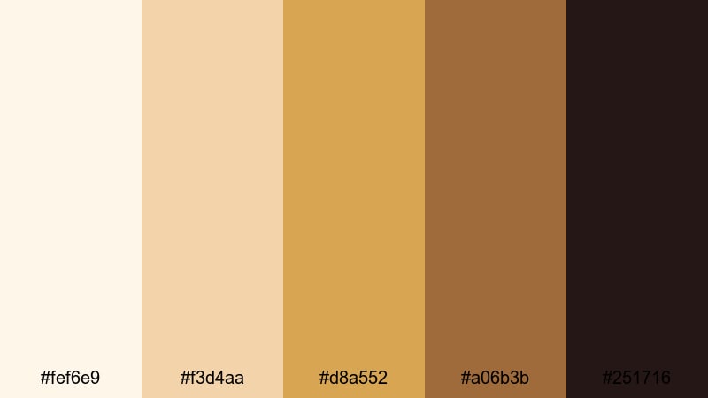
- HEX Codes: #fef6e9, #f3d4aa, #d8a552, #a06b3b, #251716
- Mood: intimate, moody, and emotional
- Use for: Great for narrative shorts, food videos, and cozy home content with a warm mood.
Candlelit Cinema Frame combines warm creams and honey golds with rich browns and deep espresso shadows. It feels like a dinner lit by candles or a cozy evening at home, perfect when you want your viewers to feel close to the scene.
Use the near black shade for background plates or letterboxing, the golds for highlights on food, faces, or key objects, and the light cream for titles. In Filmora, you can add soft light blend modes using these golds as gradients over your footage to subtly tint shadows and midtones.
Soft & Minimal Gold Color Palettes
Muted Sandstone Glow
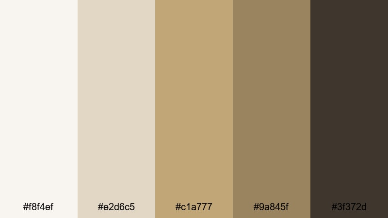
- HEX Codes: #f8f4ef, #e2d6c5, #c1a777, #9a845f, #3f372d
- Mood: calm, grounded, and natural
- Use for: Ideal for lifestyle channels, minimal branding, and soft product flat lays.
Muted Sandstone Glow uses gentle stone neutrals and soft gold accents to create a relaxed, organic atmosphere. The colors feel like clay, sand, and sun warmed stone, giving your visuals a grounded, lifestyle oriented look.
This palette works well for wellness content, studios, or product shots on textured surfaces. Keep the lighter tones as your main background and use the gold and darker browns for simple line art, icons, and understated text in your Filmora titles and overlays.
Soft Linen Halo
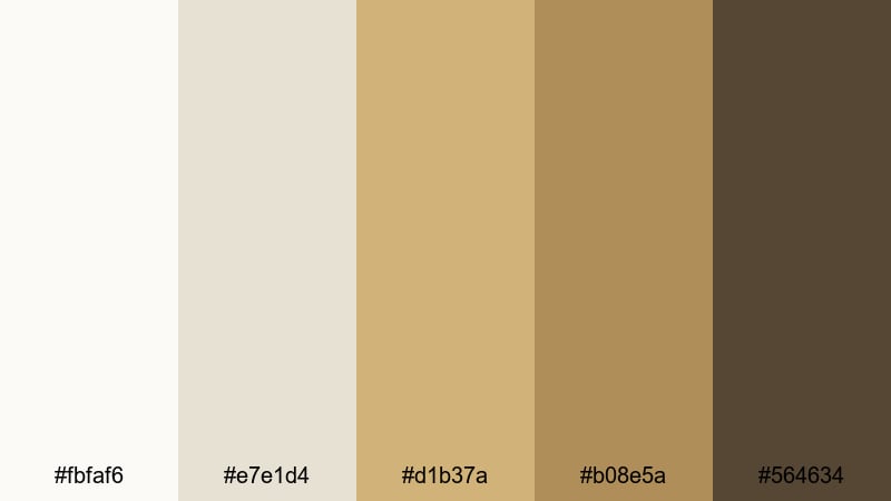
- HEX Codes: #fbfaf6, #e7e1d4, #d1b37a, #b08e5a, #564634
- Mood: serene, airy, and refined
- Use for: Perfect for tutorials, studio setups, and personal brands that want a gentle luxury feel.
Soft Linen Halo is built from linen whites, oatmeal neutrals, and brushed gold tones. It feels bright and airy but still refined, similar to a sunlit home studio or a boutique workspace.
Use this gold color combination for tutorial videos, educational channels, or personal branding where you want a hint of luxury without dark or heavy tones. In Filmora, use the light colors for text boxes and safe areas and let the gold hues highlight key steps, timestamps, or important captions.
Pastel Sunrise Gilt
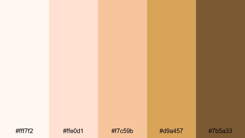
- HEX Codes: #fff7f2, #ffe0d1, #f7c59b, #d9a457, #7b5a33
- Mood: gentle, optimistic, and dreamy
- Use for: Great for morning routines, wellness content, and soft branded intros.
Pastel Sunrise Gilt captures peachy pastels and light amber gold, like an early morning sky with a subtle metallic glow. It feels optimistic and soothing, making it ideal for routines, journaling content, and soft motivational edits.
Use the palest shades as background gradients for your openers, then layer in the amber gold for key text and icons. The deeper brown provides enough contrast for smaller typography in Filmora, ensuring your gold aesthetic stays dreamy but still easy to read on mobile screens.
Bold & Dramatic Gold Color Palettes
Black Tie Spotlight
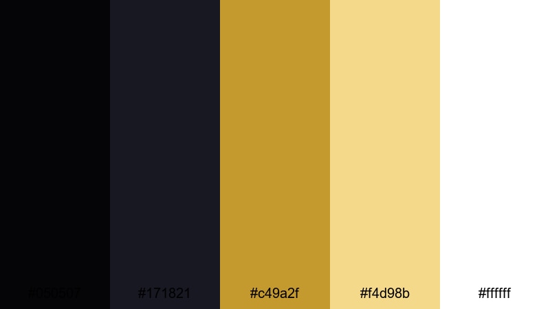
- HEX Codes: #050507, #171821, #c49a2f, #f4d98b, #ffffff
- Mood: striking, formal, and cinematic
- Use for: Ideal for trailers, event promos, and bold YouTube intros that need maximum impact.
Black Tie Spotlight clashes pitch black and deep navy with bright spotlight gold and clean white. It feels like stage lights cutting through darkness, which gives your content instant drama and formality.
Use the darkest tones as full frame backgrounds and the golds for bold, large titles and accent lines. In Filmora, this palette works brilliantly for countdowns, channel intros, and event promos where you need strong contrast for fast moving text and graphics.
Neon Ember Gold
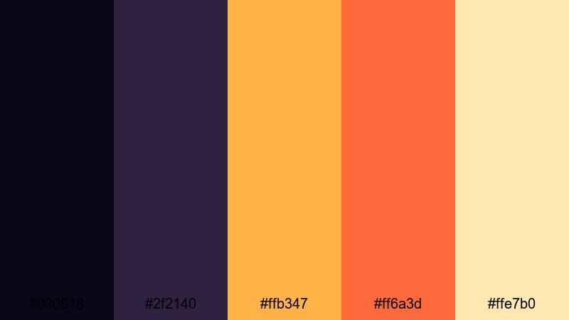
- HEX Codes: #090818, #2f2140, #ffb347, #ff6a3d, #ffe7b0
- Mood: energetic, edgy, and modern
- Use for: Great for gaming overlays, music videos, and fast paced social edits.
Neon Ember Gold brings together deep violet shadows, glowing gold, and ember like oranges. It feels like a neon sign in a dark club, ideal for content that wants energy and edge rather than subtle luxury.
Use the dark purples as a base layer, then draw attention with the gold and orange gradients for titles, progress bars, or alerts. In YouTube thumbnails, a dark background with diagonal neon gold strokes and bold text will stand out in crowded feeds.
Royal Stage Curtain
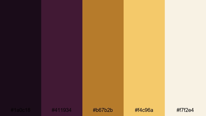
- HEX Codes: #1a0c18, #411934, #b67b2b, #f4c96a, #f7f2e4
- Mood: regal, theatrical, and expressive
- Use for: Perfect for performance promos, stage event trailers, and bold channel branding.
Royal Stage Curtain combines plum and wine tones with rich gold and spotlight cream. It feels like standing in front of velvet theater curtains just before the show starts, full of anticipation and drama.
Use the deep purples as your base, the golds for title frames and borders, and the cream shade for readable text. This gold palette is strong for trailers, music performances, and expressive channels that want a royal, showtime identity across their Filmora intros and outros.
High Contrast Stream Overlay
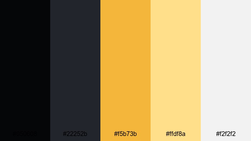
- HEX Codes: #050608, #22252b, #f5b73b, #ffdf8a, #f2f2f2
- Mood: dynamic, punchy, and high energy
- Use for: Ideal for streaming overlays, esports branding, and eye catching thumbnails.
High Contrast Stream Overlay pushes inky blacks and dark grays against bright interface golds and soft white highlights. It is designed for readability and impact, making on screen elements easy to see even when gameplay or footage is chaotic.
Use the blacks and grays for panels and background strips, then highlight key stats, follower alerts, or chat boxes with the vivid gold and pale yellow. In Filmora, this palette gives your intermission screens, starting soon cards, and esports highlight reels a strong, cohesive look that still feels playful and energetic.
Tips for Creating Gold Color Palettes
Gold is powerful, so it needs careful pairing to stay readable and on brand. These practical tips will help you combine gold with other hues for video, thumbnails, and design work that looks intentional instead of random.
- Pair gold with deep neutrals (charcoal, navy, espresso) when you want a luxury or cinematic vibe; the contrast makes gold accents pop without feeling cheap.
- For thumbnails and titles, always test readability at small sizes. Use light gold on dark backgrounds or dark text on pale gold blocks, and avoid midtone on midtone combinations.
- Limit yourself to one main gold tone plus 2 to 3 supporting colors. Too many different gold shades can look messy and weaken your brand recognition.
- Match your gold palette to your footage temperature. Warmer scenes work with amber and champagne golds, while cooler scenes suit desaturated or slightly greenish golds.
- Use gold for emphasis, not for everything. Keep backgrounds relatively neutral and reserve gold for logos, buttons, key phrases, and important UI elements in your edit.
- Check your palette on both light and dark mode mockups if your audience uses phones or streaming platforms with different themes.
- In Filmora, create color presets or save title templates with your chosen HEX codes so you can reuse the same gold color palette across intros, lower thirds, and end cards.
- When grading, protect skin tones. If you shift yellows and oranges to get a richer gold, use masks or HSL tools to keep faces natural while backgrounds and graphics go warmer.
Gold color palettes can signal luxury, warmth, energy, or nostalgia depending on how you combine them with neutrals, shadows, and highlights. With these 15 curated HEX based palettes, you can quickly match your brand personality and set the right mood for intros, thumbnails, and full edits.
Try a few different gold color combinations in Filmora, save your favorites as presets, and use them as a visual thread across your channel or brand content. Consistent gold styling, from color grading to lower thirds, will help your videos feel more professional and instantly recognizable.
Whether you lean toward soft champagne tones or bold black and gold contrasts, Filmora gives you the tools to lock in your palette and refine it with AI color matching, manual grading, and creative LUTs.
secure downloadNext: Turquoise Color Palette
