
 100% Security Verified | No Subscription Required | No Malware

Turquoise sits between blue and green, which is why it feels both calming and energizing at the same time. Psychologically, it is linked to clarity, creativity, balance, and a fresh start. In video, thumbnails, and branding, a turquoise color palette can instantly suggest ocean air, clean technology, wellness, or playful travel, depending on how you combine it.
For creators and Filmora users, turquoise is a powerful base for intros, lower thirds, overlays, and color grading styles that stand out in feeds without feeling harsh. Below you will find 15 ready-made turquoise color combinations with HEX codes you can copy directly into your thumbnails, motion graphics, channel branding, and color grading workflows.
In this article
Soft & Serene Turquoise Color Palettes
Coastal Morning Mist
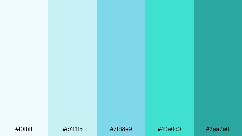
- HEX Codes: #f0fbff, #c7f1f5, #7fd8e9, #40e0d0, #2aa7a0
- Mood: Calm, refreshing, and airy.
- Use for: Ideal for travel vlogs, calming b-roll sequences, and minimalist title cards that need a soft ocean vibe.
Coastal Morning Mist feels like the first quiet walk along the shore, before the beach gets busy. Pale sky blues and light seafoam shades surround a classic turquoise accent, giving your visuals a soft, breathable atmosphere that never feels heavy.
Use this turquoise color palette for minimalist openers, airy lower thirds, and thumbnails that promise peaceful storytelling or slow-living content. In Filmora, you can build simple gradient backgrounds with these HEX codes, pair them with clean white text, and keep your branding light yet recognizable across intros, reels, and channel art.
Pro Tip: Build a Cinematic Turquoise Look in Filmora
When you commit to a palette like Coastal Morning Mist, your video instantly feels more intentional. In Filmora, you can use the same turquoise tones for text, overlays, and background shapes so your b-roll, talking head shots, and thumbnails all share one cohesive ocean-inspired look.
Try sampling the brightest turquoise hex (#40e0d0) for key accents like subscribe buttons or callout boxes, while using the lighter tones (#f0fbff and #c7f1f5) as subtle gradient backdrops. This keeps your visuals cinematic and calm, while still drawing the eye toward the most important parts of your frame.
AI Color Palette
Instead of manually matching every clip, you can let Filmora do the heavy lifting. With Filmora's AI Color Palette feature, you can import a reference still or thumbnail that uses Coastal Morning Mist and automatically apply that soft turquoise mood across all your footage.
Pick one beautifully graded frame that nails your turquoise aesthetic, save it as your reference, and let AI Color Palette match contrast, saturation, and color balance throughout your timeline. This is especially handy for travel vlogs, where lighting shifts from indoors to outdoors but you still want a consistent, misty coastal vibe.
 secure download

HSL, Color Wheels & Curves
Once your turquoise base is in place, fine-tuning it with Filmora's color tools can take the look from simple to cinematic. Use the HSL panel to gently desaturate greens while keeping turquoise vibrant, then adjust color wheels so midtones lean slightly toward teal and highlights stay clean and cool.
If you want a more polished result, combine curves and color wheels as shown in Filmora's color correction tutorials, such as the guides in its color correction tips hub. Lift shadows just a touch for a soft-film feel, and use a slight S-curve in the RGB curve to add contrast without crushing those delicate coastal pastels.
secure download1000+ Video Filters & 3D LUTs
If you want to experiment beyond manual grading, Filmora's video filters and 3D LUTs make it easy to push your turquoise aesthetic toward vintage film, dreamy pastel, or glossy commercial looks. Start with a LUT that suits your genre, then re-balance your turquoise accents using the Coastal Morning Mist HEX codes.
Stack soft glow filters or light leaks in turquoise and aqua for romantic travel b-roll, or choose more subtle cinematic LUTs when you are producing tutorials and brand stories. This way you get the speed of one-click styling without losing the specific color identity of your turquoise palette.
secure downloadLagoon Whisper Glow
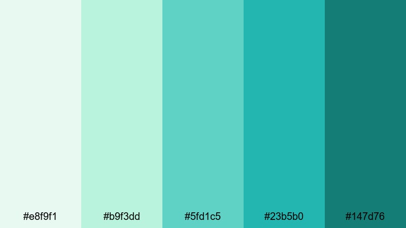
- HEX Codes: #e8f9f1, #b9f3dd, #5fd1c5, #23b5b0, #147d76
- Mood: Peaceful, dreamy, and slightly tropical.
- Use for: Works well for wellness content, yoga intros, and slow-paced cinematic edits with a gentle tropical hint.
Lagoon Whisper Glow blends soft greens and turquoise to create a spa-like, slow-breathing atmosphere. The lighter mint tones keep everything open and clean, while the deeper teal greens add a touch of tropical depth.
Use this palette in wellness intros, guided meditations, or ASMR thumbnails where you want to signal calm without going fully blue. In Filmora, combine these HEX codes in background gradients, line icons, and titles for a consistent wellness brand across long-form videos, shorts, and social posts.
Seafoam Daydream
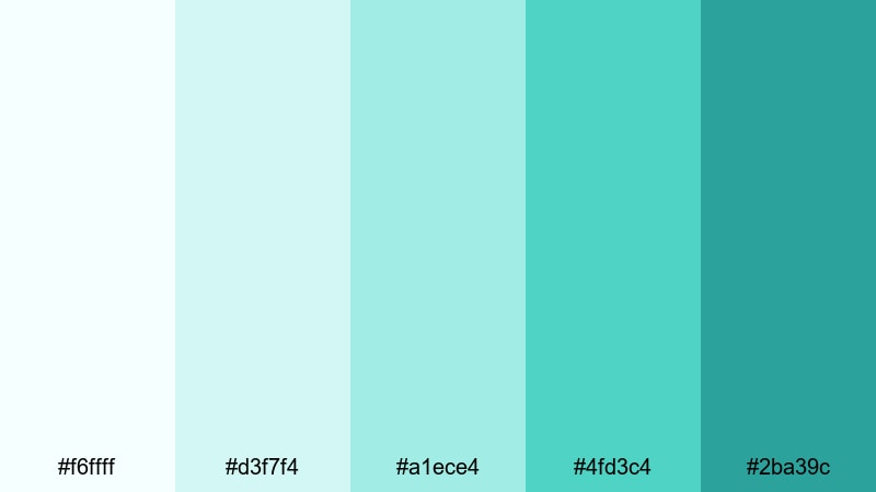
- HEX Codes: #f6ffff, #d3f7f4, #a1ece4, #4fd3c4, #2ba39c
- Mood: Light, optimistic, and uplifting.
- Use for: Use for lifestyle vlogs, morning routines, and soft overlays on text-heavy scenes that need a bright but gentle touch.
Seafoam Daydream is all about fresh mornings and upbeat clarity. White-tinted aquas and soft turquoise create a bright, optimistic feel that is perfect for lifestyle and productivity content.
Apply the lighter shades behind black or dark gray text for high readability in tutorials and how-to videos, and reserve the richer turquoise for buttons, icons, or chapter markers. This palette helps thumbnails feel energetic and clean without the harshness of neon tones.
Cloudlight Aqua
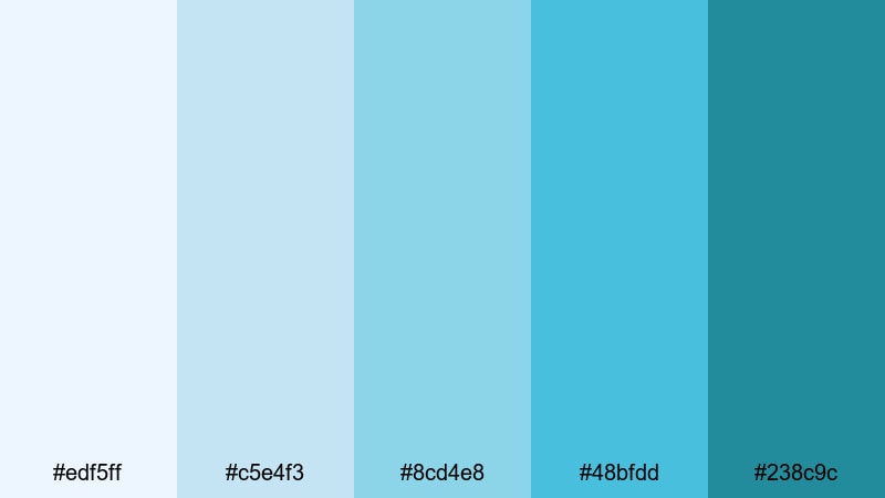
- HEX Codes: #edf5ff, #c5e4f3, #8cd4e8, #48bfdd, #238c9c
- Mood: Clean, cool, and cinematic.
- Use for: Best for cinematic title cards, minimalist lower thirds, and tech explainers that still feel friendly and light.
Cloudlight Aqua leans a bit more blue, combining airy sky tones with crisp turquoise accents. It feels clear and controlled, which works beautifully for cinematic intros, educational content, and product explainers.
Use the darker turquoise (#238c9c) for logos or bold typography, and let the lighter hues fill the background so your graphics have room to breathe. This is an excellent turquoise hex palette if you want a tech-forward look that still feels approachable and fresh.
Bold & Tropical Turquoise Color Palettes
Coral Reef Escape
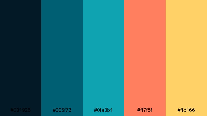
- HEX Codes: #031926, #005f73, #0fa3b1, #ff7f5f, #ffd166
- Mood: Adventurous, vibrant, and energetic.
- Use for: Perfect for travel shorts, adventure reels, and thumbnail designs that need instant tropical impact.
Coral Reef Escape throws rich turquoise and teal against bright coral and golden highlights. The deep navy base adds cinematic contrast, making the warm accents and turquoise pops really explode on screen.
This turquoise and coral color palette is ideal for beach trips, snorkeling reels, and destination guides. Use the dark tones as a background, then layer bold turquoise and coral text or shapes for thumbnails and animated titles that stand out immediately in crowded feeds.
Paradise Surf Pop
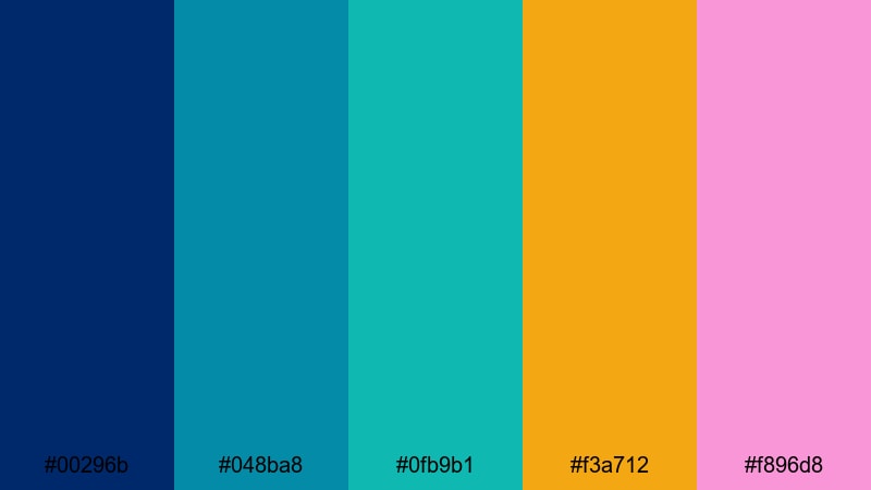
- HEX Codes: #00296b, #048ba8, #0fb9b1, #f3a712, #f896d8
- Mood: Playful, punchy, and sun-soaked.
- Use for: Use in surf edits, festival recaps, and kinetic openers where color needs to feel loud and fun.
Paradise Surf Pop turns turquoise into a beach party. Strong aqua and turquoise tones meet sunny yellow and candy pink, giving you a palette that screams energy and fun.
Use this for kinetic typography, fast cuts, and motion graphics in festival or surf content. Keep your main backgrounds in deep blue (#00296b), then employ the bright turquoise and pink for text, icons, and animated shapes to create bold, clickable thumbnails and intros.
Festival Neon Tides
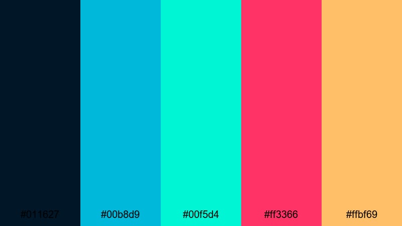
- HEX Codes: #011627, #00b8d9, #00f5d4, #ff3366, #ffbf69
- Mood: Electric, daring, and modern.
- Use for: Great for music videos, event promos, and animated titles that lean into a neon, nightlife aesthetic.
Festival Neon Tides is a high-contrast set of electric turquoise, aqua, neon pink, and warm orange over a deep night-sky background. It instantly reads as nightlife, stage lights, and festival energy.
Use this turquoise color combination for music promos and countdowns, with glowing turquoise outlines and neon text. In thumbnails, place light aqua text on the dark base and frame performers or DJs with pink and orange accents to mimic real stage lighting.
Candy Coastline
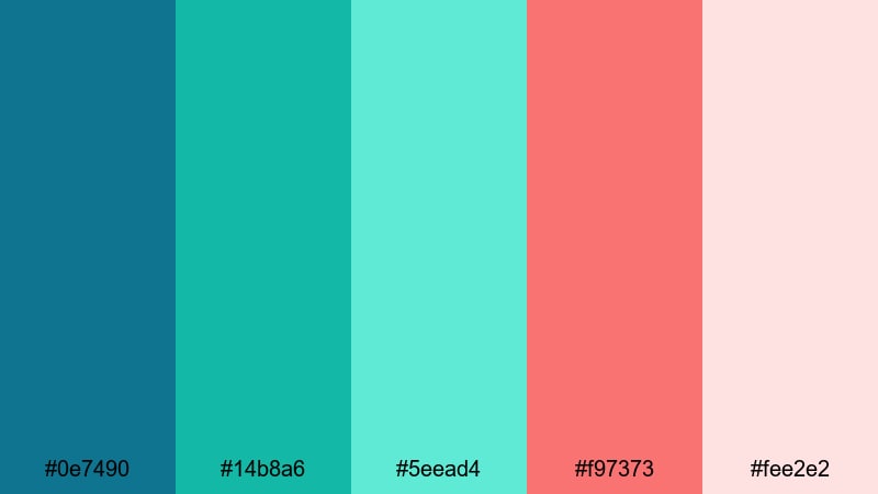
- HEX Codes: #0e7490, #14b8a6, #5eead4, #f97373, #fee2e2
- Mood: Sweet, bright, and playful.
- Use for: Best for kawaii-inspired edits, channel art, and social shorts targeting a fun, youthful audience.
Candy Coastline mixes bright turquoise with soft, candy-like pinks for a kawaii beach aesthetic. The result is youthful and upbeat, perfect for channels aimed at a playful community.
Use the softer pink background with turquoise icons and typography for channel banners and outro screens. For TikTok or Reels, combine these colors in animated stickers, frames, and emojis to create a cohesive turquoise-themed video style that feels friendly and fun.
Modern & Minimal Turquoise Color Palettes
Urban Glass Skyline
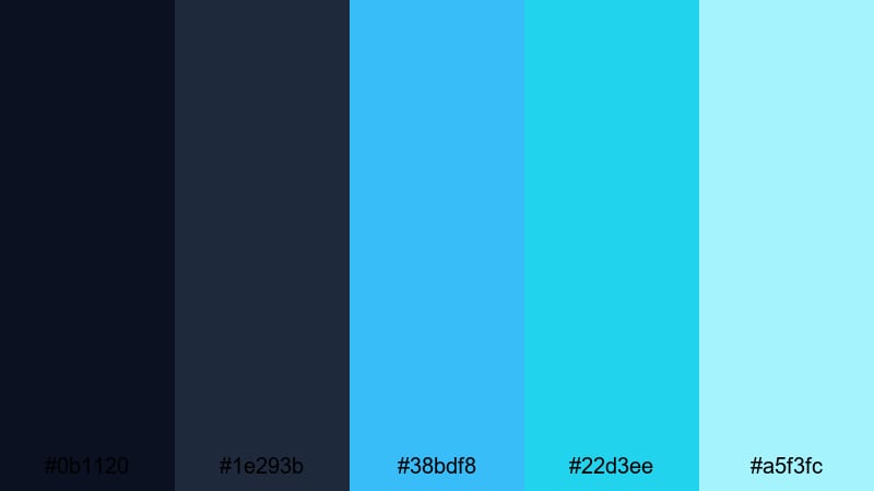
- HEX Codes: #0b1120, #1e293b, #38bdf8, #22d3ee, #a5f3fc
- Mood: Sleek, futuristic, and professional.
- Use for: Ideal for tech reviews, app demos, and UI-style motion graphics with a polished city-at-night feel.
Urban Glass Skyline pairs dark navy foundations with glassy turquoise and cyan highlights. It feels like reflective skyscraper windows at night, which works especially well for tech brands and startup content.
Use the darkest tones as your base layer in Filmora, then build UI-style panels, buttons, and line icons in the bright turquoise and aqua. This keeps your thumbnails clean and on-brand for tech reviews, software explainers, and case study videos.
Nordic Aqua Studio
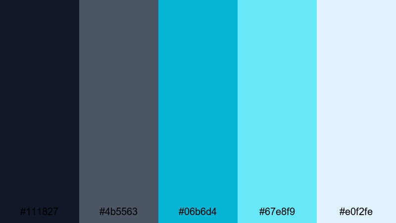
- HEX Codes: #111827, #4b5563, #06b6d4, #67e8f9, #e0f2fe
- Mood: Cool, minimal, and design-forward.
- Use for: Use in portfolio reels, design case studies, and branding videos that need a calm but sophisticated palette.
Nordic Aqua Studio mixes muted charcoal grays with clean aqua accents for a Scandinavian design feel. The turquoise tones stay crisp but are balanced by neutral backgrounds, which keeps everything polished.
Use this as your aesthetic color palette for vlogs about design, productivity, or studio setups. In Filmora, combine gray backdrops with subtle aqua highlight lines, underlines, and icons so your on-screen text and UI mockups look professional and uncluttered.
Digital Interface Aqua
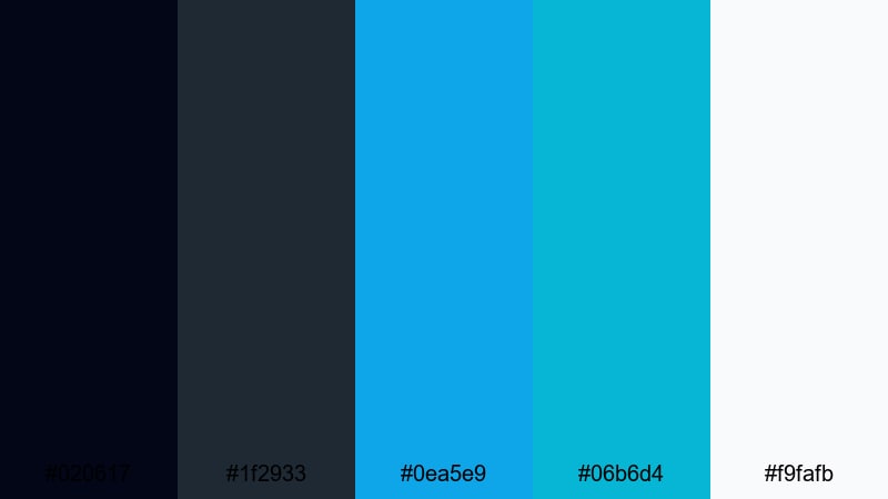
- HEX Codes: #020617, #1f2933, #0ea5e9, #06b6d4, #f9fafb
- Mood: Techy, precise, and crisp.
- Use for: Great for software tutorials, UI mockups, and lower thirds that mimic clean dashboard and interface styling.
Digital Interface Aqua offers inky dark bases with sharp turquoise and sky-blue highlights, plus a clean white for contrast. It feels like a dashboard UI brought to life.
Use it for screen-recording tutorials, coding videos, or SaaS explainers. Place turquoise accents on key UI elements, and use white text on the dark background for clarity. In thumbnails, frame screenshots with turquoise borders so your content is instantly recognizable.
Monochrome Wave Grid
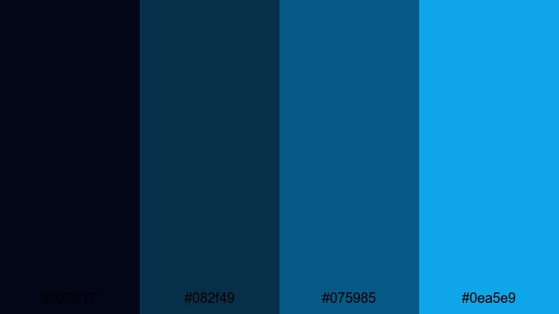
- HEX Codes: #020617, #082f49, #075985, #0ea5e9
- Mood: Focused, minimal, and controlled.
- Use for: Best for logo reveals, glitch effects, and HUD-style graphics where a tight blue-turquoise range keeps things cohesive.
Monochrome Wave Grid keeps everything within a tight range of deep blues and turquoise. Because there are no contrasting warm tones, the result is very controlled and minimal.
Use this turquoise hex palette for logo stings, HUD overlays, and data visualizations. Your animations can be complex, but the restrained color range keeps the design clean and easy to follow, especially in tech and gaming content.
Vintage & Boho Turquoise Color Palettes
Retro Motel Pool
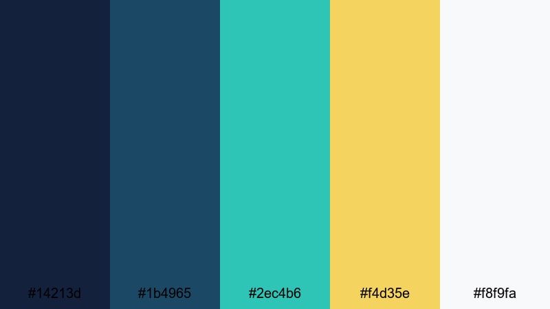
- HEX Codes: #14213d, #1b4965, #2ec4b6, #f4d35e, #f8f9fa
- Mood: Nostalgic, sunny, and cinematic.
- Use for: Perfect for retro travel edits, vintage title cards, and cinematic overlays with a classic roadside motel feel.
Retro Motel Pool pairs poolside turquoise with deep blues and buttery yellow accents, giving your visuals a nostalgic vacation vibe. It feels like classic road-trip postcards and 60s motel signs.
Use this turquoise color palette for stylized travel vlogs, retro-styled intros, and chapter cards. Add film grain and a slight vignette in Filmora to enhance the vintage mood, and use the yellow as a highlight for prices, dates, or episode numbers in your thumbnails.
Desert Turquoise Charm
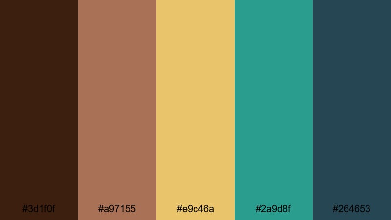
- HEX Codes: #3d1f0f, #a97155, #e9c46a, #2a9d8f, #264653
- Mood: Warm, earthy, and artisanal.
- Use for: Use in documentary-style travel pieces, boho lookbooks, and brand films with handcrafted textures.
Desert Turquoise Charm combines sunbaked browns and ochres with a rich desert turquoise. The result is earthy and grounded, ideal for storytelling set in markets, deserts, or artisan studios.
Use this palette in docu-style travel edits, boho brand films, and handmade product features. Keep text in the darker teal (#264653) and use turquoise (#2a9d8f) for line details and icons, layered over warm-beige footage or textured paper backgrounds.
Boho Beaded Shores
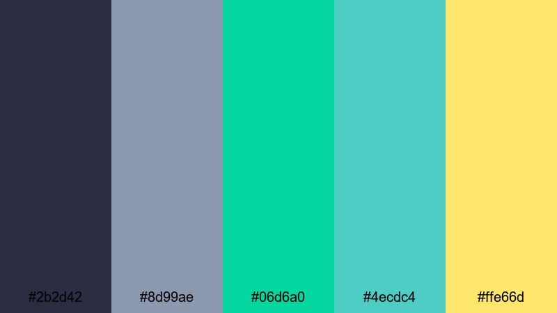
- HEX Codes: #2b2d42, #8d99ae, #06d6a0, #4ecdc4, #ffe66d
- Mood: Artistic, eclectic, and free-spirited.
- Use for: Best for boho fashion videos, music sessions, and creative lifestyle vlogs that mix handmade and coastal influences.
Boho Beaded Shores mixes muted charcoal and slate with bright turquoise and sunny yellow. It feels like a beach market full of handmade jewelry and textiles.
Use this turquoise color combination for music sessions, fashion lookbooks, and creative lifestyle vlogs. Let the darker tones anchor your titles and frames, while the turquoise and yellow appear as bead-like accents, brush strokes, or animated shapes to give your edits an expressive, handcrafted look.
Tips for Creating Turquoise Color Palettes
When you build a turquoise color palette for video and design, the right supporting colors, contrast levels, and text treatments will decide whether your visuals feel calm, tropical, techy, or chaotic.
- Decide the mood first: pair turquoise with soft whites and pale blues for calm content, or with coral and yellow for energetic, tropical edits.
- Protect readability: always test white and dark text over your turquoise backgrounds to make sure subtitles, titles, and UI labels stay legible on mobile.
- Limit accent colors: choose one or two accent hues (like coral or yellow) alongside turquoise so thumbnails and overlays remain cohesive, not cluttered.
- Match your footage: if your main scenes already feature ocean or sky, pick turquoise HEX codes that are slightly brighter or darker so overlays stand out without clashing.
- Use darker turquoise for branding: keep logos and key icons in the deeper turquoise or teal shades so they remain visible across light and dark footage.
- Stay consistent across formats: reuse the same turquoise hex palette in your intros, end screens, channel banner, and lower thirds for instant visual recognition.
- Balance warm and cool: add small touches of warm tones (coral, peach, or gold) when your turquoise palette feels too cold or overly clinical.
- Test in grayscale: quickly preview your designs in grayscale to check contrast; if text and important shapes still pop, your turquoise combination is strong.
Turquoise is one of the most versatile colors for creators, shifting from spa-like calm to neon festival energy depending on the palette around it. With these 15 turquoise color palettes and hex codes, you can quickly shape the mood of your channel, strengthen your brand identity, and make your thumbnails and intros instantly recognizable.
Try dropping these HEX codes directly into Filmora for titles, shapes, and overlays, then build matching color grades using AI Color Palette, HSL adjustments, and LUTs. With a consistent turquoise aesthetic across your edits, every upload will feel more polished and professional.
Experiment, save your favorite turquoise presets, and refine them over time. The more intentionally you use color, the more your audience will feel the mood you are trying to create the moment your video appears in their feed.
secure downloadNext: Tan Brown Color Palette
