Gold Dark Blue is a classic combination that mixes the depth of navy with the glow of metallic gold. The dark blue brings stability, trust, and cinematic drama, while gold adds luxury, warmth, and a touch of spotlight energy. Together, they feel premium and polished, which is why this duo shows up so often in film posters, sports events, financial brands, and award-show visuals.
For video creators and Filmora users, a well-planned Gold Dark Blue color palette can instantly level up thumbnails, intros, overlays, lower thirds, and even full color grading. Below are 15 ready-to-use Gold Dark Blue color palettes with HEX codes, so you can match titles, graphics, and footage for a cohesive, high-end look in every project.
In this article
Elegant Gold Dark Blue Color Palettes
Midnight Gala Luxe
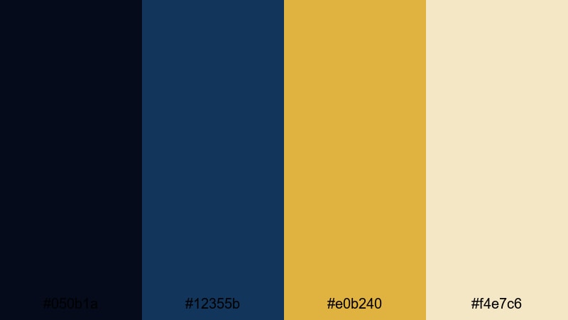
- HEX Codes: #050b1a, #12355b, #e0b240, #f4e7c6
- Mood: Luxurious, cinematic, and polished.
- Use for: Perfect for cinematic title cards, luxury brand intros, and premium YouTube channel branding.
This palette pairs inky midnight blue (#050b1a) and deep navy (#12355b) with a refined champagne gold (#e0b240) and soft highlight ivory (#f4e7c6). It feels like a red-carpet night under spotlights, where every frame looks rich and intentional.
Use Midnight Gala Luxe for opening title cards, logo reveals, end screens, and lower thirds in high-end product videos or luxury-themed vlogs. Dark blues can frame your scene or background, while gold accents highlight key text, subscribe buttons, and important on-screen elements without overwhelming the viewer.
Pro Tip: Build a Cinematic Gold Dark Blue Look in Filmora
To keep a Midnight Gala Luxe mood consistent across your whole edit, design a few key elements in these HEX values, then reuse them inside Filmora. Create a title preset with navy as the background, champagne gold for the main text, and ivory for subtitles. Reapply this preset for intros, chapter cards, and outros so every segment feels like part of the same cinematic brand.
You can also add a subtle vignette in dark blue over your footage and then use gold-toned overlays for transitions or logo stings. This keeps your content grounded in deep navy tones, while the gold accents draw the viewer's eye exactly where you want it.
AI Color Palette
If you already have a still frame, thumbnail design, or moodboard that nails this Gold Dark Blue balance, you can turn it into a reference look for your whole video. Filmora's AI Color Palette feature analyzes the colors from one clip and applies a matching palette to other shots with just a few clicks.
Import your hero frame that shows the perfect mix of deep blue shadows and warm gold highlights. Then use AI Color Palette to match other scenes, b-roll, and even talking-head clips so everything shares the same luxe tone, even if you shot in different locations or lighting conditions.
HSL, Color Wheels & Curves
Once your base palette is in place, you can fine-tune the Gold Dark Blue tones in Filmora using HSL, color wheels, and curves. Slightly deepen blues in the midtones and shadows to make the image more cinematic, then warm up the highlights so gold jewelry, lights, or text overlays glow without clipping.
If you want more control, adjust specific hue ranges in the HSL panel and refine contrast with curves. This approach, similar to techniques shown in Filmora's tutorials such as this guide to color grading in Filmora, helps you keep skin tones natural while still leaning heavily into the luxurious navy-and-gold look.
1000+ Video Filters & 3D LUTs
If you want to stylize your Gold Dark Blue palette even faster, Filmora's built-in filters and LUTs can push your edit toward a specific mood: moody cinema, glossy commercial, or elegant documentary. Start with a filter or LUT that adds contrast and saturation to blues, then fine-tune the strength so gold accents stay rich, not oversaturated.
Filmora's video filters and 3D LUTs make it easy to test multiple looks on your timeline until you find the perfect one for your Midnight Gala Luxe visuals. Save your favorite combinations as presets so all your future intros and thumbnails stay on-brand.
Royal Harbor Crest
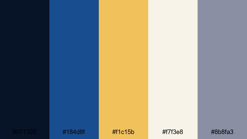
- HEX Codes: #071326, #184d8f, #f1c15b, #f7f3e8, #8b8fa3
- Mood: Regal, confident, and timeless.
- Use for: Use in documentary lower thirds, channel logos, and authority-building explainer videos.
Royal Harbor Crest layers a near-black navy (#071326) with a brighter ocean blue (#184d8f), then crowns them with a bold brushed gold (#f1c15b). Light cream (#f7f3e8) and muted slate (#8b8fa3) keep the palette balanced and readable.
This is an excellent choice for channels that want authority without feeling cold: finance explainers, history documentaries, or expert-led tutorials. Use the darkest blue as a background, the medium blue for accents or lines, and the gold for key icons, subscribe CTAs, and titles. The soft cream can sit behind text in thumbnails and end screens to keep contrast strong but not harsh.
Cathedral Velvet Trim
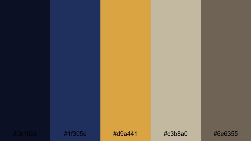
- HEX Codes: #0b1024, #1f305e, #d9a441, #c3b8a0, #6e6355
- Mood: Opulent, historic, and warm.
- Use for: Works beautifully for cinematic trailers, title sequences, and heritage-inspired brand identities.
Cathedral Velvet Trim blends velvety blues (#0b1024 and #1f305e) with an antique-feeling gold (#d9a441), softened by stone-like neutrals (#c3b8a0 and #6e6355). It echoes stained glass, carved wood, and gilded details in old cathedrals.
Use this palette for narrative intros, historical content, or brand stories that aim to feel rooted and serious. The darkest blue works well in letterbox bars, while the mid blue supports frames or sidebar shapes. Antique gold can highlight important dates or names, and the muted neutrals are perfect for background panels behind on-screen text or chapter markers.
Regal Art Deco Lines
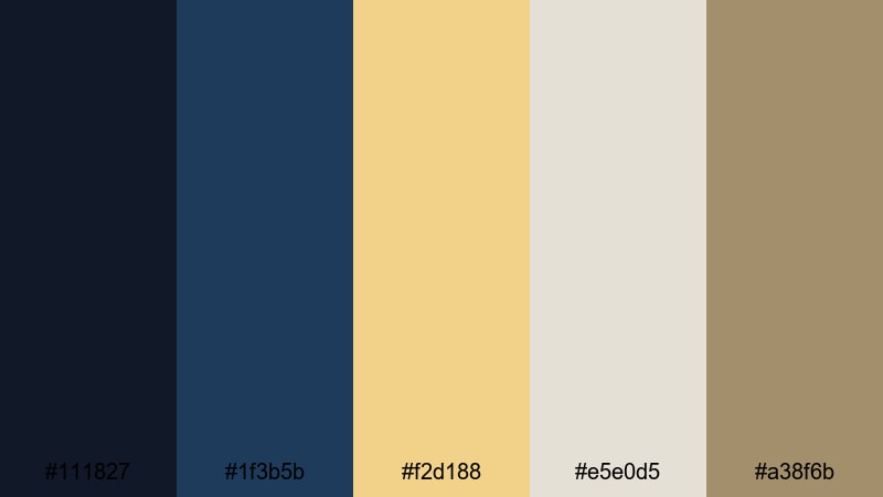
- HEX Codes: #111827, #1f3b5b, #f2d188, #e5e0d5, #a38f6b
- Mood: Sophisticated, vintage, and structured.
- Use for: Great for geometric motion graphics, stylish lower thirds, and title cards with a vintage cinema feel.
Regal Art Deco Lines captures the glamour of classic theaters: structured deep blues (#111827, #1f3b5b), warm champagne gold (#f2d188), soft cream (#e5e0d5), and a muted bronze accent (#a38f6b). It feels both retro and surprisingly modern.
Apply this palette to geometric line animations, frame borders, and text panels. Use the darker blue for full-screen backgrounds, the mid blue for lines and dividers, then layer gold for headline text or frames. The lighter neutrals are ideal for body text areas in explainer slides or YouTube chapter cards, keeping everything easy to read on any screen.
Gilded Nightfall Minimal
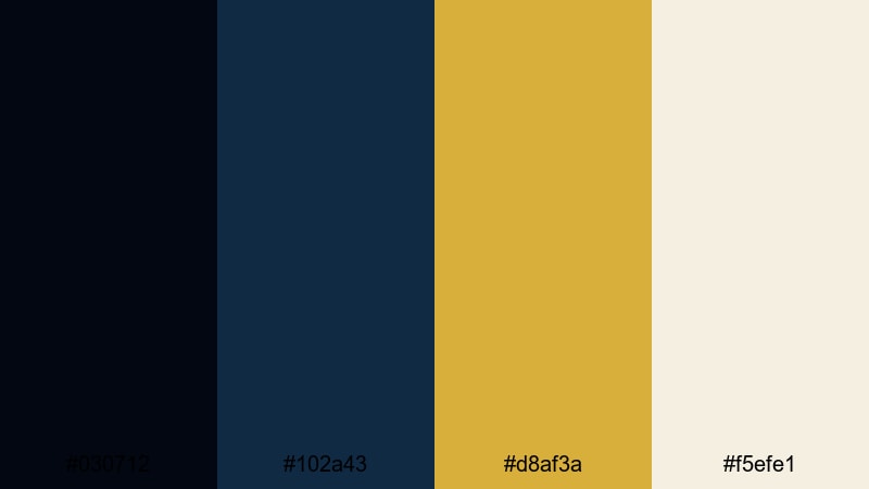
- HEX Codes: #030712, #102a43, #d8af3a, #f5efe1
- Mood: Minimal, sleek, and high-end.
- Use for: Use for luxury product showcases, tech promos, and minimalist channel branding.
Gilded Nightfall Minimal strips the Gold Dark Blue look down to essentials: almost-black blue (#030712), a clean navy (#102a43), a sharp gold accent (#d8af3a), and a soft ivory background (#f5efe1). The result is sleek and modern.
Use the darkest blue to fade edges or backgrounds behind product shots, with the navy driving key UI elements like buttons or icons. A small dose of bright gold is enough for logo marks, price tags, or call-to-action text. Ivory backgrounds make your thumbnails and title cards look light and premium, especially when paired with simple typography and minimal graphics.
Bold Gold Dark Blue Color Palettes
Neon Docklights
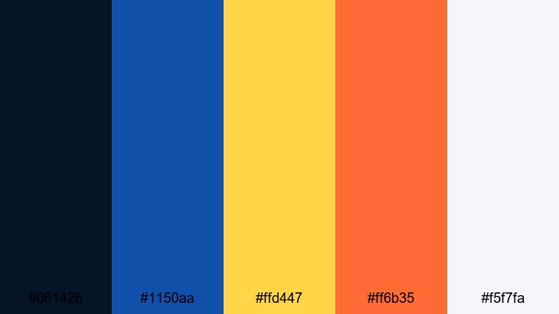
- HEX Codes: #061426, #1150aa, #ffd447, #ff6b35, #f5f7fa
- Mood: Energetic, modern, and attention-grabbing.
- Use for: Perfect for YouTube thumbnails, gaming intros, and high-energy promo edits.
Neon Docklights cranks up the intensity with electric blue (#1150aa), a bold neon gold (#ffd447), and a hot orange accent (#ff6b35), anchored by deep navy (#061426) and pale off-white (#f5f7fa). It feels like city lights reflecting on water at night.
Use this palette to build clickable thumbnails and punchy lower thirds. The darkest blue can be your base, with electric blue and gold outlining characters or text. Drop orange on key buttons, arrows, or streaks behind kinetic typography to trigger instant attention in social feeds and YouTube recommendations.
Cinematic Championship
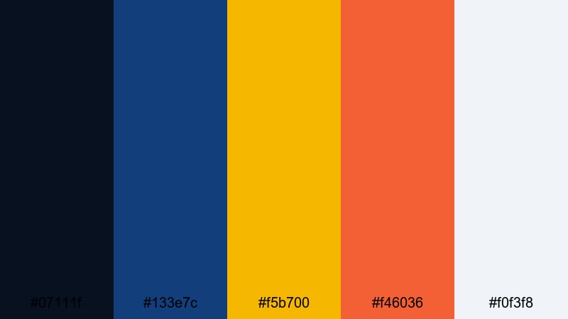
- HEX Codes: #07111f, #133e7c, #f5b700, #f46036, #f0f3f8
- Mood: Triumphant, sporty, and cinematic.
- Use for: Ideal for sports edits, event recaps, and hype reels with strong motion graphics.
Cinematic Championship blends stadium-night navy (#07111f, #133e7c) with a strong trophy gold (#f5b700) and energetic warm orange (#f46036). A soft highlight tone (#f0f3f8) keeps text and graphics readable.
This palette is perfect for countdown timers, score animations, and high-energy recap reels. Use the blues for backgrounds and overlays, gold for team names and numbers, and orange as a secondary accent for streaks, flares, and glitch transitions. The pale tone can back your text blocks in highlight reels and social cutdowns.
Cosmic Tide Treasure
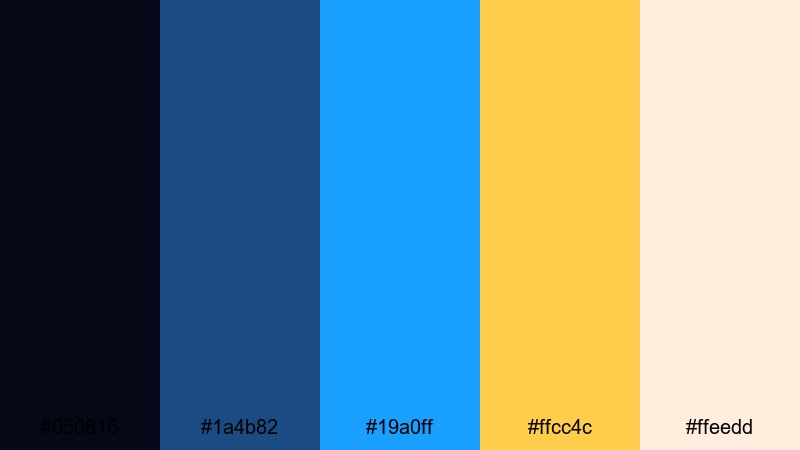
- HEX Codes: #050816, #1a4b82, #19a0ff, #ffcc4c, #ffeedd
- Mood: Futuristic, adventurous, and bright.
- Use for: Use in sci-fi openers, tech explainers, and animated infographics that need pop without losing depth.
Cosmic Tide Treasure combines a space-deep navy (#050816) with clear sea blue (#1a4b82), a neon cyan highlight (#19a0ff), and a vivid treasure gold (#ffcc4c). Creamy ivory (#ffeedd) adds warmth and balance.
Try this palette for tech launches, space content, or futuristic explainers. Dark blue can fill the background, lighter blues and cyan can highlight data, lines, and HUD elements, while gold marks important stats or calls to action. The ivory hue works well behind text in infographics and on slide-like sequences inside your video.
Urban Skyline Glint
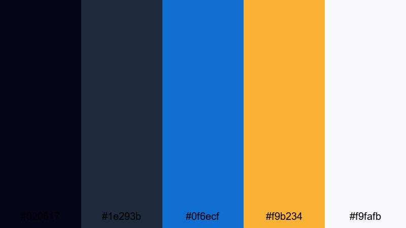
- HEX Codes: #020617, #1e293b, #0f6ecf, #f9b234, #f9fafb
- Mood: Contemporary, urban, and dynamic.
- Use for: Great for travel vlogs, city montages, and startup pitch videos.
Urban Skyline Glint pairs concrete-like dark blues (#020617, #1e293b) with a strong city-sky blue (#0f6ecf), a glowing gold accent (#f9b234), and near-white (#f9fafb). It captures the feeling of skyscrapers catching the last light of day.
Use the dark blues to frame city footage, then layer bright blue for lines, pins, or digital map graphics. Reach for gold to call out prices, key metrics, or location names in pitch decks and travel intros. The off-white keeps charts and text blocks clean, especially in video presentations or LinkedIn-style content.
Festival Marquee Waves
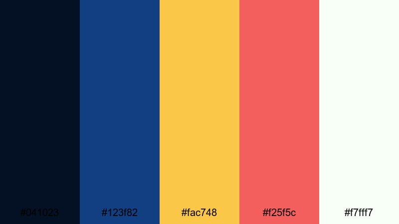
- HEX Codes: #041023, #123f82, #fac748, #f25f5c, #f7fff7
- Mood: Festive, bold, and playful.
- Use for: Perfect for event promos, festival recaps, and music video lyric animations.
Festival Marquee Waves mixes deep and medium blues (#041023, #123f82) with a bright marquee gold (#fac748) and a fun coral red (#f25f5c). A fresh off-white (#f7fff7) softens the overall look.
Choose this palette when you want your thumbnails and lyric videos to pop instantly. Use the darker blue in backgrounds and gradient overlays, let gold and coral drive animated shapes, waveforms, or bouncing text, and reserve the off-white for lyric lines or event details so they stay readable even on small screens.
Soft Gold Dark Blue Color Palettes
Dawn Harbor Mist
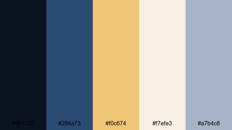
- HEX Codes: #0b1220, #284a73, #f0c674, #f7efe3, #a7b4c8
- Mood: Calm, reflective, and cozy.
- Use for: Use for lifestyle vlogs, travel diaries, and calming productivity content.
Dawn Harbor Mist softens the Gold Dark Blue idea with misty navy (#0b1220), soft marina blue (#284a73), gentle golden light (#f0c674), warm cream (#f7efe3), and cool gray-blue (#a7b4c8). It feels like early morning at a quiet dock.
This palette works well for slower edits, cozy desk setups, and reflective voiceovers. Use the blues as subtle tints in overlays or background shapes, let the gold peek through in subtle icons, timestamps, or progress bars, and keep the light creams and grays behind your text blocks for a relaxing, uncluttered look.
Moonlit Champagne Foam
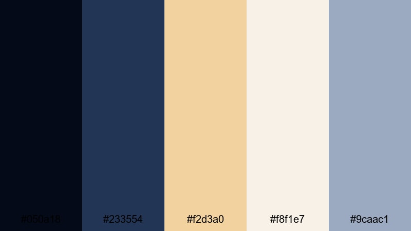
- HEX Codes: #050a18, #233554, #f2d3a0, #f8f1e7, #9caac1
- Mood: Dreamy, romantic, and gentle.
- Use for: Great for wedding films, engagement reels, and emotional storytelling pieces.
Moonlit Champagne Foam combines dark moonlit blues (#050a18, #233554) with soft champagne tones (#f2d3a0, #f8f1e7) and muted blue-gray (#9caac1). It creates a dreamy, romantic glow without looking overly saturated.
Use this palette in wedding highlights, proposal videos, and emotional storytelling edits. The blues can frame your footage with vignettes or gradient overlays, while champagne tones shine in titles, date cards, and delicate animated flourishes. The muted gray-blue can support minimal icons and chapter markers in longer edits.
Pastel Marina Glow
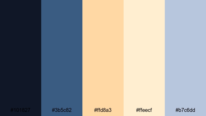
- HEX Codes: #101827, #3b5c82, #ffd8a3, #ffeecf, #b7c6dd
- Mood: Light, airy, and optimistic.
- Use for: Ideal for family vlogs, educational content, and cheerful brand intros.
Pastel Marina Glow takes solid Gold Dark Blue roots (#101827, #3b5c82) and washes them with sunny pastel golds (#ffd8a3, #ffeecf) and a soft blue-gray (#b7c6dd). It feels bright, friendly, and slightly coastal.
This is a great palette when you want to stay polished but approachable. Use deeper blues to anchor your frames and nav-style elements in overlays, while pastel golds fill background shapes for intros, tips, or FAQ sections. The gentle blue-gray keeps body text easy to read on slides and info cards while maintaining a soft, positive tone.
Quiet Library Gilding
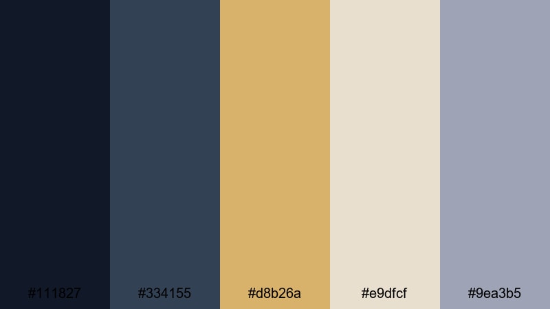
- HEX Codes: #111827, #334155, #d8b26a, #e9dfcf, #9ea3b5
- Mood: Thoughtful, intellectual, and warm.
- Use for: Use for educational channels, book reviews, and long-form commentary videos.
Quiet Library Gilding uses subdued blues (#111827, #334155), a bookish gold (#d8b26a), soft paper-like cream (#e9dfcf), and a muted gray-blue (#9ea3b5). It feels like worn leather spines and soft lighting in an old study room.
Try this palette for book reviews, commentary essays, or educational deep dives. Keep the screen calm with blue backgrounds and cream panels behind your text. Use gold sparingly for underlines, bullets, or key phrases in your overlays, while gray-blue is perfect for secondary text and small labels on charts.
Sapphire Latte Haze
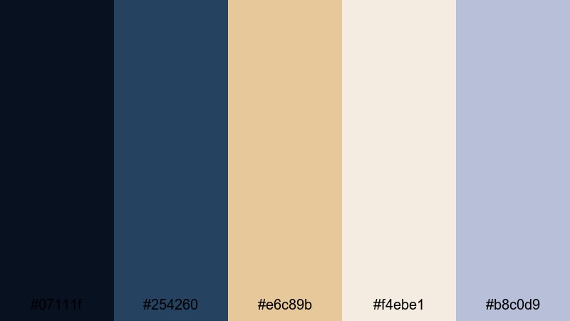
- HEX Codes: #07111f, #254260, #e6c89b, #f4ebe1, #b8c0d9
- Mood: Relaxed, modern, and inviting.
- Use for: Great for cafe vlogs, podcasts, and aesthetic productivity or study videos.
Sapphire Latte Haze brings together soft sapphire blues (#07111f, #254260) with latte and cream tones (#e6c89b, #f4ebe1) and a muted periwinkle (#b8c0d9). It reads modern and cozy, like a chic cafe interior.
Use this palette for podcast covers, quiet desk vlogs, or study-with-me content. Blues can tint your backgrounds and overlays, while latte and cream colors support titles, timestamps, and lower thirds. The periwinkle accent works well in UI-style elements like progress bars, playlists, or chapter markers that sit on top of your footage.
Tips for Creating Gold Dark Blue Color Palettes
When you design your own Gold Dark Blue color palette for video or branding, a few simple rules help keep your visuals both stylish and practical across intros, overlays, subtitles, and thumbnails.
- Decide on your base: choose one main dark blue for backgrounds and shadows, then pick one primary gold for accents so your palette does not feel chaotic.
- Control contrast: test white, ivory, and light beige text against your dark blues in thumbnail sizes to make sure titles stay readable on mobile.
- Limit bright accents: intense gold or orange accents should highlight only key elements like CTAs, numbers, or icons so the viewer knows where to look first.
- Balance warm and cool tones: if your footage is already very warm, lean into cooler blues and softer gold; if your footage is cool, a richer gold can add energy.
- Add at least one neutral: include a cream, off-white, or gray so you have a calm background for body text, subtitles, charts, and infographics.
- Match your brand personality: deeper, muted blues and antique gold feel serious and premium, while brighter blues and neon golds feel modern and energetic.
- Test in motion: preview transitions, lower thirds, and overlays in Filmora to see how your colors behave over real footage, not only on a static palette card.
- Save presets: once you find a Gold Dark Blue combination you like, save title, filter, and color settings as presets in Filmora so every new video stays consistent.
Gold Dark Blue color palettes are powerful tools for shaping mood, trust, and perceived quality in your videos. Whether you want a royal documentary style, a bold gaming intro, or a soft romantic look, the right mix of deep navy and refined gold can instantly define your brand identity on screen.
Use the HEX codes in this guide as starting points for your titles, overlays, and color grading. Then refine them in Filmora, matching the palette to your real footage, lighting, and subject matter until everything feels cohesive.
The more you reuse a consistent palette across intros, thumbnails, and social cutdowns, the more recognizable your channel or brand becomes. Experiment, save your favorite looks as presets, and let Gold Dark Blue give your content a cinematic, professional finish.


 100% Security Verified | No Subscription Required | No Malware
