
 100% Security Verified | No Subscription Required | No Malware

Gray green sits between neutral gray and muted green, which gives it a calm, grounded personality. It feels modern but still organic, so it works beautifully for creators who want their visuals to look cinematic, focused, and easy on the eyes. In video, gray green is often used for backgrounds, overlays, and color grades that feel serene and premium without being too bright or distracting.
This guide rounds up 15 gray green color palettes with ready to use HEX codes for thumbnails, intros, vlogs, branding, UI, and more. Every palette is tailored for creative projects and can be applied easily in Filmora, whether you are building a full channel look or just grading a single cinematic reel.
In this article
Soft & Serene Gray Green Color Palettes
Misty Harbor Hush
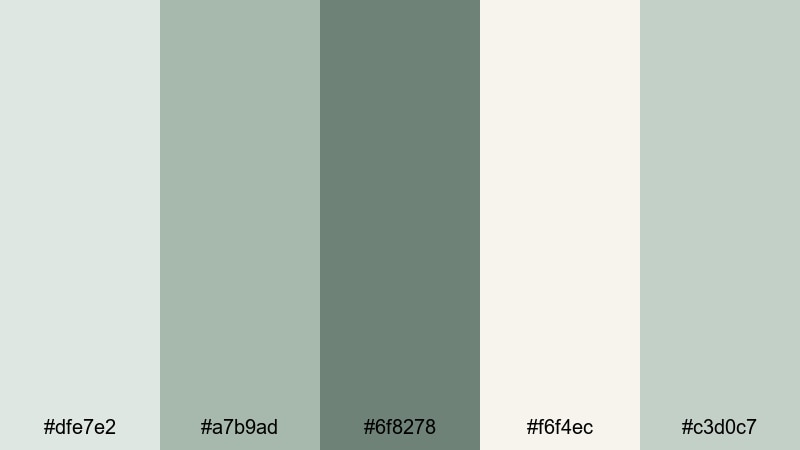
- HEX Codes: #dfe7e2, #a7b9ad, #6f8278, #f6f4ec, #c3d0c7
- Mood: Calm, airy, and reflective.
- Use for: Ideal for cinematic vlogs, slow-travel B-roll, and gentle tutorial intros.
Misty Harbor Hush mixes pale gray greens with muted cream to create a light, hazy atmosphere. It feels like a quiet morning by the water, where everything is soft, balanced, and slightly dreamy. This palette will not compete with your subject, so faces, products, and text still stand out clearly.
Use these tones for intro slates, lower thirds, and background graphics in your vlogs or tutorials. The gentle contrast works beautifully in YouTube thumbnails, channel banners, and reel covers when you want a cinematic but approachable gray green aesthetic.
Pro Tip: Build A Soft Gray Green Aesthetic In Filmora
To keep a Misty Harbor Hush look across your project, design your main elements once in Filmora, then reuse them as presets. Create an intro title, a lower third, and an end screen using these HEX codes, then save them as custom templates so every new video lands in the same gray green world.
You can also apply a subtle color grade that leans toward these muted greens and soft off-whites. When your B-roll, overlays, and motion graphics all share a similar gray green bias, your whole edit feels more cinematic and cohesive, even if you filmed in different locations or lighting.
AI Color Palette
If you have a reference frame that perfectly captures this soft harbor mood, you can use Filmora's AI Color Palette feature to spread that look across every clip. The AI analyzes the colors in your reference shot and automatically matches other footage to the same gray green balance.
Try exporting a simple color card with these HEX codes or grabbing a still frame from your favorite graded clip. Feed that into AI Color Palette and apply it to your vlog timelines, B-roll sequences, or short social edits so everything shares the same airy, reflective tone with almost no manual tweaking.
 secure download

HSL, Color Wheels & Curves
Once your base look is in place, you can refine your gray green tones with Filmora's HSL, color wheels, and curves. Slightly lowering saturation in the greens while lifting brightness in the highlights will keep your footage light and misty, without losing important detail in the midtones.
Use the color wheels to cool down shadows and add a hint of sage into midtones for a cinematic wash. Then, with curves, you can add a soft S-curve for gentle contrast, making outlines and subjects pop while preserving the relaxed, airy mood of Misty Harbor Hush.
secure download1000+ Video Filters & 3D LUTs
If you want to move faster, Filmora's video filters and 3D LUTs make it easy to stylize any gray green palette. Start with a subtle cinematic LUT, then tweak intensity so your #dfe7e2 and #a7b9ad tones stay soft and believable.
Layer light film grain, vignettes, and glow effects on top of your Misty Harbor Hush colors to instantly turn everyday footage into something that feels handcrafted. Once you like the result, save it as a custom preset and reuse it across vlogs, reels, and shorts to keep your gray green branding consistent.
secure downloadDawn Fog Meadows
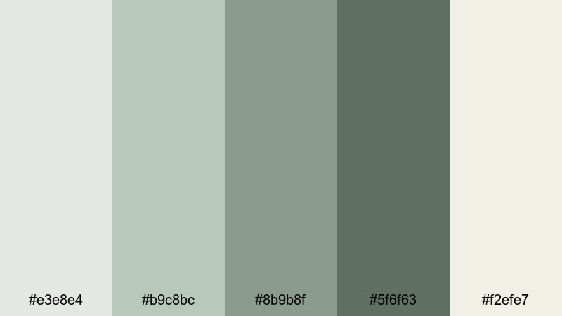
- HEX Codes: #e3e8e4, #b9c8bc, #8b9b8f, #5f6f63, #f2efe7
- Mood: Gentle, hopeful, and soothing.
- Use for: Perfect for lifestyle vlogs, morning routines, and wellness channel branding.
Dawn Fog Meadows captures the feeling of walking through a quiet meadow at sunrise. The soft light grays and muted greens keep everything gentle, while the deeper gray green shade adds just enough depth for clean typography and UI elements.
Use this palette for intro screens, step by step cards, and overlay titles in wellness or lifestyle content. It is also ideal for Instagram Reels covers and Pinterest graphics where you want a gray green look that signals calm productivity and slow living.
Quiet Studio Light
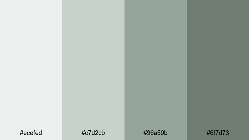
- HEX Codes: #ecefed, #c7d2cb, #96a59b, #6f7d73
- Mood: Minimal, contemplative, and clean.
- Use for: Great for productivity videos, study with me content, and subtle YouTube channel art.
Quiet Studio Light uses pale grays and mid tone gray greens to mimic soft daylight in a tidy workspace. It feels professional but still warm enough for personal content, which makes it perfect for creators who want their brand to look focused, not flashy.
Apply these colors to timers, progress bars, and overlay text in study or work sessions. They also make strong bases for channel banners, profile headers, and thumbnail frames where clean typography needs a low contrast yet sophisticated backdrop.
Cloudsoft Sage Blend
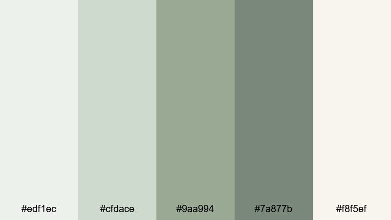
- HEX Codes: #edf1ec, #cfdace, #9aa994, #7a877b, #f8f5ef
- Mood: Dreamy, cozy, and balanced.
- Use for: Use for soft title cards, recipe videos, and calming Instagram Reels overlays.
Cloudsoft Sage Blend sits between creamy whites and gentle sage tinted grays, giving your visuals a cozy, cloudlike glow. Skin tones tend to look flattering against these hues, which is great for face camera content or cooking videos.
Use this palette for lower thirds, step labels in recipe videos, and fullscreen quote cards. In thumbnails, pair a deeper gray green with the cream highlight tone for text that is readable but still soft and on brand.
Modern & Minimal Gray Green Color Palettes
Urban Concrete Sage
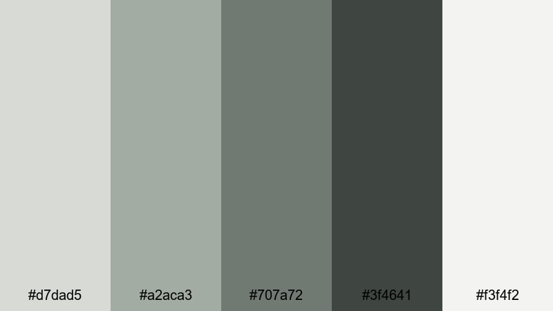
- HEX Codes: #d7dad5, #a2aca3, #707a72, #3f4641, #f3f4f2
- Mood: Sleek, grounded, and contemporary.
- Use for: Ideal for tech reviews, urban travel edits, and minimalist brand intros.
Urban Concrete Sage blends cool concrete grays with deep sage accents for a refined city feel. It looks like glass, stone, and plants in a modern apartment or co working space, which works perfectly for tech and productivity focused channels.
Use the darker tones for headline text, logo marks, and button backgrounds, while the light off white becomes your default video background or content frame. This palette keeps thumbnails clean and consistent across a whole playlist or series.
Tech Loft Alloy
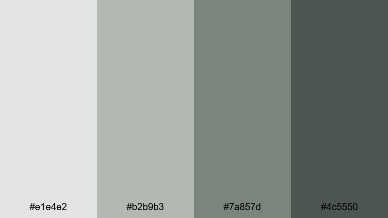
- HEX Codes: #e1e4e2, #b2b9b3, #7a857d, #4c5550
- Mood: Cool, professional, and futuristic.
- Use for: Great for app demos, UI mockups, and product launch teasers.
Tech Loft Alloy leans into cool alloy grays with a soft green undertone, giving a high tech look that still feels human. The darker shade is perfect for bold text and accent lines, while the lighter ones keep backgrounds bright enough for screen recordings.
Use this palette in product demo overlays, callout boxes, and animated UI elements. For launch thumbnails, pair the deepest gray green with a light alloy gray and your product shot in the center to create a sleek, minimalist frame.
Slate Screen Serenity
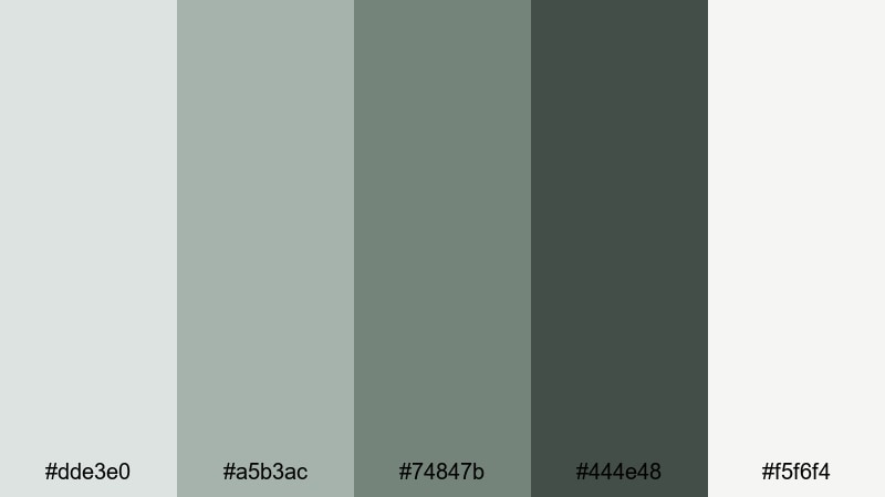
- HEX Codes: #dde3e0, #a5b3ac, #74847b, #444e48, #f5f6f4
- Mood: Balanced, focused, and tidy.
- Use for: Perfect for tutorial lower thirds, overlay graphics, and clean channel branding.
Slate Screen Serenity uses a smooth gradient of slate gray greens and off white highlights that feel tidy and distraction free. It is an ideal base for on screen text because the contrast is strong but not harsh.
Design tutorial lower thirds, chapter markers, and sidebar notes with these tones to keep your information organized. This palette is also great for course thumbnails and playlists where you want everything to look cohesive at a glance.
Monochrome Moss Grid
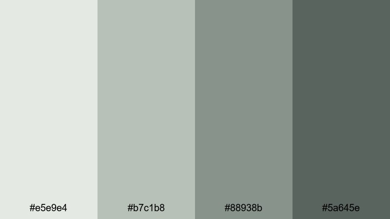
- HEX Codes: #e5e9e4, #b7c1b8, #88938b, #5a645e
- Mood: Structured, minimal, and slightly organic.
- Use for: Use for grid based layouts, portfolio reels, and clean infographic animations.
Monochrome Moss Grid keeps everything in one tight moss tinted gray family. The subtle shifts in value make it easy to build clean grids, cards, and tiles without introducing distracting color noise.
Use this palette in portfolio reels, data breakdowns, and stats overlays. Slightly darker moss tones can highlight key numbers or CTAs, while the lightest gray green becomes the main canvas for icons and text.
Dramatic & Cinematic Gray Green Color Palettes
Noir Forest Frame
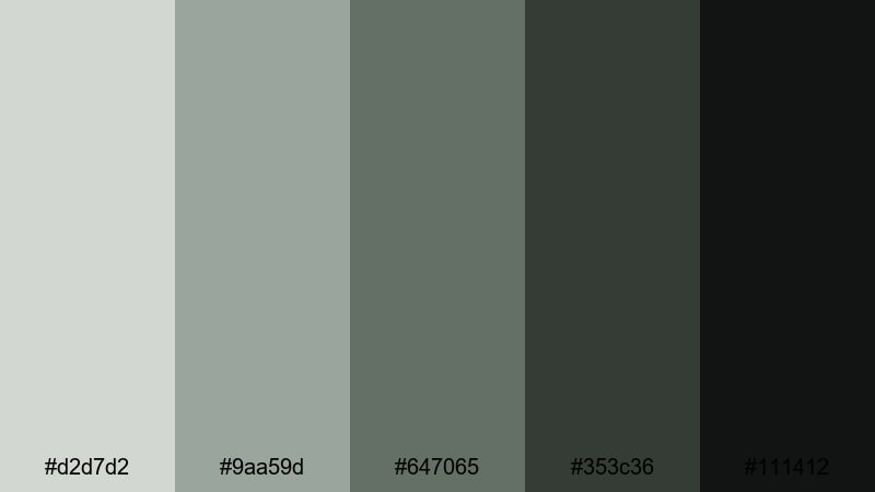
- HEX Codes: #d2d7d2, #9aa59d, #647065, #353c36, #111412
- Mood: Moody, cinematic, and intense.
- Use for: Great for short films, moody travel edits, and dramatic title sequences.
Noir Forest Frame drives your visuals into deep charcoal greens and near black shadows, with just a few muted highlights. It adds tension and depth, perfect for narrative projects or dramatic travel edits shot in forests, mountains, or city backstreets.
Use the lighter shades for minimalist typography and the darkest tones for letterboxing, title cards, and overlays. In thumbnails, combine a bright subject cutout with these rich gray greens in the background to make your main character or product stand out.
Stormy Galleon Grade
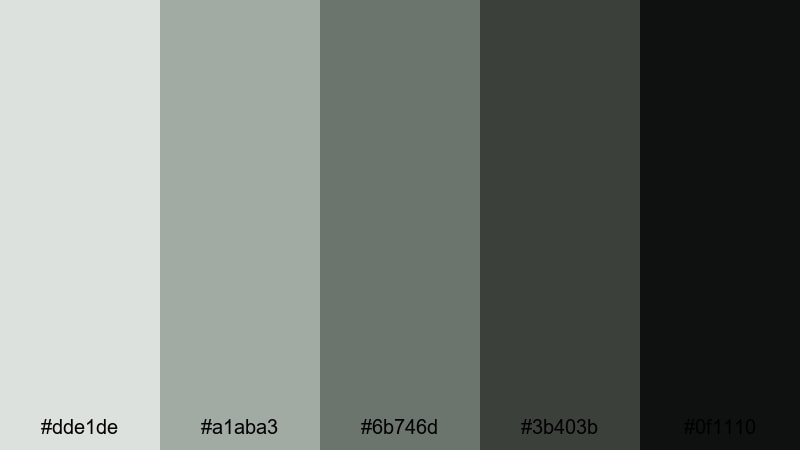
- HEX Codes: #dde1de, #a1aba3, #6b746d, #3b403b, #0f1110
- Mood: Stormy, epic, and atmospheric.
- Use for: Use for adventure montages, game trailers, and dramatic color grades in Filmora.
Stormy Galleon Grade feels like a sea storm captured on camera: misty light grays on top and dark, almost black greens below. It creates strong mood without loud colors, which makes it ideal for cinematic edits, fantasy game trailers, or action montages.
Apply this palette as a color grade to unify clips from different cameras. Use the darkest shades for title text, HUD graphics, or logo stings, and the mid gray greens for background panels behind subtitles or credits.
Dusky Skyline Reel
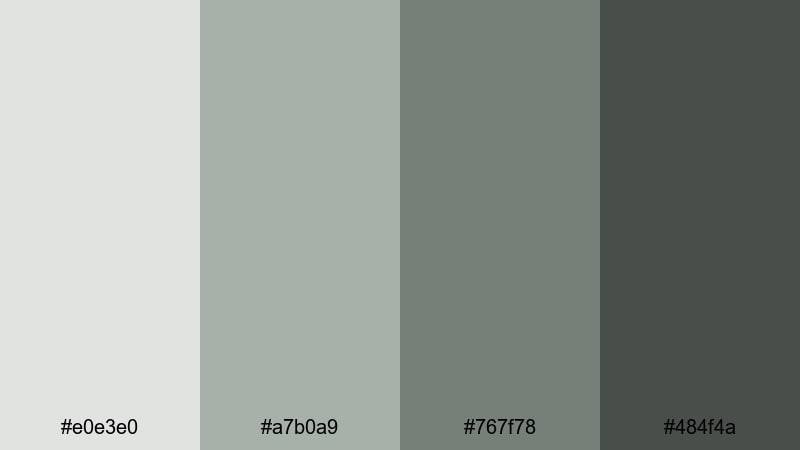
- HEX Codes: #e0e3e0, #a7b0a9, #767f78, #484f4a
- Mood: Urban, cinematic, and contemplative.
- Use for: Ideal for cityscape time lapses, rooftop interviews, and night in the city vlogs.
Dusky Skyline Reel wraps your footage in smoky skyline tones, like a city just after sunset. The gray greens in the shadows feel sophisticated and cinematic, while the lighter shades give you room for legible on screen graphics.
Use this palette for city time lapse overlays, interview lower thirds, and map animations. In thumbnails, mix a skyline photo with a gray green gradient background and bold, light text to make your urban content feel like a polished film poster.
Nature Inspired Gray Green Color Palettes
Riverstone Leaf Trail
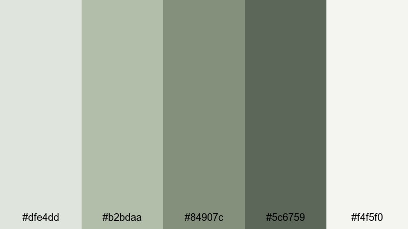
- HEX Codes: #dfe4dd, #b2bdaa, #84907c, #5c6759, #f4f5f0
- Mood: Organic, refreshing, and grounded.
- Use for: Perfect for hiking vlogs, eco brand promos, and outdoor tutorial backdrops.
Riverstone Leaf Trail balances stone gray and leafy green tones for a calm, grounded look. It feels like river pebbles, moss, and soft daylight all in one palette, making it great for outdoor and eco conscious content.
Use the lighter hues as backgrounds for on screen tips, and the deeper greens for headings, buttons, or logo marks. This palette is ideal for thumbnail frames, chapter cards, and infographic style overlays in travel or nature videos.
Pine Needle Overcast
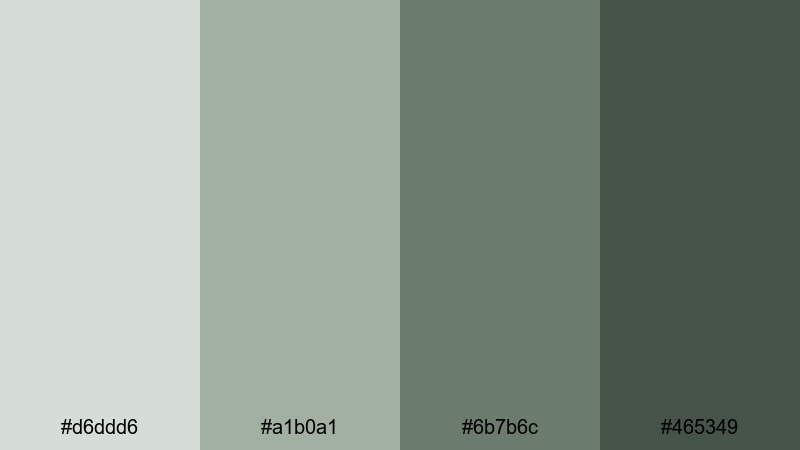
- HEX Codes: #d6ddd6, #a1b0a1, #6b7b6c, #465349
- Mood: Cool, misty, and introspective.
- Use for: Use for cabin vlogs, camping edits, and moody nature B-roll sequences.
Pine Needle Overcast captures the mood of a forest under cloud cover. The muted greens and cool grays create a reflective, almost cinematic quiet that suits slower storytelling and thoughtful voiceovers.
Apply this palette to titles, map overlays, and location tags in your camping or cabin vlogs. It also works well in thumbnails that feature dark green trees against a soft gray green sky, with clean white or light gray text laid on top.
Cliffside Moss Drift
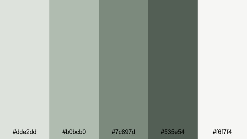
- HEX Codes: #dde2dd, #b0bcb0, #7c897d, #535e54, #f6f7f4
- Mood: Earthy, stable, and cinematic.
- Use for: Great for travel films, landscape drone shots, and documentary style edits.
Cliffside Moss Drift feels rugged but calm, like rock faces softened by moss and mist. The balanced mix of light, mid, and deep gray greens gives you lots of flexibility for both footage grading and motion graphics.
Use the lightest shade for text panels and data callouts, and the darker ones for lower thirds, map paths, and section dividers. In drone or landscape edits, this palette helps create a consistent cinematic tone even when your locations change.
Garden Wall Patina
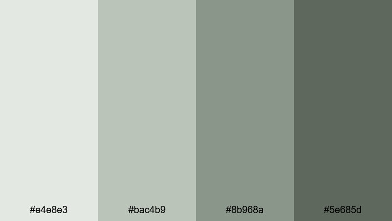
- HEX Codes: #e4e8e3, #bac4b9, #8b968a, #5e685d
- Mood: Timeless, soft, and nostalgic.
- Use for: Ideal for home makeover content, garden tours, and cozy lifestyle reels.
Garden Wall Patina combines weathered wall grays with gentle patina greens to create a soft, nostalgic mood. It hints at old stone, climbing plants, and filtered light, which suits decor and lifestyle storytelling.
Use this palette for room reveal titles, before and after labels, and product tags in home or garden content. In thumbnails, pair a decor shot with these gray green tones as borders or background gradients to give your channel a consistent, cozy brand identity.
Tips for Creating Gray Green Color Palettes
Gray green is versatile, but it works best when you control contrast, saturation, and accent colors. These tips will help you combine gray green with other hues for clear, consistent video and design work.
- Pick a main gray green for your backgrounds, then choose one darker and one lighter shade from the same family for text and accents.
- Use high contrast pairings for readability: light gray green backgrounds with dark charcoal text, or deep gray green backgrounds with off white text.
- Add one small accent color (like warm beige, muted gold, or soft coral) to avoid a flat look while still keeping gray green dominant.
- Check your footage against your palette: reduce saturation in greens and yellows if real world colors are fighting your chosen gray green tone.
- Keep branding consistent by reusing the same 3 to 5 HEX codes for titles, lower thirds, and end screens across all videos.
- Test palettes on mobile screenshots to make sure text remains clear in thumbnails and vertical video covers.
- Use subtle gradients between two shades of gray green to add depth behind logos and UI elements without overwhelming the viewer.
- Create a short style guide listing your HEX codes, font choices, and spacing so you and any collaborators can stay on brand.
Gray green color palettes are powerful tools for shaping mood, whether you want soft and serene wellness content, minimal tech branding, or dramatic cinematic reels. With the right combinations, you can make your thumbnails, intros, and overlays feel instantly recognizable and on brand.
Try dropping a few of these HEX palettes straight into Filmora and building simple templates for titles, lower thirds, and end screens. Once your gray green look is set, you can focus on storytelling while Filmora helps you keep every edit visually consistent.
Experiment with different palettes for different series or playlists, and refine them over time using Filmora's color tools, filters, and LUTs until your channel has a unique, polished gray green identity.
secure downloadNext: Gray Red Color Palette
