
 100% Security Verified | No Subscription Required | No Malware

Gray Red is a powerful mix of emotion and neutrality. Red pulls attention, suggests passion and urgency, while gray adds calm, balance, and professionalism. Together, Gray Red color palettes feel cinematic and modern, but they can also be soft and romantic depending on how warm, dark, or muted the tones are. This makes them perfect for YouTube thumbnails, channel branding, cinematic intros, and stylish social media content.
Below you will find 15 Gray Red color palettes with ready-to-use HEX codes. Each palette is designed for specific moods and use cases, from dreamy vlogs to gritty trailers, and is easy to apply in your edits, motion graphics, or branding. Whether you are grading footage directly in Filmora or designing assets to bring into your timeline, these Gray Red combinations will help you keep a consistent, aesthetic look.
In this article
Soft & Romantic Gray Red Palettes
Blush Ash Harmony
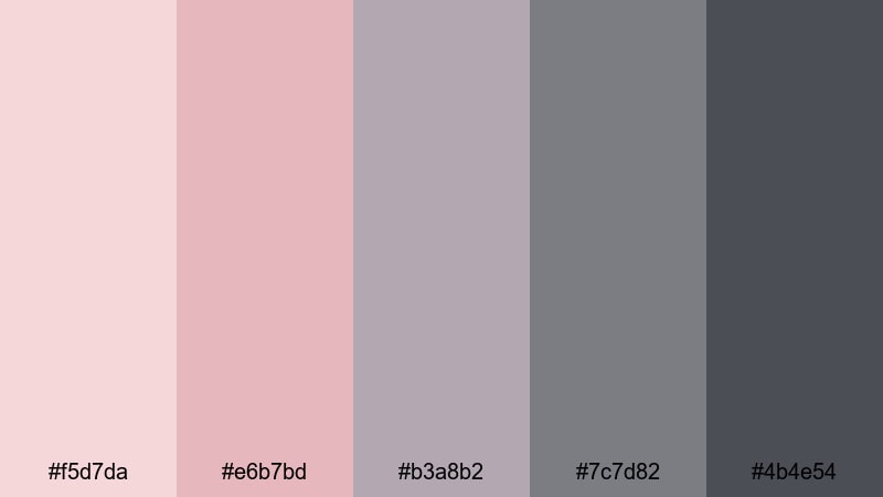
- HEX Codes: #f5d7da, #e6b7bd, #b3a8b2, #7c7d82, #4b4e54
- Mood: Tender, calm, and gently nostalgic.
- Use for: Ideal for wedding highlight videos, soft lifestyle thumbnails, and romantic storytelling sequences.
Blush Ash Harmony combines light blush reds with muted ash grays, creating a soft, intimate atmosphere. The brighter pink tones can gently draw the eye to your subject, while the cooler neutrals keep everything looking elegant and controlled rather than overly sweet.
This palette works beautifully for wedding highlight films, proposal stories, and cozy couple vlogs. Use the lighter reds for titles, call-to-action buttons, and keyframes in your Filmora intros, then balance them with the mid-to-dark grays in your backgrounds, overlays, and lower thirds so your frame never feels too busy.
Pro Tip: Build A Romantic Gray Red Look In Filmora
To keep a romantic Gray Red look consistent across an entire edit, start by designing a simple style guide inside Filmora. Use Blush Ash Harmony for your text colors, shapes, and overlays, then save those as custom presets. That way, your thumbnails, intros, B-roll transitions, and end screens all share the same soft blush accents and cool gray framing.
You can also layer subtle gradients or shape masks using the light blush red as a corner vignette and the deeper gray as the base. This creates an airy, cinematic feeling that flatters skin tones while keeping attention on faces and important details.
AI Color Palette
If you have a still frame or mood board that already uses Blush Ash Harmony, you can turn it into a reference for your whole project. Filmora's AI Color Palette feature lets you analyze that image and automatically transfer its Gray Red tones to all your clips, so the entire storyline feels unified.
Simply pick a reference shot with the perfect blush and gray balance, apply AI Color Palette to your other footage, and adjust the intensity slider. This is especially useful for wedding films, where daylight, indoor lights, and reception lighting can shift your reds and grays from clip to clip.
 secure download

HSL, Color Wheels & Curves
Once your base Gray Red look is in place, you can fine-tune it using HSL, color wheels, and curves. In Filmora, gently desaturate the reds in the shadows while keeping the highlights warmer to create a dreamy, film-like rolloff that flatters skin and fabrics. Using tools similar to those shown in this color correction guide, you can nudge your grays toward blue or purple to match the exact romantic tone you want.
Adjust the curves to lift the blacks slightly, giving your footage a soft matte feel that works perfectly with Blush Ash Harmony. A slight S-curve can bring back contrast in the midtones so your subjects stay crisp while the overall image remains gentle and nostalgic.
secure download1000+ Video Filters & 3D LUTs
If you want to stylize your Gray Red palette even faster, Filmora’s video filters and 3D LUTs make it easy to test different romantic, cinematic, or pastel looks on top of Blush Ash Harmony. Start with a soft film LUT, then adjust intensity so your blush reds stay gentle and your grays remain neutral.
You can combine LUTs with subtle filters like vignettes, glow, or diffusion to enhance the dreamy quality of this palette. Save your favorite combinations as presets, so every new wedding highlight, anniversary montage, or love story intro can load the same Gray Red style in seconds.
secure downloadRose Mist Overcast
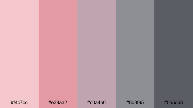
- HEX Codes: #f4c7cc, #e39aa2, #c0a4b0, #8d8f95, #5a5d63
- Mood: Dreamy, wistful, and cinematic.
- Use for: Use in dreamy vlogs, aesthetic reels, and slow-paced narrative intros with a soft emotional tone.
Rose Mist Overcast pairs dusty rose tones with cool, cloudy grays to create a gentle, daydream-like feeling. The muted reds avoid looking too intense, while the misty grays give your frames a soft, overcast atmosphere that feels introspective and cinematic.
This palette is ideal for aesthetic morning routines, reflective city walks, and poetic voiceover videos. Use the roses on text and key visual elements in your thumbnails, then let the deeper grays guide your background graphics, overlays, and end-card layouts so everything feels cohesive from intro to outro.
Smoky Petal Glow
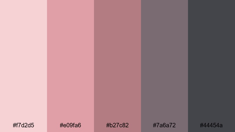
- HEX Codes: #f7d2d5, #e09fa6, #b27c82, #7a6a72, #44454a
- Mood: Warm, smoky, and subtly glamorous.
- Use for: Great for beauty content, product close-ups, and lifestyle lookbooks where you want soft glamour.
Smoky Petal Glow combines warm petal reds with smoky charcoal grays for a refined romantic mood. The deeper tones add a touch of mystery and elegance, while the lighter reds add just enough warmth to feel inviting and glamorous.
Use this palette for beauty tutorials, product teasers, and lookbook-style edits. Highlight lips, nails, or product packaging with the richer reds, then ground your overlays, text bars, and frame borders in the smoky grays to keep the overall look polished and premium in Filmora.
Dawn Blush Concrete
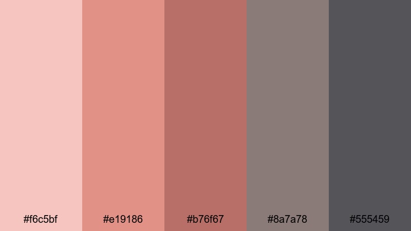
- HEX Codes: #f6c5bf, #e19186, #b76f67, #8a7a78, #555459
- Mood: Gentle, grounded, and hopeful.
- Use for: Best for morning routine vlogs, lifestyle covers, and subtle branding overlays.
Dawn Blush Concrete mixes sunrise blush reds with urban concrete grays, creating a look that is both soft and grounded. The warm tones suggest a fresh start or new chapter, while the grays keep everything feeling modern and real rather than overly dreamy.
This palette suits lifestyle vlogs, self-care routines, and productivity content. Use the warmer reds for chapter cards, text highlights, or call-to-action buttons in your intros, while the middle and dark grays make ideal backgrounds for timelines, on-screen widgets, or subtle brand watermarks.
Bold & Cinematic Gray Red Palettes
Crimson Steel Impact
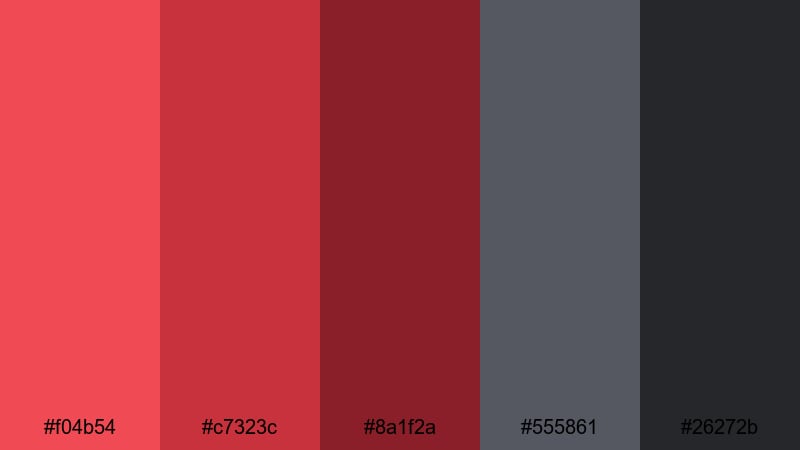
- HEX Codes: #f04b54, #c7323c, #8a1f2a, #555861, #26272b
- Mood: Intense, powerful, and dramatic.
- Use for: Perfect for action trailers, bold channel branding, and high-impact thumbnails.
Crimson Steel Impact pits vibrant crimson reds against cold steel grays for maximum drama. The bright reds scream energy and urgency, while the darker grays bring a cinematic, almost industrial edge that feels powerful and confident.
Use this palette when you want your thumbnails to pop on crowded feeds, especially for gaming, action sports, or tech commentary channels. Let the brightest red drive your titles and main subject outlines, while the steel and near-black grays form dramatic backgrounds, lower thirds, and end screens in Filmora.
Neon Ember Skyline
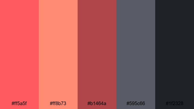
- HEX Codes: #ff5a5f, #ff8b73, #b1464a, #595c66, #1f2328
- Mood: Urban, energetic, and edgy.
- Use for: Use in night city montages, gaming intros, and music videos with high energy.
Neon Ember Skyline channels the look of city lights and glowing signs. Hot, neon-like reds and corals stand out sharply against deep urban grays, giving your visuals an energetic, nightlife-inspired feel.
This palette is perfect for EDM edits, gaming highlight reels, and fast-paced city B-roll. Use the neon reds as accent lights, glitch text, or overlays in your intros, and rely on the darker grays for gradients, shadows, and background shapes to keep everything legible and cinematic.
Action Noir Scarlet
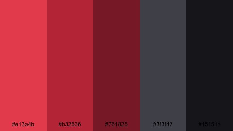
- HEX Codes: #e13a4b, #b32536, #761825, #3f3f47, #15151a
- Mood: Dark, suspenseful, and gritty.
- Use for: Great for thriller trailers, cinematic B-roll, and dramatic narrative projects.
Action Noir Scarlet blends deep scarlet reds with near-black grays, evoking classic noir movies with a modern twist. The rich reds suggest danger and emotion, while the almost-black tones create strong silhouettes and tension.
Use this palette for crime stories, mystery shorts, and dramatic title sequences. In thumbnails and posters, let the scarlet highlight characters or key props, framed by the darker grays and blacks for a striking contrast that instantly signals suspense.
Trailer Flame Storm
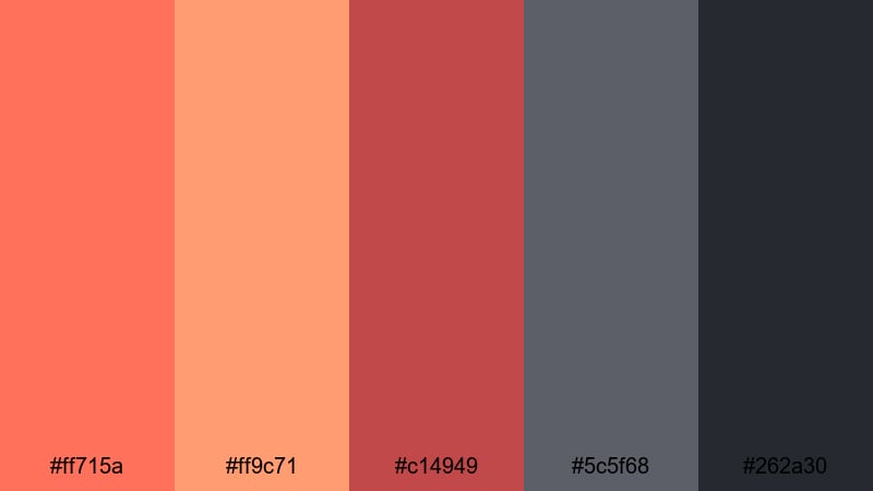
- HEX Codes: #ff715a, #ff9c71, #c14949, #5c5f68, #262a30
- Mood: Fiery, dynamic, and bold.
- Use for: Ideal for trailers, sports edits, and energetic promo videos that need instant attention.
Trailer Flame Storm bursts with hot, flame-like reds and embers supported by stormy grays. The warm tones feel explosive and fast, while the grays provide a moody backdrop that keeps your visuals structured.
Try this palette for sports hype videos, event promos, and channel trailers. Use the lighter oranges for highlights and streak transitions, the deeper red for bold titles, and the grays for textured backgrounds, tracking graphics, and end-card layouts in Filmora.
Minimal & Modern Gray Red Palettes
Concrete Rouge UI
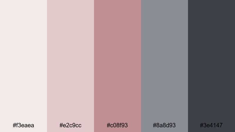
- HEX Codes: #f3eaea, #e2c9cc, #c08f93, #8a8d93, #3e4147
- Mood: Clean, polished, and contemporary.
- Use for: Perfect for modern UI overlays, app promos, and sleek product demos.
Concrete Rouge UI uses soft rouge accents on a foundation of neutral concrete grays. The reds are subtle enough to feel professional but still provide a clear focal point for calls to action and important on-screen elements.
This palette is a great fit for SaaS explainers, app walkthroughs, and tech product demos. Let the light grays define panels, cards, and backgrounds, while the rouge shades highlight buttons, progress bars, and lower thirds for a clean interface-style design in your video.
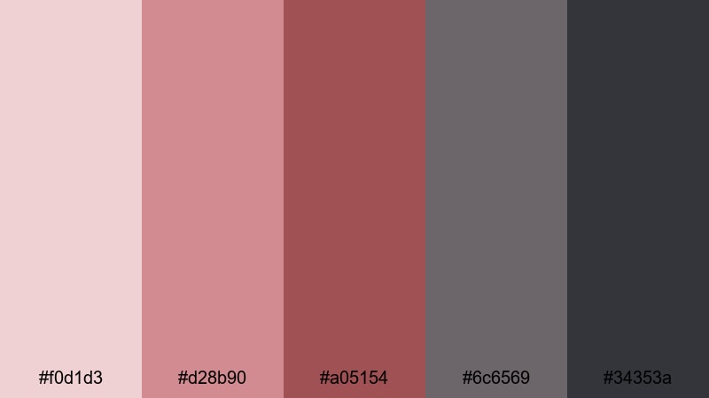
Charcoal Blush Grid
- HEX Codes: #f1d4d7, #d59ba0, #a8777b, #696b72, #2e3136
- Mood: Balanced, stylish, and design-forward.
- Use for: Use for clean channel art, typography-based thumbnails, and UI-inspired motion graphics.
Charcoal Blush Grid balances soft blush reds with solid charcoal grays, delivering a modern but approachable design. The combination feels design-forward and suitable for creative professionals who want a touch of warmth without losing structure.
Use the blush tones on your key typography, icons, and small accent lines, while the charcoals form grids, frames, and large background areas. This Gray Red mix works especially well for educational content, portfolio videos, and design or productivity channels.
Soft Rubble Accent
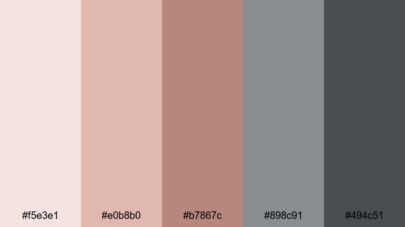
- HEX Codes: #f5e3e1, #e0b8b0, #b7867c, #898c91, #494c51
- Mood: Subtle, calm, and understated.
- Use for: Best for subtitles, lower thirds, and background graphics that should feel gentle but modern.
Soft Rubble Accent keeps everything muted and gentle. Red appears as a quiet accent while stone-like grays provide most of the structure, resulting in a calm and understated look that does not distract from your content.
This palette is great when you want clarity and readability but still need a bit of style, such as for subtitles, educational overlays, or commentary videos. The light grays make ideal panels behind captions, while the muted reds can highlight key phrases or icons without shouting.
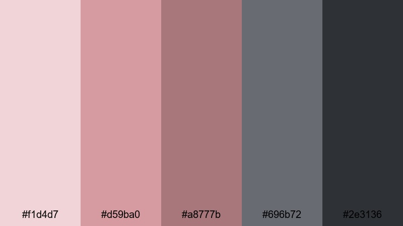
Slate Ruby Minimal
- HEX Codes: #f0d1d3, #d28b90, #a05154, #6c6569, #34353a
- Mood: Sophisticated, confident, and minimal.
- Use for: Ideal for branding intros, signature outros, and portfolio pieces.
Slate Ruby Minimal contrasts clear ruby reds with reserved slate grays to create a sleek, confident aesthetic. The reds feel strong enough for branding, while the grays keep the overall design minimal and uncluttered.
Use the ruby tones for logos, signature marks, or monotone product shots, and lean on the slates for negative space, title cards, and overlay frames. This palette works especially well for personal brands, agencies, and creative professionals who want a premium Gray Red identity.
Vintage & Moody Gray Red Palettes
Old Brick Alley
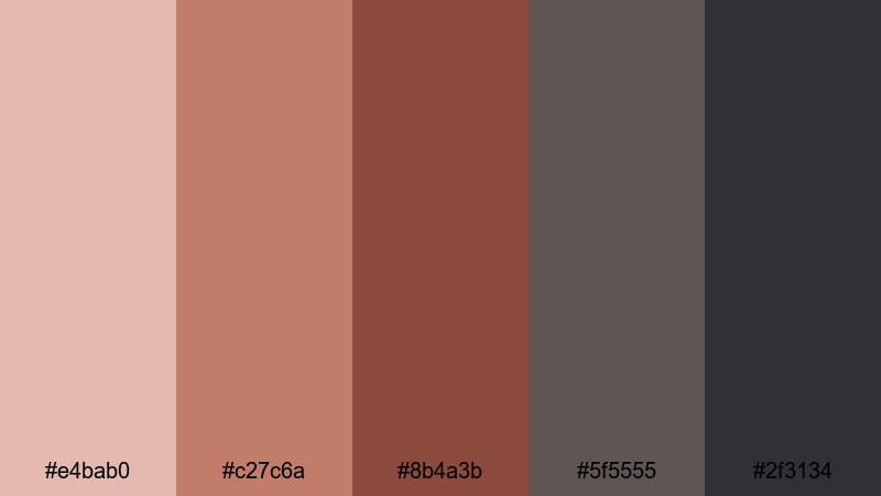
- HEX Codes: #e4bab0, #c27c6a, #8b4a3b, #5f5555, #2f3134
- Mood: Nostalgic, gritty, and warm.
- Use for: Great for travel diaries, street photography edits, and documentary-style vlogs.
Old Brick Alley is inspired by aged walls, worn streets, and narrow city corners. Brick reds blend with weathered grays to give your footage a lived-in, cinematic character that feels both warm and slightly gritty.
This palette is excellent for travel vlogs, street photography edits, and behind-the-scenes documentaries. Use the mid and deep reds to emphasize buildings, props, or clothing, while the darker grays grade your shadows and backgrounds for a cohesive, story-driven tone.
Rusted Metro Haze
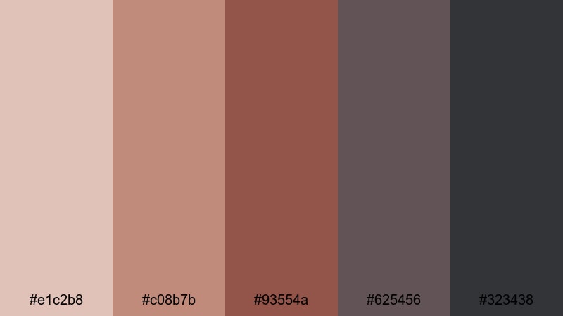
- HEX Codes: #e1c2b8, #c08b7b, #93554a, #625456, #323438
- Mood: Urban, worn, and atmospheric.
- Use for: Use in urban exploration videos, grunge edits, and lo-fi music visuals.
Rusted Metro Haze blends rusty reds with hazy gray tones to capture the feel of an old metro line or forgotten industrial space. The palette feels urban and textured, with a slight melancholy edge that works well for atmospheric edits.
Try it for urban exploration, lo-fi music videos, or city-time-lapse sequences. The faded reds can highlight graffiti, brick, or rust details, while the hazy grays control the overall mood, especially when used in vignettes, overlays, and graded shadows.
Analog Scarlet Grain
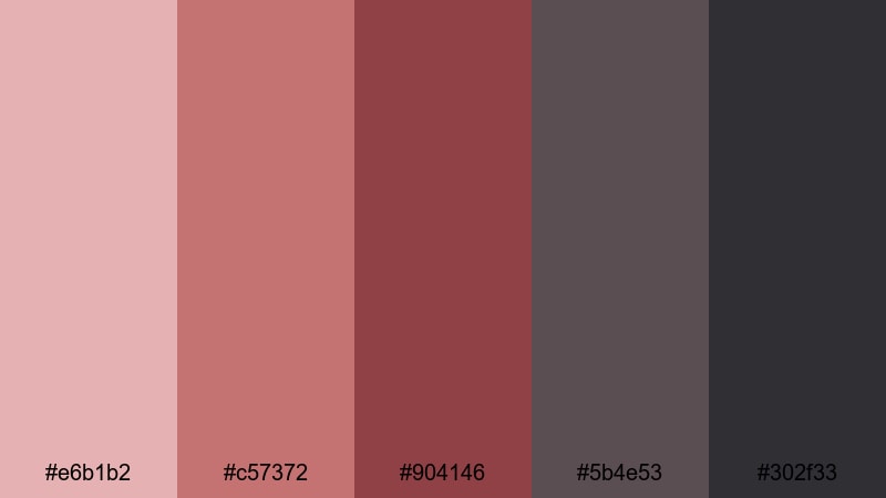
- HEX Codes: #e6b1b2, #c57372, #904146, #5b4e53, #302f33
- Mood: Retro, emotional, and cinematic.
- Use for: Perfect for film-style color grades, nostalgic montages, and story-driven shorts.
Analog Scarlet Grain echoes the look of old film prints, with scarlet tones drifting into dusky grays. The palette feels emotional and slightly faded, as if you are watching a memory rather than a live moment.
Use it for nostalgic montages, family stories, or retro-styled short films. Emphasize the scarlet shades in key scenes or props, and push the grays in your shadows and sky tones. Adding a bit of grain and a subtle vignette in Filmora can complete the analog mood this Gray Red palette suggests.
Tips for Creating Gray Red Color Palettes
Gray Red works across many genres, from minimal tech branding to romantic vlogs and gritty documentaries. These practical tips will help you combine Gray Red tones so your videos, thumbnails, and graphics stay clear, consistent, and on-brand.
- Decide the mood first: choose softer, desaturated reds with lighter grays for romantic or lifestyle content, and deeper, more saturated reds with dark grays for bold cinematic looks.
- Use gray as the base and red as the accent: keep 70 to 80 percent of your frame in neutral grays, then reserve reds for titles, buttons, and important subjects so they stand out.
- Check text readability: test white, black, and light gray text on your chosen reds and dark grays to be sure subtitles and titles remain easy to read on mobile screens.
- Match your footage temperature: if your camera footage is warm, nudge your grays slightly warm; for cooler footage, lean your grays toward blue so the palette feels natural.
- Limit the number of active reds: in one video frame, use one primary red and maybe one accent variation to avoid visual noise and keep your design clean.
- Stay consistent across assets: reuse the same HEX codes in thumbnails, intro animations, lower thirds, and end screens so viewers instantly recognize your Gray Red brand.
- Test on different backgrounds: place your palette over light, mid-tone, and dark footage to see how the reds and grays behave in shadows and highlights.
- Save presets in your editor: once you have a Gray Red grade you love in Filmora, save color presets and graphic templates so future edits keep the same visual identity.
Gray Red color palettes are a versatile way to control mood, guide attention, and build a recognisable visual identity. Softer palettes support romantic stories and lifestyle channels, while bolder mixes of crimson and charcoal create cinematic tension for trailers, gaming, or documentary work.
Use these 15 ready-made Gray Red palettes as a starting point, then fine-tune them inside Filmora to match your footage and brand. With presets, AI-driven color matching, and LUTs, you can keep your reds and grays consistent from the first thumbnail to the final outro screen.
The more you experiment, the faster you will find a signature Gray Red style that fits your channel or project. Try applying one palette to your next video, export a few variations, and pick the version that feels most aligned with your story and audience.
secure download